Project: Ansan Hotel
Architectural Renovation and Interior Design: WJ Studio
Principle Designer: Hu Zhile
Design Team: Liu Yu’ao, Zhou Shuyi, Yu Haodong, Zhang Yonghui
Lighting Design: Fang Fang, Yi Zonghui
Location: Shaoxing, Zhejiang, China
Completion Date: 2023
Project Area: 5000m2
Client: Shaoxing Keqiao Ziyi Ansan Hotel Management Co.
Photographer: Robyn
01 Symbolic + Visual recognition
In different historical periods and regions, the forms and functions of buildings reflect the cultural characteristics and values of the society at that time. When cities start to find their positioning and continue to strengthen their features and build city brands, the buildings and landscapes in cities can only form strong enough memory points if they follow this trend. From the design perspective, unified and repeatable design elements and spatial features can develop a symbolic language together. A building is not only a physical object but also a cultural symbol.
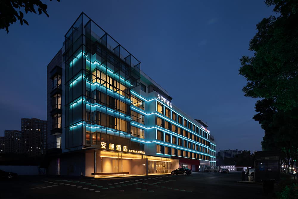
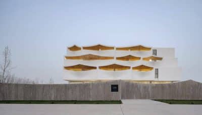
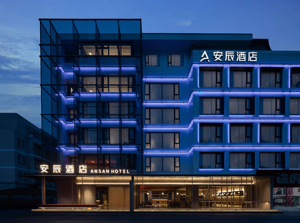
With this symbolic language in mind, WJ STUDIO put into the design of Shaoxing Ansan Hotel. We proposed a renovation plan with the concept of symbolization, hoping that in addition to the renovation of the hotel’s interior, the exterior facade and landscape of the hotel will be renovated so that the exterior form, material and colour of the building will convey the regional characteristics and urban culture of Keqiao.
At the same time, we transformed the social attributes of the Ansan hotel into a design approach, using the public areas of the hotel as a basis to provide a small social place for hotel residents and young people in the surrounding community to interact and provide a shared space for people in a wider area on the online platform. The two design objectives of symbolization and communalization are enhanced to the level of conceptual design, which drives the development of the whole project and eventually improves the hotel’s brand identity.
02 Public+Dialogue
Located in the ancient town of Keqiao, Shaoxing, the original building before the renovation was a business hotel built ten years ago, with no regional or brand identity along the street facade – the first-floor facade was rented to local merchants, the entrance facade was all transparent glass, and the lobby had only a check-in front desk.
At the same time, the upstairs rooms and air conditioning units did not leave any impression.
Such buildings, which flourished with the massive demand for business travel generated by the century’s rapid economic development, are scattered throughout cities in China but are now hidden in the background of the urban interface.
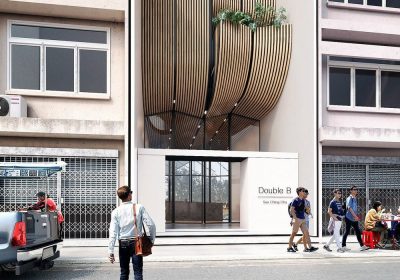
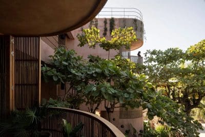
The considerations of architectural form start with the interface along the street. One side of the building is covered with metal mesh, creating a sheer volume that echoes the horizontal lines of the light strips.
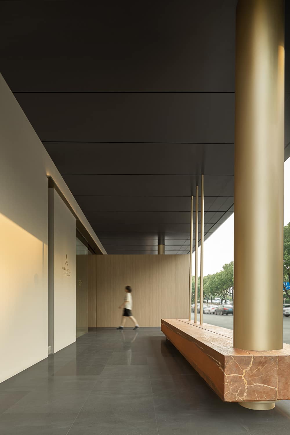
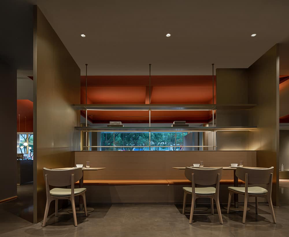
In the first floor’s design, the entrance space along the street is set back inward to create a strong guiding and welcoming gesture, and together with the adjacent restaurant, they form a complete sense of a window, creating a dialogue with the city outside.
The metal on the ceiling forms an understated, luxurious quality, and the soft lighting creates a cinematic atmosphere for the entire restaurant space. The outermost metal rods resemble a few sparse bamboos, projecting the hovering bamboo shadows and the warmth of Jiangnan into the interior space.
The design uses a reinvention of indoor and outdoor spaces, public and private, to create a sense of freshness while respecting the original site and to refresh guests who are tired of urban business hotels and desire a different spatial experience.
03 Young+Social
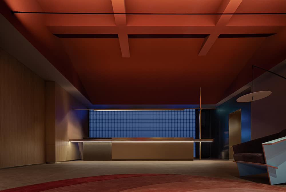
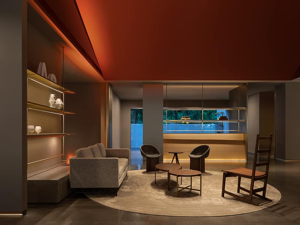
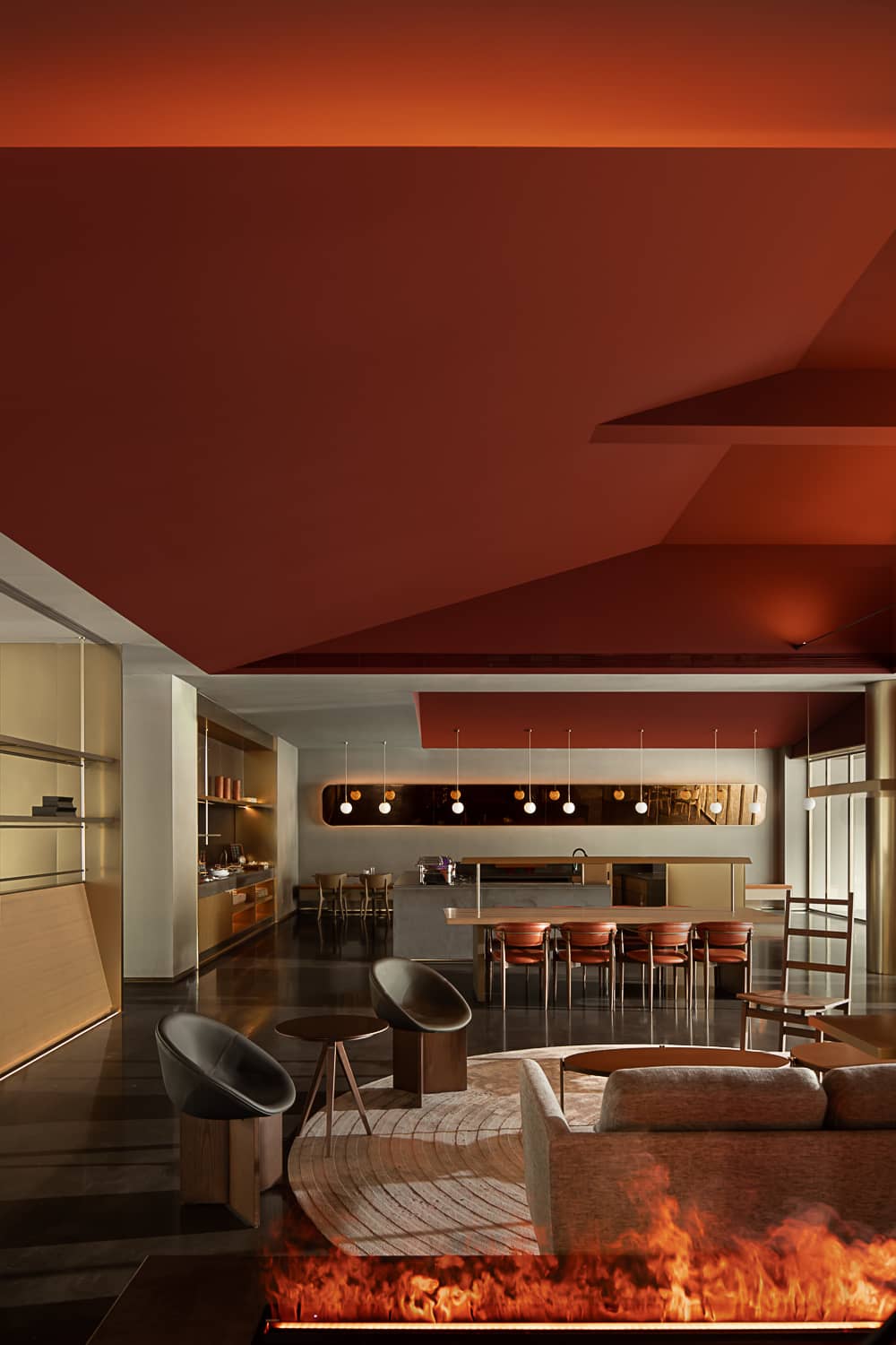
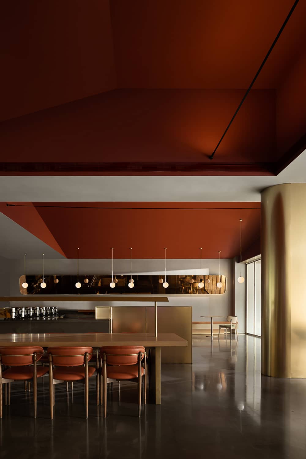
On the first floor, the hotel’s lobby and restaurant are boldly decorated with orange roofing and the LED lighting in the background of the front desk, creating a solid colour tension and reminding guests of the hotel’s young, trendy brand culture.
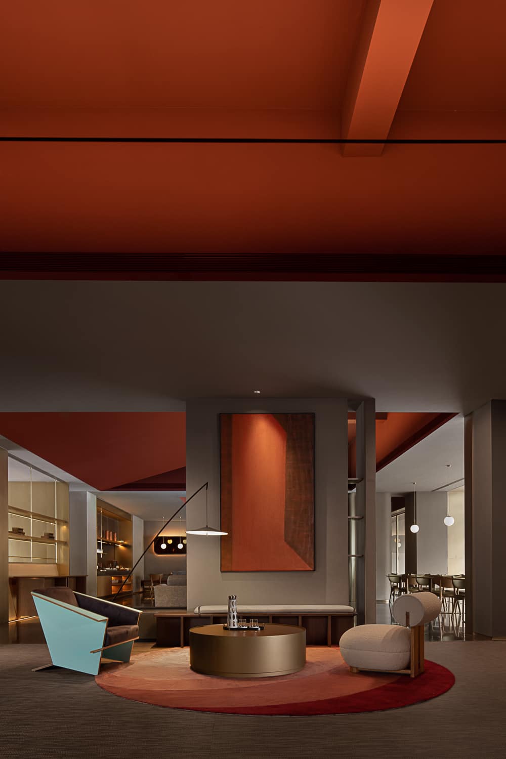
We designed a comon space for travellers on the second floor, consisting of two relatively private and quiet game rooms and a spacious public lounge area that can be used to provide entertainment after work or travel or to enjoy the city streetscape from the window.
Those who gather here can have fun and have their own “boundaries” in a strange crowd. It is a small social place where people can enjoy their freedom and interact with the community simultaneously. The community-oriented event space will enrich the overall experience of the traveller.

Like the restaurant on the same floor, the continuous floor-to-ceiling windows of the second-floor lounge area reveal a gesture of communication and dialogue with the city. Shade and city views are reflected inside, while people passing through the city can look up and see a splash of red on the ceiling of the lounge area. With a bit of transcendence, the lively and the silent can mingle.
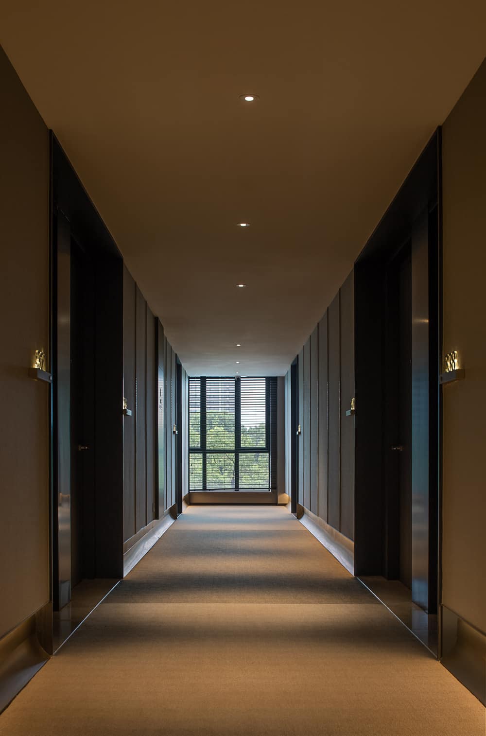
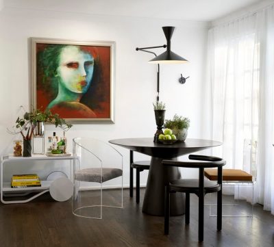
There are many little surprises hidden in the space for guests to discover: the sculptural geometric light fixtures at the end of the corridor, the abstract painting on the living room wall and the origami-like armchair, the giant city map in the elevator car.
04 Leisure+Art
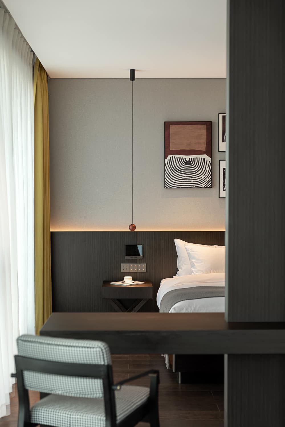
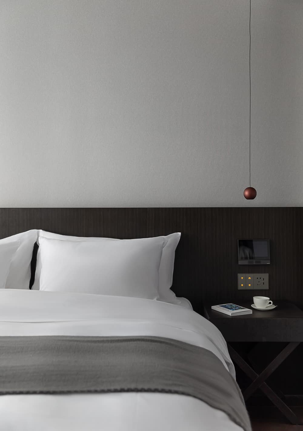
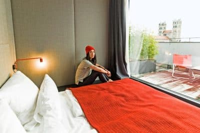
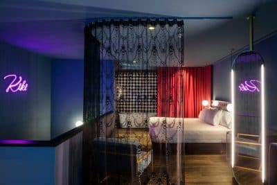
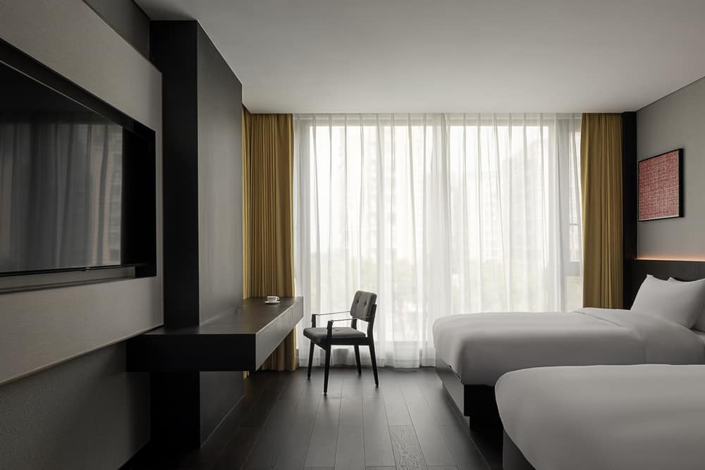
The designer wanted to shape the unique living experience of the city hotel through symbolic spatial elements. The guest rooms are designed with dark walnut and beige fabrics to create a relaxing, home-like feeling for the residents.
The embellished brass elements not only enhance the artistry and beauty of the space, bring a business-like atmosphere and a relaxed and comfortable home feeling to the guest rooms, but also continue the design language of the hotel’s public space to a certain extent.
Ansan Hotel’s design takes symbolic language as the concept, transforming the building’s form, material, color, and interior space to create a personal yet detached, blurred yet clear boundary for the travelers in the urban business hotel. This community space becomes part of the customer’s experience and is finally immersed in the brand story.
