When it comes to home design, it’s often the finishing touches that tie everything together. Indoor blinds are one of those features, practical, stylish, and capable of completely transforming a room. They don’t just filter sunlight or give you privacy; they help set the mood of your space. And one of the best ways to maximise their impact is by making sure your blinds and wall colours complement each other.
If you’ve just given your home a fresh coat of paint or are considering an upgrade with a local painting company, matching your blinds to your wall colours can make your space feel polished, balanced, and inviting. Whether you’re going for a calm, neutral vibe or a bold, modern look, the right blinds can bring everything together.
Here’s a detailed guide to help you pair blinds with paint like a pro.
Why Matching Indoor Blinds with Paint Colours Matters
Most homeowners focus on either paint or blinds separately, but the real magic happens when you think of them as a pair. The walls set the stage, while the blinds frame your windows, one of the most noticeable features in any room. If they clash, the space can feel disjointed or unfinished. If they complement each other, the whole room looks cohesive, intentional, and welcoming.
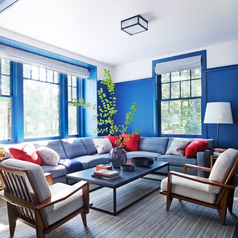
Blinds also influence how wall colours are perceived. For example, a soft grey wall paired with crisp white blinds looks bright and modern, while the same wall paired with darker blinds feels moodier and more dramatic. It’s not just about colour, it’s about how they work together to shape the atmosphere of your home.
The Benefits of Getting It Right
- Cohesive design: When your blinds and walls work together, the room feels put-together and thoughtfully designed.
- Increased home value: Buyers notice details. A well-matched interior signals care and quality, which can help boost resale appeal.
- Mood control: Colours affect how we feel. Pairing the right blinds and walls helps create the vibe you want — cosy, bright, calm, or energising.
- Practical harmony: Blinds aren’t just visual. Choosing tones that complement your paint ensures functionality (light control, privacy) without disrupting your style.
- Long-term flexibility: If you choose wisely, your blinds will still look great even if you repaint or update your décor later.
💡 Pro Tip: Think of your blinds as an investment. Unlike paint, which is easier (and cheaper) to change, blinds are a long-term fixture — so pick colours and fabrics that will work with multiple paint schemes over time.
1. Start with Your Colour Palette
Your wall colour sets the foundation of your interior design, so it’s the first thing to consider when choosing indoor blinds.
- Neutral walls: White, beige, cream, and light grey walls are versatile and pair well with almost any blind colour. You can add contrast with charcoal, navy, or even patterned blinds, or keep things subtle with soft whites or textured neutrals.
- Bold walls: Strong colours like emerald green, navy, or terracotta can be tricky. The safest approach is to pair them with understated blinds — think soft greys, light timber finishes, or off-whites. This prevents the room from feeling overwhelming.
- Pastel walls: Softer shades like blush, sage, or pale blue look great with natural fabrics or sheer blinds. These options preserve the airy, calming effect of pastels.
💡 Tip: If you’re repainting, think about your blinds before finalising your wall colour. Many homeowners regret choosing a bold wall colour only to find it clashes with their blinds later.
2. Match or Contrast?
Once you know your base colours, the next question is: do you want your blinds to blend in or stand out?
- Matching blinds: When blinds are similar in tone to your walls, the result is a seamless, minimalist look. This is especially popular in modern and Scandinavian-inspired homes, where simplicity is key. For example, pairing white blinds with off-white walls creates a clean, airy space.
- Contrasting blinds: Choosing blinds that differ in tone or colour creates a striking focal point. Charcoal blinds against light grey walls or timber Venetian blinds against cool-toned paint can give your room more depth and interest.
Think of your blinds like an accessory. A matching approach is like a classic pearl necklace — subtle, timeless. A contrasting approach is like a bold statement piece — eye-catching and stylish.
3. Factor in Light and Functionality
Blinds aren’t just about aesthetics. They also control light, privacy, and energy efficiency. Your wall colour can influence which blind fabric or style works best.
- Blockout indoor blinds: Great for bedrooms, nurseries, or media rooms. Darker colours combined with deeper wall tones create a cosy, restful retreat.
- Light-filtering blinds: Perfect for living spaces. Pairing them with lighter wall shades (whites, creams, or pastels) keeps the space bright and welcoming while reducing glare.
- Sheer blinds: A good option if you’ve invested in a feature wall. Sheer blinds soften natural light without completely covering up bold paint colours.
💡 Pro Tip: North-facing rooms in Australia get a lot of sunlight. Light-filtering or UV-protective blinds paired with neutral walls can prevent fading while keeping the space comfortable.
4. Play with Textures and Finishes
Paint isn’t just about colour — finish matters too. Matte walls, satin finishes, or high-gloss feature walls can all affect how blinds look beside them.
- Matte-painted walls: Pair beautifully with textured fabrics like linen roller blinds or Roman blinds. This creates a layered, homely feel.
- Gloss or satin walls: Work best with sleek, modern blinds like aluminium Venetians or smooth blockout rollers. The clean lines balance out the reflective finish.
- Timber blinds: Add warmth and work well against cooler tones like grey, navy, or crisp white. They’re a popular choice in coastal and Hamptons-style homes across Australia.
💡 Tip: If your walls are neutral, texture is where you can play. A soft, textured blind fabric can prevent a space from looking flat or bland.
5. Coordinate Across the Whole Room
Matching blinds to paint isn’t about creating an exact copy-paste look. It’s about making sure everything in the room feels connected.
- Flooring: Timber-look blinds tie in beautifully with hardwood floors. For tiled or stone floors, neutral fabric blinds work better.
- Furniture: Blinds that echo the tones in your sofa, rug, or dining set help pull the room together. For example, cream blinds to match a beige lounge create cohesion.
- Décor: Accent colours matter too. If you’ve painted a bold feature wall, pick blinds that complement your throw pillows, artwork, or light fixtures.
This approach helps your blinds act as part of the overall design rather than an afterthought.
Why the Right Pairing Makes All the Difference
Matching indoor blinds with your interior paint colours is about more than just aesthetics, it’s about creating a space that feels intentional, comfortable, and stylish. When done well, blinds and paint can work together to enhance natural light, control mood, and add value to your home.
If you’re planning a repaint, working with a professional painting company can make it easier to choose shades that coordinate with your blinds from the start. Pairing the right blinds with the perfect wall colour is a small decision that makes a big difference to how your home looks and feels every day.