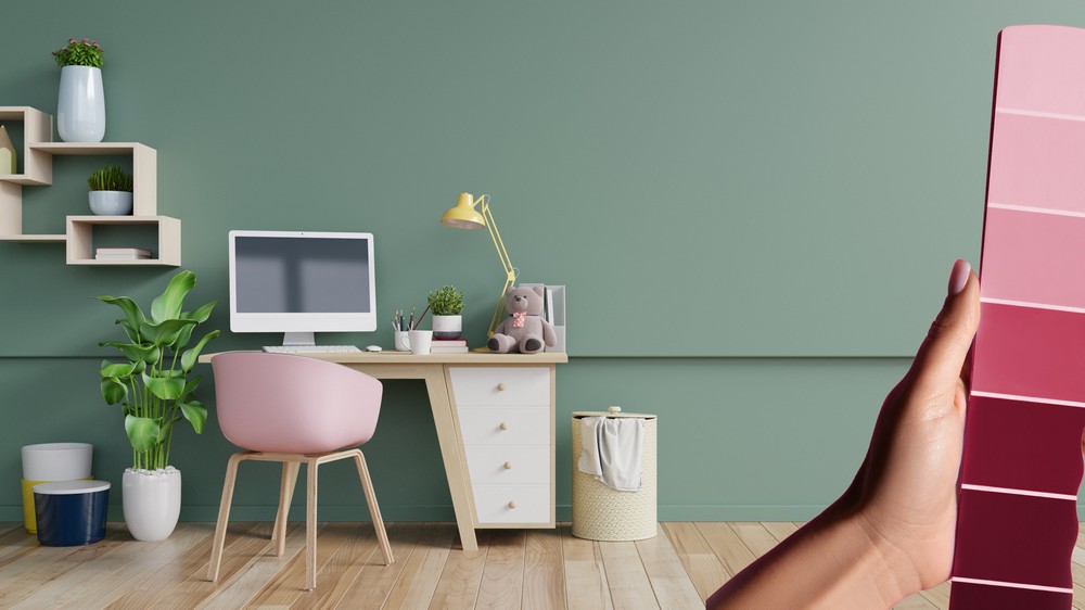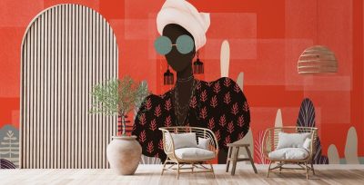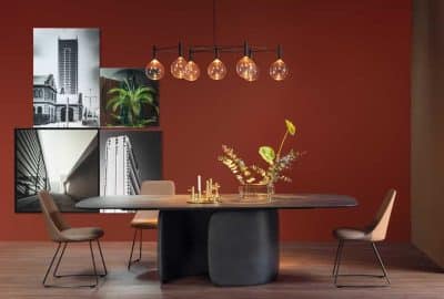
The 60-30-10 color rule in interior design provides the complete guidelines for achieving a balanced color scheme in your space. This rule tells you about the improvement in the interior design using different color proportions.
60-30-10 Color Rule
Following is the division of the colors according to this rule in 3 percentages:
● 60% Dominant Color: In this rule, the 60% is the main color. It will be covering the majority of your space. 60% color should be dominant and go well with the theme of your room. This color will be applied to the walls and the larger pieces in your living space. It will set the overall appearance of your room. So choose this color with great consideration to make your room look more appealing.
● 30% Secondary Color: It is the second color that is applied to the furniture, curtain, or bedding. It should complement the dominant color. This 30% color will add more visual interest and balance with the dominant color. Always choose the secondary color that suits best with the dominant color.
● 10% Accent Color: This is a color that is used for different decoration pieces and small accessories in your room. It will add personalization, control, and beauty to your space. It should be contrasting to the secondary and dominant colors, creating the center of attraction to the specific places and things in the room.
Following the 60-30-10 color rule in interior design will help you have a cohesive and visually appealing look for your room. By following this color scheme, you will get a balanced contrast of colors. It will also prevent over mixing of colors in a single place. By keeping this rule in mind, you can easily do the interior decor of your home according to your personal preferences.
Tips for 60-30-10 Color Rule in Interior Design
There are different tips to follow for applying this color rule in your small or large place. All these tips will tell you the effectiveness of this color rule for having a well-balanced interior design.
Understand Color Effects
Always understand color psychology. You should deeply understand the effect of colors. Cool tones like blue or green can lead to calmness of mind while warm tones like red or yellow can enhance liveliness in your place.
Consider Room Size
Always consider the room size and the amount of natural light it receives. Lighter color helps in opening up the space while dark colors can lead to confinement. So always test the color samples in different lighting to ensure your desired look.
Balance with Neutral Tones
Try to use neutral color tones to provide balance and cohesion in your home. Neutral colors like beige, white or gray make a good color blend between the secondary, dominant, and accent colors.
Consider Existing Elements
Always consider the existing accessories in your home before applying any color. So coordinate with the existing elements while following the 60-30-10 color rule in interior design. Always ensure that the color scheme you have chosen harmonizes with the accessories and decorative elements in your home.
Embrace Patterns
Try to introduce different stylish patterns with each color scheme. If you have a dominant color which is a solid color, then use patterned items or textured fabrics of that color. It will give a more cohesive look while playing with the patterns and textures efficiently.
These combinations are just examples and can be adjusted based on your preferences or the specific ambiance you want to create in your space.
Flexibility and Personalization
This 60-30-10 color rule in interior design gives some very helpful guidelines along with adhering to personal preferences. This rule should be followed to increase clarity as well.
● By incorporating all these necessary tips, you can easily enhance the look and effectiveness of this color rule in your place. It will increase the interior design of your space and will give a visually appealing look.
The following table contains the color pallets and combinations of most used colors in interior design. Pick one as you like.
| Color Combination | Dominant Color | Secondary Color | Accent Color |
| Neutral Palette | White | Light Gray | Navy Blue |
| Earthy Tones | Terracotta | Olive Green | Mustard Yellow |
| Coastal Vibes | Light Blue | Beige | Coral |
| Modern Monochrome | Charcoal | Dove Gray | Teal |
| Pastel Dream | Pale Pink | Mint Green | Lavender |
Benefits of the 60-30-10 Color Rule in Interior Design
The 60-30-10 rule in interior design offers numerous benefits that contribute to a harmonious and balanced color scheme. Following are some of the advantages that must be considered for applying this rule:
Balance and Harmony
This 60-30-10 color rule in interior design shows a balanced distribution of colors. It will also increase the visual harmony by balancing the dominating colors with other secondary colors. It will also promote a more unified and smooth look of your space.
Focal Point
This rule helps you in creating a center of attraction in the room. This focal point will help increase appraisal and add value space.
Easy Coordination with Elements
This rule also helps in coordinating with the new color scheme of the existing elements. It will ensure a seamless flow of the new color themes of furniture, decorative accessories, flooring, or other architectural features.
Consistency
If you follow this rule attentively, then you will get a consistent appearance throughout the room which will result in an overall cohesive design.
Conclusion
The 60-30-10 color rule in interior design helps in making your space more aesthetic. This Interior color scheme rule depicts the professional appearance of your space. You can easily do the interior decor of your house with the help of this rule. By using the right dominant, secondary, and accent colors you can make your space aesthetically pleasing.
FAQs
Can the 60-30-10 color rule in interior design be applied to small areas?
Ans. Yes, it can be applied. For small spaces, always use a lighter color as a dominant color. This is because light colors create spaciousness.
Is there any compulsion to apply this rule in interior decor?
Ans. It is not necessary for all interior designs to follow this rule. It is only a good guide for having a unique appearance in your space.
How can we create center focal points with the help of accent color?
Ans. Using accent color on art pieces, pillows, cushions, or decorative items can create a focal point.
Can this 60-30-10 color rule in interior design be personalized?
Ans. Yes, it can be personalized using different color schemes of your style and preferences.
Is this rule good for all interior designs?
Ans. Yes, it can change from one space to another. It is easily adaptable to different interior designs.


