Project: Mosman Heritage Home Renovation
Interior Designer: Studio Minosa
Stylist: Simona Castagna
Location: Mosman, New South Wales, Australia
Photo Credits: Nicole England
Set in one of the first homes built in Sydney’s prestigious lower north shore; this heritage-listed circa 1900 property houses a professional couple and their two young children.
The clients have an acute eye for detail and their budget reflected a desire for design excellence.
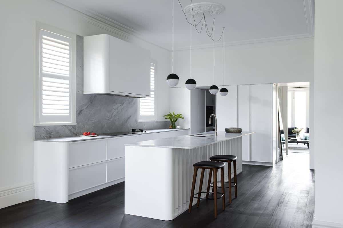
Whilst the client did not want a traditional kitchen, they did want the kitchen to look effortless in an impressive piece of Sydney’s heritage.
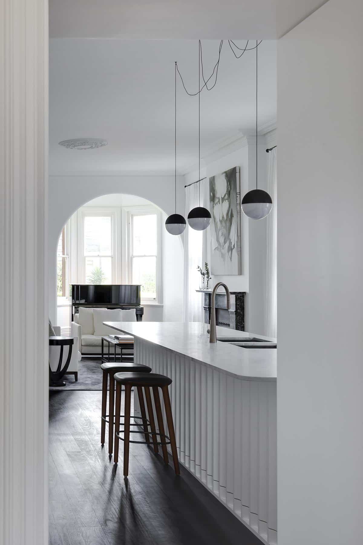
Inspiration can be born from the smallest details, searching for a unique quality, the stunning joinery of the island was drawn from a sewer-breathing stack dating back to the late 1800s. The vintage stack outside the home’s front door. The Stack has a fluted base and was made from solid copper, exquisite in detail, it was the perfect flash of ingenuity. Crafting the island unit base reflected a bygone era the client was in search of.
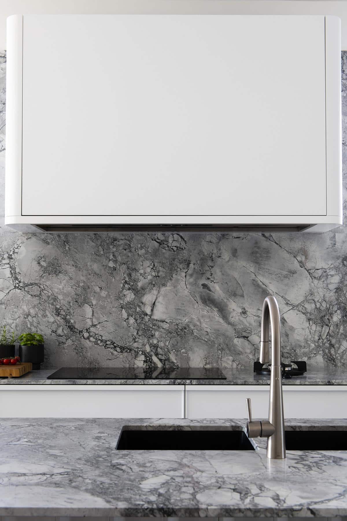
The designer generated a modern take on the old-world shaker door by designing a door profile with a 10mm by 10mm shaker. A custom-made timber handle sits seamlessly with the joinery detail.
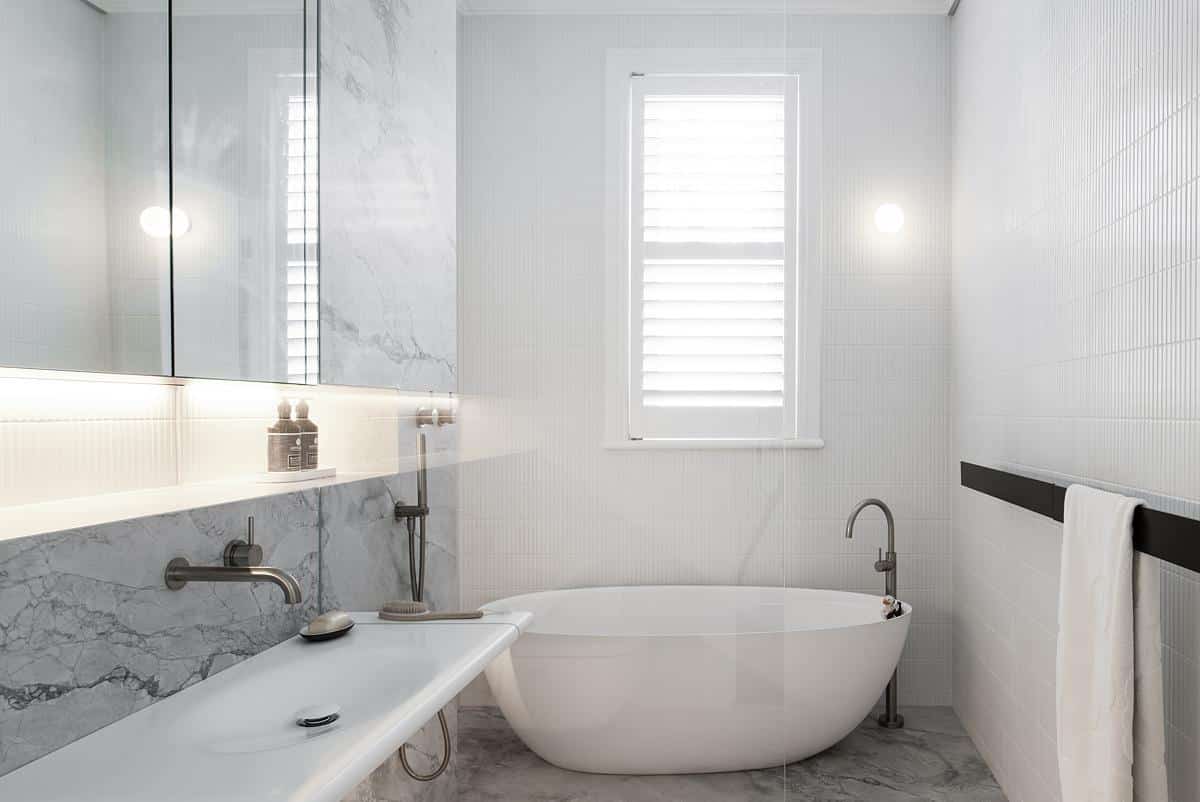
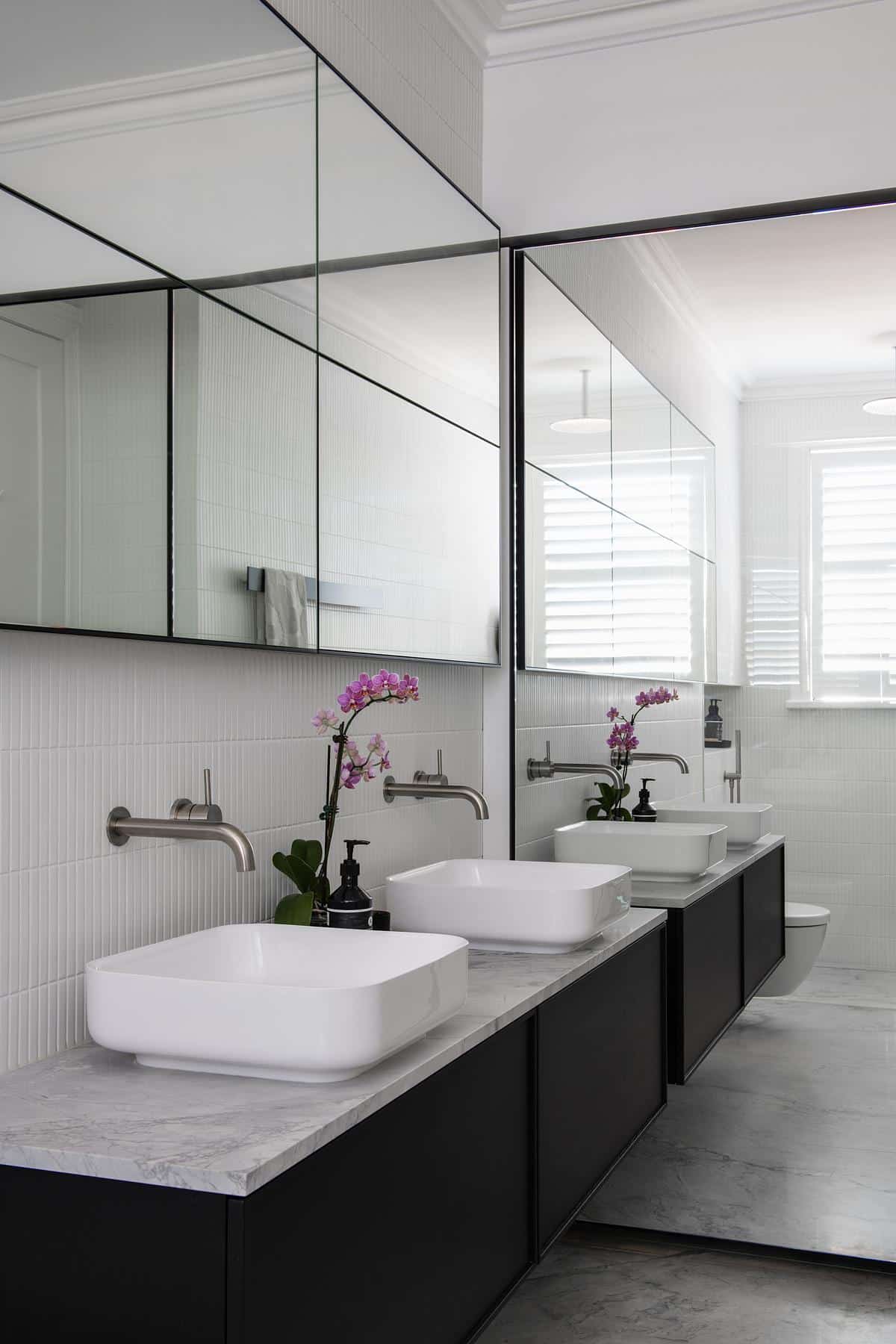
Marble was introduced to the benchtops and splashbacks to add a natural element and an elegant design focal point.
The incredible architectural details of the home were repeated in the design. Soft edges of the joinery reflected the arches, and the radius matched that of the flutes, as do the selected modern pendant lights. The original ceiling rose could not be relocated. Instead, the designer worked off the ceiling rose centre by introducing a contemporary light fitting and looping the cord. In time the cord will smooth to continue the repetition of arches.
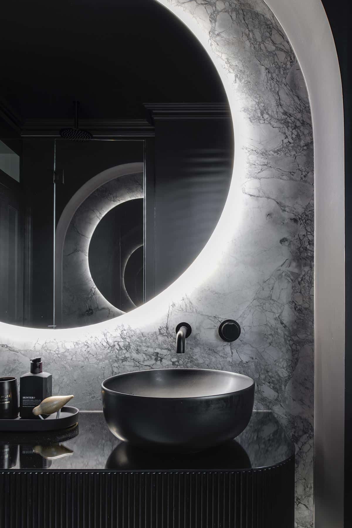
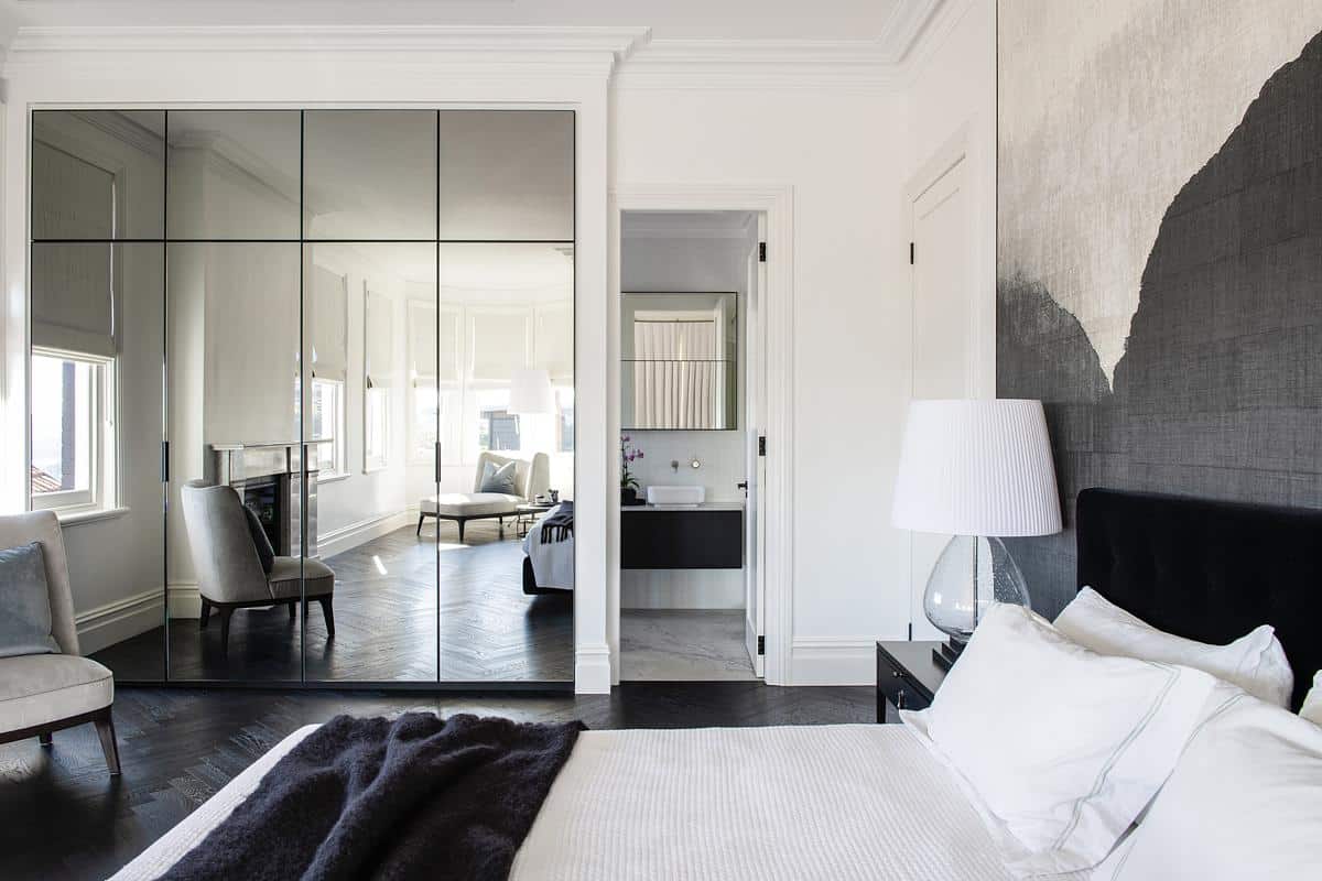
With the bathroom clients requested a bold statement; therefore the room was completely painted black. It is the Yin to the house Yang!
Architectural features added to the room, a plasterboard arch encasing the vanity. This created a focal point when entering. Complimented with traditional woodwork detailing & cornicing all matching the original details of the home.
Emphasis is placed on the height of the room to create the illusion of spaciousness. A large oversized backlit mirror holds pride of place. LED lighting under the vanity and concealed behind the cornice assist in illuminating the darkest points of the room and create visual depth.
With craftsmanship being a big part of 1900s architecture, a bespoke, curved vanity comprising timber dowels and finished with a black glass top was created. This design, although modern, complimented the existing curved detailing throughout the home. In keeping with the black theme, a black toilet and quality fittings were chosen to match the dark scheme.
The use of grey marble slabs as flooring and wall panelling makes a breathtaking statement. The minimal grout lines assist in scaling up the volume of the room, making the room feel more spacious and grander.
The result is shockingly amazing, the room is incredibly functional and unique and the attention to detail and finishing is second to none!
The devil is in the detail.
