Project: The public spaces in the renovated Museum Arnhem
Design: Studio Modijefsky – Esther Stam, Natalia Nikolopoulou, Ivana Stella, Agnese Pellino, Aurelia de Chevigny
Design project team: architect: Benthem Crouwel Architects / graphic identity: Thonik / landscape design: Karres & Brands
Program: General entrance, café, museum shop, activity room
Assignment: Interior design
Status: Realised May 2022
Size: 466m2
Client: Museum Arnhem
Location: Arnhem, The Netherlands
Photography: Maarten Willemstein
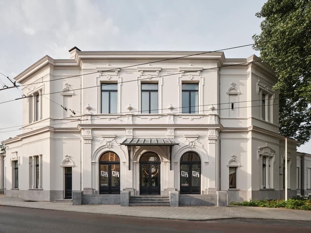
As a museum for modern, contemporary, and applied art and design with a specific focus on female artists, Museum Arnhem has one of the most important cultural collections in The Netherlands. Studio Modijefsky was commissioned to design the new public spaces in the renovated museum: the general entrance, café, and shop on the ground floor; and an activity room plus event space on the first floor.
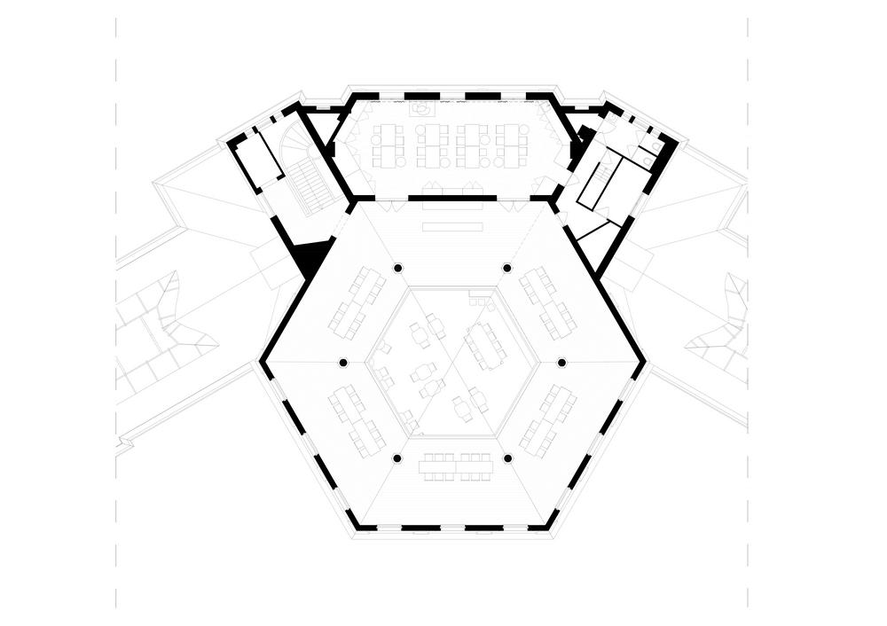
All these spaces rotate around the museum’s iconic dome. To unite the areas spread across this cavernous expanse, Studio Modijefsky created a new design language inspired by aspects of the building’s past and present: its origins as a gentleman’s club; and the Magic Realism that is part of the museum’s current collection. While seemingly worlds apart, both these guises have escapism at their heart, from the men who used to evade everyday life to the artists creating fantastical takes on reality. The new spaces designed by Studio Modijefsky take visitors on the same journey by playing with perspective and offering pathways into other dimensions.
With the collection moving into the new wings of the museum, the interior of this monumental building has become a work of art itself, expressing Museum Arnhem’s core value: ‘from the heart, looking further, from now on and with quality’.
General entrance
An atmosphere of magic realism is established as soon as you step through the museum’s entrance. A lightbox hangs above the entrance desk, mirroring the desk’s shape, while floating bewitchingly above it. A further twist is added by a large mirror. It follows the outlines of the entrance door, but flipped upside down and tilted, inviting the visitors to look at themselves in their new surroundings in a different way, reflected in a new reality. Finally, a small chandelier offers a hint of the larger version that awaits on the other side of the entrance.
Ground Floor
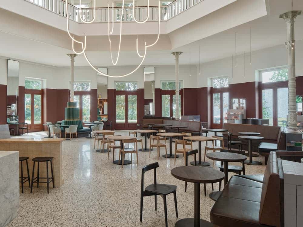
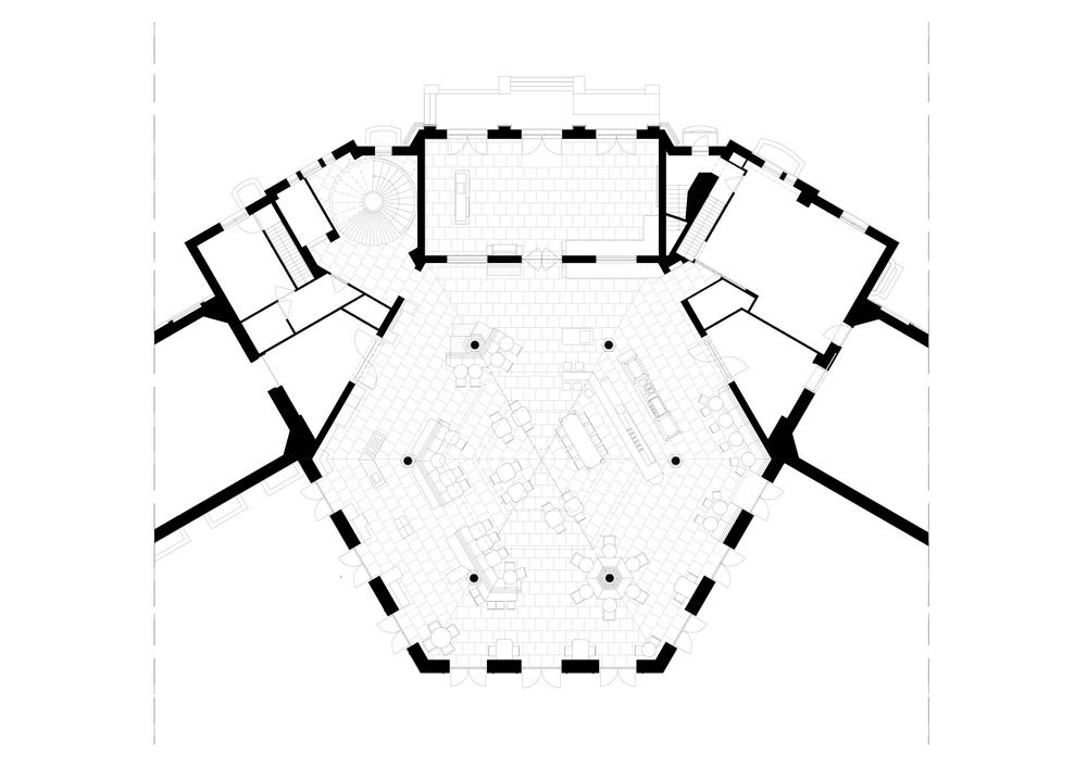
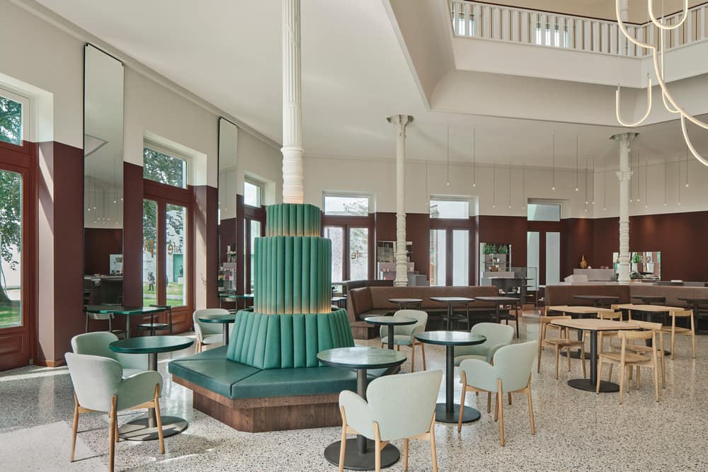
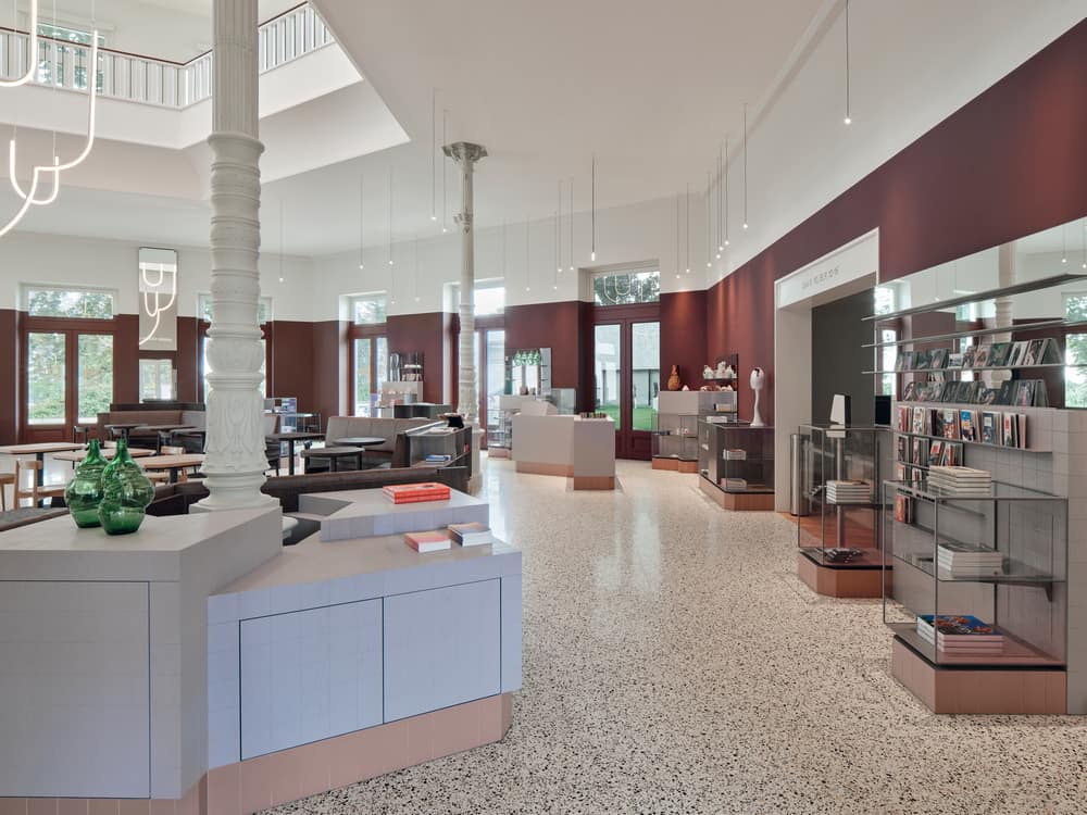
The café and museum shop are located within the enormous space underneath the museum’s dome. Studio Modijefsky embraced its sheer size by creating zones for the café and shop that give direction while retaining the dome’s original character. There are no boundaries – each area is distinguished by a unique identity and set of materials linked to a different theme of the museum’s collection. The entire floor becomes a space to hang out and be inspired, with visitors flowing naturally between each area to enjoy a drink or browse in the shop.
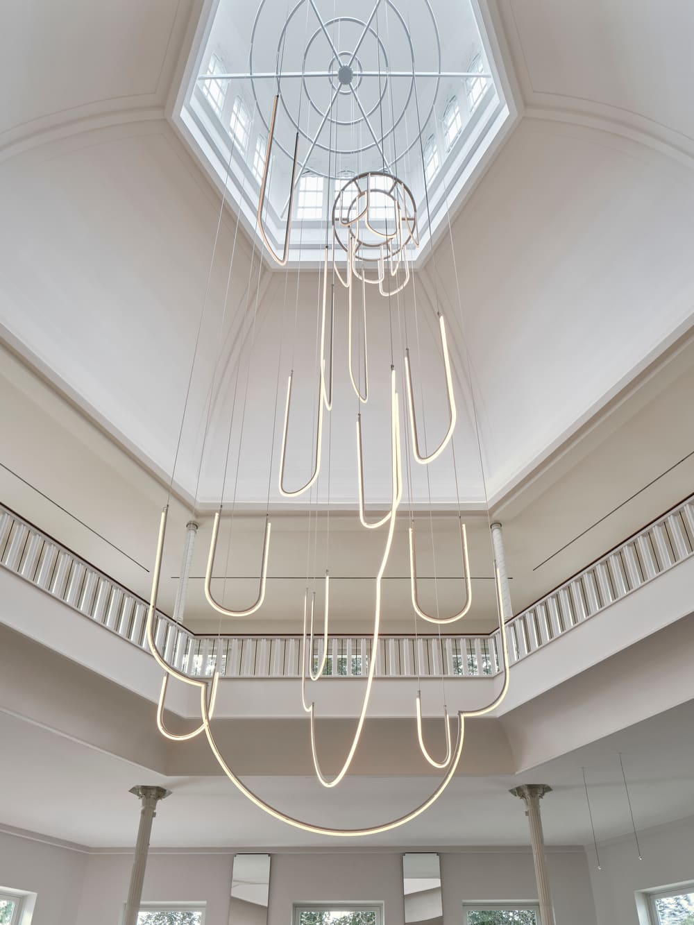
All eyes will be drawn to the custom-made chandelier that makes full use of the dome’s glorious height. As it falls from the top of the dome to the ground floor, the chandelier unites the entire space.
It is formed of illuminating curved shapes that hang together in a composition of different heights and clusters. Presented in different shades of white, the shapes mirror the outline of the cupola above it, and the windows in the top of the cupola. They intertwine to create a constantly shifting path of lines and light.
To bring the monumental space’s height down to a more human scale, Studio Modijefsky added a low coloured plinth. Painted umber brown, it encircles the walls around the café and shop to subtly unite the two zones.
Honed terrazzo tiles create a distinctive yet subtle pattern on which every component stands out. The tiles are laid starting from the centre of the dome, following the facade walls to form a hexagon.
Café Pierre
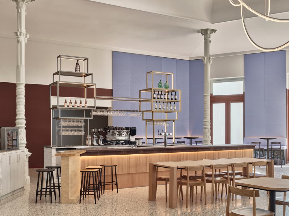
The bar is the first thing you see upon entering the space, whether it’s from the entrance or returning from the exhibition wing. In typical Modijefsky style it’s a mix of different materials and sculptural elements: a marble block that faces the entrance; two towers of aged brass and bronze that stand as beacons calling visitors to quench their thirst or sate their hunger; a marble ornament on the right side of the bar top that adds a playful touch. Further materials include dark and light oiled oak, linoleum, and white crackle tiles. Café Pierre, named after the former museum director Pierre Janssen (1926-2007), encompasses a broad palette of surfaces and patterns. Inspired by Magical Realism, it’s an intriguing juxtaposition of elements, materials and shapes placed side by side.
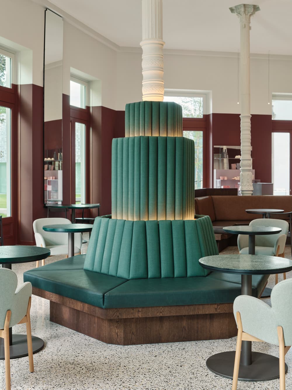
All the spatial elements relate to the space’s monumental columns in the space. These were the only part of the existing structure that had to be retained, therefore all the benches, shop displays and bar are positioned around them. To counter balance the height and light of the dome, all the elements have been designed to be dark and ‘heavy’. Low and high custom-made wooden tables are paired with bespoke benches that back onto four of the columns. The benches are upholstered with two types of eco-leather that contrast with the roughness of the wood.
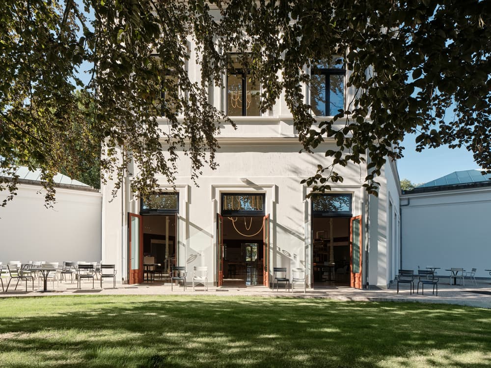
Nature is brought into the building, not only via views of the spectacular landscape outside but with evocative colours and materials. To reflect the colours of the beautiful sculptural garden opposite the entrance, materials used for furniture become greener as they get closer to the garden outside.
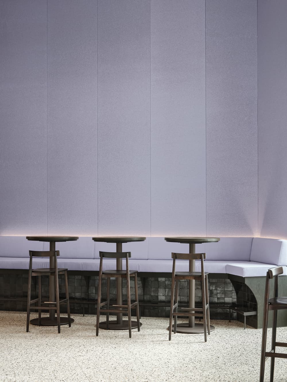
The high seating area is characterized by a lilac backdrop behind the bar. Mirrors reflect all the colours and structures used in the seating area. As they are positioned higher than the dark wooden plinth, they invite the visitors to look up at the reflection of the chandelier.
Shop
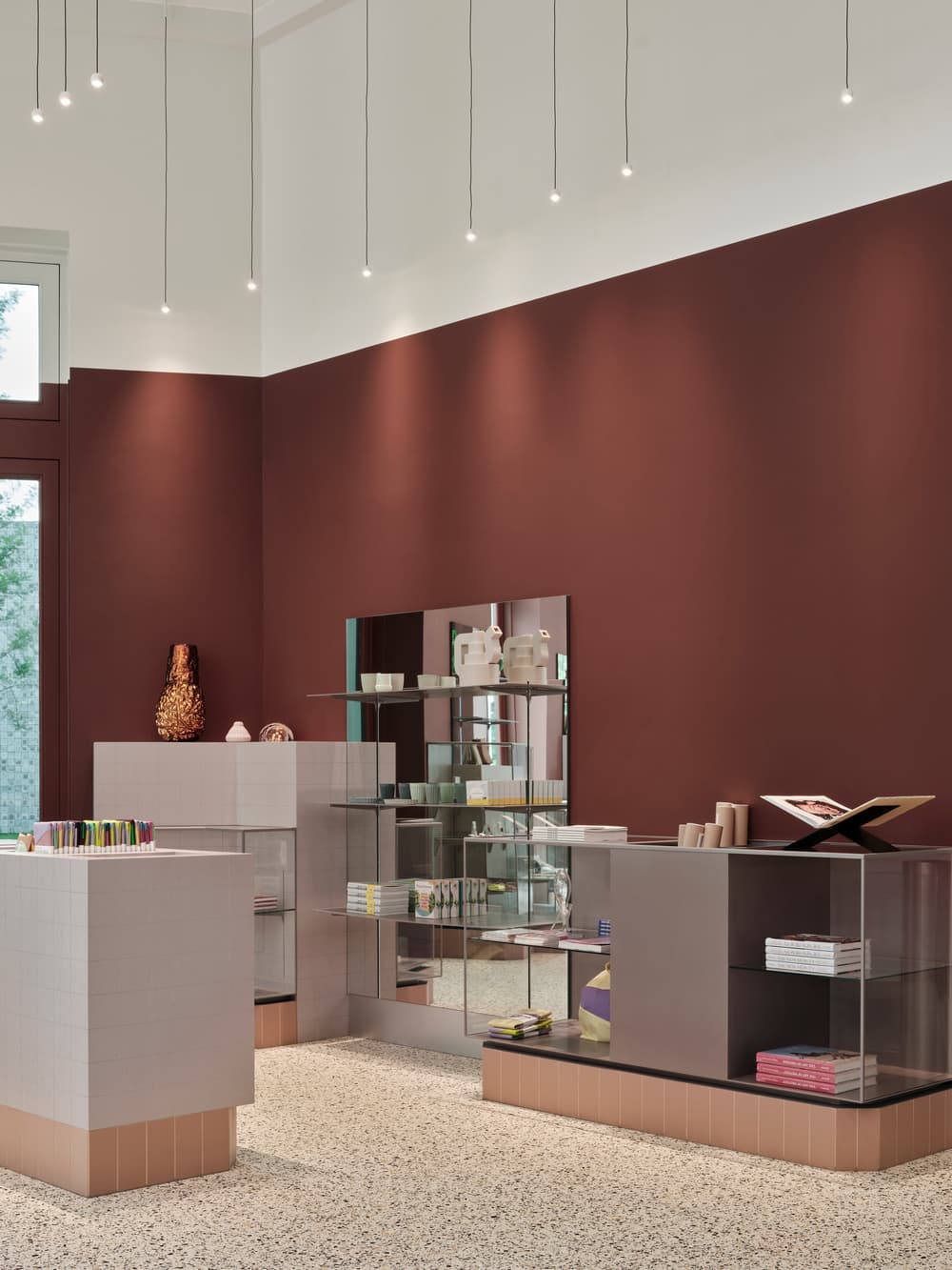
The shop is located on the right side of the dome. Display volumes pop out of the floor as you approach it, generating a dynamic, welcoming atmosphere. All the materials here have a lighter, more refined feel. Glass and steel are used for the different display elements, with pastel pink tones offering a subtle background for the objects on display. On some sides of the vitrines, the colours travel in a gradient from transparent to pink. The whole structure is detailed with metal profiles and mirror backgrounds that play with reflections. Geometric block patterns on the variety of display blocks give this area a distinctive visual character all of its own.
Activity Room & Event Space
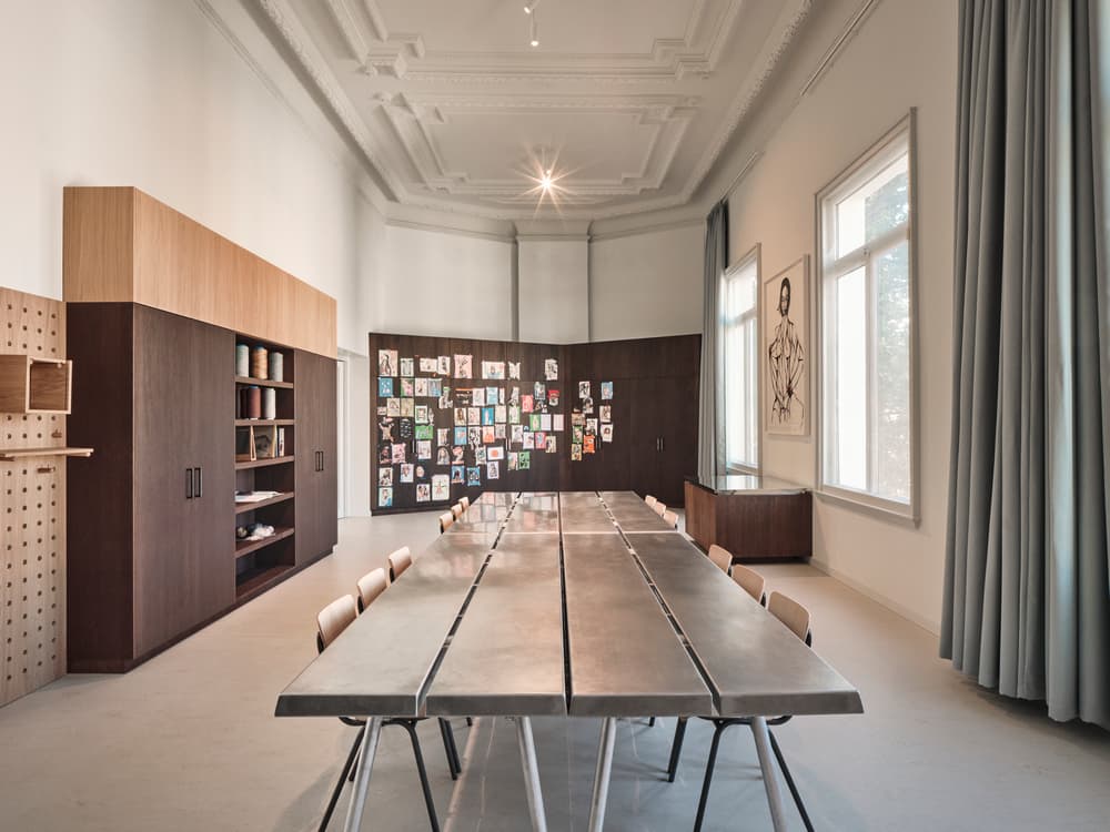
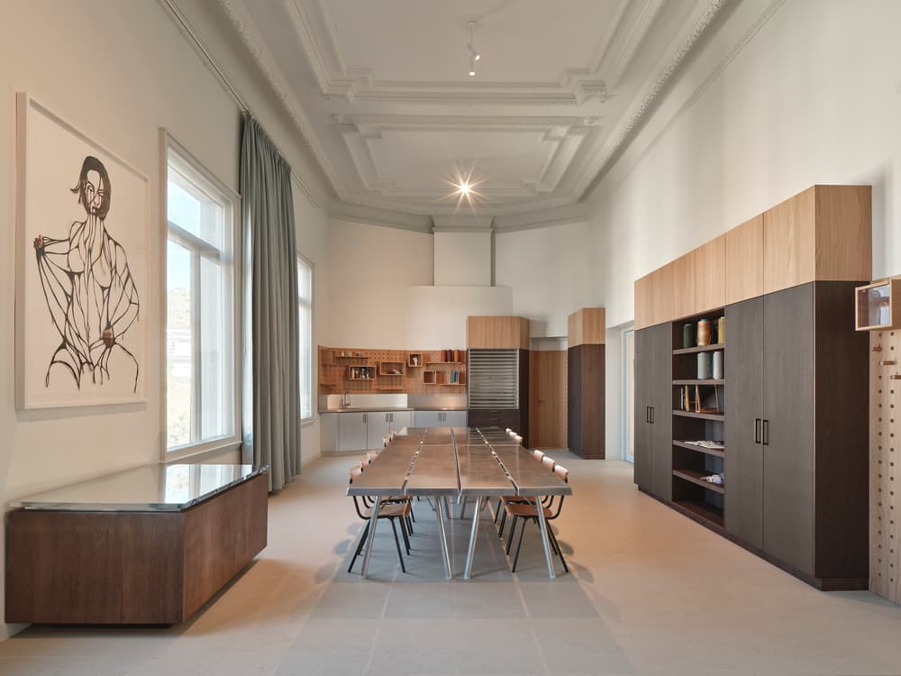
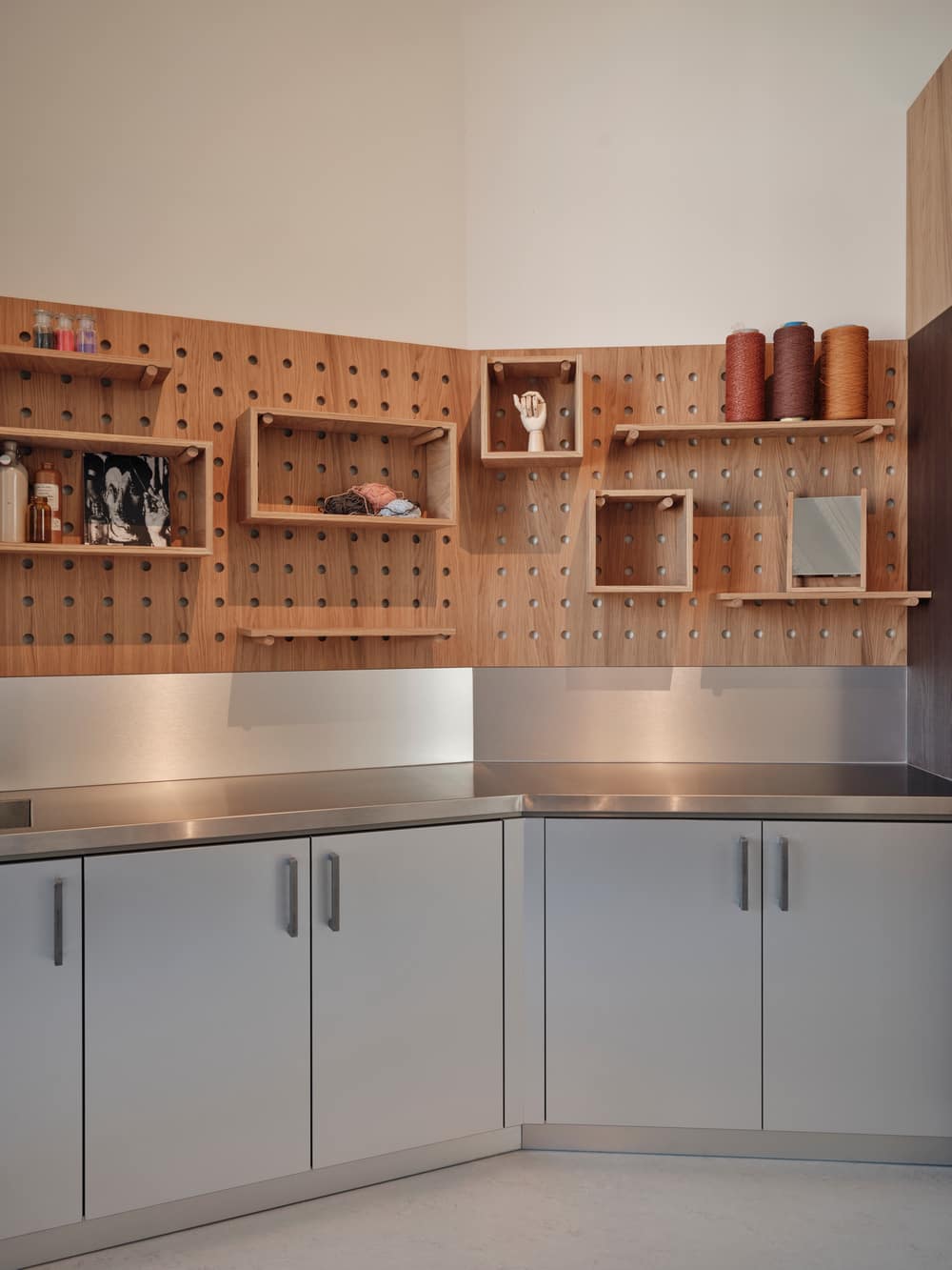
This is where visitors can let their creativity loose – everything here inspires visitors to grab a marker, paintbrush or pen and start drawing. As a wide range of activities will take place here, it was important that every piece of furniture could be quickly moved and adapted. Big metallic folding tables form the core of the activity space, with wooden pegboards covering the walls for visitors to pin their artworks or hang, place and organize materials and tools.
The open space on the first floor, overlooking the café, is a wide area with a natural oak floor that follows the hexagonal shape of the dome above. This is where events take place: from group events to openings & exhibitions, from catwalks to temporary shows. The chandelier transcends this floor, enlightening the entire level at different heights and points.

