Project: Isabel Cadroy, Pediatric Dentistry Clinic
Year: 2021
Location: Castellon, Spain
Surface: 350 m2
Interior Design and Branding: Vitale
Architecture Project: Font Arquitectura
Builder: AT4
Flooring and Cladding: Tarkett
Suspensions lamps: design by Vitale
Furniture: Sancal
Planters: Vondom
Photography: Santiago Martín, Hilke Sievers
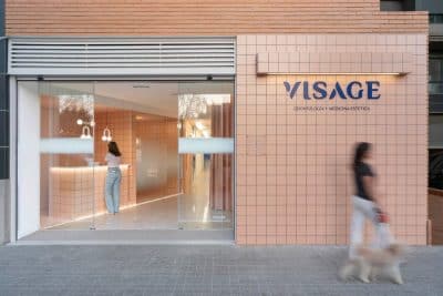
The interior design project for the pediatric dentistry clinic of Dr. Isabel Cadroy begins with the definition of a new communication strategy to strengthen the positioning of the business. The new premises and the renewal of the brand represent the beginning of a new stage that consolidates its competitive advantage as a clinic dedicated exclusively to pediatric dentistry and orthodontics for children and adolescents.
The clinic should be friendly and welcoming, but without falling into a childish aesthetic, and turn stress and fear (common in dental visits) into confidence and tranquility. Vitale designs a corporate space that connects with the entire public of the clinic and recreates a positive, familiar, comfortable and quiet environment.
The project highlights the corporate philosophy of the clinic: the importance of educating families to achieve good oral health and improve the quality of life of their patients. From this perspective, Vitale generates a common thread that highlights the idea of “learning at the dentist” conceptualizing the communication work required by the clinic to make dental processes and treatments understandable.
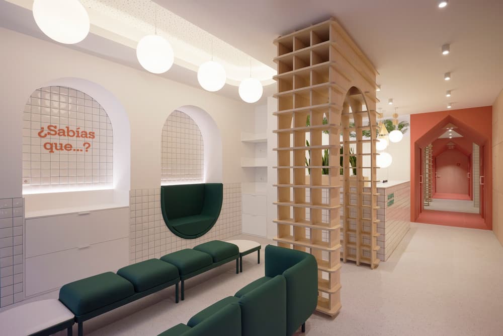
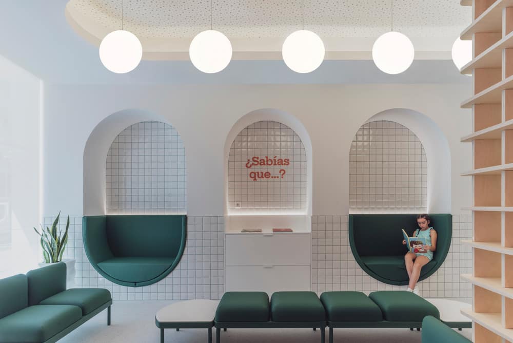
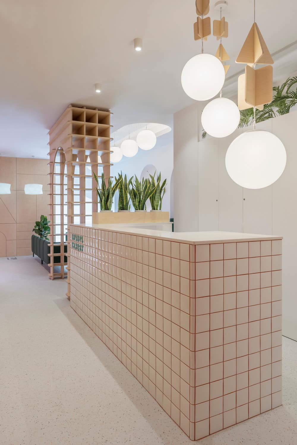
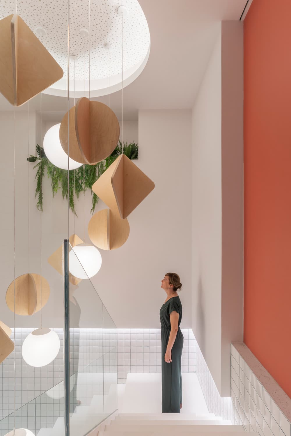
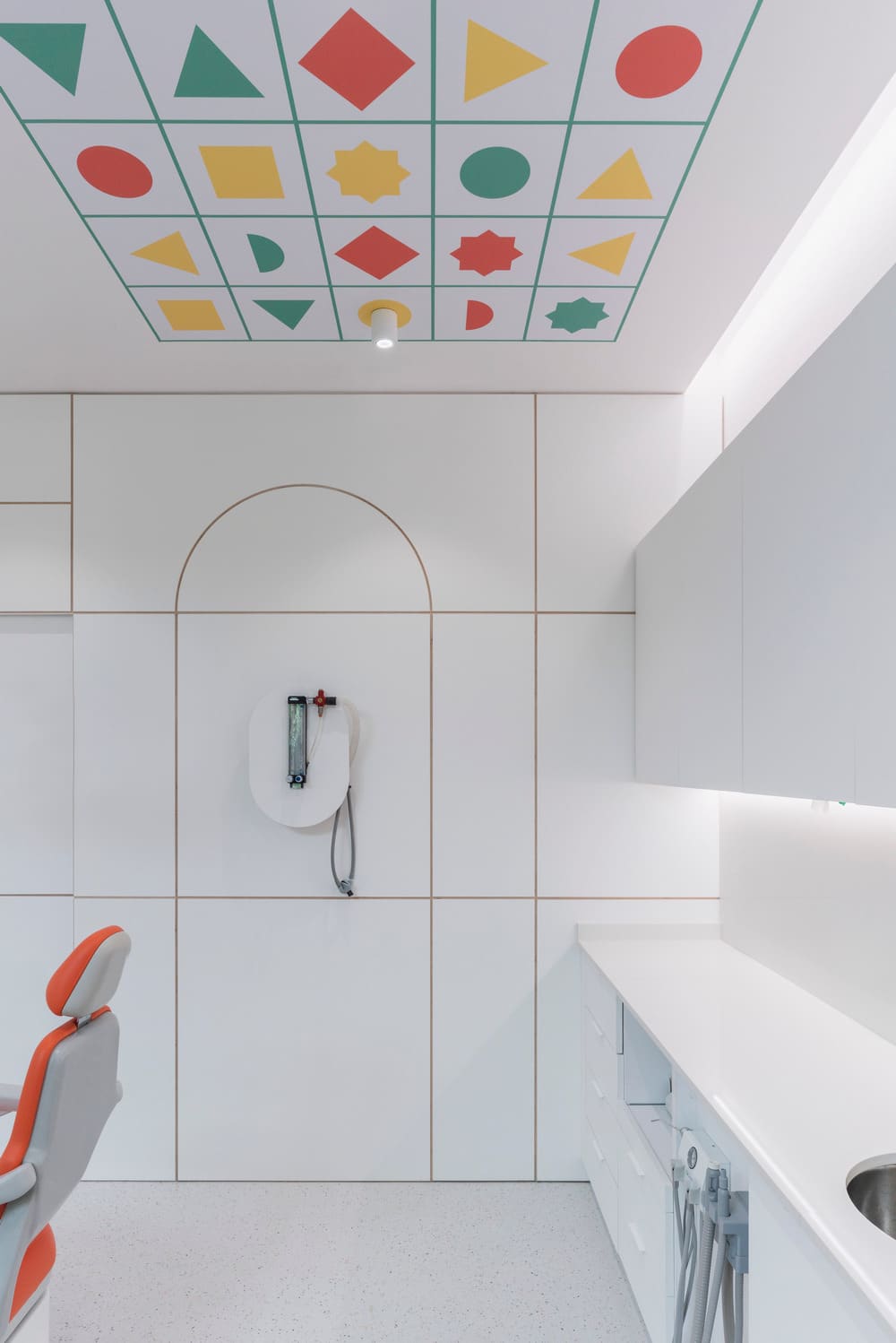
The creative axis is inspired by some of the learning forms of children’s cognitive development. The brand and the corporate interior design project are generated taking as a starting point the construction games of wooden pieces and the puzzles of elementary geometries. The clinic surprises both children and adults with recognizable out-of-scale elements that refer to children’s learning such as huge porticoes, lamps in the form of wooden mobiles or paneling like jigsaw puzzles. The result is an evocative space that connects with the child in us and takes you to childhood.
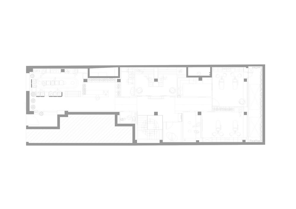
The clinic consists of 2 floors (with a total of 350m2) that are distributed fulfilling a complete program of needs. All patient care areas are located at street level and the basement is used for personnel and operational uses.
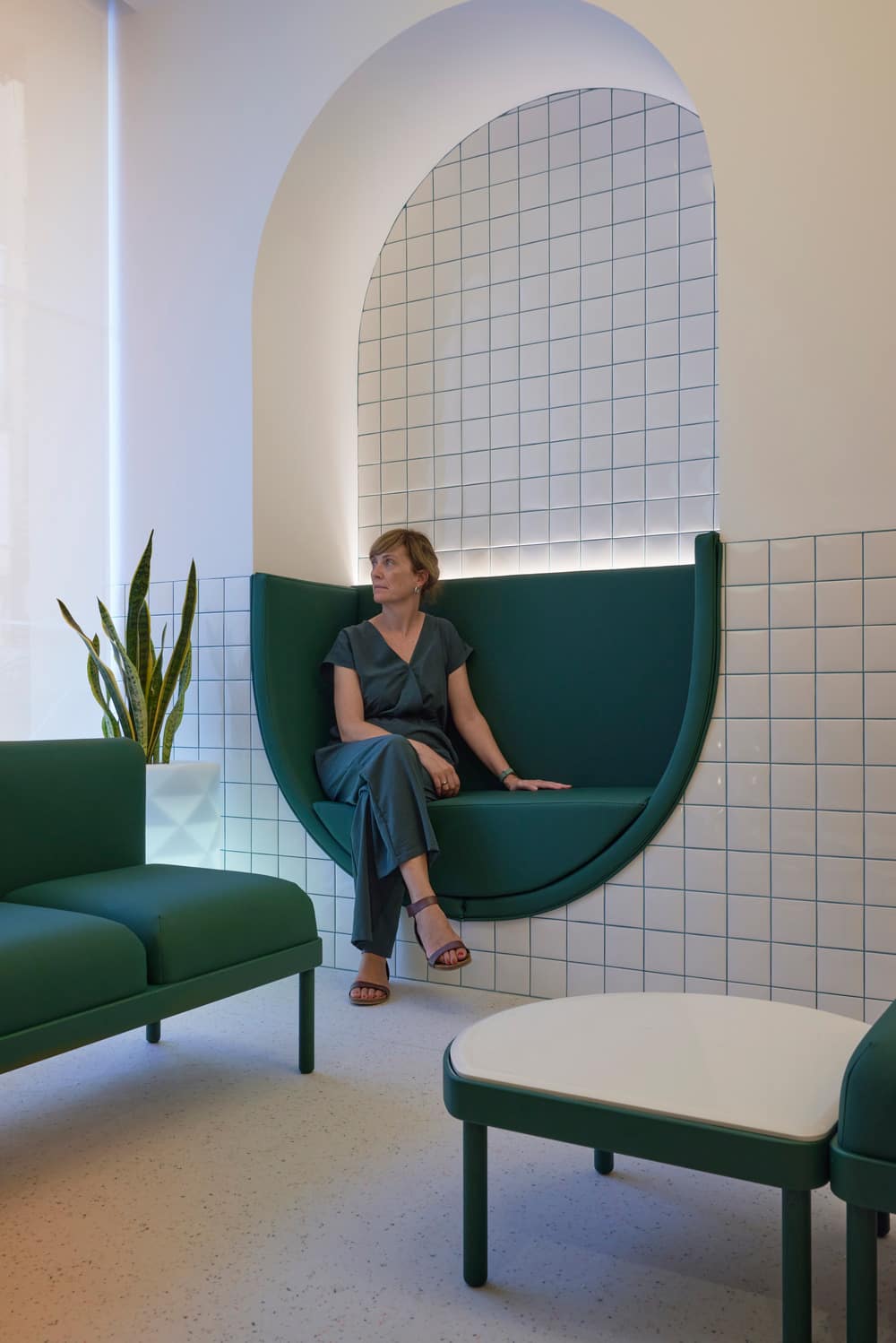
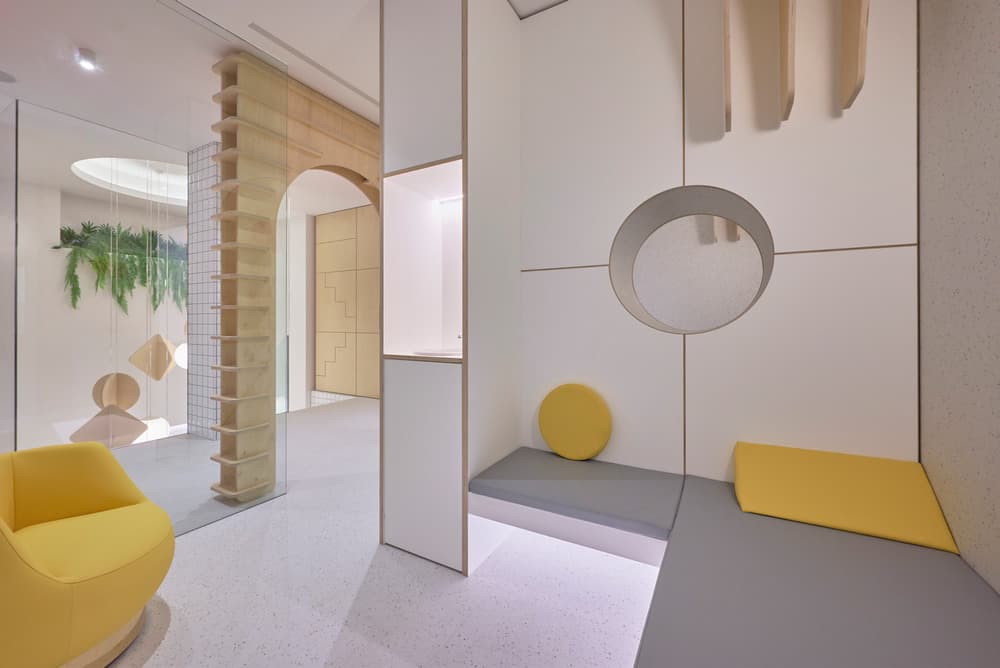
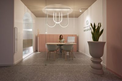
The waiting area is an open and bright space that is delimited and articulated with versatile and modular furniture. After entering through a 3-meter-high arch made of wooden pieces, the capsule-shaped seats take center stage and invite relaxation and a feeling of protection. The aim is to bring tranquility and well-being to patients with soft shapes and warm indirect lighting.
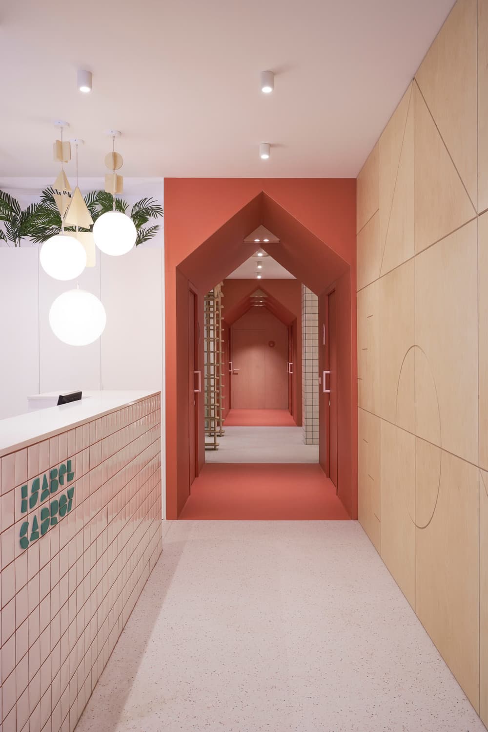
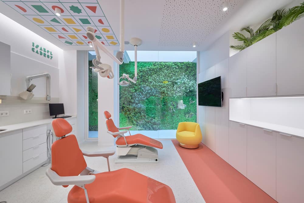
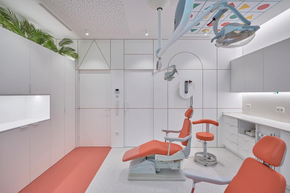
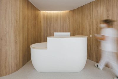
The reception of the clinic is covered with 10×10 ceramic tiles with the corporate color grouting, reminiscent of the typical grid of notebooks. The walls are protected with pantographed birch plywood panels that help convey warmth and tranquility. Plants are important in the clinic’s main points of contact with patients (such as treatment boxes) due to their positive effect on mood.
The corporate colors and the brand are part of the design of the clinic and subtly accompany the visitor. The new brand is built with a typeface based on elementary geometries (circle, triangle, rectangle, etc.). The result is a robust and forceful identity based on the children’s language of the building blocks.
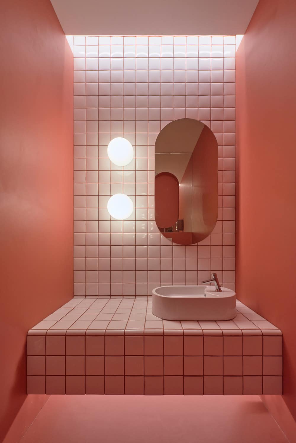
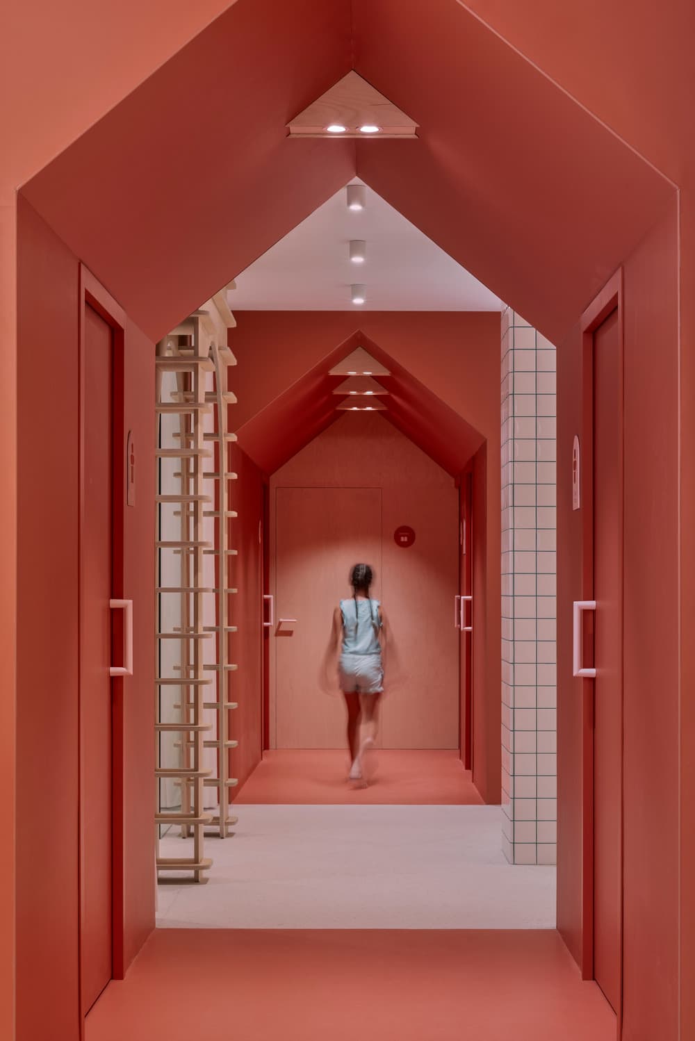
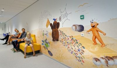
In the circulation areas, the tunnels that give rhythm to the space and provide a cozy and homely feeling stand out. A first tunnel houses leads to the bathrooms and serves as a transition between the entrance area and the rest of the clinic. It opens to a distributor that gives access to radiology, to the post-treatment room through another wooden portico and to the area that goes down to the basement. A spectacular 5 meter high mobile lights up the staircase.
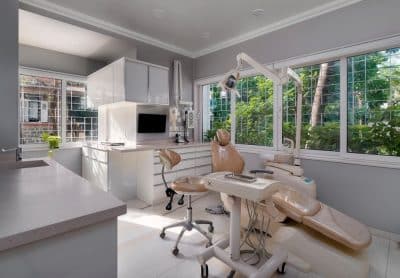
A second tunnel houses gives access to the sedation room and the treatment boxes that are located at the rear of the clinic. An atypical medical area, in tune with the rest of the clinic, which receives natural light from a skylight with a formidable vertical garden. It was important that the design of the clinic took into account maintenance and cleanliness. Continuous vinyl flooring is chosen for being especially suitable for a medical clinic, providing excellent performance, durability, and mechanical and stain resistance. The walls are also covered with the same continuous vinyl to protect them. In the same line, ceramic cladding and decorative plywood panels are used.
The result is a space of well-being, safety and knowledge that, by combining traditional educational elements with the image of the clinic, achieves a very direct perception of the personality of the doctor and her vision of pediatric dentistry. For adults it is an environment full of nods to their childhood and for children a comfortable and familiar space. A medical center that communicates the corporate strategy of the business inviting patients and their families to an active attitude of learning about oral health.

