Project: Greenberg Traurig Office
Architecture: BIT CREATIVE
Team: arch. Barnaba Grzelecki, arch. Jakub Bubel, arch. Agata Krykwińska, arch. Katarzyna Biedrzycka-Macioch, arch. Anna Margoła, arch. Zuzanna Wojda, arch. Joanna Zaorska, arch. Malwina Klimowicz
Location: Varso Tower, Warszawa, ul. Chmielna 69, Poland
Photo Credits: Fotomohito
This is what a law firm’s office in the tallest building in the European Union looks like, designed by BIT CREATIVE
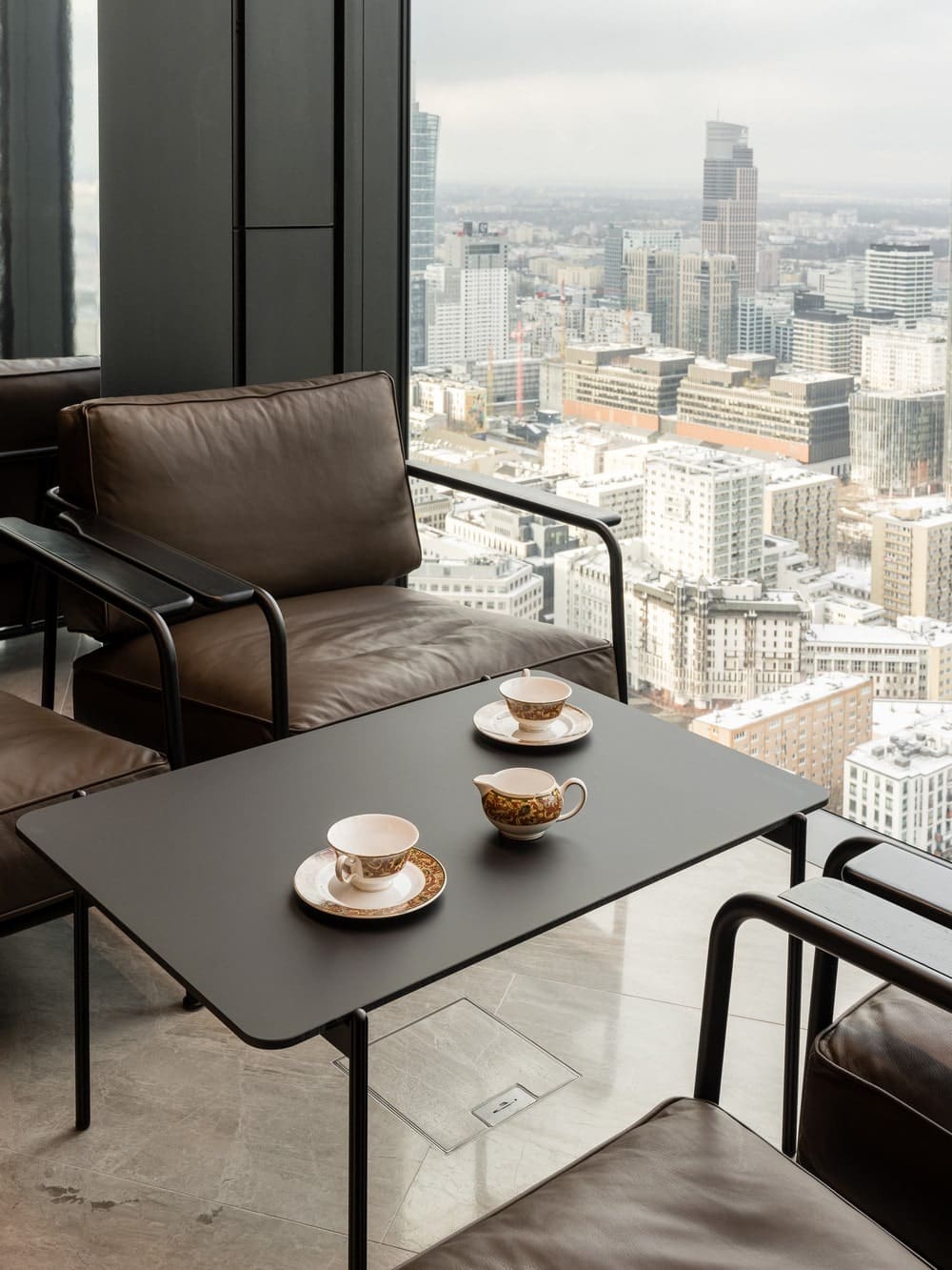
Greenberg Traurig law firm is located on three floors of Varso Tower, the tallest building in both Poland and the European Union. However, what determines its uniqueness is not only the location. It is, above all, a unique office space, created with respect for tradition, and yet very modern, original and functional. For its design is the responsibility of BIT CREATIVE architects, who specialize in creating aesthetic and functional public interiors. It is they who, using natural and noble materials – stone and wood, created prestigious interiors of the office, where art plays the leading role.
Modern office interiors with their aesthetics, functionality and ergonomics are supposed to provide flexibility, enabling both individual and team work. Being multifunctional spaces, build a friendly atmosphere and foster integration, encouraging employees to return to the office after pandemonium. This also applies to the design of law firms, the specifics of which impose certain solutions, and the nature of the business affects the layout of the space and its aesthetic qualities.
„Looking at current implementations of law offices, we can distinguish two major trends. Law offices that want their interior to look traditional and finished with natural materials, and those that want their interior to look nothing like a typical law office. In the latter case, the aesthetics are more free-form. These arrangements resemble projects from the IT or media industries, rather than typical law firms or financial funds” – says architect Barnaba Grzelecki from BIT CREATIVE studio.
The second trend was chosen by the owners of the law firm Greenberg Traurig, who invited architects from the BIT CREATIVE studio, known for their unconventional projects, to collaborate on the design of their new headquarters.
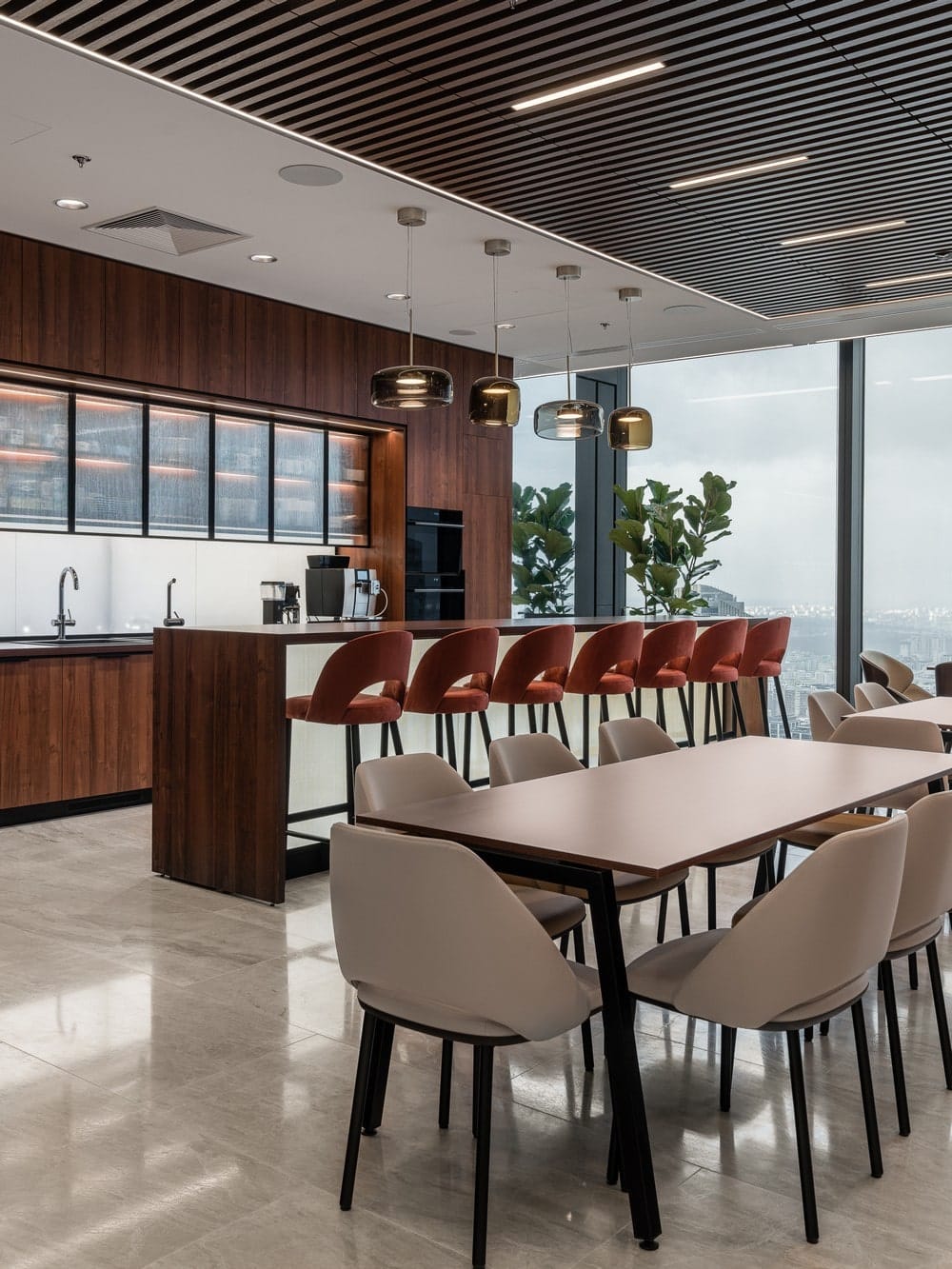
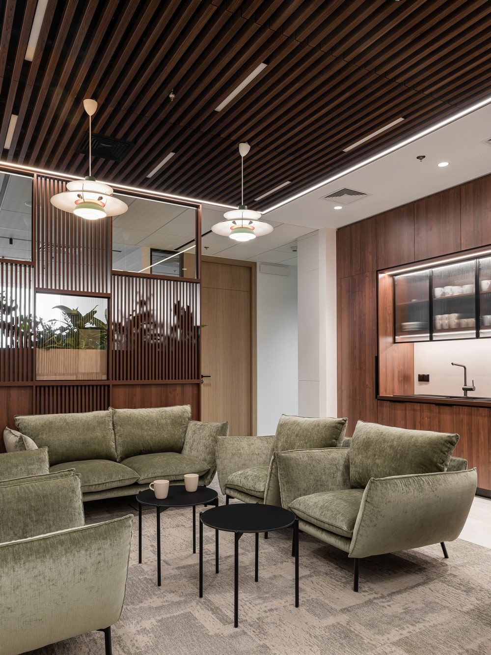
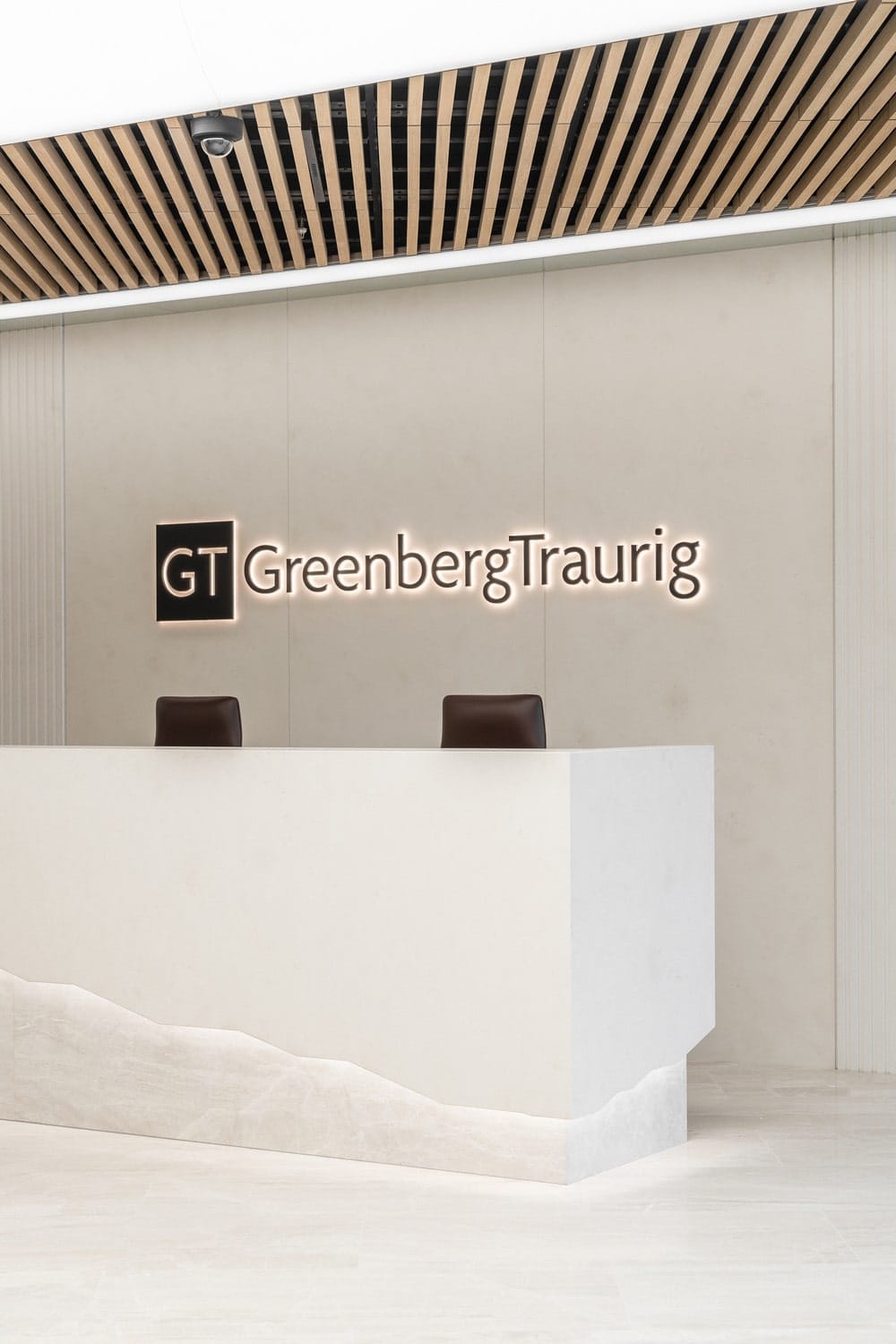
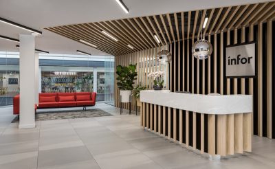
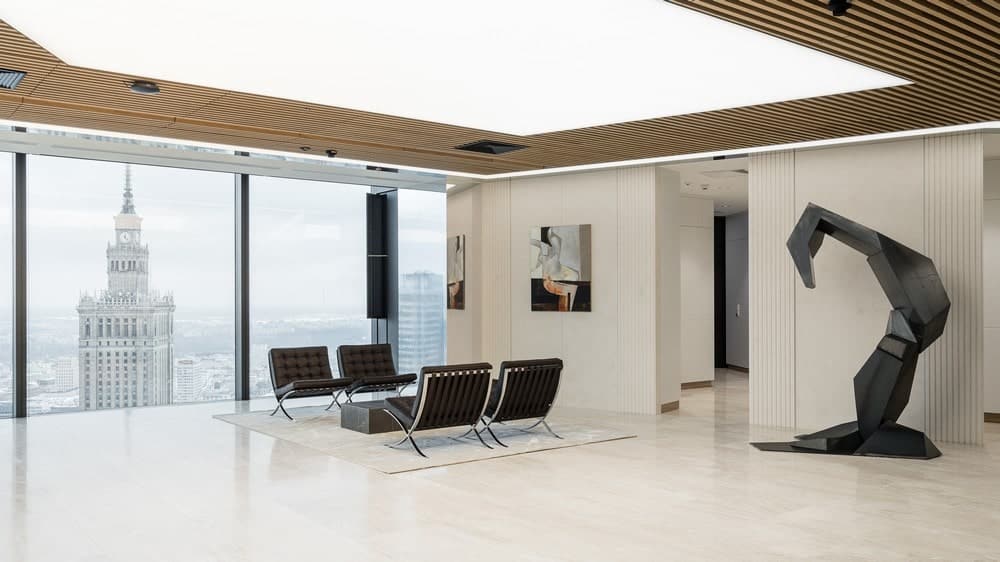
A key element, as with most legal offices, has become the representative entrance area. The reception area, conference rooms and coffee point located here form an open space of the open type, combining backstage, conference and event functions. With the help of mobile and audiovisual solutions, employees are able to hold a meeting, presentation or townhall here in various formats for a large number of people. With sanitary facilities in the form of a social room and coffee point, the space is also used for various corporate events. In turn, its decor emphasizes the prestigious nature of the place.
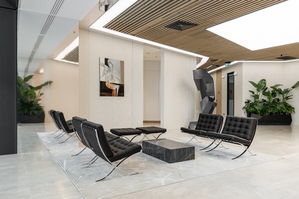
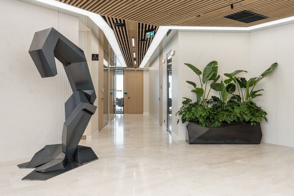
„We opted for an elegant space dominated by bright and warm colors. Minimalist in expression, the interior has been complemented by bold sculpture and artworks, which interact with each other to give the feeling of interacting with art known from the world’s best galleries. The whole is complemented by minimalist details, play of light and unobvious ceiling finishes.” – says architect Barnaba Grzelecki from BIT CREATIVE studio.
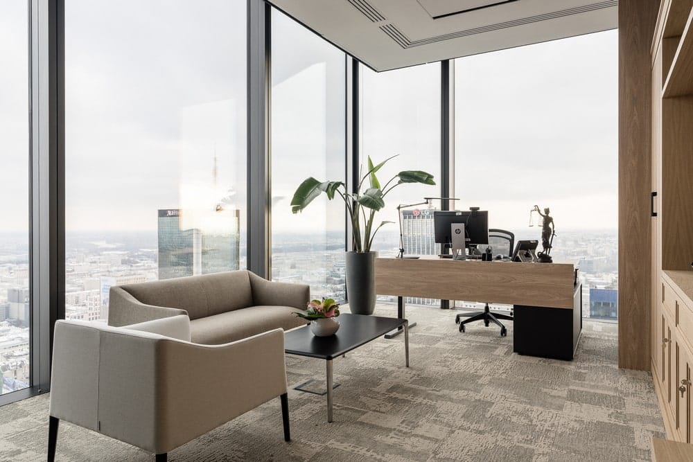
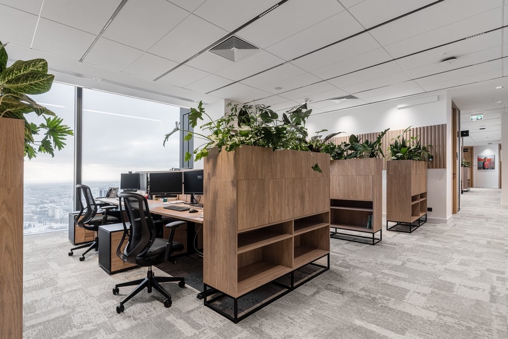
The main role is played by natural materials, the choice of which was not random. In terms of aesthetics, law firms usually rely on noble materials and timeless colors. Thanks to luxurious raw materials such as stone and wood, the architects of BIT CREATIVE created a minimalist, yet elegant and welcoming space with a timeless character. The aesthetics of the entrance area also set the design direction for the rest of the office, designed in light, warm colors, using classic materials such as copper, stone and wood precisely. The play with shades of beige here stands in opposition to the currently reigning gray in office designs. The functional layout itself is typical of law offices, where work is still done in enclosed single- or multiple-person rooms.
„In the law offices we have had the pleasure of designing, the vast majority are dominated by the office layout. Primarily due to the nature of the work, which requires quiet and concentration. These are mostly offices of 1-2 people, sometimes 3 people. We often design the infrastructure and size of the room so that in the future the number of people in the room can be freely reconfigured. The open space layout works great in spaces for assistants, collaborative work or support rooms like copy point or coffee point. Each employee has 1-2 person rooms for quiet and focused work anyway” – explains architect Barnaba Grzelecki from BIT CREATIVE studio.
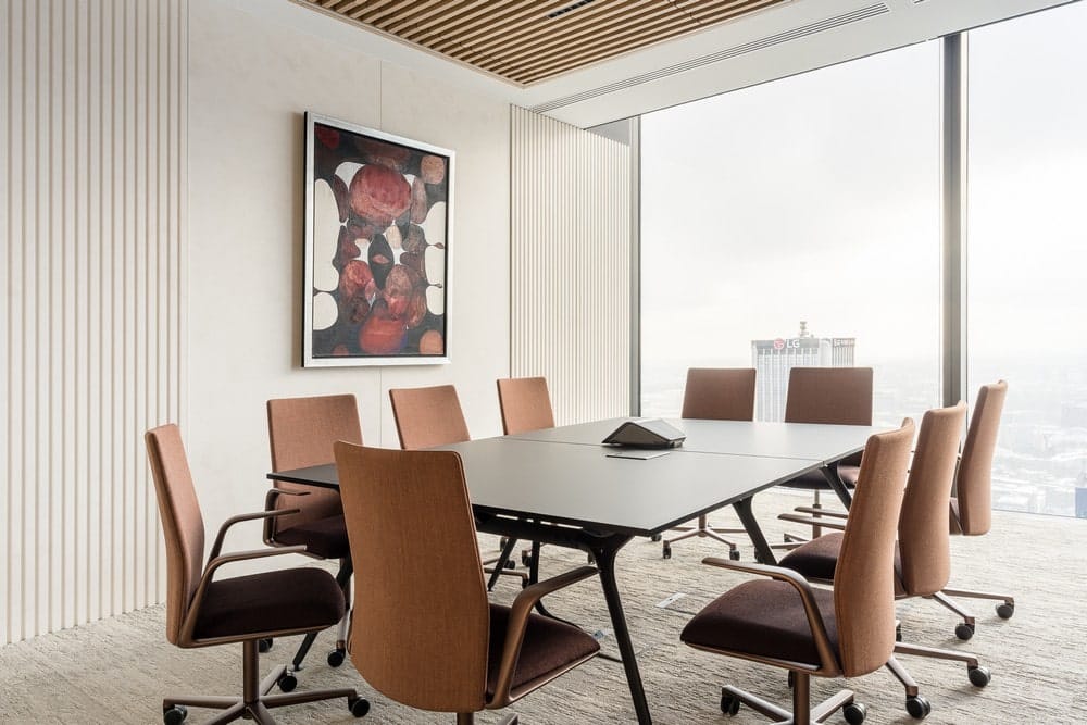
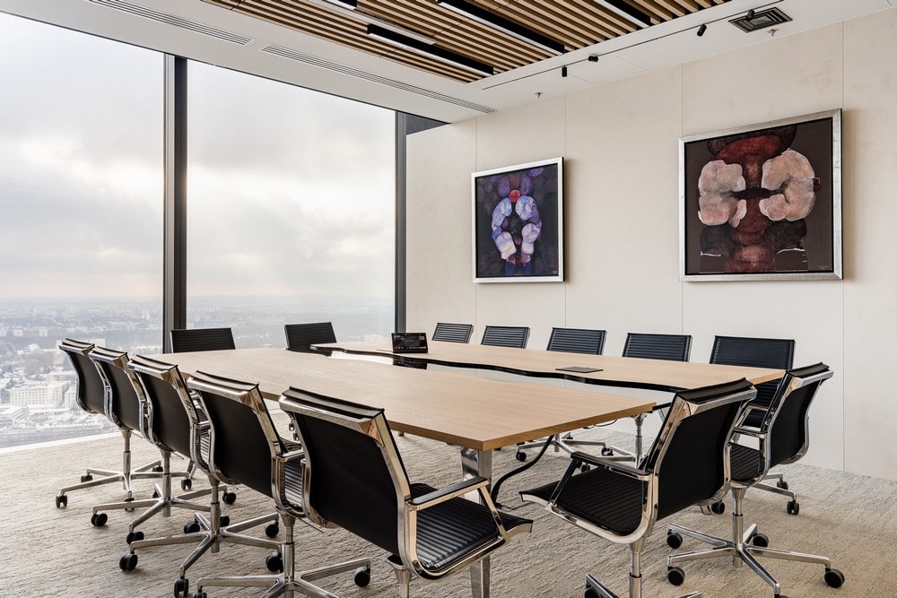
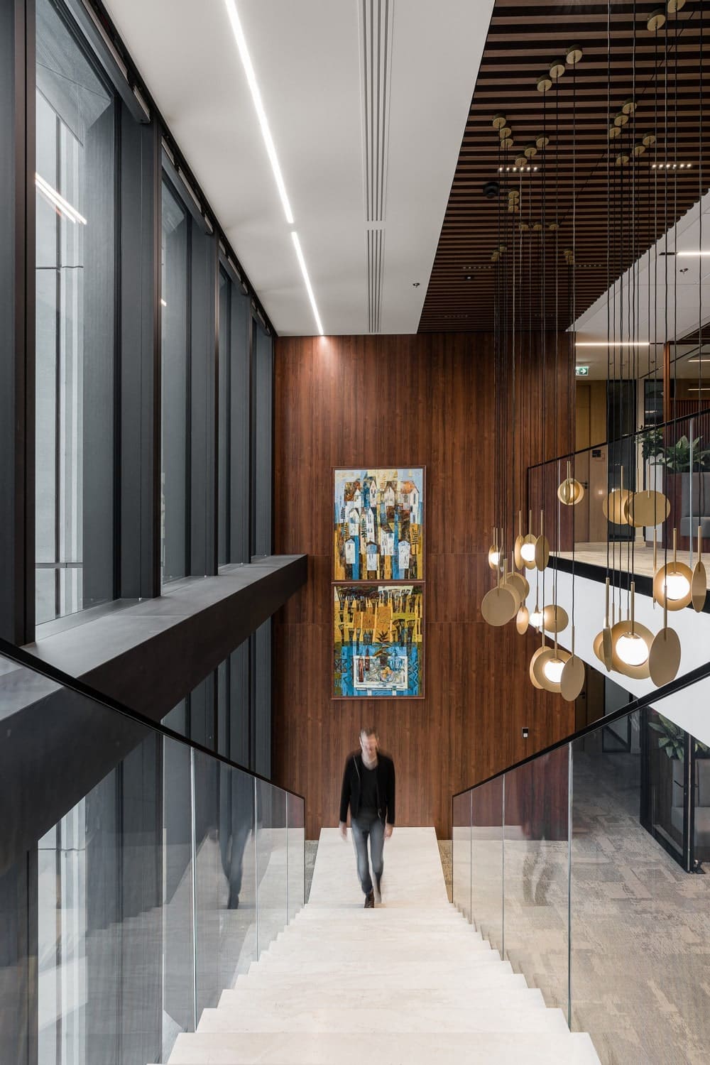
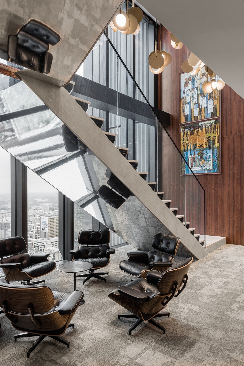
A very important role in the project is played by the aforementioned works of art, which raise the rank and prestige of spaces beyond the office. Carefully selected, they ennoble the space, while allowing one to interact with art on a daily basis.
„The spatial sculpture in the entrance area has become a kind of dominant feature of the interior. It complemented the composition of the space in a subtle way. In the rest of the common or conference rooms, the paintings on the walls blend in well with the space, giving them character. With natural colors and materials, such as stone or wood, paintings depicting linear, abstract compositions in warm but intense colors perfectly complement the aesthetics of the space” – tells architect Jakub Bubel from BIT CREATIVE studio.
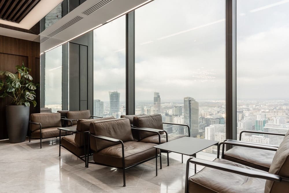
„We tried to develop a neutral, timeless interior where everyone would feel comfortable and at ease. An interior that will take advantage of the panoramic view of the capital, geometric and linear. Simple in its form, but with details that give character to the” – He sums up.
