Project: Lama House
Architects: LAMA Arhitectura
Location: Bucharest, Romania
Architects in Charge: Dan Enache, Calin Radu
Engineers: CONSPRO Developement
Interactive Design : Andrei Tudor
Area: 225.0 sqm
Project Year: 2015
Photographs: Radu Malașincu
Lama Arhitectura have recently completed Lama House in Bucharest, Romania.
Context: The project could be considered as daring because of its site proportions, a long but very narrow strip of land (7.5 X 40 M) with a blind wall on one side.
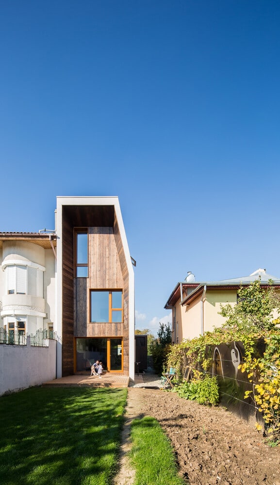
Concept: Lama house was built for a family of 4, in order to protect its members and meet the needs as best as possible. Due to the shape of the site and its surroundings, the house resulted as a long and 4.5 m narrow shape, attached to the neighbours blind wall. The facades and the layout of the house were built according to their position towards the public or private areas of its surrounding and the cardinal points. The facades and the layout of the house had different approaches, given the orientation towards the public or private areas of the surroundings and the cardinal points. The best example would be the southern facade, moulded to work as a sun trap.
Layout: Lama house was built so that it would have a small front yard which provides entrance from the street, as well as a larger private backyard. The acces point inside the house is signaled by a burnt wooden box, the vestibule, attached to the white main volume of the house, thus creating a visual contrast.
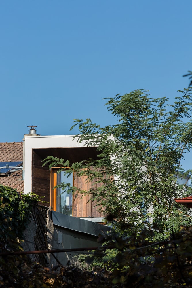
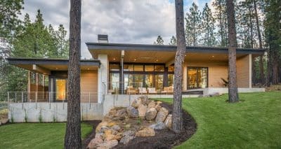
This project was build with consideration towards the main principles of passive housing. The southern facade opens large windows towards the private family backyard, without forgetting to shield itself from the sun. It uses passive shading creating a funnel shaped facade and a pergola. The main material used for the backyard facade is burnt wood. The image created is harmoniously integrated with the protected intimate garden, due to its organic reference and induced warmth.
The facades facing the street (North) and the neighbour on the left (East), due to the nearing position providing little privacy, are more opaque and sober. On all of the facades, the windows are larger at the bottom and smaller at the top, as to capture the right amount of light for each space.
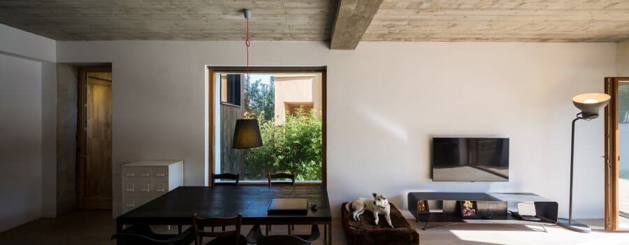
The layout of the house uses the same principle as the facades, considering the position of the space towards public or private outlook, and the amount of received natural light. This is why towards the backyard (South) you will find primary functional areas such as the living room, the master bedroom and the children’s bedroom, whilst towards the street (North), the kitchen, bathrooms and the second floor terrace are positioned. This layout was primarily considered to have a functional structure.
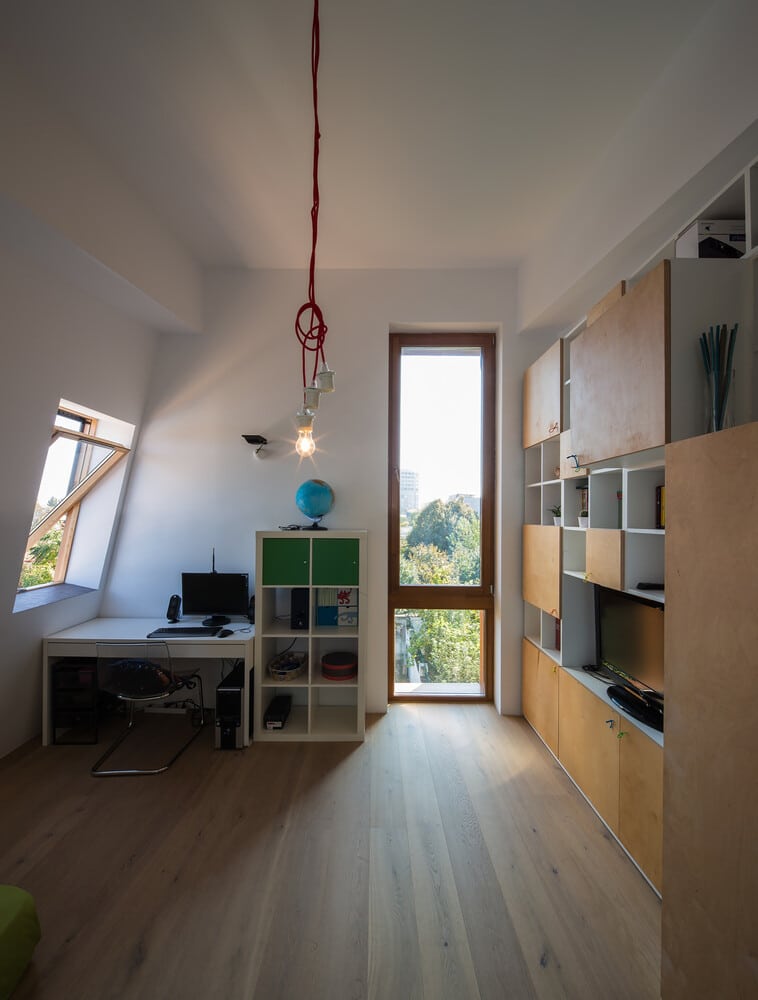
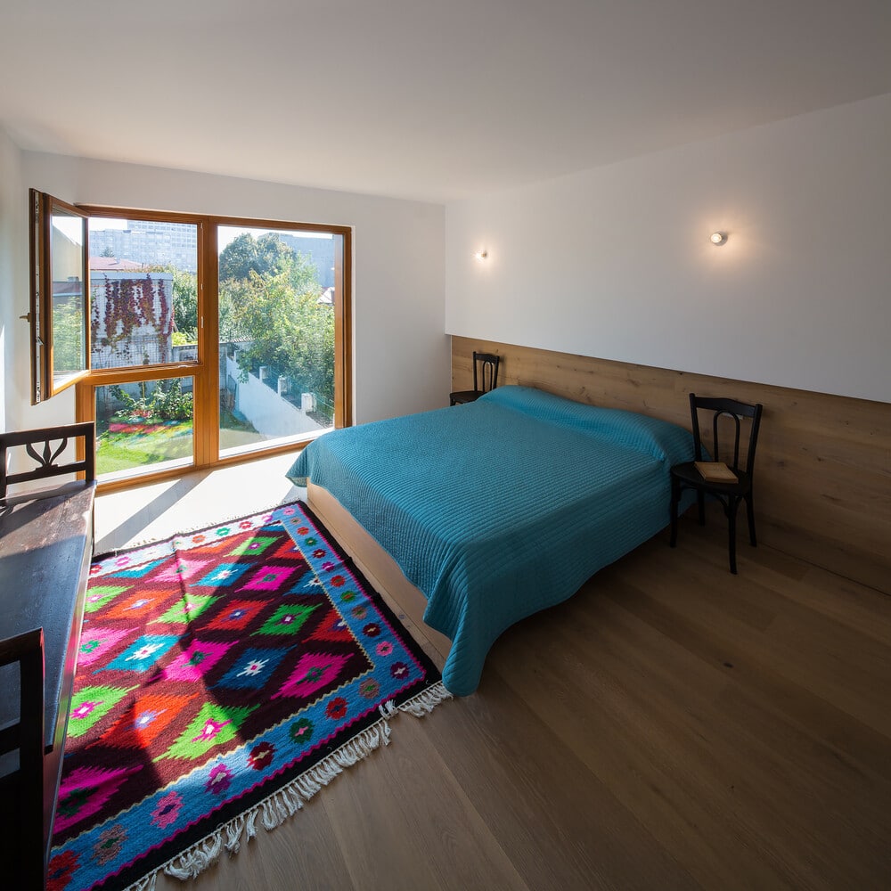
The basement contains a hobby room, the utility room and storage space. The ground floor provides the outside access via the vestibule, to the living area and the kitchen, and a downstairs cloakroom. On the first floor you will find the master bedroom with a dressing space, the family bathroom and a small bedroom for the family’s 2 year old baby . The second floor provides the third bedroom, a library, a bathroom, a storage closet and a private terrace.
Materials, Systems: For the exterior design, we used PU foam with white decorative finish, burnt pinewood, white painted steel frames for the openings and triple glazed windows with timber frames. The performant triple glazed windows and the PU thermal foam together with the cellulose attic insulation, creates a thermal protection that is twice as efficient to the commonly used insulation means. A sustainable ventilation system was integrated, consisting of air tubes buried at the level of the building’s foundation.
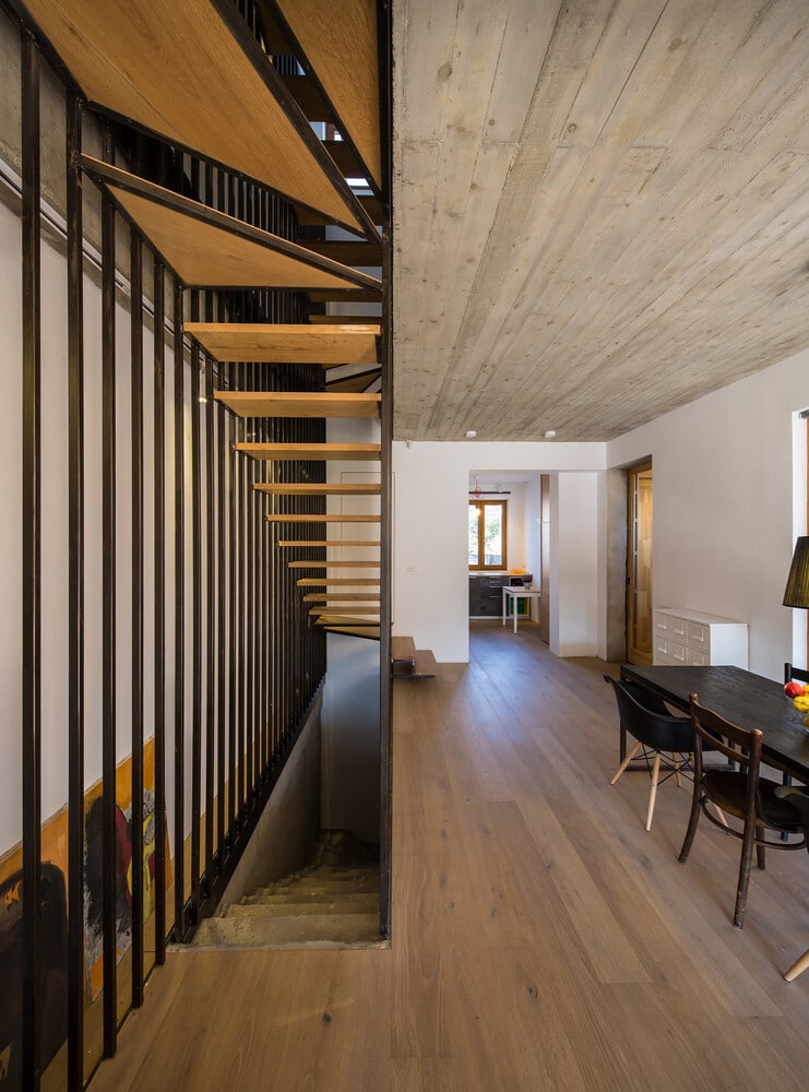
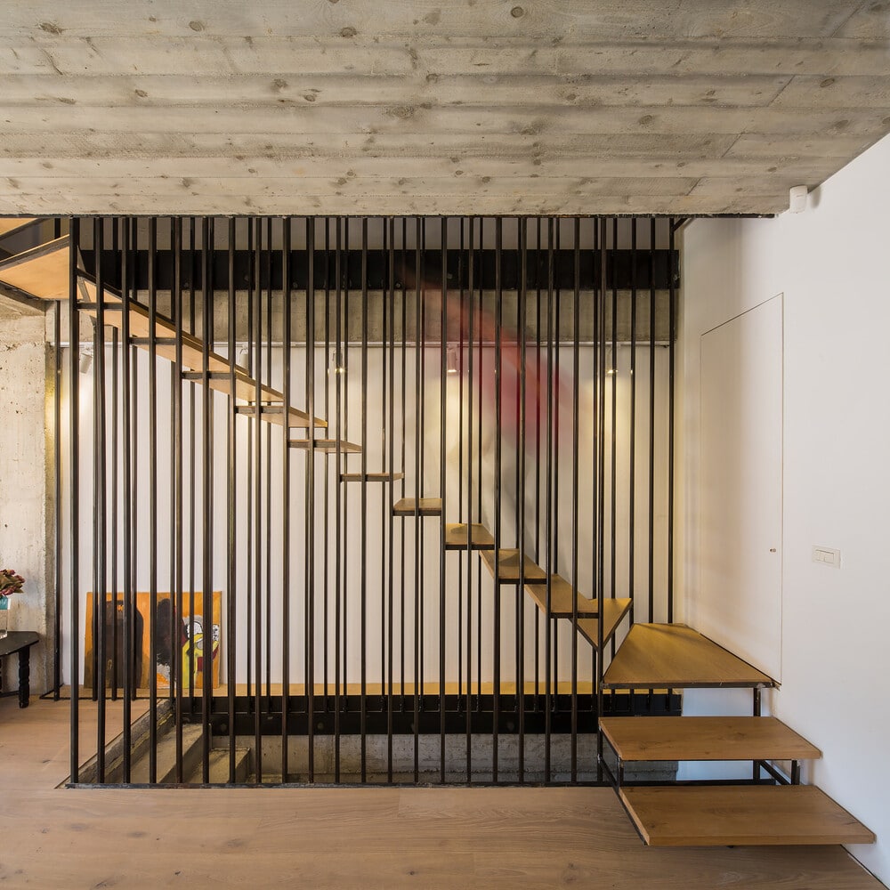
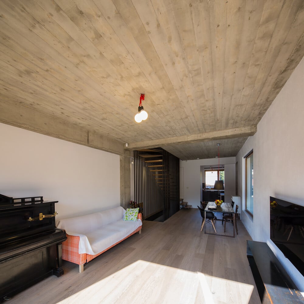
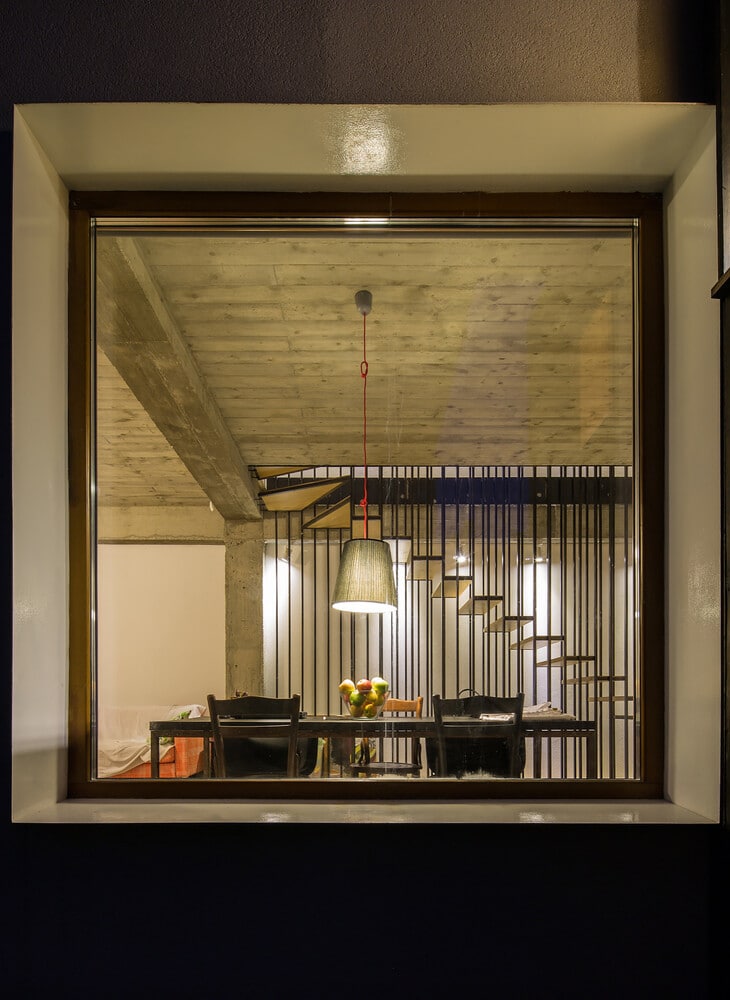
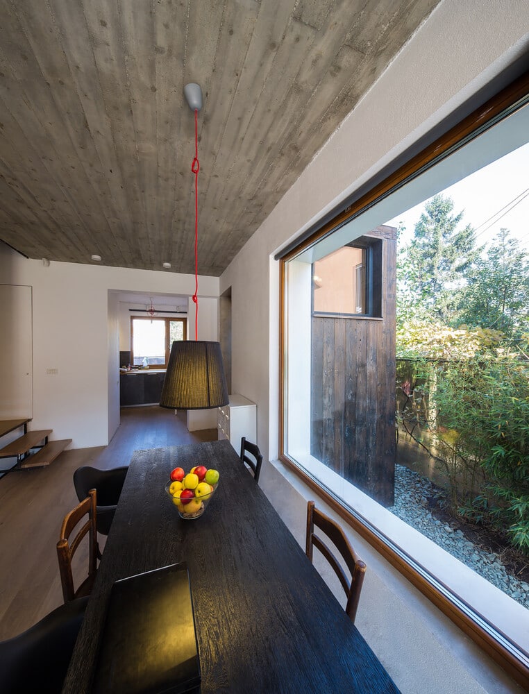
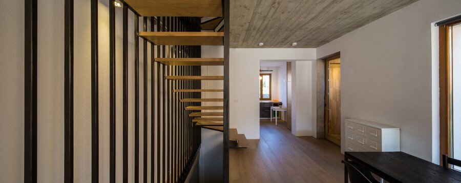
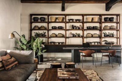
Regarding the interior design, the walls were covered in protection mortar died white, and the oak floor has a natural colour. The living room ceiling purposely left the exposed concrete, visible. Travertine plates were used for the access hallway and inside the bathrooms. The staircase’s structure was built out of steel and kept with a natural lacquered appearance. Most of the furniture for the project was custom made.


