Project: Maison Lavande
Design: ISSASTUDIO
Architecture and project management: Syscomax
Partition walls: Groupe API- Teknion
Furnitures: Burovision et Élément de base
Lighting: Luxtec, Luminaire Authentik
Vegetation: Planteca
Concrete and terrazzo: Béton multi surfaces
Carpet and vinyl: Interface
Ceramics and porcelain: Stone tile
Acoustic panels: Ezobord
Location: St-Eustache, Quebec, Canada
Area: 12 012 sq.ft. / 1 116m2
Photograph: David Boyer
ISSASTUDIO opens the doors of Maison Lavande’s administrative center in the lower Laurentians region of in Quebec. Operating in the agrotourism and lavender perfumery sector, Maison Lavande is a family-run company that is well known and appreciated by Quebecers. To mark the company’s progress and continuity, it had to relocate and expand its current production center – La Fabrique des Filles – to centralize its design activities. This change provides the company with a larger production area for its various lavender-derived products.
The project
With a desire to offer their employees a workspace focused on their well-being, the proposal of a nature-oriented environment was a natural fit. The new plant is located in an industrial district, and as the team was leaving a bucolic rural environment, it was important to emphasize the link with nature by implementing natural connector elements within their new work environment.
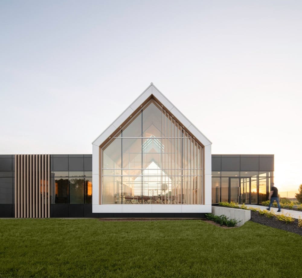
ISSASTUDIO, formerly known as ISSADESIGN, an agency specializing in biophilic design, was commissioned to design the interior of the administrative area. Architectural and site management services were provided by Syscomax. The building’s visual signature, suggested by Syscomax, is a beautiful ensemble of defined geometric lines blending country and Scandinavian allure, while echoing the company’s logo.
The designers’ brief was to design a sustainable, welcoming, and unifying layout and aesthetic concept, without taking on the rural aesthetic codes associated with La Maison Lavande. In addition, nature has always been of great importance and inspiration to the Maison Lavande family. For the design team, it was important to include nature’s shapes and colors within the project. With this approach, the design challenge was to create an enchanting environment, highlighting the site’s architecture, singular identity, and natural surroundings on a human scale.
Pathways and distribution of spaces
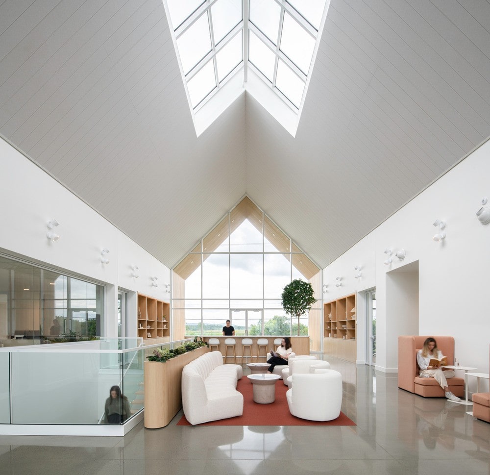
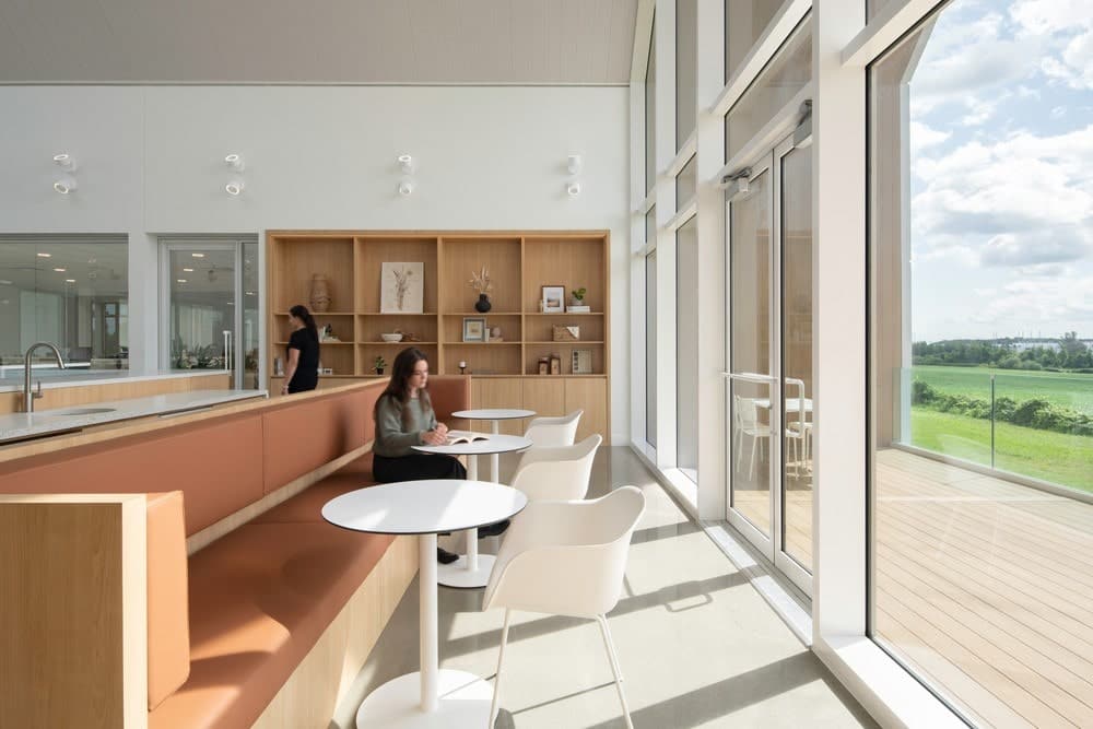
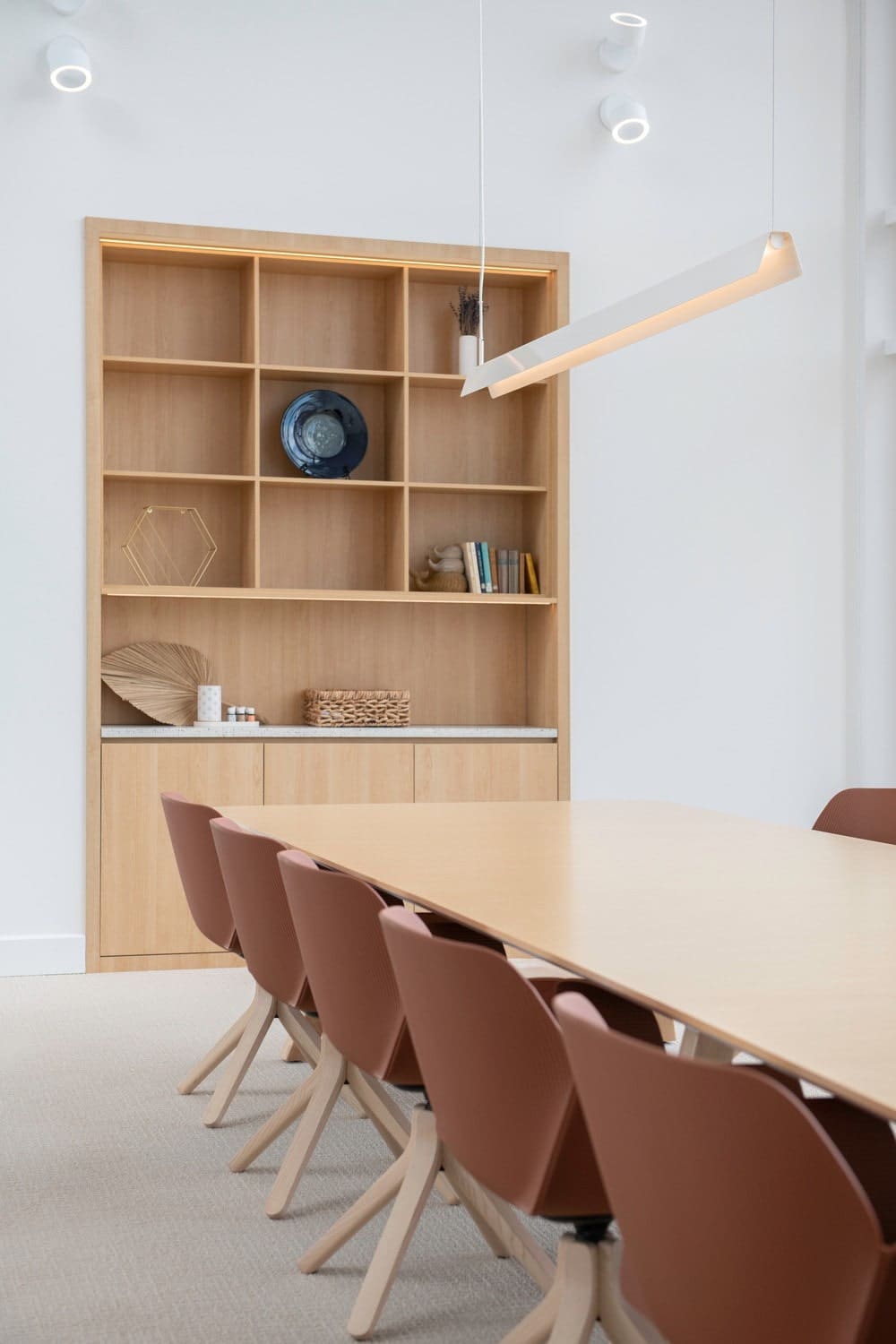
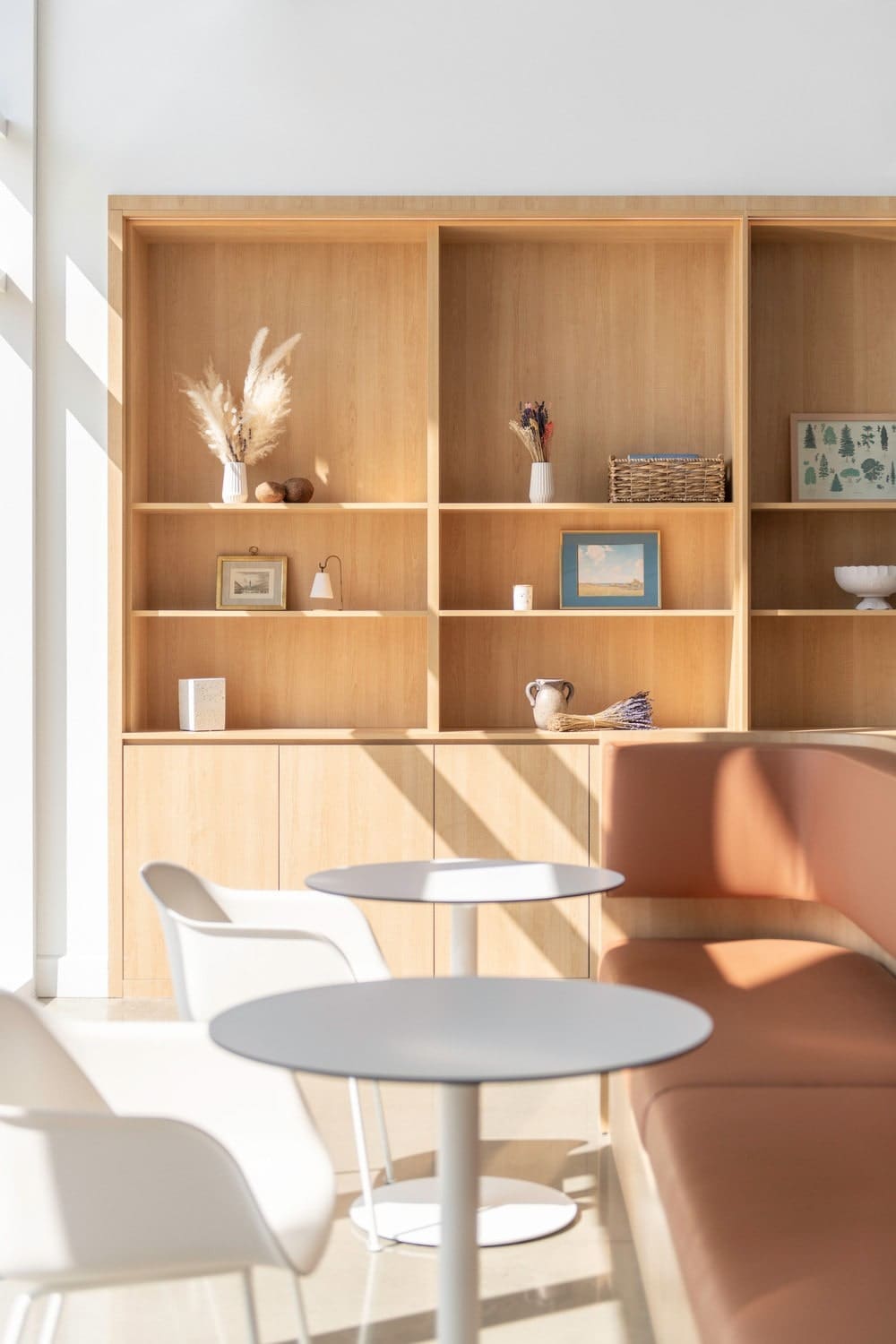
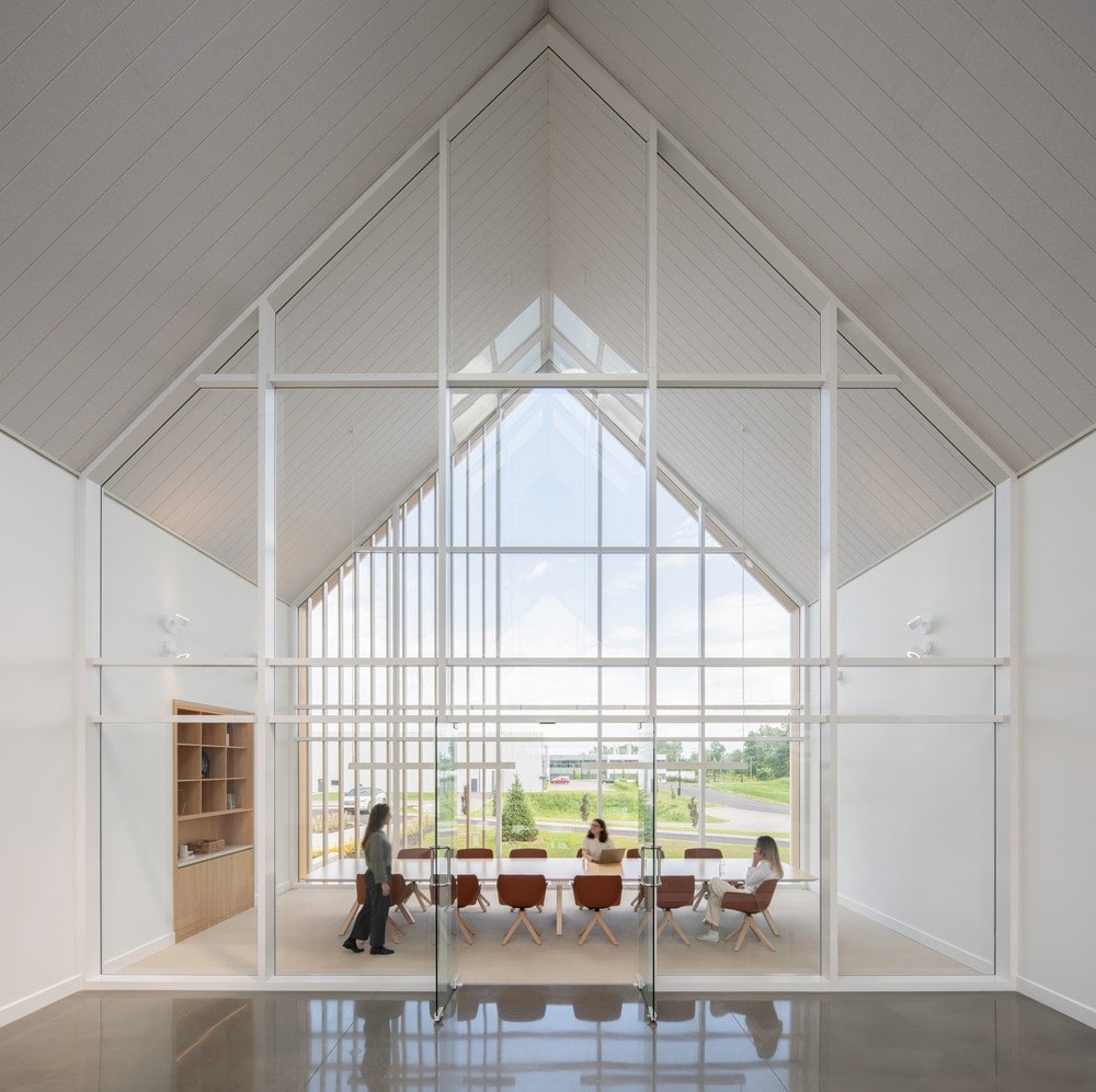
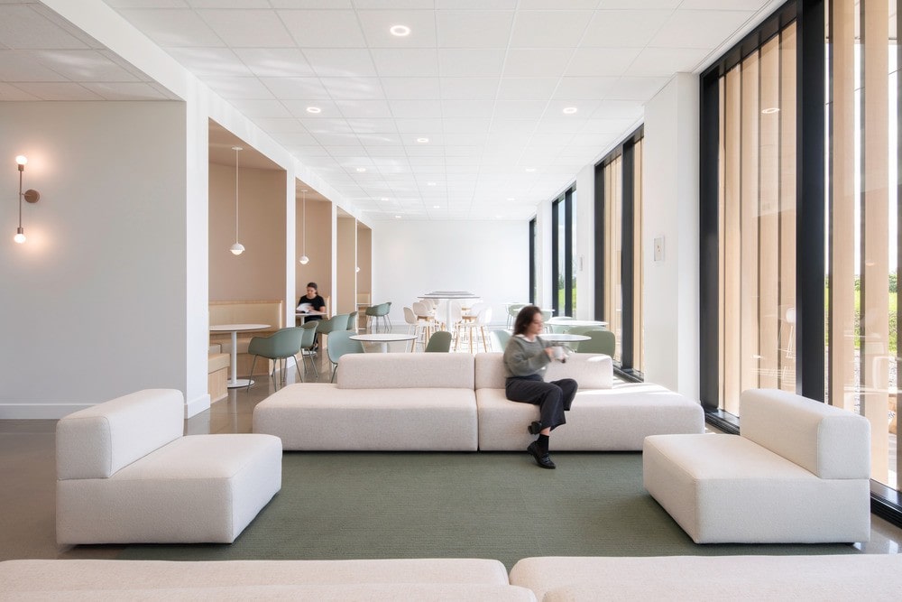
Visitors enter the building via a large walkway. The entrance to the administrative area is simple and uncluttered, with low ceilings. The idea is to contrast with what the designers call the clearing, the large atrium. The interplay of ceiling levels accentuates the effect of grandeur felt on arrival in this room. Welcomed by a vast cathedral ceiling with a central skylight, the atrium is immersed in natural light and offers views of the neighboring agricultural fields. As soon as visitors enter this room, they feel a happy mixture of elevation, calm, and contemplation. The clearing is the ideal place for collaboration, with collaborative lounges, a café, and a large conference room that can comfortably accommodate up to 12 people. The design is inspired by biophilia to offer comfort and peace of mind.
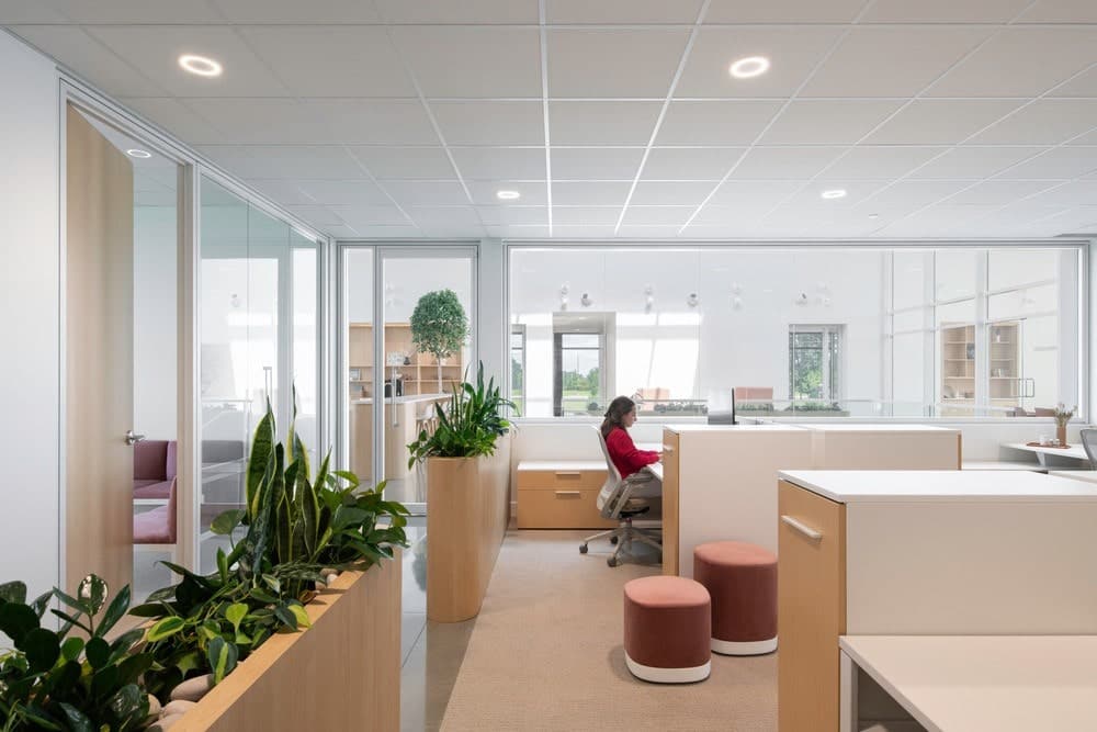
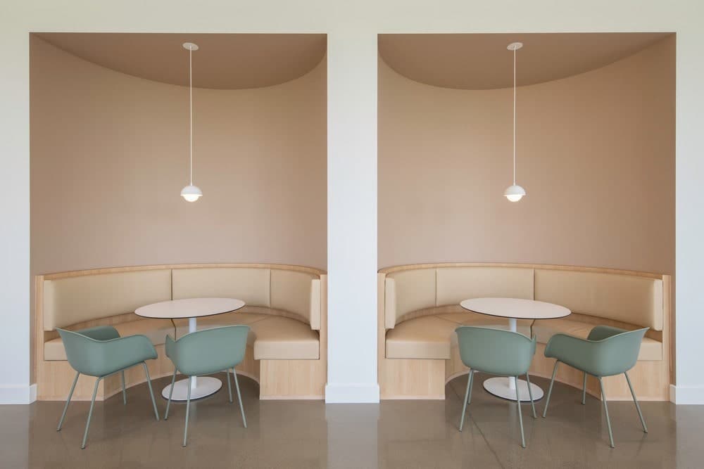
The administrative offices are located at the rear of the atrium. The layout is a mix of closed offices and open-plan workstations, according to the needs of the employees’ functions. All the furniture is designed to be collaborative to maximize discussion. Acoustic booths are also available, giving everyone access to more confidential spaces.
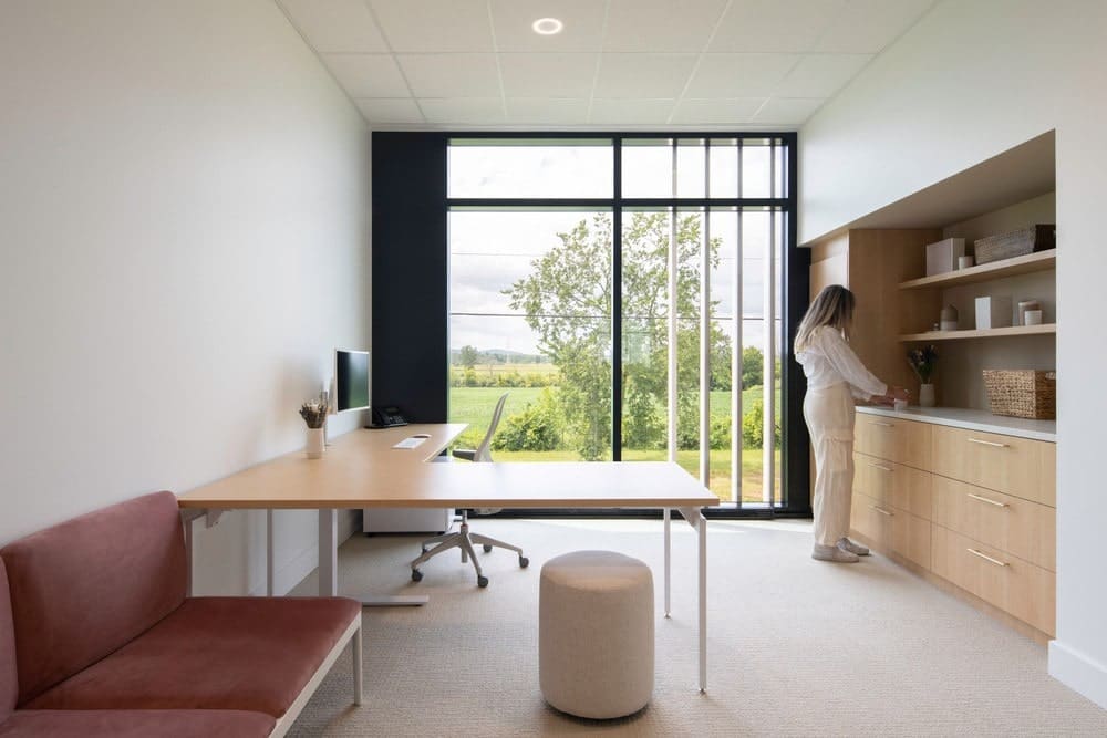
Furthermore, the layout of the rooms and offices has been thought out in such a way that everyone can see outside and enjoy the daylight and views of the countryside. Artificial lighting was meticulously chosen to minimize the amount of artificial lighting required, while providing a beautiful distribution of light by self-adjusting according to the time of day. In the evening, the atrium is the ideal place to enjoy the sunset.
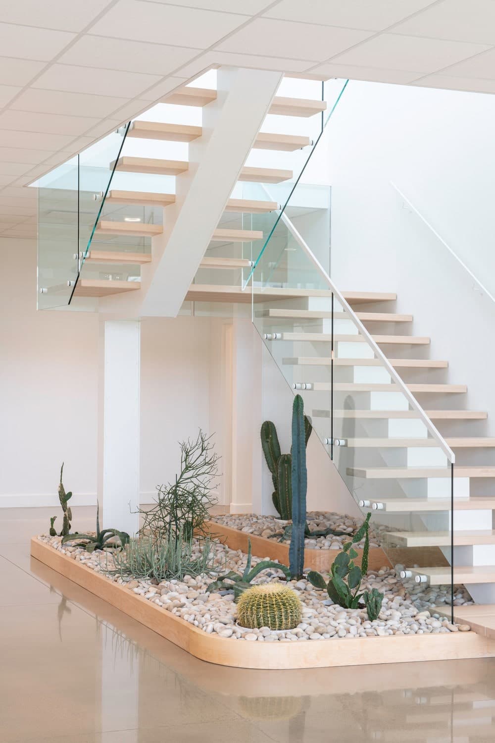
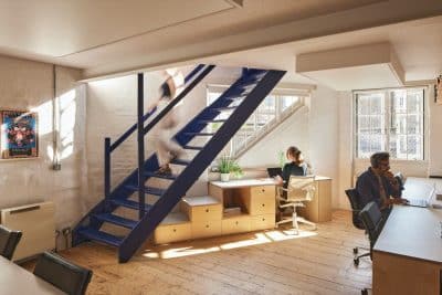
Back in the atrium, a staircase connects with the garden level. The descent leads the visitor to the large windows, allowing everyone to take advantage of the visual breakthroughs. This is where you’ll find the friendly cafeteria and the transitional spaces leading to the factory: changing rooms, laundry rooms, and a fitness room accessible to all.
Materiality
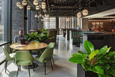
Wood and neutral colors were at the heart of the choices for the materiality in order to propose a sustainable environment in harmony with the surrounding nature. Accent colors, such as green and terracotta, are also found on the 2 floors. This play of neutral and natural colors creates a soft and reassuring, yet energizing ambience.
The atrium ceiling is wrapped in acoustic panels with a shingled look as a nod to the country aesthetic. This application brings a subtle continuity to the architecture and is essential for ensuring well-being by controlling the sound reverberations generated by conversations and events.
For its part, the project’s cabinetwork takes up the codes of natural analogy through its play on shapes and textures. Resembling stone at times, and flora at others, through the integration of plants and trees, and even a garden at the foot of the staircase, the woodwork allows employees to exploit the space and personalize it through the addition of decorative objects that are meaningful to them.
In conclusion, the facilities at the La Maison Lavande x La Fabrique des filles administrative center were designed with a view to providing all employees with a workplace that lives up to their ambitions and is dedicated to the well-being of all.
