Project: Mediabrands Offices
Architecture: Colombo and Serboli Architecture (CaSA)
Location: Barcelona, Spain
Area: 720 m2
Year: 2021
Photo Credits: Roberto Ruiz
Text by Colombo and Serboli Architecture
CaSA won a restricted competition between different studios for the offices of Mediabrands in Barcelona with an organic, tailor-made proposal that adapts to the spaces and fills them with green.
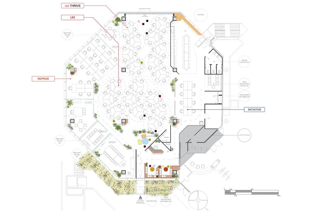
The clients wanted their Barcelona offices to unify in the same space all of their brands (UM, UM-Thrive, Initiative and Reprise) under the Mediabrands family. One of the key issues of the brief was to have the brands working independently but integrated in the same space, and for each of them having independent entrances and paths from the communal reception area.
The greeting area had to be a special one, by clients brief. CaSA won a restricted competition between different studios for the offices of Mediabrands in Barcelona with an organic, tailor-made proposal that adapts to the spaces and fills them with green.
Concept and Layout
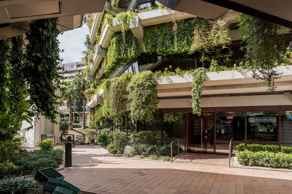
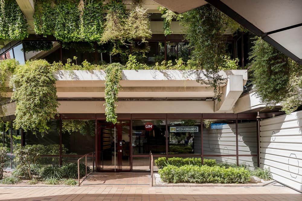
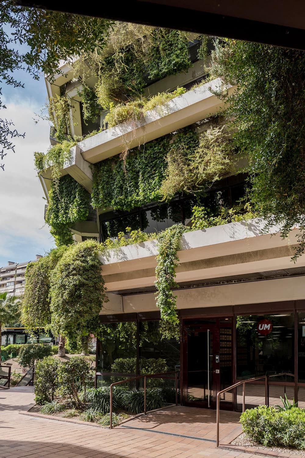
The starting point of the project was the emblematic building that hosts it: a wonderful brutalist 1979 landmark building (by Josep María Fargas and Enric Tous), softened by 3,8km of overflowing planters on its façade. The two, green covered, octagonal buildings that form the complex are an eye-catching feature of the area, and one of the most recognizable office buildings of Barcelona.
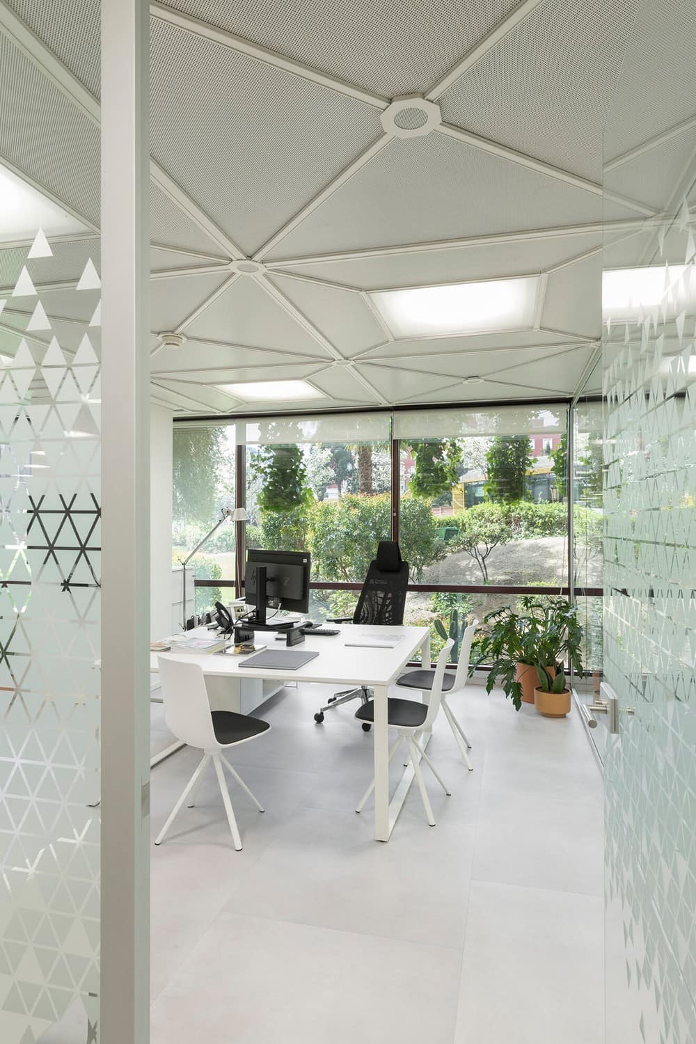
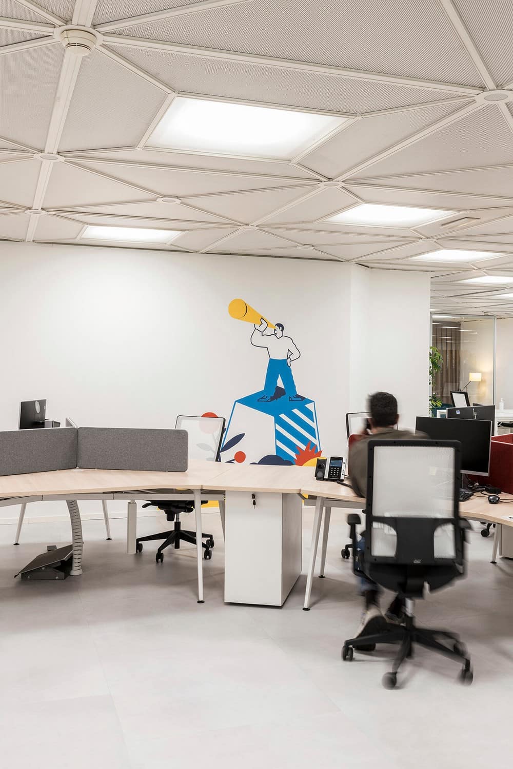
The building shape had to be considered, not only to pay homage the architecture, but also because all technical ceilings have a Sci-Fi geometric pattern that obliged every partition to be on the lines that formed it, to respect ceiling lights, sprinklers, and air-con access.
Another main theme of the project was to bring the vegetation into the offices, using plants to give continuity between outdoor and indoor spaces. Maximizing natural light and views to the green outside the big windows was also a priority.
Reception
Clients wanted the welcoming area to be a special place and have impact.
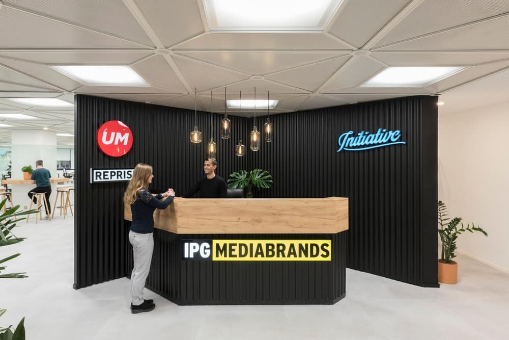
The partition between reception and the rest of the workspaces had to be drawn on the technical ceiling lines, forming a peak-shape that also allowed two different entrances into the offices.
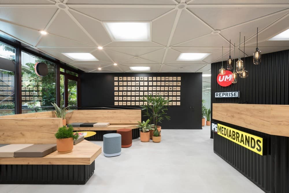
The black colour was used to give more depth and a dramatic backdrop to the reception desk, and also one of the brand’s corporate colours. The bench seats for this area run all around the space, their chamfered shapes recall the angular volumes of the planters on the façade of the building. Made-to-measure cushions in eco-leather complete the seats. Stella central tables by Inclass and Puck textile stools by Enea give the colourful touch.
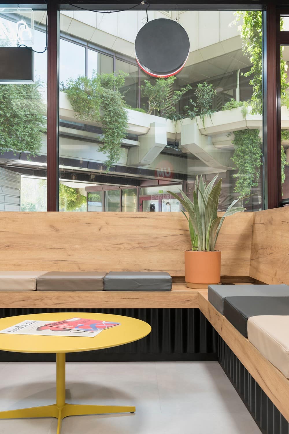
This area doubles as an informal meeting room.
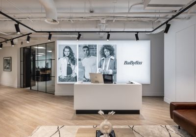
The same language is used in the reception desk, geometric shapes, wooden top and black corrugated base. The backdrop of the desk carries lit signs of the different brands hosted in the offices.
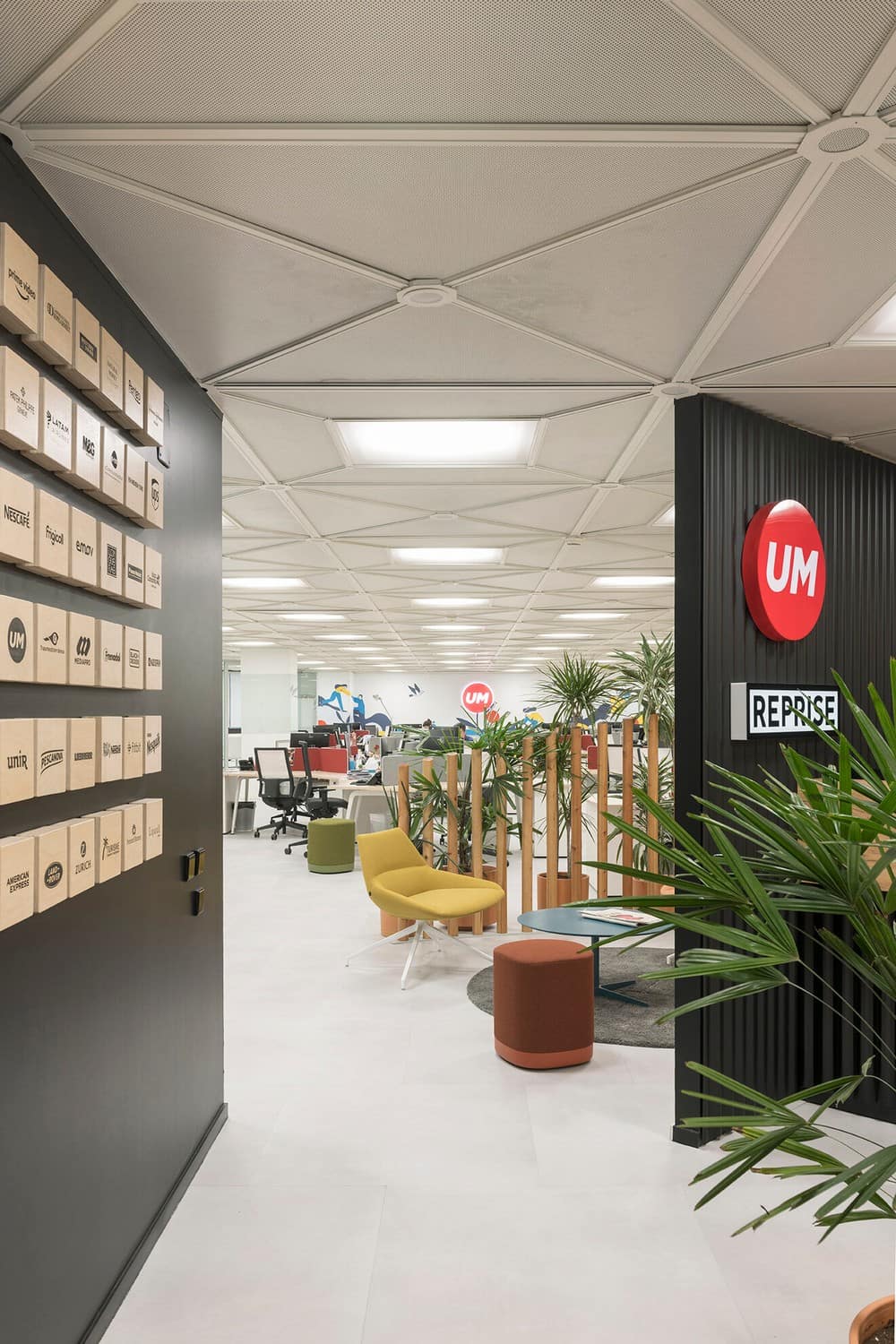
Along the entrance, a series of wooden blocks displays the names of the brands that are clients of the Mediabrands group in Spain.
Potted plants are placed around the space visually connecting with the plant-covered building. This happens throughout the whole project, wherever the natural light allows the presence of plants.
Meeting Rooms
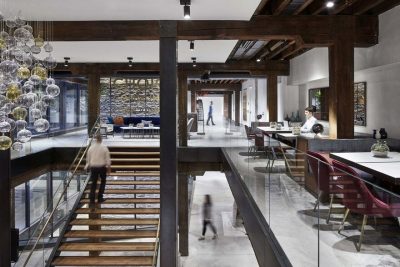
The Mediabrands Offices includes all sorts of meeting areas.
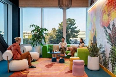
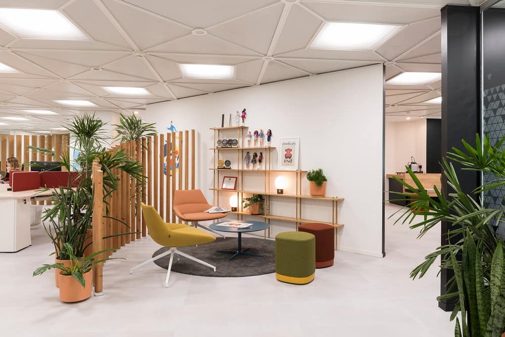
Passed the reception, as entering the workspace, one informal meeting area that is also thought as a relax area for workers. It features a divider made of wooden poles forming a sloping curve, crossed by the plants around it. This area is furnished with armchairs (Dunas XL) and tables (Stella) by Inclass and Enea Puck stools. A Wooden Bond bookshelf by Fogia recalls the timber divider. On its shelves, among the Concrete lamps by Menu are exposed several prices won by the agencies.
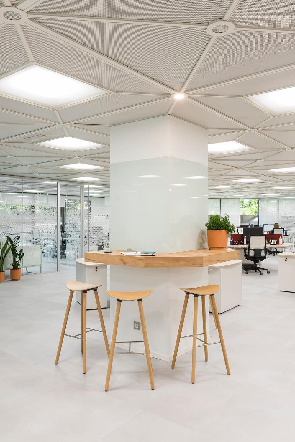
Small, high tables with stools for brief encounters are placed around the pillars (Comma wooden stools by Enea).
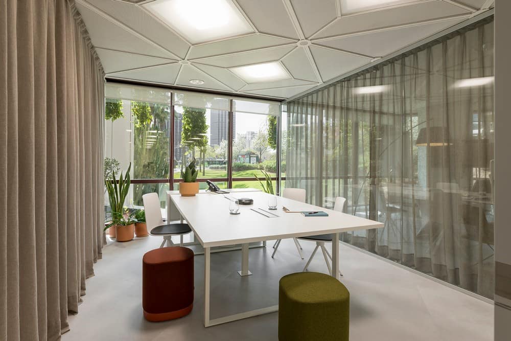
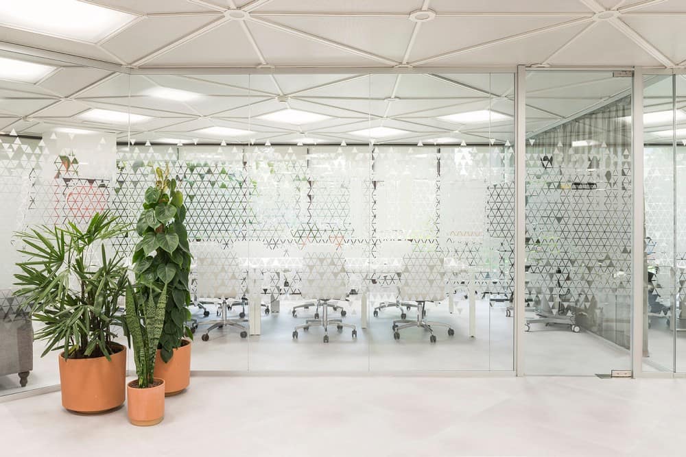
The closed meeting rooms are placed near the entrance, along a path that goes from reception, to the director’s office, occupying the brightest areas.
The glass partitions are placed along the lines of the geometry created by the technical ceilings.
A similarly geometric vinyl pattern was designed expressly for the glass partitions, discretely giving privacy to the meeting areas while letting the light flow into the spaces.
Textile curtains in raw colours are used to screen each room on dividing glass partitions, softening the spaces and buffering sound. Plants are also included into meeting rooms.
The director’s office is spacious and has its own meeting table and great views onto the green.
Desks Area
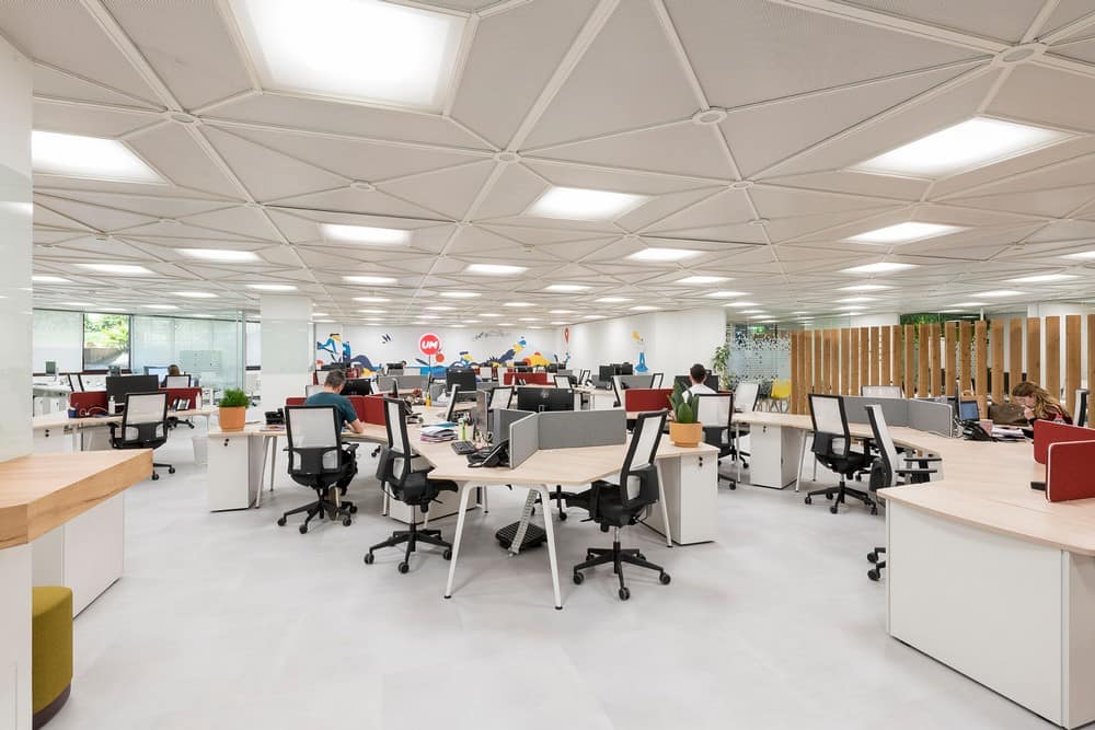
The main area features a desks system (Twist by Actiu), a particularly flexible, whose organic shapes help forming the layout within the faceted building. The peculiar shape of these tables allows forming clusters of workers. Its organic configuration allows its modification, foreseeing the expansion of the company for the next two years.
Colourful Enea stools are scattered around the desks for a quick chat.
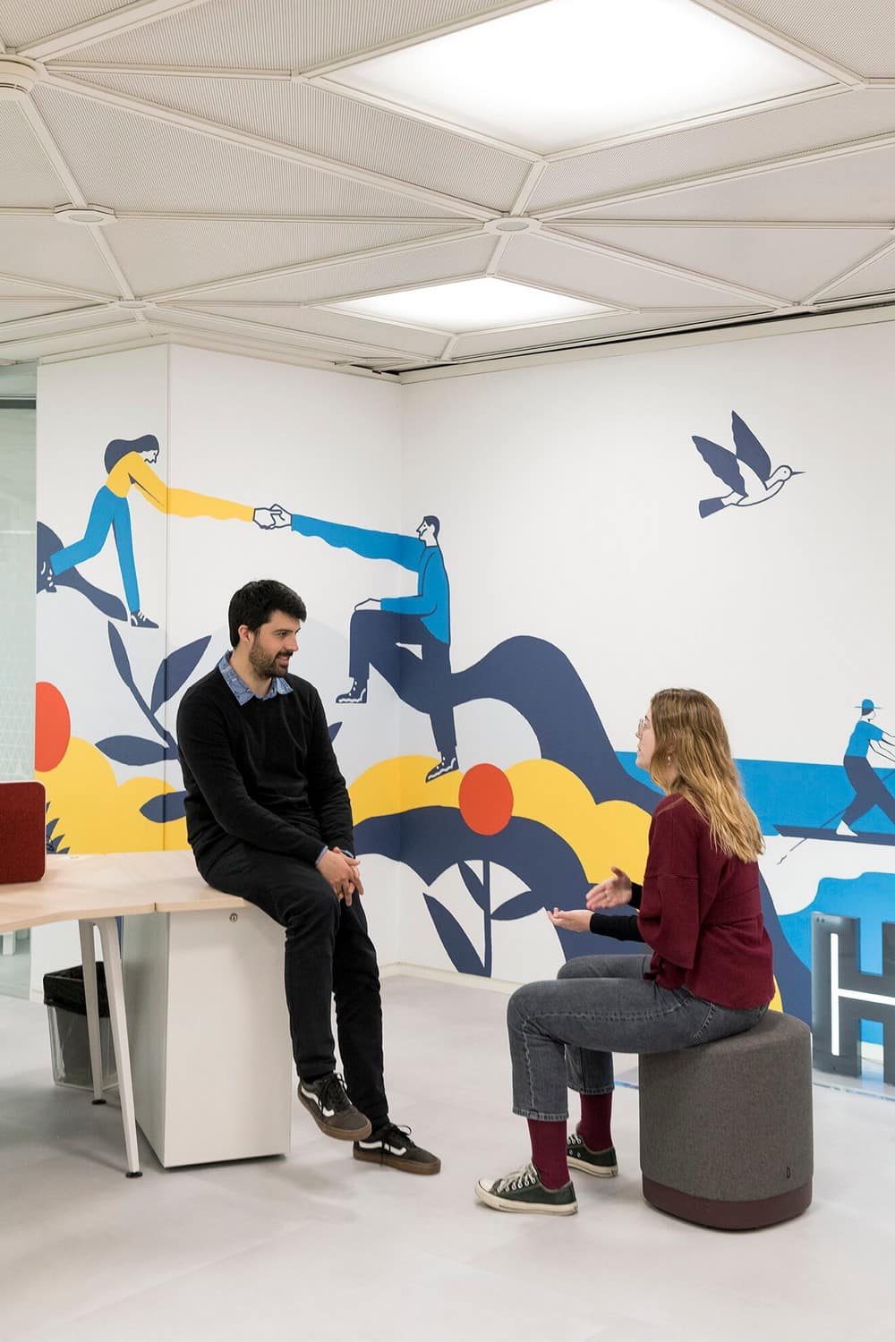
All around this area, art interventions by artist Alessandro Alonso were painted directly on the walls, inspired by the company’s values. The Venezuelan-born illustrator filled the walls with his evocative scenes painted in primary colours. The biggest one covers all the back wall of the desks area and includes a UM backlit sign.
All around this area, art interventions by artist Alessandro Alonso were painted directly on the walls, inspired by the company’s values.
The Venezuelan-born illustrator filled the walls with his evocative scenes painted in primary colors. The biggest one covers all the back wall of the desks area and includes a UM backlit sign.
