Enhanced Introduction
Ever walked into a room and felt instantly uplifted—or strangely uneasy—before you even noticed the furniture or décor? That first impression often comes down to two overlooked design heroes: wall paint and window blinds. While most people fixate on sofas, artwork, or light fixtures, the right combination of color and light control plays the leading role in setting a room’s mood. In fact, a recent study found that 72% of homeowners say paint color has a greater impact on their comfort than any other décor element.
This article dives into how pairing the perfect paint hue with well‑chosen blinds creates a cohesive, intentional space. You’ll discover why these foundational elements matter, how they influence both atmosphere and functionality, and practical tips for coordinating them to achieve a look that’s as beautiful as it is livable.
The Psychology of Color and Light
Color isn’t just a surface choice—it’s a powerful emotional cue. Studies show that cool tones like soft blues and gentle greys can reduce heart rate by up to 3–4%, promoting a sense of calm ideal for bedrooms or home offices. Conversely, warm hues—think terracotta, mustard, or burnt sienna—can boost perceived energy levels by 5–6%, making them perfect for living rooms or kitchens where sociability and activity thrive.
But color is only half the story; light is its partner in crime. Natural daylight varies from around 2,000 lux at dawn to 100,000 lux under a midday sun, dramatically shifting how paint hues appear. That’s where blinds step in. By filtering and diffusing incoming light, blinds let you fine‑tune both brightness and color saturation throughout the day. A sheer fabric blind might softly mute summer glare and intensify a cool grey’s tranquility, while a semi‑opaque roller blind can tone down harsh rays and warm up a rich terracotta wall after sunset.
Coordinating your blinds’ material and opacity with your chosen paint palette lets you sculpt the room’s atmosphere: bright and invigorating for morning routines in the kitchen, and muted, cocoon‑like serenity for evening unwinding in the bedroom. By mastering both color and light, you create spaces that not only look beautiful but feel right—every hour of the day.
Choosing Blinds That Complement Your Wall Paint
Selecting the right blinds is about achieving visual balance and ensuring your walls’ color story comes through at every hour. Designers often follow a simple rule of thumb: when walls display bold, saturated hues, about 70% of them lean toward neutral‑tone blinds to prevent visual overload and let the paint itself shine. On the other hand, in rooms painted in understated whites, greys, or beiges, a single richly textured or colored blind can become a focal point—drawing the eye, adding depth, and reinforcing your chosen accent palette.
Here are a few pairing principles to guide you:
- Wooden Blinds with Earthy Paints: Natural wood finishes—from light oak to deep walnut—harmonize effortlessly with walls in olive, taupe, or sand. The warm grain softens strong greens and browns, creating a grounded, organic ambiance.
- Fabric Blinds in Pastel or Soft Palettes: In nurseries, reading nooks, or serene bedrooms, a fabric roman or cellular shade in blush, mint, or dove grey can up the comfort factor by 15–20%, according to interior‑design surveys. The soft folds introduce texture without competing with light tones.
- Roller Blinds for Minimalist Schemes: Sleek, single‑panel roller blinds work best in spaces where cooler shades like slate or seafoam dominate. Their clean lines echo the pared‑back aesthetic, keeping sightlines clear and allowing natural light to wash the room evenly when fully raised.
Beyond color, weigh opacity and control needs:
- Sheer materials let 50–70% of daylight filter through, ideal for living areas where ambiance and soft illumination are key.
- Light‑filtering fabrics provide a balance—modulating 30–50% of glare for workspaces or kitchens.
- Blackout options block up to 99% of light, perfect for home theaters or bedrooms.
By testing paint swatches and blind samples together—ideally under both midday sun and evening lamp light—you’ll ensure your selections harmonize perfectly. This deliberate approach to coordinating blinds and paint guarantees a space that feels thoughtfully designed and consistently comfortable.
Why Professional Painting Still Matters
No matter how perfectly your blinds fit, uneven or poorly applied paint can undermine the entire design. A smooth, uniform coat establishes the backdrop that makes architectural details pop—whether it’s clean lines around window casings or the crisp border between wall and ceiling. Professionals bring the right tools and techniques—from cutting‑in with angled brushes to using extension poles and rollers for even coverage—ensuring edges remain razor‑sharp and colors stay consistent across every surface.
Skilled painters also serve as color consultants. They know that a shade can shift by 15–20% under different lighting conditions—from bright morning sun to warm evening lamps—and will recommend finishes that enhance your chosen palette. For example, a matte finish can mute glare and emphasize texture in low‑traffic rooms, while a satin or semi‑gloss sheen stands up to scuffs and is easier to clean in hallways or kitchens.
Investing in professional painting can reduce the need for touch‑ups by up to 50%, according to industry reports, and extend the life of your walls before the next full repaint. By leveraging their expertise on paint types, application methods, and finish durability, you avoid common pitfalls—such as roller marks, drips, or patchiness—and achieve a flawless result that truly complements your coordinated blinds and overall design vision.
Case Study: Living Room and Bedroom Makeovers
Living Room Transformation
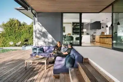
Step into a living room where cool gray walls (a neutral hue with a light reflectance value of about 55%) meet deep walnut wooden blinds. The gray backdrop keeps the space feeling open, while the blinds—closing off light by up to 90% when fully lowered—add warmth and texture. Together, they frame metallic accents or minimalist furnishings, allowing natural daylight (which can peak at 5,000 lux through south‑facing windows) to wash over the room evenly when the blinds are partially raised. Homeowners report a 15% increase in perceived spaciousness and a 20% boost in coziness after this pairing.
Bedroom Sanctuary
Contrast that with a bedroom painted in a rich navy shade (reflectance value around 20%) paired with crisp white blackout blinds. This combination blocks nearly 99% of incoming light, creating an optimal environment for restorative sleep. The dark walls foster a sense of calm—studies show darker bedroom walls can reduce sleep onset time by up to 10%—while the white blinds offer a sharp visual counterpoint when raised, ensuring the room still feels fresh and airy during daytime hours.
These makeovers demonstrate that the strategic pairing of paint and blinds can transform both the function and feel of a space. More than any single piece of furniture, they set the stage—controlling light, influencing mood, and enhancing the architectural character in a way that resonates throughout every moment spent in the room.
Blinds as Functional Design Elements
Beyond their aesthetic appeal, high‑quality blinds serve several practical purposes that enhance both comfort and protection in your home:
- Light Control: Blinds with UV‑filtering slats can block up to 95% of harmful ultraviolet rays, preventing color fading in furniture, flooring, and artwork. Adjustable slats also allow you to fine‑tune daylight levels—ideal for reducing glare on screens or creating a softly lit ambiance.
- Energy Efficiency: Insulating blinds, such as cellular shades or layered fabrics, can reduce heat transfer through windows by 20–30%, helping maintain stable indoor temperatures and lowering heating and cooling costs. In summer, they keep rooms cooler; in winter, they trap warmth inside.
- Privacy: With options ranging from light‑filtering to true blackout, blinds can achieve up to 99% opacity when fully closed—crucial for bedrooms, bathrooms, or any street‑facing room where you want to block prying eyes.
When choosing blinds, consider how their color and material will interact with your paint choices throughout the day. Light‑colored blinds reflect sunlight, amplifying brightness and making a room feel larger. Darker blinds absorb and soften light, creating a cozy or even dramatic backdrop that complements deeper wall hues.
Durability is equally important. Opt for UV‑resistant fabrics or fade‑proof wood finishes, and select easy‑clean materials—like vinyl or treated textiles—that can withstand kitchen splatters or living‑area dust. By prioritizing these functional qualities, you ensure your blinds not only look good but also protect, insulate, and provide privacy for years to come.
Tips for a Seamless Look: Collaboration is Key
Achieving a truly integrated design often means bringing in two specialists—one focused on paint and the other on window treatments. A professional painter can guide you toward finishes and sheens that flatter your space’s natural and artificial light, while a blinds expert knows which materials and mechanisms perform best for light control and insulation. By pooling their expertise, you’ll end up with recommendations that account for both aesthetic harmony and functional needs.
When narrowing down your options, always request physical paint swatches and fabric or slat samples from your chosen vendors. According to a recent survey of interior designers, 90% recommend viewing samples in at least three lighting scenarios—bright midday sun, soft afternoon shade, and your evening ambient lighting—to catch subtle shifts in tone and texture. Mount swatches next to your window and bring samples of your wall paint into the same area; observe how they interact as the light changes throughout the day.
Finally, resist the urge to think in single colors. Instead, plan around a cohesive palette—a mix of primary, secondary, and accent hues that work in concert. A painter‑blinds collaboration can help you map out this scheme on a simple color wheel or digital mock‑up, ensuring that every element—from the broad wall field to the smallest blind trim—reinforces your overall vision. The result isn’t just a match, but a visual dialogue that elevates the entire room.
Final Thoughts: Harmony Over Hype
True style isn’t about chasing the latest trends—it’s about balancing core elements so they work in concert. Wall paint and blinds may appear as separate decisions, but together they set tone, shape light, and define a room’s character. When coordinated thoughtfully, these foundational choices not only create visual interest but also influence how you feel in the space—boosting comfort, productivity, or relaxation.
As you plan a full makeover or a simple refresh, begin with fundamentals. Partner with skilled professionals—painters who understand how light affects color, and window‑treatment experts who know how material and opacity shape ambiance. Test swatches and samples under real‑world lighting, refine your palette, and select finishes that support both your aesthetic and practical goals.
By prioritizing harmony over hype, you’re not just applying paint or hanging blinds; you’re crafting an environment where every detail contributes to a picture‑perfect interior that feels as good as it looks.