Project: Public Spaces Design
Interior Design: Babayants Architects
Developer: Forma
Location: Moscow, Russia
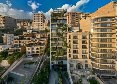
Babayants Architects was assigned to design public spaces in two out of ten residential towers in the new Republic residential district in the heart of Moscow.
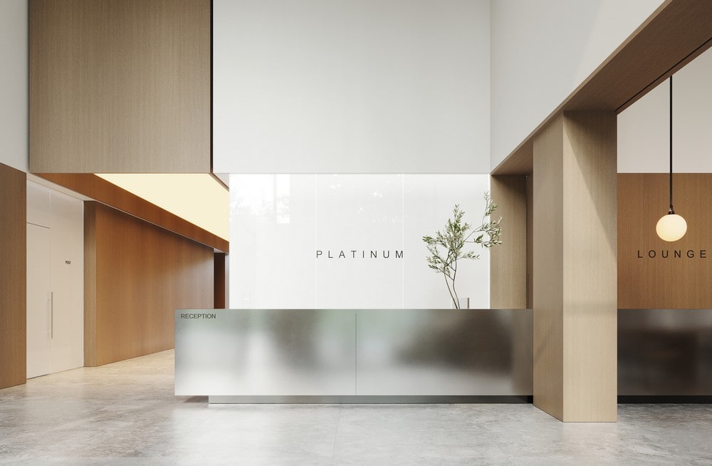
Reds and Platinum are two towers placed on the common stylobate with the common inner courtyard and parking. We had to make them different by characters but united by style.
We used identical materials, repeating furniture, and lighting pieces in the public spaces of two towers to create a common and recognizable leitmotif yet leave space for creativity. The lobby interior of each tower is different and highlights its architectural features.
The Main Feature of the Project
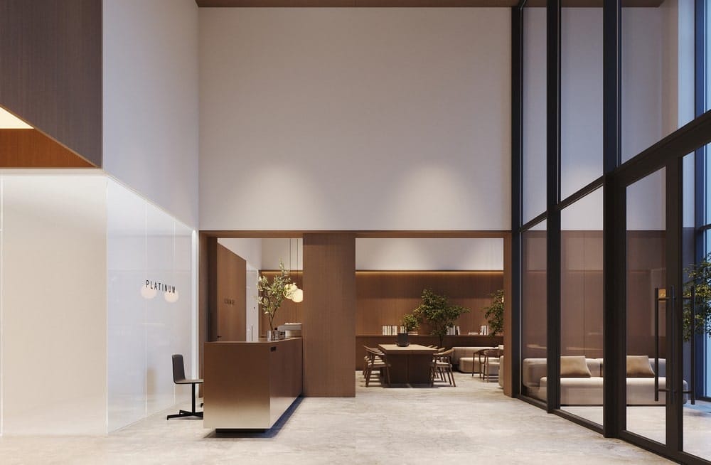
The lobby is a living showcase of the residential complex that can be seen from the street. Modern, airy, and laconic double-height space creates a recognizable image.
The lobby interior of the residential complex has several functions:
1. Creates a first impression, gives a sense of space and immediately demonstrates the quality of the architecture.
2. The lobby is a daily background for residents, so the space must be visually pleasing, convenient, and intuitive.
3. The lobby is a meeting place and a pleasant pastime. There is a reception, a lounge area, and an outdoor coffee point.
4. The main hall is as bright and welcoming as possible. The large plane of glazing on the side of the main facade and the courtyard makes the lobby a transparent buffer zone between public and private areas.
The Project’s Complexities
Initially, we dealt with a very large and tall space at Reds. The space, glazed on both sides, with 9-meter ceilings, looks airy and bright, but there was a risk that the interior would turn into an office-like or look like a shopping center.
The main task was to create a maximally comfortable atmosphere in the living space.
The huge scale had to be brought to human proportions, creating pleasant areas for spending time. At the same time, it was necessary to maintain the feeling of a grand lobby, because this is the lobby of the entire Republic district. This is the main entrance, which should be both monumental and presentable, stylish, modern, and cozy.
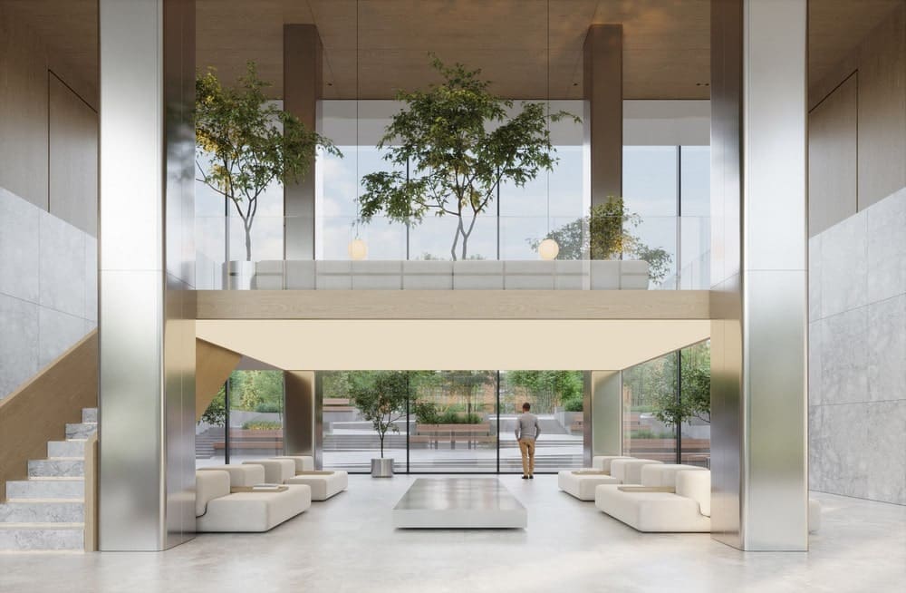
We solved this challenge by dividing the lobby into two levels. We proposed making a mezzanine and a staircase leading to it. In the mezzanine, there is a more private lounge area.
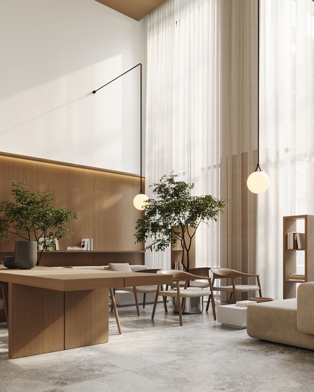
We vertically separated the materials which helped us visually harmonize proportions and heights. The walls are trimmed with stone up to a certain height and then there is a wood trim continuing on the ceiling. The natural warm tone of the wood helped to visually reduce the height and build beautiful, human-scale proportions.
Developed Internal Infrastructure
The reception area and the spot where one can receive and send parcels are to the left of the entrance.
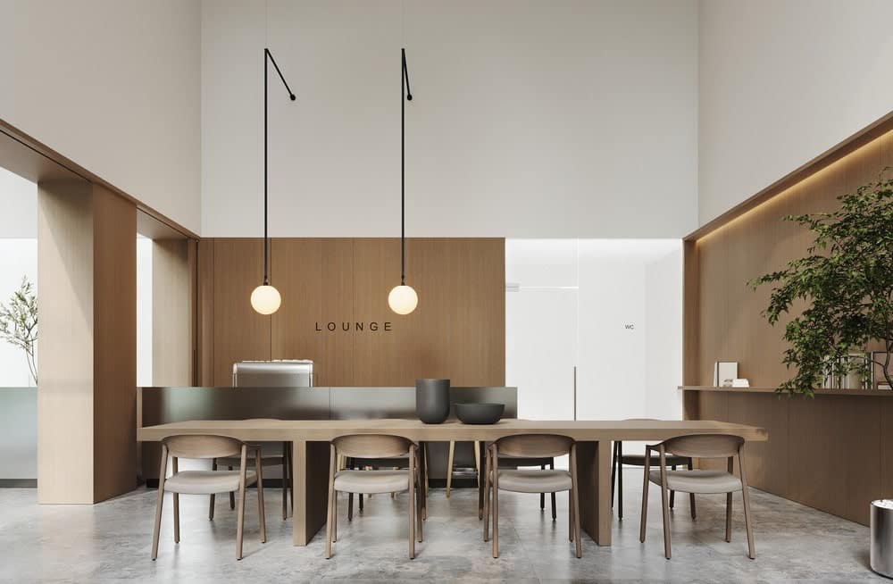
The seating and waiting area is located in the center of the hall between four columns. Opposite the reception area, there is a staircase leading to the mezzanine with a more private lounge area. It is an ideal place to meet friends, chat and relax.
We used an island-type planning solution to make it possible to move freely around the hall without crossing the seating and waiting area.
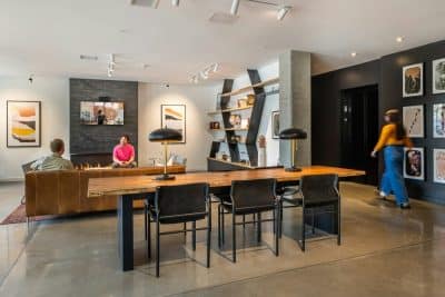
In addition to the coffee point, recreation areas and functional areas, there is a Club House – a co-working space with different typologies of workplaces.
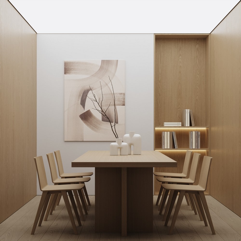
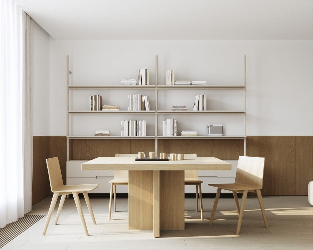
Workplaces are zoned with bookshelves and partitions. Here one can work and read a book, just like in a home library.
On the second floor of the Club House, there is a living room, a kitchen, and a games room with a TV, consoles, and an area for board games.
The residential complex has its fitness room, the interior of which is designed with a reference to Japanese aesthetics. The space is completely decorated with wood and is conducive to contemplation and care for yourself and your physical health.
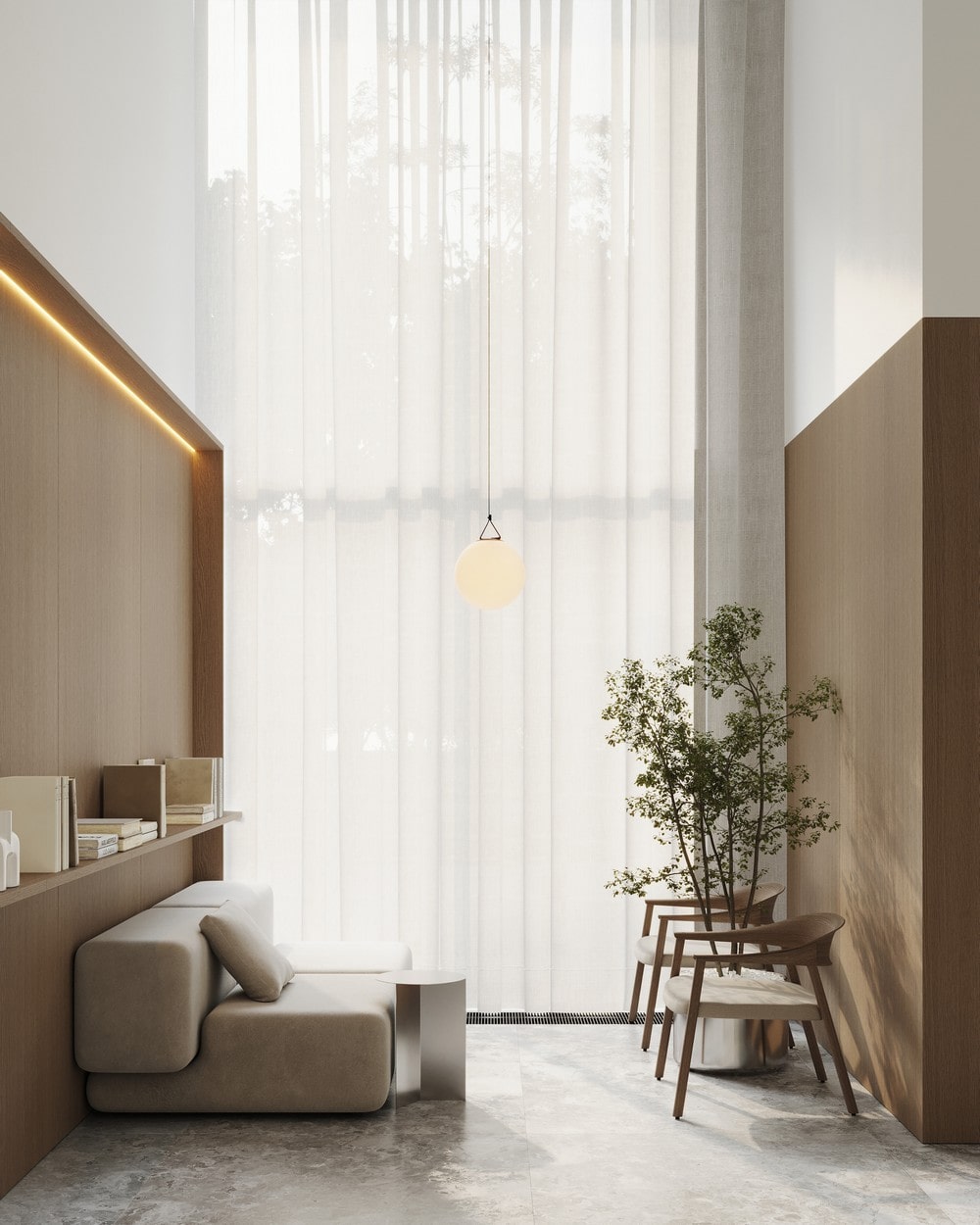
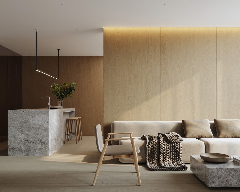
The interiors of the floors are designed in the same style, with the same materials such as wood, stone, and metal, only in a warmer color.
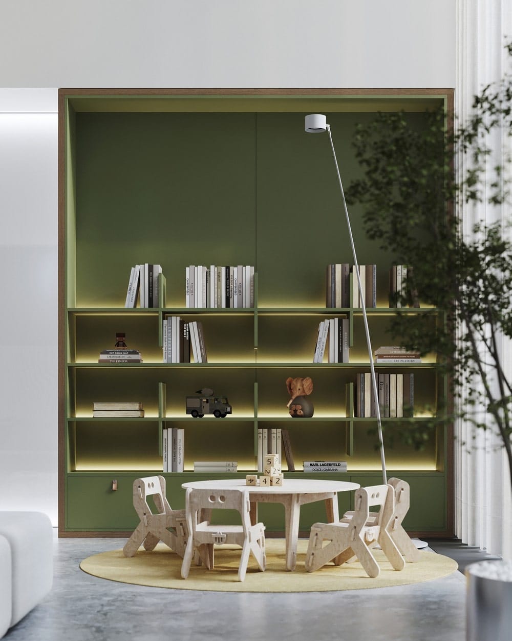
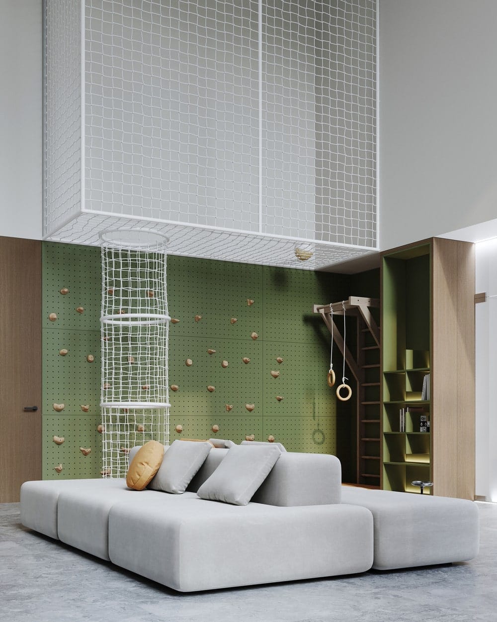
Amongst the facilities, there is a contemporary kids’ playground with access to the safe courtyard where the games can continue.
There are many public bathrooms for the residents and their guests
We also designed stylish parking.
Materials
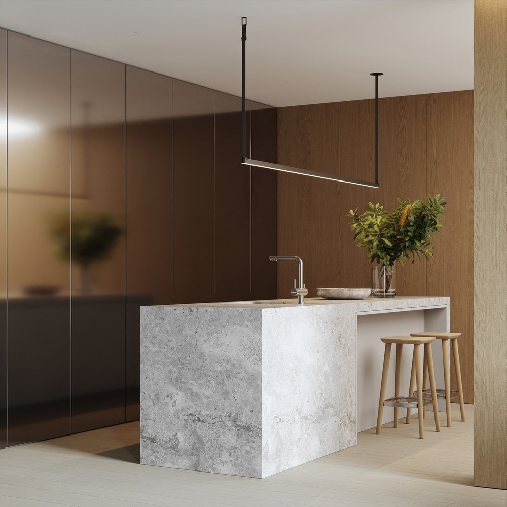
The stone used for the reception area and wall decoration to a certain level forms unique proportions for each zone and it gives the feeling of a monomaterial, uniting the entire space into a single whole.
We used wood partially for the walls and ceiling to visually unite these elements and make the space more enveloping and cozy.
Panoramic glazing brings the exterior into the interior, making the lobby architecture more holistic and complete.
The steel-framed columns provide a rich texture and, reflecting the rest of the materials and surroundings, are constantly changing. This enlivens the interior and makes it diverse. They visually lighten the interior and cease to be just a constructive element, organically fitting into a single composition with the mezzanine. It creates the feeling of steel rods that stretch the light sheet. This is how a dialogue between the interior and the improvement of the internal territory of the residential complex is born.
Metal is also used to decorate the coffee point, table in the recreation area, tree tubs, and partitions leading to the stroller area and bathrooms. This is the leitmotif of space. We used light sheets for a brighter metal tone.
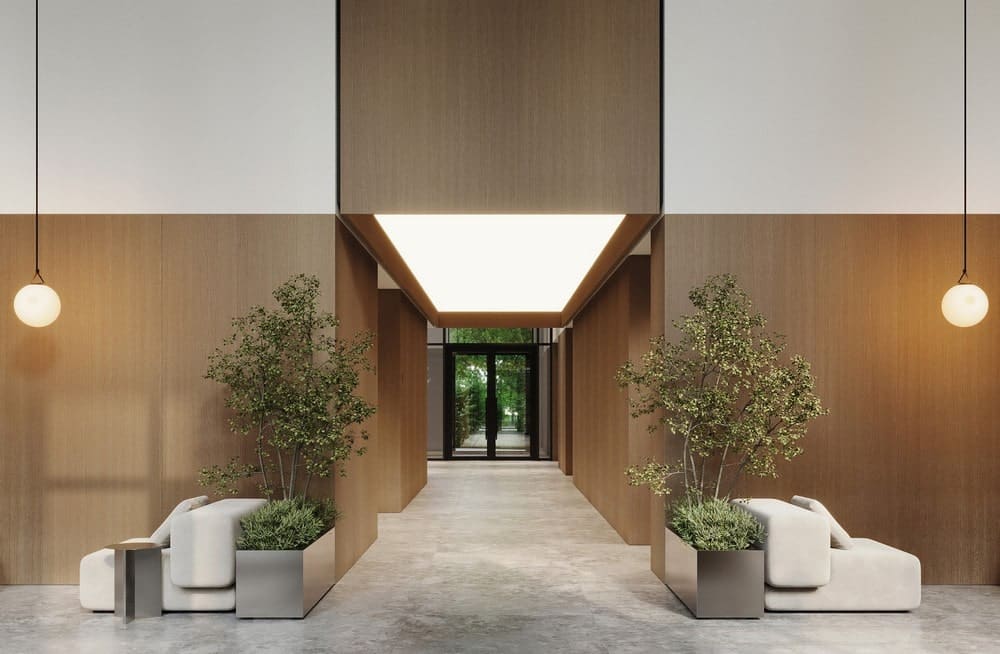
The interiors of the remaining zones conceptually continue the solutions in the lobby space. For example, the walls and floor up to the level of the courtyard entrances in the elevator halls and corridors are finished with gray stone and the walls above and the ceiling are made of natural light-colored wood.
Opposite the exits to the courtyard, we placed light panels that create a certain atmosphere and continue the idea of light screens in the lobby of the residential complex. It is expected that the application will be interactive for residents of the towers: everyone can set their own tone for the light screens. The ability to control color and ambience reinforces the feeling that this is their home. Of course, it will be necessary to provide boundaries and balance, for example, no more than 3 times a day for one person, so that the performance does not disturb other residents.
