Project: Renewed Classic Eichler Home
Architects: Klopf Architecture
Project Team: John Klopf, AIA, and Geoff Campen
Landscape Designer: Beth Mullins of Growsgreen Landscape Design
Contractor: Flegel’s Construction
Photography ©2015 Mariko Reed
Location: Sunnyvale, Silicon Valley, California, USA
Year completed: 2015
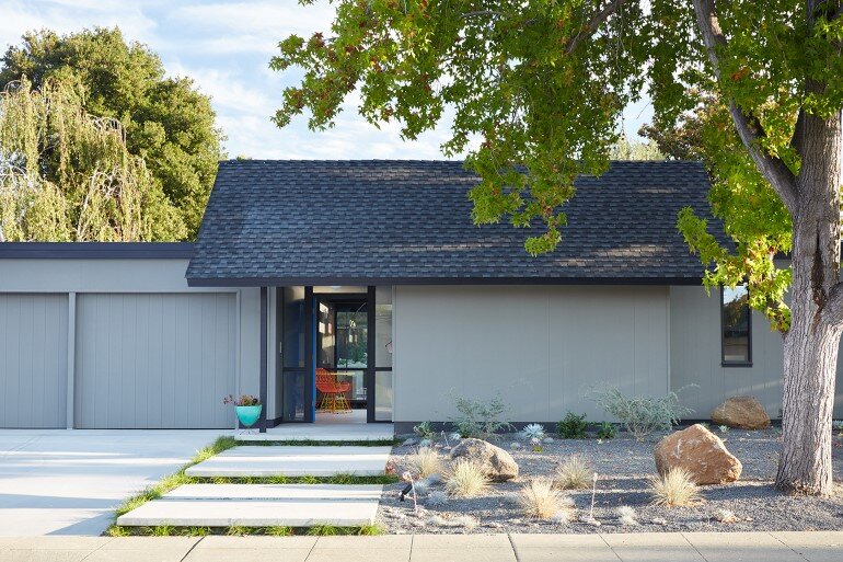
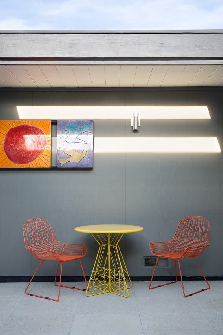
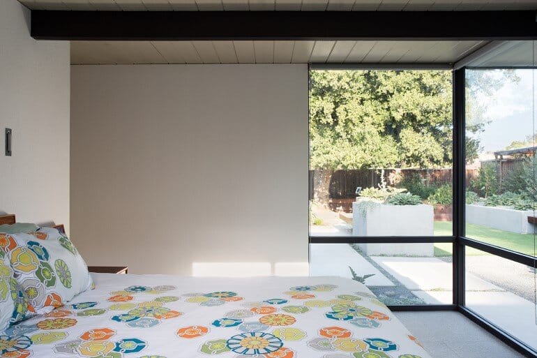
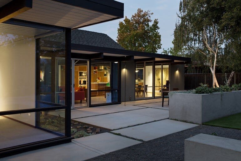
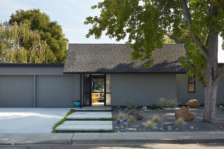
Klopf Architecture, Growsgreen Landscape Design, and Flegel’s Construction partnered to bring this mid-century atrium Eichler home up to 21st century standards. One owner’s mother grew up in an Eichler, which gave them a deeper appreciation for the style of the home (that same mother is also responsible for the Eichler quilt in the master bedroom photo).
They loved Eichlers, so while they wanted the house to work better for their family and provide a little more elbow room, they also dreamed of living in a colorful warm mid-century modern home with natural wood like the original Eichlers. They entrusted Klopf Architecture to respectfully expand and update the home, while still keeping it “classic”.
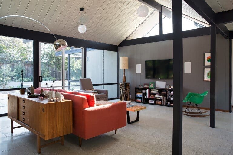
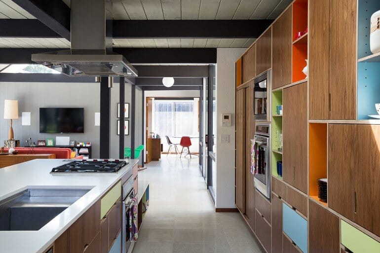
The Klopf team helped them open up the kitchen, dining, and living spaces into one flowing great room, expand the master suite, replace the kitchen and bathrooms, and provide additional features like an office and powder room, all while maintaining the mid-century modern style of this Silicon Valley home.
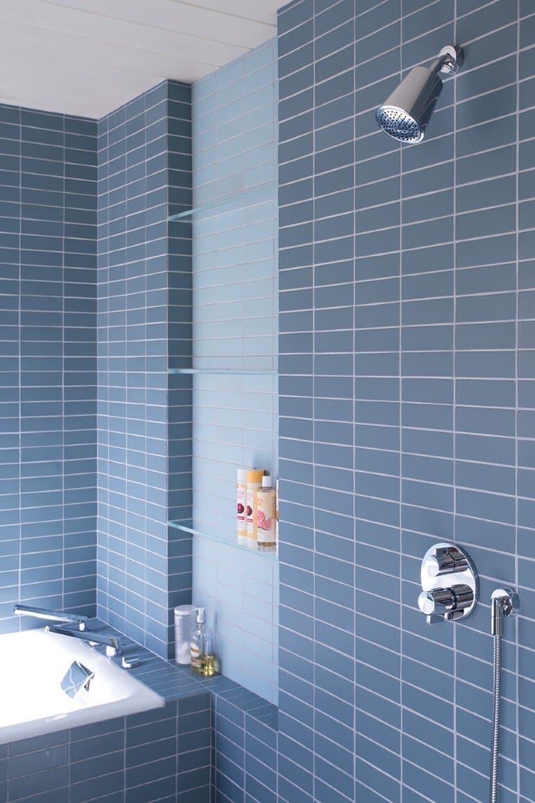
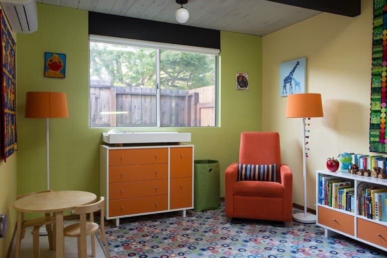
Together with the owners, Geoff Campen and the Klopf Architecture team carefully integrated elements and ideas from the mid-century period without making the space seem dated. Colorful panels on the cabinetry (by Kerf Design) harken back to the Mondrian reds, blues, and yellows in some original Eichler cabinetry. Colorful tiles (by Heath Tile and Fireclay Tile) in the bathrooms tastefully bring brightness without seeming dated. Concrete floor tiles make for a high quality floor reminiscent of the original “unfinished” looking concrete slabs.
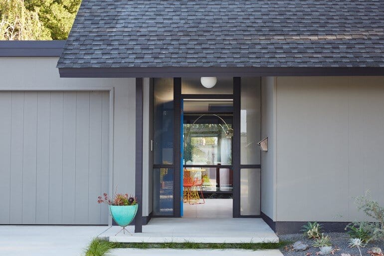
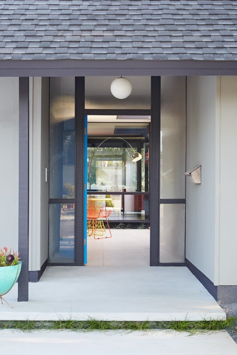
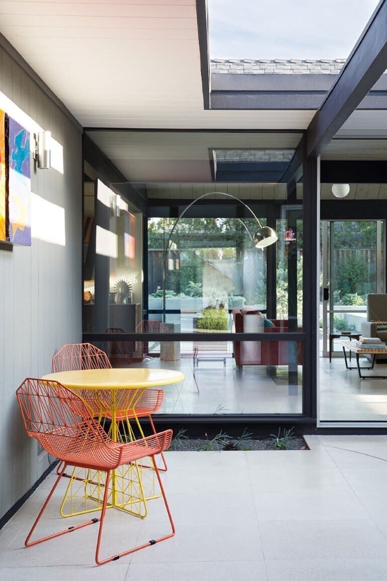
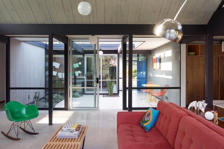
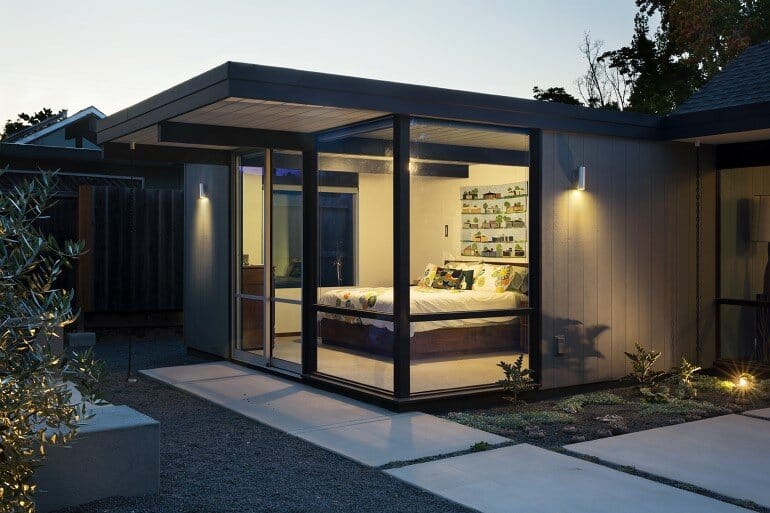
Silver-color aluminum doors contrasting with dark beams and window trims reflect the original Eichler color palette. The ceiling boards in the addition were stained to match the existing white-washed ceiling, and the original siding still continues through the house from outside to inside to out in the living room and atrium, even at the master bedroom addition. And of course the Klopf team kept the indoor / outdoor feeling of the house with floor-to-ceiling windows and doors connecting the house to the atrium and rear yard.
Hopefully this updated classic will stick around for generations to come!
Thank you for reading this article!

