Project: The Grey House
Interior Design: GA design
Principal Designer: Ritu Goregaoker
Location: Oberoi Exquisite, Goregaon East, India
Area: 3000 SFT
Completed: October 2022
Photo Credits: Prashant Bhat
On the 46th floor of a Mumbai High Rise, The Grey House is the abode of a young couple, their daughter, and their shih tzu Mango.
Being prior clients, they came to us with a lot of trust and faith that we would be able to give them their vision of a stark, minimalistic home. Open spaces, white walls and only the bare necessary furniture.
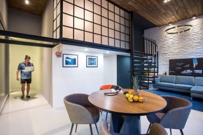
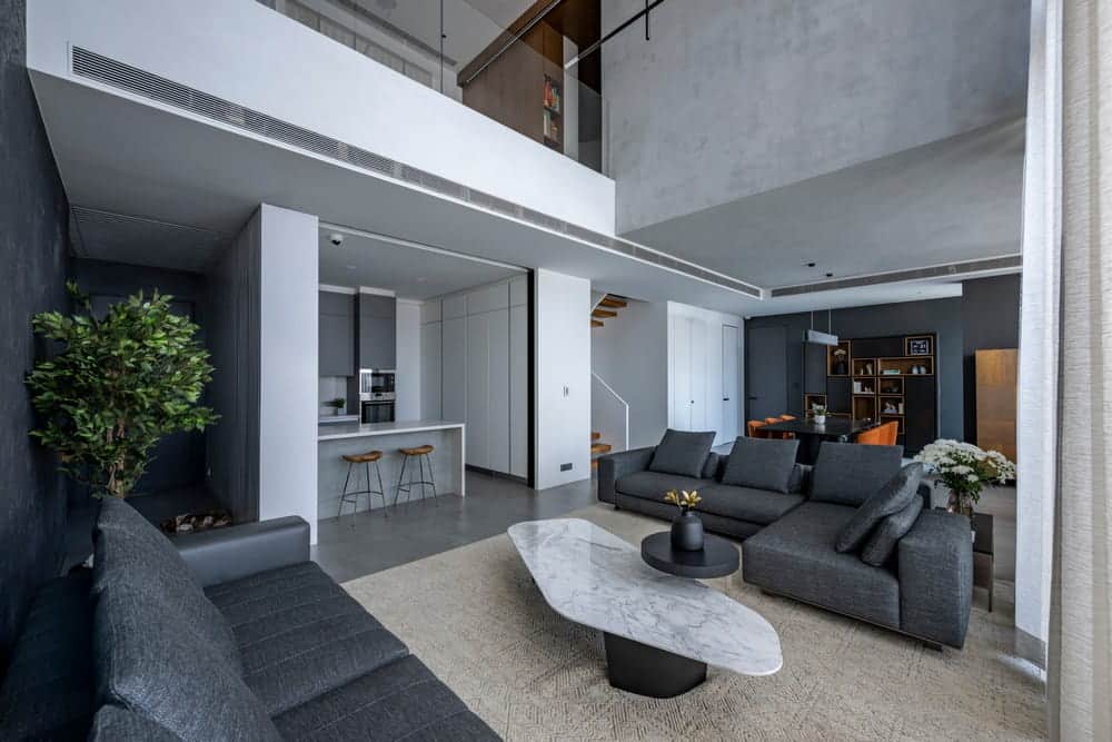
The planning stage took a while because we wanted to give space to the living and dining area. The double height living room is followed by the dining area, a corner dedicated to the bar unit and the opposite corner to the mandir, whose location was determined as per vastu.
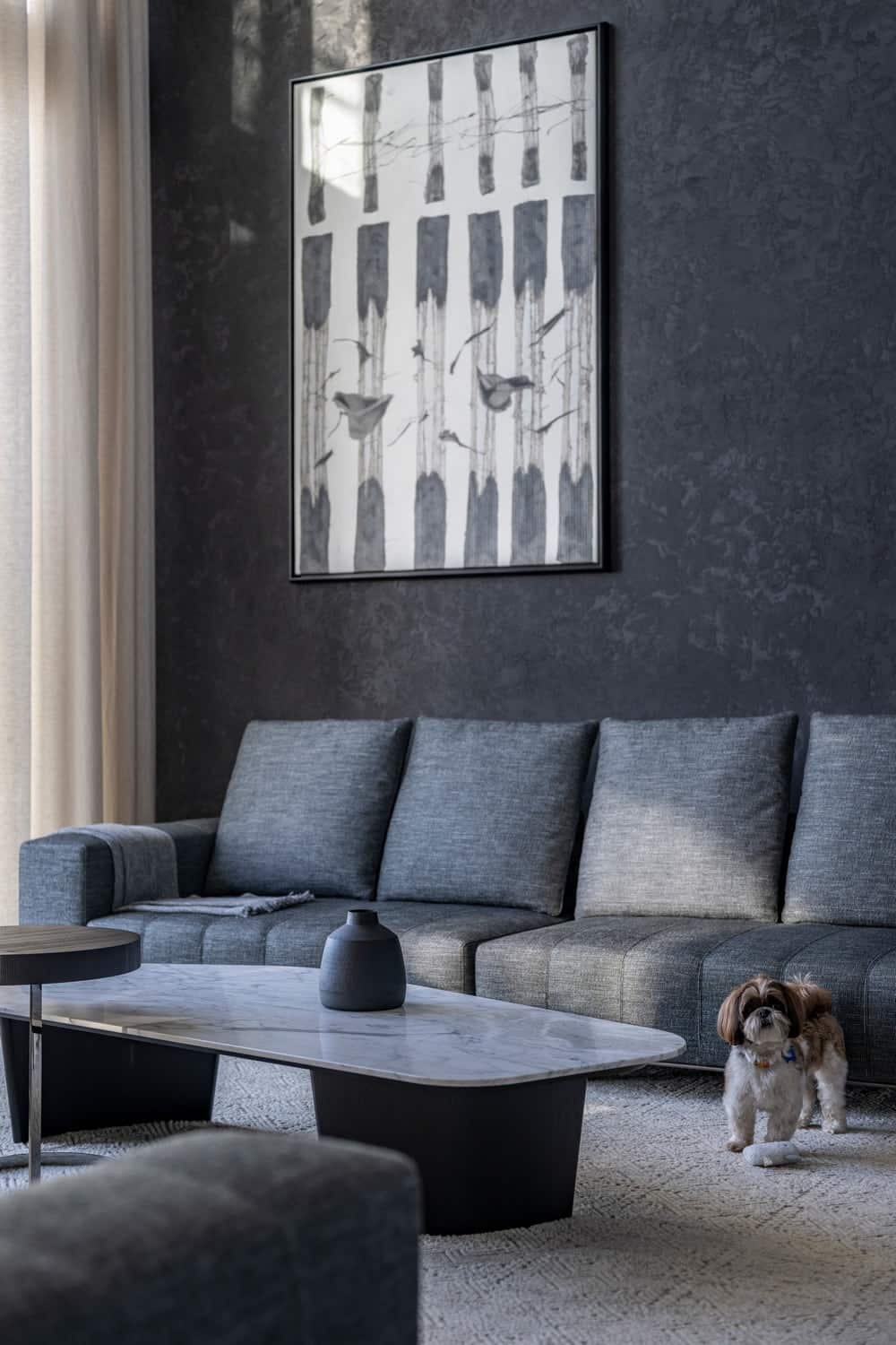
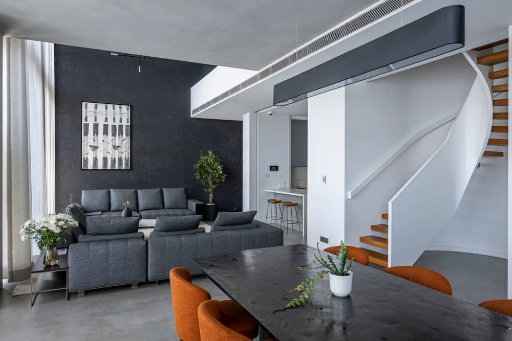
As you enter the flat from the main door, a short passage leads you to the double height living room with the double height wall in black texture. Holding pride of place is the Art by Yusuf, in an off centered setting.
To the left is the open kitchen, which is open most of the time, except when entertaining. The kitchen can be enclosed with a 10’ high aluminum sliding panels with fluted glass. In the open form it slides behind a panel and is completely invisible.
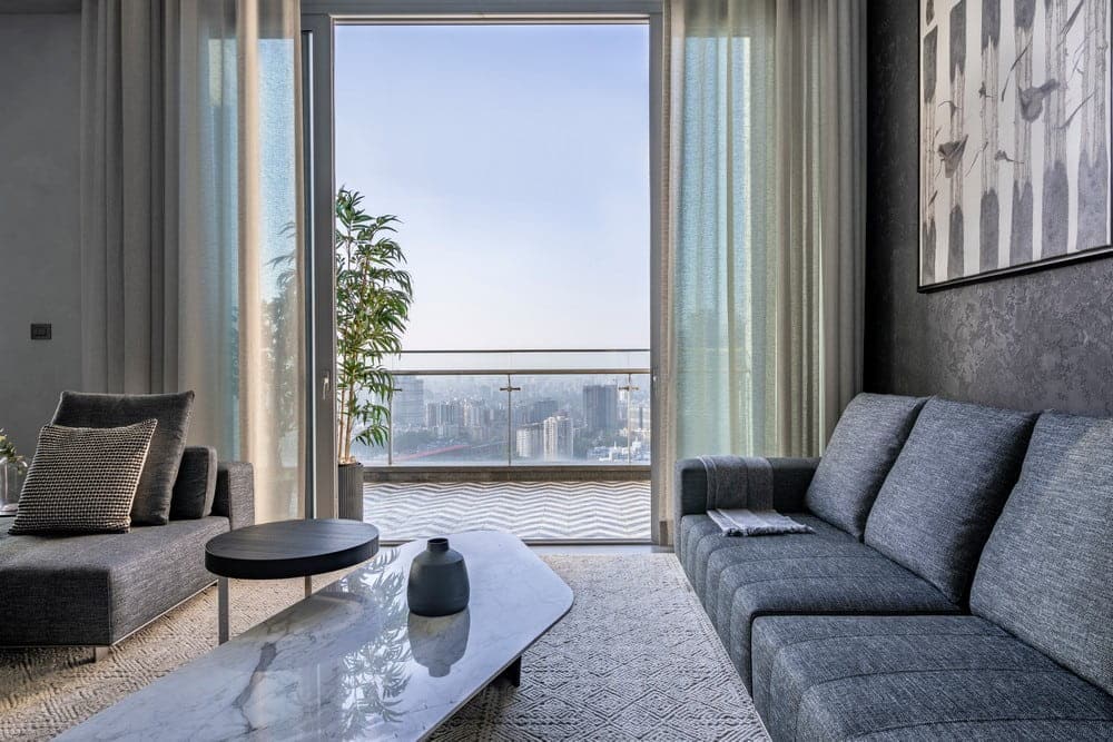
The living area opens out to the open to sky balcony. The balcony has a very interesting chevron patterned black and white tiles. A favorite place for sundowners and morning yoga for the family.
From the living room we move on to the dining area. This area is peppered by very interesting pieces.
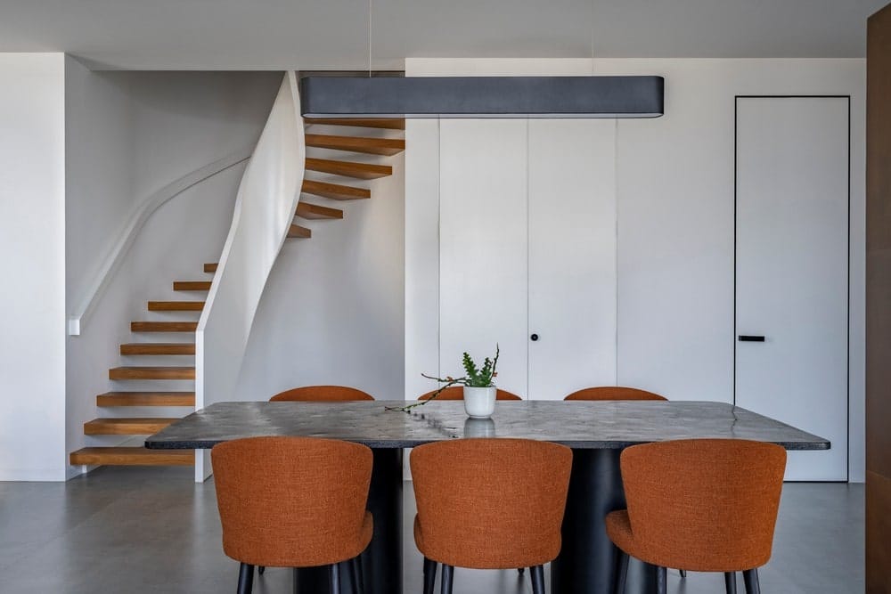
The dining table, designed in-house and specially customized for us by RIZO, has amber color crystals embedded in a carbon platform, with a black metal cylindrical base. The bar unit is also unique. Cladded completely in brass panels of varying sizes, where the metal has been oxidized to different levels in a chemical solution and then PU coated to prevent any more oxidization, the unit is a statement piece!
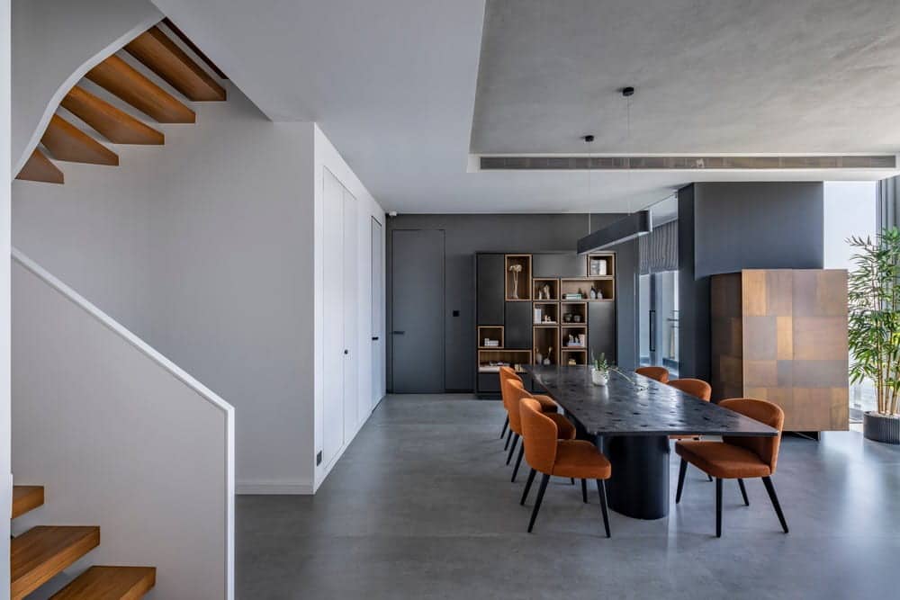
On the opposite corner is the mandir. Resonating with the sliding kitchen doors, the mandir also has pocket doors, which when in use slide inside leaving the space open without any obstruction for prayer. The doors are made in black color frames with fluted glass panels. When in the closed position, it escapes the eye as the outside is in the same grey concrete texture as the walls around it.
The dining unit is a simple combination of open shelves and storage (for crockery and miscellaneous items) finished in black pu color and natural finish teak veneer.
For this project, given the minimalistic look we wanted to achieve, we decided to treat the doors in a different way where we only see a minimal groove instead of the full door frame. These specialized door frames and shutters were supplied by WALTZ doors. When finished it provided a seamless look to our white and black walls.
Another interesting feature of this house, which normally is barely noticed, is the skirting. Normal procedure is to use as skirting the same material we use for the floor, in this case, concrete finish tiles. Not wanting to break the seamlessness of our walls, we decided to go outside the box and change the skirting material for each wall as per need and color. So, the white walls have a white tile skirting, whereas the black walls have a black tile skirting. The concrete texture walls have concrete finish tile skirting.
The kitchen is completely modular from FCML – Ernestomeda – an Italian company. The look goes with the overall look and blends with the outside look and feel.
The furniture from MINOTTI – Italy and carpet from OBEETEE complete the minimal look we wanted the house to reflect.
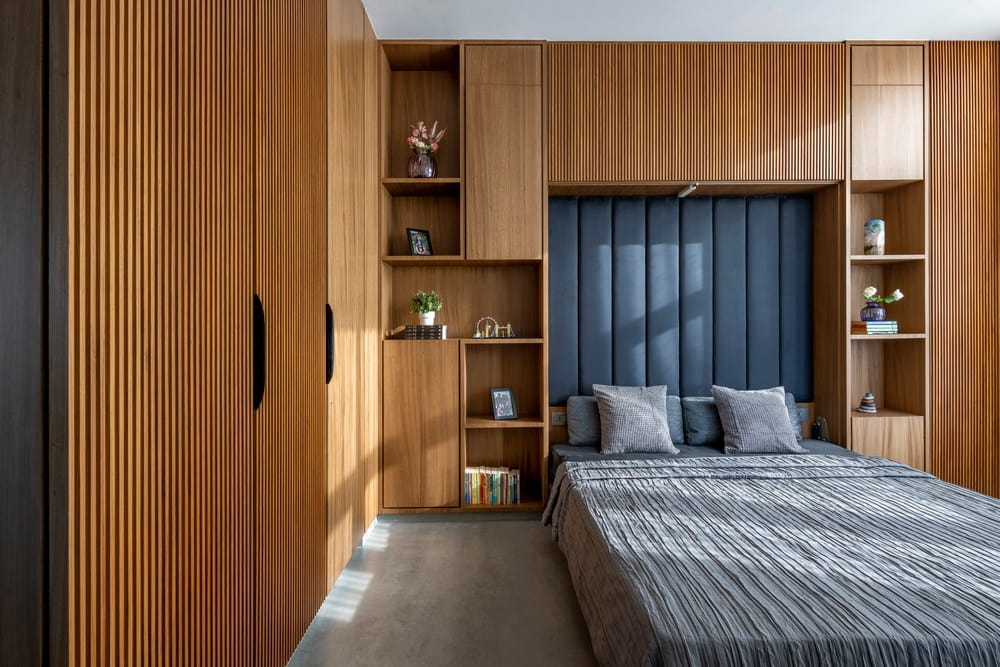
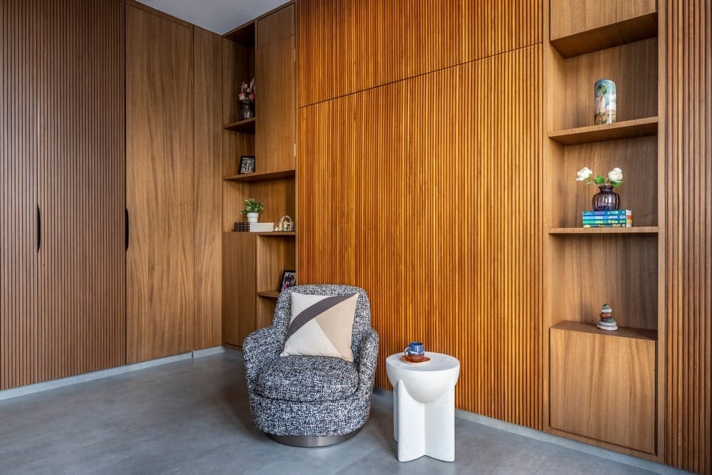
From the dining area we enter the guest bedroom with a murphy bed. This room is a multipurpose room, where kids have their play dates, read a book, and listen to music. When the family has guests, the bed is pulled down to be used as a proper king sized bed for visitors. With ample storage space, this wall which houses the murphy bed is also designed to hold travel memorabilia from the family’s vacations, Lego pieces which the family is fond of making together, stone collections and of course books! The look is seamless when the murphy bed is closed with the façade interspersed with veneer and wooden flute cladding in teak wood and teak veneer.
The attached bathroom is a special favorite with guests visiting their home. In terrazzo and concrete finish tiles, it carries on the overall theme from the living but with a dash of vibrancy provided by the terrazzo. The mirror designed in a black frame adds to the drama of the bathroom.
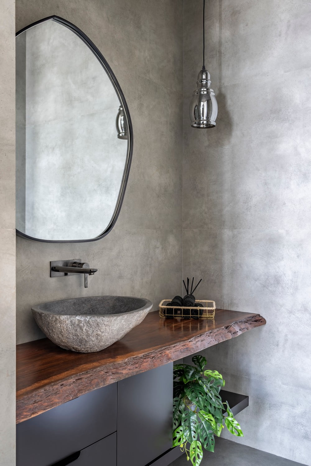
The powder bathroom which opens from the dining area is completely made of concrete finish tiles on the floor and wall cladding as well. The counter stands out in a live edge wood with a black stone wash basin. The mirror design here is amoeba shaped giving some fluidity to the rigid structure of this space.
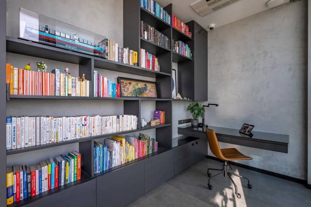
To the right side of the dining area, is a glass door leading you to the study area. With natural light flooding in through out the day, this space is apt for working from home, zoom meetings and classes and accounting! One wall is designed with shelves from edge to edge to house the countless book collection of the family and organized with color coding! The concrete tiles flow into this area as well with concrete texture paint on all walls.
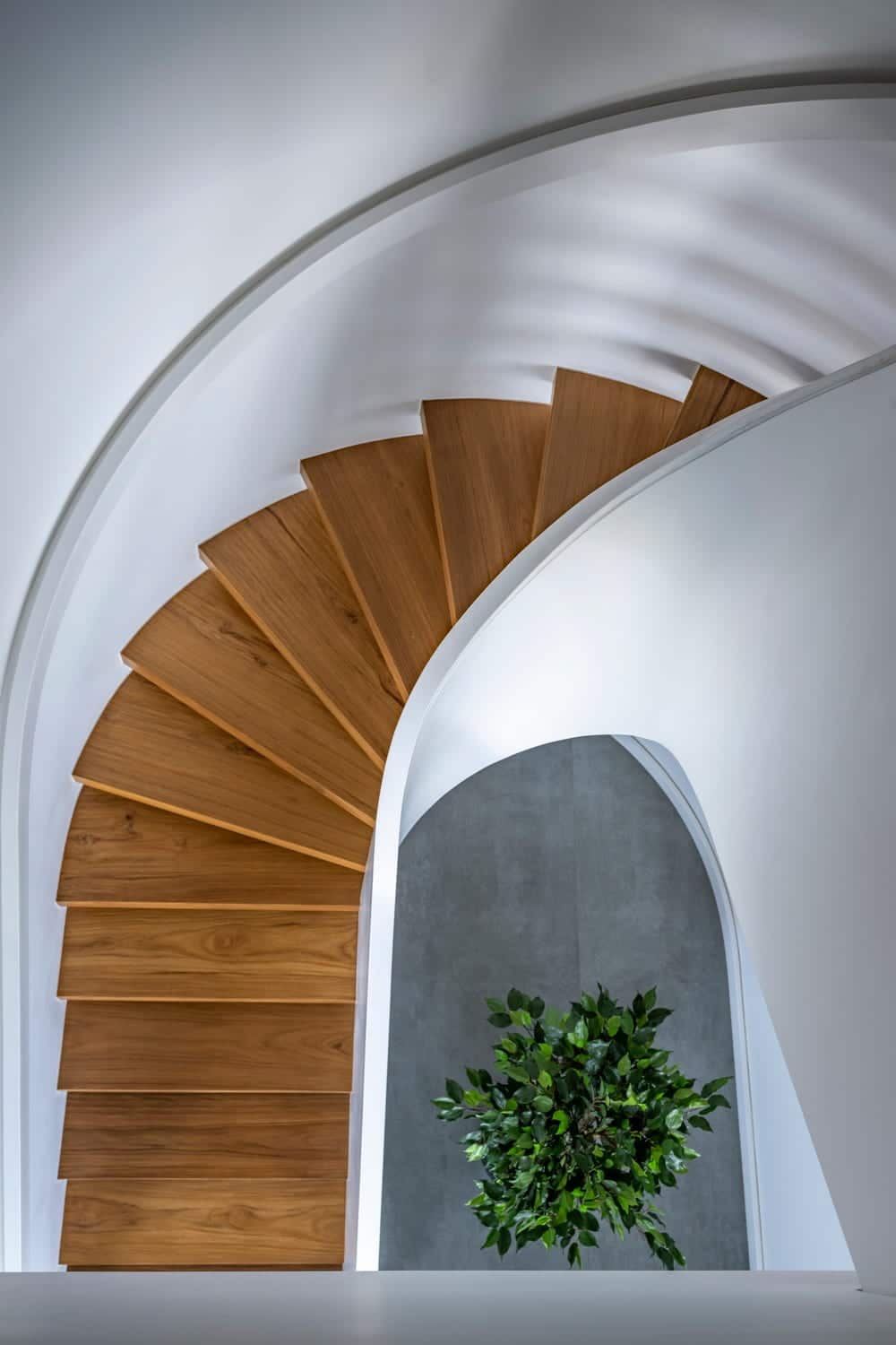
Leading from the lower level to the upper level is the staircase. Space constraints and a good slab height led to various permutations and combinations on how to fit the staircase, which is comfortable, sturdy and timeless. A metal plate was embedded inside the circular wall from which came the metal treads, which were clad in real teak wood. The metal plate was camouflaged with Plaster of Paris cladding making the treads appear floating from the walls. A simple railing was made in white Corian to adhere to the simplicity of the house. The staircase also is the starting point of the transition in the floor from concrete tiles to wood.
As you reach the upper floor, the transition of the flooring which started in the lower level from the stairs in wood, continues to the upper level, where the whole upper level is in real wood flooring from HAVWOODS. Here we have the family room – overlooking the double height living room, the master bedroom and the daughter’s room. The family’s private space.
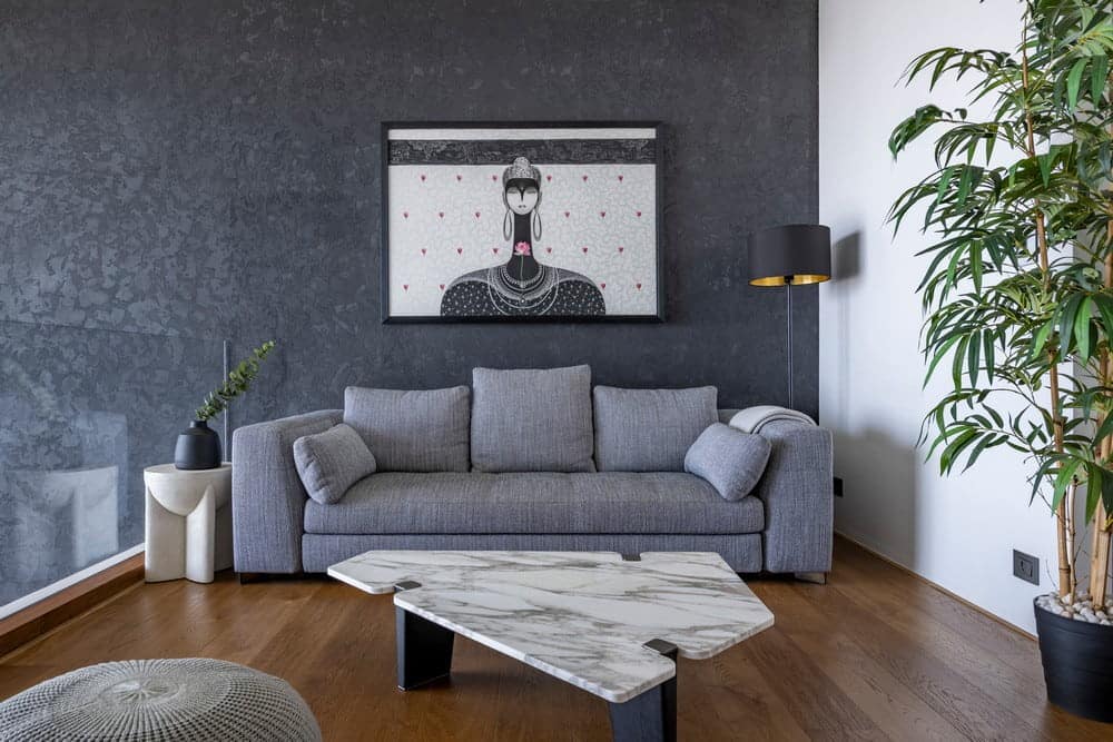
Many a Saturdays are spent lounging on the Blazer – MINOTTI sofa in the family room, watching whatever catches their fancy on the huge projector screen. With a full pantry upstairs and a coffee machine, the need to venture down on weekends is only for the big meals. Also very prominently displayed is artist Sanjay Kumar’s representation of The Buddha.
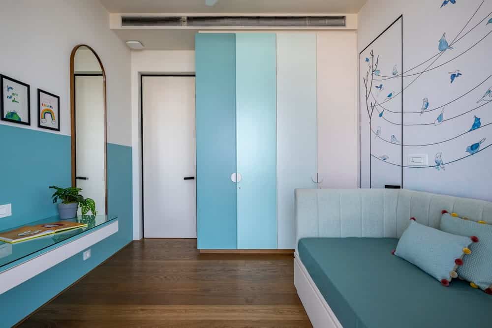
The daughter’s bedroom, as the young age of 9 suggests, sports her favorite shades of color, with a single bed against the wall, the room is kept open for space that children need for their various activities. The wall behind the bed has custom designed and printed wallpaper, giving the room a gentle and soft look.
The study table and the vertical storage have ample space for her individual book collection! The bathroom again is in soft pastel color tiles in varying shades of blue and green as is her room, a terrazzo counter and beige matt tile flooring.
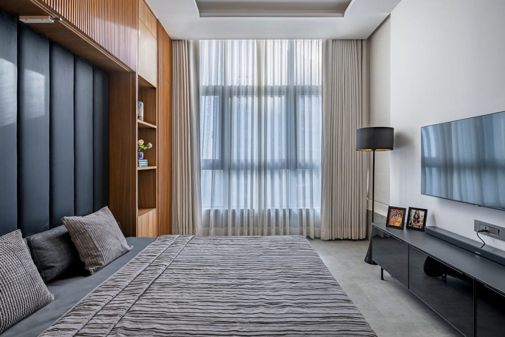
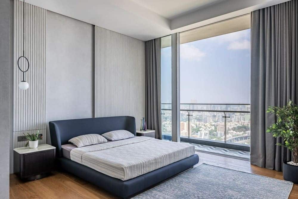
The master bedroom is extremely bare and minimalist with just the Reeves – MINOTTI bed in dark blue fabric. With all the walls in a concrete texture, the cupboards are in white matt finish back painted glass. The bed backdrop actually has a lot of storage space behind, which is cleverly camouflaged in fluted panels which slide to open up the storage when needed. On the left, the fluted panel also camouflages the duct shutter behind. This panel is also sliding, to be used when needed for maintenance purposes.
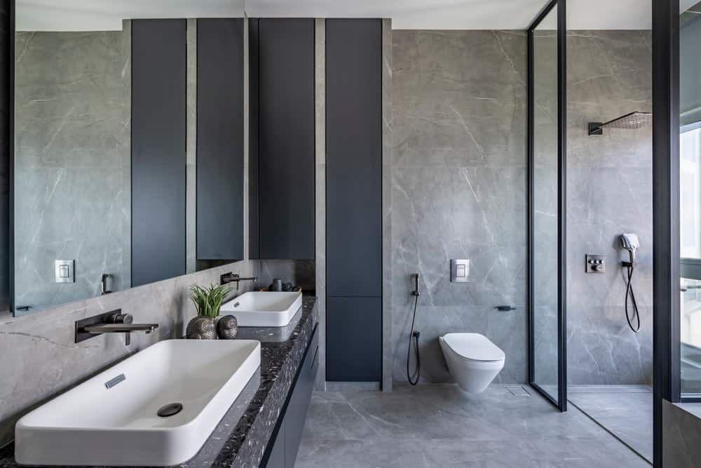
The master bathroom is completely made of grey matt tiles from Nexion and a black artificial marble counter. A large space with a bathtub and shower area, the bathroom is luxurious but minimal.
This home for a family of three plus a very lovable dog, is very contemporary and chic, minimal and serene. But though the look is minimal, the attention to detail and fruition of simplicity is maximum.
