LLI Design have recently completed their Southwood project, a total interior design and refurbishment of a 4 story 1970’s London townhouse. The project has been awarded “Best Interior Design Private Residence London” in the UK Property Awards – 2015 / 2016.
The Southwood house had tremendous potential and the new owners, a young professional couple, wanted to embrace the 1970’s feel, rather than try to ignore it, albeit not in a cliched way. Top of their wish list was a contemporary glass and steel open tread staircase and a master bathroom with a distinctive WOW factor. Although the room sizes were good, being the full width of the property on each floor and benefitting from good natural light; the circulation spaces on all floors were cramped and dark.
Lower Ground Floor
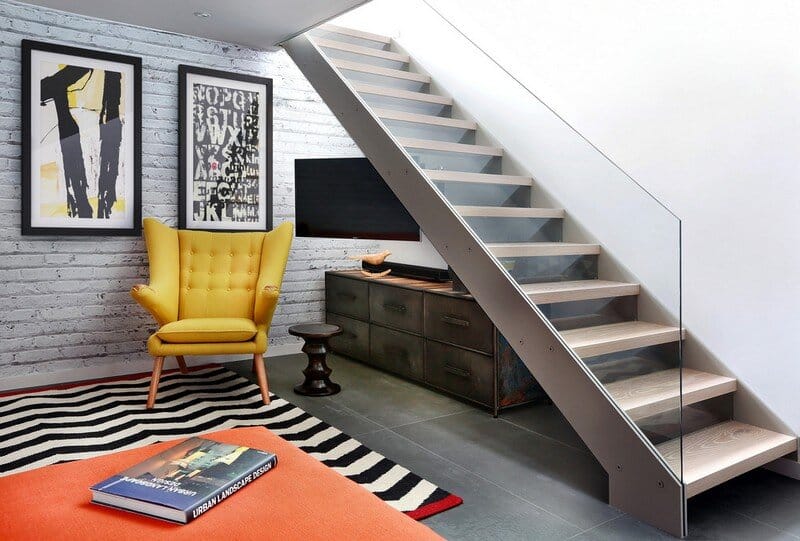
The existing staircase that led from the lower ground to the upper ground floor, was removed and replaced with a new, feature open tread glass and steel staircase towards the back of the house, thereby maximising the lower ground floor space. All of the internal walls on this floor were removed and in doing so created an expansive and welcoming space.
Due to its’ lack of natural daylight this floor worked extremely well as a Living / TV room. The new open timber tread, steel stringer with glass balustrade staircase was designed to sit easily within the existing building and to complement the original 1970’s spiral staircase.
Because this space was going to be a hard working area, it was designed with a rugged semi industrial feel. Underfloor heating was installed and the floor was tiled with a large format Mutina tile in dark khaki with an embossed design. This was complemented by a distressed painted brick effect wallpaper on the back wall which received no direct light and thus the wallpaper worked extremely well, really giving the impression of a painted brick wall.
The furniture specified was bright and colourful, as a counterpoint to the walls and floor. The palette was burnt orange, yellow and dark woods with industrial metals. Furniture pieces included a metallic, distressed sideboard and desk, a burnt orange sofa, yellow Hans J Wegner Papa Bear armchair, and a large black and white zig zag patterned rug.
Upper Ground Floor
Living Room
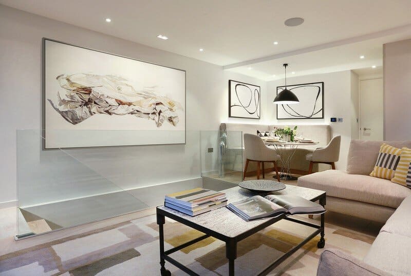
The mood changes dramatically on entering the upper ground floor, here the owners wanted a relaxed feeling of calm. The colour palette for this floor was soft cream, yellow, and pale blue with key accent pieces in black. The visual impact of the new staircase was kept to a minimum by installing a glass balustrade with no handrail. The furniture choices were kept quite simple as this room had to function as a dining area as well as a living room.
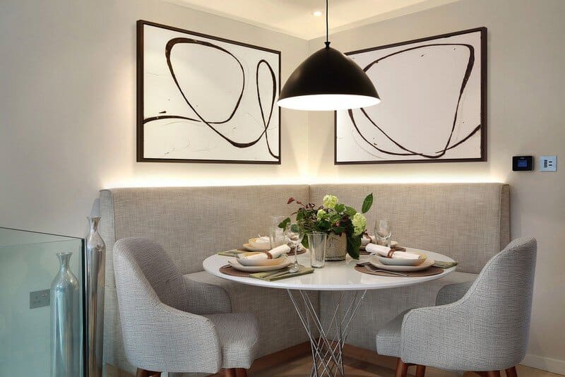
A bespoke fitted banquette was designed for the return besides the staircase, adjacent to the kitchen. This was lit from behind with LED strips, throwing a gentle light up the wall. Adding a round table, 2 dining chairs, a matt black accent pendant lamp over the table and artwork above helped to define the dining area. Although it had a small footprint the dining area can comfortably sit 6 people. Furniture choices for the living area were kept simple with a generous L shaped sofa and an industrial styled coffee table, this sat on a delicately coloured yellow and grey rug. As a counterpoint to this a rich teal coloured velvet accent chair was placed in the window near the garden. A retro matt black metal floor lamp complemented the matt black pendant lamp over the dining table. Strong pieces of artwork and graphic cushions help bring the separate zoned areas together to form a cohesive whole.
Kitchen
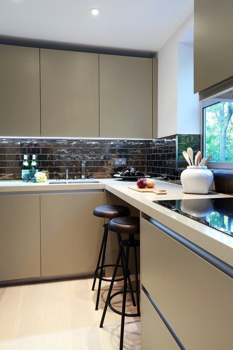
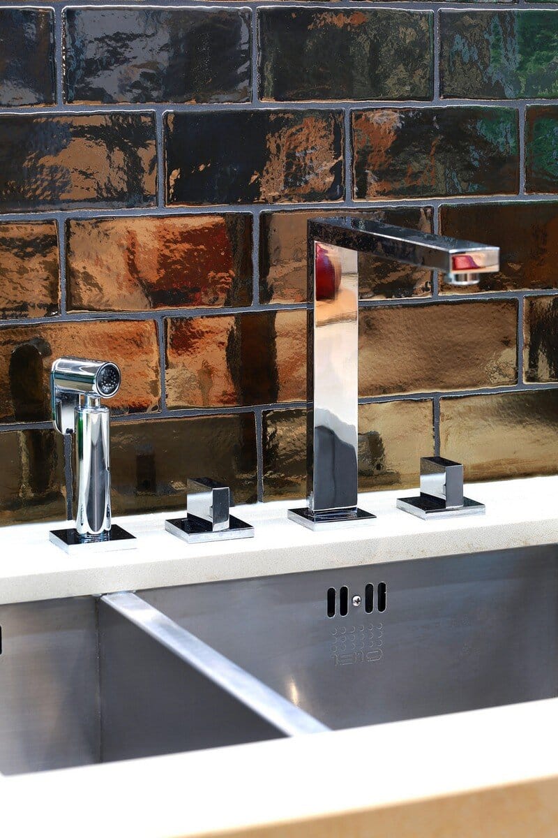
Calming hues were repeated in the kitchen, with pale khaki units and a cream composite worktop. A small breakfast bar was added and dramatic dark bronze tiles created a backsplash between the top of the counter and the bottom of the units.
First Floor
Shower Room
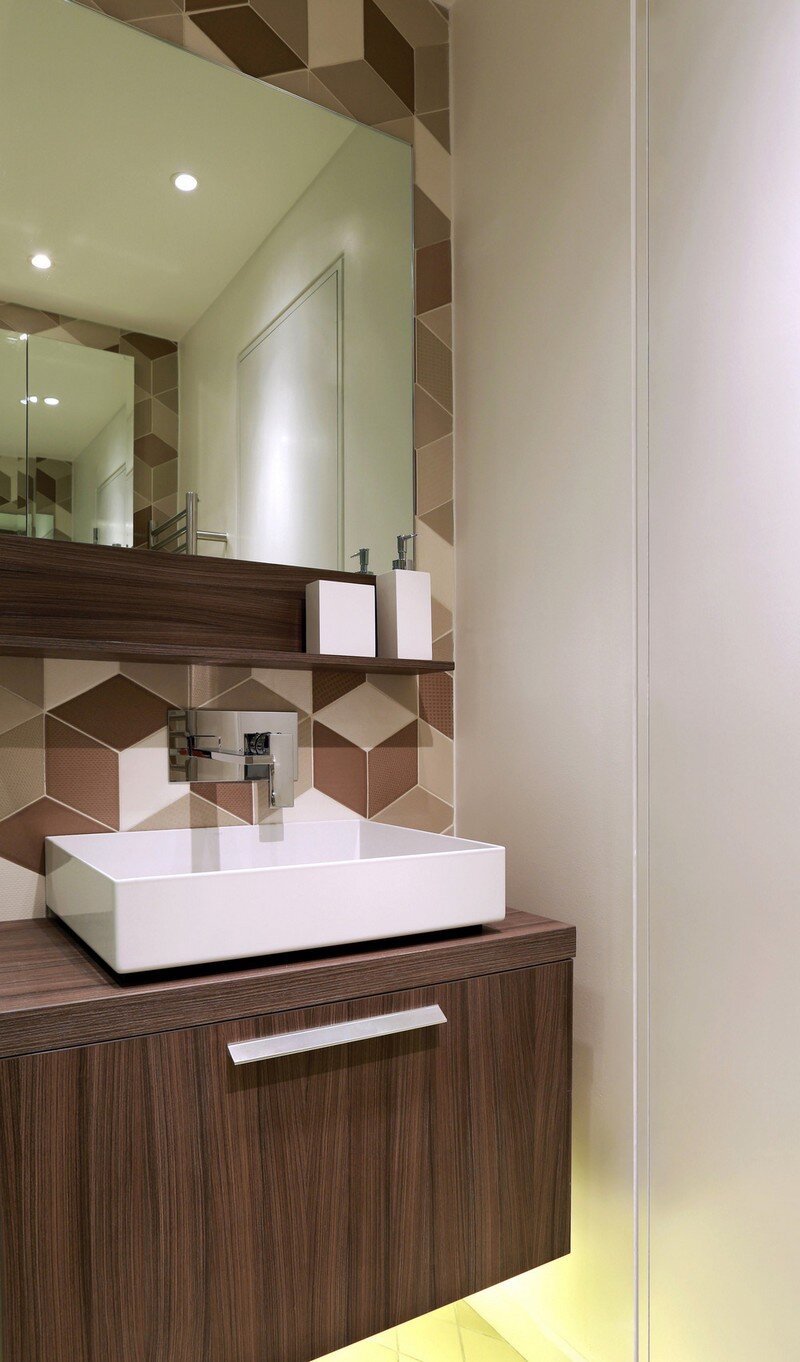
The first floor shower room was specified with a huge shower, the full width of the room, with statement diamond shaped embossed tiles in tones of cream, cappuccino and chocolate. An LED underlit wooden vanity unit and mirror finish the dramatic look.
Second Floor
Master Suite
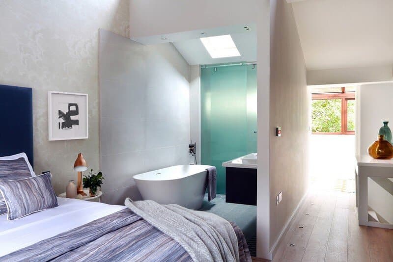
The second floor was reconfigured from a series of separate rooms into a stylish master suite, with an open plan bathroom featuring a statement freestanding bath.
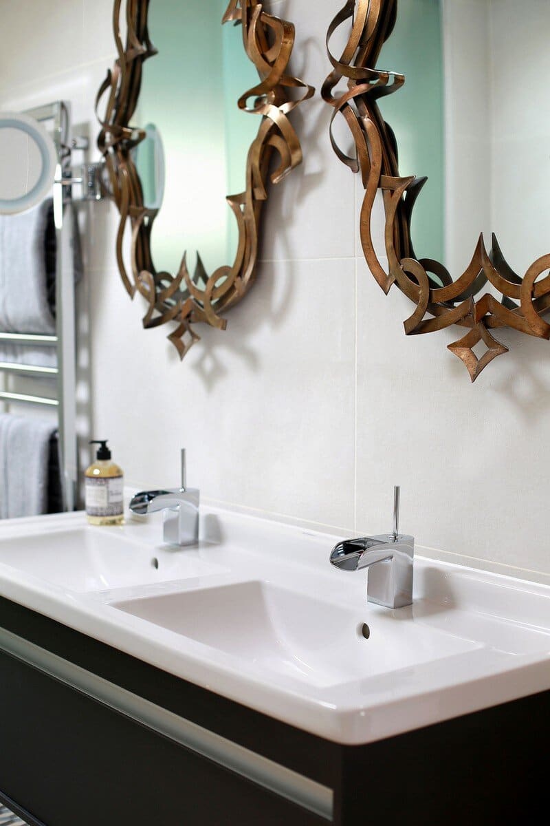
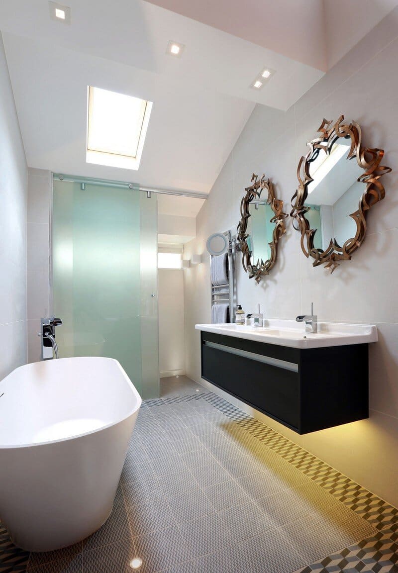
The open plan bathroom sits comfortably adjacent to the bedroom with textured porcelain wall tiles sitting easily next to the Cole & Son Fornasetti “Clouds” wallpaper. Patterned floor tiles act as a counterpoint to the to the pale timber wide plank flooring. As the bathroom was open plan it was important to bring a more “bedroom” aesthetic into the bathroom rather than the other way round and this was achieved by selecting floor tiles in the bathroom that were in the format of a rug pattern as well as adding 2no. bronze mirrors over the vanity unit. A freestanding bath was positioned facing the bedroom, offering views of the garden beyond and an opaque glass sliding screen was installed between the WC and bathroom. An LED strip under the vanity unit, additional wall lights and small in-floor uplights around the bath completed the look. The bathroom area appears bigger than it is thanks to its open plan nature. Via v2com
Interior Designer: LLI Design
Project: Southwood House
Location: Highgate, London, UK
Photographer: Alex Maguire
Thank you for reading this article!

