Project: 2 Story Apartment Renovation
Interior Design: Meital Zimber
Location: Tel-Aviv, Israel
Area: 140 m2
Year 2023
Photo Credits: Idan Gur
After 25 years of living in the same house, a couple in their 50s, from Tel-Aviv, Israel, decided it was time to renovate their family home and adapt it to their new needs. They turned to interior designer Meital Zimber after visiting a house she designed and fell in love with it. Now, she shares the trends in the design and planning of their newly renovated home.
Usually, when the children are all grown up and ready to leave the nest, it triggers many parents to consider redesigning their beloved home, adapting it to a new reality. In the case of a couple in their 50s with four children, two of whom have already left, and the remaining daughter and son still living with them, the entire house was renovated.
The major change in the layout occurred on the upper floor, where four bedrooms were transformed into two spacious and luxury suites – one for the growing daughter and another for the parents.
“The entire public area was renovated and upgraded, but we were particularly focused on the arrangement of functions. The son’s bedroom on the ground floor was renovated just a month before, and the workspace was converted into an art studio primarily used by the family’s artist mother.”
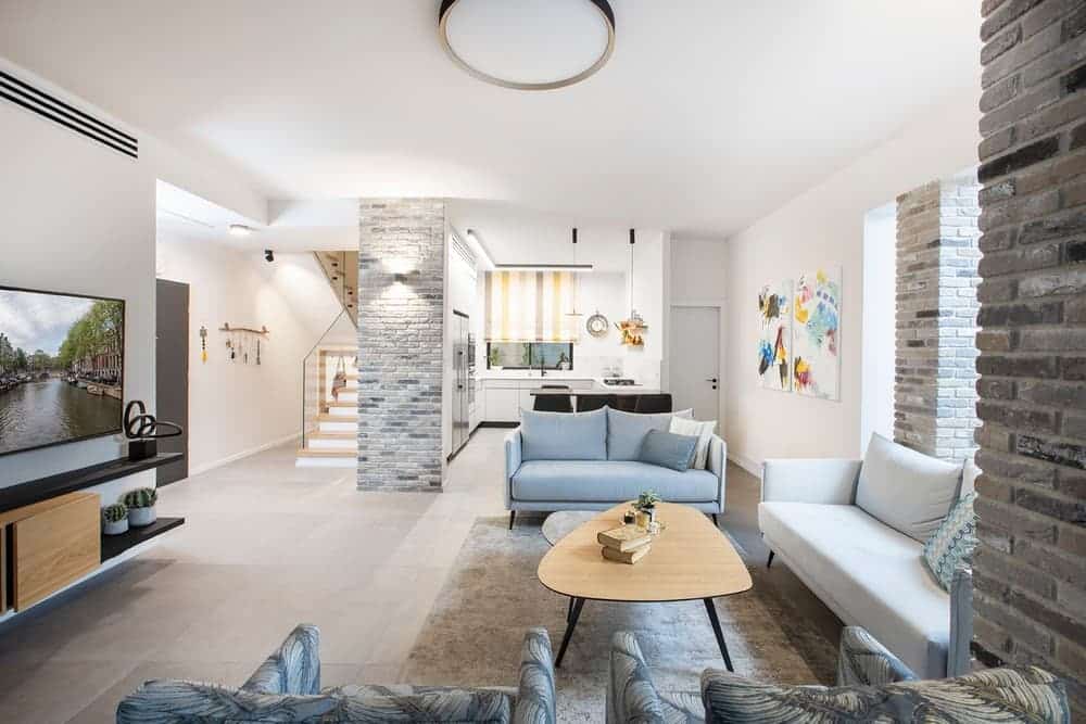
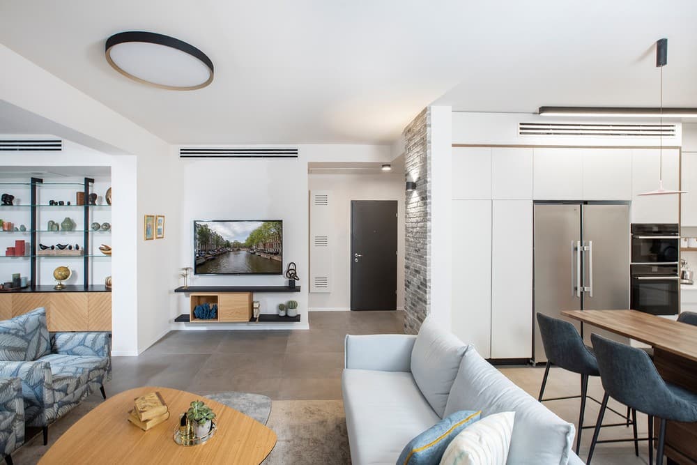
“The couple loves to entertain, so creating an inviting space with clean lines, incorporating elements and items made of wood to add warmth was crucial. They also wanted to maximize storage space, and we carefully considered solutions for that in each space.”
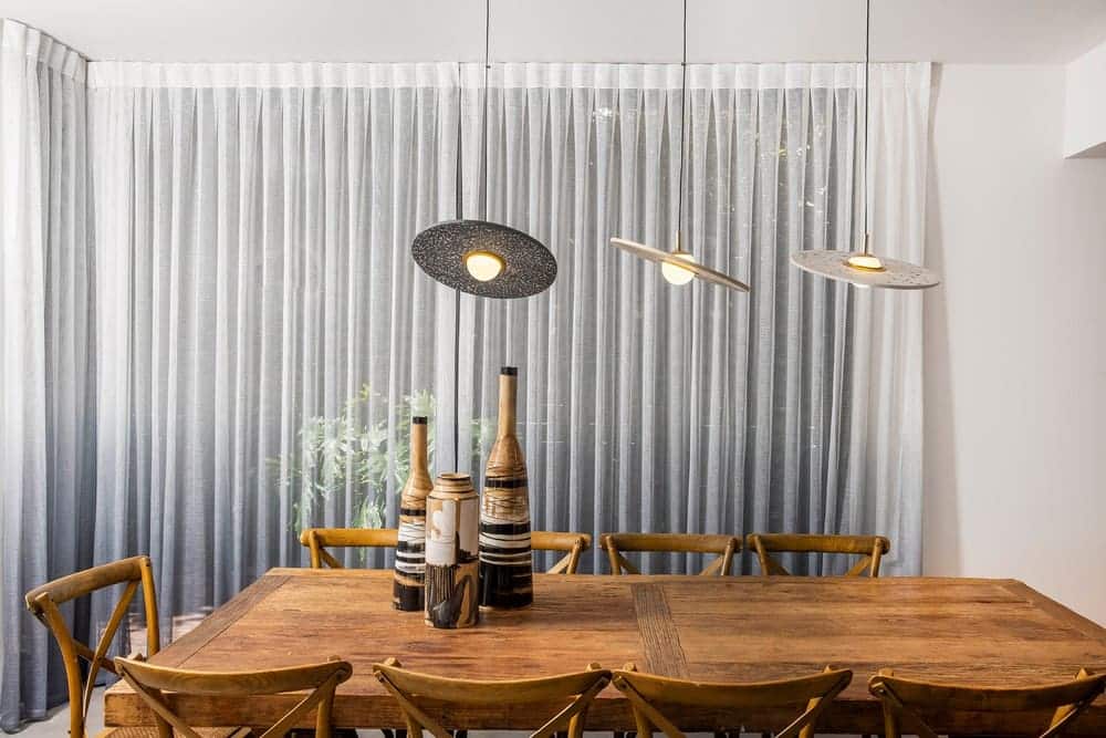
“The family’s desire for a complete renovation has turn this amazing project to a white canvas. There was one main element that that we’ve decided to preserve was the dining room, which is the place in the apartment where the family used the most and connected all the members of the family.”
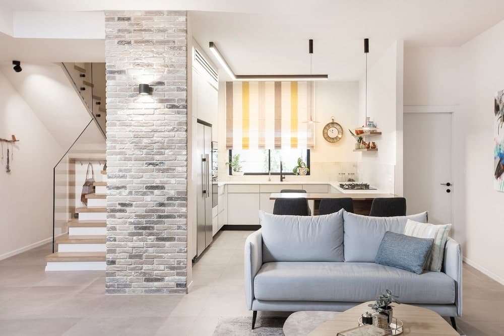
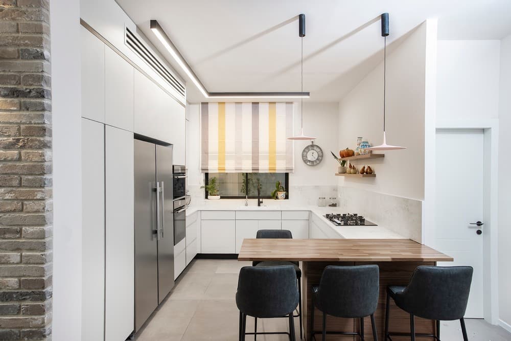
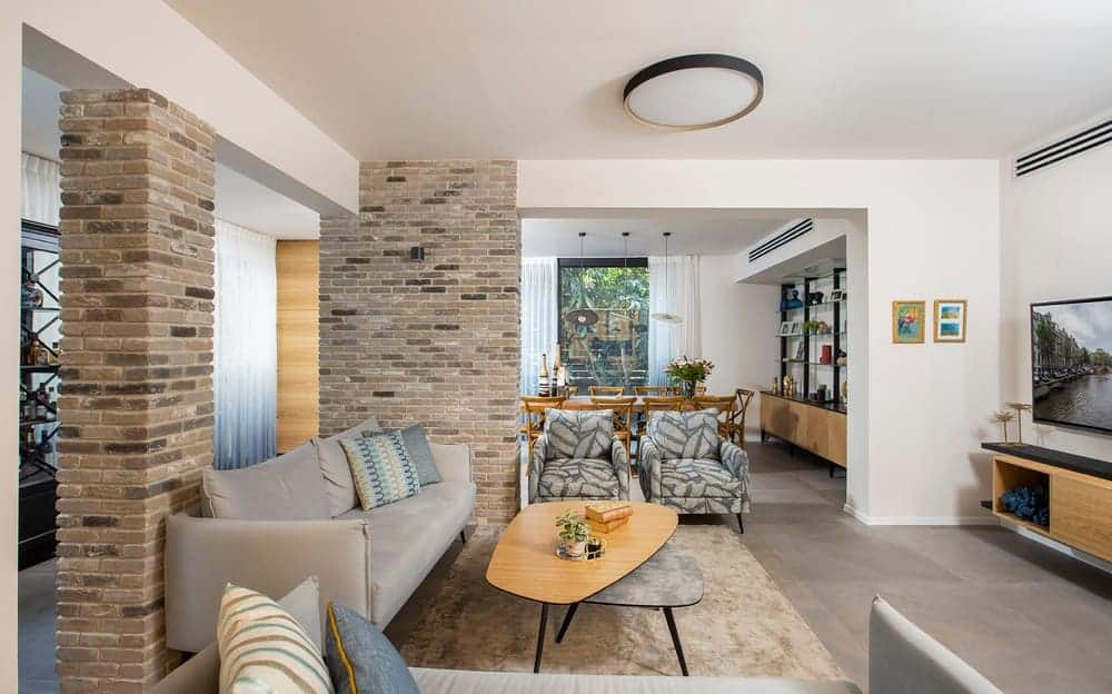
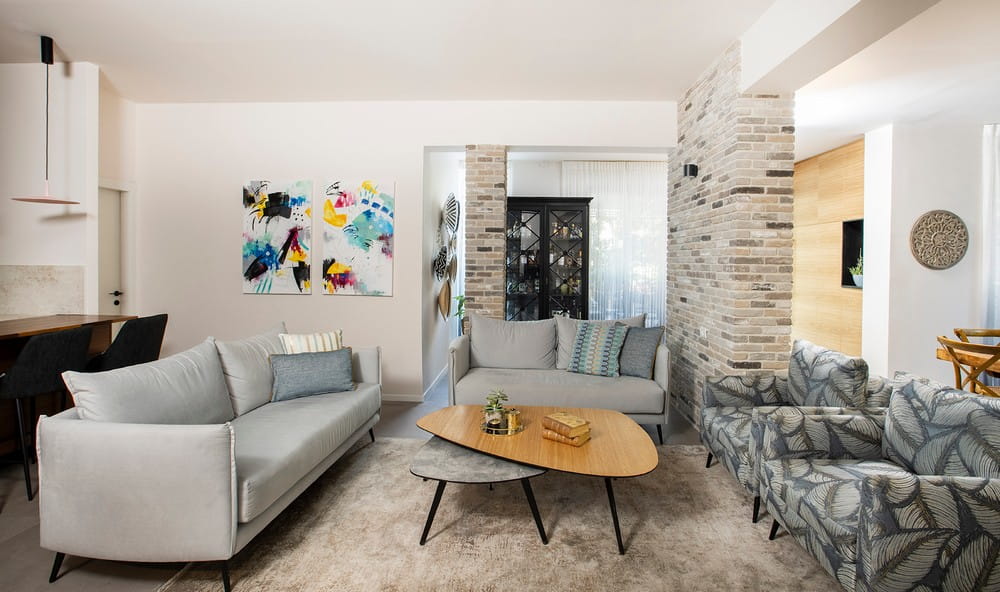
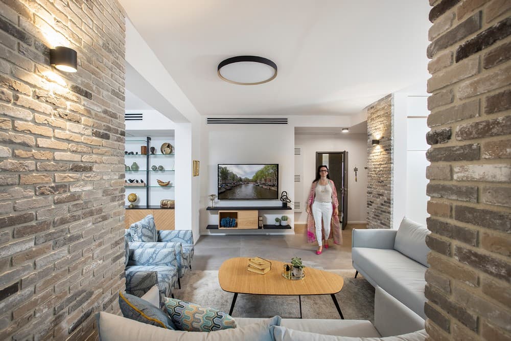
The combination of old and new, and warm and cool tones is very noticeable throughout the 2 Story Apartment, especially in terms of materials, textures, and colors. The bricks used to cover the entrance wall and structural columns in the living room, contribute to the warm and organic atmosphere. The family opted for a palette of calming and soothing colors such as grays, blues, and browns, but the use of different tones of these colors, some more intense than others, added complexity to the design.
Textures and colors were chosen with care, blending subtle and elegant fabrics with playful prints to introduce a touch of whimsy. Another element that was adding character to the public space is two colorful artworks by the artist Efrat Ilan, which were hung in the living room.
While the functionality of the public area remained intact, Meital Zimber redesigned the furniture layout in the living room to make it more efficient. The television was relocated to a smaller wall, allowing the sofa to face a larger wall, creating a more open and airier feel. The unused space behind the sofa was utilized by incorporating an old wine cabinet that was repurposed and painted black.
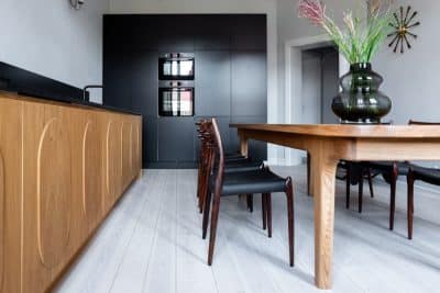
The dining area, made of solid wood and accompanying the couple for nearly 20 years, seamlessly integrated into the new design. The wooden chairs surrounding it, refurbished five years ago, remained beautiful and functional, so they were retained as well. Next to it stands a custom-made bookshelf constructed from iron, glass shelves, and walnut wood doors with a geometric pattern at the bottom. It serves as storage for tableware and displays sentimental items collected by the family over the years.
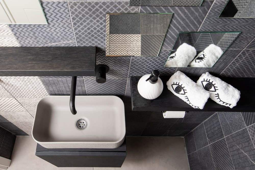
The guest services area, located on the entrance floor, allowed the designer to unleash her creativity. Black and gray tiles with geometric patterns were chosen to cover the walls, creating a non-conventional layout. Shelves made of smoked oak were hung on them, enhancing the drama in the space. Near the exit to the garden, Meital Zimber designed a place for an additional integrated refrigerator, supplementing the one in the kitchen, used mainly when the family entertains outdoors.
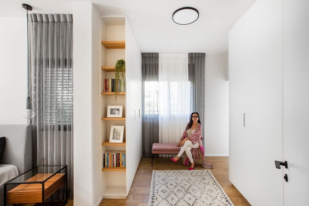
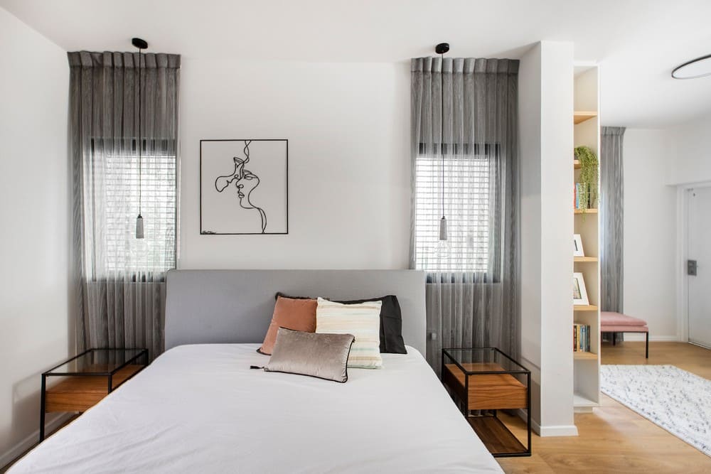
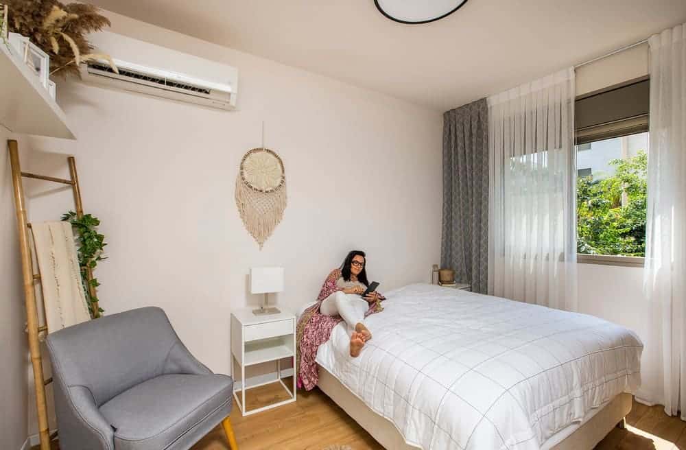
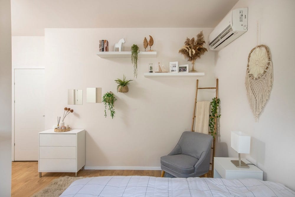
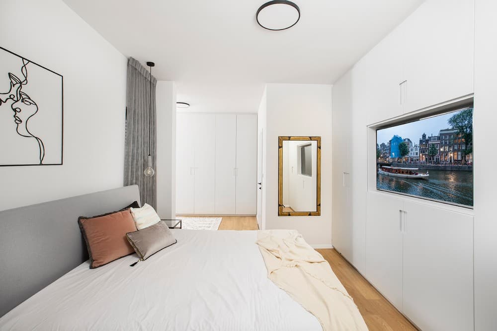
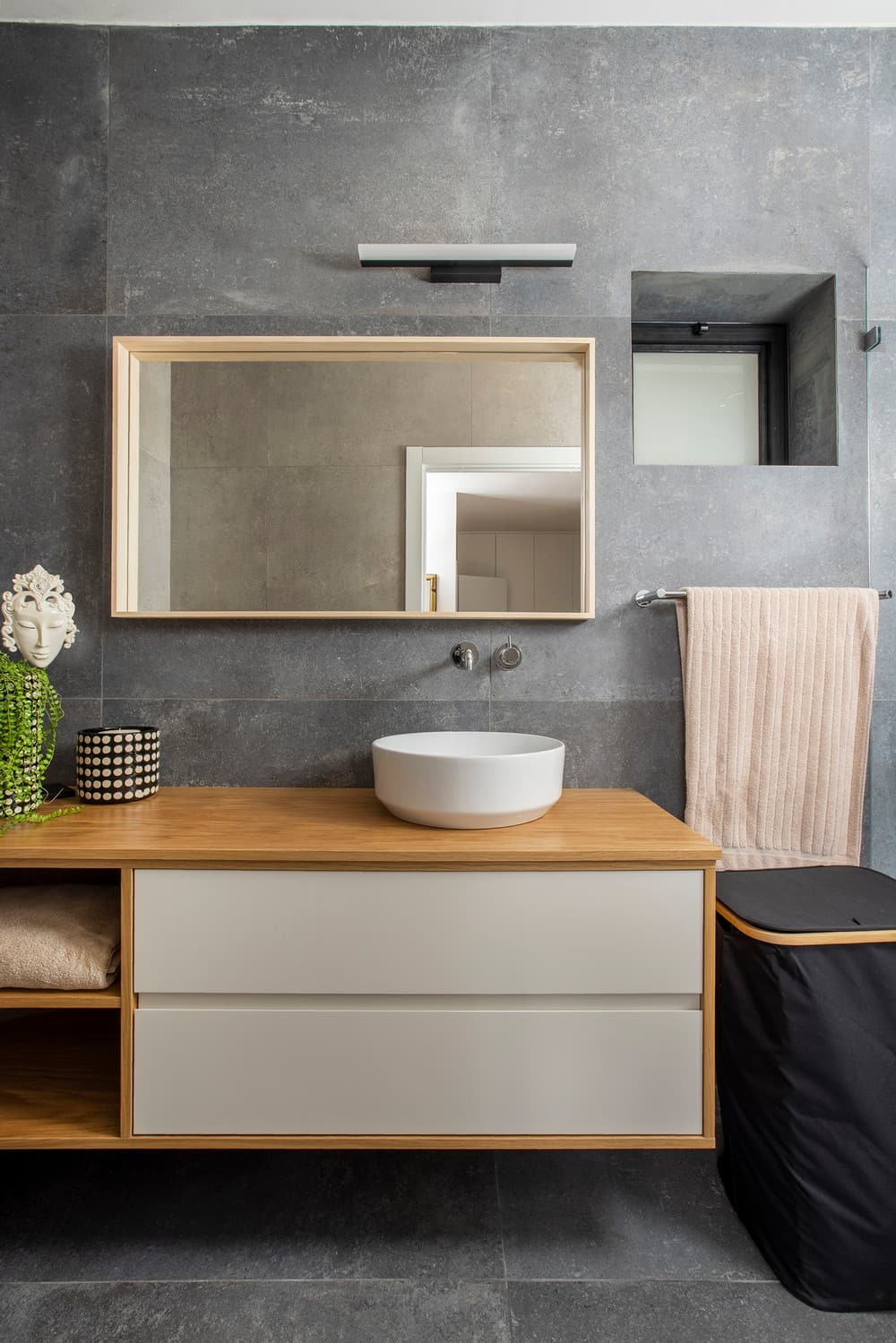
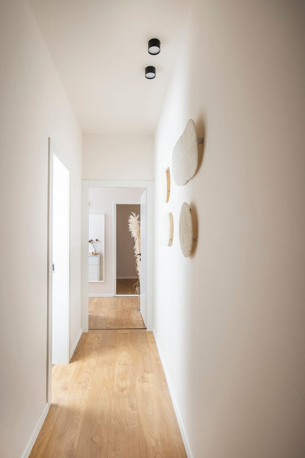
The bathroom suites on the bedroom floor were designed with elegant, modern, clean, and clear lines and were covered with large tiles. For the bedrooms, a relaxed and calm color palette was chosen based on white, cream with touches of light grey in the textiles, hints of pink and coffee milk, and wooden items.
“Into the parents’ bedroom, one enters through the couple’s wardrobe and dressing room. Opposite the bed, a large wall closet was planned, which further enlarges the storage space, in which the TV screen is also embedded,” summarizes the designer.
