Project: Tarrytown Traditional / An modern Austin home gets a traditional makeover
Interior Design: Ashby Collective, Cori Pfaff
GC: Stew & Co.
Location: Austin, Texas
Photo: Clay Grier
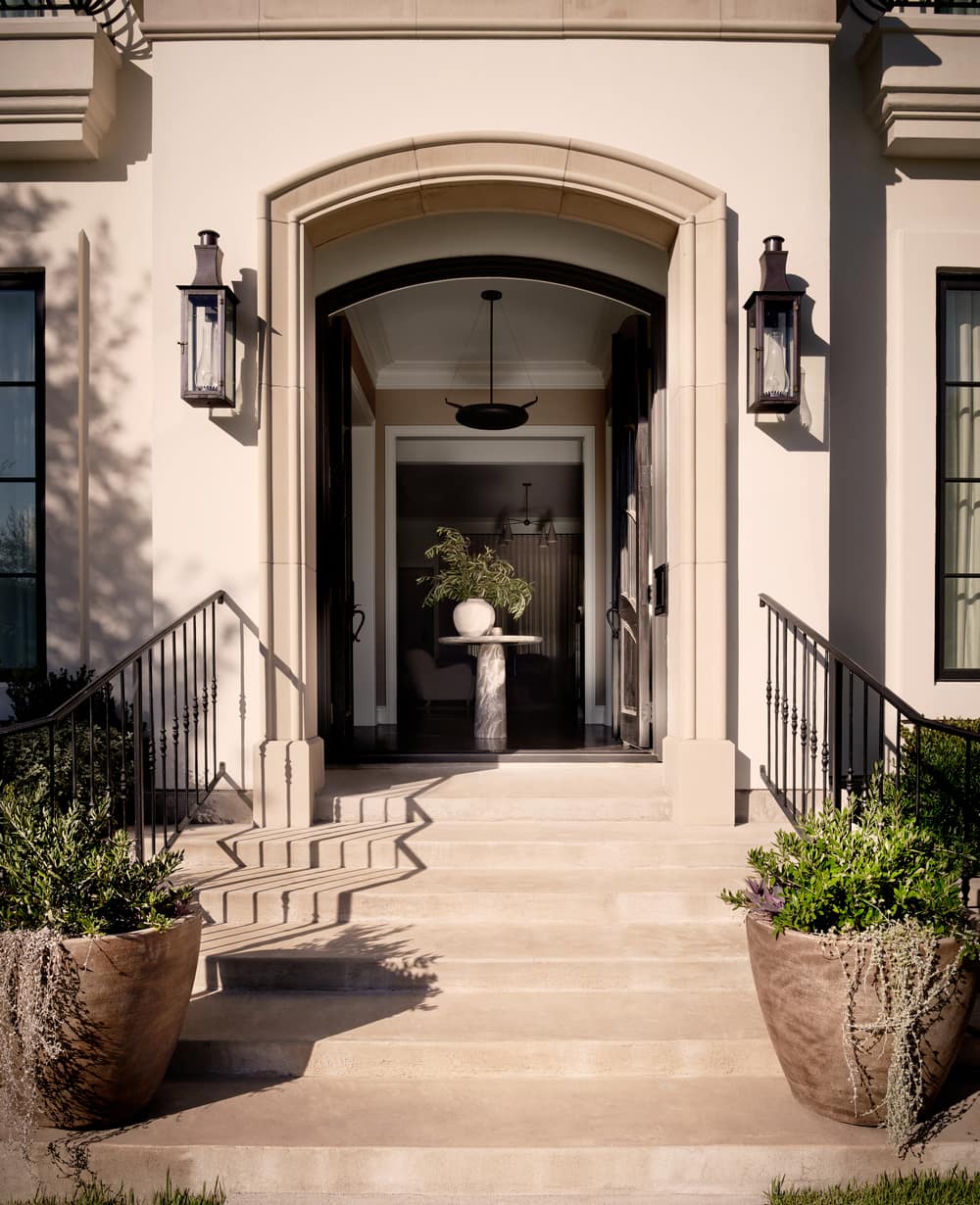
The homeowners (New York City transplants) recently purchased a contemporary, modern home located in one of Austin’s older, charming neighborhoods, Tarrytown. They wanted the interiors to reflect their own personality while also giving a nod to the quaint neighborhood made up of classic homes with traditional architecture and design. They brought on prominent Austin design firm Ashby Collective for the renovation (the design teams’ work has been published in New York Times, Architectural Digest, Dwell and more).
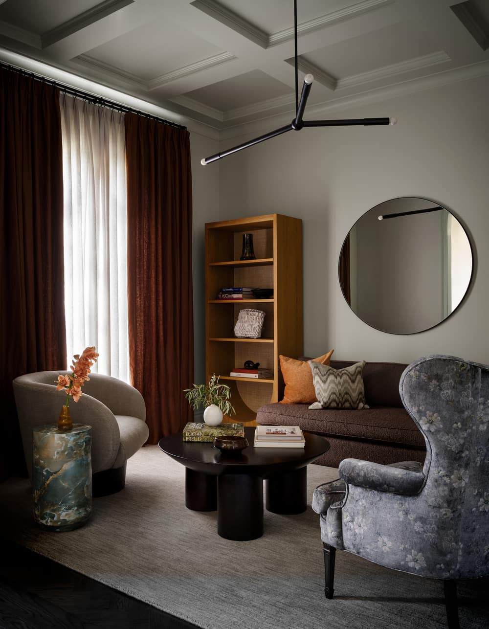
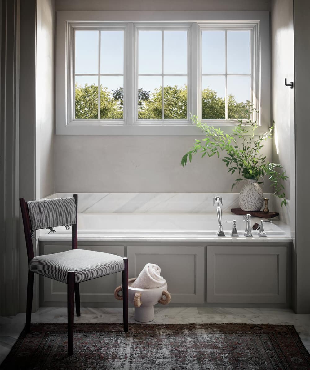
“The home initially was all bright white, a typical new design, spec home, it had very little character. It did have some great architectural elements and finishes, but it just needed a bit of wow factor. We switched out all of the matching chrome hardware for a softer finish, changed all the light fixtures and painted every inch of the house to warm it up,” says Cori Pfaff, Ashby Collective.
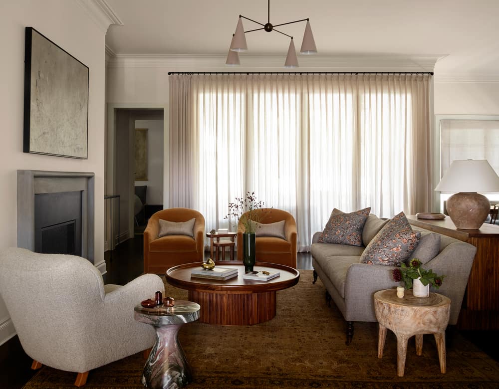
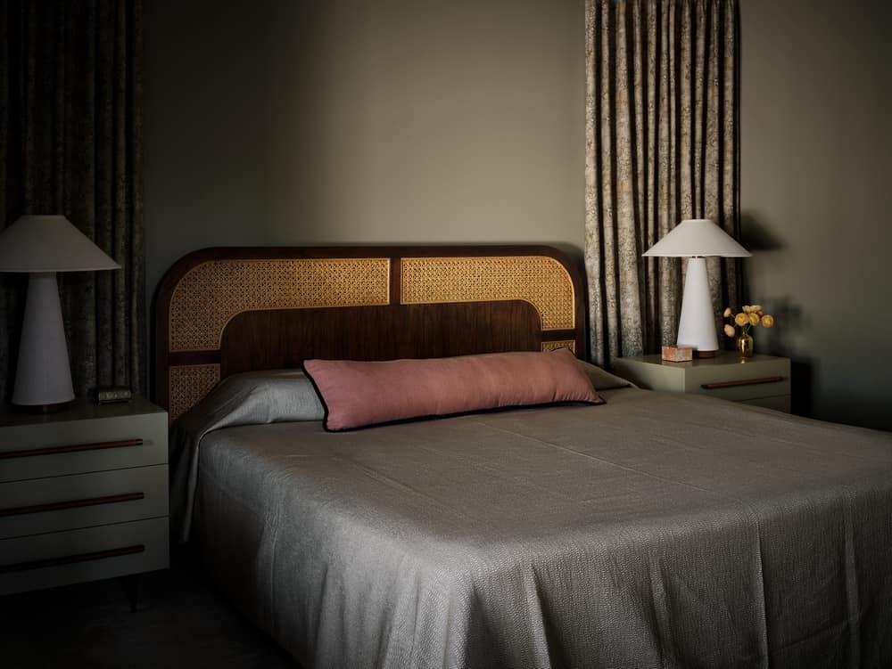
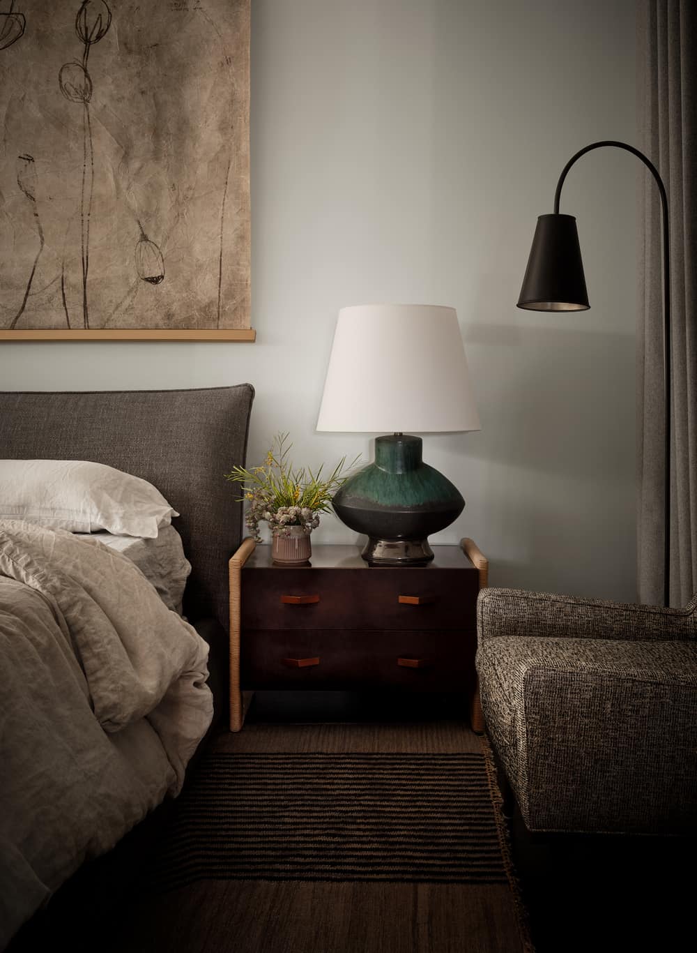
“For the furnishings, we played with a lot of textures and reupholstered retail pieces with luxe fabrics to make them feel more custom and one-of-a-kind. The client loves Heidi Calliellier, Amber Lewis, Disc Interiors, so we used their designs as an inspiration.”
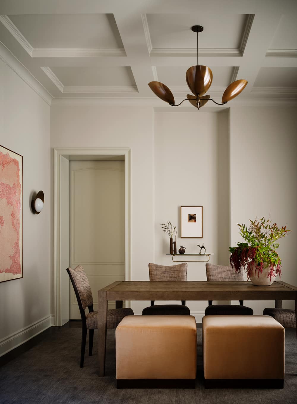
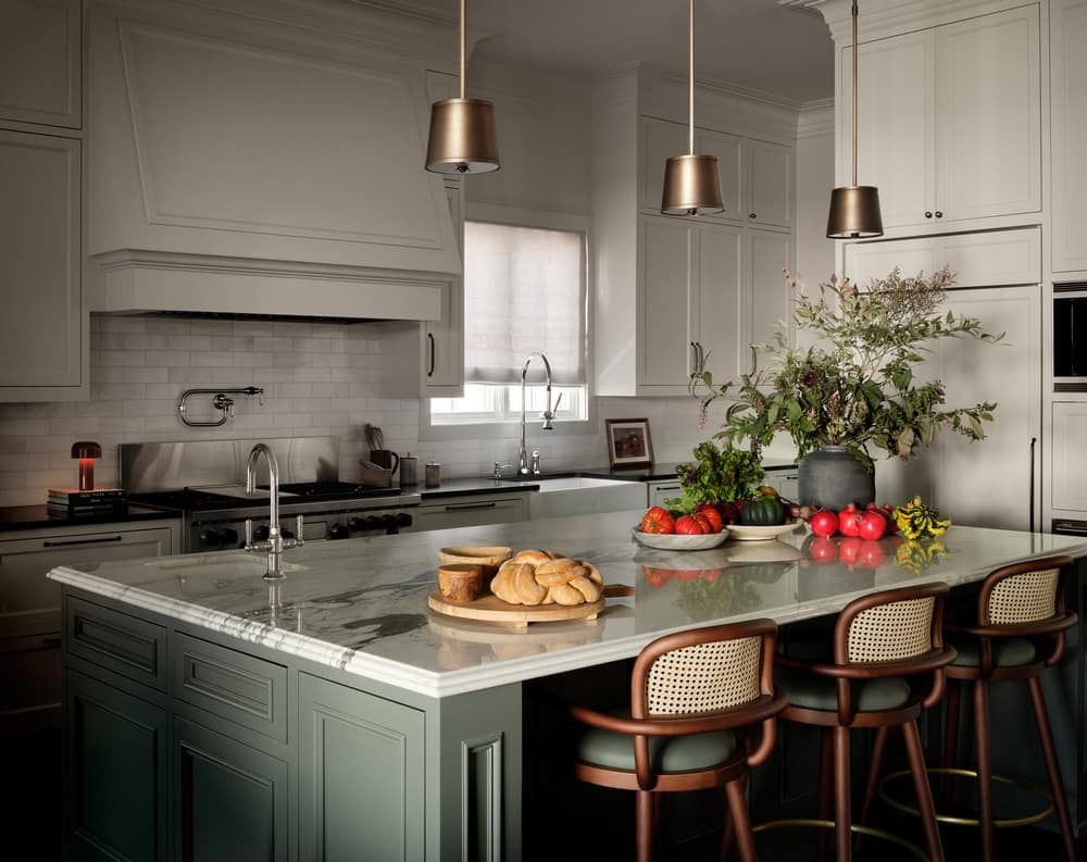
By layering in plush window treatments, rugs, and mixing fabric textures and patterns, Pfaff warmed up the home, giving it charm without breaking the budget. The kitchen design was constrained as the structure and materials had to remain intact. Adding paint was an easy but huge upgrade. “Even just changing the stark white walls and cabinets to a warmer neutral color, made a huge difference and really changed the soul of the kitchen and the entire house.”
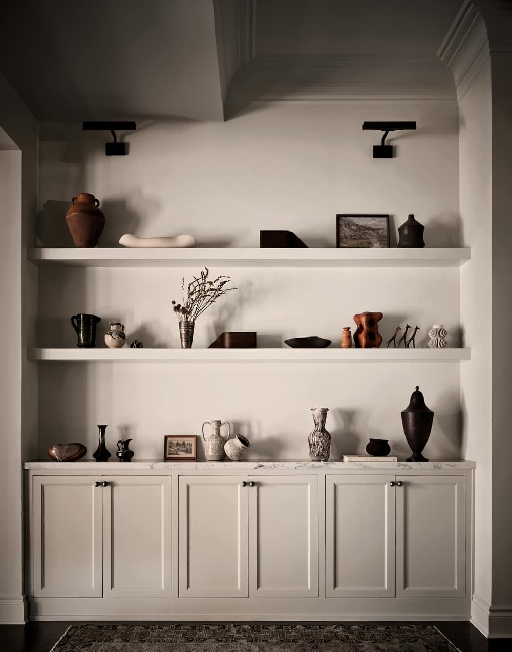
Pfaff choose Benjamin Moore, Ashwood for the cabinets and walls and Rainy Afternoon for the island. “Breaking up the island with a fun pop of color makes the kitchen more inviting, it is a huge kitchen so keeping it all white felt boring. We also painted the entire butler’s pantry, floor to ceiling, the same color!”
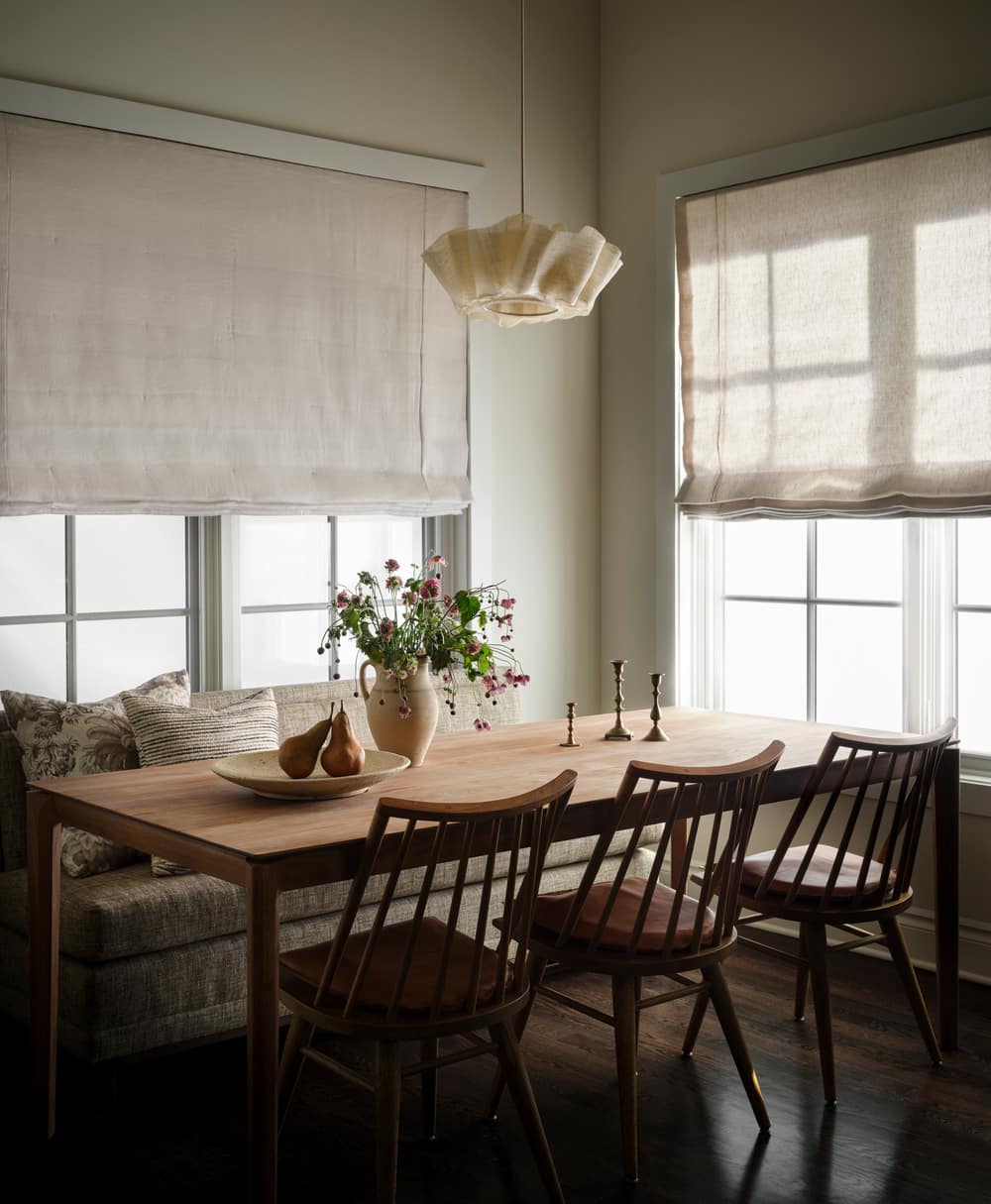
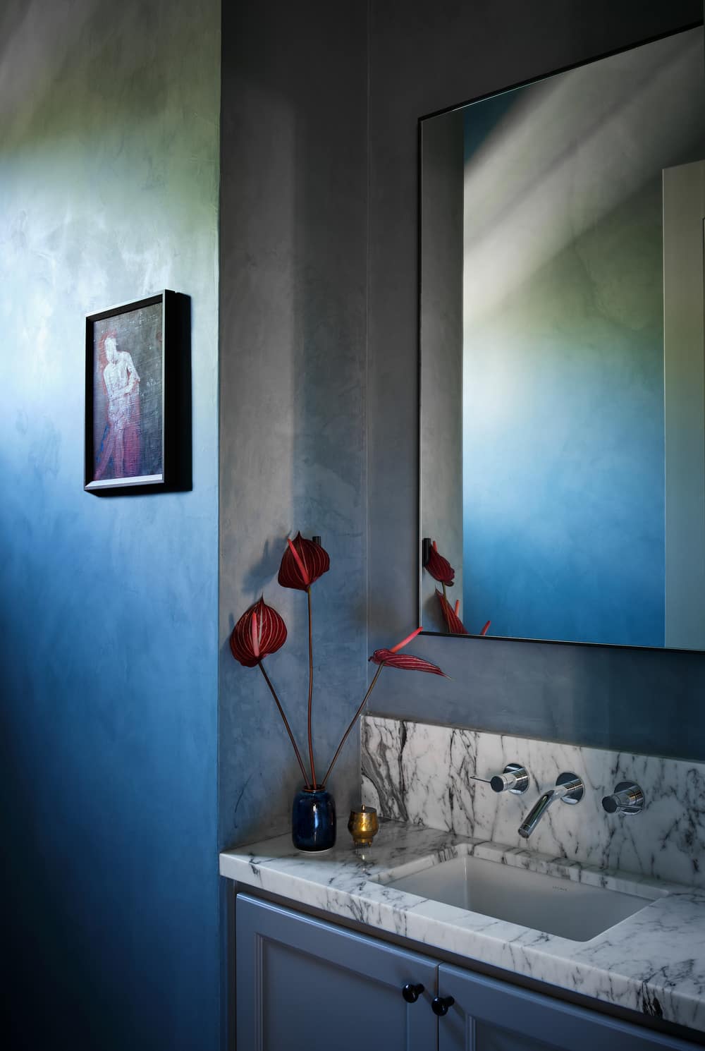
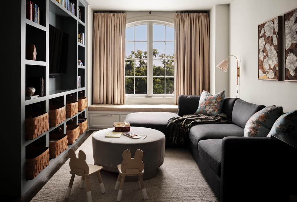
The designer chose to mix in some vintage pieces with new retail furnishings. “Not everything needs to be custom and take 20+ weeks to get!” say Pfaff. The design also notes that kid friendly doesn’t mean it has to be boring or uncomfortable. Pfaff paid close attention to fabric content so that even though the family room is a kids space, it still feels sophisticated but safe for dirty fingers and spills. The design team gave the powder room a punch of character with a calming blue plaster treatment from Portola Paints & Glazes in Serene Roman Clay.
“All of the dream changes the client wanted to do in the beginning of the project were coming in really high (post pandemic/supply chain issues) so we had to get really creative in how we were going to change the house without blowing the budget, so a careful curation of what was readily available was important for the house to not feel like we walked into a retail store and bought it all from one place, which is never the goal,” says Pfaff.
