Project: WORK IT – A Large Bright Workspace
Planning and design: Shlomit Zeldman
Location: Diamond Exchange District “The Bursa”, Ramat-Gan, Israel
Owners: Family business – company offices, steel-import
Property: approx 250 sqm
Photo Credits: Shai Gil
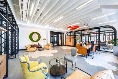
Whilst commercial rental prices have been going through the roof, a father and son who jointly own a family steel-importing business decided not to compromise on design or quality. They relocated their offices to a large bright workspace in the Diamond Exchange district in Ramat-Gan and hired designer Shlomit Zeldman, to create an elegant and experiential space that will reflect their hobbies and serve as the perfect setting for both work and hosting.
Office spaces in Israel have undergone incredible transformations in recent years, but a space like this one is rather unusual, as the 250 sqm office space is occupied by four employees only: “For a family business of four employees – father, son, and two additional staff this is a significantly large space”, explains Shlomit Zeldman, owner of an architecture and interior design studio, who planned and managed the renovation project. “Before renting these offices we discussed whether or not so much space was necessary, but with the view of expanding the team, as well as the owners’ desire to incorporate experiential functions that reflect their hobbies, we decided that this was the right space for the company offices after all”, the designer adds.
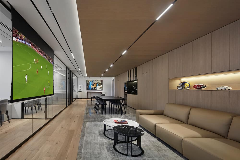
When I met the clients in their previous offices, I understood how important it was to them to incorporate experiential elements into their working environment”, she continues. “There was a wine fridge on the premises, and they used to spend their spare time in the conference room watching sports games on TV. It was clear that the new offices would need to accommodate for this, as well as for art pieces that are dear to the father, and additional pieces that represent their shared hobbies”.
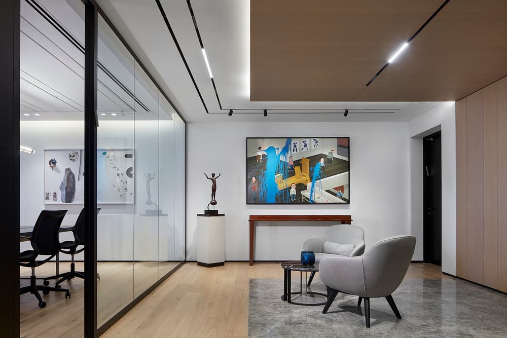
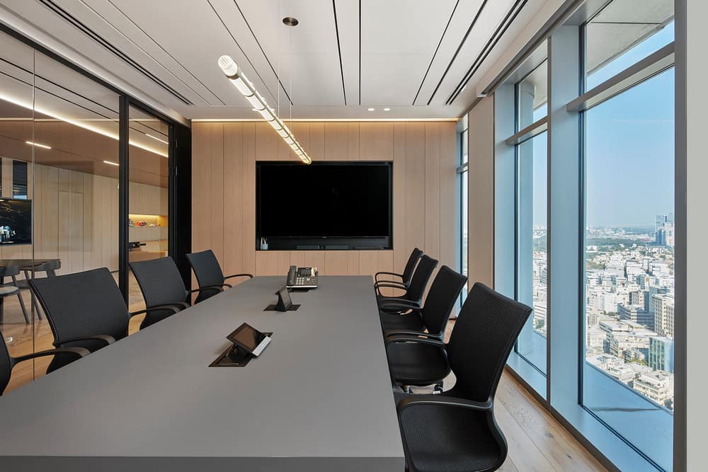
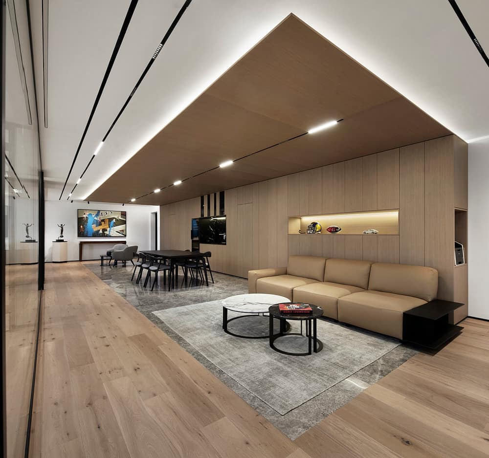
The new offices are located on one of the top floors of an office building, which has recently been refurbished and gained an additional seven stories in the process. According to Zeldman, the planning started with an empty shell: a rectangular space that needed to be “broken up”, lengthwise, for ultimate space planning from the first step on site. All the hosting functions were planned in the spacious central lobby, and the offices and conference rooms enjoy an uninterrupted view of the urban skyline, thanks to Zeldman’s plan to create floor-to-ceiling black aluminum framed glass partitions.
Marble floors were used in the central space in order to visually define it and the various functions within it. In contrast, all corridors and office spaces were fitted with oak parquet, which adds a sense of intimacy allowing the spaces to be better defined without using partitions. A power wall created by Shlomit Zeldman contributes to a homogeneous feel in the multi-functional central space. It was covered in reclaimed oak veneer for a clean yet warm look.
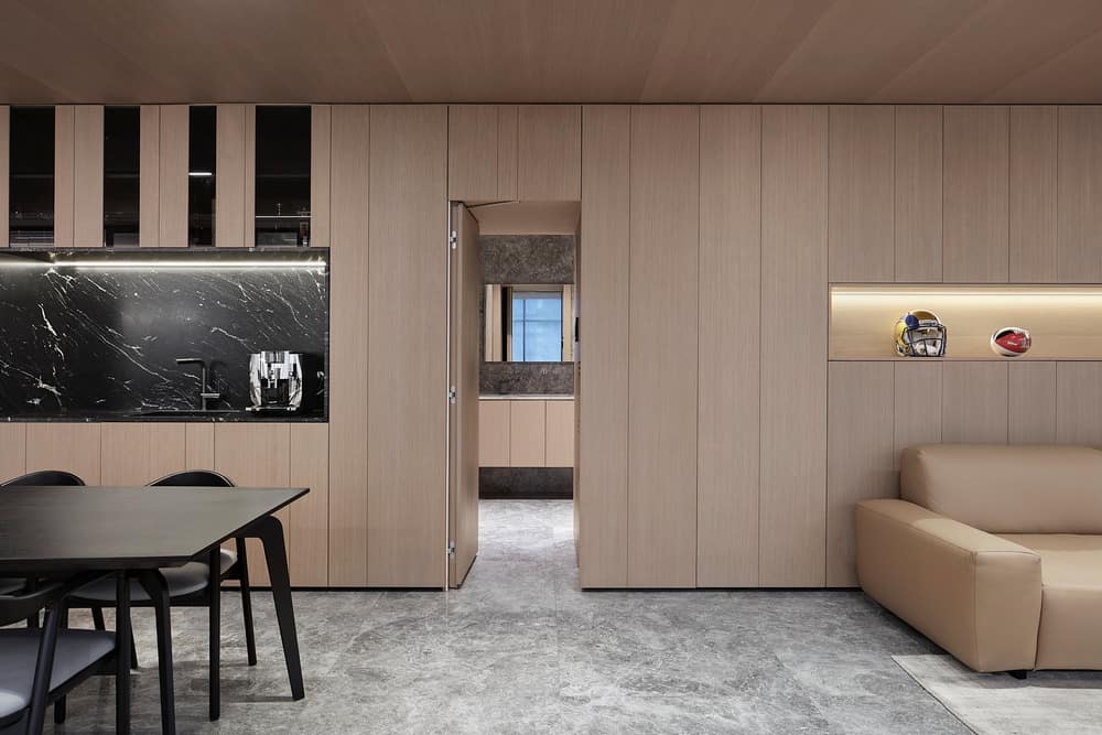
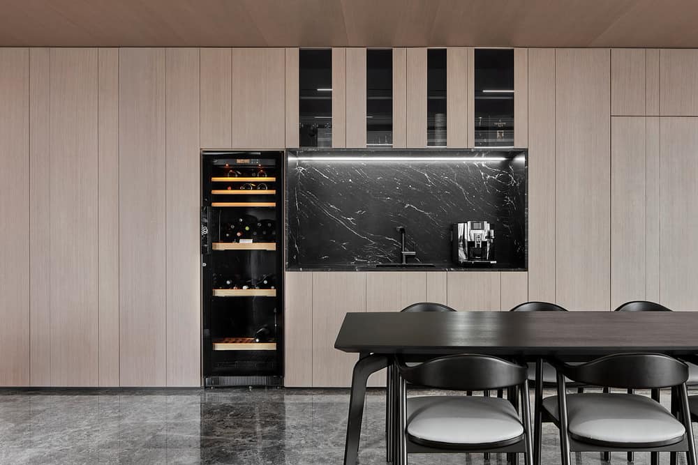
The veneer runs from the marble floors and continues across. Two concealed integral doors were fitted behind the central lobby: one leads to a bathroom with toilets and a shower, and the other leads to an employee kitchen. A coffee niche covered in natural granite stone was created in the lobby, lit by hidden lighting fixtures. Storage space was created above it and a wine cooler was designed within it, as part of the niche. The dining area is made of blackened natural oak and an entertainment system that is revealed with a push of a button was positioned across from a leather sofa. “The space is equipped with all that is required for the ultimate sports game viewing experience”, states Zeldman.
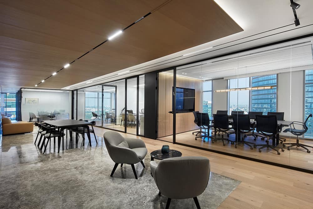
The designer, who is known for her ability to strike an immaculate balance between different materials and textures, combined natural elements throughout this multi-attraction space, such as wood, granite, and leather. All furniture in this space was custom-made in monochrome shades that serve as the perfect backdrop for the exquisite display of art pieces.
“The balance between the art pieces and the lighting chosen, was decided during the planning phase. We planned adjustable cylinders that allowed us to light up the artwork in an almost museum-like way. The angle and location of the lighting can be changed as needed, should the art pieces be replaced over time”,the designer explains. “Moreover, we planned continuous light strips throughout the space, which were fitted into the wood and plaster ceilings, illuminating the paths between the spaces”.
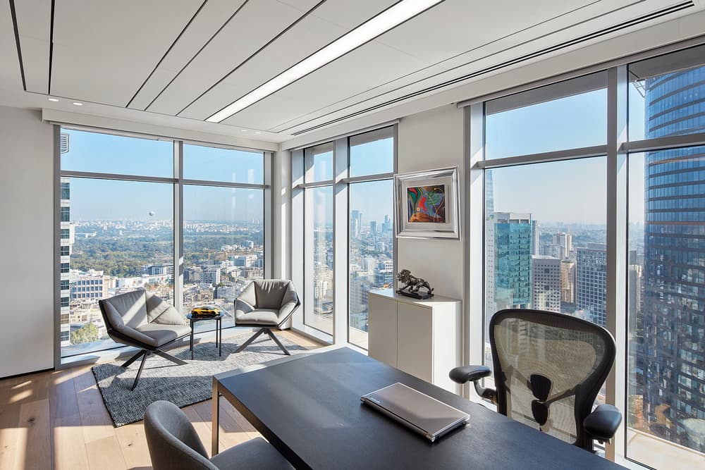
A spacious conference room and the son’s office were planned in parallel to the central space. The father has a corner office with an impressive panoramic urban view. “The ceiling in the father’s room is different to that in the other spaces: it is collapsible and fitted with lighting that emphasizes its length”, explains Zeldman. “We also created a seating corner in parallel to the glass windows that overlook the view. The team’s offices are located in the narrow section of the space, further down from the entrance, providing them with calm and quiet areas where they can work uninterrupted”, she summarizes.
