Project: Ami Bistro
Interior Design: Studio Modijefsky
Team: Esther Stam, Agnese Pellino, Moene van Werven, Ivana Stella, Felicia Ureña
Location: Amsterdam, The Netherlands
Status: Completed March 2023
Size: 125 m2 interior & 55 m2 exterior
Photography: Maarten Willemstein
Graphic ID: Yazoka
Ami Bistro is the new go-to place for unpretentious French dining in the Dutch capital. Studio Modijefsky was asked to create the interior for this all-day bistro in the popular Amsterdam district of De Pijp.
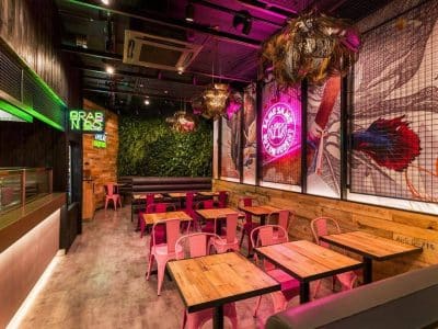
The concept blends the style of a traditional Parisian café with a playful, eclectic modern design. The interior elegantly unites both worlds by mixing glamour with freshness in a palette of soft red tones, vintage orange and crispy blue. Original and timeless materials (marbles, tiles, (lots of) mirrors, woods, polished leathers, wall panelling and textured glass) add a bohemian edge to this Amsterdam café.
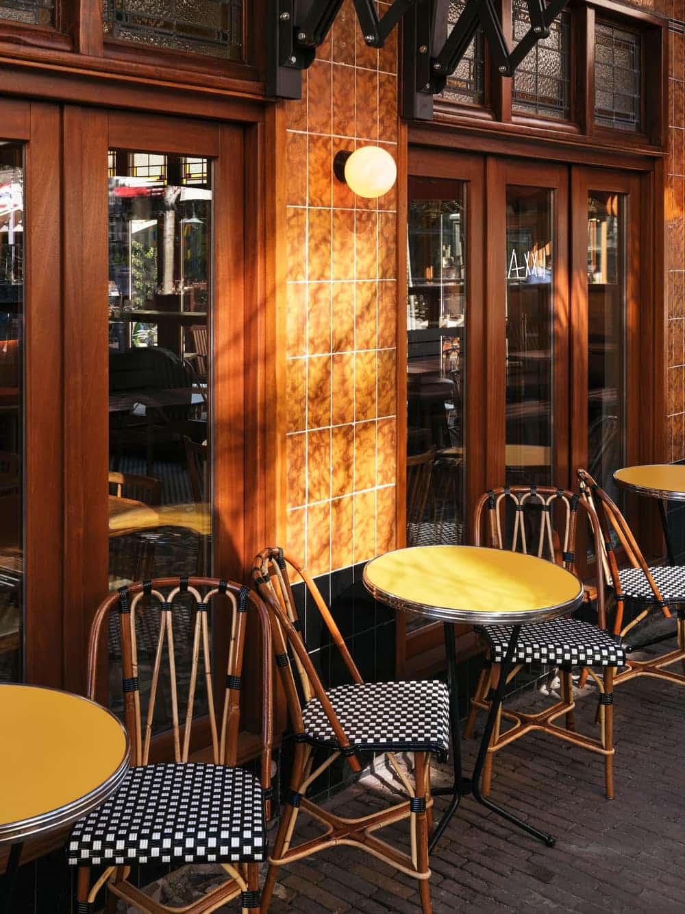
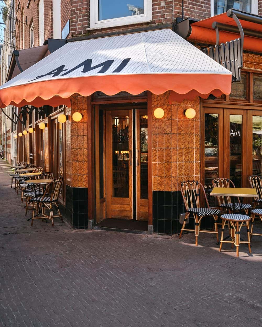
The entrance to Ami is located on the corner of a building whose plinth is covered – unusually for the area – in black and orange tiles. The design for the terrace amplifies this chromatic division while hinting at what’s to come inside: black and white striped awnings are paired with warm coral orange, and custommade wooden furniture is mixed with yellow table tops and black table legs. Lights draped around the building establish the easygoing charm that Ami offers guests throughout the day, whether they come to grab a morning croissant or linger over fruits de mer in the evening. Wooden benches wrapped around the terrace offer an irresistible invitation to pause for an aperitif or coffee.
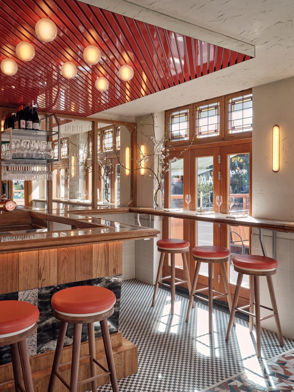
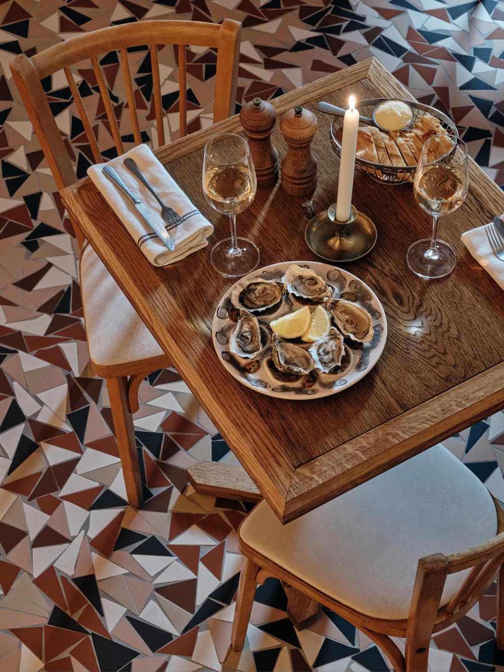
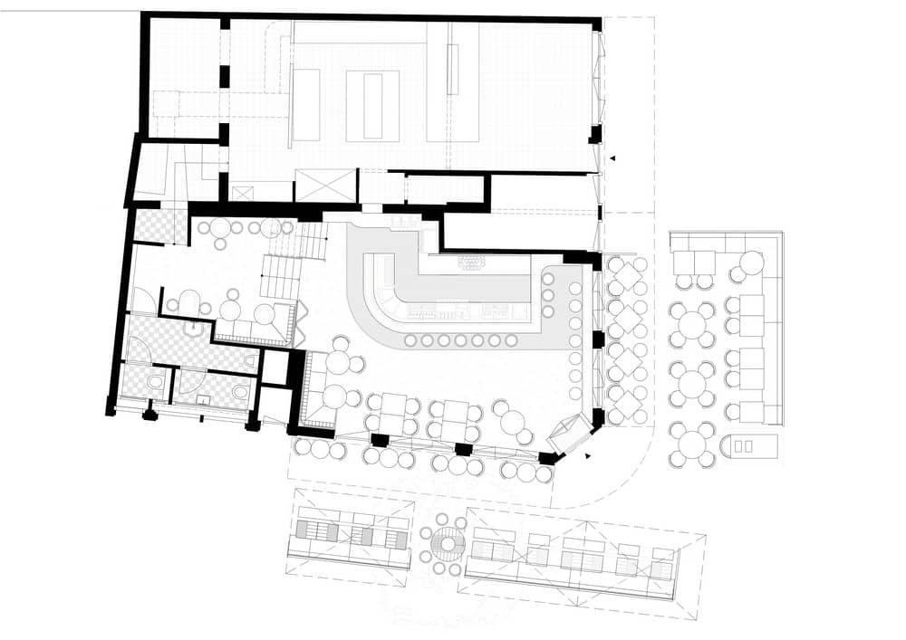
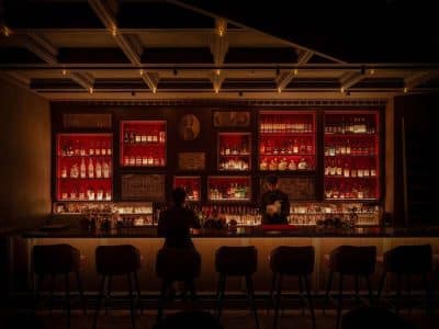
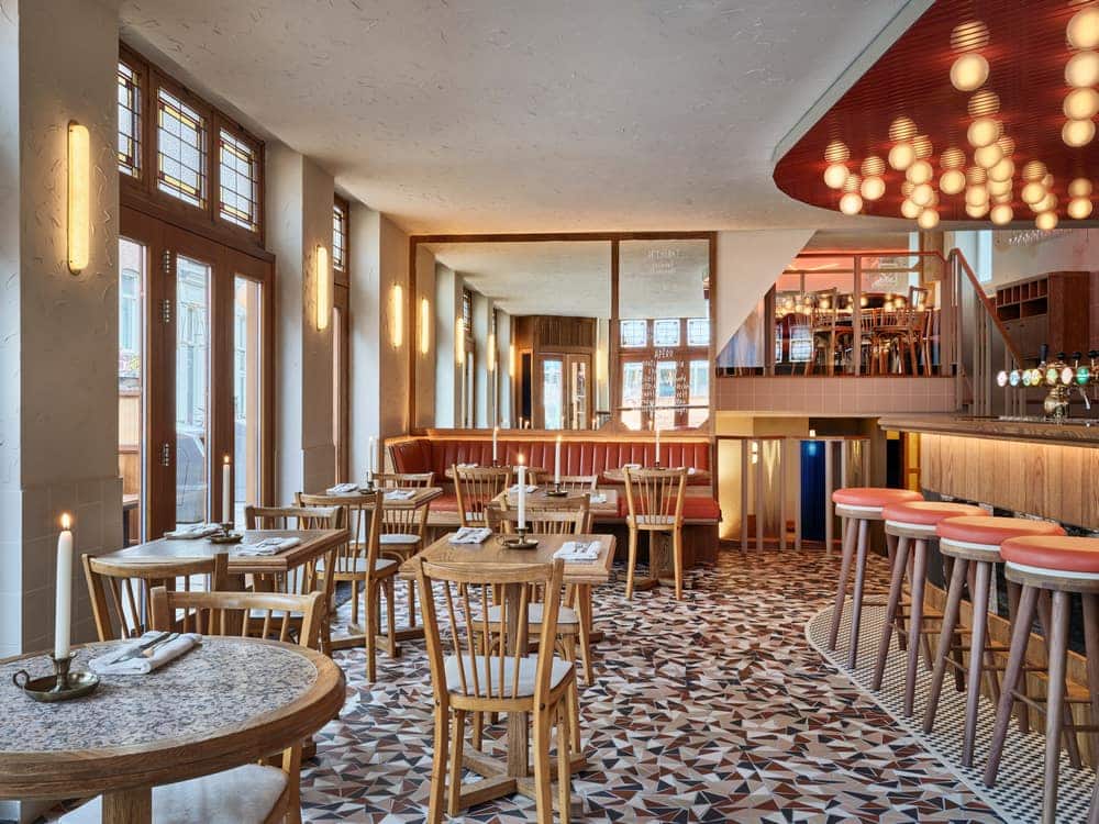
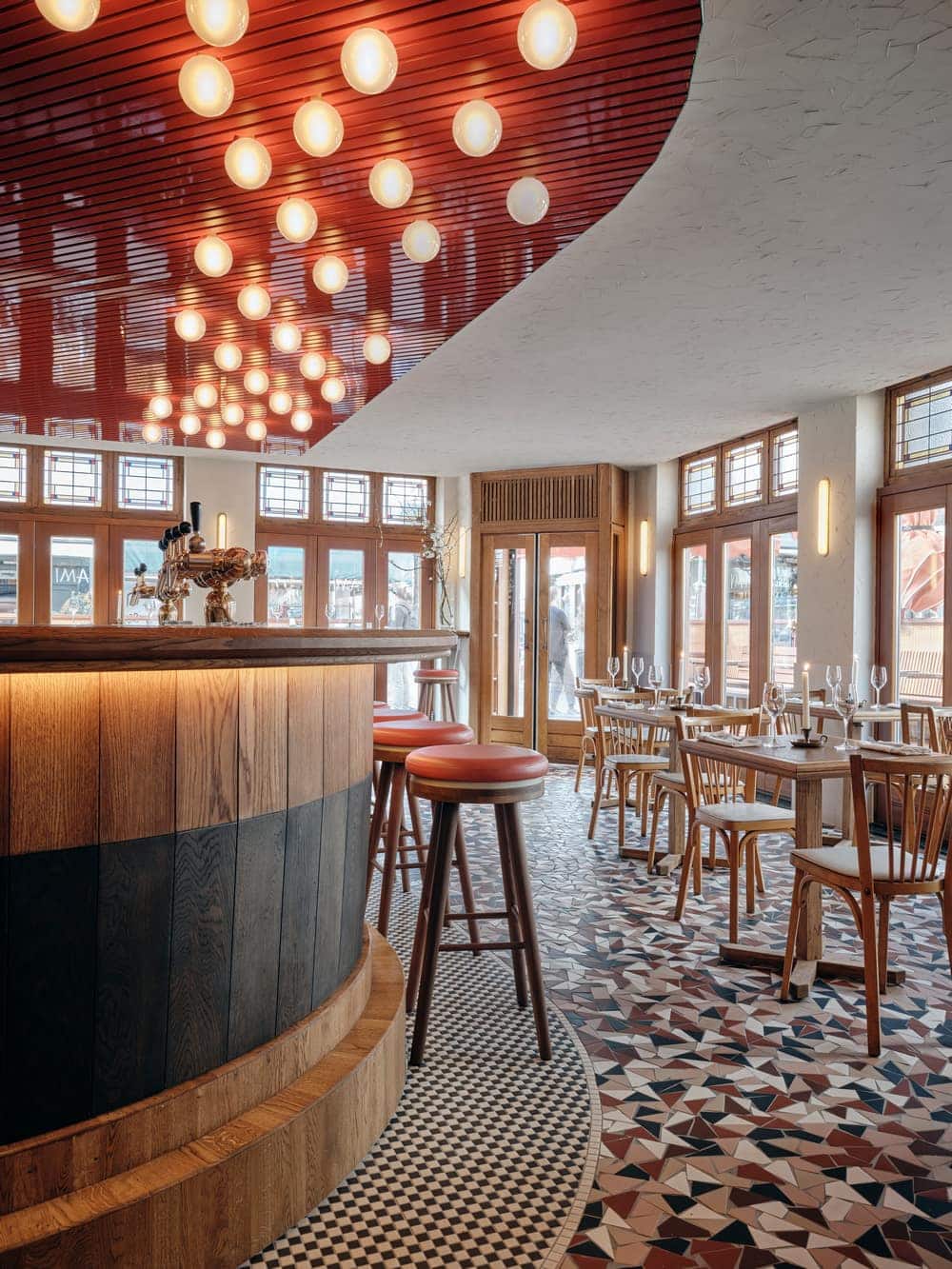
Once indoors, your attention is grabbed by the fragmented tiled floor that teleports you to the lively Parisian hospitality scene. The floor curves around the bar, where a black and white mosaic serves as the background for the bar. You can’t miss it, thanks to the eye-catching glossy ceiling above it. Red wooden slats and an ocean of spherical lamps fill the space with a warm glow and mark out the bar as the heart of Ami. Its front is covered in black and pink stones with an indentation that begins at the wooden plinth.
Blue marble and different types of wood are used to connect the centre of the space to the windows. In summer these windows can be opened completely, merging the interior with the terrace and inviting the sun in.
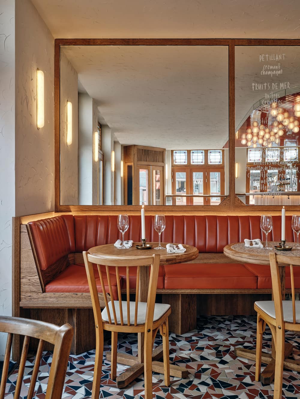
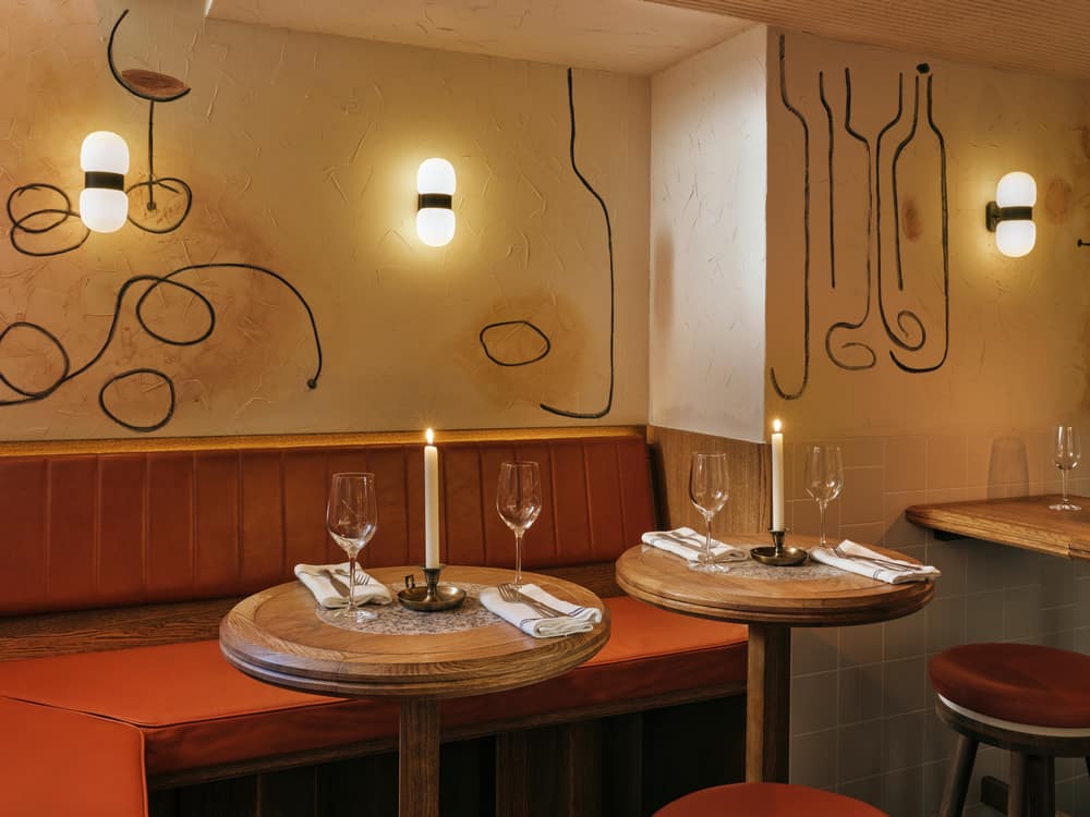
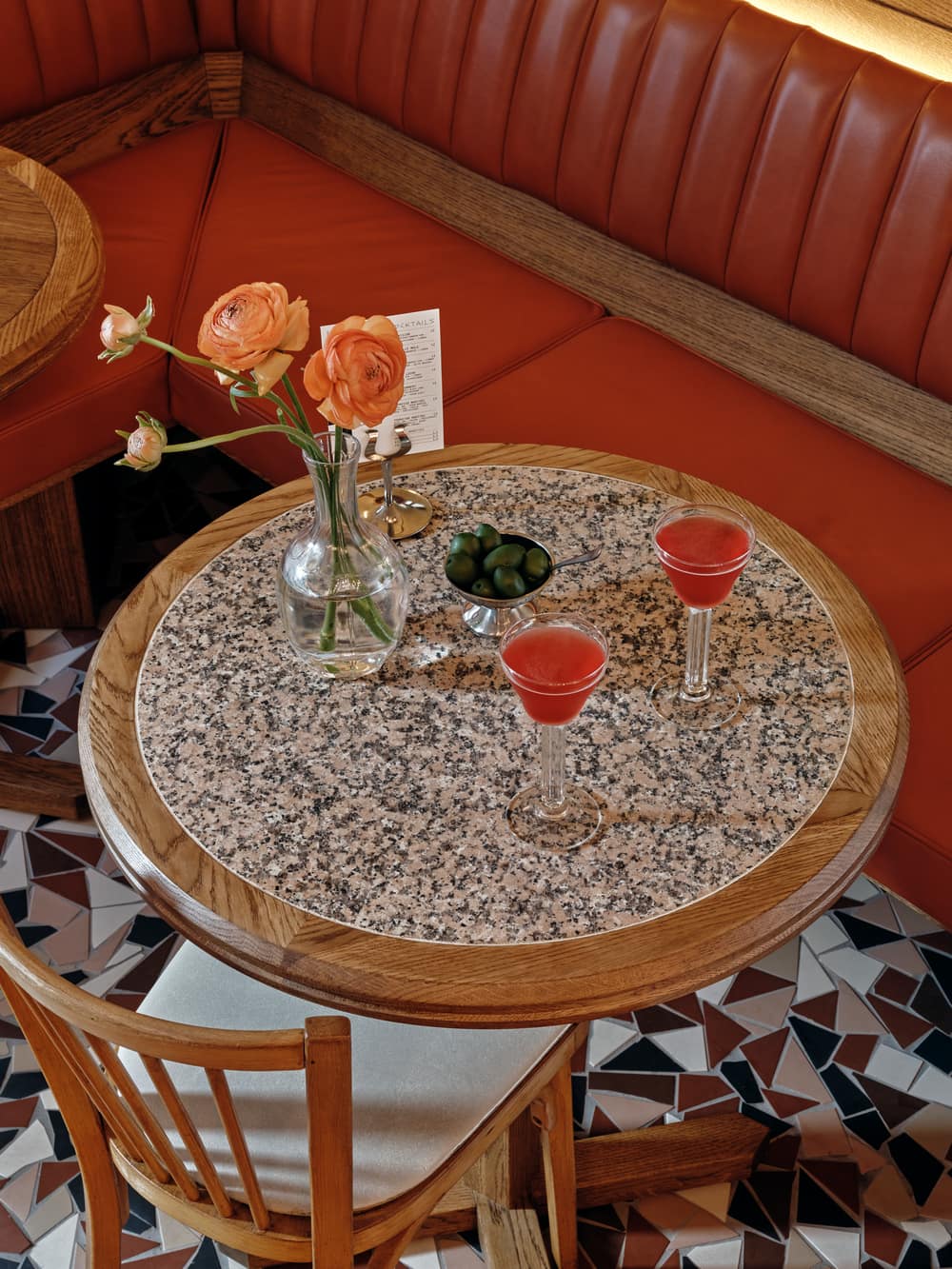
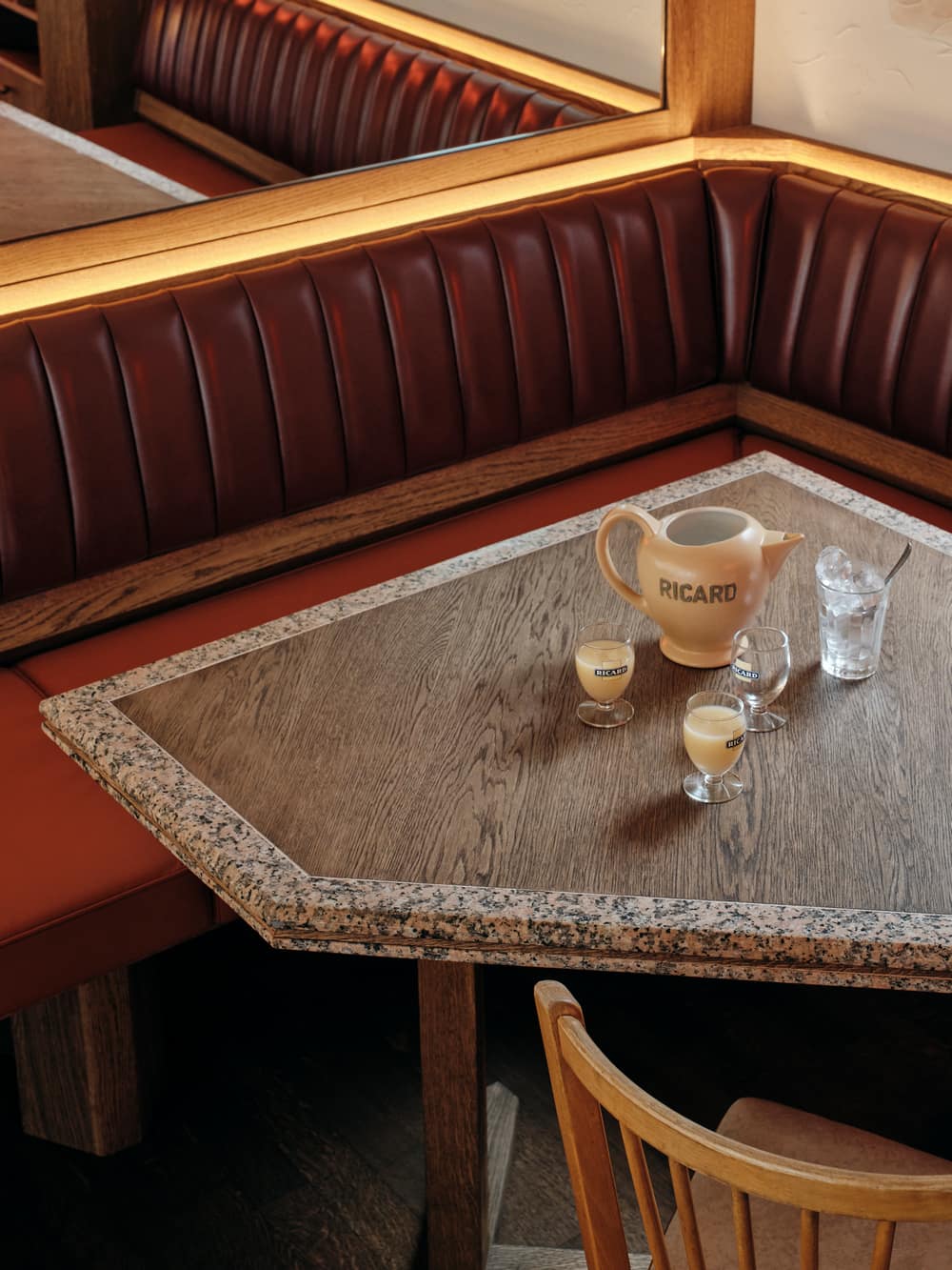
Opposite the bar, custom wooden tables with pink granite inserts stand in front of a beautiful banquette covered in matt and polished leather. Once again, you will find a framed mirror and accents of fresh blue glass panes. Next to it is a custom-made railing and a staircase that takes you to the basement. As there are only a few seats here, this is the perfect spot for an intimate evening. In this area – as well as in the mezzanine – the textured walls feature playful illustrations of abstract objects and bar scenes, and line drawings with soft colour accents, illuminated by soft alabaster lights.
Back upstairs a red orange glow attracts your attention: it comes from a curious neon composition that crawls across the ceiling and is reflected in the mezzanine’s many mirrors. A long banquette turns the corner to unite the space, while a service point complements its playfulness. Loose custom wooden tables and vintage chairs break the rigidity of the fixed elements and complete the room’s unique atmosphere. The glossy red ceiling above the bar area is covered with lights that are reflected in the bench’s mirrored backwall. Like all the other mirrors in each area, these feature handwritten menus that add a subtle graphic layer to the interior. These are part of the visual identity created for Ami by Yakoza.
Every execution, from the logo to the menus, is made by hand, adding a tactile, but modern, look and feel wherever it’s applied.
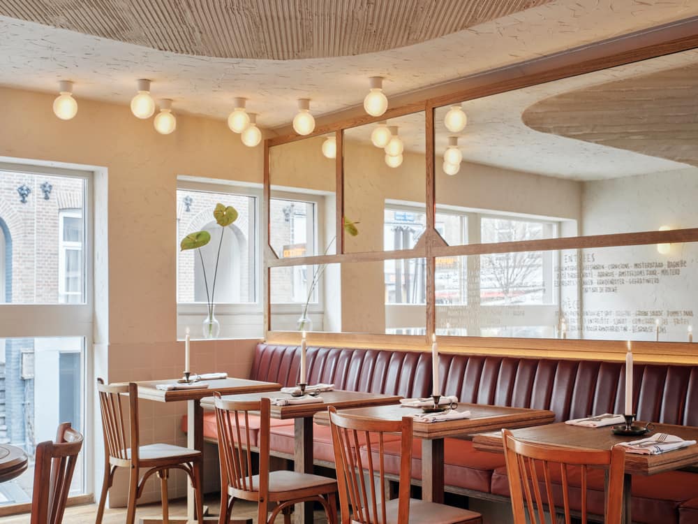
The walls of Ami are covered either in white and pink tiles in funky patterns, or finished with textured plaster, in turn accompanied by drawings that pop up joyfully throughout the interior. Warm alabaster lamps embrace the space and add a touch of romance, while the combed plaster of the ceiling creates a sensuous play of light and shadow in the basement and mezzanine. Together, all the elements work together to form a casual but classy atmosphere that adds joie de vivre to every visit.
