Project: Artek Headquarters
Architects: SevilPeach Architecture + Design
Lead Architects: Carla Rocneanu
Location: Helsinki, Finland
Area 470.0 m2
Project Year 2018
Photographer: Tuomas Uusheimo
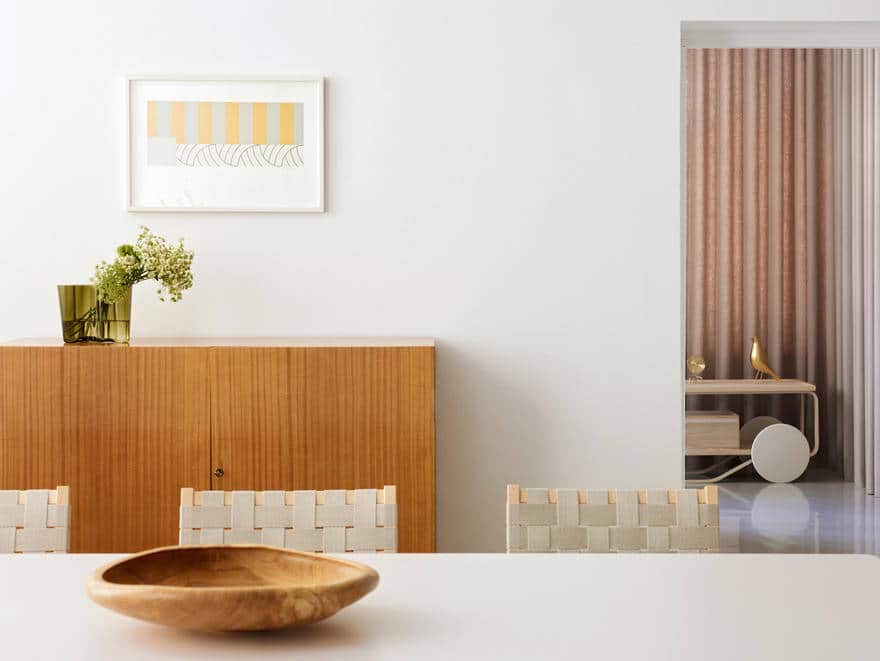
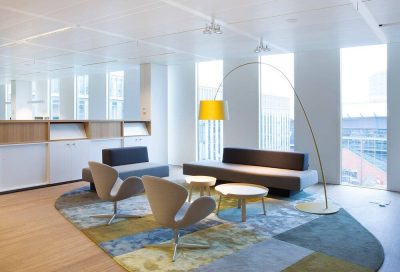
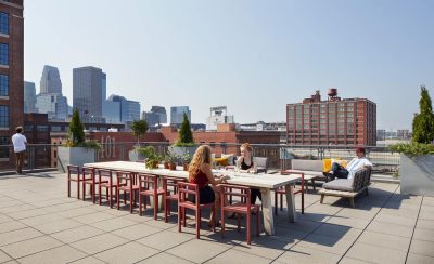
Artek Oy has moved its headquarters to new premises in central Helsinki. Situated in an elegant 19th century building at Mannerheimintie 12 B, the new space is just a few minutes’ walk from the Artek Store. It was conceived as a working showroom where architects and dealers can bring clients to experience Artek and Vitra furniture. Inside, interior architect Sevil Peach has designed an open environment that inspires a new way of working. The 470m2 space comprised a series of small rooms, reached via long, dark internal corridors with no visual connections to the outside.
The brief
Whilst serving as Artek’s headquarter, the new office should also act as a ‘working showroom’ for architects and dealers. Vitra’s role as parent company and it’s competence in office furniture are to be demonstrated by combining Vitra and Artek products in a harmonious and functional way. The new Artek headquarters environment therefore has to achieve multiple goals: convey ‘Artek’s Spirit’ through it’s planning and use of materials, create a democratic environment with maximum daylight as well as showcase the right balance between Artek and Vitra products.
The programme
With a fast track programme of seven months from start to completion, the design process had to be highly efficient. The challenging schedule affected the choice of materials used. Although some finishes appear raw and ‘as found’, much consideration was given to their strategic selection and detailing.
The canvas
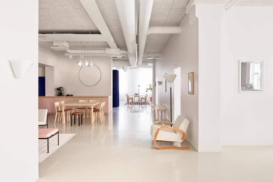
The primary goal was to strip the space back to it’s bare structure in order to gain additional ceiling height and create an open, light and airy environment – a blank canvas which acts as a clean backdrop for the products and the activities.
The facilities
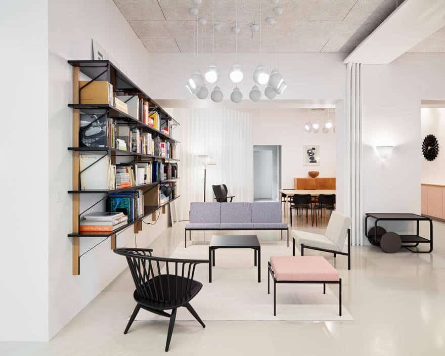
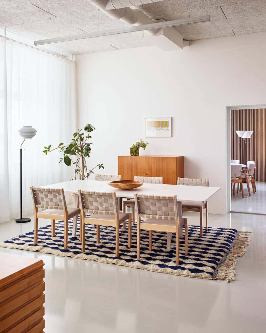
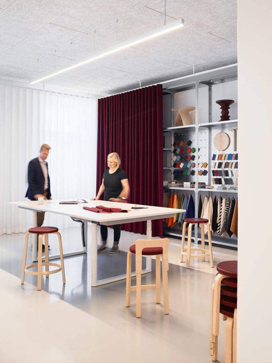
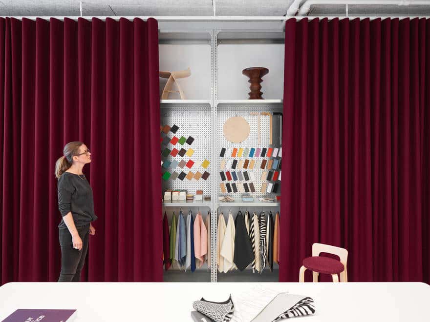
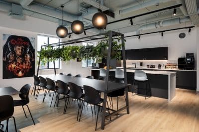
Five intimate human-scale work zones are supported by two meeting rooms. A central break-out area with an open kitchen hosts a library with soft seating alongside dining tables with flexible layout options. In addition, facilities such as a sample library, chair rack, cloakroom, lockers, bathrooms and a copy & print area complete the diverse office environment.
The enfilade
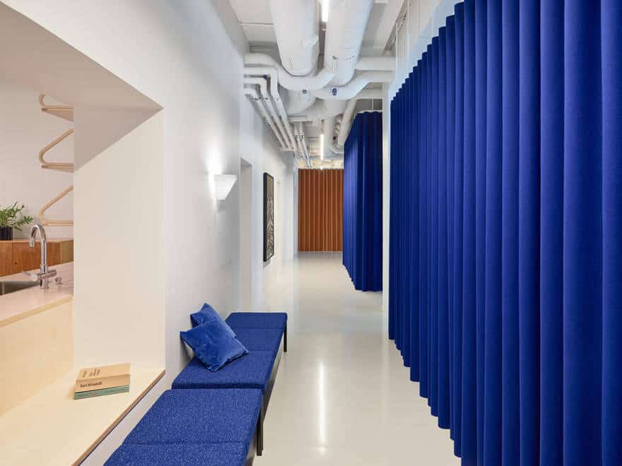
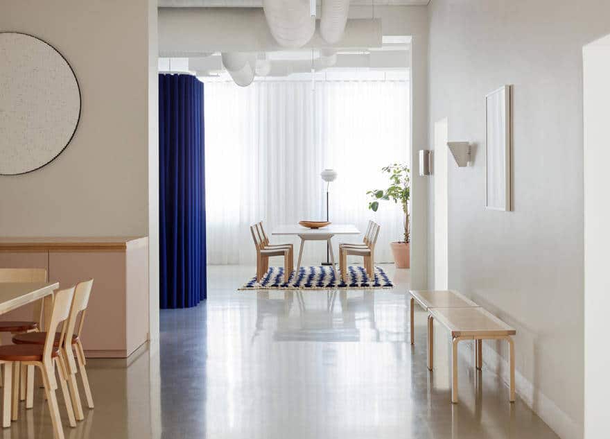
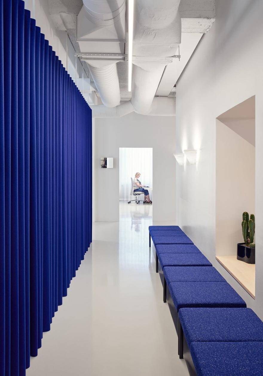
With the space being stripped back to it’s structural shell, all the individual zones have become interconnected with beautiful vistas, including views to the outside. The enfilade creates a continuous perception of space and allows for easy and immediate communication between the various team spaces. All doors are omitted with the exception of meeting rooms and bathrooms. The sense of corridor is dissolved through a series of large and small openings. They visually connect the team areas and the social heart. Through the introduction of a seating bench, the rear corridor becomes a habitable place.
The new ways of working
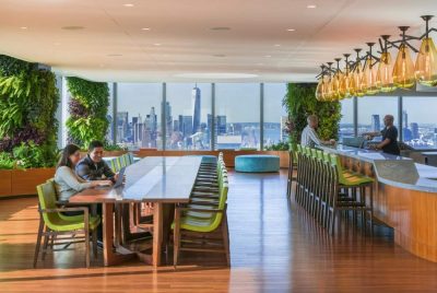
Designed to allow the users to work in a varied way, the workplace flexibly suits their task in hand and their mood. Whilst they are provided with dedicated desks, users are encouraged to use the entire environment: working soft from a sofa; settling down at an informal meeting table; working sitting or standing. At the centre of the plan, the spacious social hub fosters communication and impromptu meetings, invites for touchdown work and is flexibly furnished to allow for events to be hosted.
The materials
A seamless industrial poured floor finish is introduced to all areas. It’s neutral grey tone blends in with the roughly textured acoustic strand boards used underneath the structural soffit. In order to maximise the ceiling height, all HVAC installations are exposed and painted white.
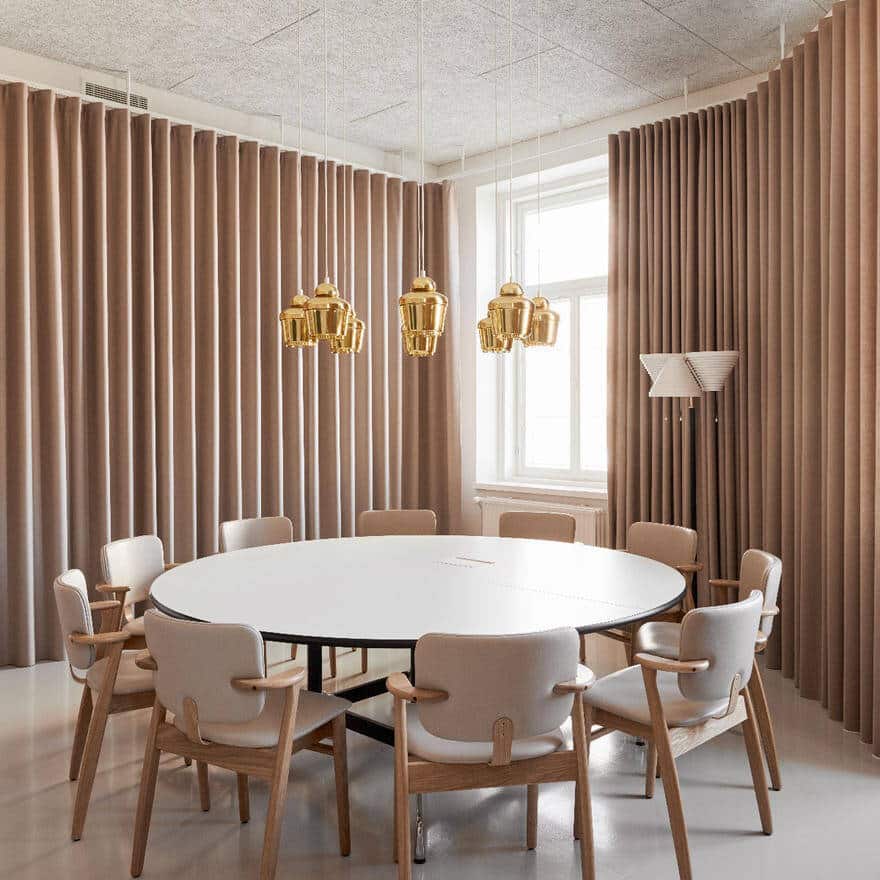
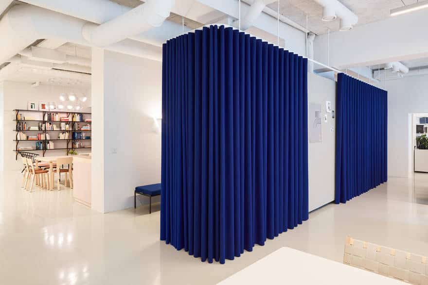
The ‘raw’ atmosphere is enriched by the introduction of bold coloured curtains. These conceal and frame the sample library, chair display, storage, archive, lockers, write-on and pin-up boards. Improving the office acoustics through their softness, the curtains equally form a theatrical setting to the functional galvanized steel shelving units behind. Depending on whether the curtains are open or closed, the perception of the space can switch between that of a vivid workshop or a serene workplace. Furthermore, the curtain colours provide an intuitive orientation throughout the space, as each zone has a different tone.
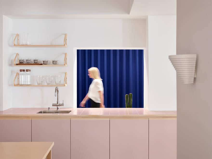
The formal meeting room is wrapped with curtains that create a soft, embracing atmosphere whilst concealing presentation walls and providing good acoustics. Visitors are drawn to the views out onto the historic city centre. Materials and details used for the purpose-made kitchen counter – lino fronts, birch handles and a tiled counter top – are a subtle homage to Artek’s heritage and craftsmanship.
The furniture
The concept for the work environment is welcoming and friendly with a collage of furniture from Artek and Vitra. Whilst both companies have a strong DNA, their products effortlessly merge to create a harmonious contemporary interior.
The light
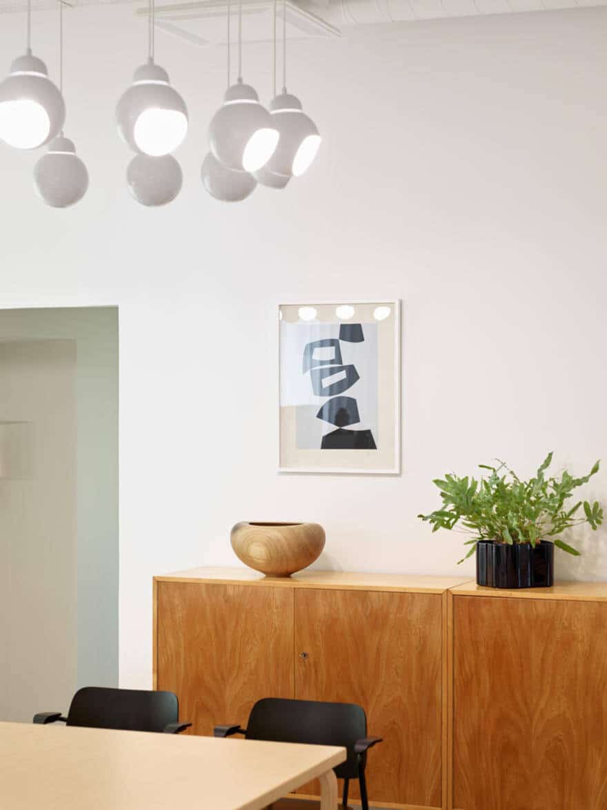
Linear Belux lights that are suspended slightly below the exposed HVAC installations create a bright yet restrained illumination. They are accompanied by a second light layer of decorative Artek light fittings which add a soft and homely ambiance to specific areas.
The art
Pieces from Artek’s art collection are displayed throughout the space. The extensive book collection is housed in the central library, allowing employees as well as visitors to browse through decades of architecture, design and art.

