Project: Astra Zeneca Offices
Architectonic Design: Space
Project Team: Juan Carlos Baumgartner, Jimena Fernández Navarra, Sinuhé Vera Montes de Oca
Collaborators: Ángel Trujillo, Marcos Aguilar
Location: Periférico Sur Mexico City
Constructionb Company: Alpha Hardin
Furnishings: Haworth Herman Miller
Photography: Paul Czitrom
SPACE has designed the new offices of global pharmaceuticals company Astra Zeneca located in Mexico City.
One of the greatest challenges facing the world today is the improvement of health. As a global pharmaceutical company, Astra Zeneca, spurred by innovation, renews and expands its offices taking advantage of its deep commitment with numerous countries aimed towards a continual improvement.
The design was based on a new trend in imaging and architecture for all offices worldwide. The company’s preoccupation for the social, environmental and occupational wellbeing of its collaborators has resulted in the implementation of innovative strategies in collaboration with numerous Mexican and foreign institutions, which increase the creation of ideas and prototypes in line with their activities.
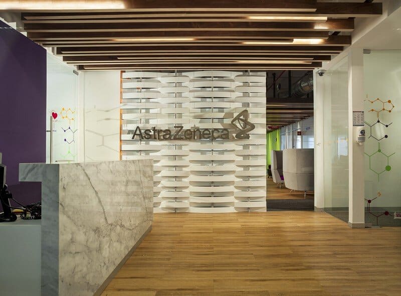
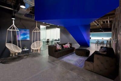
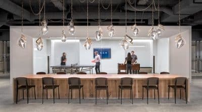
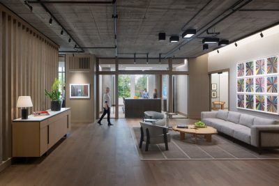
The project is developed on 3 levels with strategically-distributed key spaces: base zone, unplugged zone, connected zone, heart space: central hub and key connection routes. The reception reflects immediately the strength of the company; on possessing reflective and warm materials, a sensation of immersion is created between the user and the frame; the essence of Astra Zeneca, a plant perfectly distributed with a division between public areas and operative areas, is reflected in the architecture, and show in the DNA the stability, leadership, responsibility and efficiency represented by the great panel sustaining the brand name.
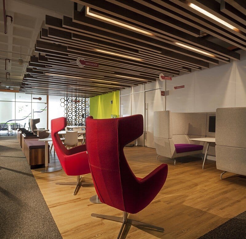
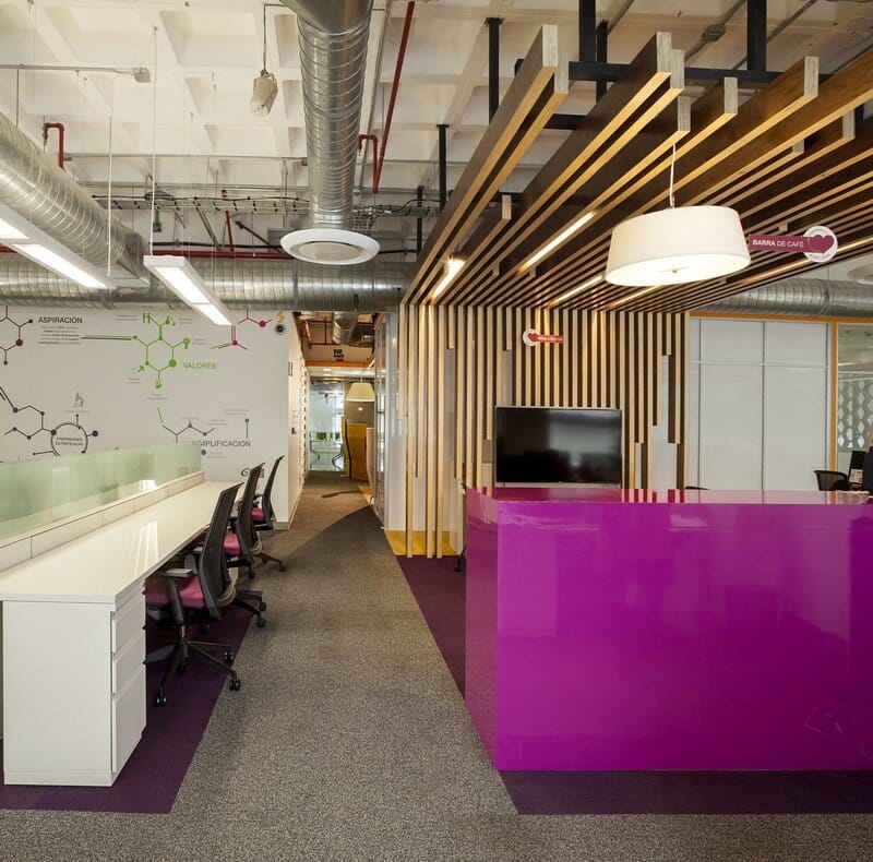
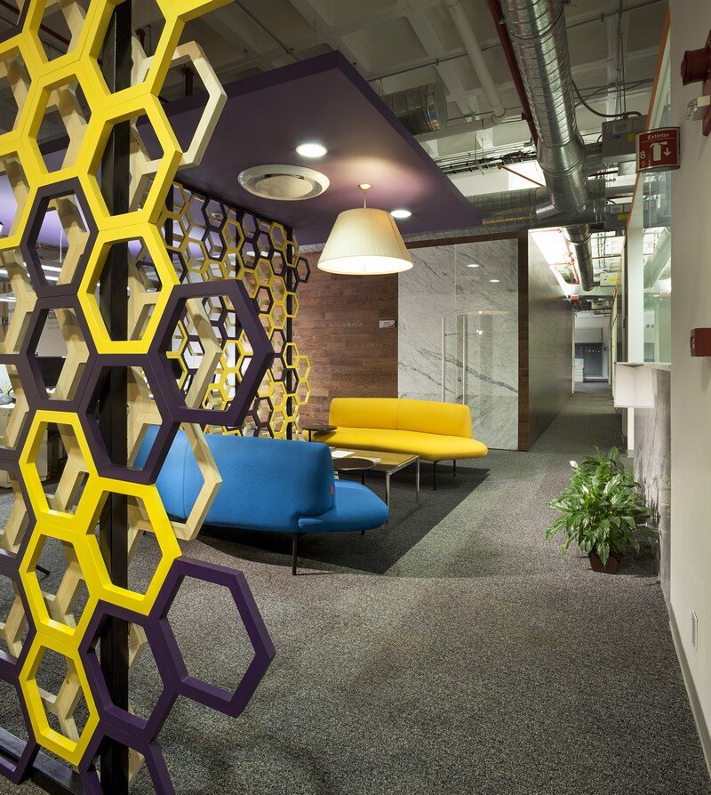
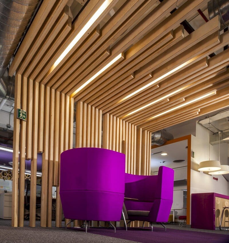
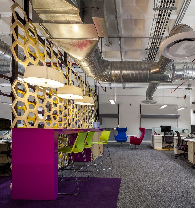
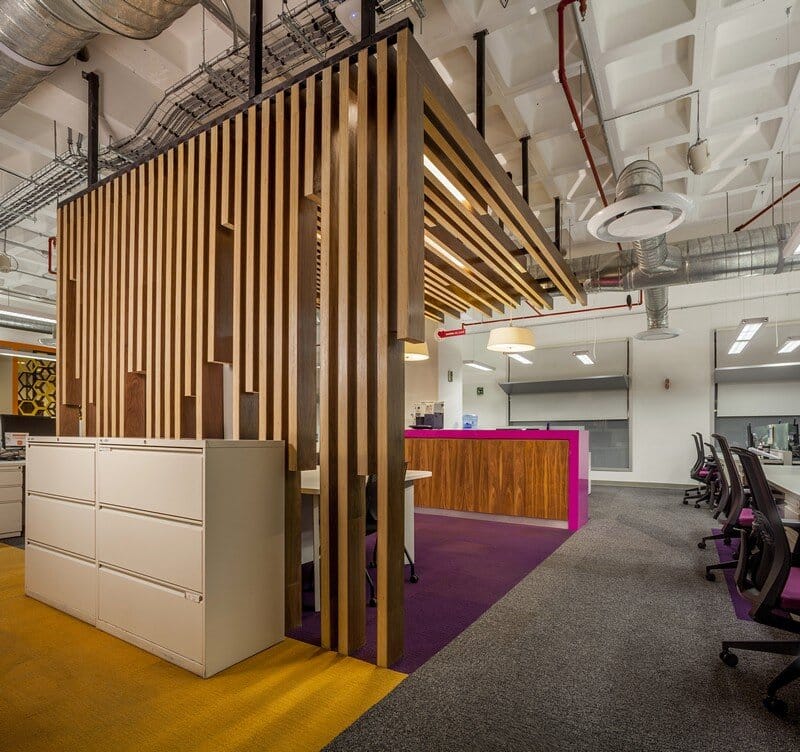
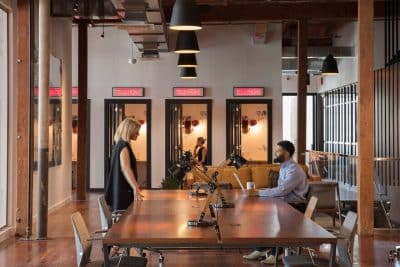
In this order of straight lines, work station trains gyrate at different octagonal angles, following soffits and false slabs with color accents in the carpets. All the color of the space responds to the theory of color, where neutral and warm colors combine to attract concentration and productivity, red and yellow details invigorate people, and purple chairs bring a little reflection and greater self-esteem to the occupants.
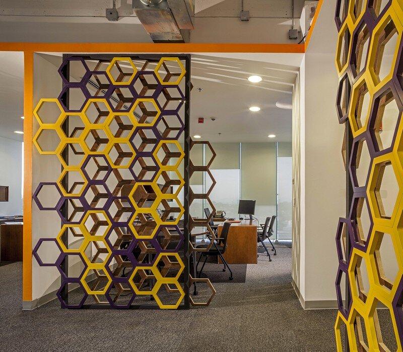
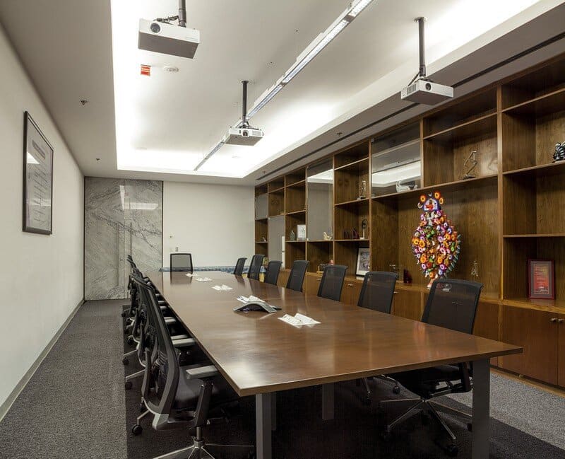
The general image creates a hybrid between modernity and avant-gard, the combination of materials, Carrara marble, glass, metal, wood and accents in color give this place a dynamic and flexible character obliging one to notice the details. This sets this space apart from any other. The utilization of hexagonals as a symbol of structure, strength and order combine with graphic details of DNA abstracts, emphasizing the importance of giving rise to, storing and transmitting the information essential for the development of new ideas to the benefit of Humanity from one generation to the next.
The use of natural light and the views of the place are taken advantage of to the maximum, placing the built-up spaces to the short sides, leaving translucent facades to allow the passage of light to the rest of the area and, in this way, take advantage of natural lighting to the maximum. To take better advantage of the plant, all services were placed at the back, on the blind side of the building. In order to illuminate this space specific lights were designed for the project, creating continuous lines of light. Zoning was done further to the uses and levels of lighting in accordance with international standards, and the perception of the human being.
The use of branding with the company DNA throughout the built-up spaces reflects the pride of the company and reinforces its identity as a firm searching for the best conditions for its workers, always ensuring that all opportunities are taken advantage of in order for innovation to occur.
Thank you for reading this article!

