Project: Block Village
Interior Design: HAO Design
Location: Kaohsiung City, Taiwan
Area: 40.0 sqm
Project Year: 2015
Photographs: Hey!Cheese
Block Village is a modern and comfortable family home designed by HAO Design in Kaohsiung City, Taiwan.
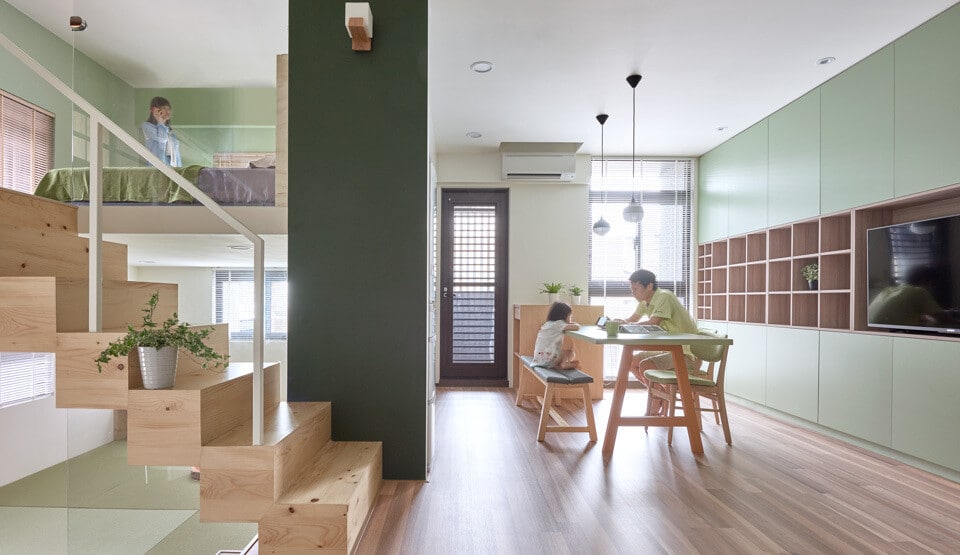
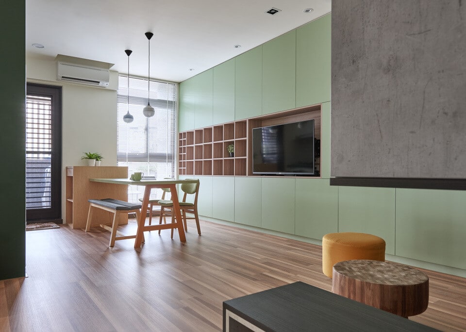
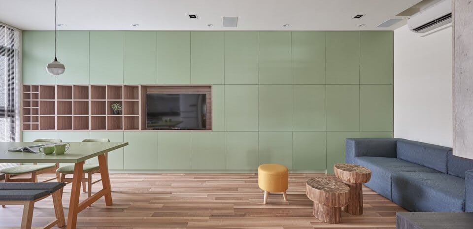
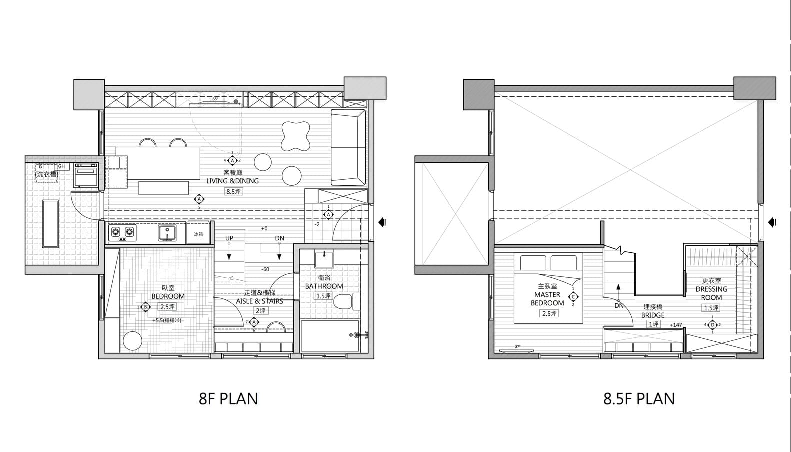
Description by HAO Design: While stepping into the 12 ping (39.6 square meters)’s house, you can feel the light revealing from the balcony clearly and simply light up the spatial functions. The living room and the dining room in the front right side will be the space to carry most of the family memory in the future. Thus, the designer decides to make the light shine unbridledly along the dining room, bringing out how the family imagine their future home – along with the simple and plain texture of pinewood, the harmonious green color, and the simple but happy atmosphere of white painted-wall.
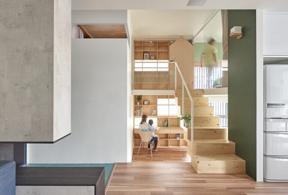
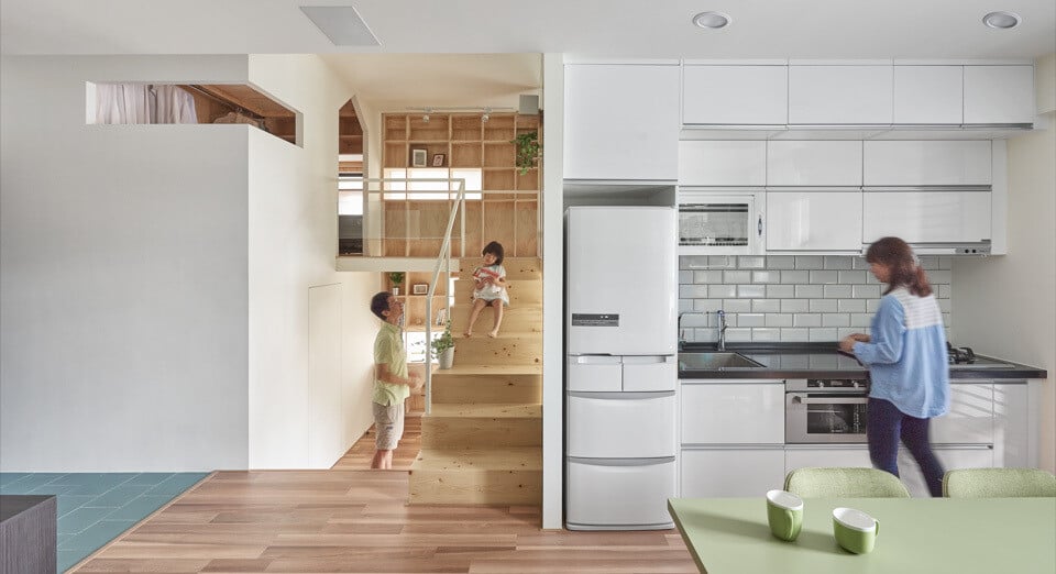
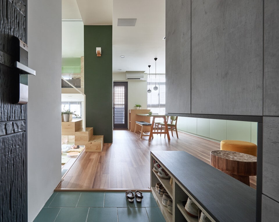
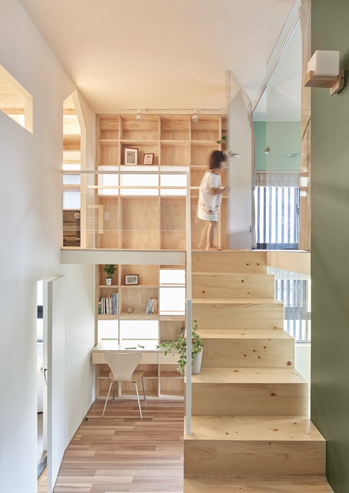
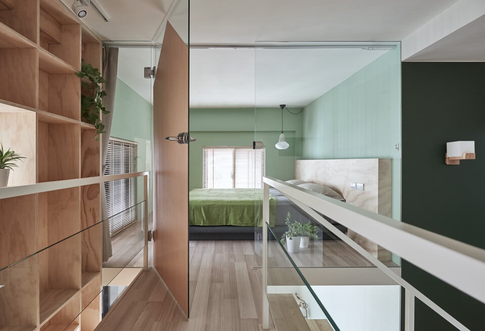
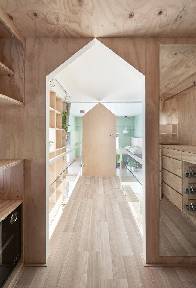
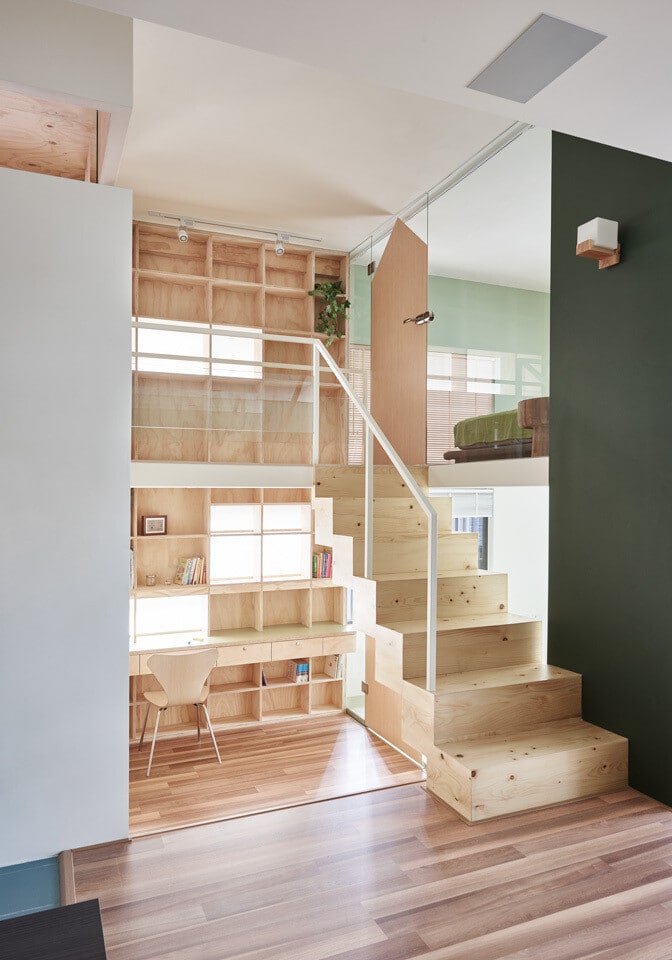
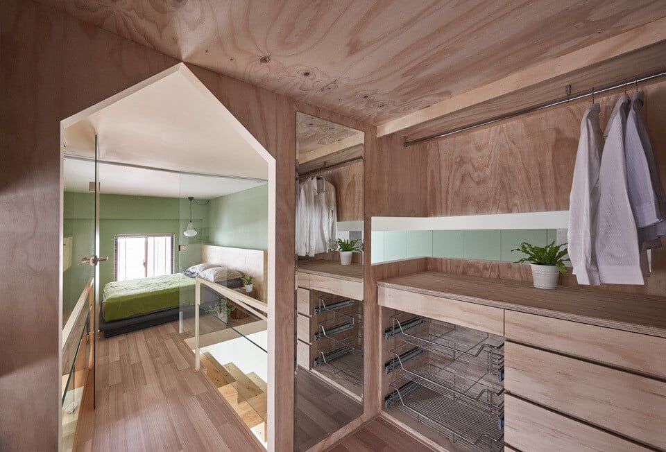
Usually, the floor space is designed to meet basic space requirements (3 bedrooms, 1 dining room and 1 living room) and the storage demand. However, in this case, the designer pays more attention to create the pleasure of visual sense while dwellers walking in the house. The main circulation – stairs combine with the aisle turning into an air bridge, connecting the master bedroom (2.5 ping) and the walk-in closet (1.5 ping), which are capable of relatively closer spatial functions.
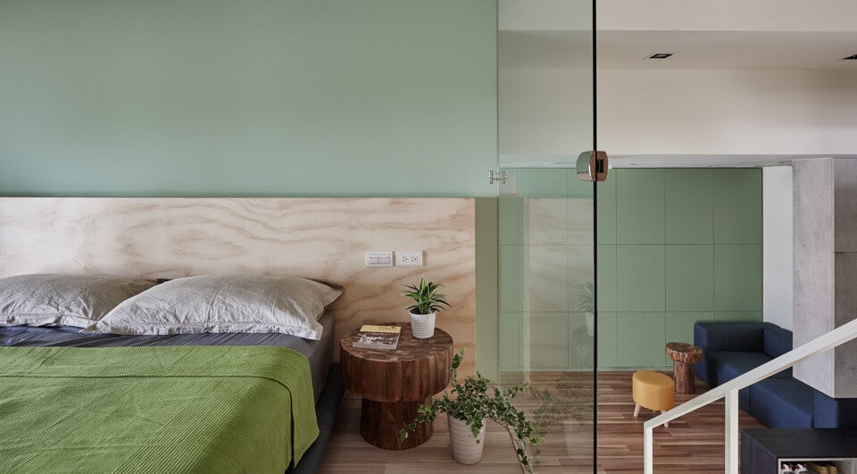
While keeping privacy for the master room, the designer still leaves the light and shadow in it, and makes the corner window in the walk-in closet foreshadow the most important view of the living room and the dining room. Through designer’s arrangement, Washitsu room for family activity is contained under the master room, and the sanitary equipment is right under the walk-in closet.
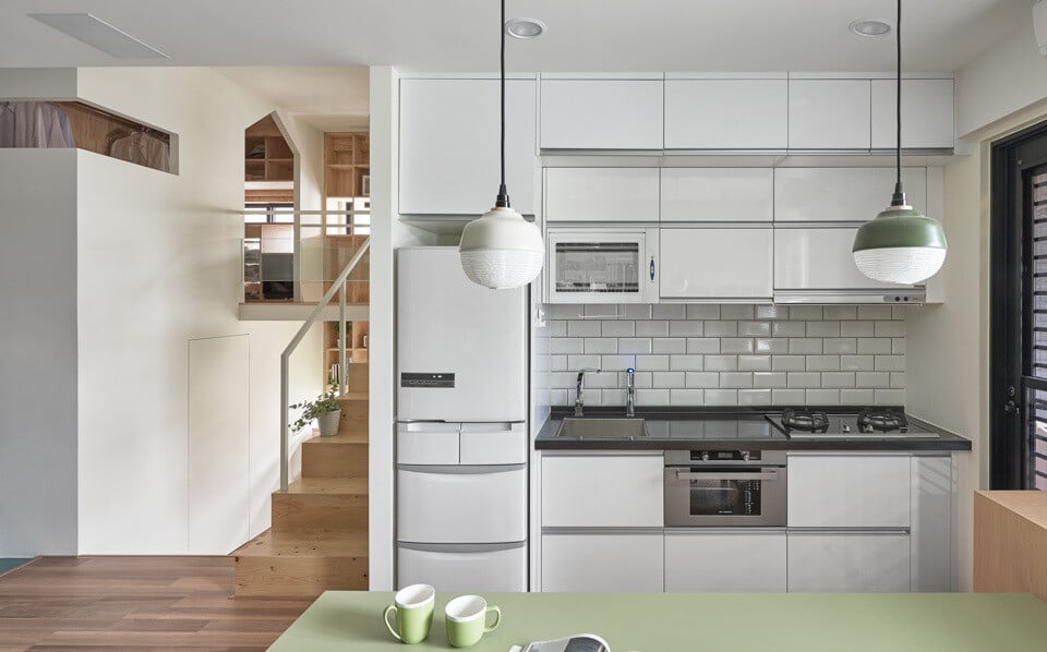
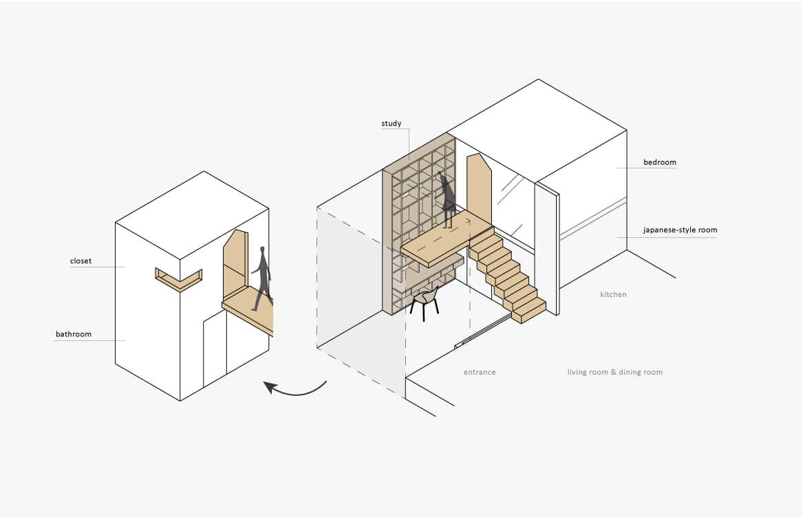
The two spatial functions of up and down space compliment each other, further, the designer transforms the space under the stairs into another aisle, and by creating bookshelves along the atrium wall of the air bridge above and the aisle below, not only extending the spatial scale to eliminate the sense of pressure, but also creating the extension of visual axis.
From outer layer of the architecture, the designer uses the windows to frame the scene, but using real and imaginary door shape to create the frame from the inner layer. Also, the height is an element that is sufficiently applied in designing, for example, the television in the living room is flexible to screw-off along the slide rail, and is able to stow into the wall, keeping horizontal to the dining table.
The design replaces the traditional single-function television wall. Besides, the storage cabinet on the wall is equipped with hidden handles to keep the living room and dining room commodious and neat. Each room seems independent but actually closely connected.
The consistent green-tone gives rise to the spatial dialogue – matcha-green of the tatami is blended with the green color of the wall in the master room, while the dark green color of blackboard consistent with the green color of the storage cabinet bottom. Time is also another element when framing the scene. It’s constantly changing, being rearranged and redefined to shape the purest look of the family’s life.

