Project: D89 House – From Rural to Modern
Architecture: Architect Raz Melamed
Location: Tel Aviv, Israel
Year 2021
Photography: Amit Geron
Text and photos: Courtesy of Raz Melamed
This house in Tel Aviv went from rural to modern, and under the professional hands of architect Raz Melamed, it underwent a full transformation that eventually suited its occupants like a glove, suited to both to their daily life and large scale hospitality that takes place on a regular basis.
The couple and their 4 young children lived in the D89 house before the renovation, and although the architect recommended demolishing the house from its foundation for the sale of time and budget, they chose to cling to the sentimental aspect of the house, deciding to preserve the shell and make the necessary interior changes to suit changing need sand contemporary and kicking design. The thought in planning was clients who love the finer things in life and treat their home as a ground for recreation and hospitality, with the woman a chef by profession, and even conducting cooking workshops at home.
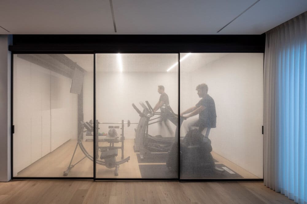
Thus, working with a basement and 2 floors, this house came to life with children’s suites, an elegant master suite, gym, study and family corner, all in response to the customers requirements detailing functions as well as design. This family asked the architect for a significantly larger kitchen, spacious dining area, and an additional dining area and living room outside that can also be used during the winter.
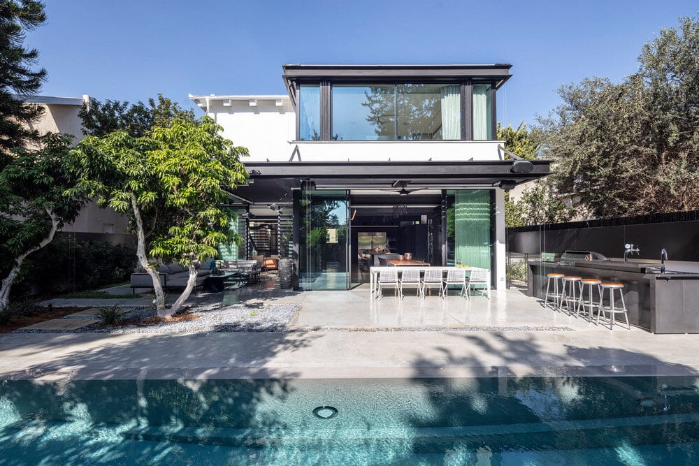
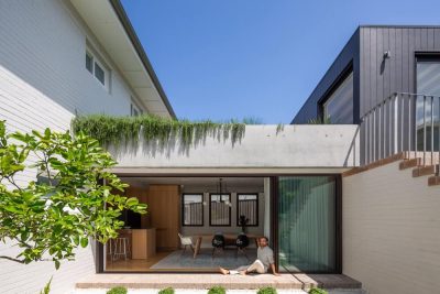
The beginning of the renovation was a multi faceted production all the pillars and shell walls on the ground floor were demolished, reinforcements were installed, and the whole house was on scaffolding. First to fall were the exterior walls, which were the first challenge to Melamed, which he solved in front of a perimeter continuous glass front that creates continuity from the courtyard. While the original D89 house was dark, the new design created open facades to the courtyard with an emphasis on natural light and air. For support, black rails were placed as vertical columns and as horizontal beams, which carried heavy weight on the one hand, and created a light industrial look on the other.
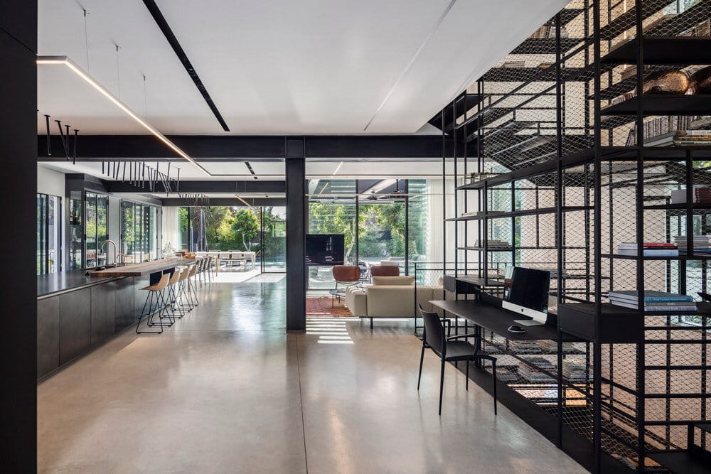
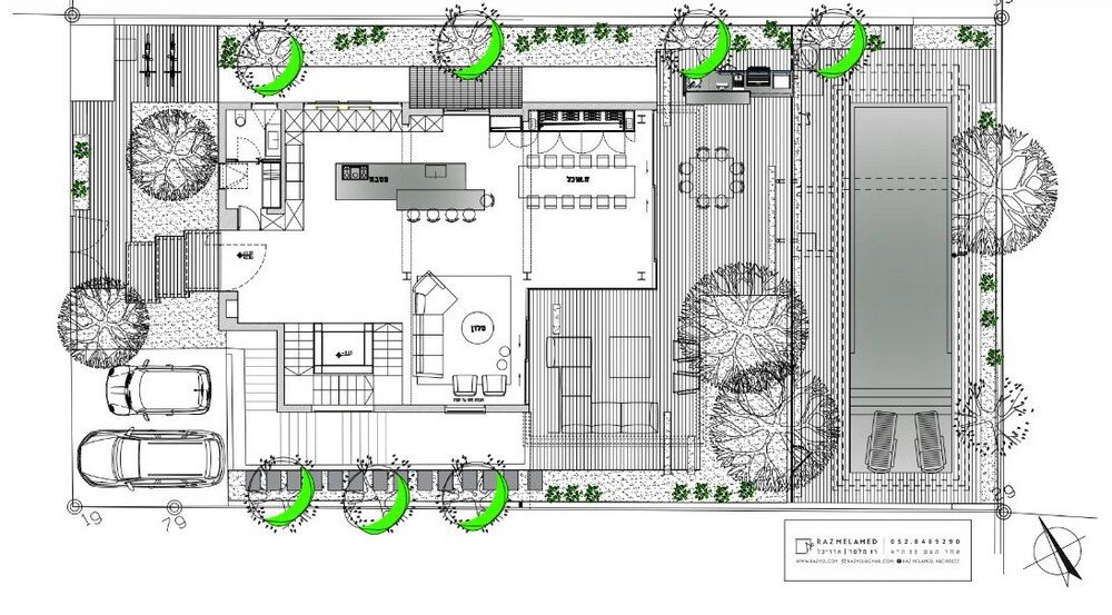
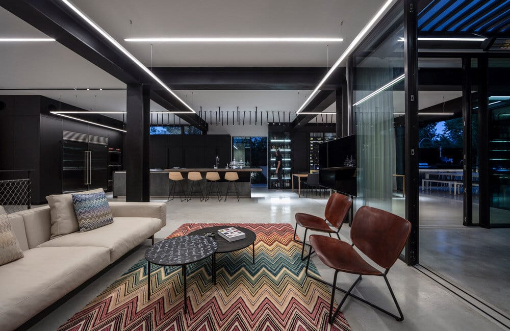
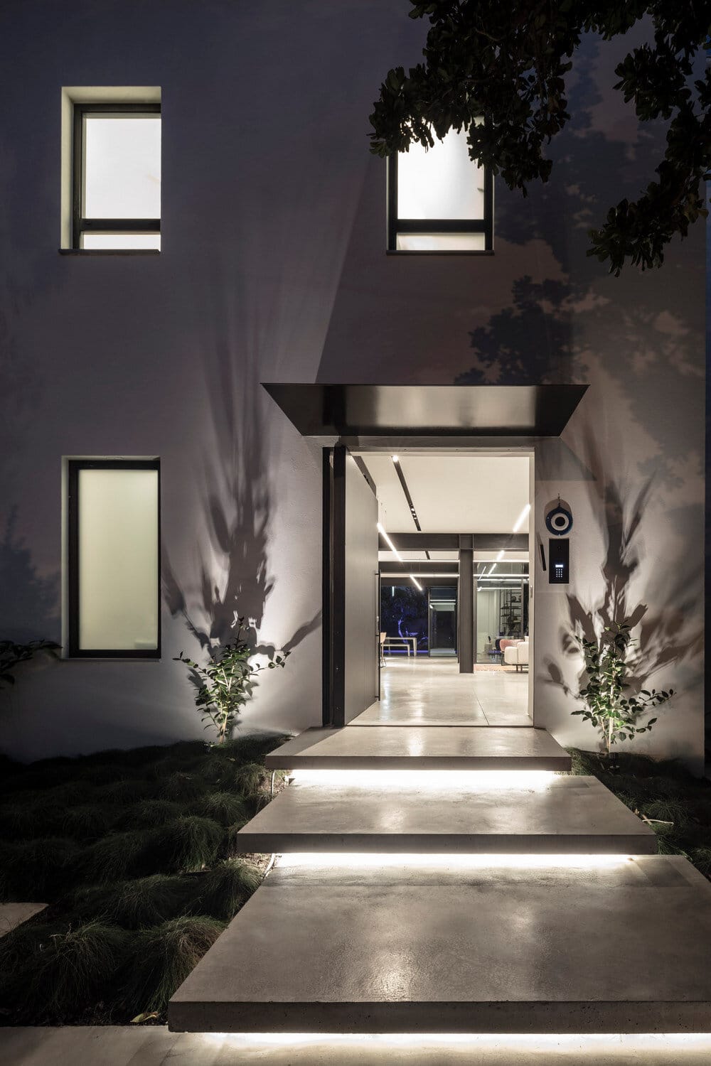
Their location creates a grid that divides the public space into a kitchen, dining area and living room, a grid that is also repeated in the concrete divisions on the floor as a design decision that creates a clean and quiet line in the eye, and even blends in with the ceiling light strips. The front of the home facing the street remained as it was, including the location of the windows framed in thin aluminum in a graphite hue, a hint of the change made in the interior. At the opening of the front gate, massive lighted concrete paths are revealed, rising one by one to the front door. Around them is minimal vegetation and above them is a thin metal roof in a graphite shade, which looks like a leaf breaking out of the wall. Its size is the same as the size of the pavement below, thus creating with it an interesting play of masses and colors.
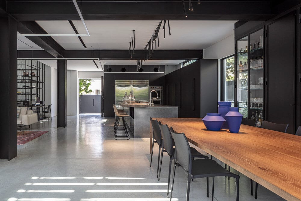
At the entrance, a raw concrete axis that crosses the D89 house was exposed beginning on the floor of the floor, continuing to the floor of the courtyard, and ending in the pool. To the left of the door is the carefully designed kitchen for a professional chef 2 refrigerators and 2 stainless steel ovens protruding on top of the tall graphite cabinets, above which circles of the same color have been opened for air conditioning outlets. The air conditioner itself is hidden in the ceiling of the guest toilet, which is hidden behind the lobby of the coat closet.
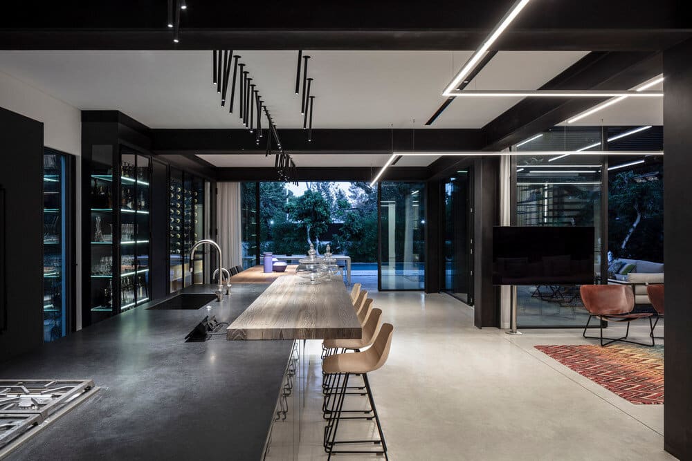
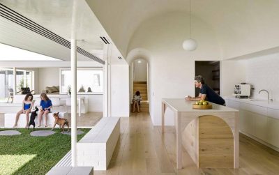
Perpendicular to the refrigerator are additional cabinets with pocket doors that reveal a work surface covered with wood and appliances of a professional kitchen. Opposite it is the island in a titanium finish with a metallic cloud, which is divided into a work surface and a seating surface in the form of a floating wooden top, with light bar stools combined with iron and wood. The ceiling beams that run parallel to the refrigerator divide the entrance axis into different functions first a work area, then eating on the island, and finally accommodation in the dining area.
The lighting in the public space emphasizes the beams perpendicular and parallel to them, and combines recessed ceilings, profiles suspended by thin wires and adjustable ceiling mounted fixtures that look like dancing from the ceiling at different angles. Their light beams create a rounded motion that contributes to softness in space, a feature that would not be expected to be found in an iron rod, and the result is a practical and well designed lighting element that presents a balance of hard and soft, straight and rounded. The iron bars strengthen the longitudinal axis of the D89 house and seem to be subject to the ceiling rails, while the hanging lighting maintains freedom and emphasizes movement and angles.
These rails and iron rods are just some of the coarse, unprocessed materials in the project that represent the architect’s concept that is woven into each project and shows that each material should appear in its original form. Glass, iron, wood, concrete all of these are connected to Melamed’s “I believe” attitude which showcases dominant materials throughout the house and also in its height, whether in architectural elements or in custom designed furniture. It is an industrial sight that is not afraid to burst into an open door and be present in all of its glory.
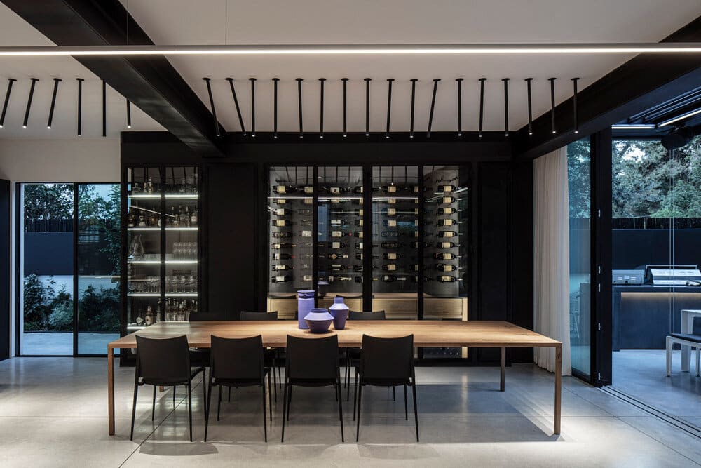
Adjacent to the kitchen is the dining area, which is dominated by a wooden table with a huge plate that sits on thin legs. Around it are gray chairs, standing on slender legs, which reinforce the strong design motif throughout the D89 house, whether in architecture or furniture a display of massive pallets held thanks to thin elements, showing a play of weight and lightness, mass and airiness. The big star of the corner is the wine refrigerator, the embodiment luxury, which features a display of glasses and various bottles of fine alcohol that tie in in together the image of a good and enjoyable life. This motif does not only exist inside.
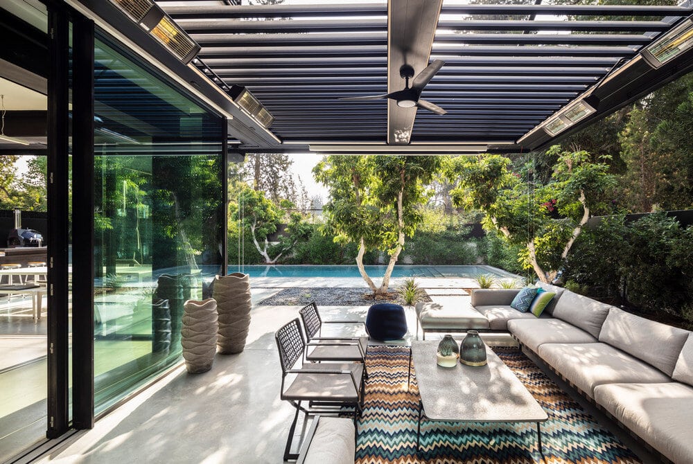
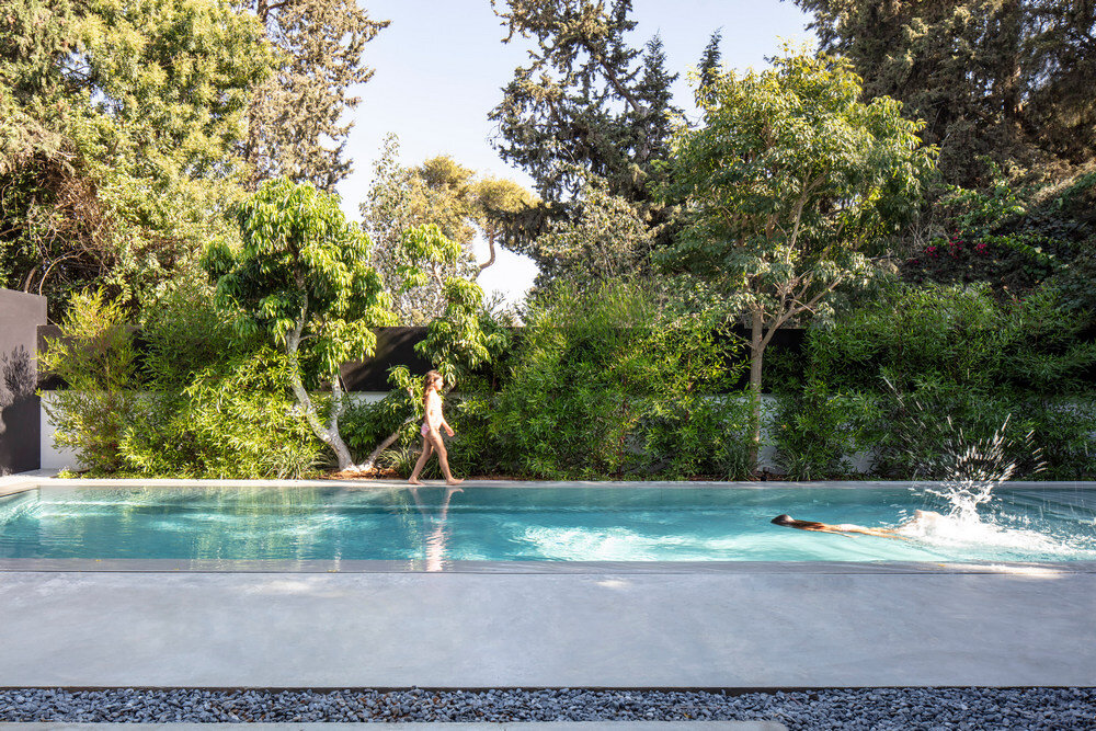
On the outside of the D89 house, the family wanted a space to host their friends like kinds. As such, an outdoor dining area stands next to an outdoor kitchen with a black concrete surface that diffuses cooking aromas in the yard. It overlooks a flat pool, surrounded by wild landscape architecture that is not subject to the rules of order and stands in contrast to the neat grid of paving. It is this contrast be tween order and wildness that creates interest on the one hand, and balance on the other, the yard turns into a place designed for recreation.
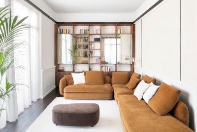
At the request of customers, the outdoor living area was designed for hospitality that does not depend on the sea sons above it is a ceiling that opens and closes with walls that go up and down at the touch of a button. In addition, floor heating was installed and is surrounded by heaters in the pergola that surrounds it, a combination of elements that allows use on cold days. In front of this, inside the house, is the interior living room which consists of a light sofa to soften the black around it, and armchairs in a cloudy cognac hue. The furniture sits on a zigzag patterned rug that creates freedom inside the neat grid, adding joyful vividness as well as the decorative cushions.
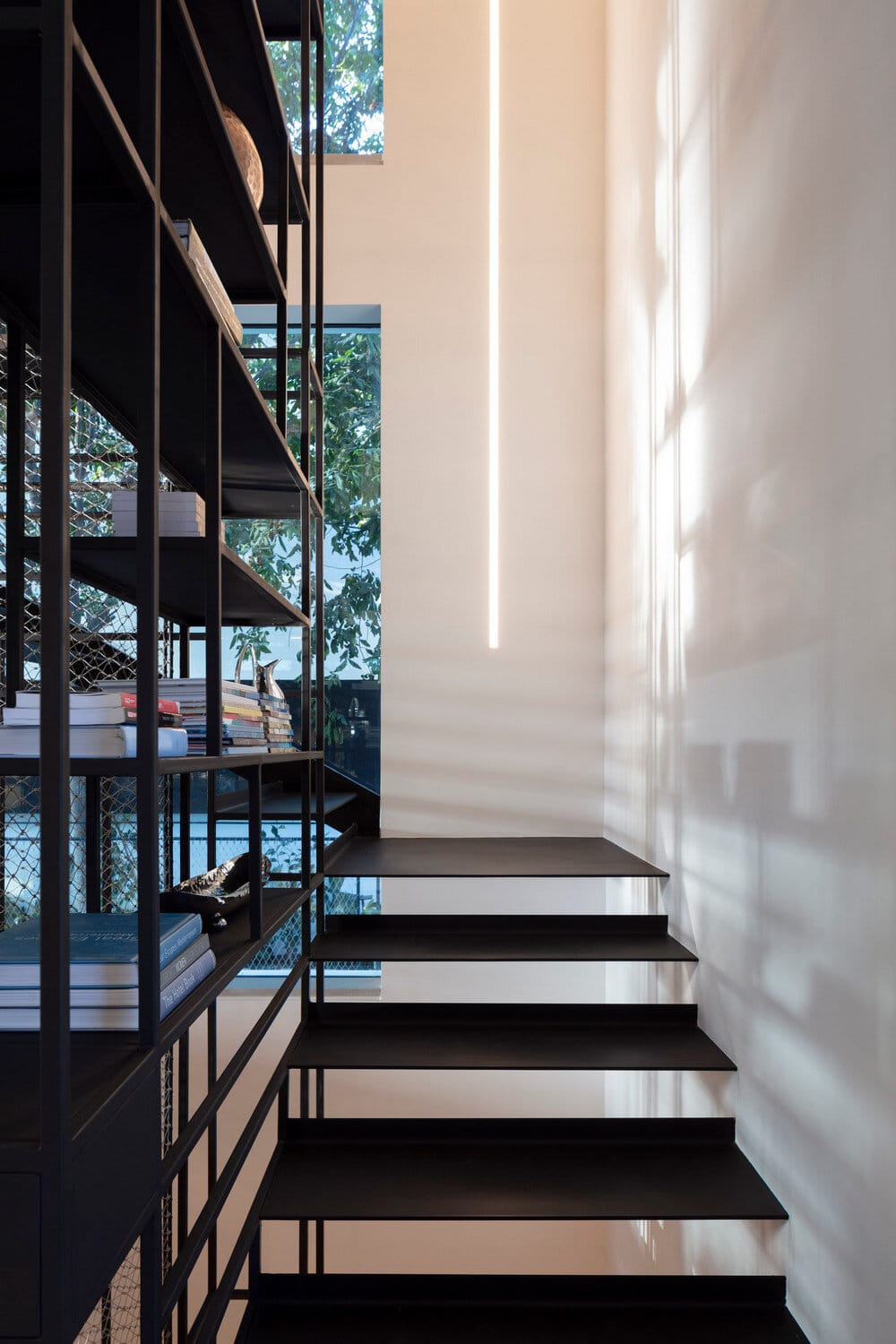
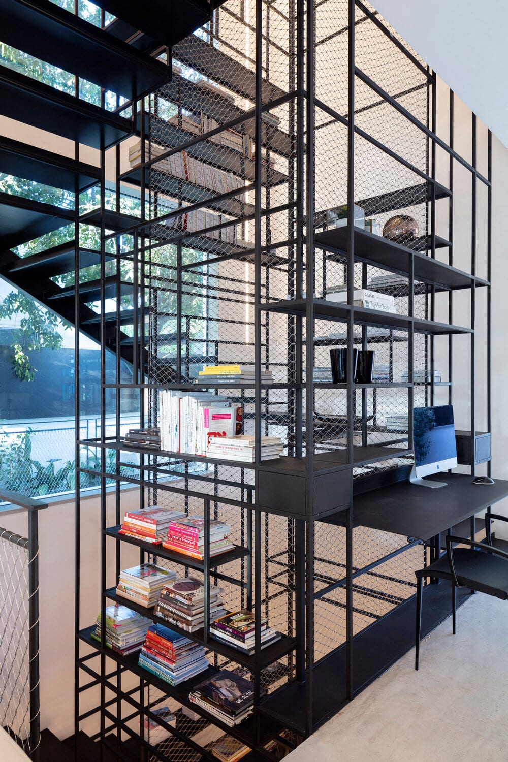
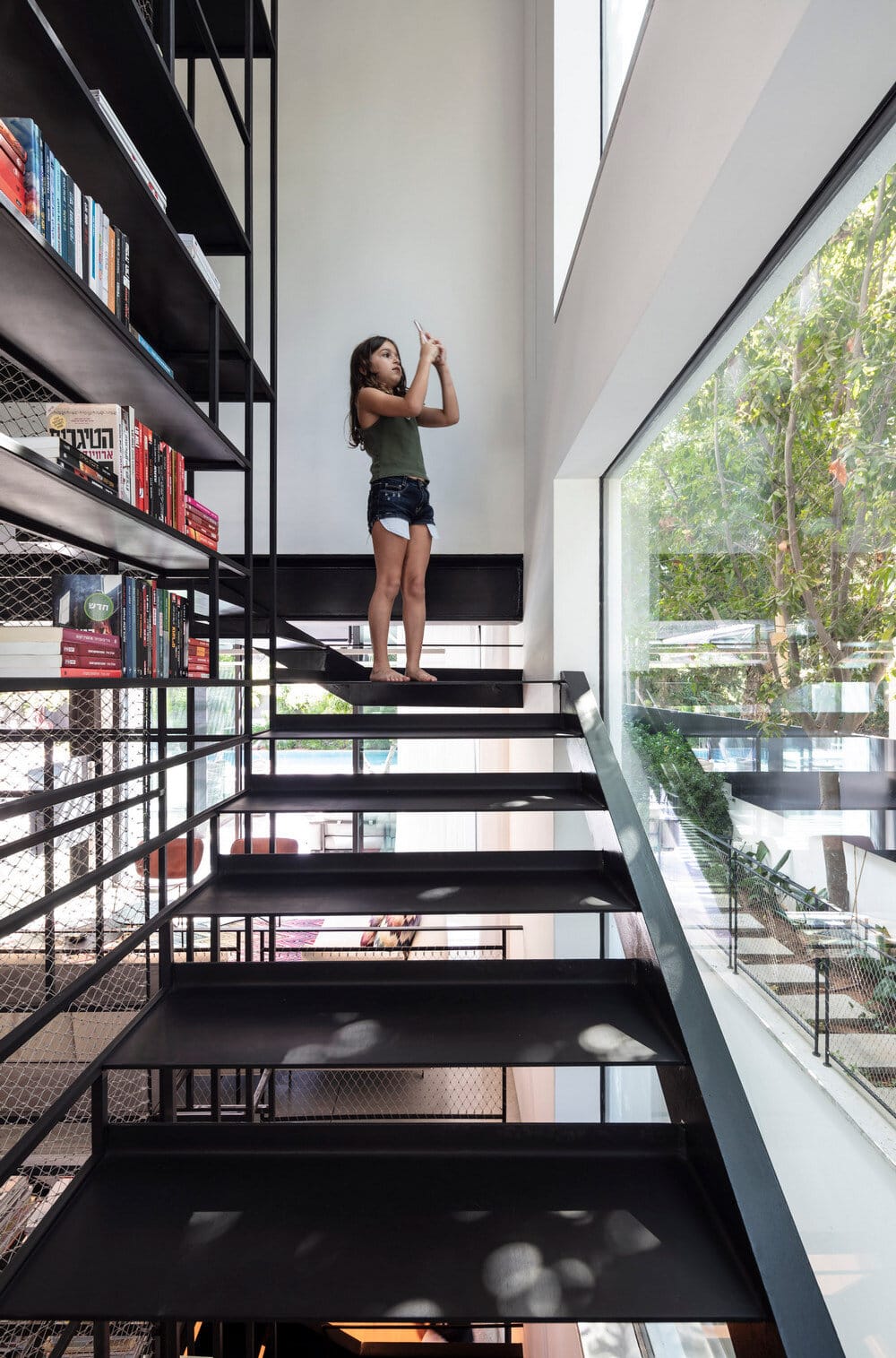
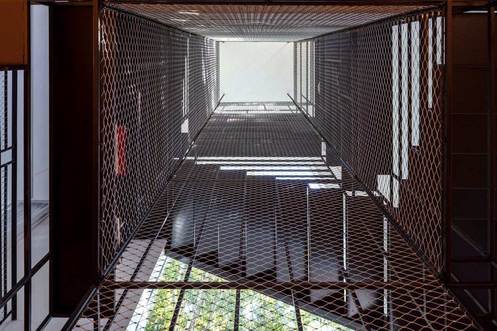
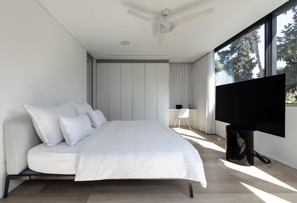
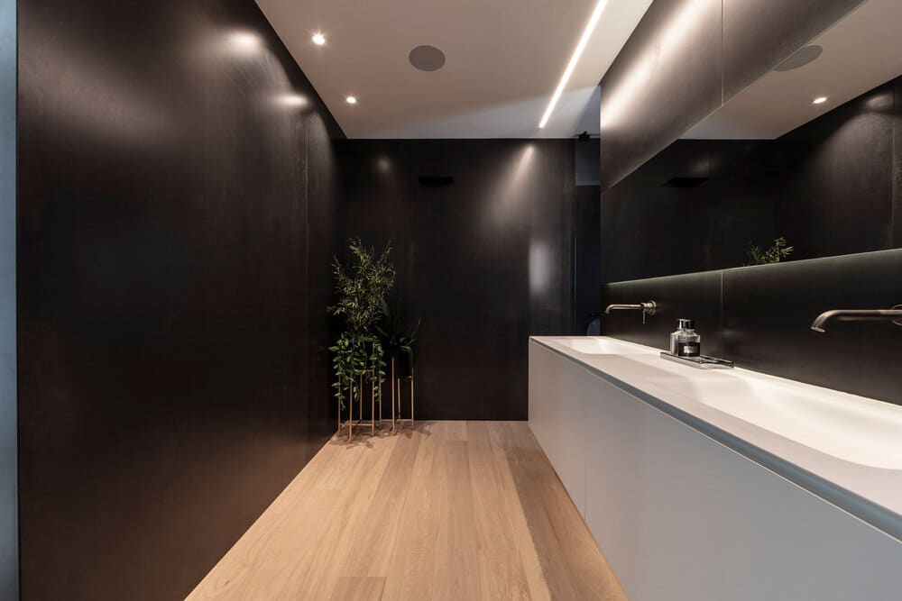
The ascent to the rooms floor and the descent to the basement take place in a kind of metal vortex that combines stairs, shelves, a railing and a work area, all in one work that stands in space like a piece of art. The iron element hangs from the ceiling in thin rods that reinforce the central idea of planar plates, which fold and create movement in space. These rods ascend to the master suite where white dominates the architecture as well as textiles and furniture, with parquet as a substrate that contributes to the warmth of the space. The closet next to it is made of huge glass cabinets, in the center of which stands a white carpentry in a personal design for sitting and storing ties and shoes. The parquet goes in to the bathroom, and above it hovers a sink cabinet with elegant wall faucets, all wrapped in a tight wall cladding with a cloudy graphite iron look, a testament to the good life that stays not only in public, but makes sure to penetrate every function and use of space.
D89 – From Rural to Modern
Brands in the project:
Kitchen – Boffi
Island chair – Lapalma
Dining table – MDF Italia
Dinning chairs – Desalto
Outdoor living – Tribu
Living room sofa – Depadova
Rugs – Missoni
Master bed – MDF Itaia
Wardrobe – Poliform

