Project: OPALO Store
Interior Design: Alapar Studio
Location: Tafalla, Spain
Area: 21m2
Year 2018
Photographer: Xabi Ansó
The new OPALO store space focuses on returning the prominence to the product by creating a boutique where personalized treatment is one of its hallmarks.
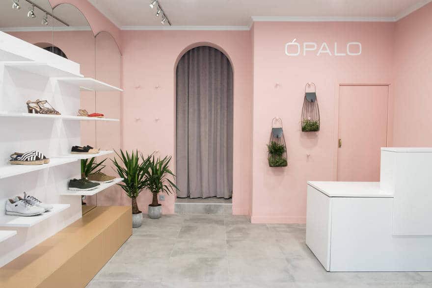
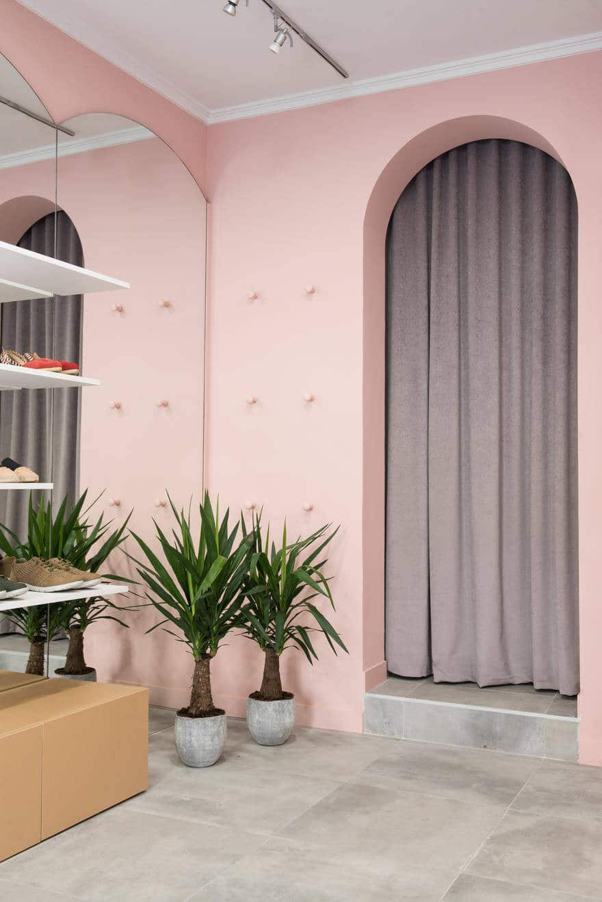
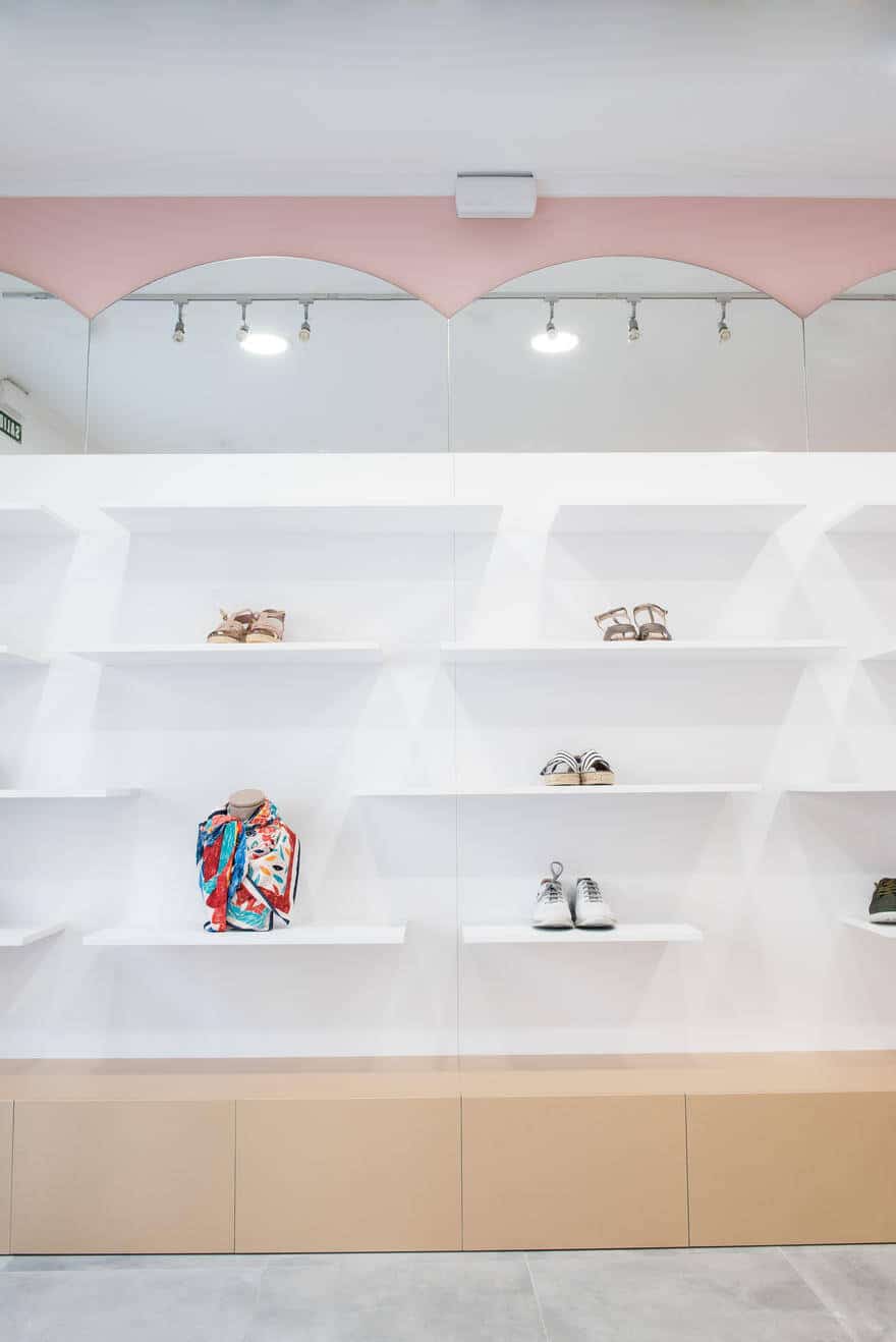
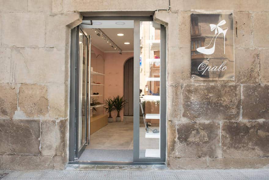
Opalo has been around for 10 years but they wanted a change of location. The new premises had elements that we wanted to maintain such as the mirrors on the wall that we wanted to maintain as they gave character to the space, at the same time they helped to expand it and create visual verticality. The rhythm generated by these mirrors in the shape of a half circle in the upper part, encouraged us to work with a similar shape – the hollow of the storage area – making this arch one of the figurative elements of the interior space.
The new space was smaller than the one they had been in previously, so we worked with different heights on the walls to be able to show as much product as possible in an orderly manner.
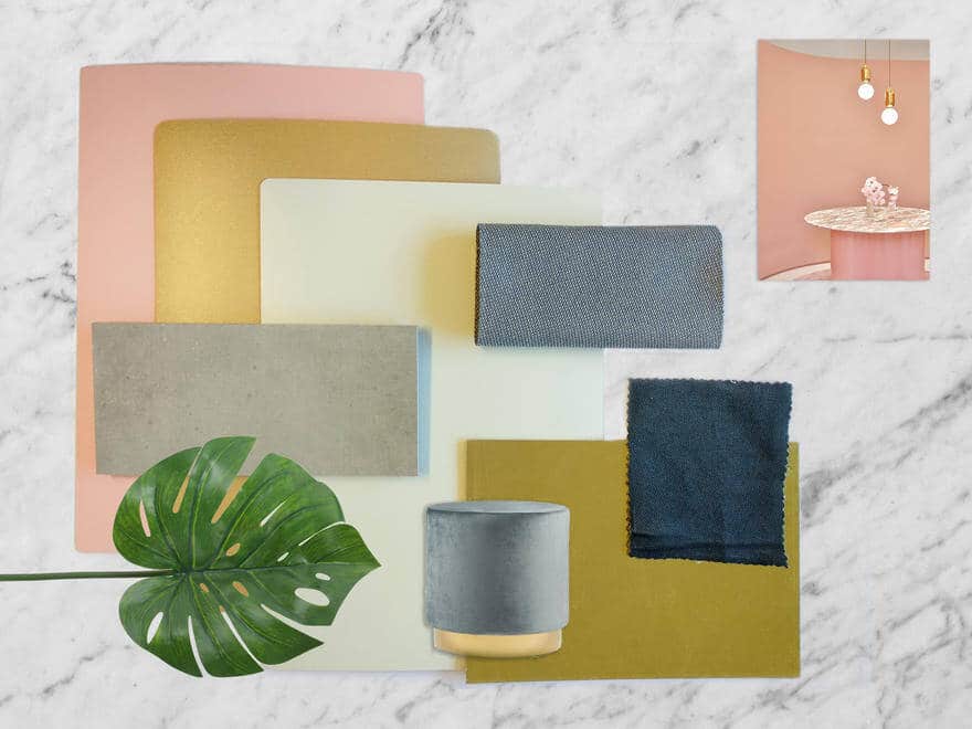
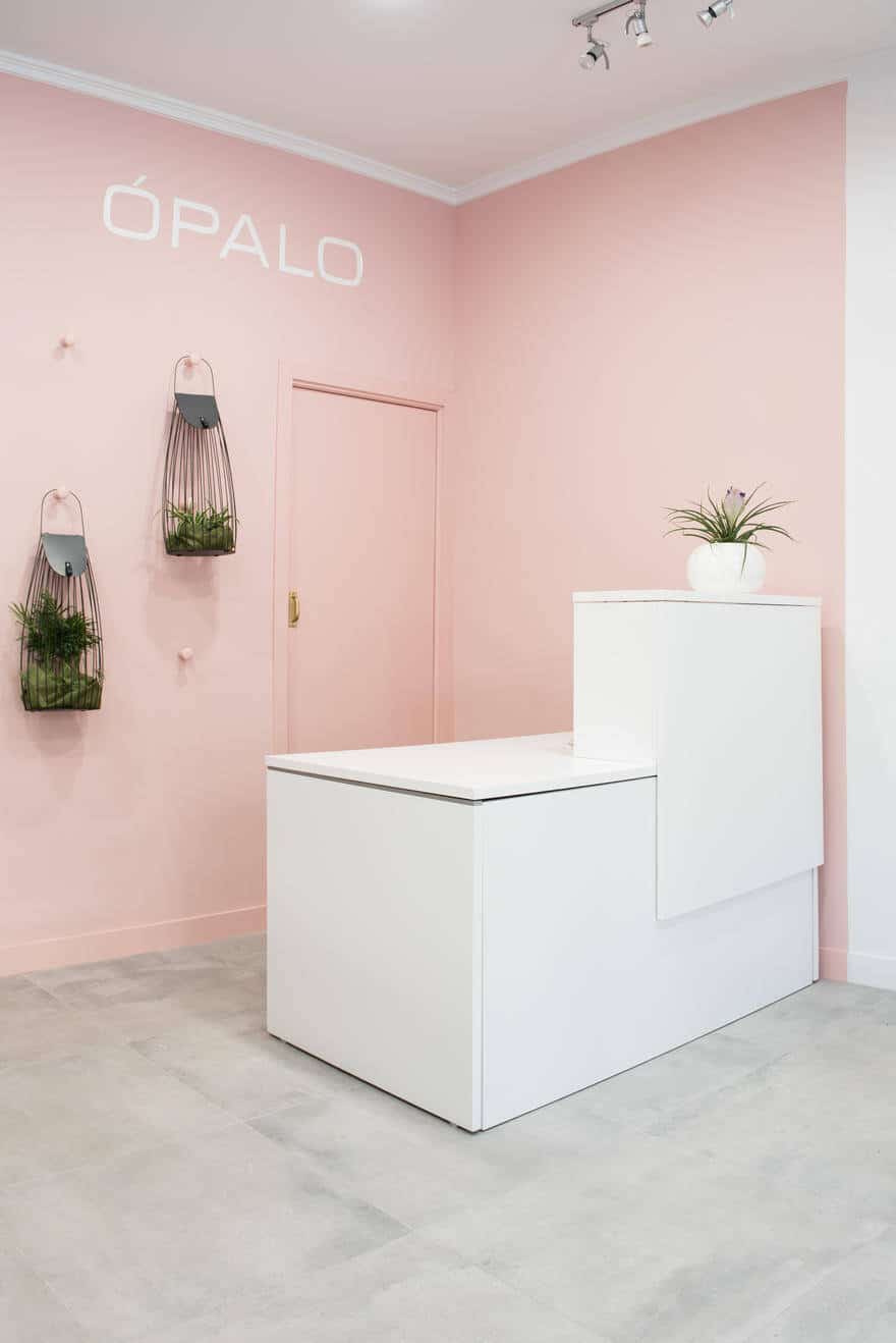
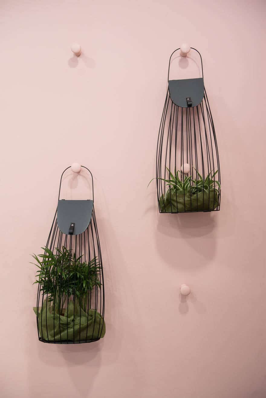
The different nuances of space are enhanced with the different materials used. On the one hand we have the painting of the pink wall, which zonifies zones the counter space and transmits us femininity and delicacy. On the other hand the floor of large grey tiles give us this feeling of spaciousness; also the curtain of the warehouse has the same grey tone so floor and wall seem to merge.
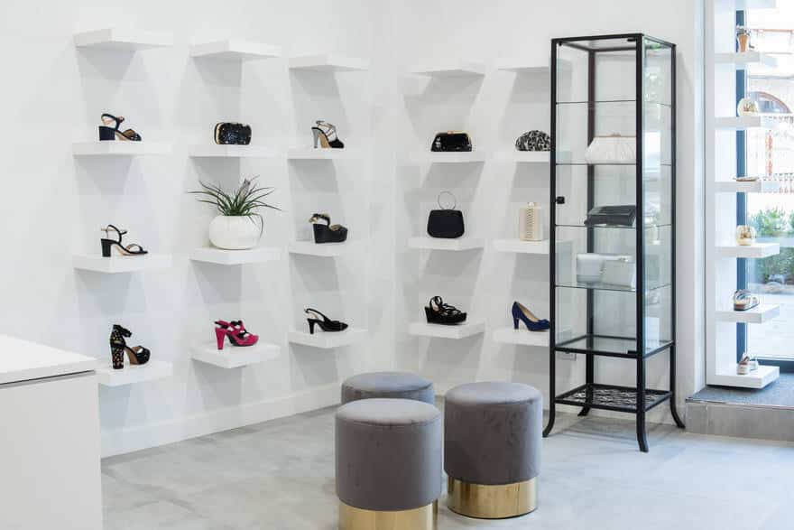
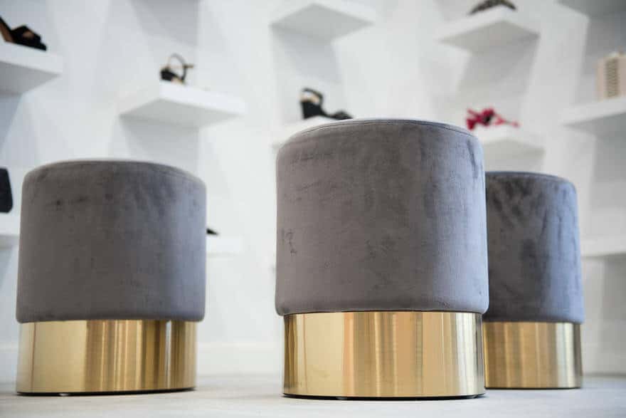
As single elements we can see three stools in velvet grey with golden base so they can work as a group or as single seats. A wooden custom made cabinet was placed in front of the mirror but without completely covering it so it´s integrated into the space. The lower, golden module serves as storage while the back and shelves are white so they can create different compositions with their products. On the other side, we use several shelves in white, the same color as the wall, to show off their products and create a changing exhibition area depending on the season.
