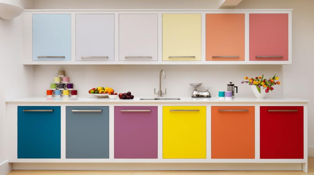
Imagine walking into your kitchen and suddenly finding something odd about it. Your attatchment towards kitchen is not strong anymore. You don’t feel your kichen as the heart of your home and sadness lurks. You know why? The reason is that you have moved on to new world where old kitchen trends seem no longer viable.
Let’s make the year 2024 a year of riddance of all old kitchen trends that are maligning your home From bulky cabinetry that takes up too much space to layouts that hinder your culinary creativity, it’s time to say goodbye to the past and welcome in a new era of kitchen aesthetics. Let’s get going.
Following are outdated kitchen trends that you must avoid:
1. Open shelving
Open sheving may look a great option while designing your kitchen interior but according to famous architect Angie Harpole, open shelves are gradually phasing out. In the near future, you may not see these sleves as homeowners go for shelves and cabinets that can store foods and cutlery while keeping them safe from climate and dust. Another reason, they are not trendy anymore is that sometimes articles, or food can extend infront giving an ugly look.
2. All black fixtures on all-white kitchens
The popularity of incorporating all black fixtures into all-white kitchens is on the decline in the ever-changing landscape of kitchen design. While initially appealing, the stark contrast often disappoints, resulting in a space that feels cliché rather than sophisticated. It’s like trying to inject drama into a setting meant for cleanliness and tranquility. Instead of sticking to this trend, consider adding subtler elements or experimenting with different finishes for a more nuanced look. Avoiding the all-black-on-white approach allows for the creation of a kitchen that feels fresh, timeless, and welcoming, avoiding fleeting trends and ensuring lasting relevance.
3. Gray-toned flooring
The trend of gray-toned flooring, once a popular choice for its modern and versatile appeal, is now falling out of favor in the realm of interior design. While it initially offered a sleek and contemporary aesthetic, the prevalence of gray floors has become somewhat ubiquitous, leading to a sense of monotony and predictability in home décor. Moreover, the cool undertones of gray can sometimes create a cold and unwelcoming atmosphere, detracting from the warmth and coziness that many homeowners desire in their living spaces. To avoid the pitfalls of this outdated trend, consider opting for flooring options with warmer undertones or unique textures that add visual interest and character to your home. By embracing a more diverse range of flooring materials and colors, you can create a space that feels inviting, stylish, and distinctly your own.
4. Too much gray
The overuse of gray, once hailed as a sophisticated and versatile choice in interior design, is now losing its charm. While gray can certainly add a sleek and modern touch to a space, an excess of it can lead to a lackluster and uninspired atmosphere. Too much gray can make a room feel drab, dull, and devoid of personality, robbing it of the vibrancy and liveliness that make a house a home. To avoid falling into the trap of an overly gray space, consider incorporating pops of color or introducing elements with different textures and patterns to add depth and visual interest.
5. Glass mosaic backsplash tile
The trend of using glass mosaic backsplash tiles, once favored for bringing a touch of sophistication and glimmer to kitchen and bathroom designs, is now waning in popularity. While these tiles undeniably make a striking visual statement with their intricate designs and reflective surfaces, their widespread adoption has led to an abundance in the market. Consequently, many homes now showcase similar-looking glass mosaic backsplashes, resulting in a lack of individuality and character in interior decor.
Moreover, the reflective properties of glass mosaic tiles can sometimes create a sense of visual clutter, particularly in smaller spaces. To avoid the drawbacks of this trend, consider exploring alternative materials for your backsplash, such as ceramic, stone, or even textured wallpapers. These alternatives offer a broader range of design options and can infuse your space with a more distinctive and personalized style.
6. Builder’s grade light fixtures
Builder’s grade light fixtures, once commonly chosen for their affordability and convenience in home construction and remodeling, are now losing favor in the realm of interior design. Although these fixtures offer basic functionality by providing light, their generic appearance and lack of individuality are no longer desirable traits. Ubiquitous in many households, these fixtures contribute to a homogenous look that fails to add character or reflect the homeowner’s unique taste.
Additionally, builder’s grade fixtures are often constructed from inexpensive materials, resulting in subpar quality and limited longevity. Their lack of visual appeal and craftsmanship can detract from the overall aesthetic of a room. To update your space and avoid the outdated appearance associated with builder’s grade fixtures, consider investing in lighting options with distinctive designs, higher-quality materials, and superior construction. By selecting fixtures that complement your decor and express your personal style, you can enhance the ambiance of your home and create a more visually appealing environment.
7. Granite Countertops
Once revered for their durability and luxurious appearance, granite countertops are now being reconsidered in kitchen design. Despite their long-standing popularity due to resistance to heat and scratches, their widespread use has led to saturation in the market.
Additionally, environmental concerns have prompted homeowners to seek alternative materials. Moreover, the uniformity of granite countertops can contribute to a lack of uniqueness in kitchen aesthetics, leading to a growing preference for more distinctive options.
Therefore, exploring alternatives such as quartz, marble, or sustainable materials offers an opportunity to deviate from the traditional granite trend and introduce a fresh and personalized touch to kitchen spaces.
8. An overly industrial, metal-heavy style
A design style characterized by an excessive use of industrial elements and a heavy reliance on metal accents is now falling out of favor in interior design trends. While once admired for its contemporary and edgy appeal, the prevalence of metal fixtures and industrial materials can create a cold and uninviting atmosphere. Additionally, an abundance of metallic elements can lead to a feeling of visual clutter and overwhelm, detracting from the overall cohesion of a space.
Moreover, an overly industrial and metal-heavy style may lack the warmth and comfort needed to create a welcoming environment. To avoid the downsides of this outdated trend, consider incorporating softer textures, warmer hues, and natural elements to counterbalance the industrial aesthetic. By achieving a harmonious blend between industrial and softer elements, you can design a space that feels stylish and inviting, without overwhelming it with a metal-heavy look.
9. Kitchen Triangle Layout
The classic kitchen triangle layout, once seen as the gold standard for practical kitchen design, is now undergoing a rethink in modern home setups. While organizing the stove, sink, and refrigerator in a triangular formation was believed to streamline cooking tasks, today’s lifestyles and kitchen dynamics are challenging this traditional approach. Critics argue that sticking too rigidly to the triangle layout can lead to cramped and inefficient spaces, especially in smaller kitchens where every inch counts.
Furthermore, this fixed layout may stifle creativity and limit options for personalizing the kitchen to match individual needs and tastes. Instead, designers are exploring more flexible layouts that prioritize functionality, flow, and the unique preferences of homeowners. By embracing a less rigid approach to kitchen design, people can create spaces that not only work efficiently but also reflect their own lifestyles and cooking habits.
10. Gaps between the ceiling and cabinets
In contemporary interior design, the once-overlooked issue of gaps between cabinets and the ceiling is gaining attention. Previously regarded as an inevitable consequence of ceiling height discrepancies or cabinet installation, these gaps are now seen as disrupting the visual flow of a room and leaving it looking incomplete. Furthermore, these spaces often collect dust and grime, posing a maintenance challenge.
Today’s design trends prioritize attention to detail and seamless integration, making such gaps less acceptable. Homeowners and designers are exploring remedies such as extending cabinets to the ceiling or using trim and molding to bridge the divide, resulting in a more cohesive and polished appearance. Addressing these gaps enhances the overall aesthetic of a space, offering a refined and sophisticated look for kitchens and living areas alike.
Conclusion
In summary, as interior design trends progress, it’s essential to tackle previously disregarded concerns such as the gaps between cabinets and ceilings. Prioritizing seamless integration and meticulous attention to detail enables homeowners to elevate the visual appeal of their living spaces. Measures like extending cabinets or integrating trim and molding not only close visual gaps but also enhance the overall unity and elegance of the room. Embracing these refinements ensures that every facet of the design contributes to a cohesive and refined ambiance, reflecting the evolving expectations of modern interior design.


