Project: Thrive Capital Office
Architecture + Interior Design: Mesarch Studio
Interior Design: For Reference
Builder: Essential Design Build
Structural Engineer: KTA Engineering
MEP Engineer: ABS Engineering
Location: New York, New York, United States
Photo Credits: Joseph Shubin
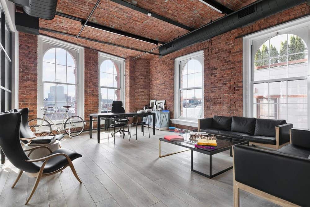
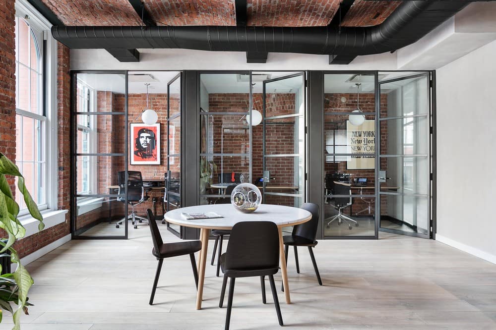
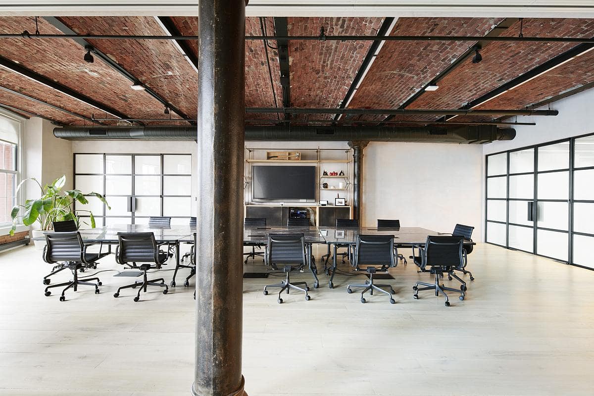
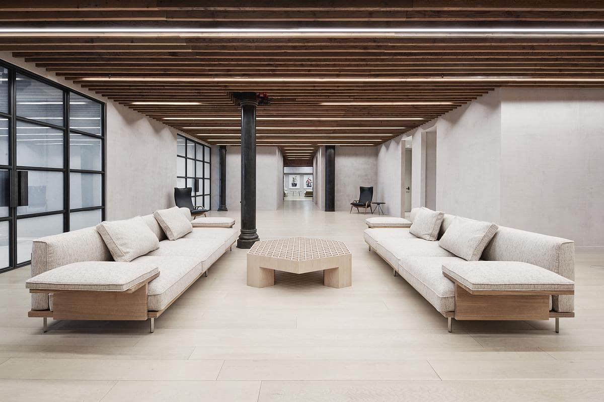
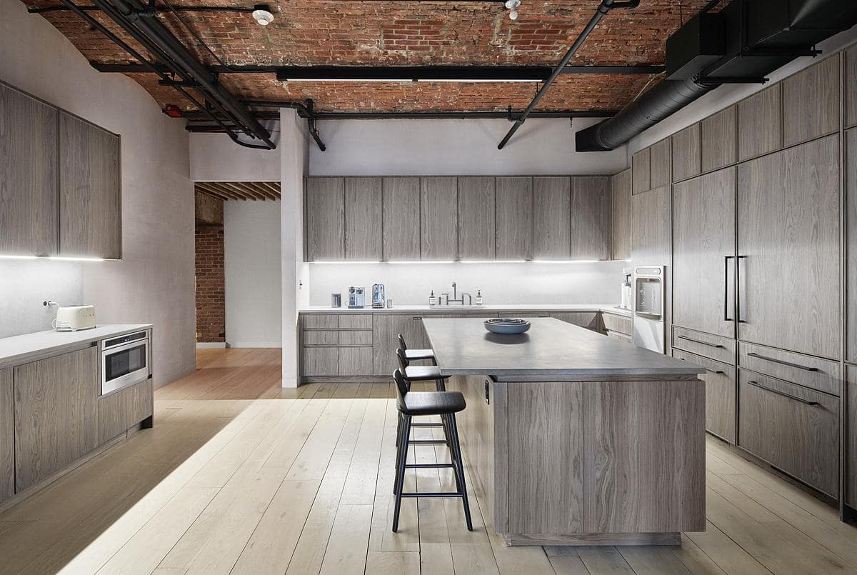
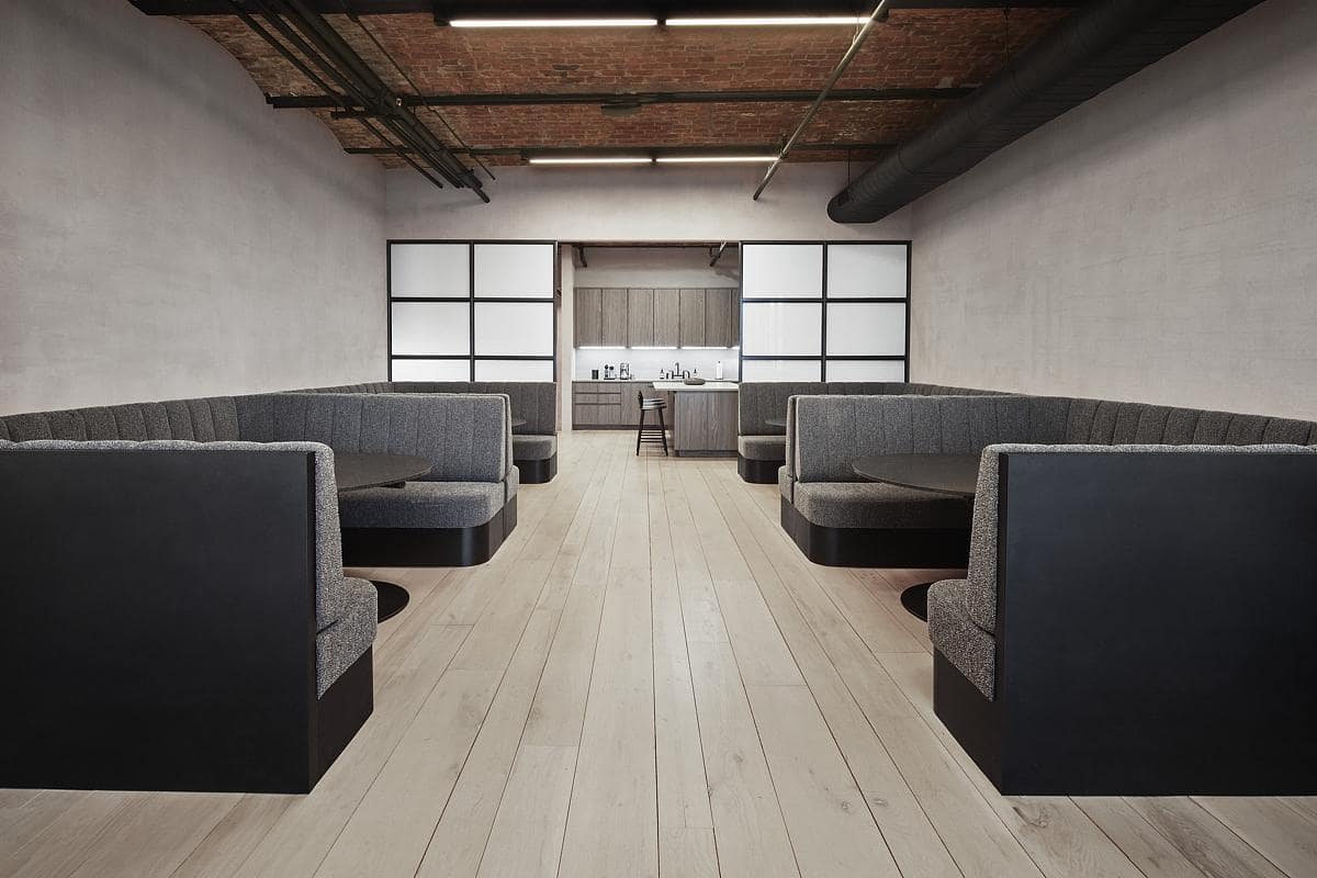
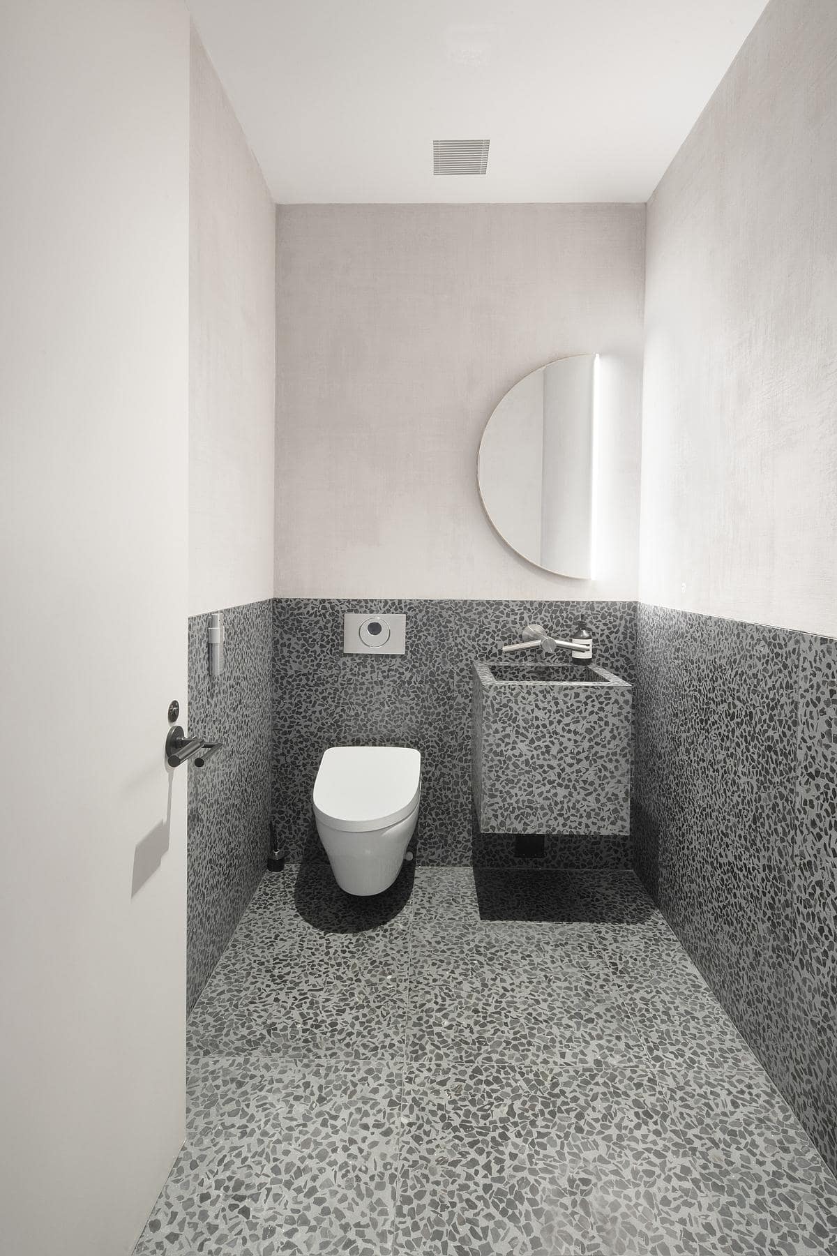
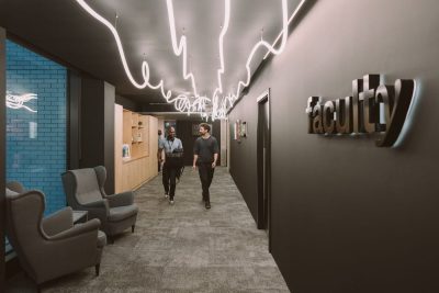
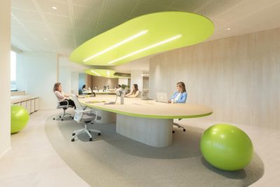
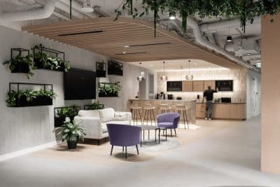
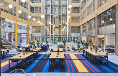
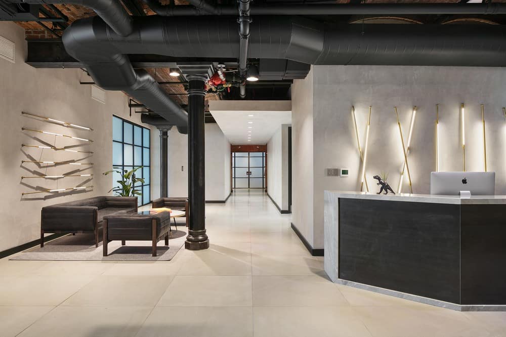
The Thrive Capital office is on the 7th floor of the iconic Puck Building in Soho. The building is an individual landmark built in two sections in the 1880’s and 1890’s. The project included the renovation of their existing office as well as the expansion of the office to encompass the entire floor. In the existing office we expanded the lobby, redesigned the bathrooms, updated the ventilation system, redesigned office partitions, expanded the kitchen adding custom banquette seating and refinished the floors and walls. In the expansion we added additional bathrooms, a gym clad in walnut tambour, additional conference rooms, phone booths, work space, a kitchenette, and lounge seating.
The project was all permitted and ready to start construction right before the pandemic. The city wide lockdown gave us an opportunity to rethink what an office might be post pandemic and how it might be designed better to withstand the next one. The design team worked closely with ABS Engineering to come up with a host of revisions to make the office a more welcoming and healthier place to work.
The resulting redesign included the addition of a HEPA and UV filtration system, the addition of a 10 ton compressor on the roof to bring in more fresh air, the spacing of desks further apart, and the addition of touchless bathroom fixtures.
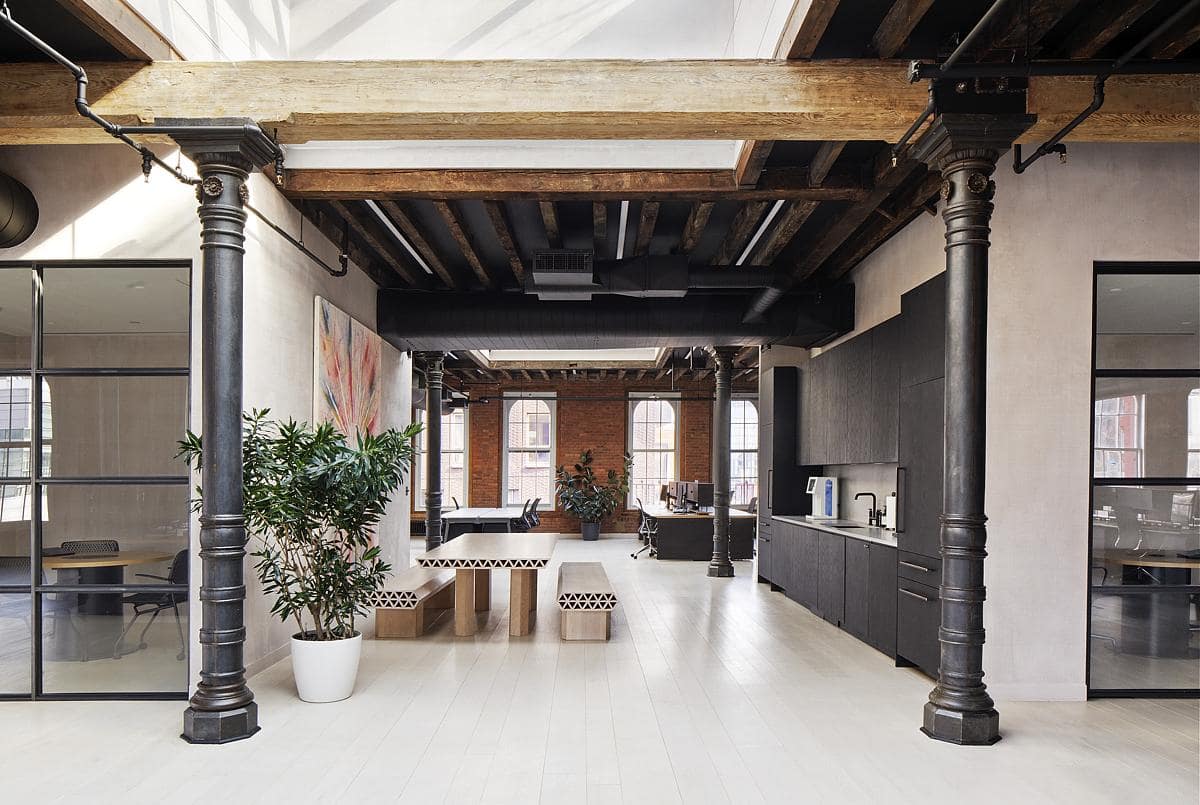
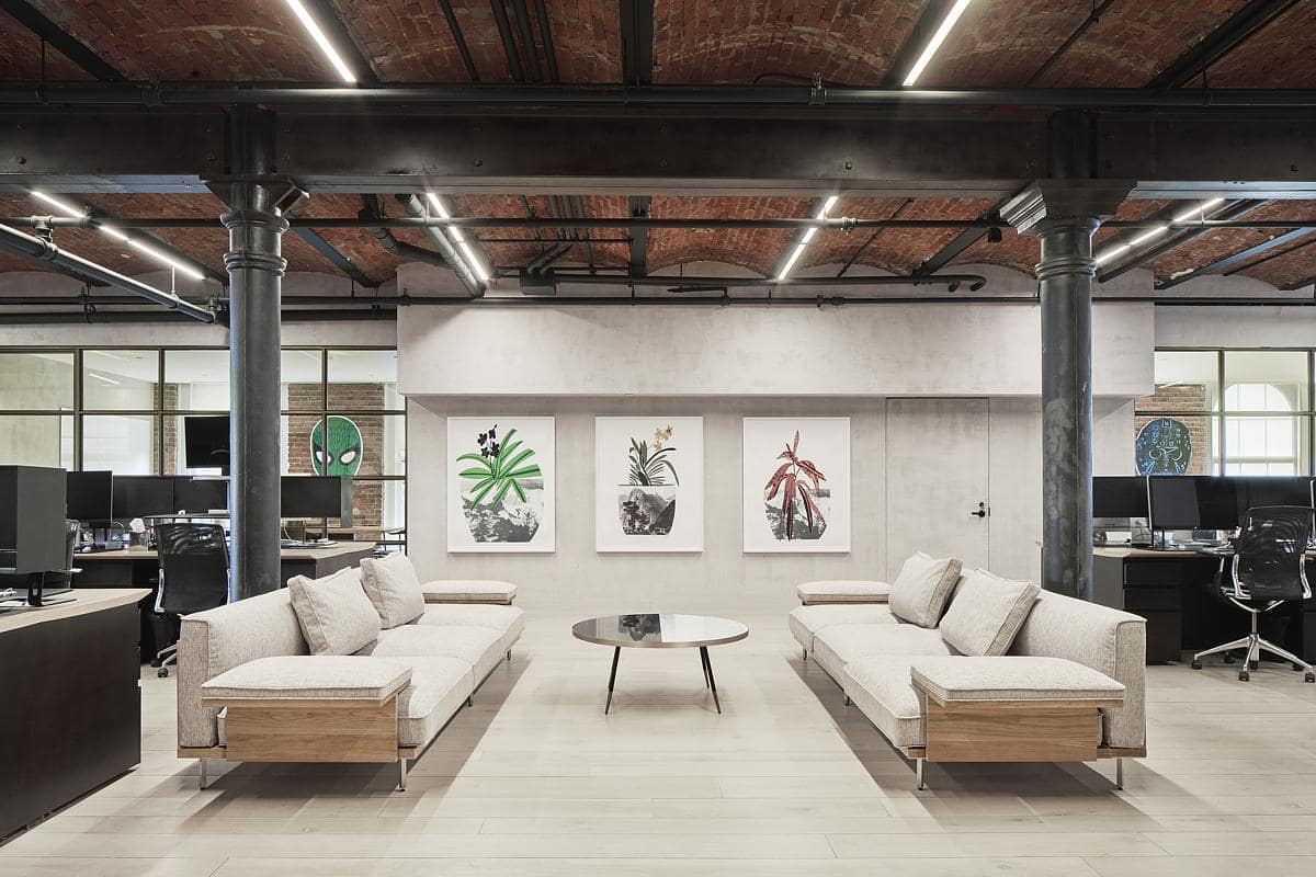
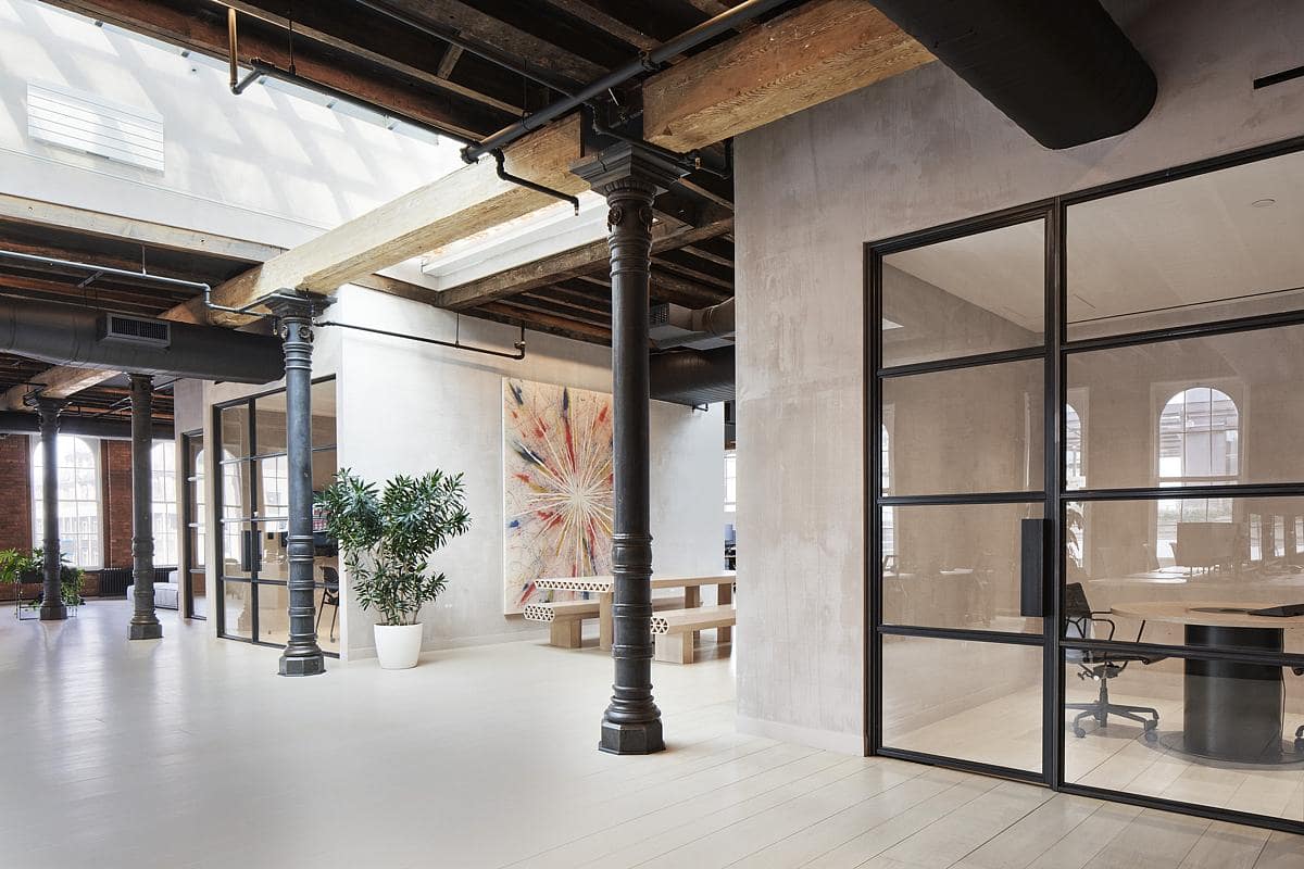
Great care was taken to coordinate locations of mechanical ducts. In some areas they’re exposed, others they are tucked above a dropped acoustic plaster ceiling and in other areas they are placed in the interstitial space created between a new structural roof built for the penthouses above and the original roof joists no longer supporting loads. Where ducts are exposed, they are oval and painted black. Linear, instead of conventional diffusers, were included wherever possible.
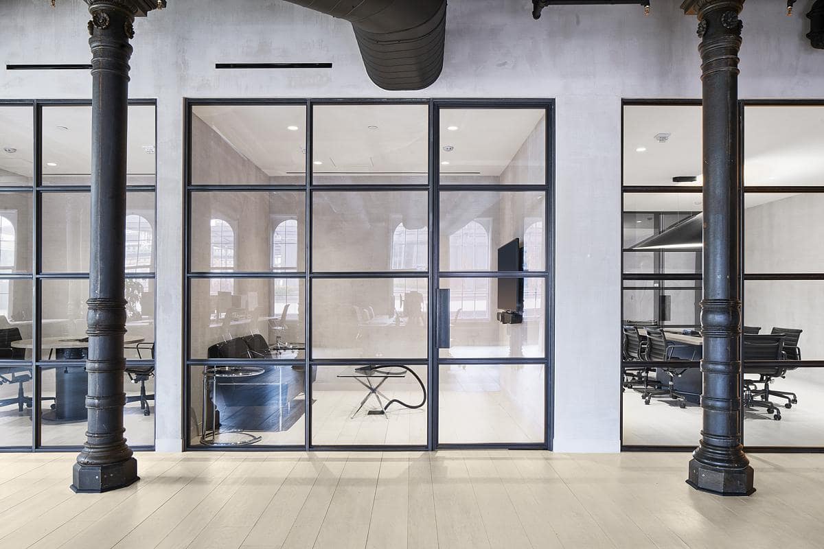
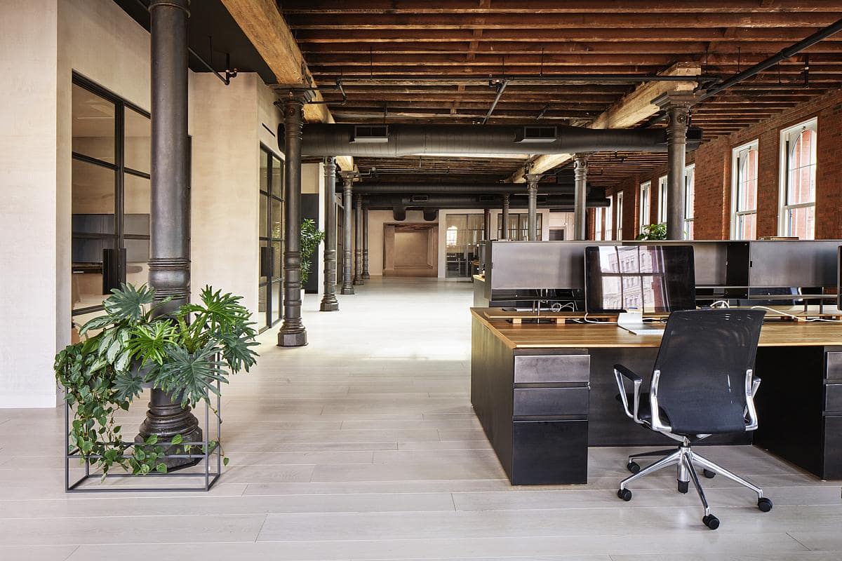
Detail was intentionally kept minimal, with trim-less doors, exposed jambs and recessed wall base. Lighting was integrated into the existing building structure. Access panels and overhead lighting were all trim-less and taped in. Bathrooms were clad with black terrazzo from Concrete Collaborative.
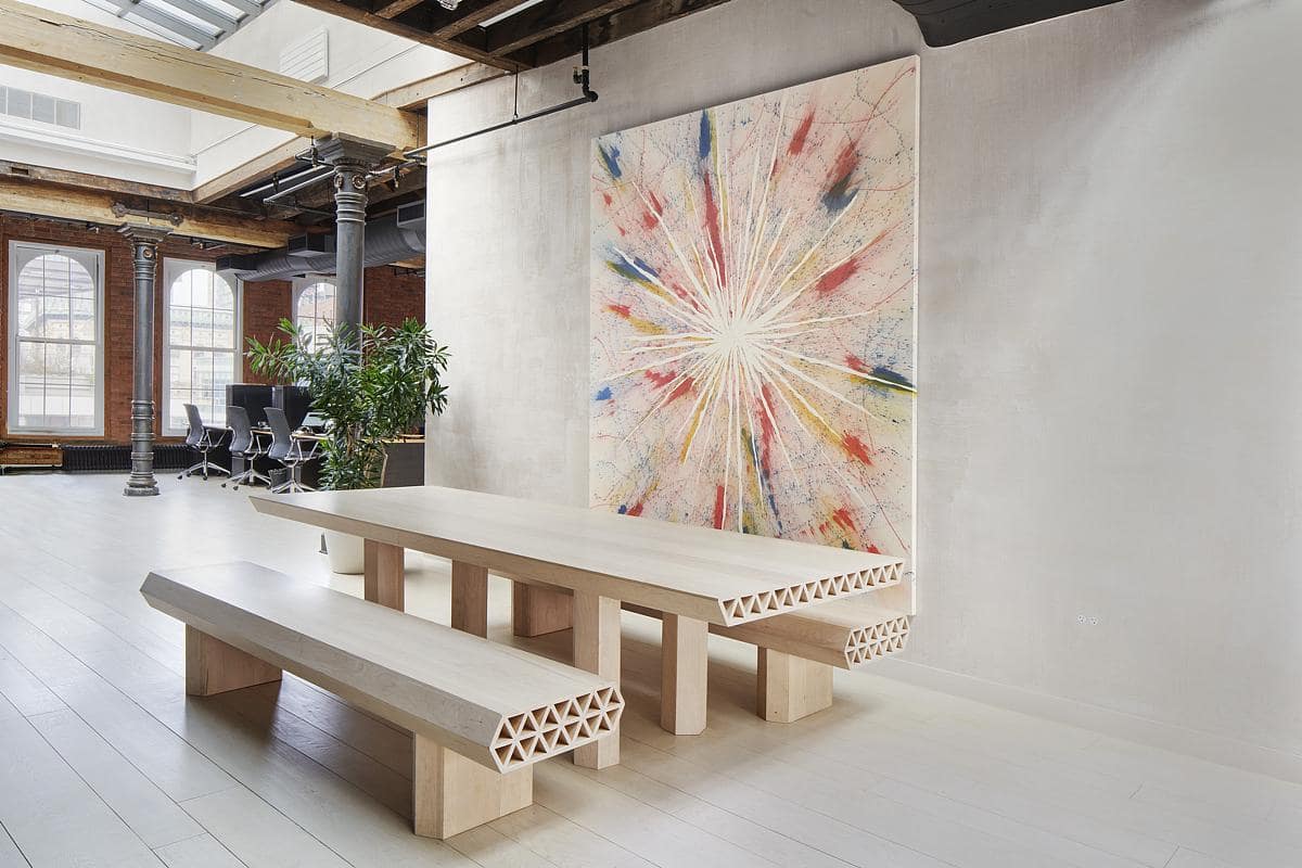
We repointed the brick walls on the north side of the building, covered interior walls with a marmorino earth-tone plaster, and installed wide plank white oak floors to keep the design cohesive and in line with the minimal aesthetic.
