Project: Tunnel House
Architects: MODO – Michael Ong Design Office
Location: Hawthorn, Australia
Builder: Seventy7 Projects
Furniture: AJAR furniture and design
Photographs: Peter Bennetts
The client approach us with a brief to renovate their double fronted cottage in hawthorn, after a few briefing session with the clients, it became very clear that their lifestyle revolved around their garden and spending their days outdoor as much as possible. Unfortunately, their existing house doesn’t utilise the exterior as well as it could, and being completely south facing, the central body of the house remains quite dark most of the year.
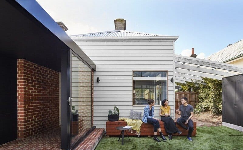
So our first approach, was to remove the awkward rear lean-to and instead of extending from the existing house, we decided to build a stand alone structure off the front house and connect the two spaces with a central passageway. Conceptually, this allows the two built form to contrast their individual form and characteristic, creating an architecture that provides clear distinction between ‘old’ and ‘new’. Spatially, the new stand alone living at the rear opens the central body of the site to create a north facing courtyard, with this planning strategy we now have a new north facing rear living area, natural light into the ‘darkest’ spot of the front house and an active garden courtyard.
The new living area is now nestled between the rear garden and the new courtyard, creating an architecture that now physically embeds the clients in between the garden, where previously they were only next to it. We felt this approach not only respected their interest and lifestyle but we hope it will enhance it.
Formally the concept is constructed of 4 key elements; the existing front house, the tunnel, the pavilion and the voids. Each of these elements are design to be formally understood separately, but knitted closely together to work with each other.
The first four rooms of the front house was preserved with minimal work, we wanted to make sure that we kept it as simple as possible, this was both because of budget constraints but also we wanted to retain all of the existing character of the front house.
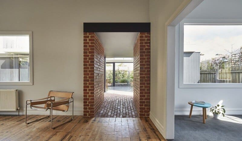
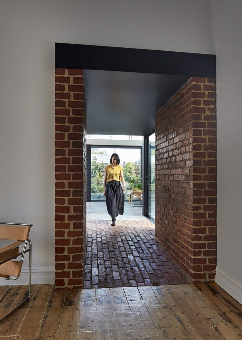
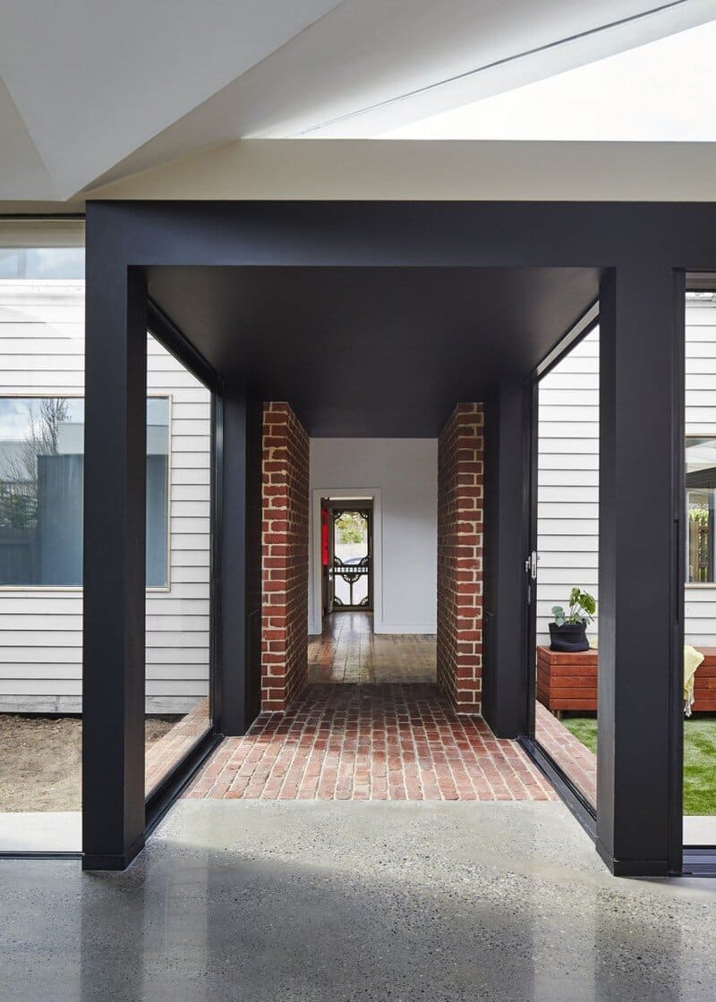
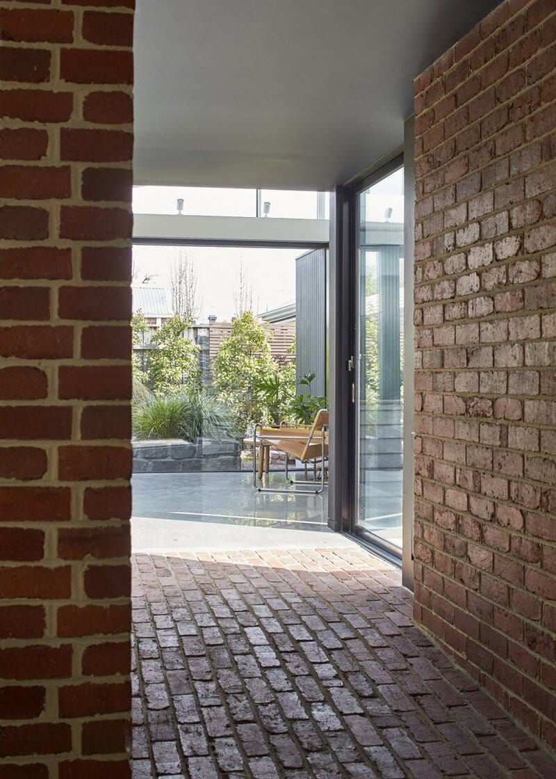
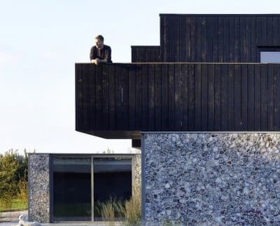
At the rear of the front house, there is a connecting Tunnel which leads you through into the new living zone and forms the central courtyard. Conceptually the tunnel is designed to communicate the transition between the old and new zones, the tunnel is formed in salvage brick and a glazed sliding door. The brick portion of the tunnel is designed to subtly compress the space down before releasing the clients into a high and light filled living room. The bricks also gives a sense of weight, density and coolth, which when walking through, also momentarily shields your senses, and similar to the physical spatial release you get from the squeeze, you also get sensory release into the new living area and courtyard.
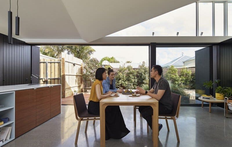
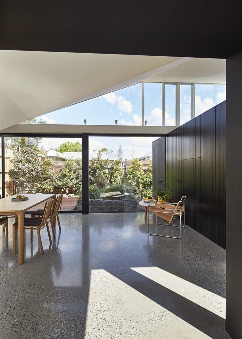
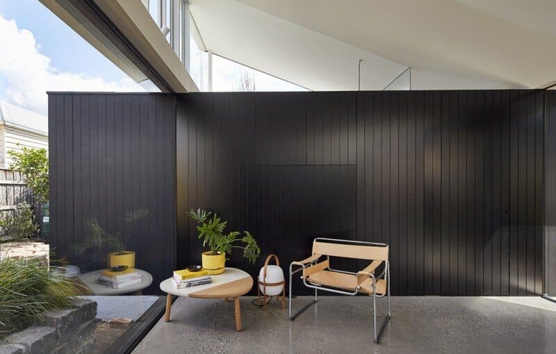
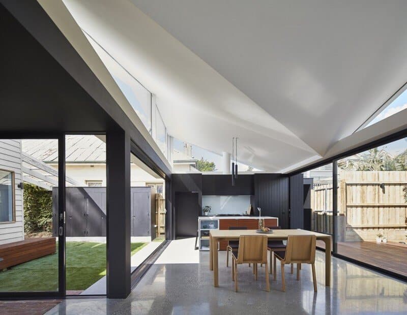
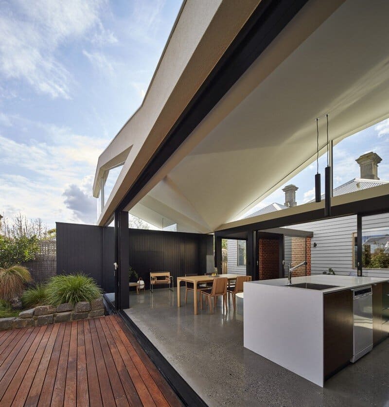
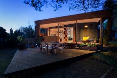
The new addition consists of a kitchen, pantry, dining, living, bath and laundry. Unlike the brick tunnel, the concept of the addition is to borrow qualities you may find in a park pavilion. Rather than creating a wall space with windows and doors punched out, we decided to mirror it and place objects (black boxes), lines (structure) and planes (roof) to hold the space, with the spaces between glazed. By reversing this approach, we visually open the living areas to the garden, the ‘walls’ are now the garden itself, which subtly changes throughout the day, evening and season.
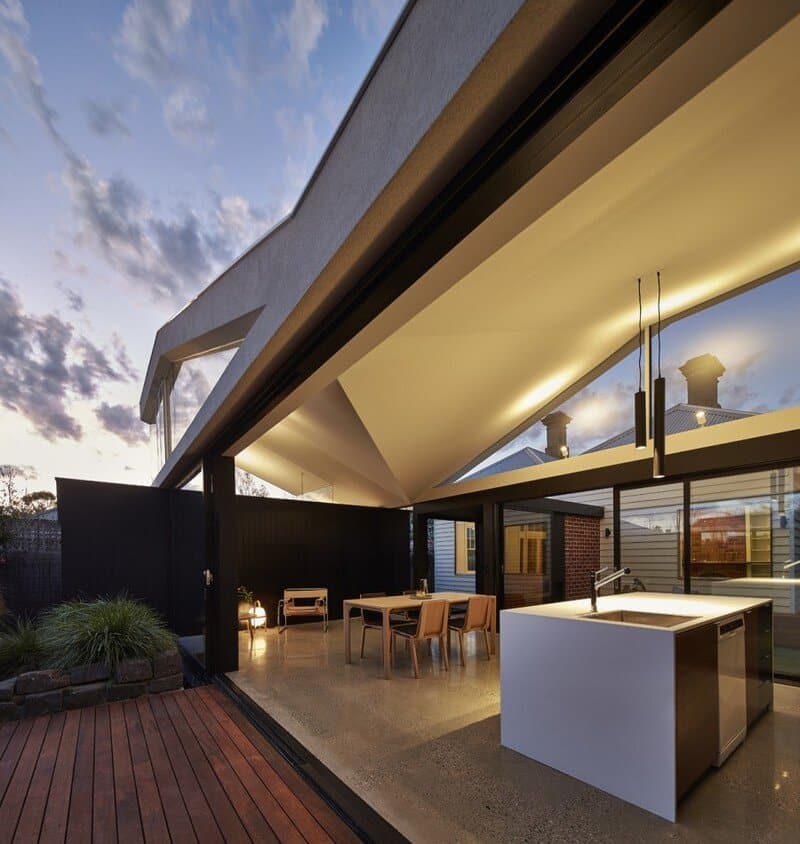
The roof form kicks up form an asymmetrical butterfly roof, the combination of the raked ceiling and high windows softly diffuses the natural light down into the space and to gently lift the space up. The ceiling continues to diffuse light in the evening, a set of track lights are designed to bounce light back down into the living areas, the ceiling helps to soften the light while also create quite a sculptural element in the evening.
The Void, is the garden space between the spaces, there is 4 sets of sliding doors which are designed to slide away completely which is used to enhance the ‘pavilion’ concept. With the doors fully opened, the interior space becomes incredibly permeable and invites the garden through the space and to become the ‘hero’ of the story.
Thank you for reading this article!

