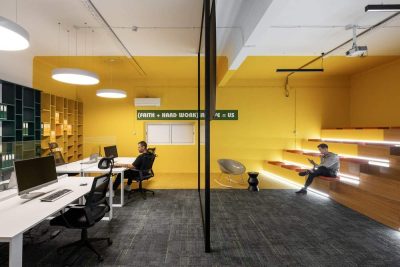
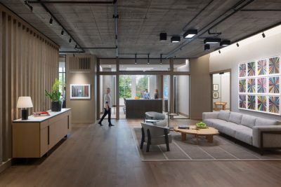
Design Republic has recently completed the design of a new office space in New York City for popular review website Yelp. The project was named: Welcome to the Neighborhood, Yelp!
The designer’s presentation: The atmosphere in the Yelp NYC office has always been a rowdy one. Composed of mostly sales, all the team members sit in open benching. It was very important that this excitement was duplicated in the new workplace. The challenge presented to Design Republic was not only preserving that energy, but almost doubling the head count to a total of 900 employees.
When Yelp initiated their relocation into 11 Madison Avenue, Design Republic quickly noted the sprawling 80,000 RSF floor plates of the two floors they were to assume—immediately presenting the question of how to make the space manageable. To the design team, the answer was obvious: Much like the city it was representing, the office needed to be broken down into easily navigable “neighborhoods.”
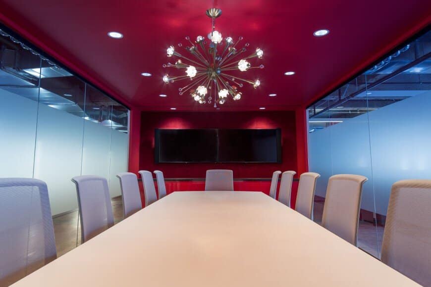
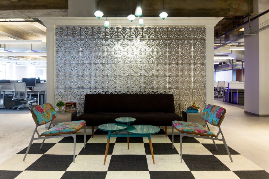
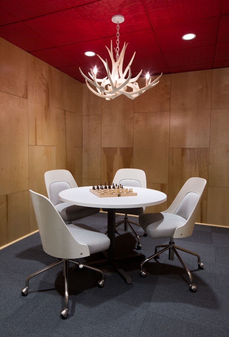
Natural splits between sales groups were divided by floating meeting spaces, themed after specific NYC neighborhoods. Design Republic worked internally with Yelp to distinguish which neighborhoods suited them best. Replacing the mundane invitation to “Meet me on 14 in conference room D,” Yelp employees can schedule meet ups “at the Blind Tiger in the West Village.” Special attention was paid to the design details of each space so the aesthetic reflects the neighborhood and specific designation, not simply a name on a conference room door. The neighborhood demarcations also provide a sense of belonging to the employees. They work in the Lower East Side with 80 co-workers, they are not 1 out of 900 nameless employees. Not unlike the reviewers on Yelp, their specific perspective matters, and adds to the greater good.
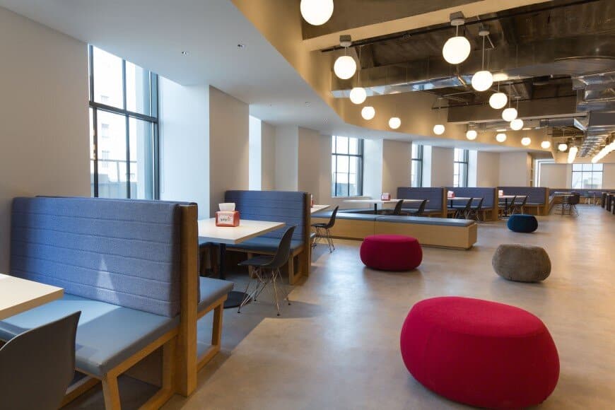
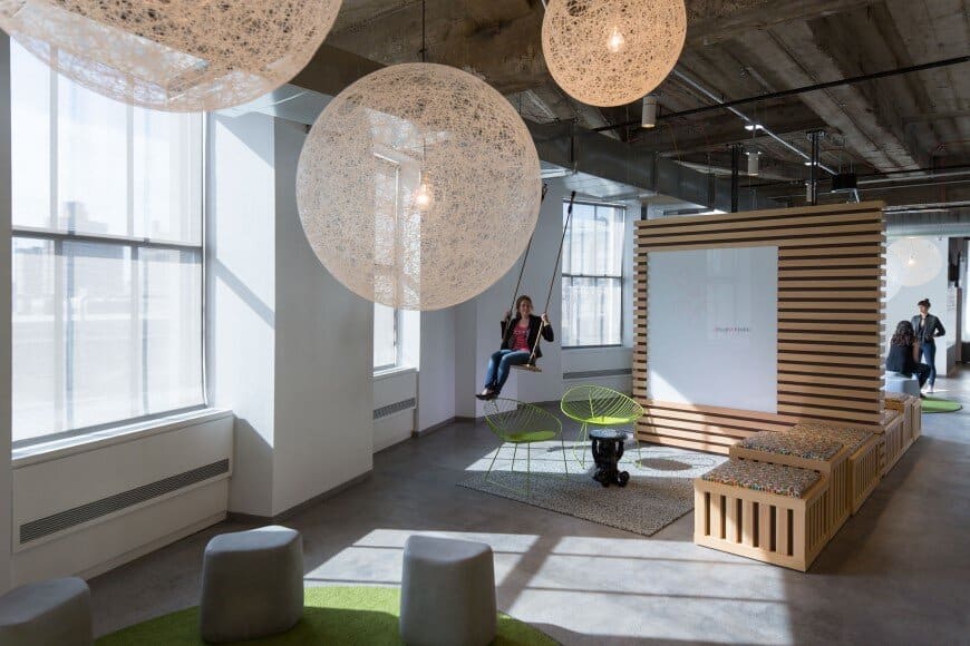
Not unlike New Yorkers, Yelp employees need break away spaces: to commingle, and to relax. (Working within an open plan of hundreds of employees requires an escape from time to time.) To elaborate on our design concept, these spaces reflect where locals escape to; public parks, night bazaars, waterfront concerts, libraries, etc. These specific destinations were loosely translated and placed thoughtfully within the floor plan.
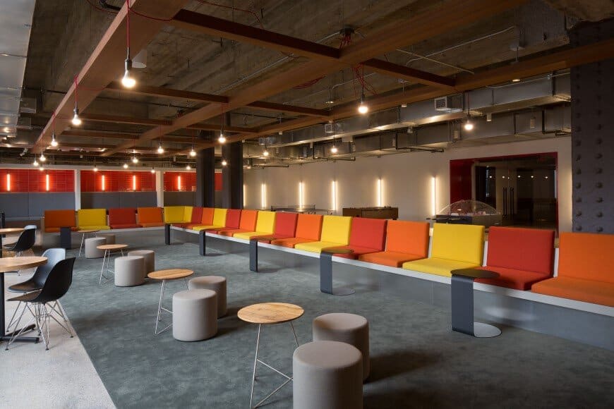
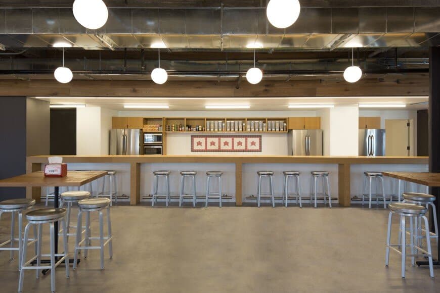
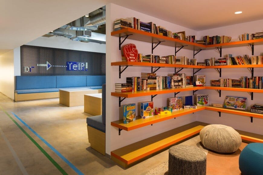
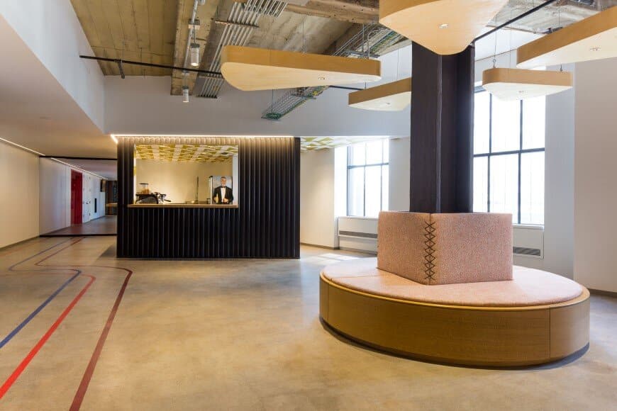
Communal spaces are included in all our clients’ workplace designs, but Yelp wanted to heighten the company culture even further. A coffee shop with on-staff baristas welcomes you into a night bazaar themed café with the flexibility to open into a large training room for all-hands events. A kegerator bar can be found just around the corner, with a rotating selection of craft beers and a lounge evocative of the historic NYC High Line. Yet another hangout zone is a subway inspired gaming zone, mimicking the seating of several train line interiors. These communal spaces help to provide breathing space between neighborhoods—not to mention the obvious fun factor they add to the work day.
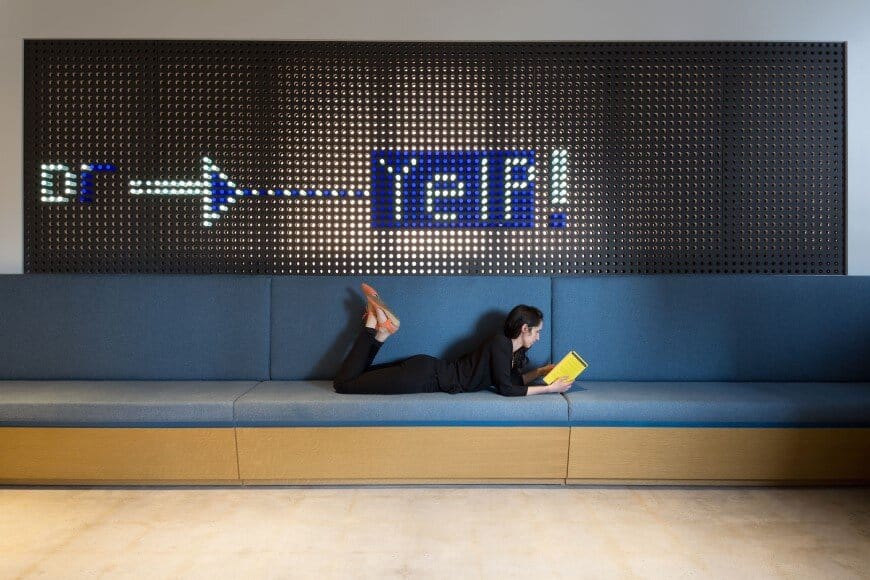
Way finding and graphics were a large part of the design process from day one. Breaking up the massive floor plates into neighborhoods was only going to be helpful if one knew how to get from one location to another. To further emphasize our city-centric approach, we played off of the colorful New York subway lines. You are led to each neighborhood by its appropriate subway line, color-stained into the exposed concrete floor. Legends are placed throughout to guide employees and visitors alike.
In all, we approached the workplace design for Yelp very distinctly; the connections that Yelp provides those living in New York should be reflected in their office space. This playfully branded space embraces exploration, a sense of community, and finding your new favorite place to meet up with coworkers. Photography: Thaddeus Rombauer

