Project name: Wonderlab Headquarters Office
Design firm: Onexn Architects
Chief designer: Wang Jingjing
Design team: Ding Yao, Zhang Xiaolong, Lin Guoxiang
Location: Shenzhen, Guangdong, China
Area: 1,565 m2
Completion time: October 2022
Photography: b+m studio/ Kelvin
Construction drawings: Shenzhen Dizhu Deepening Design Co., Ltd.
Construction: Essence Atelier Engineering Co., Ltd.
Lighting design: PUDI DESIGN
Furniture: Simple Furniture
Floor material: Carpet, Vinyl / ShenZhen Francis Trading Co., Ltd
Wonderlab is a nutritional supplement brand that was founded in 2019 with the aim of promoting human health. The company is committed to providing innovative nutritional solutions to young consumers. In its brand name, “wonder” represents making breakthroughs, while “lab” connotes scientific and professional expertise.
The design draws inspiration from the core corporate values and brand style of Wonderlab, and echoes the concept of sustainable development highlighted today. Inspired by the company’s campaign to recycle the blue bottles of its probiotic supplement products, Onexn Architects incorporated the concept of recycling into the project through applying recycled materials to the display installation design. The goal was to create delightful surprises with a touch of blue on a backdrop highlighting science and precision.
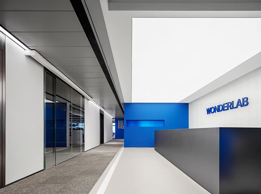
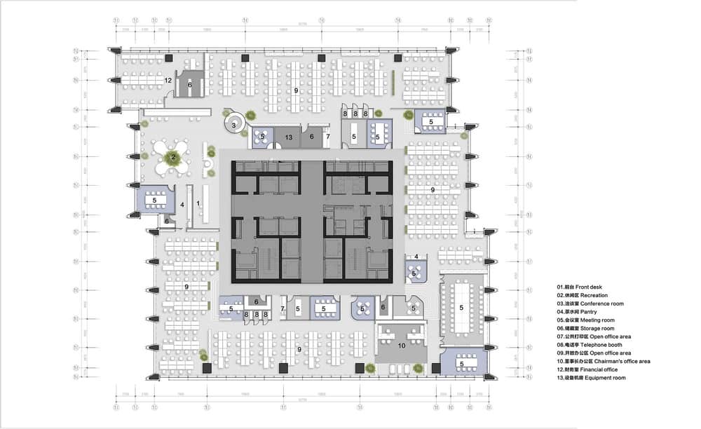
Site conditions: Wonderlab’s new headquarters office is located on the upper floors of a Grade-A office building at MixC World in Shenzhen, providing an expansive view of the cityscape. The floor plan considers both the landscape and daylighting, with open office areas arranged around the perimeter and functional boxes surrounding the core tube. This design ensures a streamlined and efficient functional layout with a clear circulation that aligns with the company’s R&D philosophy emphasizing science, precision and efficiency.
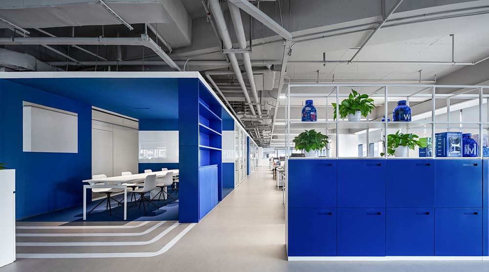
Meanwhile, the space has been divided into different areas based on the number of employees and their job roles. Sufficient space has also been reserved to accommodate the company’s future expansion needs. The overall design adopts an open layout, which enables employees to move, interact and collaborate freely. Additionally, multi-level office and meeting spaces have been created to cater to diverse work scenarios.
1. “Flowing” blue blocks
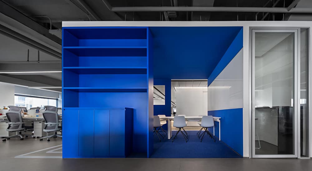
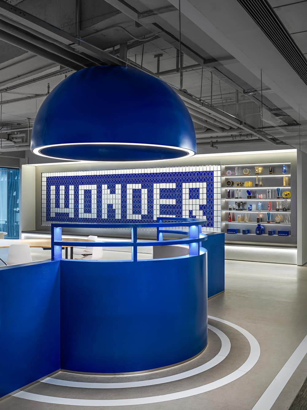
The spatial design integrates Wonderlab’s signature color and uses blue blocks to connect different levels within the space. The design draws inspiration from Zima, the main character in the animated video “Zima Blue”, who pursued extreme purity in art and ultimately found the meaning of life in his final work. It is through primal curiosity that continual exploration becomes possible. In this project, the designers arranged blue blocks at various dimensions in the space, attaching different meanings to the color blue.
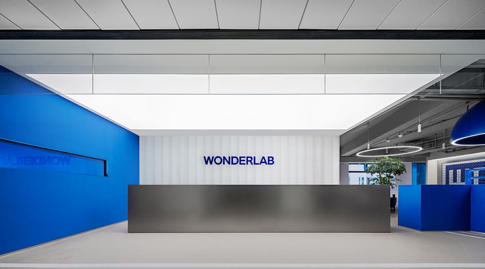
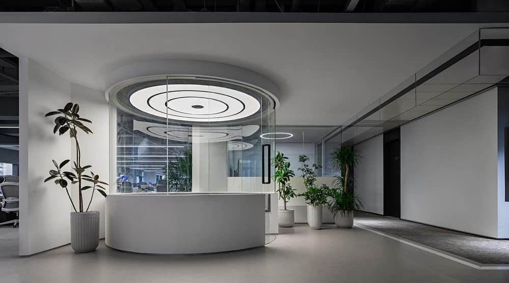
The front desk area is characterized by simple and clear horizontal lines. An expansive light membrane is used to provide an even and bright lighting environment to the area.
2. Blue surprises
The designers translated Wonderlab’s iconic Little Blue Bottles and Little Fat Bottles into abstract symbols, deconstructed these symbols, and incorporated them into the spatial design, creating delightful surprises at various positions across the space.
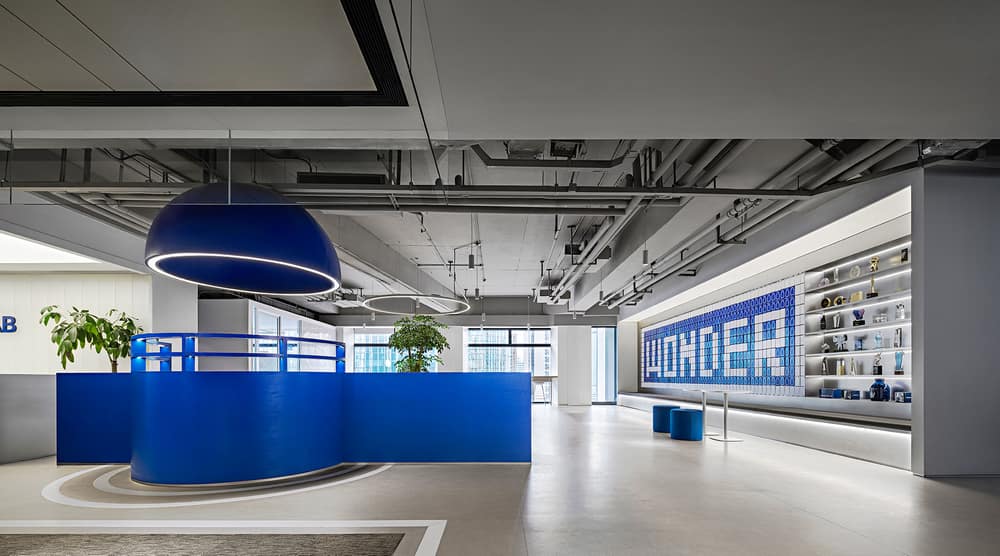
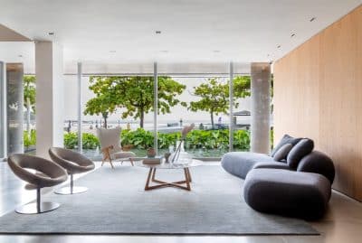
The blue sofa modules are an abstract expression of Wonderlab’s Little Blue Bottles. While providing a space for rest, these structures also convey the design concept of Little Blue Bottles — creative opening and simplified, uniformed Klein blue bodies.
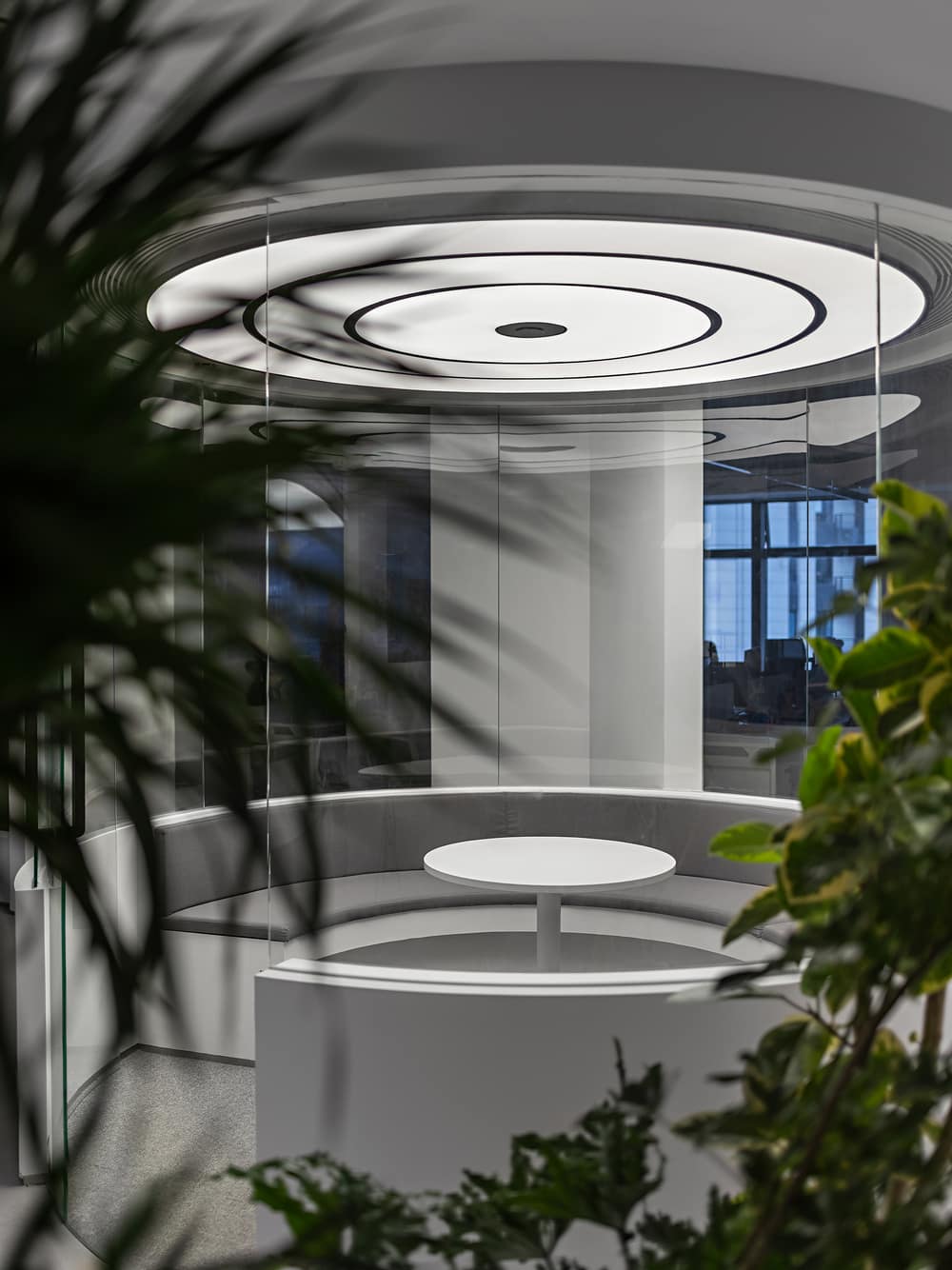
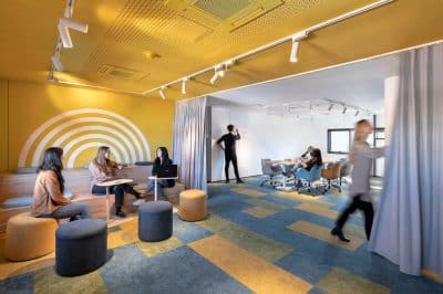
The conversation area is like a container that floats into the space. It breaks the boundaries and allows dialogues to happen between different areas.
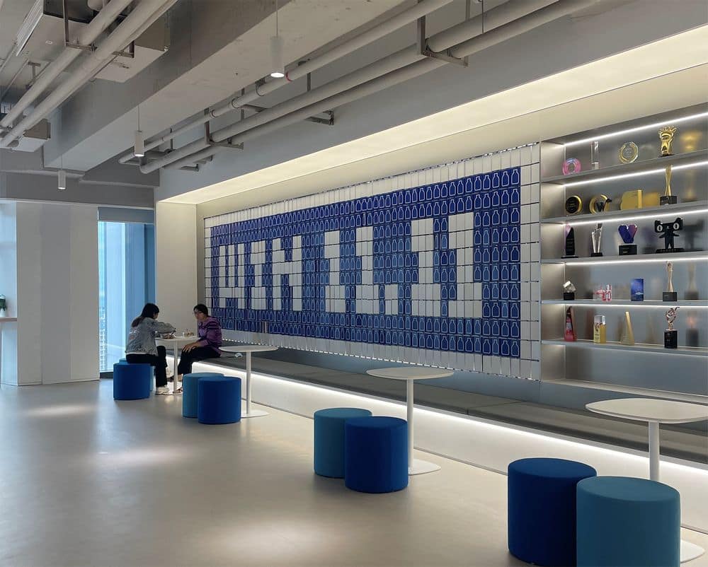
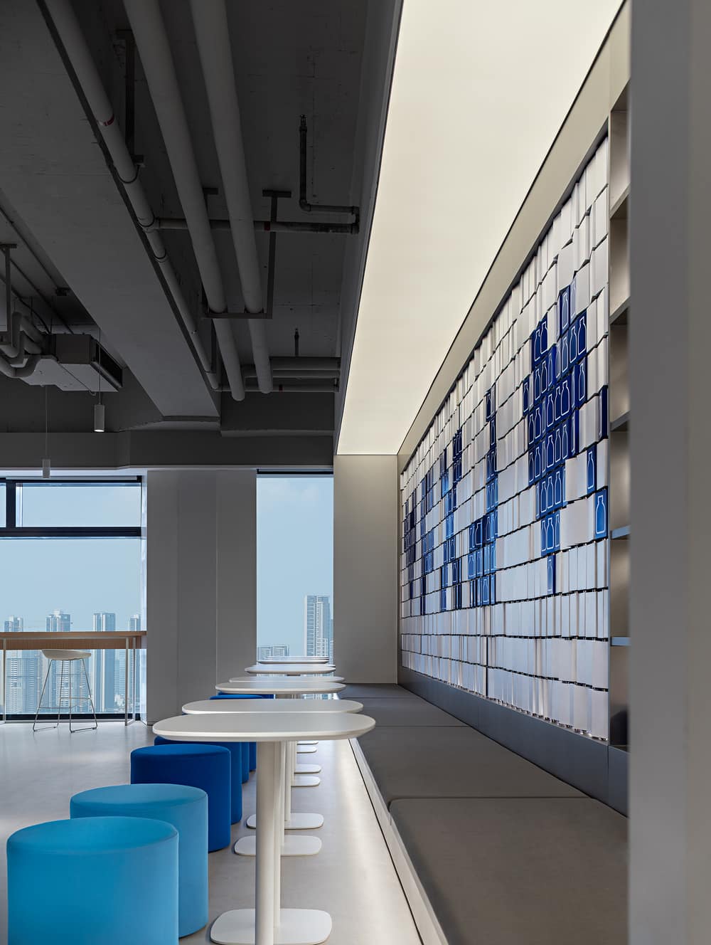
The display wall provides a space for Wonderlab’s employees to give full play to creativity. At the company’s different events, they can create various patterns with the Little Blue Bottle pixels on the display wall. The design is also a metaphor that the gathering of Little Blue Bottle pixels can create infinite possibilities.
The leisure area is enclosed within the blue sofa modules and the display wall. The central table is characterized by a fluid edge. Combined with plants, it provides a space where the staff can work and talk freely.
Installations made of recycled materials
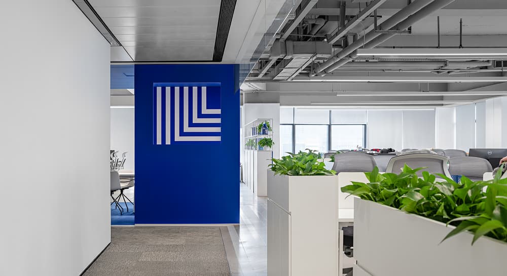
The design team created a logo wall with recycled Little Blue Bottles, responding to the company’s efforts on recycling. The design not only helps the company’s clients and employees to better understand the brand, but also creates an extension of Wonderlab’s recycling campaign.
As a core element, the Little Fat Bottle outline is enlarged through layers of luminescent acrylic plates to intensify the visual impact of the brand’s iconic symbol and brand identity.
3. A streamlined and efficient spatial layout
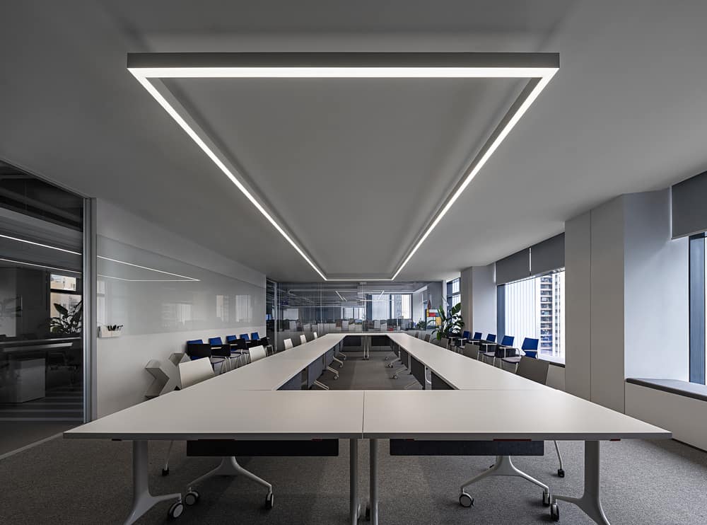
Meeting rooms of various sizes are arranged along a circulation route around the core tube. The efficient circulation ensures that the space is easy to navigate for employees working in the open office area. Meanwhile, the streamlined design also echoes the company’s philosophy that emphasizes science and precision.
Onexn Architects firmly believe that this spatial design not only enhances the brand image and competitiveness of Wonderlab, but also supports the public initiative of sustainable development and a low-carbon, eco-friendly lifestyle with recycling practices. In addition to human health, it is equally important to prioritize the health of the environment that sustains humanity.
