Project: XOCO 325 Penthouse
Architects: DDG
Location: SoHo, New York City, NY, United States
Area 70000.0 m2
Project Year 2016
Photography: Bruce Damonte, Robert Granoff
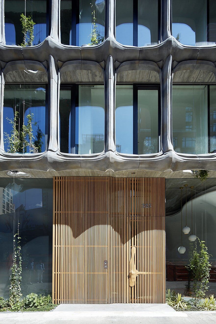
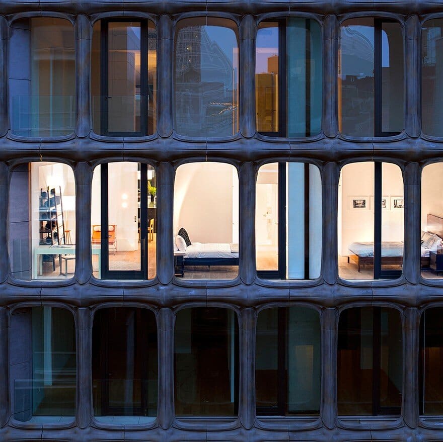
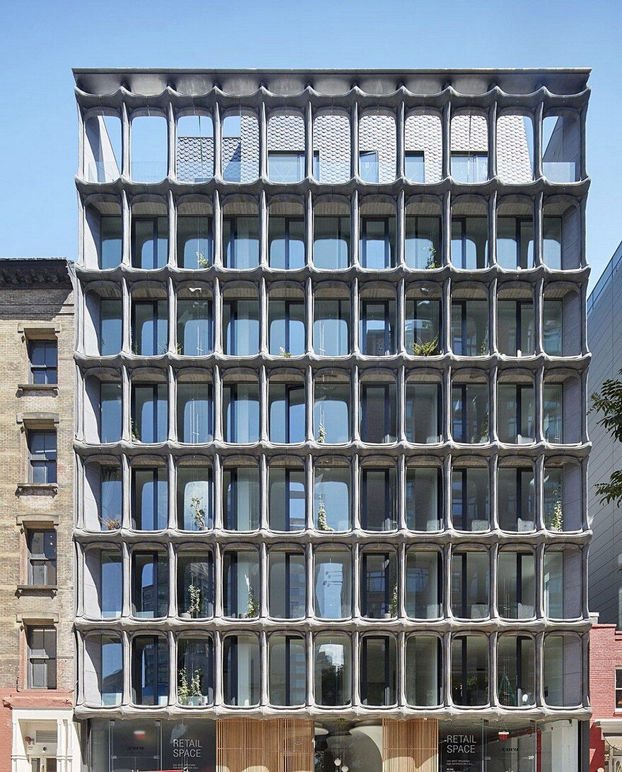
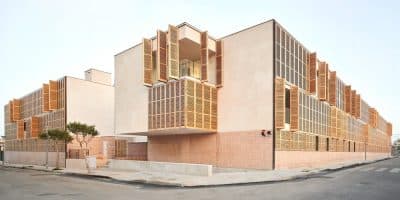
Nestled in the heart of SoHo, XOCO 325 is a luxury condominium that sits on the site of a former Tootsie Roll chocolate factory. The ground-up new development has been designed, developed and constructed by DDG and elegantly references SoHo’s celebrated cast-iron loft buildings, while while forging a balance between classic and contemporary design. Its cast-aluminum façade is a modern reinterpretation of the district’s historic cast-iron loft buildings and vertical gardens will wend their way from the base all the way up to the penthouse.
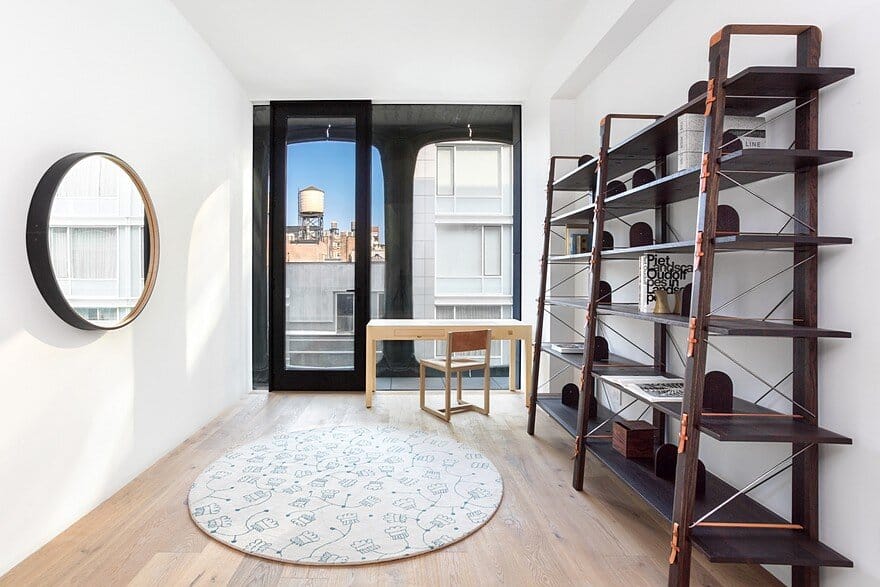
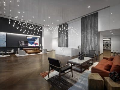
The impressive design extends beyond the façade into the lobby, where residents are greeted with an elevated design experience. Penthouse West at XOCO 325 was intentionally designed by DDG to keep the entertaining areas (dining room, great room) seemingly separate from the domestic and more casual spaces (kitchen, living room and bedrooms).
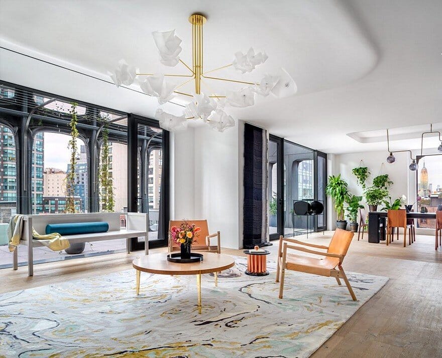
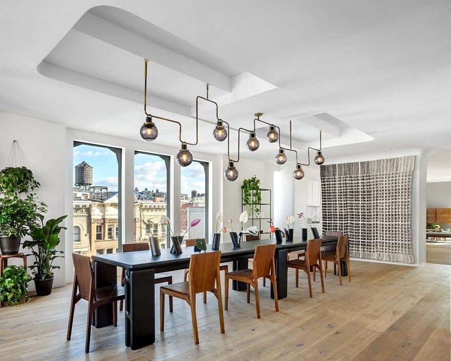
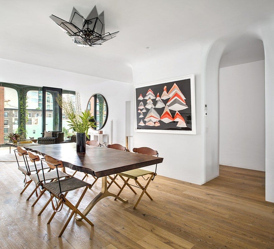
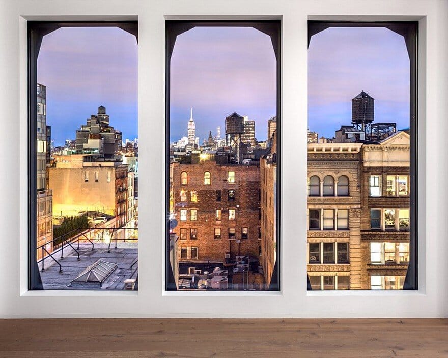
A large part of the design team’s inspiration came from traditional New York City homes, which they reinterpreted through the creation of plaster coves, medallions and soffit edges. Upon entering one can head to the formal dining room, which is centered on a view of midtown Manhattan that showcases the Empire State Building. The goal of the design team was to accentuate the view. The chandelier hanging above the dining room table was custom created for the space and inspired by the New York City skyline. The table itself mimics the organic rounded curves of the home’s architecture. All wall hangings and window treatments were handwoven by Hiroko Takeda.
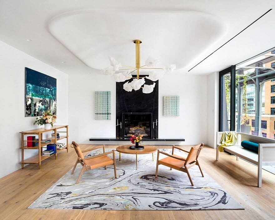
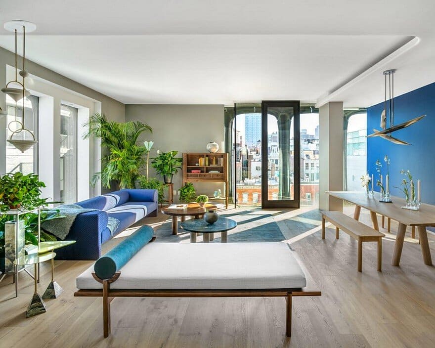
Following the dining room, one can transition to the great room, which features an expansive gas fireplace, encased in black Saint Laurent marble with a beveled cut, as well as access to the spacious terrace. The great room’s domed ceiling is made of plaster and can be likened to a large medallion, and once again illustrates the designers’ inspiration of traditional New York City homes. The plaster was all handmade at a small shop in Greenpoint. The massive light fixture is by an independent Chicago artist and was chosen as it highlights the medallion in an unexpected way. Other furnishing / design highlights in the great room: design co-op Colony wanted to maintain the organic and contemporary theme of the room and was inspired by its likeness to Art Nouveau, taking inspiration from those shapes and visual cues. The furnishings are a combination of light and dark to contrast the dark elements of the wet bar and fireplace.
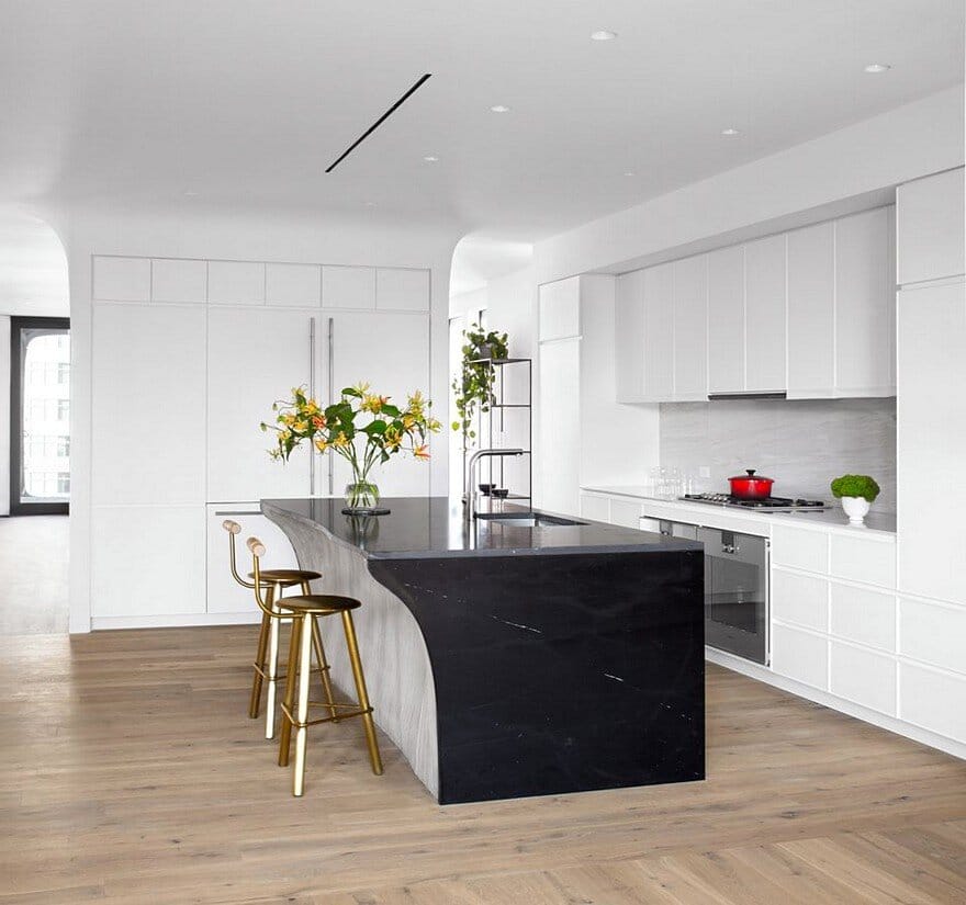
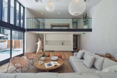
From great room one transitions to the “domestic/casual” portion of the apartment and into the kitchen. The domestic areas of the home were Intentionally situated in this part of the Penthouse West as it receives the eastern light in the morning and thus is a great area to wake up in. The goal of the family room and kitchen was to create spaces that retain the luxury element, but that also feel warm and inviting – less formal than the entertaining spaces.
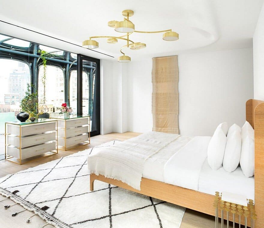
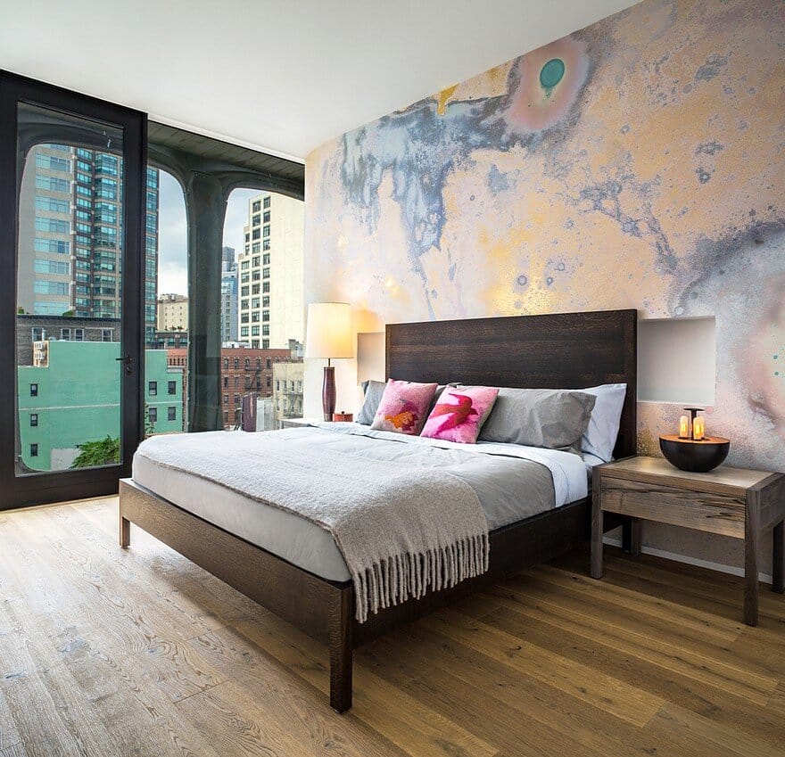
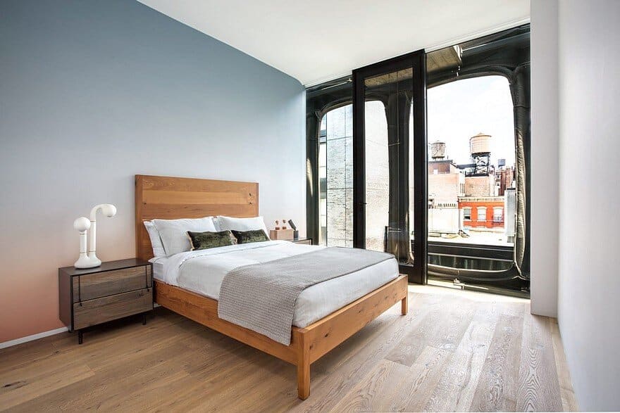
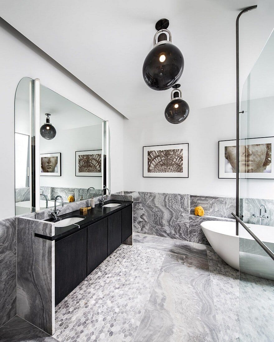
The master bedroom was designed to be symmetrical. Colony reemphasized this with the positioning of the bed and furnishings as well as wall décor. In Colony’s words the design scheme is “symmetrical with idiosyncratic moments”. The dresser is a coursed oak, which is also used in many other furniture pieces in the home. It features floating drawers in a bleached white oak finish. The master bathroom is composed of Gray Argento marble intermixed with an elongated custom hex style mosaic.
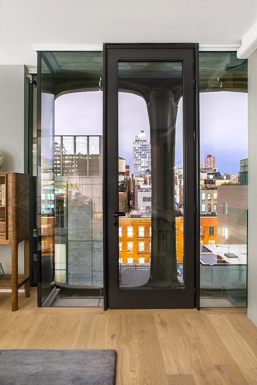
The terrace is accessible from both the great room and the master bedroom. The building siding at that level took its inspiration from SoHo and Tribeca, employing a mansard cap to the building. Mansard is French and typically means a sloped wall rendered in slate. It is usually seen on top of buildings. The terrace is made of concrete pavement and outlined with Mexican river rocks. The curved walls and corners are one of the building’s major design details. The roundness of these details is intended to tie back to the building’s curved façade.

