Project: Z3 House – A Centrally Located Estate
Architects: Raz Melamed Architect
Project Manager: Reut Nachmias Saban
Project Management: Pini Abitbul
Structural design: Yaron Shahrabani
Location: Israel
Completion Year: 2023
Photography: Amit Geron
Styling for photography: om studio by Omer Danan
Assistant Photographer: Michael Shevdron
Next to an avocado plantation, a unique architecture combined with modern elements is built from the ground up by architect Raz Melamed, who designed this three-generation home overlooking a view taken straight from a postcard.
The structure is home to a couple with three children, and their eldest daughter who had three children of her own. The family asked for a space to house their extended privacy while maintaining privacy for everyone.
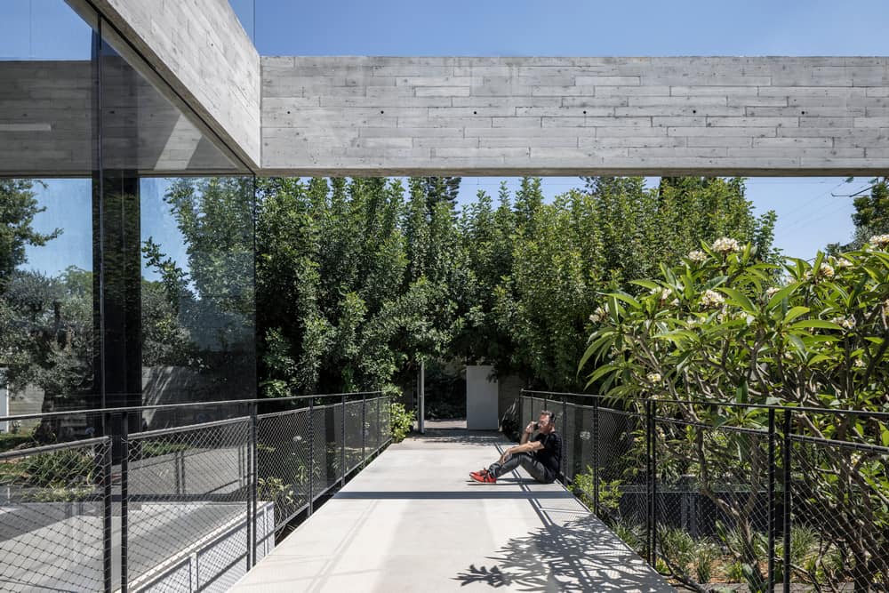
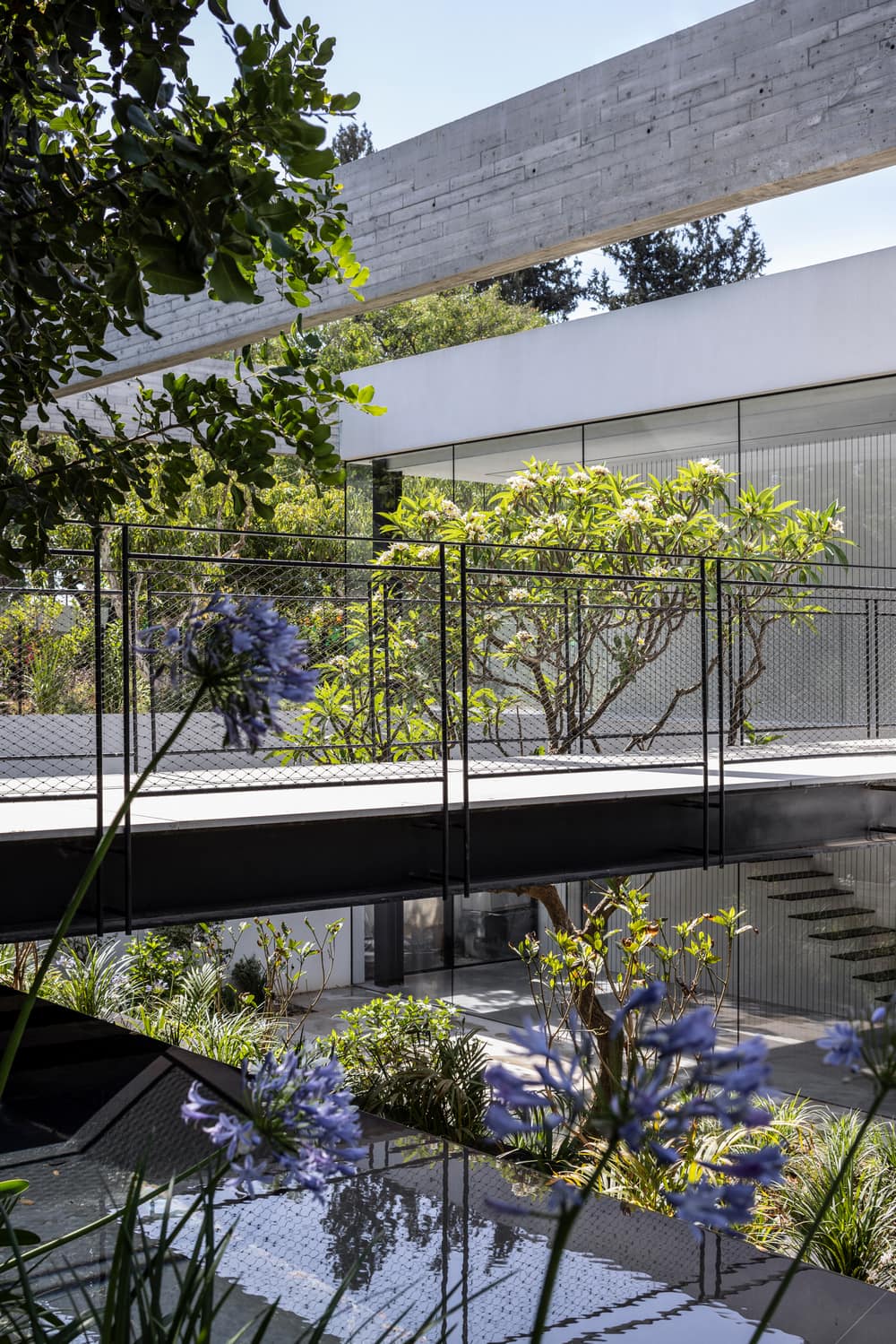
The design plan answered this need by creating two separate houses, one house for the parents and the children and a second house for the daughter and grandchildren), who share the same yard and pool, but keep separate from each other thanks to the topography.
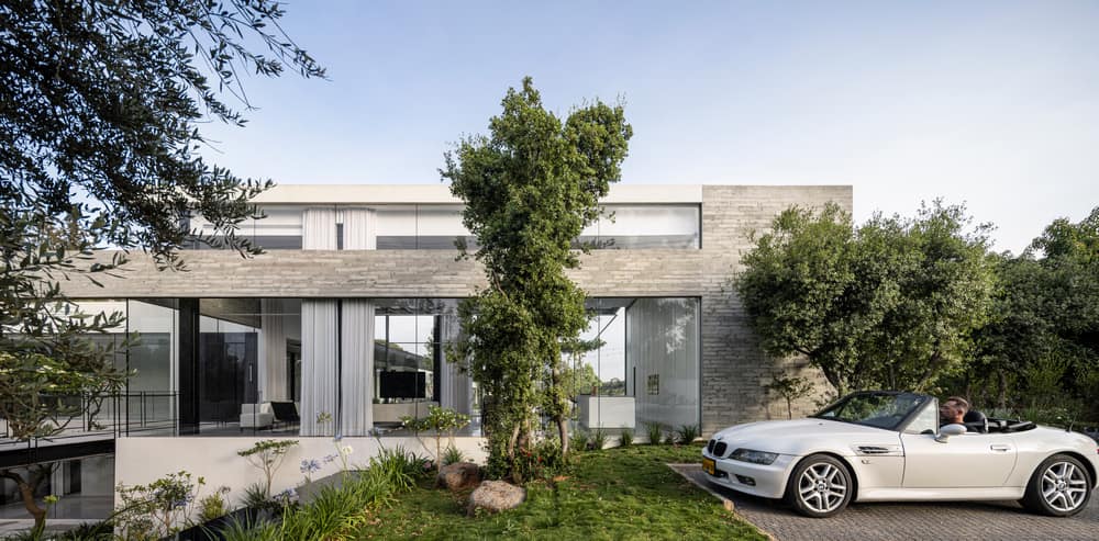
The fronts of each house face the street and two overlook the pool. A floating concrete beam wraps the building and “protects” it from the passers-by, creating a uniform facade for the street in the form of an airy membrane that is partially sealed and partially open.
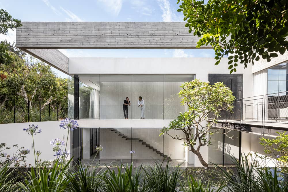
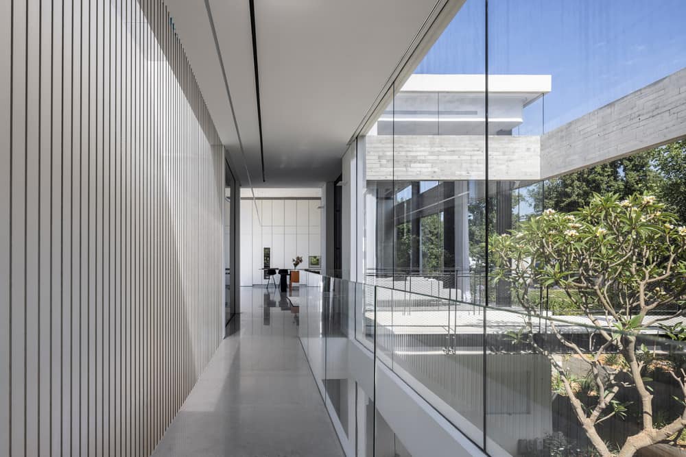
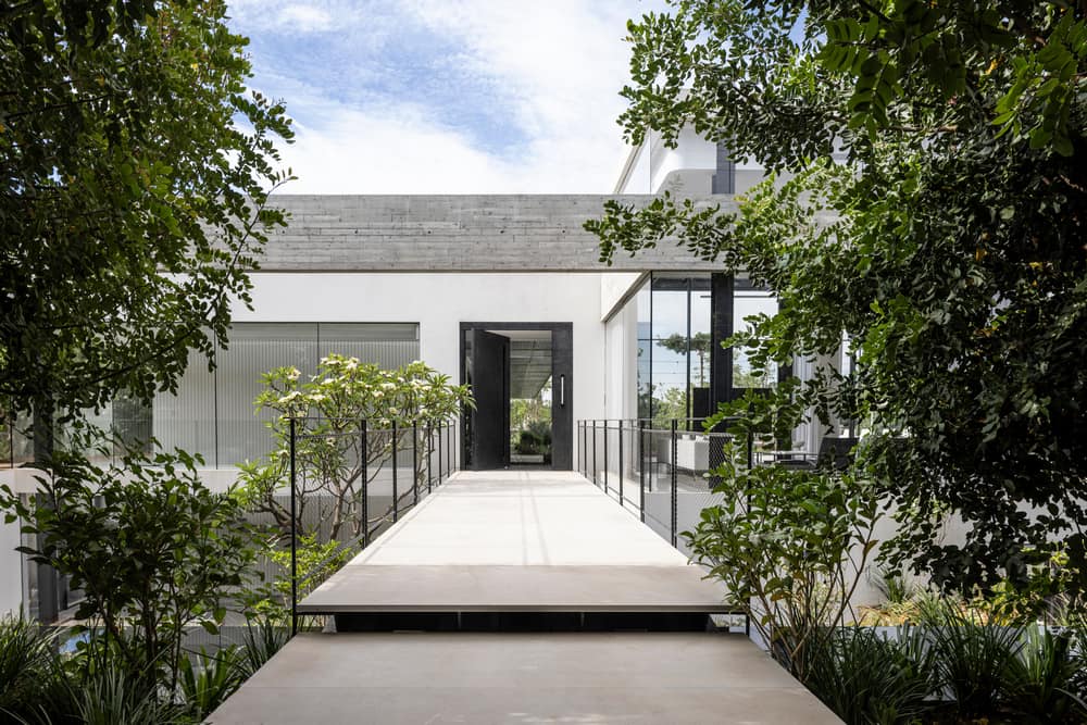
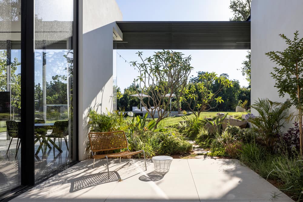
A patio sits between the wings in the corner of the house, overlooking the street it separates a yard to the basement above which a bridge to the main entrance to the Z3 house.
The beam is reflected in the mirror pool below, which turns into black terraces that descend towards the basement. These create an encounter with the patio vegetation that creates
privacy, as well as curtains that are spread over the huge openings.
Above the patio the entrance bridge leads to the main door of the house, which is paved with stone that also extends to the inside of the house, signaling a prominent interior-exterior connection.
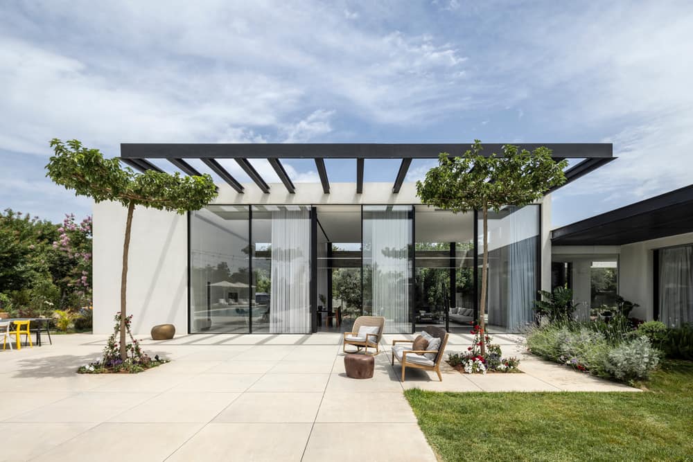
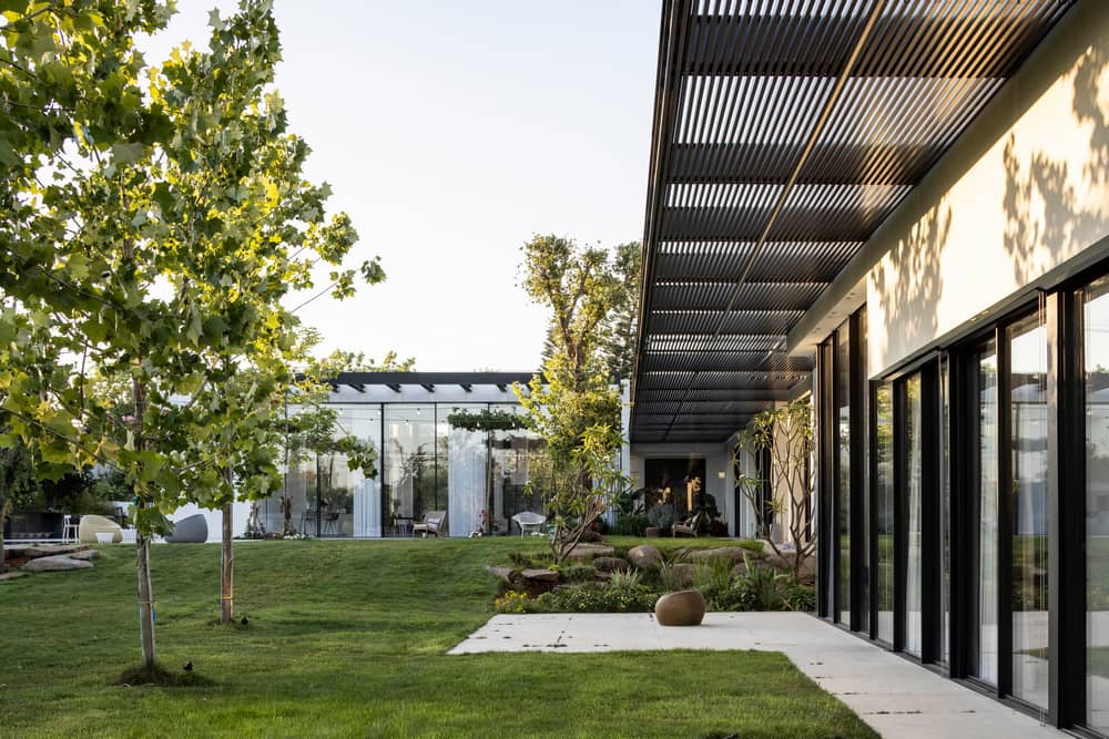
This connection is strengthened through the large windows that project the view inward, and the entrance to the house is in sight. Another element that reinforces continuity is the pergola that stretches along the second house, creating an axis that connects the two houses despite their different height across the property.
This structure reflects the architect’s view: the more open = the more beautiful. Melamed uses a small number of walls for an open and clean look and a design in order to create an open space without divisions and sections by using constructive columns. Moreover, the columns in the space are placed in a grid that does not line up with the front, allowing a sequence of windows without interruptions.
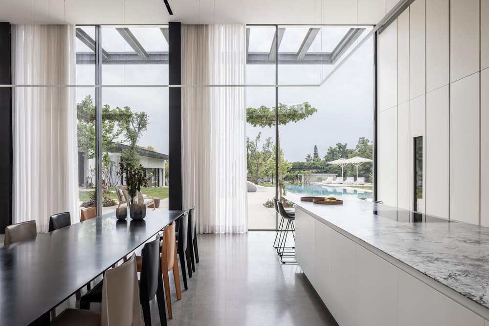
To the right of the main entrance is the living space that presents a harmonious play of white, black, and gray, which repeat throughout the space in different doses. The white kitchen rises to a height of 4.8 meters, bordered on one side by a covered display case and a curtain that emphasizes the height. On the other side is a display case divided by the concrete membrane.
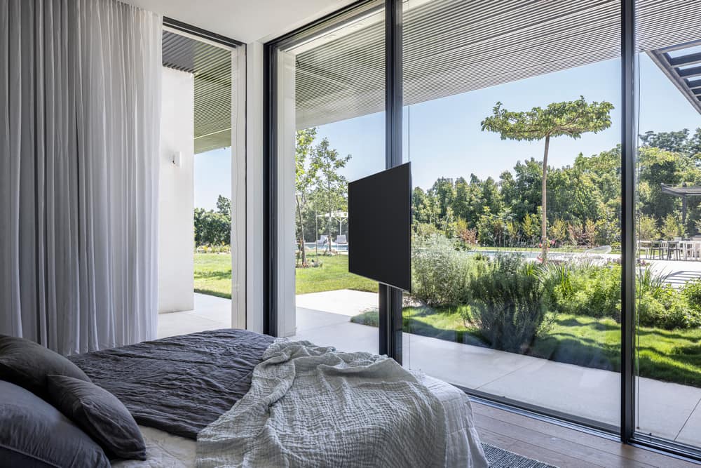
The front of the kitchen hides the space’s technical systems and features a door to guest services, and a door to the pantry and parking. This space reflects thorough planning that puts an emphasis on efficient daily functions for the members of the household.
The family likes to entertain and cook, which made marble the perfect choice for the kitchen island, matching the floor color. Parallel to the corner island is a kitchen eating area, surrounded by chairs of different colors that create interest and joy.
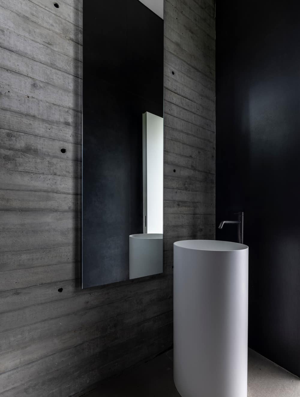
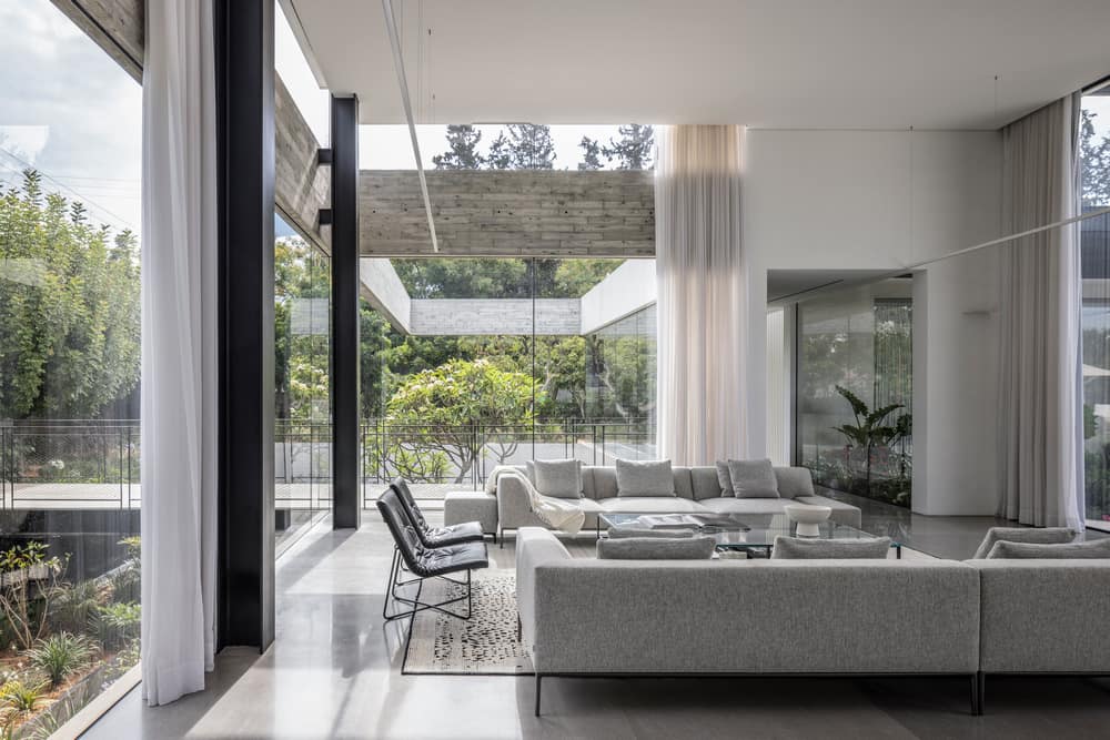
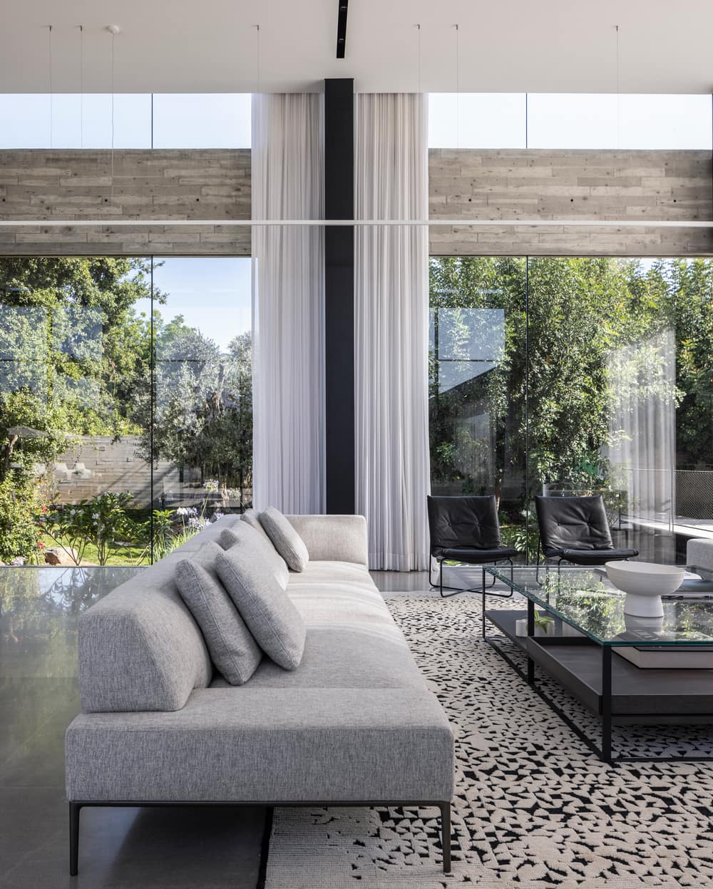
Next to this is the living room, which is defined by a black and white carpet, with exclusive and luxurious furniture chosen thanks to the combination of a soft upper cushioning, and light legs that create levitation, and contributes to continuity from the entrance to the kitchen.
This texture in the public space illustrates the use of colors in the project: black for metal elements (columns, rails, stairs, cables, bridge) white for walls and carpentry, and gray for
flooring and furniture.
The lighting works under the auspices of the height: recessed fixtures were chosen for the lowered corridors, while a recessed strip in the ceiling hangs at the point where the ceiling
rises, a design that creates a mirage in heights and reinforces continuity.
The white hanging strip is joined by black recessed lighting strips, and all of them together turn the ceiling into a design dimension that cannot be ignored.
To the left of the entrance is the private area, where all the bedrooms face the pool for a spectacular view that creates a feeling of freedom and vacation. The access to this area is on a bridge with a cable railing on one side that connects the floors. The railing is stretched from the floor to the basement and the son’s suite, up to the ground floor ceiling, and on the other side a double space that overlooks the patio. The patio strengthens the idea of openness – a space with a yard that is not bounded by walls.
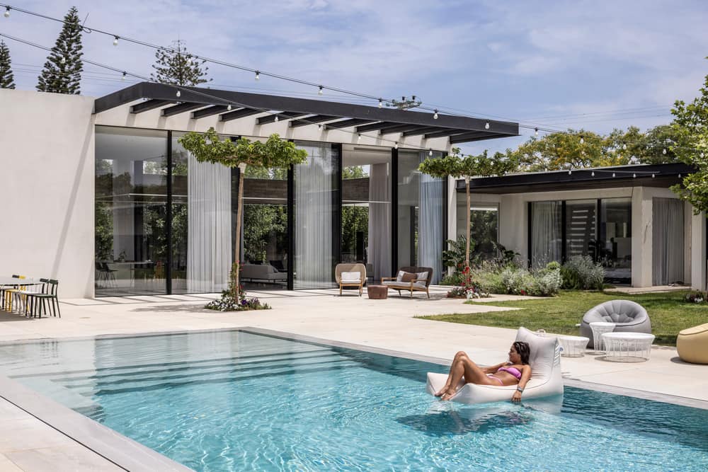
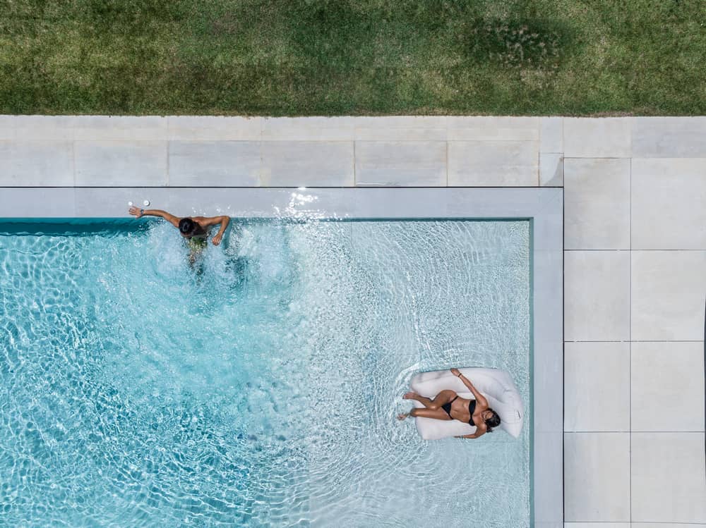
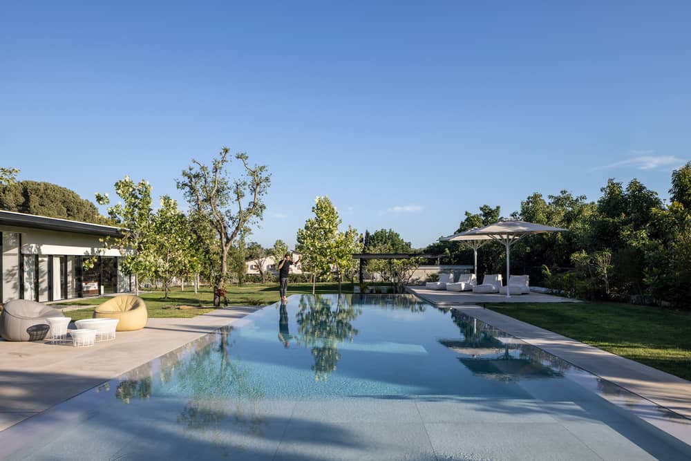
The second house has a longitudinal architecture that is lower than the first house on the surface of the lot. The pool highlights the difference in the heights, with the first house on
ground zero, and ends in front of the second house, becoming a cube that grows out of the ground.
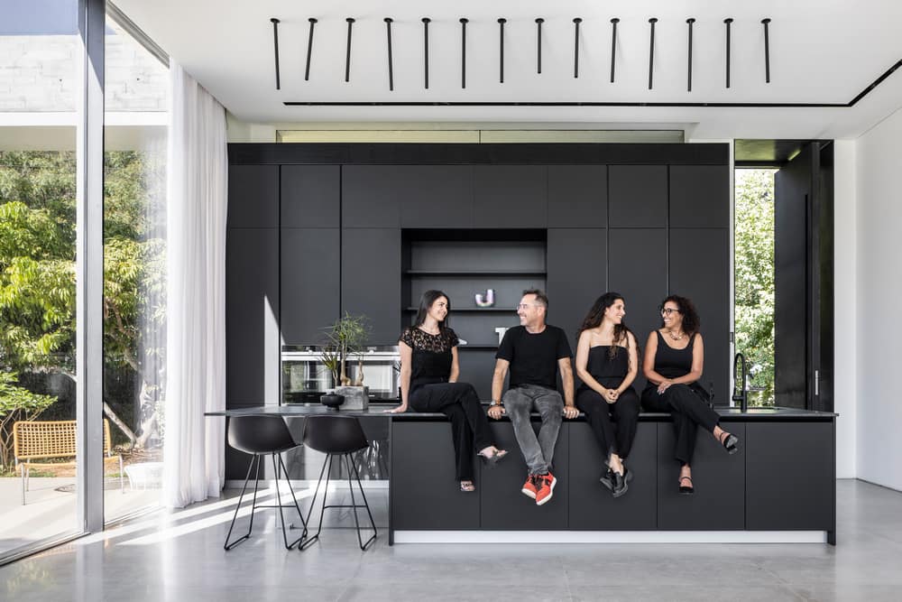
The design line is shared by the two houses, but in the interior of the second house a bare tone stands out, and there is more of a black tone in the elements like the front door and the kitchen, which is in a dramatic and youthful line.
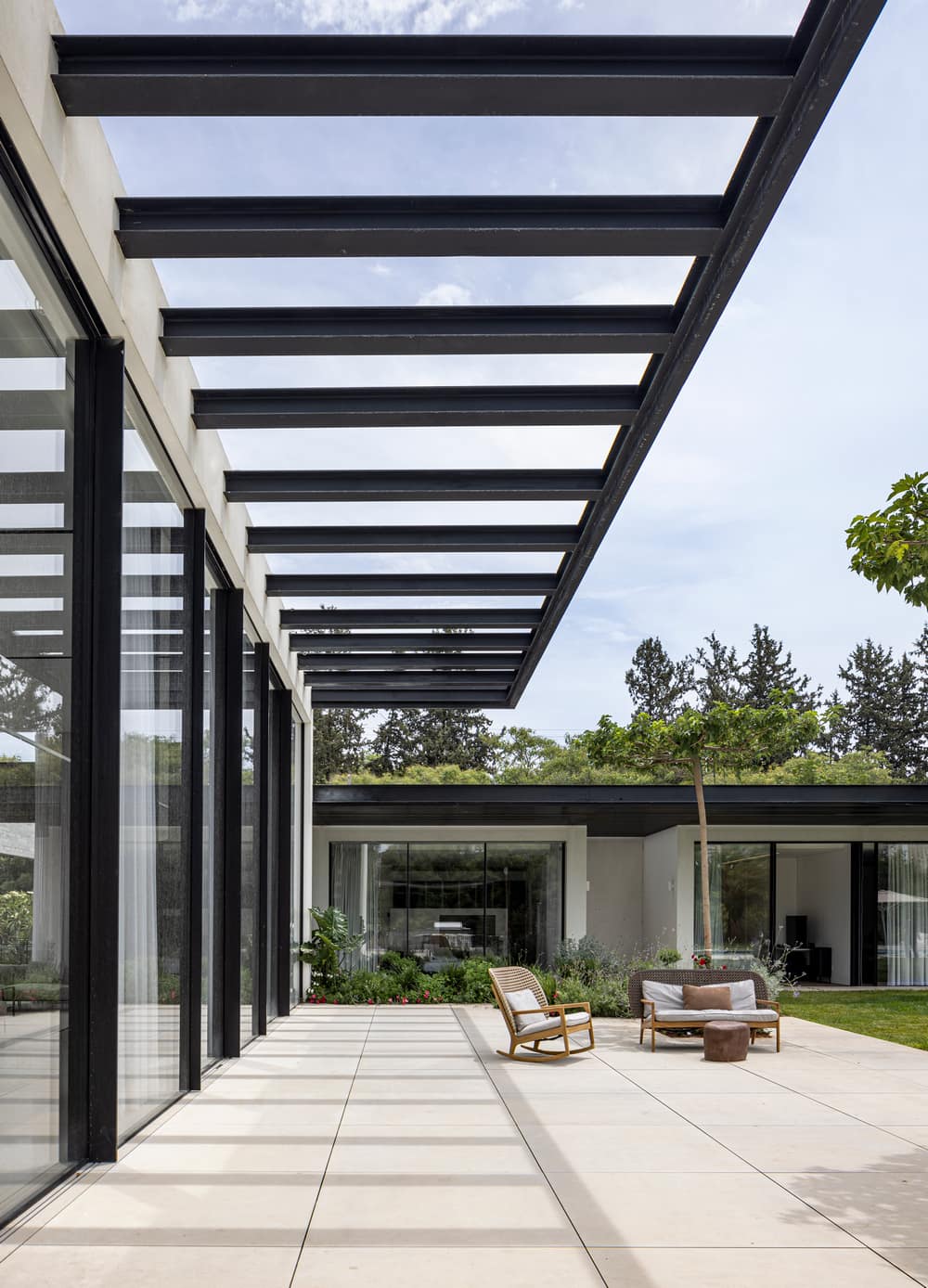
The development of this area is a jewel, and along with careful landscape planning, the architect placed functions such as an outdoor kitchen, the pool, a fireplace, a pergola for
shading, designed furniture and wardrobes. All these together with the interior of the Z3 house create a pampering space that knows how to give privacy along with an embracing family feeling.
