Project: A Lively and Inviting Family Space
Planning and design: Shlomit Zeldman
Plot: 1,000 sqm
Property Size: 420 sqm
Location: Sharon Region, Israel
Owners: Remarried couple + five children
Photo Credits: Shai Gil
The Covid pandemic and lockdowns prompted this couple and their five children to revisit their whole living experience and renovate their property turning it into a specious, lively and inviting family space.
“This couple hired my services to renovate a part of their property, with a focus on repositioning and replacing the existing pool”, recalls Designer Shlomit Zeldman, owner of an architecture, planning and design.
Zeldman adds that throughout the renovation, and mainly due to the Corona pandemic, the dialogue around the property had changed. “The lockdowns prompted the couple to revisit their idea of a family home since their needs had evolved. This led them to significantly extend the renovation to include the entire property”.
According to Zeldman, the owners live in the property with two of their five children. A large guest suite was designed in the basement with a cozy lounge and an exit to a courtyard, to be used by their three grown children when they come to visit.
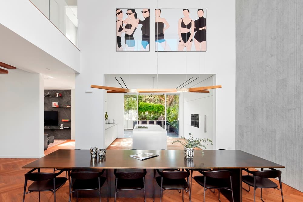
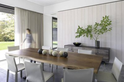
Upon entry to the property, a large dining area is revealed. A symbolic look that reflects the owners love of entertaining. An unusually large 4m long black brass table was positioned in the center of the dining area, which is located between the kitchen and the swimming pool, creating an inviting and pleasant dining experience.
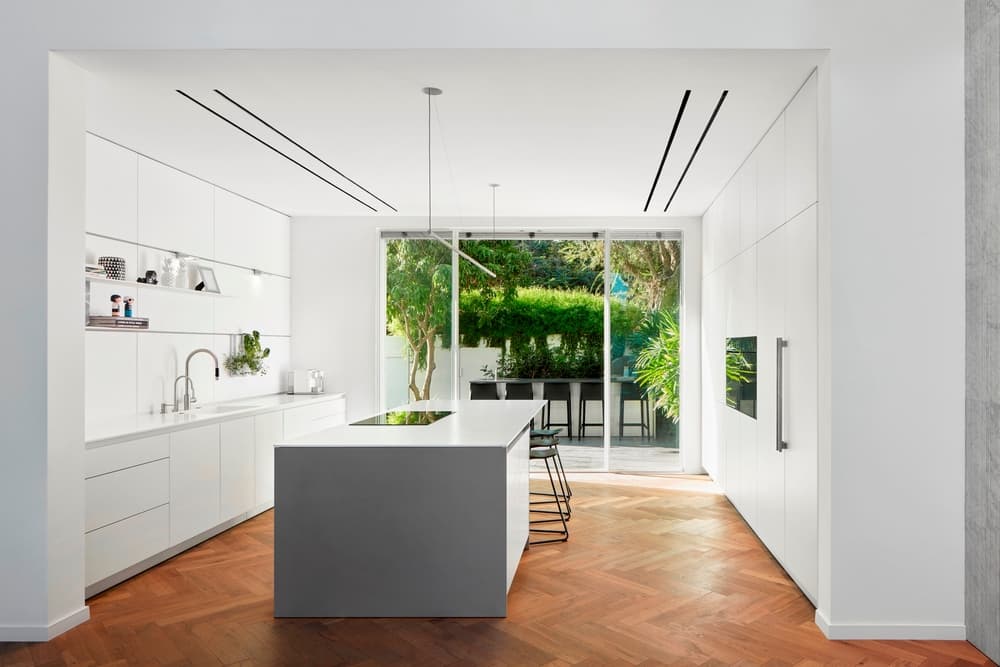
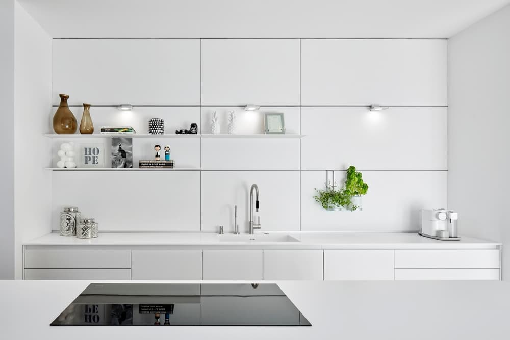
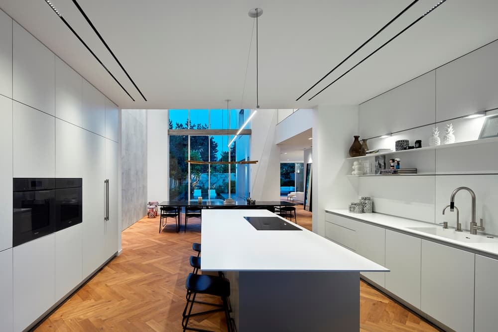
A spacious kitchen is located to the left of the dining area. It is abundant in storage space, kitchen appliances, and worktops yet still maintains a clean minimalist look. Fishbone parquet floors add to the richness of the space and its design. The kitchen is monochrome with touch-open cabinets, the appliances are hidden, and minimalist lighting was fitted along a thin hanging profile to maintain a clean look.
According to Zeldman, the owner loves to cook and entertain, thus the kitchen is a very active and dominant area in the home and much of the attention and investment were dedicated to its design. This is continued by an outdoor kitchen, and both are often used simultaneously.
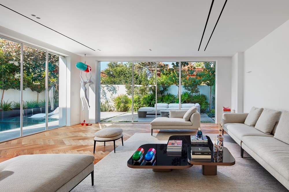
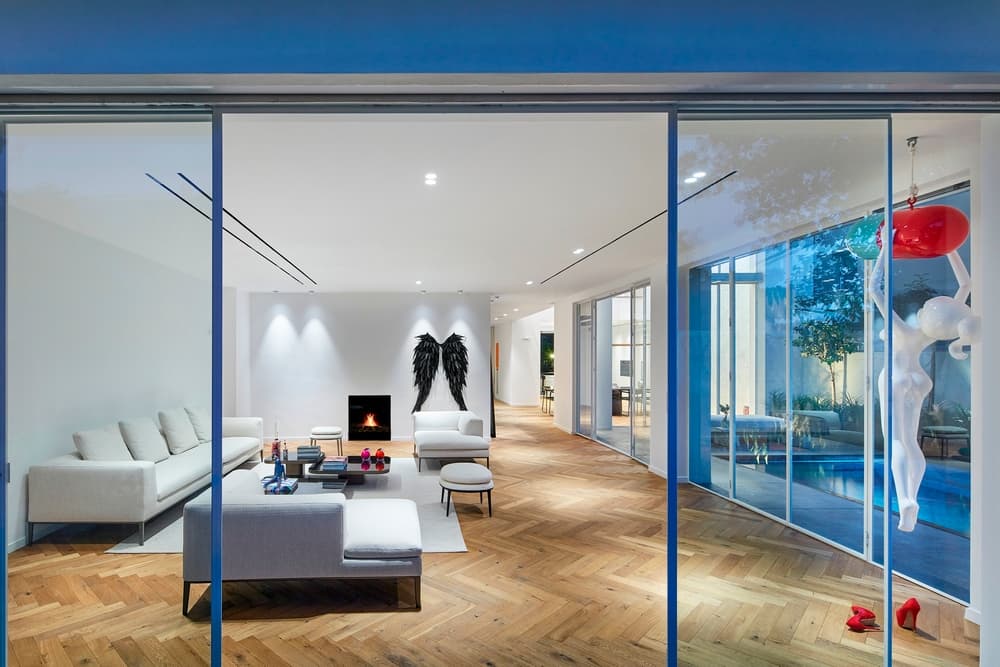
The lounge, also fitted with fishbone parquet, continues the kitchen’s clean design lines. A variety of harmonious seating spaces, in neutral shades, were placed in the lounge and include chaise-lounges, stools and other inviting cozy areas for each and everyone of the family members.
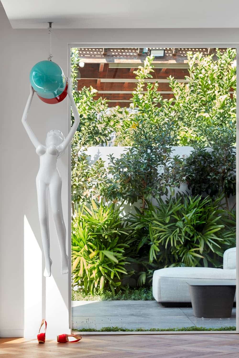
This space was designed purely for the purpose of entertaining and overlooks the garden through large windows that create a sense of space and seamless continuity between the indoors and the outdoors. “The owners are art lovers, and so a strategic corner in the lounge was dedicated to a red and white work of art created by the Israeli artist Orit Fuchs”, explains Zeldman. “The variety of other art pieces dotted around the house “break” the clean white design and inject a fresh twist into the mix”.
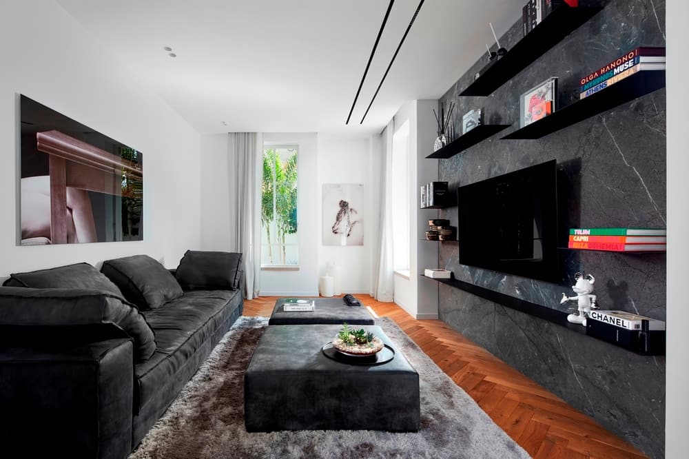
A concealed family and TV room is located near the kitchen. This is where the family, from both sides, comes together. Unlike the rest of the property, this room was designed in darker tones with a luxurious leather couch, stools, and an advanced audio system.
The stairs were covered in wood that matches the parquet and continues the design thread. A glass banister, supported by hidden attachments, emphasizes the “less is more” theme. A small bridge was designed on the top level, from which the ground level can be observed and serves as a partition between the children’s wing and the parents’ wing.
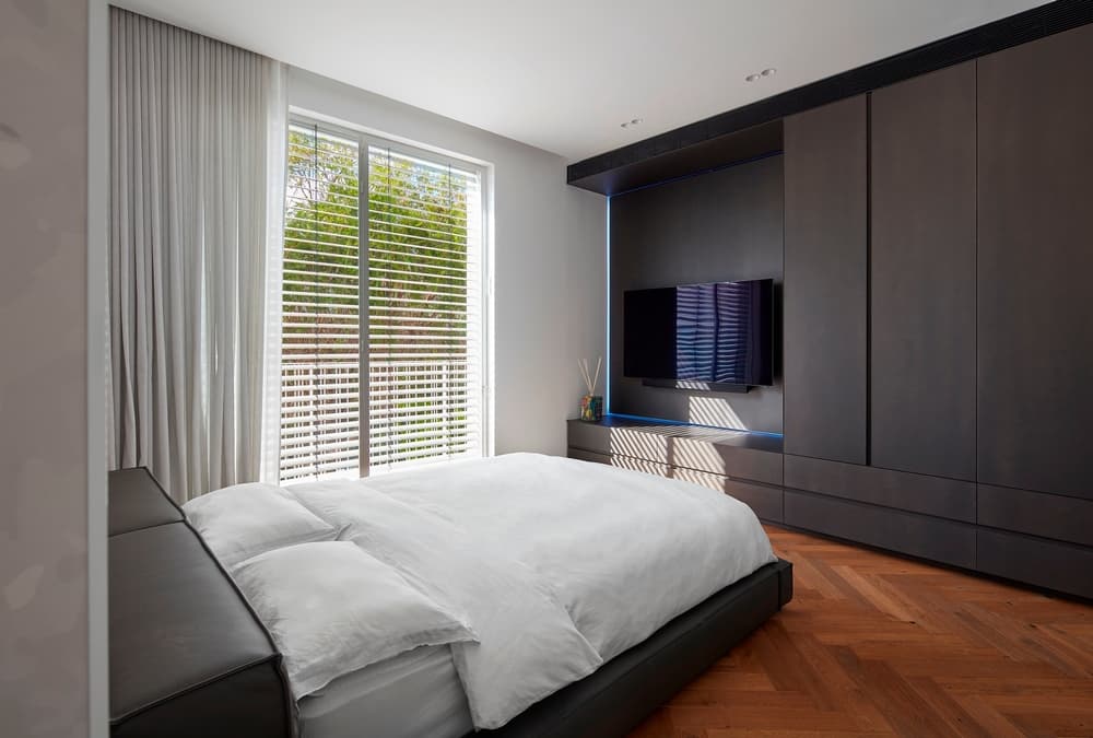
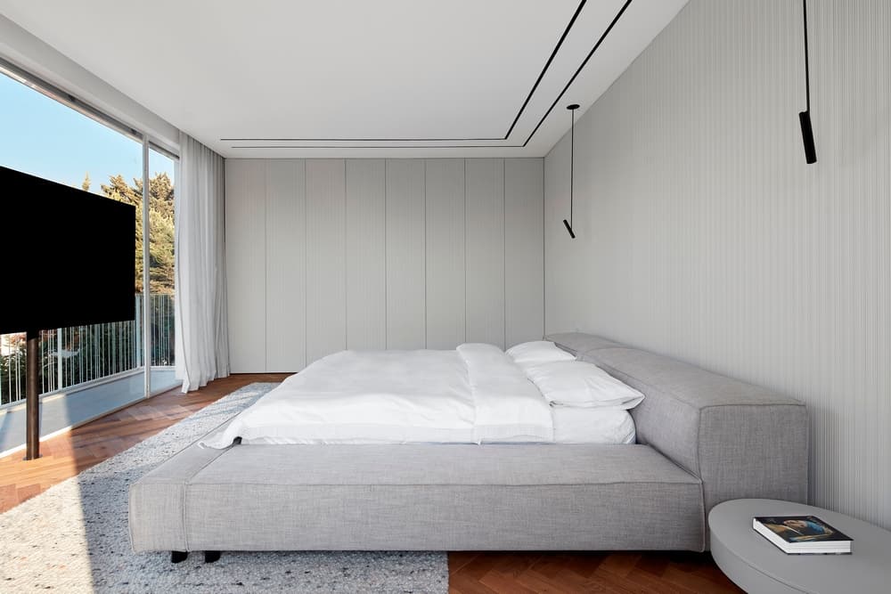
The entrance to the master bedroom is through a corridor of cupboards. Those, as well as the door to the en-suite, are concealed by engraved carpentry. The same carpentry design was used for the bed headboard, which is combined with hanging reading lights, as well as the cupboard fitted across from the bed. This creates a harmonious look with ample storage space.
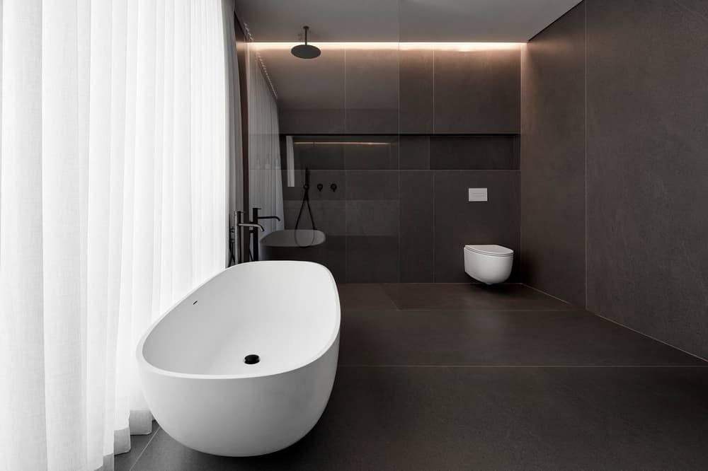
The design concept in the couple’s large en-suite is different. The space was tiled with large, thin, dark gray tiles, and the space was fitted with a dominant freestanding bath, a large shower and a granite covered cupboard.
The 120 sqm basement includes a well-equipped gym, a kitchenette, a guest suit, and a workout studio. According to Zeldman, with regards to the gym, the idea was to create a sporty vibe with advanced equipment. “We invested in a sound system, a very large floor-to-ceiling mirror, an infra-red sauna and wallpaper with custom-made graphics”, says the designer.
The basement is also home to a guest unit that is used by the older children when they occasionally come for visits. The guest suite continues the design theme of the property with parquet floors, a seating area, a bed that overlooks a courtyard, a large TV and a pampering bathroom.
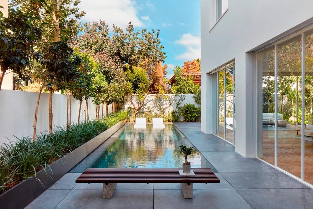
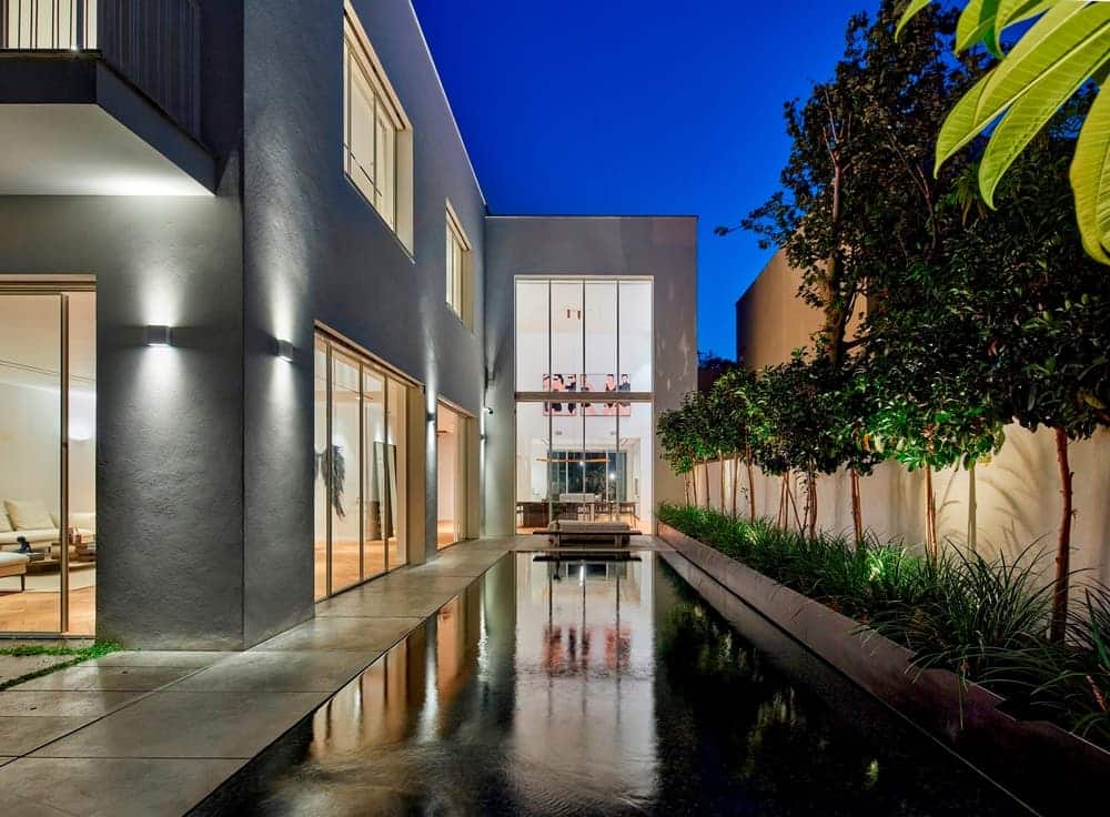
The garden surrounds most of the property. The pathway to the house is visible upon entry through the minimalist opaque front gates. It is made of large concrete slabs with irregular spacing that allows vegetation to grow, and leads to a large black entrance door as well as to the swimming pool. A large area of the swimming pool, which isn’t big and mostly used for entertaining, was dedicated to a splash pool with sunbeds.
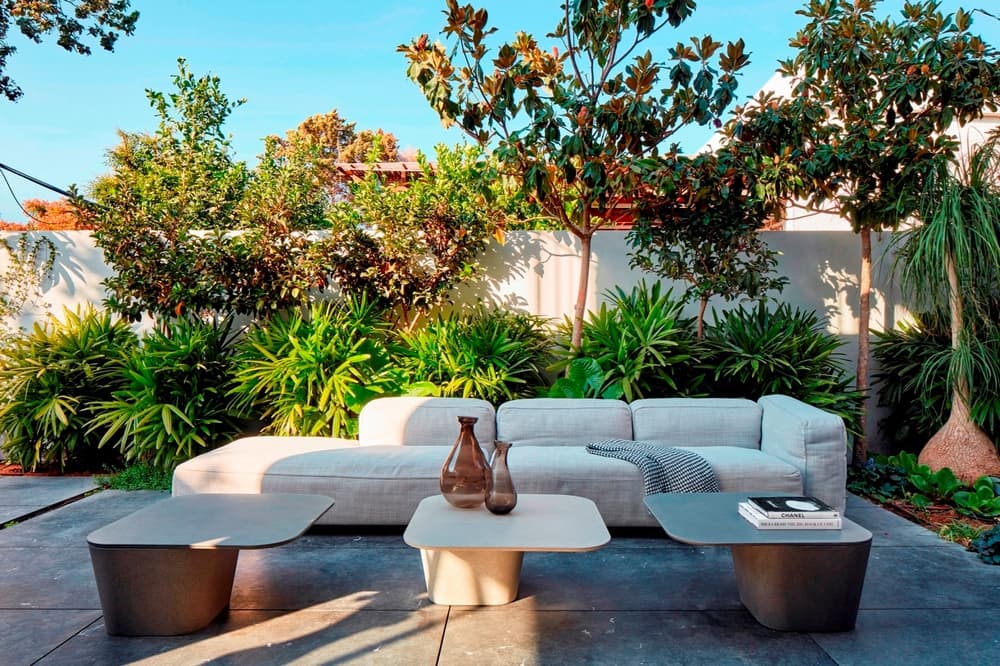
A lounging area and a dining area were designed on either side of the pool, each continuing their respective internal areas.
“The family lived in the property prior to the renovation. Despite the fact that this is the owners’ second marriage, the attention they gave to the children’s spaces – those who live at home as well as those who visit – was equal throughout the planning process with much attention given to each child’s needs”, sums Zeldman.

