Project: Apartment for a Musician
Architect: Ing.arch.Štěpán Havlík, a-sh
Project location: Ústí nad Labem, Czech Republic
Project size 69,4 m2 designed area, 103 m2 total usable area (includes a recording studio that’s not a part of the project)
Year 2015
Photo credits: Jakub Skokan, Martin Tůma / BoysPlayNice
The subject of design is the furnishing and facilities of a part of the apartment for a musician and his partner. The space in question is a new apartment on the second floor of a new apartment building in Ústí nad Labem. Certain elements of the apartment – floors and windows – were left intact, according to the wish of the client.
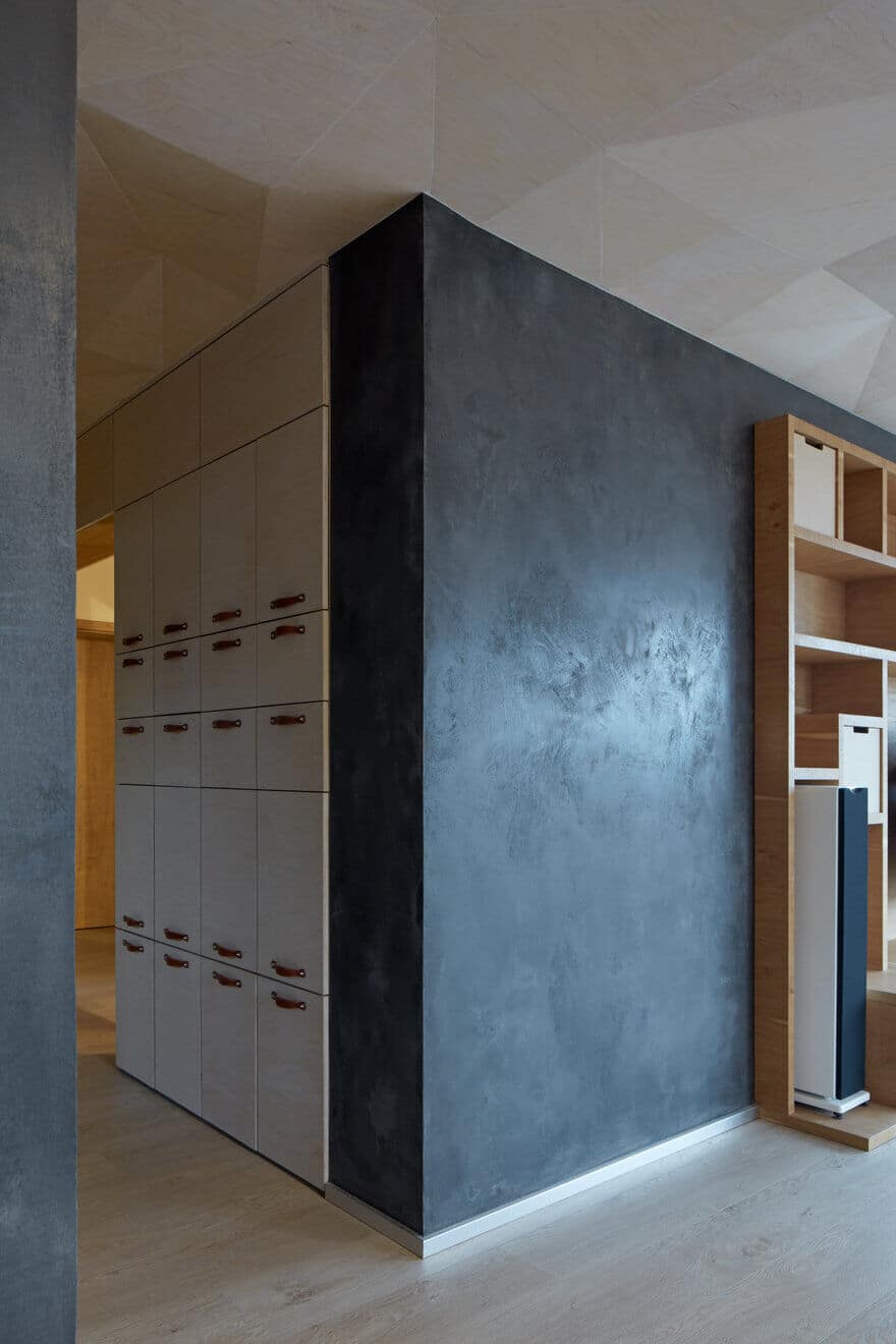
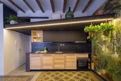
The inspiration brought in by the owner into the first ideas about the living space came from the interest in the furnishing of old cottages heavily scattered on the surrounding hills of the České Středohoří landscape. Another influence was the client’s love for the sunlit homesteads of Provence. Despite being quite disparate, these visions seemed very concrete. The goal of this project was to combine these inspirations into one compact entirety. I did not wish the design to stay in the past by repeating all the well-known borrowed architectural phrases. I rather wanted to create a real and contemporary answer to the specific demands of the customer. In this sense, the design was a search for the atmosphere of these studied references. The interior extracted its solid wood furniture from cottages and its light from Provence. The selection of materials and their tones was well influenced by the surrounding nature. There are three basic materials in the interior: a dark cement coating, oak wood and a whitened birch plywood.
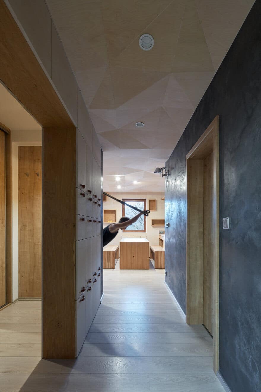
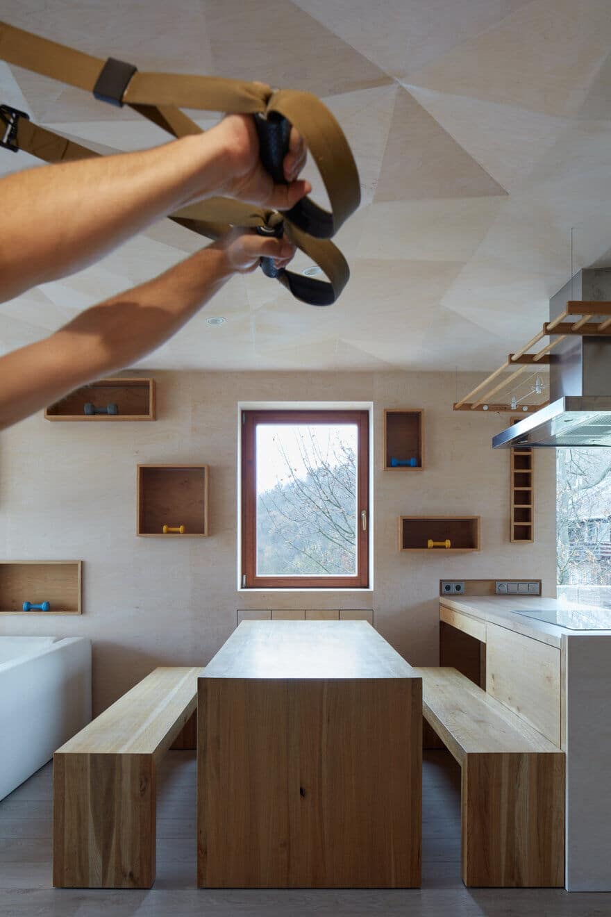
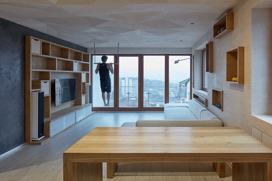
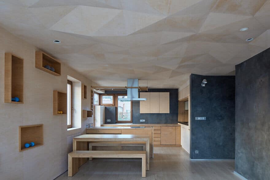
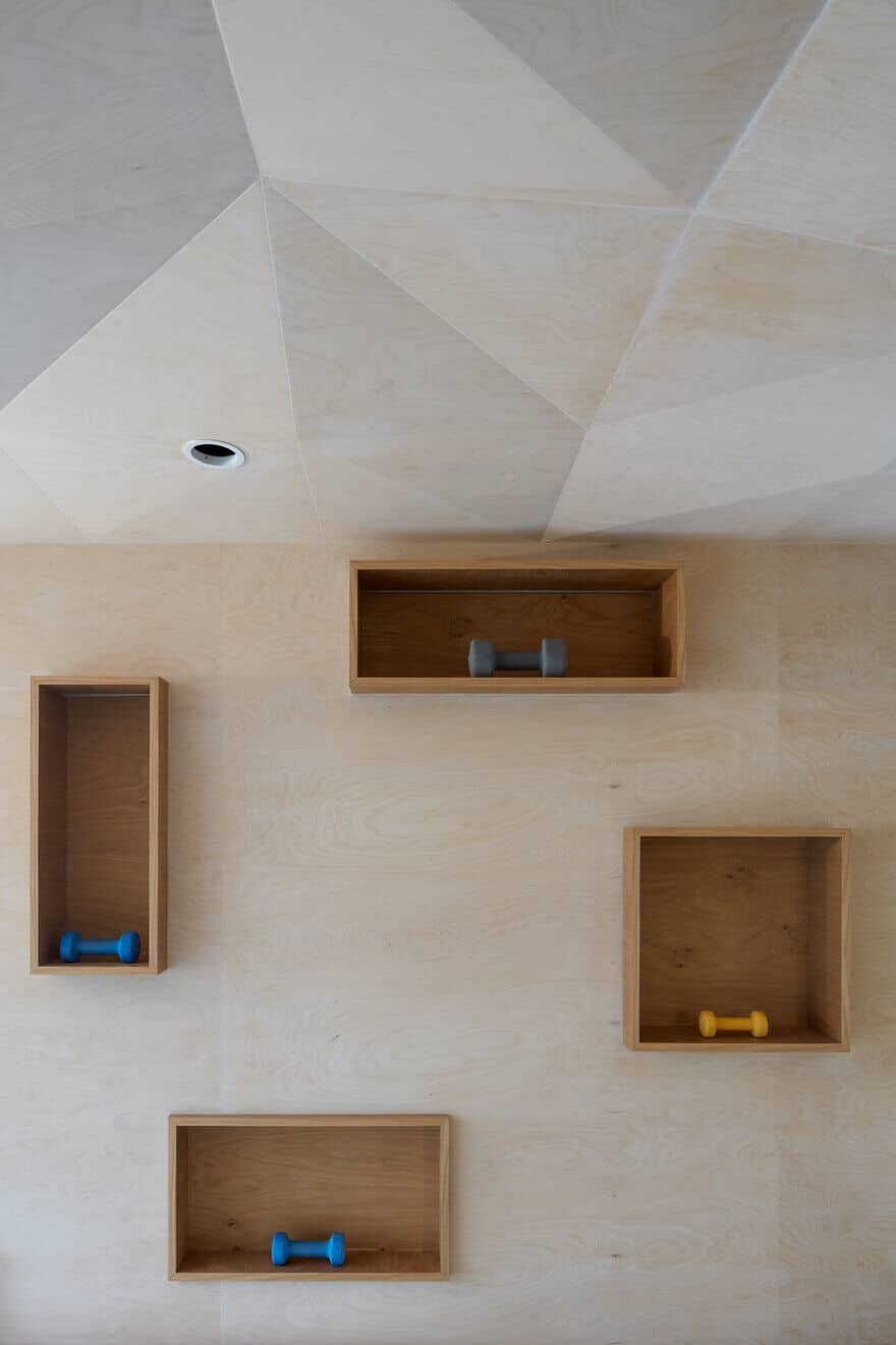
The whole design with a strongly modelled ceiling from light coloured and whitened birch plywood (in reference to rock-climbing walls – the owner is a climber) uses the large glass areas of the balcony window to bring plenty of light into the space. The light slips across the ceiling, bending at the edges as if on water surface. It is furtherly important that the space is well lit. The ceiling hides a system of points for hanging either elements like hammocks or exercising bars and also spot lighting. At the same time, it hides a visually unappealing girder or ventilation above the kitchen island. The decision to implement this lowered and diffracted ceiling was not easy, because it perceptibly lowers the headway height of the room. However, the distinctiveness and functionality of the solution convinced us that this is the right path.
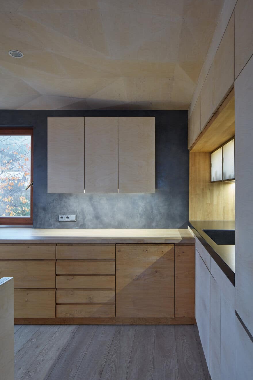
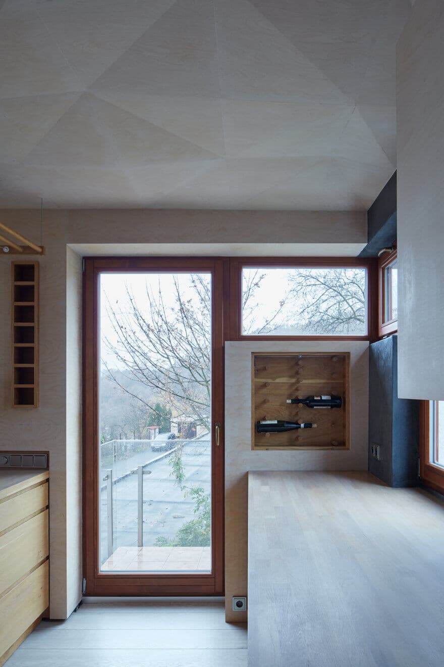
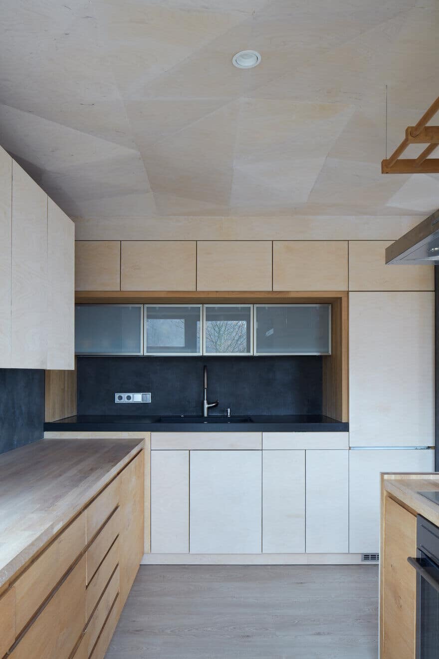
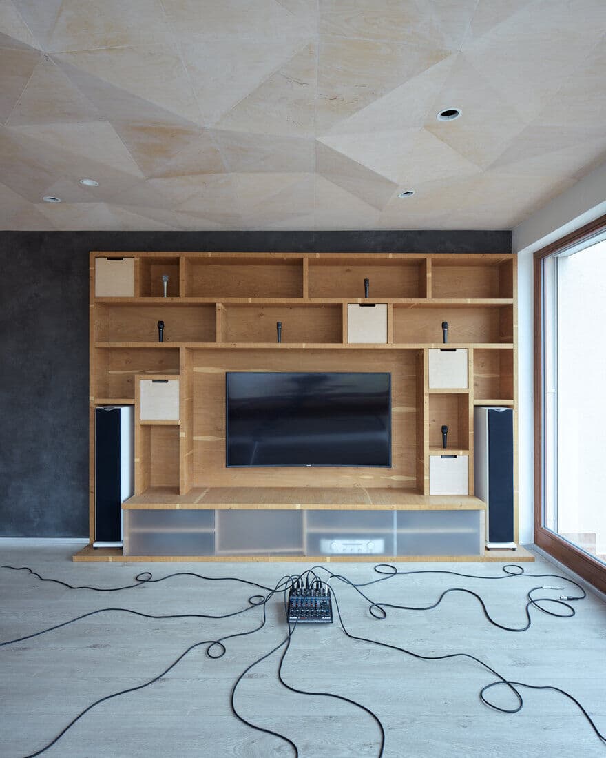
The original unnecessarily large (however dark) entrance has been divided by a closet wall into a hallway and walk-in closet. The entrance hall is therefore much lighter. Furthermore, at the very moment of entrance, there is a much stronger visual connection with the window at the back, near the dining table. The closet room in the centre of the disposition works as a filter into the bedroom and recording studio. The kitchen takes form by the extrusion of large “drawers“ coming out of the walls. Similarly, the countertop by the sink is formed by pulling out a part of mass that it then placed on the other wall. The inserted countertop and sink are made of African granite with a structured surface. The wall with randomly placed shelves is also covered with plywood so it would be soft at touch and for leaning against and therefore becomes a living space. Also in this wall there is a small wine cabinet. The shelves wall with small drawers across the room is a space for books, sound system and other objects from the equipment of the musician.

