Project: Black Brick house
Architects: Freadman White
Project Team: Ilana Freadman and Michael White
Area: 250.0 sqm
Location: 4 Hoddle St, Elsternwick VIC 3185, Australia
Photography: Jeremy Wright
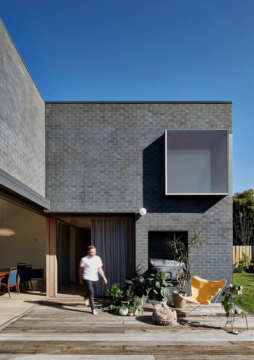
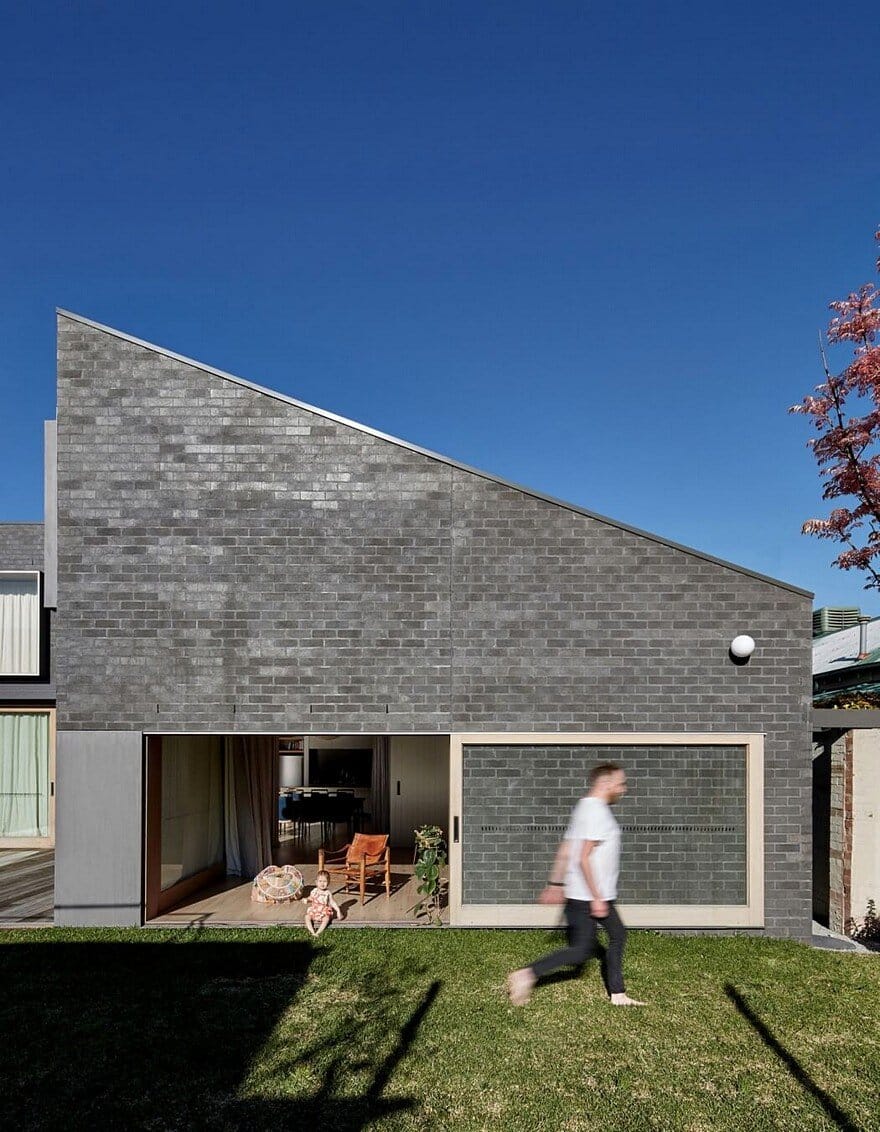
This Black Brick house has been designed to nurture the changing needs of a young family over time, through the creation of generous spaces with a high degree of flexibility. The existing dwelling was a 1930s brick with a rear 1970s addition.
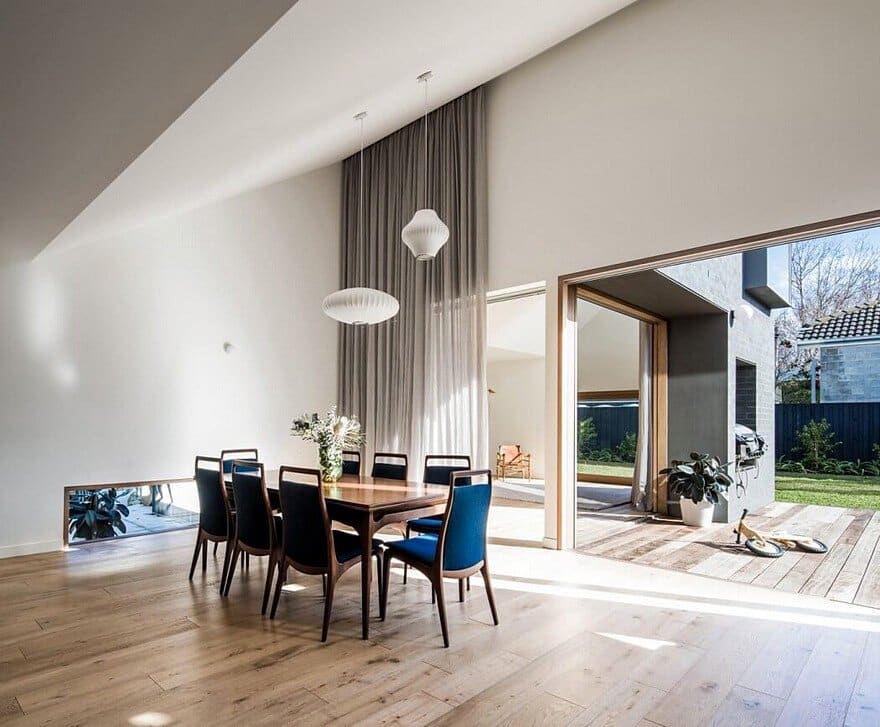
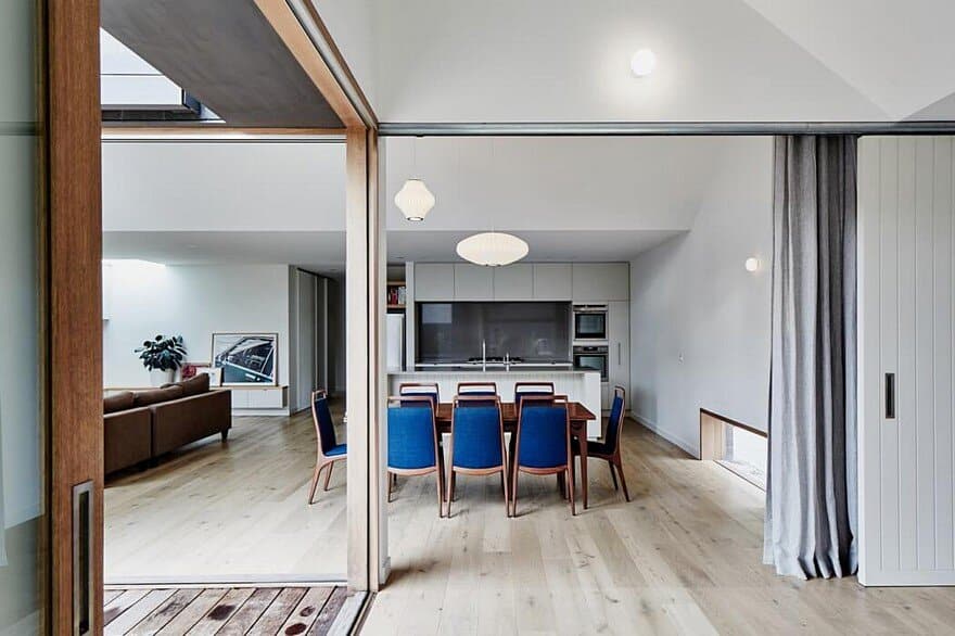
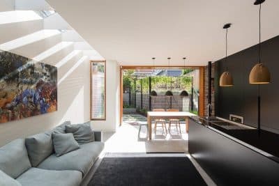
The client required additional space for their young children to explore; a rumpus room, living, kitchen and terrace. A primary deficiency in the existing condition was that the living/dining areas were buried within the rear addition, whilst the laundry occupied valuable garden space. Freadman White’s approach was to swap the laundry and living areas, providing a raking ceiling at the junction of old and new to reveal the extensive yard beyond.
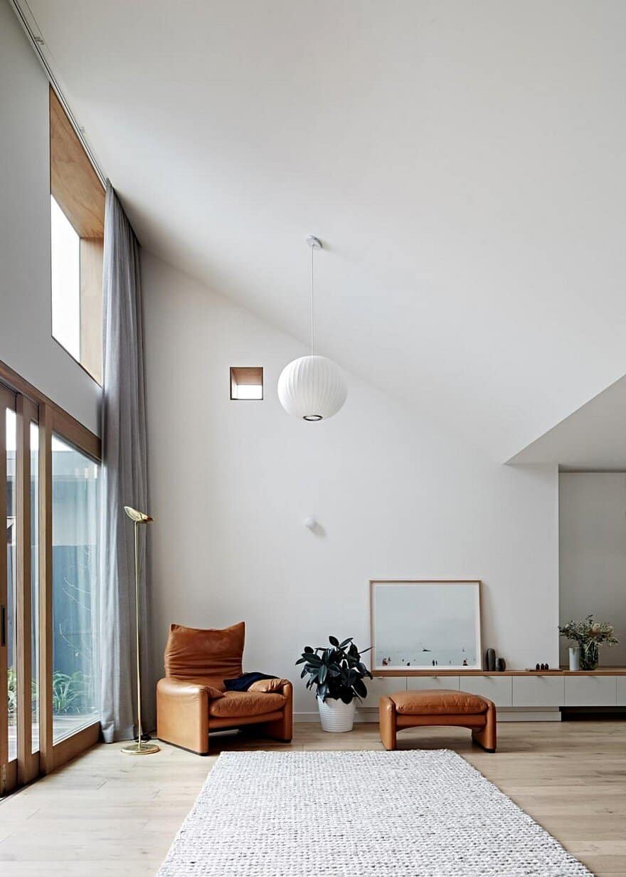
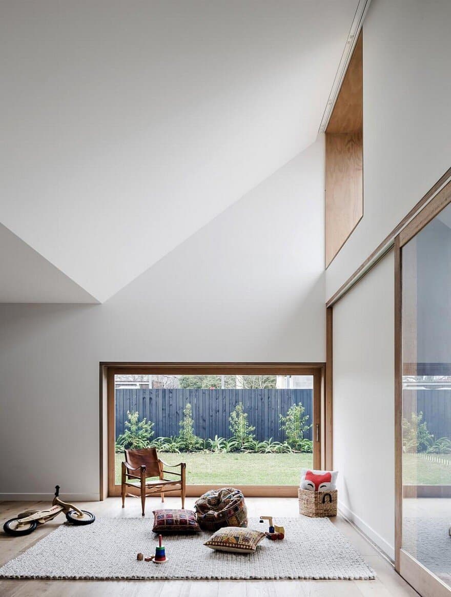
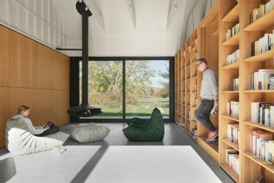
The rumpus room was envisaged as a space of indeterminate function. Connected to the new living area by a large slider, it could be a rumpus room, as required by the client, or it could be more – a reading room, large dining room, or sleep-out. The room is bereft of joinery, or other programming features; its only determining feature is its connection to the garden, deck and living room, making it a connective space, open to variability and change.
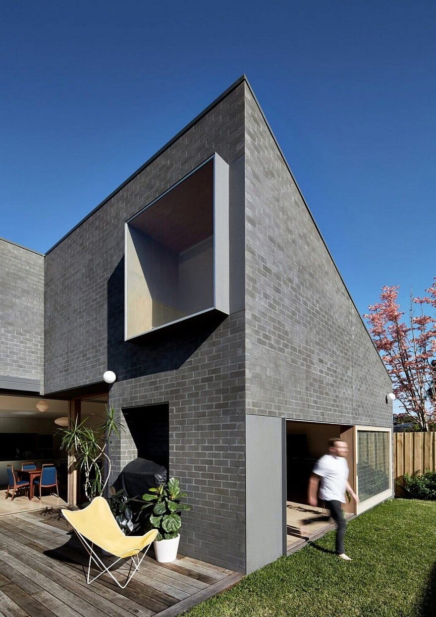
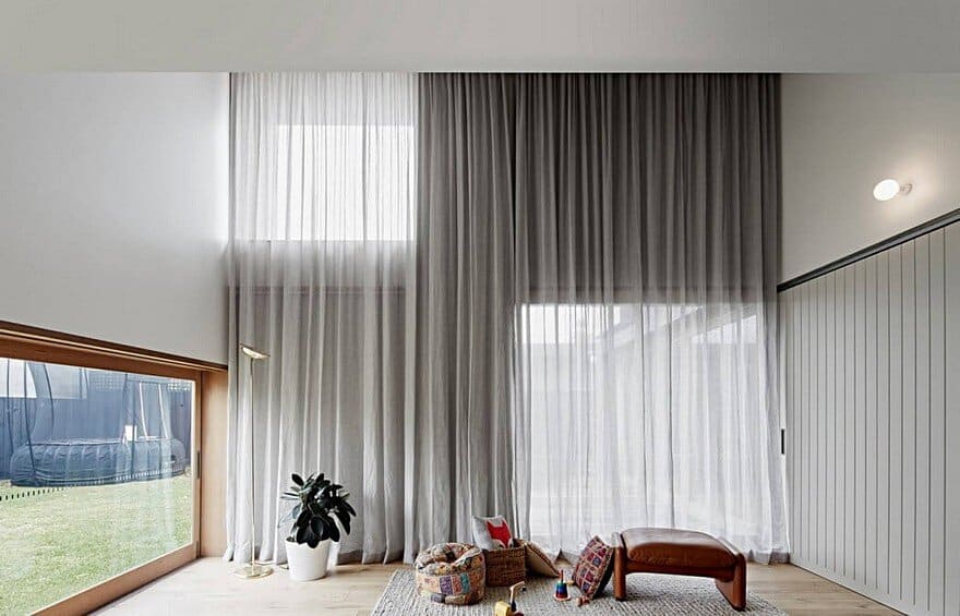
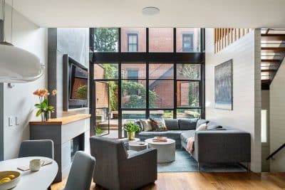
The new volumes adopt atypically thick walls and window reveals providing formal, shading, thermal and cost benefits; rather than demolish and re-build, much of the original extension is retained and concealed within these thick walls. To animate the building, sheer curtaining coupled with variegated window heights and depths blurs the static formalism. A common feature of the surrounding context is the hipped roof; in this addition, the exterior roof form is hidden from view. It is not until one experiences the interior that the angular forms of the hip roof type appear, in the form of soaring raked ceilings.
To watch over the children from inside, the client required vistas across the yard. A deceptively simple and cost effective approach was taken by the landscaper to express the boundary, by specifying black paint to all palings. This ‘horizon line’ can be seen form several internal vantage points, extending the effective floor area right to the boundary.

