Project: Ceres House
Architects: Dan Gayfer Design
Building Contractor: Built by Wilson
Location: Geelong, Victoria, Australia
Project Year 2017
Photography: Dean Bradley Photography
Text by Dan Gayfer Design
Ceres House is our largest project completed to date. Located within the rolling hills of Ceres – a rural hamlet of Geelong – the project was virtually a new build and involved the simultaneous design of the residence, its interior and immediate exterior spaces.
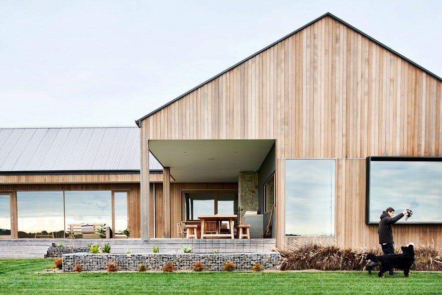
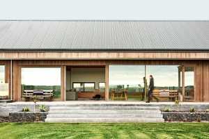
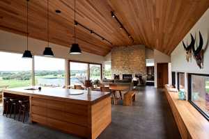
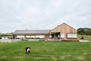
Somewhat inspired by American Ranch style architecture with its picture windows, gabled rooflines and far-reaching single storey floor plan, the buildings careful orientation encompasses 180 degrees of views whilst protecting the exterior living spaces from prevailing winds that can sweep across the property.
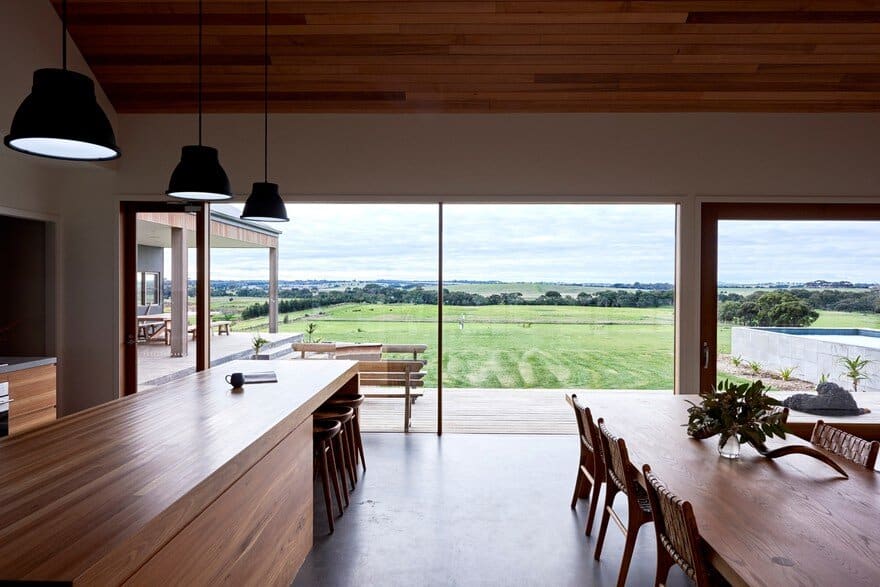
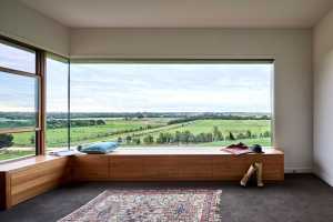
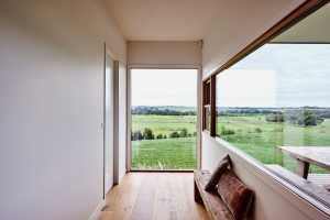
The views are part of the design and its aesthetic; they are not borrowed but practically stolen from the surrounding landscape to become part of the interior.
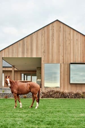
The brief for the Ceres House project was largely concerned with facilitating the multifaceted and diverse lifestyle of the owner’s and their four young children – all at various stages of schooling upon the commencement of design. If one had to summarise the family in a singular word then one should look no further than ‘busy’. There is a constant revolving door of kids and adults all engaging in various forms of work, school, sport, entertaining, farming and of course horse riding; the family are very passionate horse people and this was certainly a factor in settling on this rural context for the new family home.
Just as important as responding to the hectic activities of family members was the design acknowledging the unquestionably strong and cherished role that friends, school/work colleagues and extended family play in the day to day living of the owners and their children. The design needed to accommodate fraternising between all kinds of people, at all different scales and at any time of the day and week. These interactions were not viewed as ‘one offs’ or irregular occurrences that took place at Easter or Christmas; they were identified as being intrinsic to the lifestyle of the family and thus to the conceptual platforms on which the design was developed.
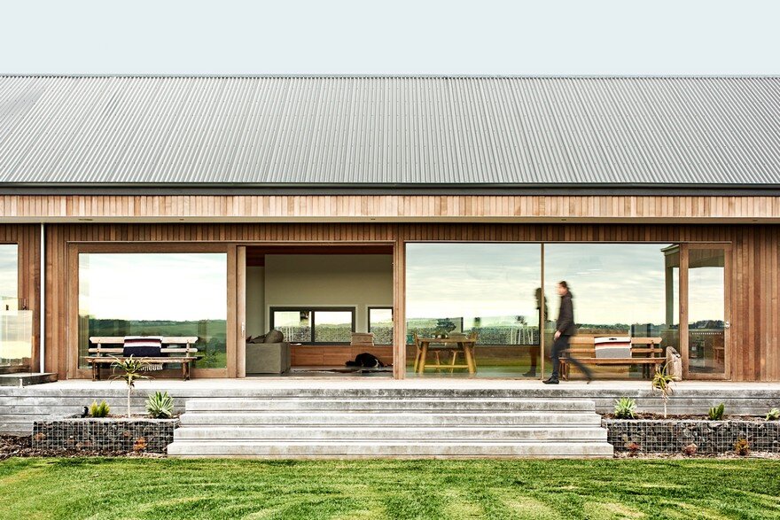
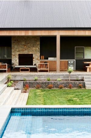
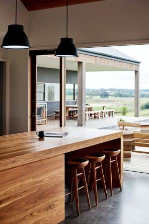
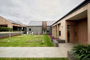
Essential to translating this concept of an ‘all-inclusive’ environment was the need for extensive outdoor living spaces that provided additional areas for friends and family to lounge, entertain, cook and dine. The ensuing terrace stretches alongside the bedroom wing; sharing the same roof structure as the residence it gives the impression that some of the walls were simply removed to create this exterior living area.
From a site specific view point there were a number of conditions that the design needed to consider. As the proposed site for the residence was virtually perched on the side of a hill it was subsequently exposed to prevailing winds from a number of directions. Subsequently, the exterior living spaces needed to be located to minimise their exposure to these adverse conditions thus maximising their use. Last but not least was the non-negotiable of the design embracing the stunning views on offer; rolling farmland, Barwon River, You Yangs, Northern Geelong and Port Phillip Bay all find their way into the interior.
Key challenges faced throughout the design process all centred upon meeting the aforementioned brief. The size and layout of all internal spaces were painstakingly determined; from our initial concepts the majority of rooms increased in size as the design was developed further.
As the majority of this studio’s projects had been located in the inner suburbs, we were initially somewhat ‘reserved’ in our calculation of how considerable the interior spaces should be. Typically, we are hesitant to design spaces there are larger than they need to be; the premium on space in an inner-city context is too high to create spaces that are not utilised to their full potential. As a consequence, we were perhaps hesitant in taking full advantage of the unrestrictive parameters that existed for this project.
After gradually developing a more accurate understanding of the family’s frenetic lifestyle and the exceptional frequency of visitors to the home, we felt we could be less restrained in designing larger spaces (that we were accustomed to) as there was legitimate reason to do so. Once this point of realisation was reached then it became more about the structure of spaces and functions as opposed to their physical boundaries.
Where and how do people congregate in both small groups and large? Do particular spaces have the capacity to facilitate a diverse range of functions, activities and interactions? How do people or groups move from one space to another? Where could one escape for some quiet time during a large gathering? How do you comfortably move from the inside to out? And at what locations? The families profile in regard to size, social groups, lifestyle, interests etc. meant that these questions and others were specific to the project and ones that might not have necessarily been addressed in previous city-based projects.
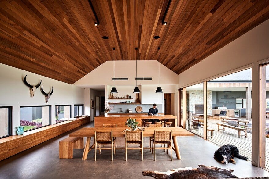
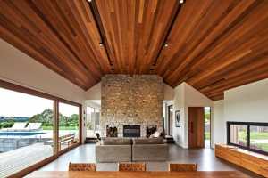
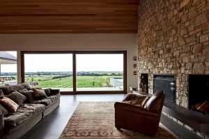
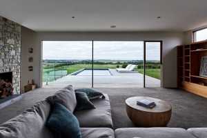
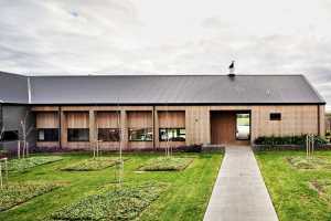
There are a number characteristics that are exclusive to the Ceres House ranging from its contextually driven aesthetic to its ability to switch roles depending on the profile and number of its occupants. Essentially the built form of the residence consists of two perpendicular ‘wings’; one housing the main living spaces including a living room which is separated from the sitting/dining/kitchen spaces by a floor to ceiling sandstone fireplace.
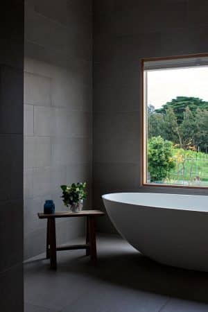
A second living space and study completes this east-west structure whilst the north-south wing contains the bedrooms and various wet areas including an ensuite, bathroom, laundry and second bathroom exclusive to the more disorderly members of the house i.e. boys.
The architectural style of the design borrows from the canon of American Ranch architecture but with a contemporary twist or two. The east-west wing is a single room deep so that its spaces can not only enjoy the northern light and views across the swimming pool they can also take advantage of the beautifully curated garden to the south.
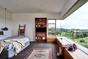
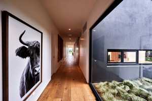
The bedroom wing is also one room deep however an over-sized hallway, or gallery, runs down one side; the bedrooms each have exclusive views to the west whilst the hallway looks across the outdoor living spaces to the east and across the Barwon River to the north.
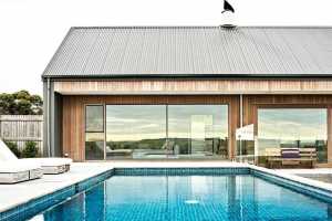
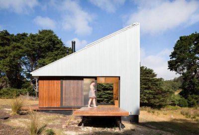
The single storey ‘T’ shaped floor plan, widespread sliding glass doors and undeniable emphasis on the surrounding landscape through views from almost every room are all key elements of the Ranch style. The low-slung roofline that is typically associated with Ranch architecture has been replaced by a higher pitched gable roof; this bringing a grand, almost imposing, character to the kitchen/dining/sitting area.
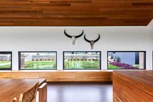
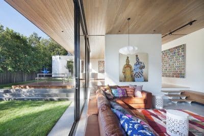
The design unashamedly takes the views on offer and integrates them into the interior design of Ceres House. They are showcased by floor to ceiling windows and doors and become living artworks to be experienced during the routines of the everyday. Only enhancing the views is a swimming pool located at the foot of the living room; looking out across the pool to the Barwon River and Port Phillip Bay on a clear summers day is a unique experience to say the least.
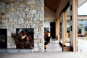
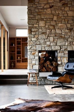
The aesthetic of both the interior and exterior draws from the projects rural surrounds, its diverse vegetation and scattered rocky outcrops translated into a palette of timber and stone elements that feature strongly throughout the interior. Blackbutt cabinetry, Cedar linings, American Oak flooring and Spotted Gum timber decking provide a mixed timber palette with the different colours, textures and patterns all highlighting particular elements both inside and out.
The double-sided fireplace between the living room and sitting/dining/kitchen is arguably the centrepiece of the design; it has been beautifully crafted of Mt Angus sandstone whilst timber cavities each side of the fire have been defined by raw steel sheeting.
This setting is enriched further by the adjacent Cedar lining that follows the three sided profile of the cathedral ceiling, its natural variation highlighting the canopy above the spaces below, bringing with it colour, life and a unique grandiose that is a permanent fixture of the day to day activity that occurs beneath it. The more refined and consistent finish and grey tones of the burnished concrete floor provides an unambiguous contrast to the Cedar above.

