Project: Dreams do Come True
Interior Designer Odelia Barzilay
Location: Central Israel
Area: 200 sqm
Photography: Einat Deke
The couple who bought this property had a clear vision of their dream house. They presented the interior designer with a picture of what they wanted, and she made their dream home come true.
In the age of social media, we are constantly exposed to inspiration. This couple came across a picture of a designed property on Pinterest and knew immediately that this was what they wanted their future home to look like. The couple purchased a private property in central Israel and approached Interior Designer Odelia Barzilay, who designed their previous property, to help them make their dream come true. “It was an old property built in the 90’s”, says Barzilay. “The clients showed me this Pinterest picture and wanted me to recreate it for them. That was the starting point from which we embarked on the journey”.
Bazilay adds that the clients, a couple and their two children, wanted a classic property with a modern twist. “They wanted a bright, warm and clean property – European with an injection of modern style. This was their vision. They are a very ambitious couple with a very clear sense of style”, she says. “From the day they stepped foot into their previous property, a garden apartment, it was clear to them that their next property would be a private house and they already had an idea of what it would look like. To my delight, they gave me full artistic license and so, I embarked on the journey of making their dream home come true”.
Barzilay says that the couple came prepared. “Pinterest is a wonderful source of inspiration. It captures the desired look and feel, style, design concept, ambience, and harmony as well as materials and color palettes. The journey from the Pinterest pictures to their translation into a real property, is a long one, but it is certainly a good starting point”, she adds.
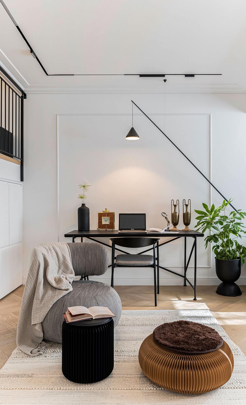
The planning of the house involved functional considerations of the family’s needs. The ground level includes the entrance hall, kitchen, dining area, lounge, family corner, office corner, safe room and guest toilets. “The clients wanted a large classic kitchen with an adjacent dining area. Per their request I designed the home office corner inside the safe room as it is used for storage and is fitted with a large cupboard and desk for the children’s computers”, she explains. “I created many storage solutions throughout the property, such as under the stairs and next to the office desk. This is a house that is aesthetic and beautiful without compromising the family’s needs. Thought was given to every single aspect of the design to ensure the family can easily maintain order around the house”.
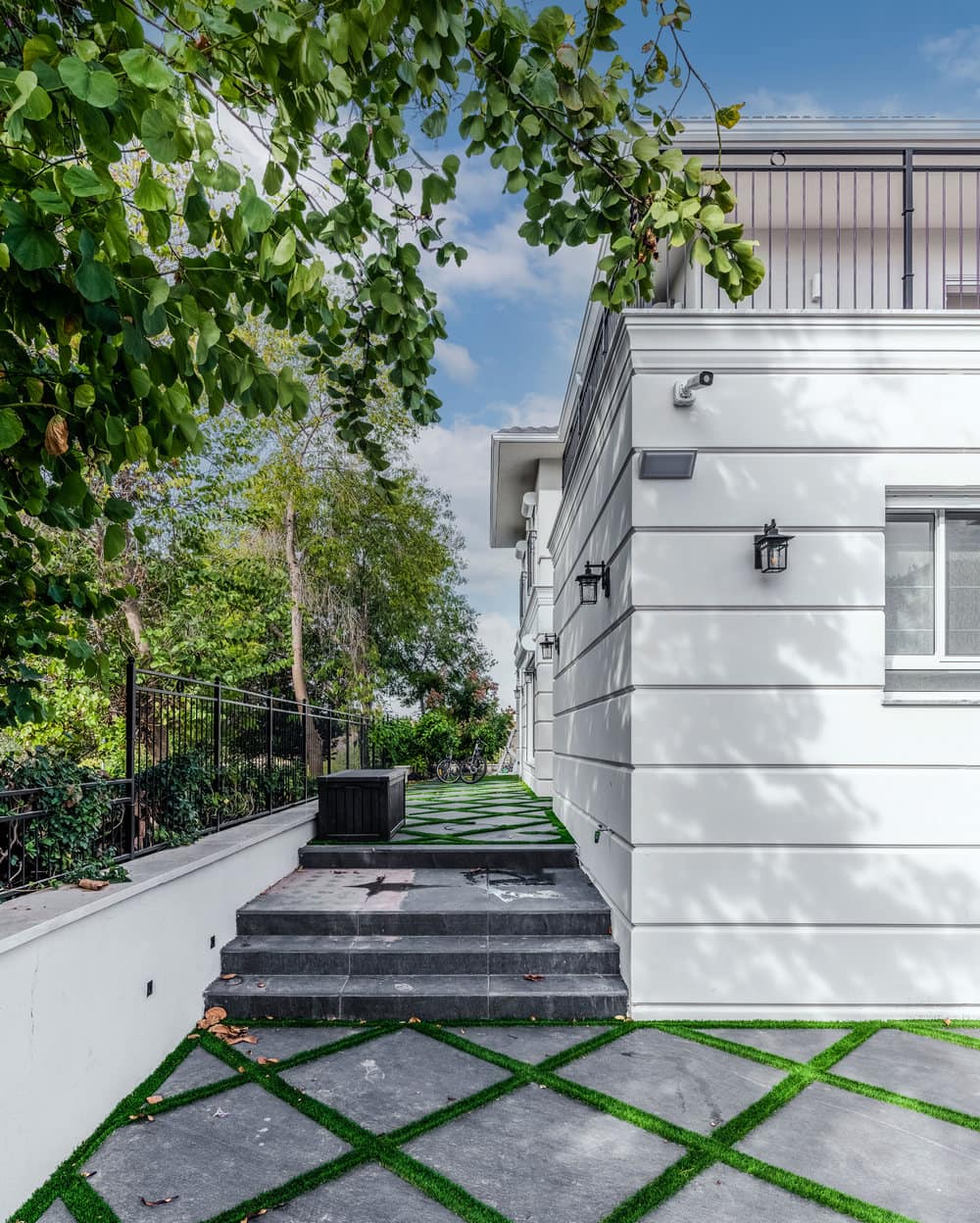
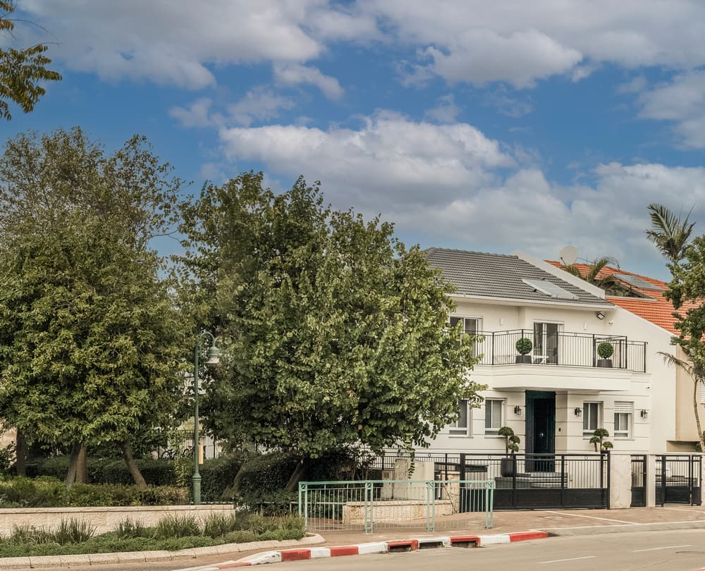
“Beyond the design aspect, the property went through an extreme makeover regarding the space planning”, continues Barzilay. The property was extended in all directions. The kitchen was extended into the garden by 1.5 meters. “This allowed us to create a spacious kitchen and incorporate a family area and office corner in the main living space”, she explains. “We also extended the lounge. We changed the location and size of all the windows as a result of the extensions and on the top floor we created balconies at the front of the property adjacent to the children’s rooms and the master suite that was also extended”. The changes were also carried out externally. The whole property was re-cladded and fitted with cornices. Barzilay redesigned the entrance that is fitted with a large door and an impressive marble staircase. The entrance path was designed as a grid of paving and grass. As a result, the entire look, internally as well as externally, has changed and become very European.
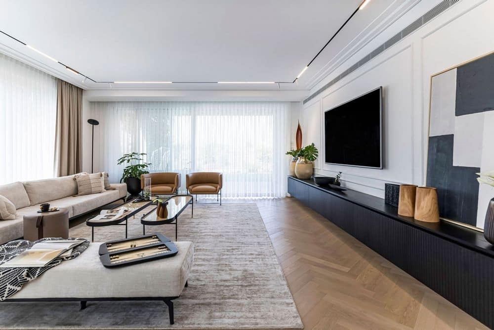
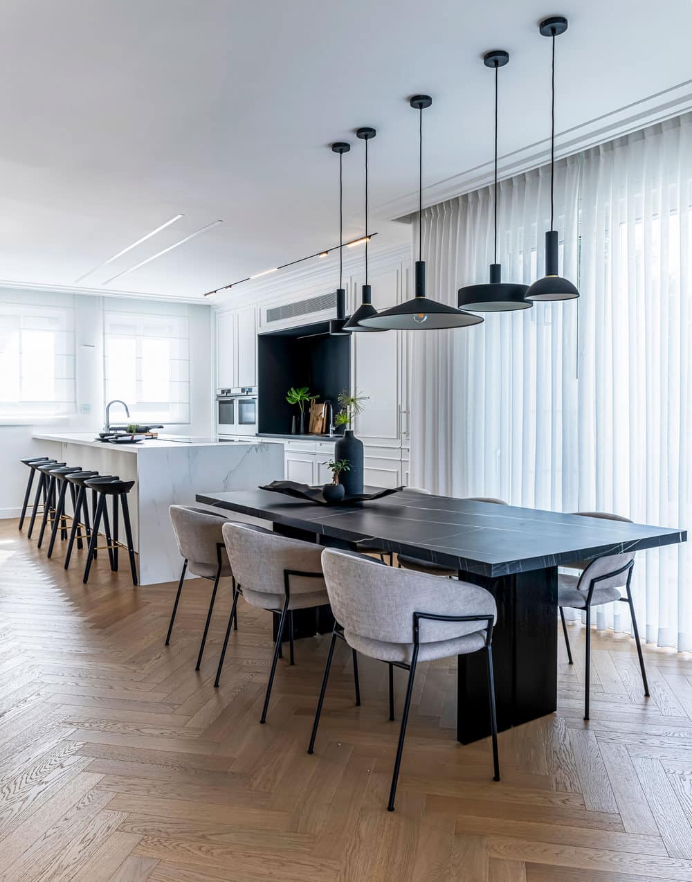
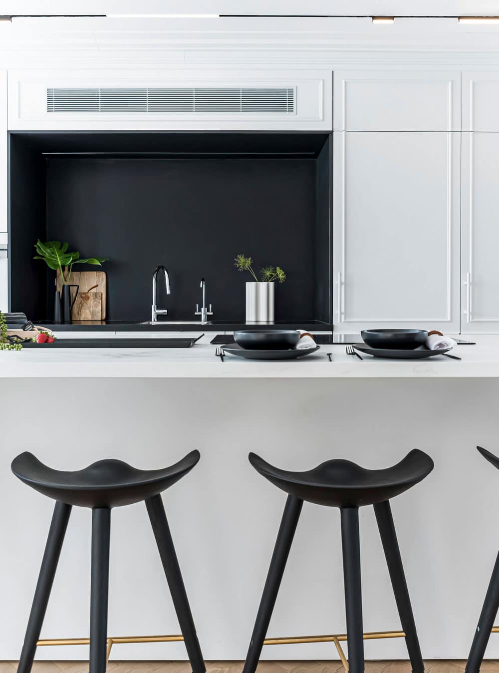
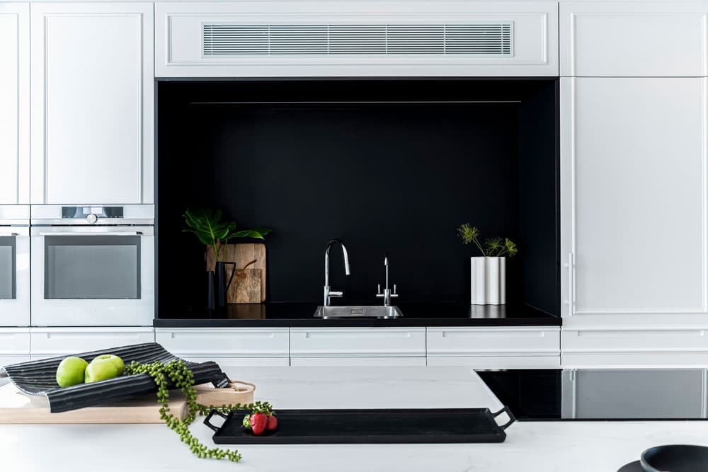
The floors were fitted with oak fishbone parquet, for a warm feel. The kitchen, as the heart of the open space, was designed in a classic European style with engravings and finishings. “Floor to ceiling cabinets were fitted in the kitchen concealing 2 integral refrigerators, an oven, a combi oven, a microwave in between which we created a niche fitted with a sink”, says the designer. “The clients requested two sinks in the kitchen. One was fitted in the light-colored kitchen island and another in a black Dekton niche along the cabinet wall.
The combination of black and white creates a dramatic effect that enhances the classic style of the kitchen. Both colors compliment and contrast each other. This contrast, along with the parquet, creates a sense of harmony and adds warmth to the space. “This isn’t a pure white classic European kitchen but rather one that is combined with a dark modern niche, dark chairs that warm up the space and modern appliances”, explains interior designer Odelia Barzilay.
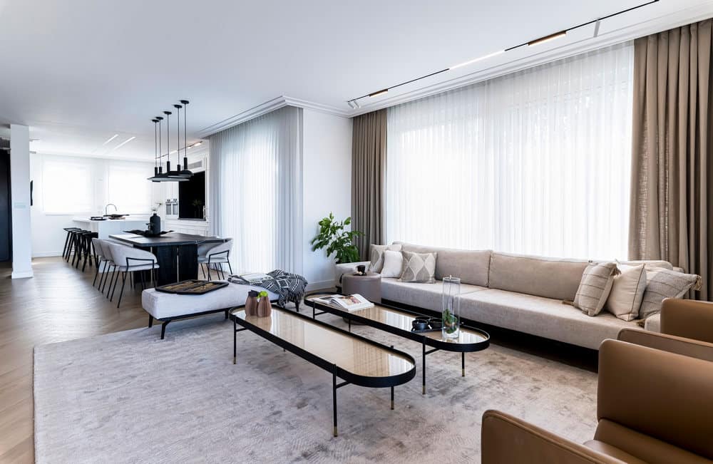
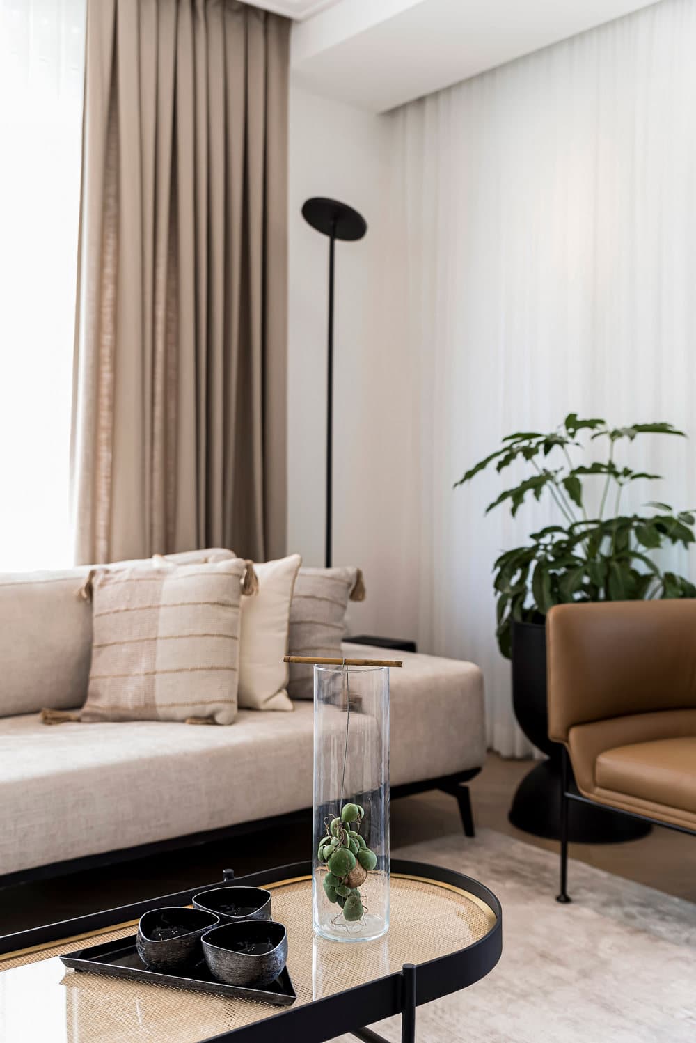
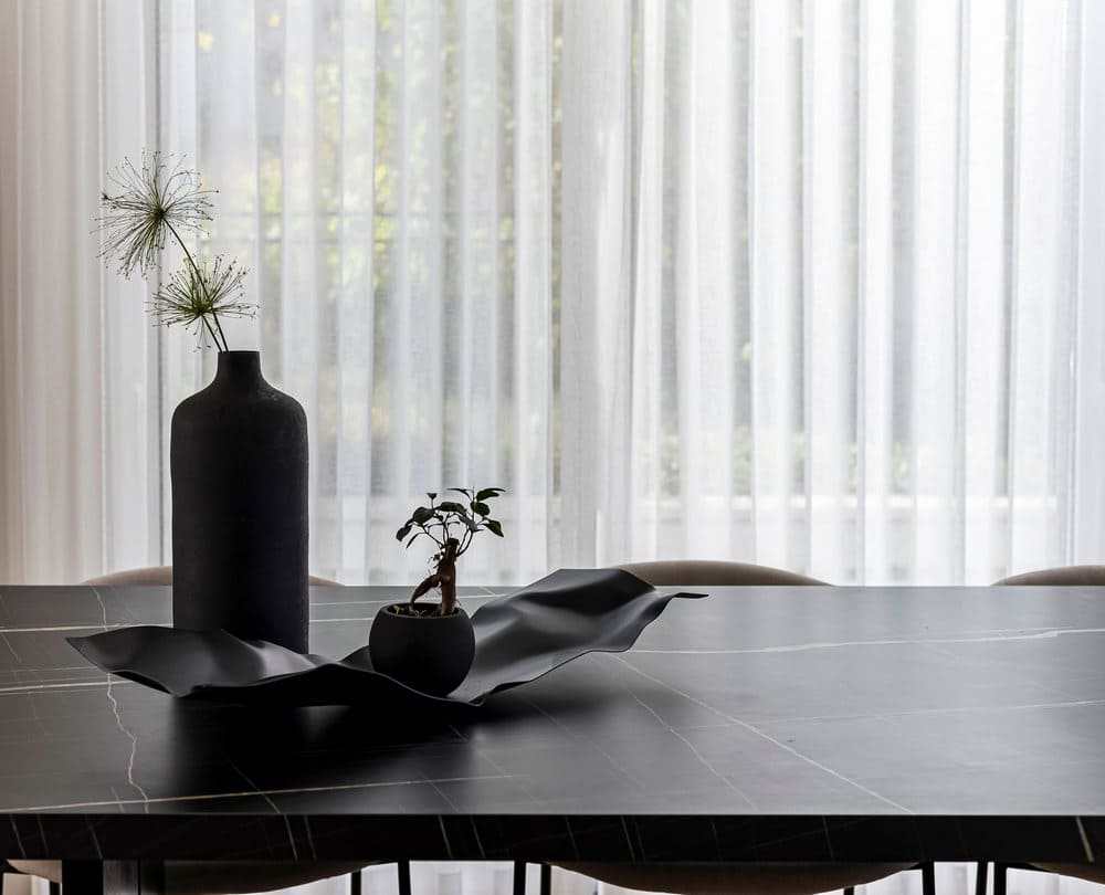
“This contrast was also incorporated into the dining area”, she continues, “where we chose to combine a dark table with light colored chairs. In fact, this color scheme was used across the entire property – shades of dark wood, a light couch, camel-colored armchairs, dark framed glass tables alongside light-colored rugs. All these along with two-tone European style curtains, that complement the main space, form a part of the classic European look”.
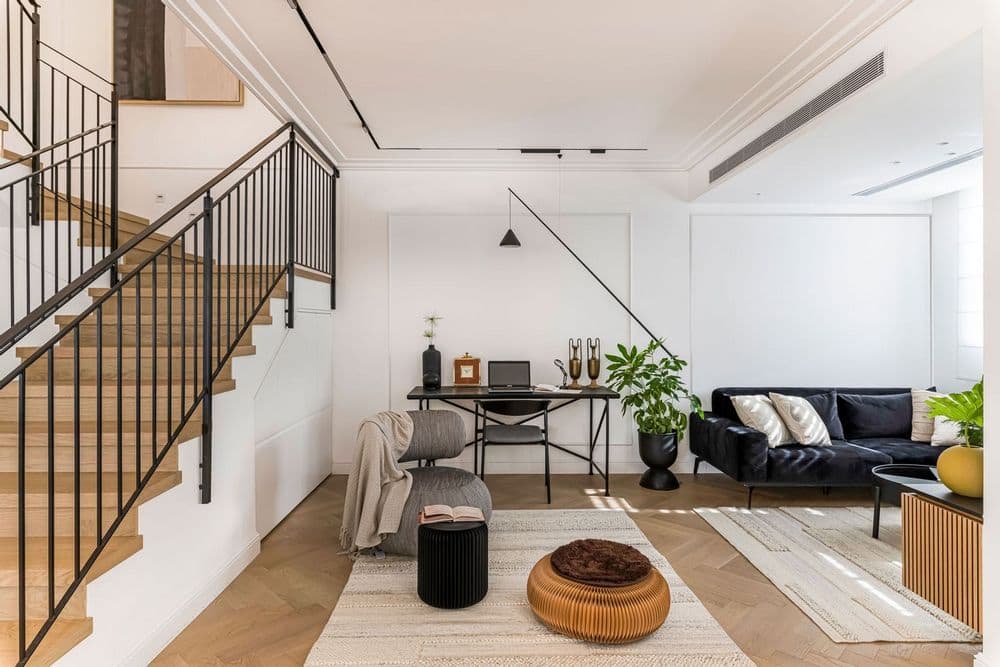
To create a seamless flow between the classic and modern styles, the designer chose modern light fittings above the dining area as well as a cornice that surrounds the entire level and gives it a classic feel. “I didn’t want to create a classic look that was too heavy, which is why we opted for magnetic light bars. Modern light fittings were also placed in the lounge and the home office corner”.
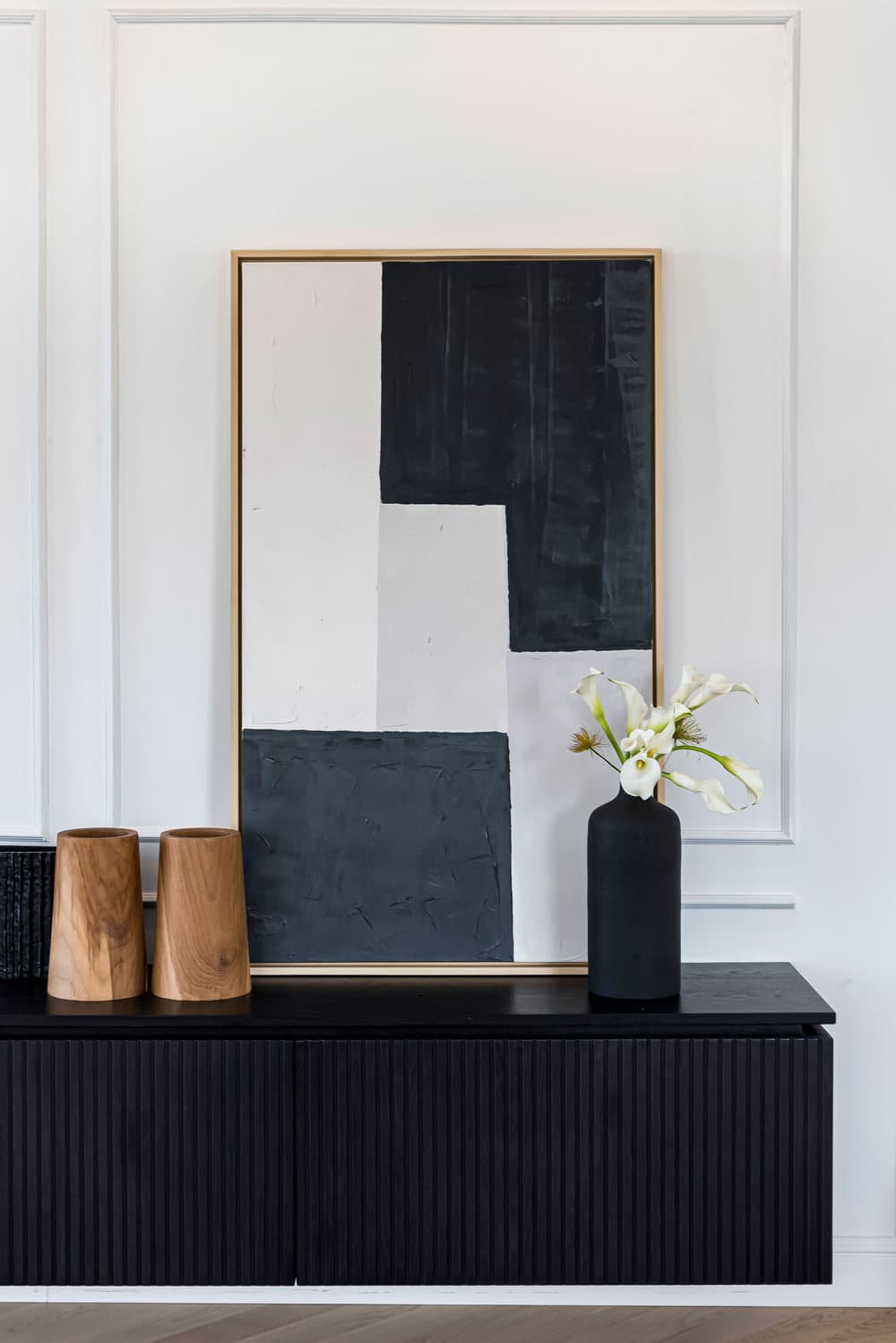
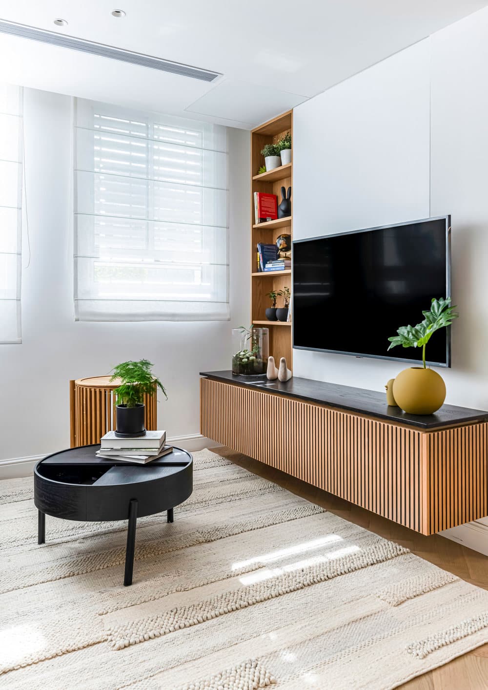
One of the focal points of the space is a large sideboard made of blackened oak with wooden panels that stands against a white wall and continues the design theme. “The sideboard is decorated with vases that correspond with the parquet, the table and sofas and the wooden accessories that create a relationship with the rest of the decorative elements across the property”, emphasizes the designer.
On the other side of the level is a cozy family corner with an adjacent home office corner.
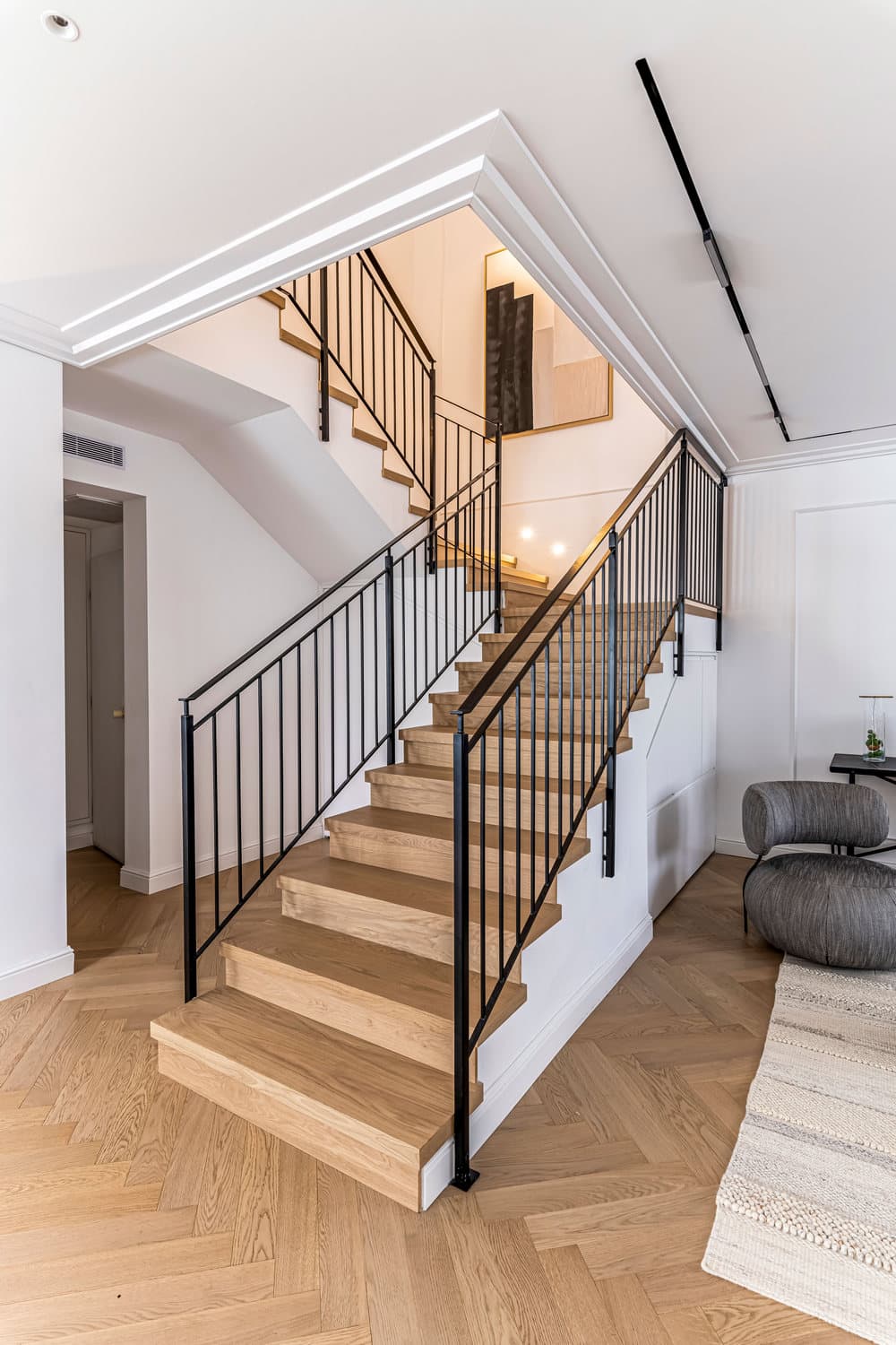
“I create works of art for the properties I design, which I also did on this occasion”, says Barzilay. “I know what suits my clients and their homes. For this property I created artwork that was placed on the sideboard and another piece that hangs in the stairwell”, she explains.
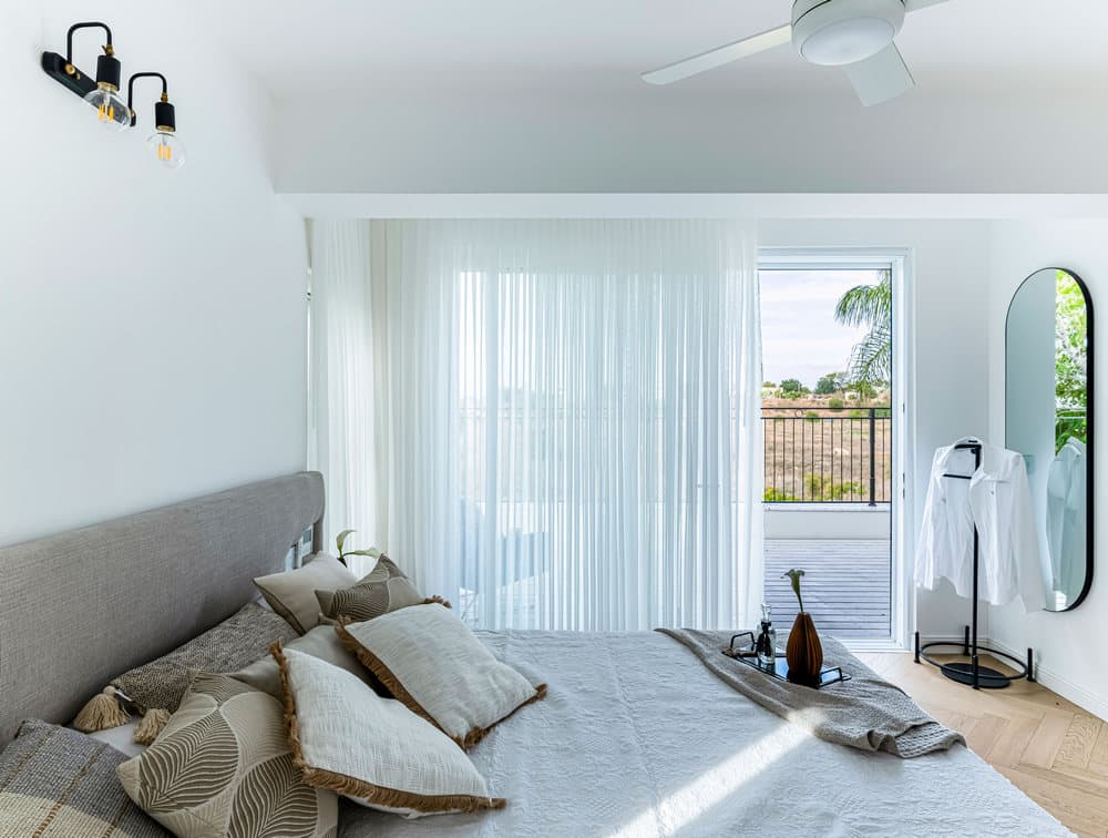
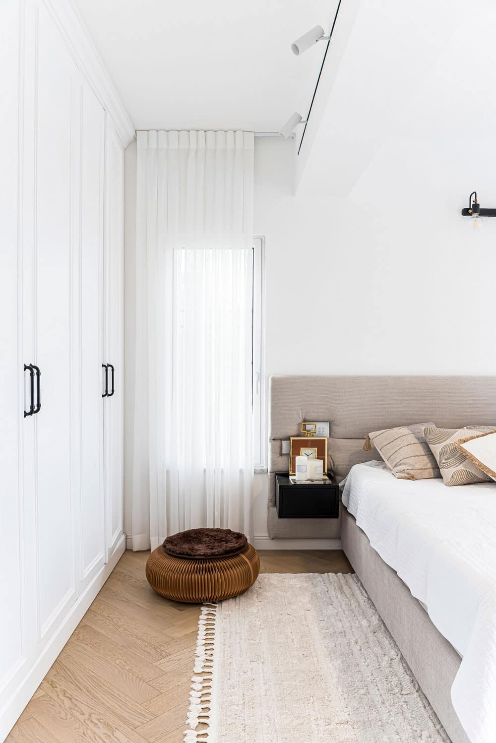
A wood cladded staircase, exhibiting Barzilay’s artwork and a light fixture, lead to the top level that includes 4 bedrooms, a children’s bathroom, a utility room and a master bedroom with a balcony. “We added windows in the master bedroom and fitted a white country-style wardrobe. I wanted to create an unwinding and calm feeling in the bedroom”, she says. The ensuite bathroom was tiled with large light 3m tiles, fitted with a wooden panel cabinet, and a Corian worktop and sink – to establish the calmness of this space.
“The work on the house was exceptionally challenging since we extended it and needed to deal with pillars and beams in the ceiling that we couldn’t remove”, Barzilay summarizes.
“The couple’s dream was a bright inviting home with abundant storage and to create the right combination we needed to be very specific in identifying the right balance between classic and modern. We started the design process from a Pinterest picture and to my delight the clients admitted that the house they ended up with was above and beyond the one in the original pictures”.

