Project Name: A White House ∣ Easy and Minimalist Living Style
Design Company: AD Architecture
Chief Designer: Xie Peihe
Project Team: Ji Jianan, Zhou Qian, Zhu Jie
Project Location: Shantou City, Guangdong, China
Construction Area: 90 m2
Main Materials: KD board, ceramic tile, gray glass, stone, matt white paint, wood floor
Completion date: January 2018
Photographer: Ouyang Yun
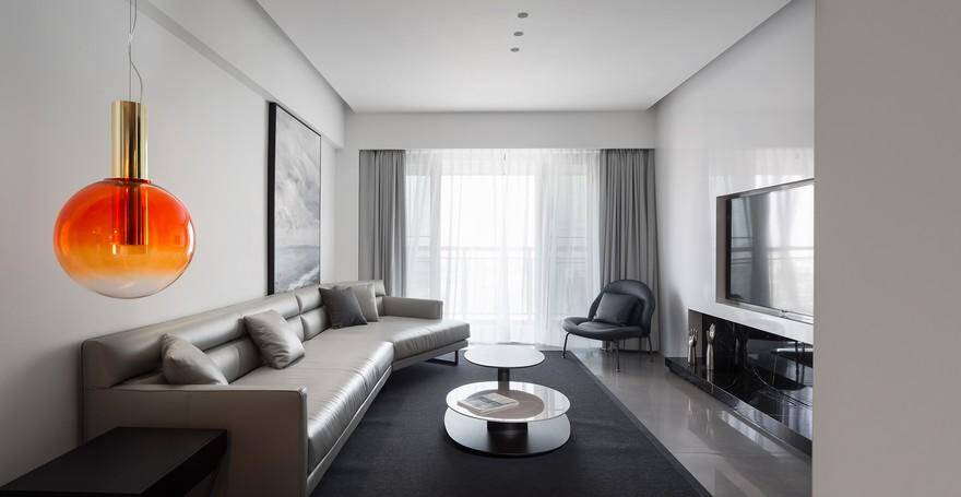
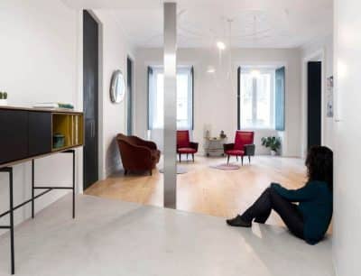
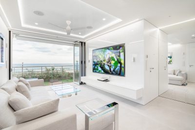
This white house is located in a community that is far away from the downtown and rural area. Here we can see a large farmland and a branch of Han River outside the window. In terms of design, our philosophy is to create a minimalist white house with the simplicity and purity of black, white and gray, so that people can enjoy the air, the sun and the scenery, and embrace the nature in a place that is only 90 square meters. In general, the house takes a very low-key color scheme of black, white and gray to build textured spaces. The design focuses on “white” in a restrained manner, which balances the strong contrast between black and white boundaries.
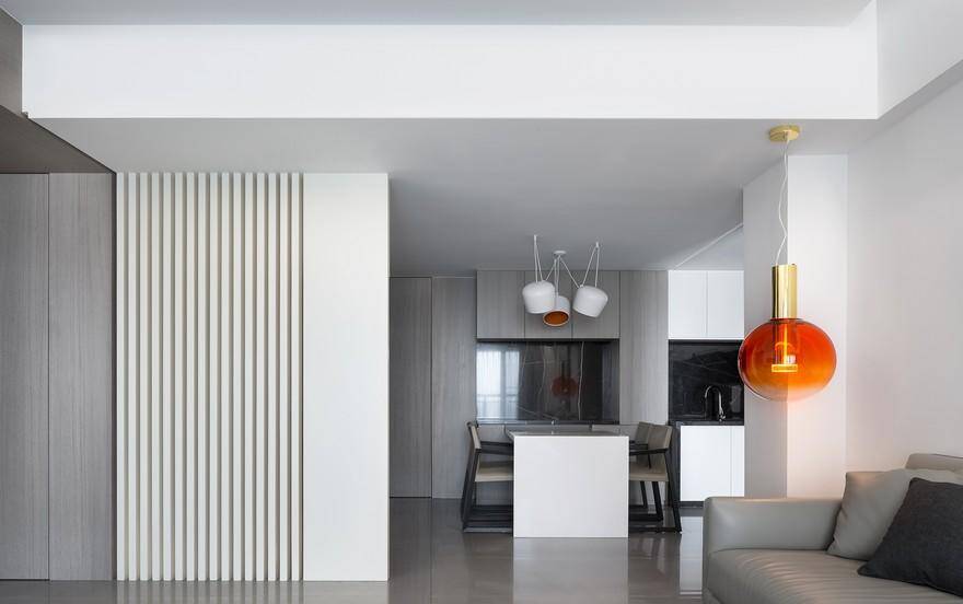
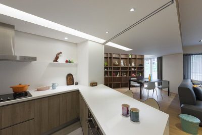
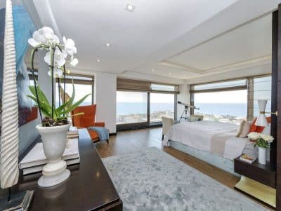
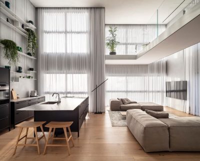
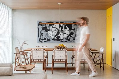
The overall layout perfectly integrates the Eastern and Western design philosophies and interprets an extremely pure modern minimalist living style. The public areas (dining room, living room and kitchen) are very coherent, giving the small apartment a sense of spaciousness. The lines in different places are in good proportion, simple yet elegant. The large windows frame the most beautiful scenery; the bright light passes through the soft curtains, bringing pleasure into life.
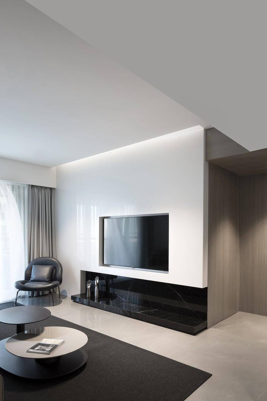
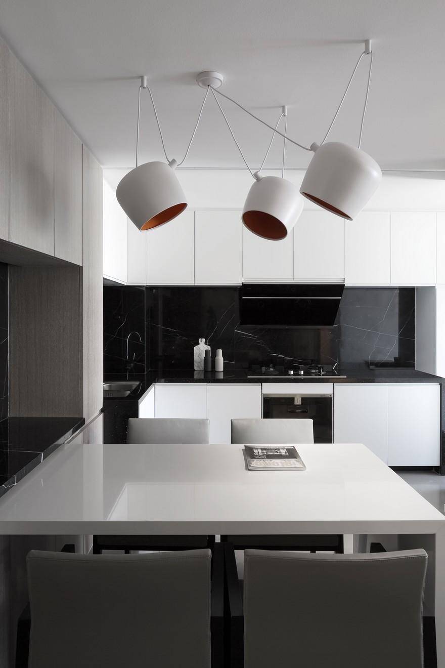
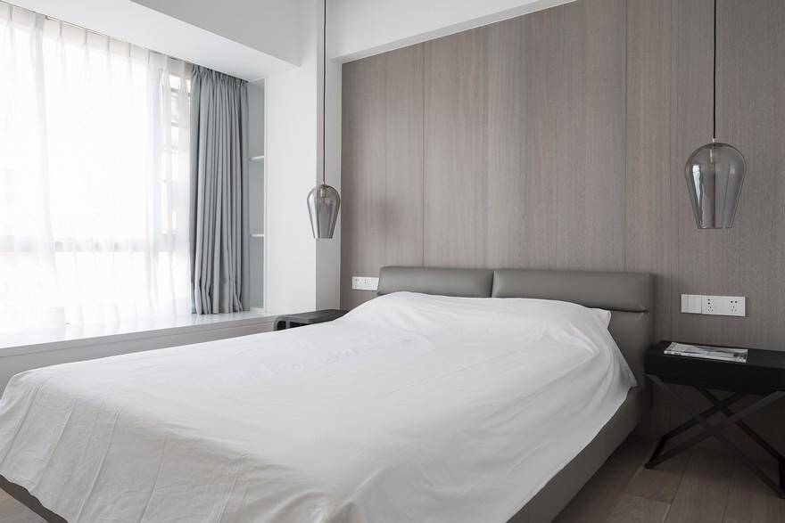
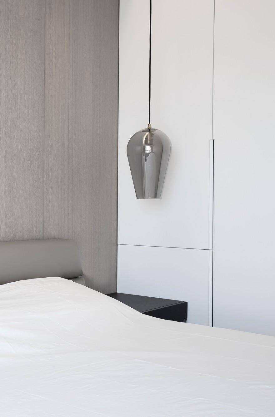
Owing to the reflection of natural light, the matt white paints and marbles divide the space into several layers, in addition to a carefully considered lighting layout, the space has a unique glamour of light and shadow. Leathers, woods, ceramic tiles, gray glasses and other different materials are cleverly collocated, enhancing the temperament and style in the space.
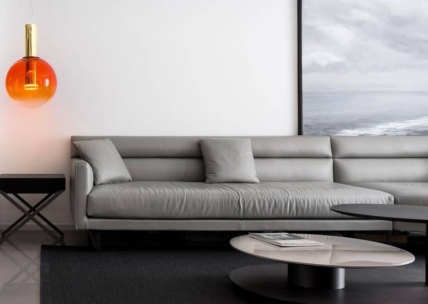
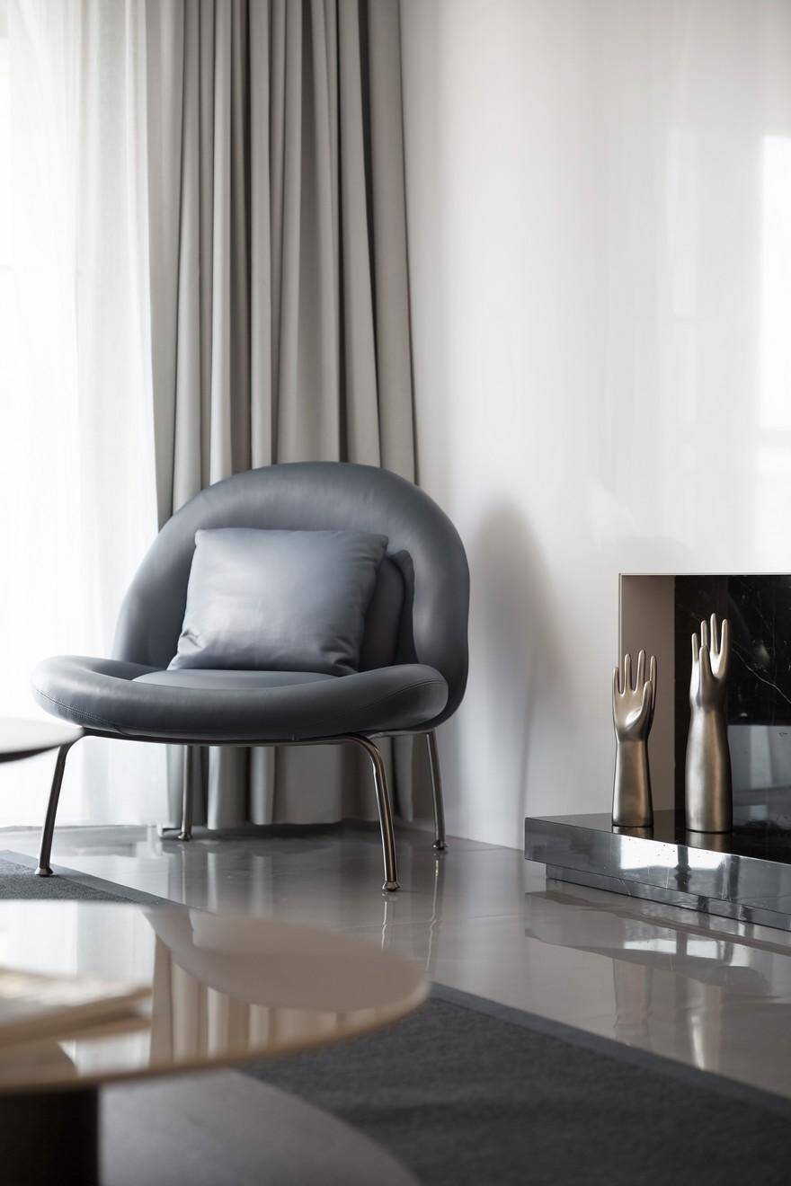
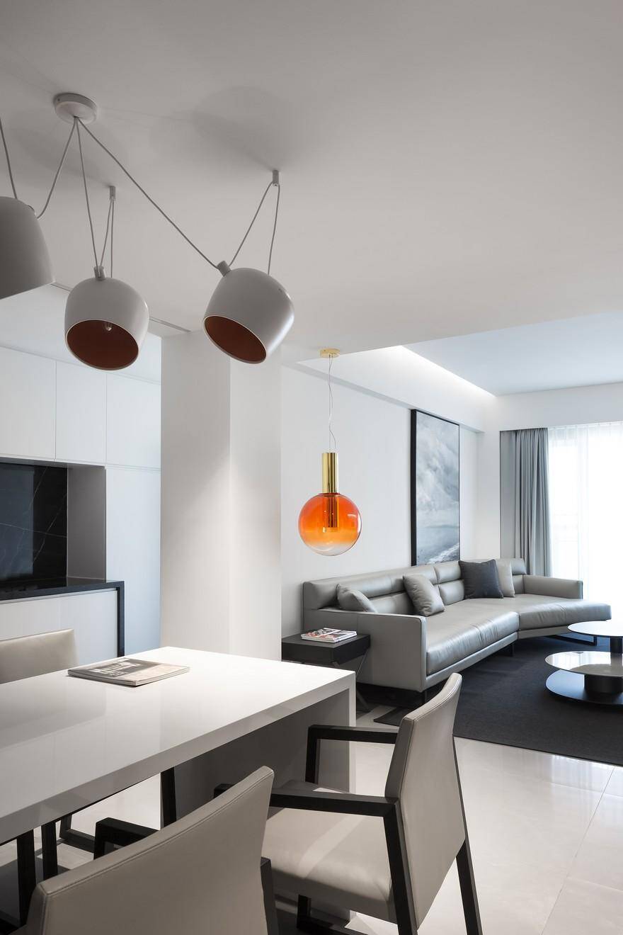
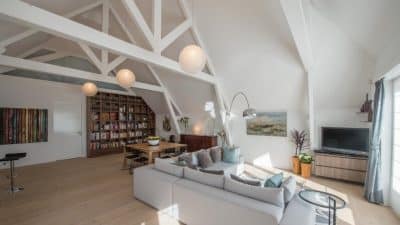
In the living room, the TV background is decorated with black and white, and the ground is in light gray, moreover, white is applied in a large area of the space, together they achieve a simple and bright effect. The gray woody feel penetrates inside and adds warmth into the white and clean space. As the main background of the overall space, white is used to highlight the details and softness of the furniture, reflecting the owner’s pursuit of quality. The customized decorative painting—“listening to the tide” that is on the back of the sofa further highlights the mood created by this home. Sitting here with a cup of coffee and a good book is the life state we want. The chic metal objects inadvertently reveal the owner’s style and taste. The quietness and artistic temperament make people immerse themselves into this concise and smart atmosphere.
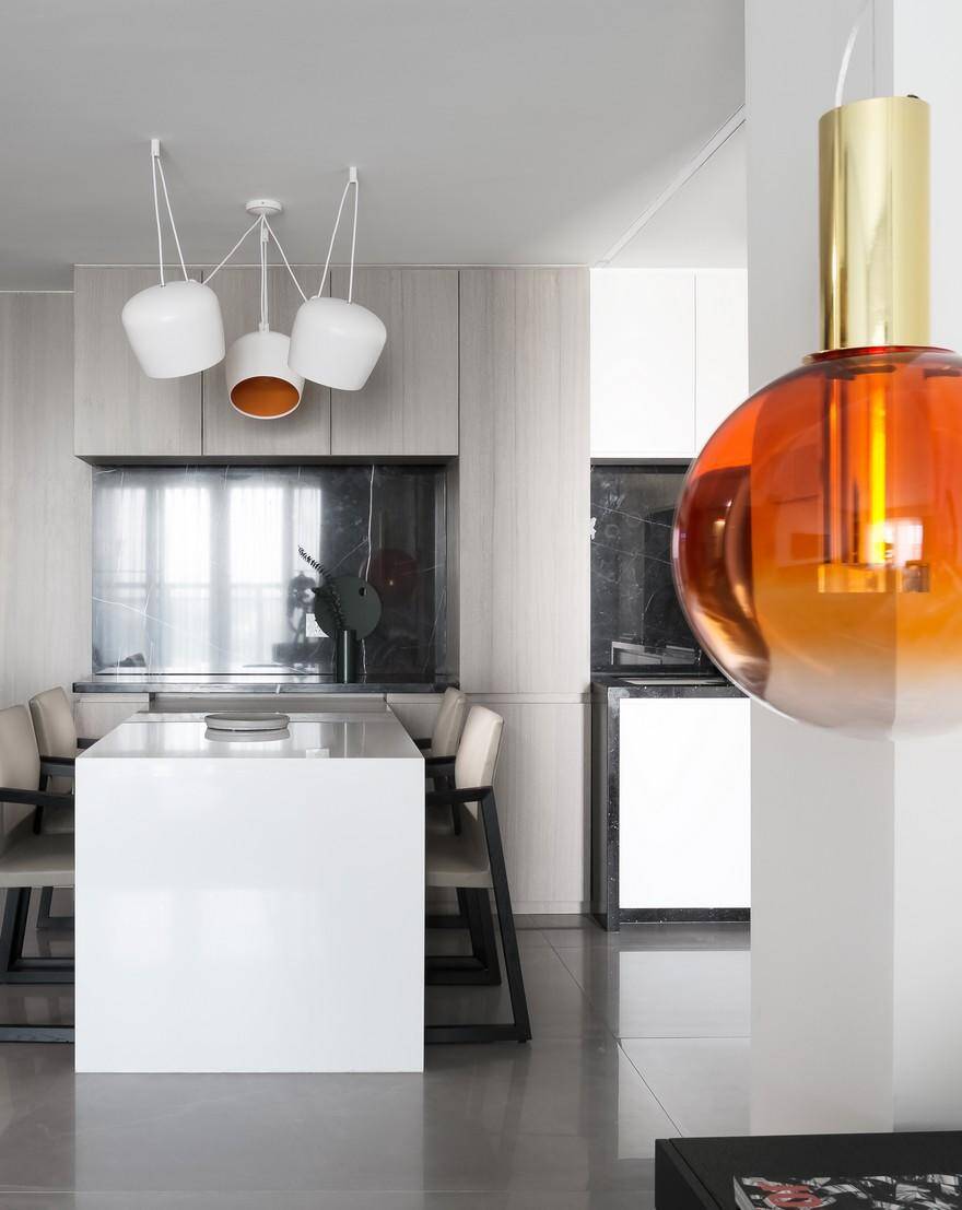
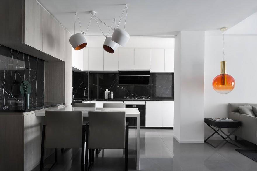
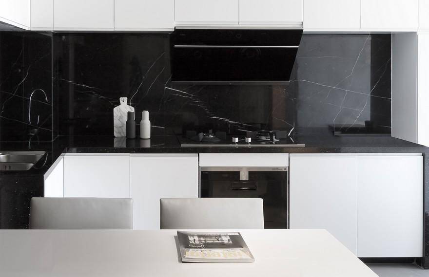
Black marbles are applied on the surfaces and walls of the kitchen, such strong contrast enriches the layering sense in the space.
Glass partition is used between the children’s room and dining room, which effectively increases the spatial feeling and brightness of the children’s room.
Minimalism is a kind of complex. The design team abandoned too many complicated designs, opposed stereotyped forms without piling up objects, but making life simpler, so as to pursue a more suitable living environment. We think we should enjoy this space and let it make us feel relaxed and happy.

