Project: Font Salem Headquarters
Architects: Dobleese Space & Branding
Construction: Grupo Valseco
Location: El Puig, Valencia, Spain
Area: 1800m2
Project Year: 2018
Photo Credits: Grupo Valseco
Text by Dobleese Space & Branding
Architecture and Interior design for the Font Salem Headquarters. Font Salem is the leading manufacturer of beverage distribution brands of the Damn Group in Spain and Portugal.
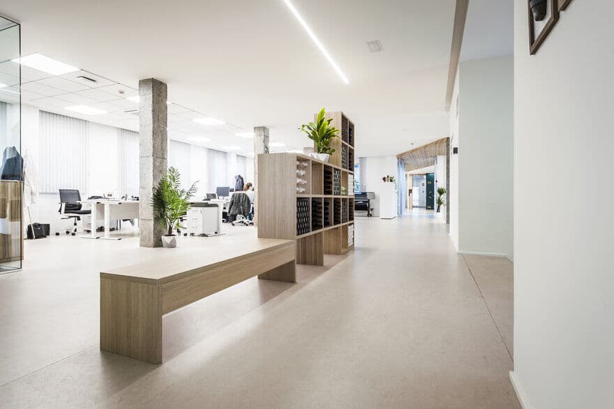
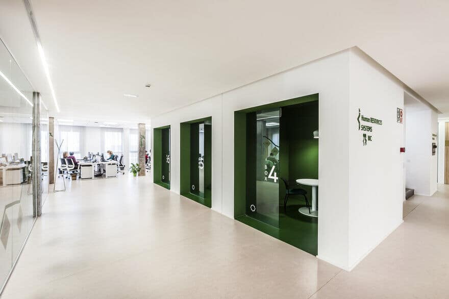
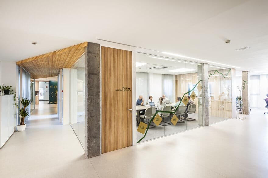
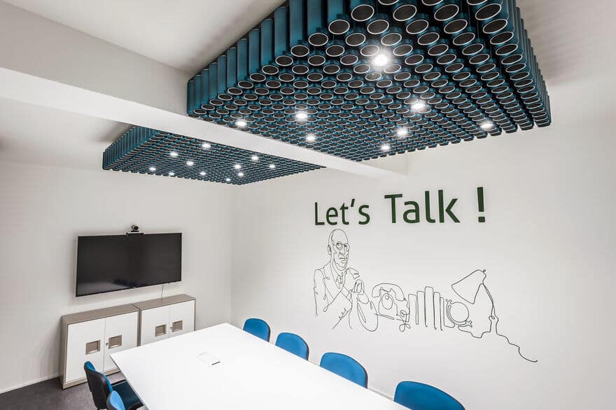
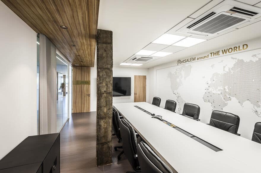
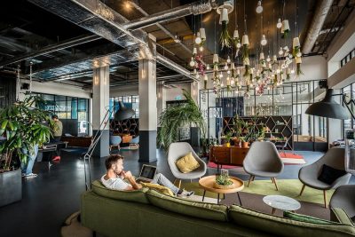
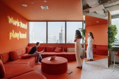
A 360º project in which our studio has developed from the restyling of the brand to the renovation of its more than 1800 m2 in which we have put in value its philosophy strategy and the brand identity. New Font Salem’s Offices design, emanate the pure brand identity. Allowing a flexible and collaborative workplace, aligning these features with brand values and Company image and acting as a showcase of the company’s manufacturing capacity, have been this projects key points.
This renovation responds to the corporate image restyling. A rejuvenated and internationalized brand require the improvement of work processes in order to connect workers and encourage interaction between them and their delegations.
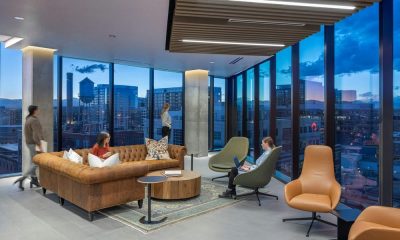
New work habits require spaces with natural light, exterior views and a visual communication that allows workers collaboration and interaction between them.
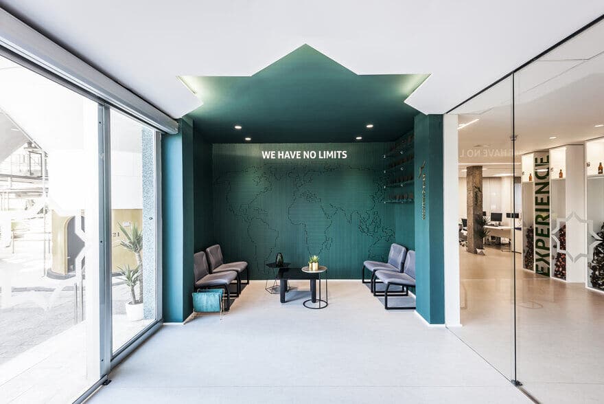
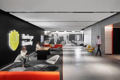
For this reason, the new space composition organizes around a central core, main staircase, giving way to the different departments and work rooms. Already in the hall, the waiting room is illuminated with a star silhouette on the ceiling, generating indirect illumination and that projects a Company image “without limits”.
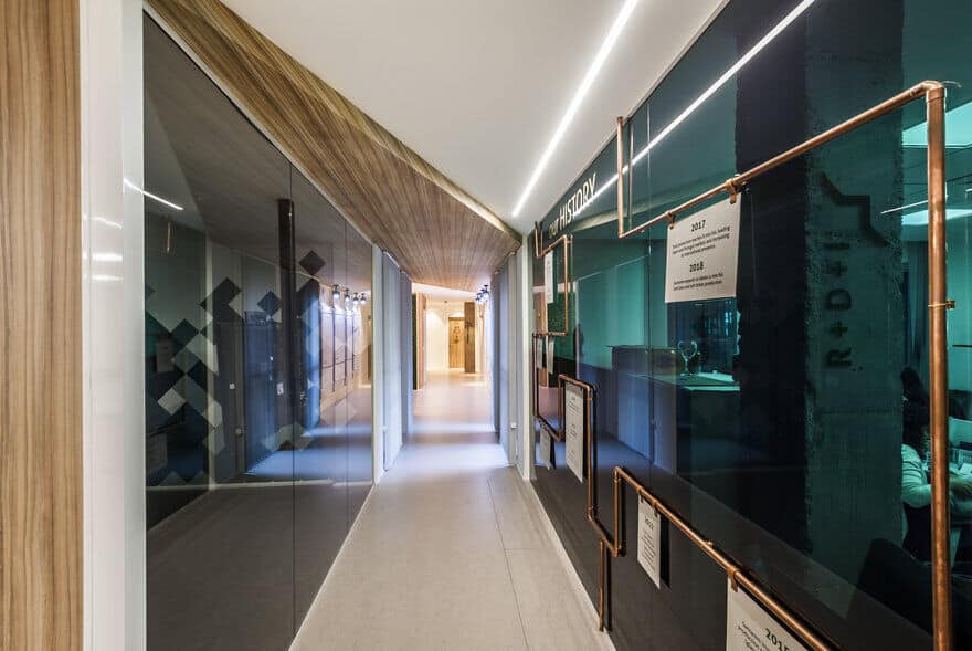
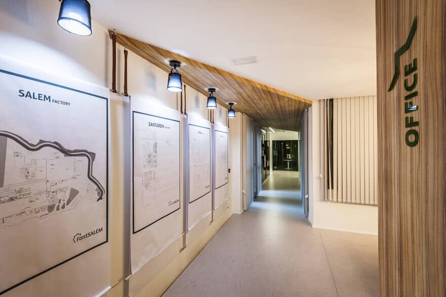
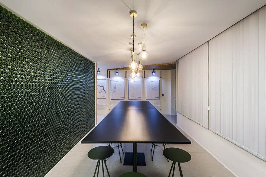
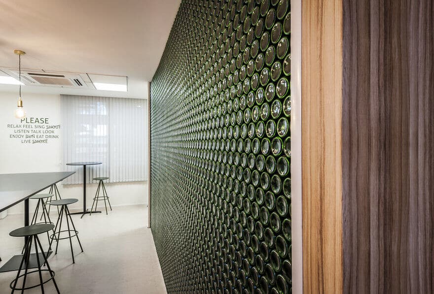
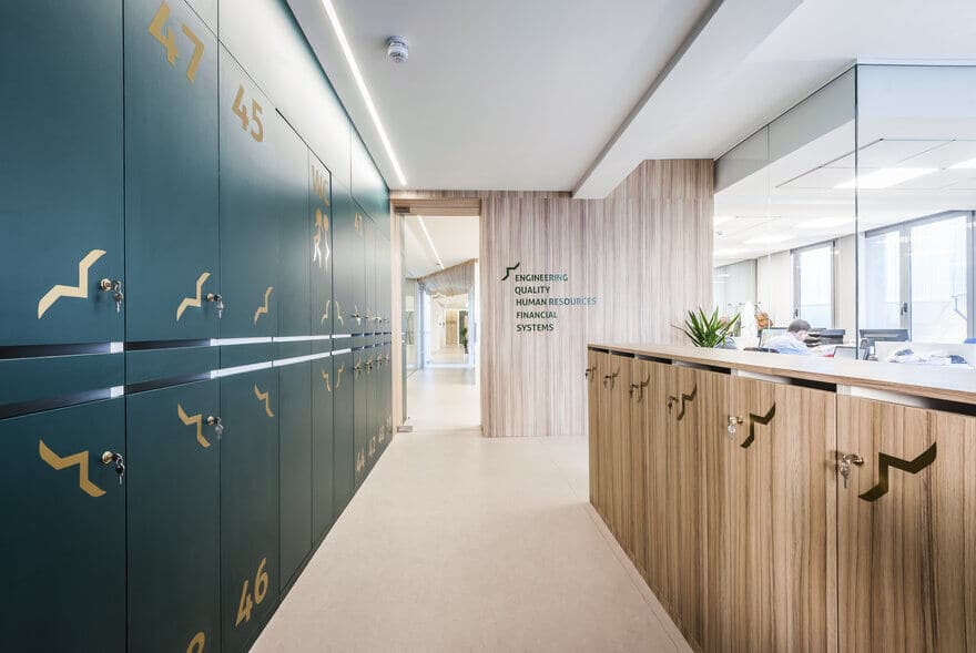
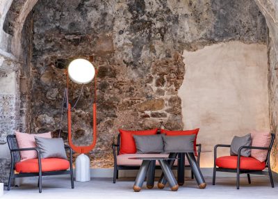
In the main Access the brand logo is present on a wooden board, protagonist by the presence of its grain that gives way to the hall. Materials have been selected by its natural aspect in order to add warmth and texture without sacrificing their inherent natural qualities and characteristics: plywood, metal, glass and re-interpreted product selection.
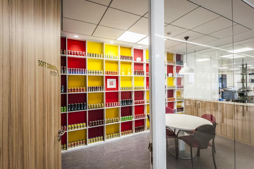
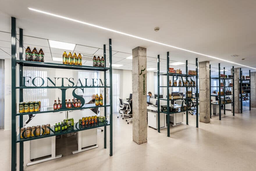
Strategy, visual impact and product is what you find when you move towards the different office departments. Font Salem is contagious, Pass it On, We are unique, are some of the claim that the commercial department reads every day. This message written inside several shelves serves as a materiotheque and as a space division.

