Project: Law Firm Office
Planning: architect Raz Melamed
Responsible in the office: Anat Pinchas
Client: Shimonov & Co
Location: Israel
Photo Credits: Amit Geron
Can a large law firm truly operate in a homey and inviting design that creates a warm feeling for every employee and guest? When the design is in the hands of architect Raz Melamed…yes, absolutely!
Shimonov & Co. is the leading and most active law firm in Israel in the field of capital market and securities, and one of the highest quality and leading boutique law firms in Israel (according to the firm’s website).
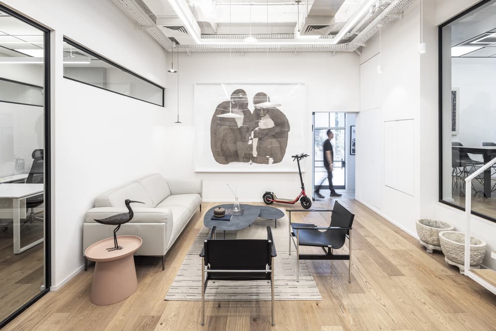
First and foremost, the goal of this office design was to create a home-like space for dozens of lawyers and interns, which would stand in contrast to just about every other urban space in this multi-level building.
To this end, the team had a lengthy search for an appropriate architectural space, with each space being examined for suitability for their needs together with the architect. They focused on conservation buildings, which have a unique appearance and nostalgic character, out of a desire to find a space that fits the atmosphere inside – no longer an office in an innovative and cool line, but a contemporary and kicking design that creates intimacy.
And at last, the property is found!
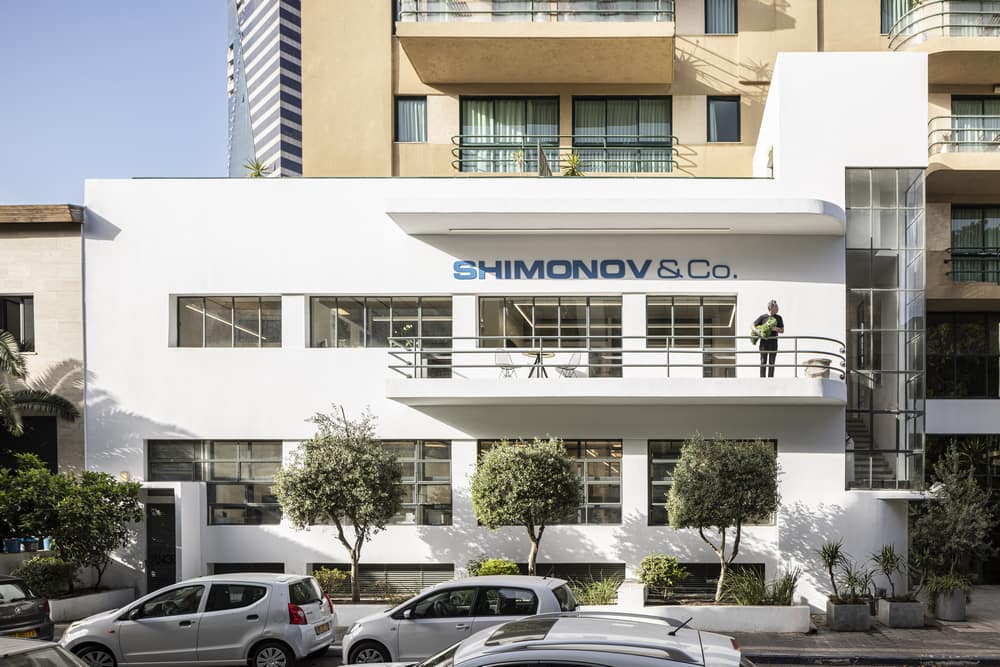
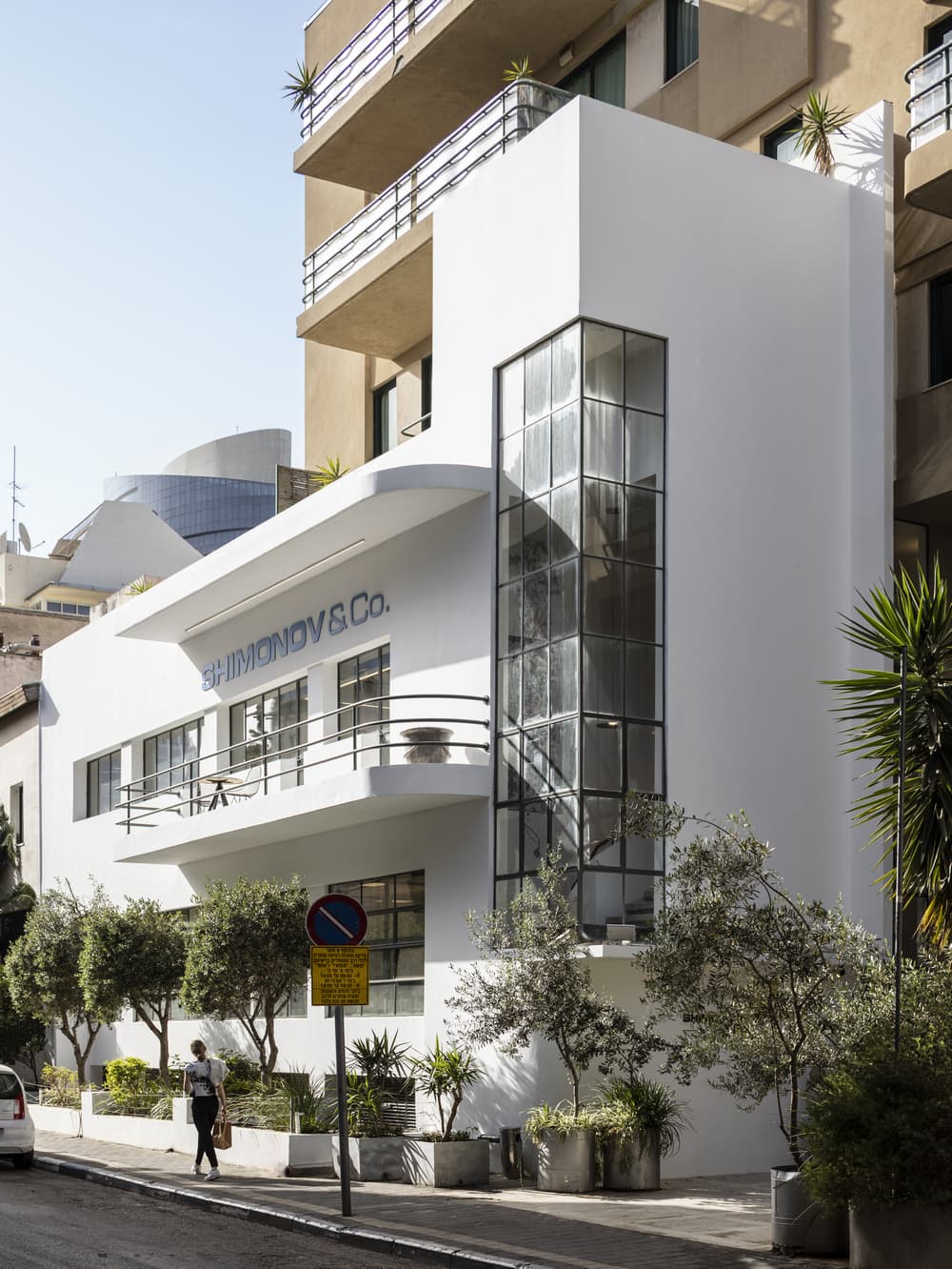
A Bauhaus-style building from the 1930s, which used to be the residence of the oldest and largest newspaper in Israel- Ha’aretz.
It was originally divided into different offices with the interior division that did not fit at all, and even the original design language was light years away from the design vision. Thankfully, since all the office building’s tenants left at the same time, it was possible to design the entire building:
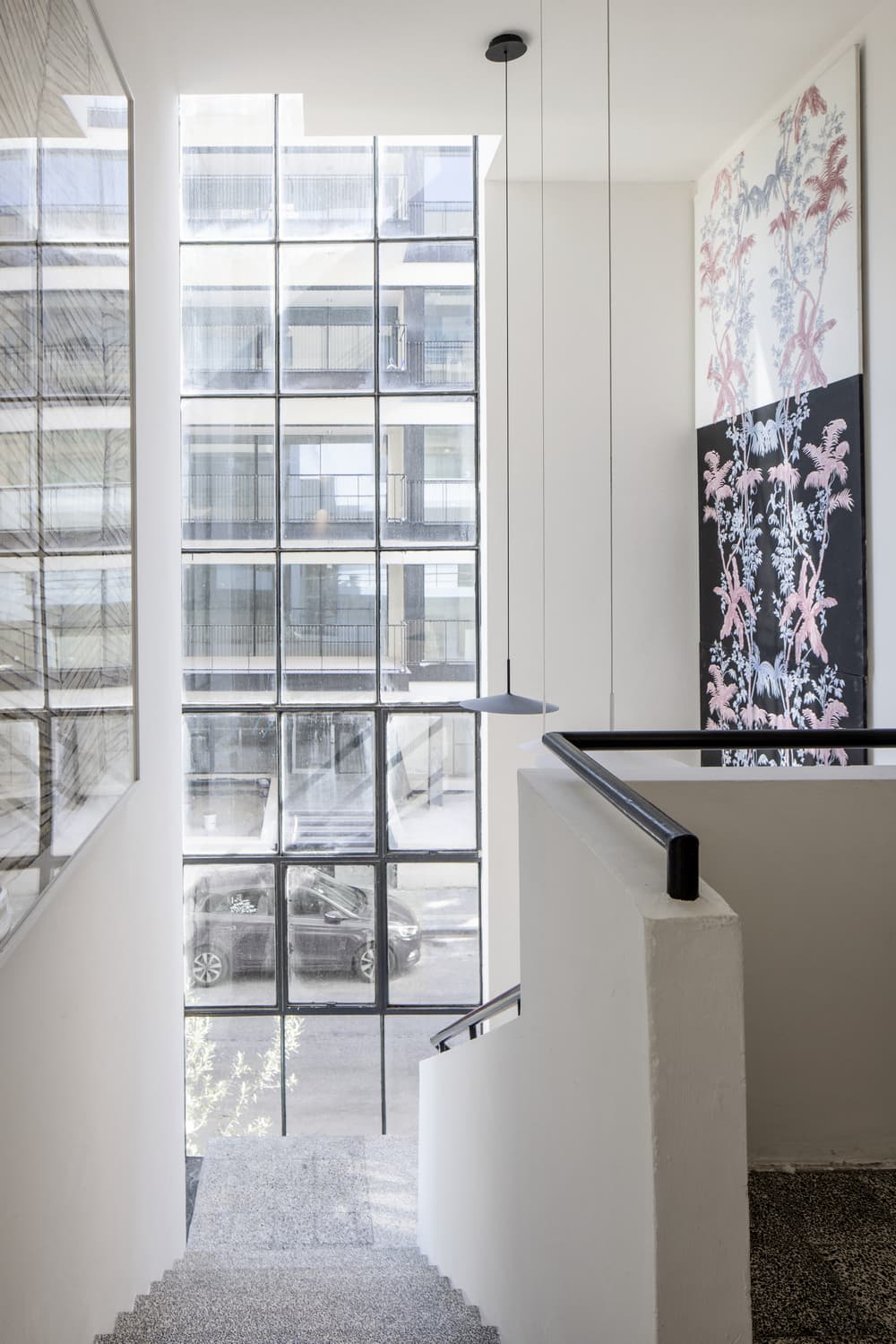
The first step was to dismantle the entire interior subject to the city’s preservation guidelines, which prohibit changing the facade, entrance, windows, railings and stairwell, where the original flooring remains.
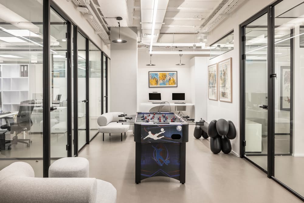
Melamed’s big challenge was to design 3 floors of 300 square meters each, with one floor in particular taking place underground, meaning no light and air. The solution was to place large study rooms on this floor for the office staff, a meeting room, dining areas and a kitchen/ common space. The idea was to stay away from creating small rooms by using multiple partitions to transmit as much natural light as possible to the entire space.
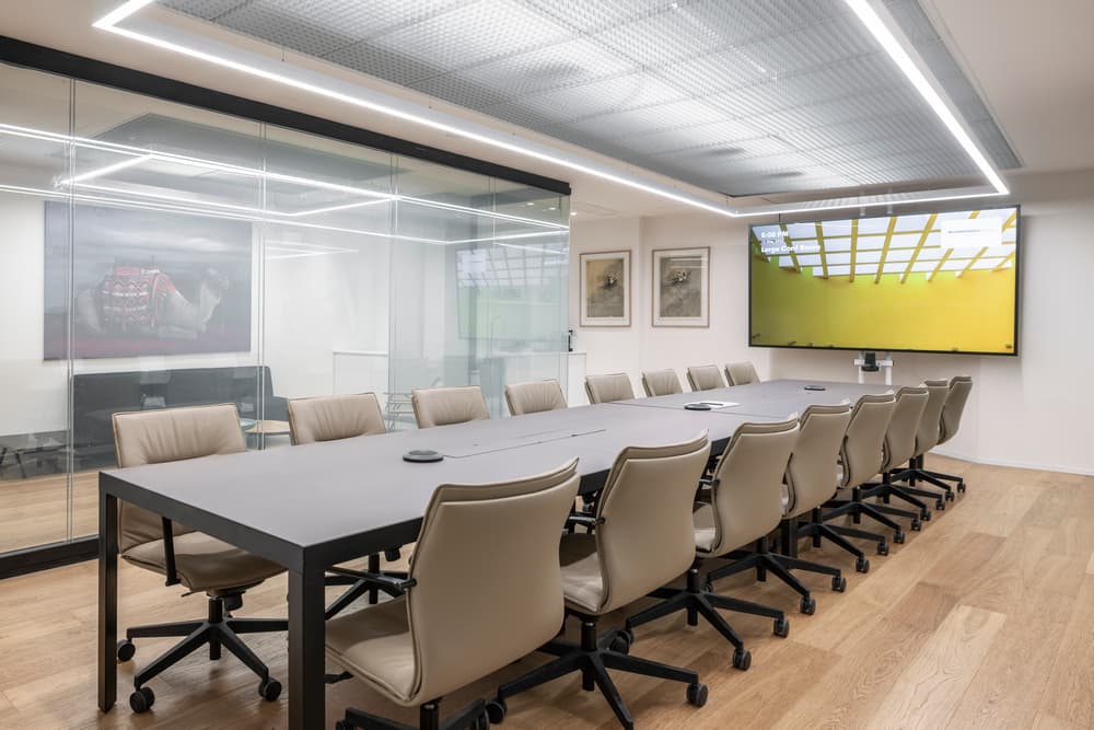
As a solution, instead of walls, acoustic glass partitions were placed at full height to let in light and create space, and in the 3 meeting rooms, the glass walls become foggy at the touch of a button for privacy and secrecy.
Another element that helps the feeling of space is the use of mirrors that reflect the light outside towards the inside of the office.
In addition, there was a desire to treat this floor as an integral part of the office, so a kitchen and dining area were designed there so that it serves as a central meeting point for all employees. It is designed in a contemporary line combined with acoustic insulation that emphasizes privacy and the ability to concentrate at work.
The floor is gray and serves the room with lightness and shine that will strengthen the little light that enters from the outside. For a touch of fun, there are ice cream refrigerators and drink dispensers around the floor!
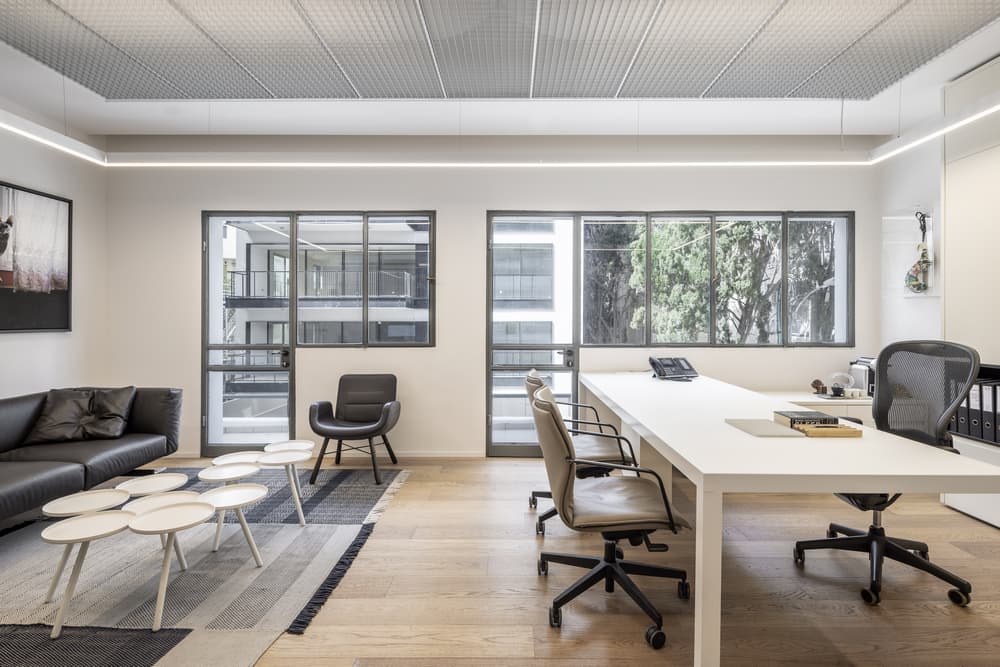
The ground and first floors are divided into the offices of the heads of the firm and their partners. The main challenge was to create privacy in them while they are the source of light for the entire office.
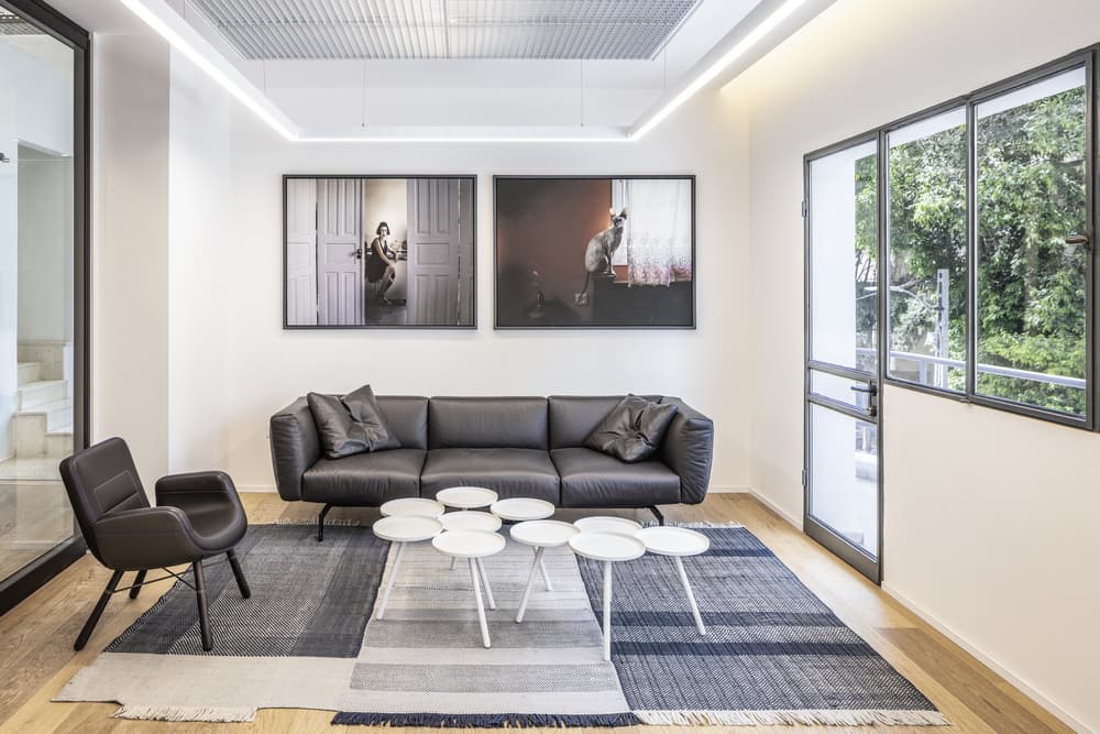
The solution was designed as light transitions from a top window and a door that create an interesting geometry on the original facade of the building itself: from the office the window creates privacy and beneath it is hidden a work area, the door lets in light and air, with a sitting area for a relaxed conversation.
As a continuation of this solution, the geometry of the upper windows is woven as the second thread throughout the office, introducing light as well as creating privacy in the interior rooms.
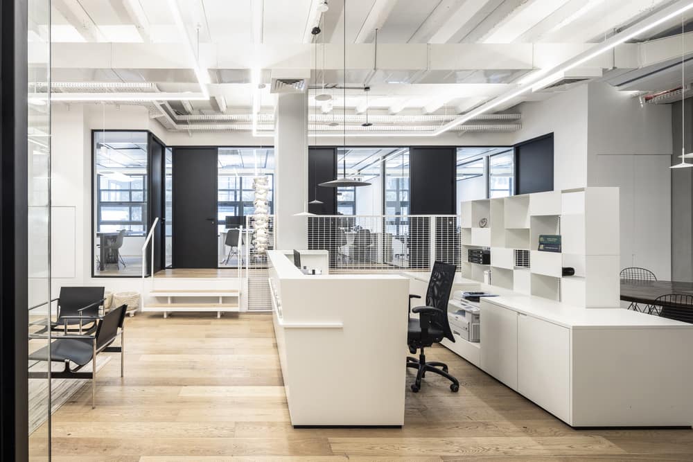
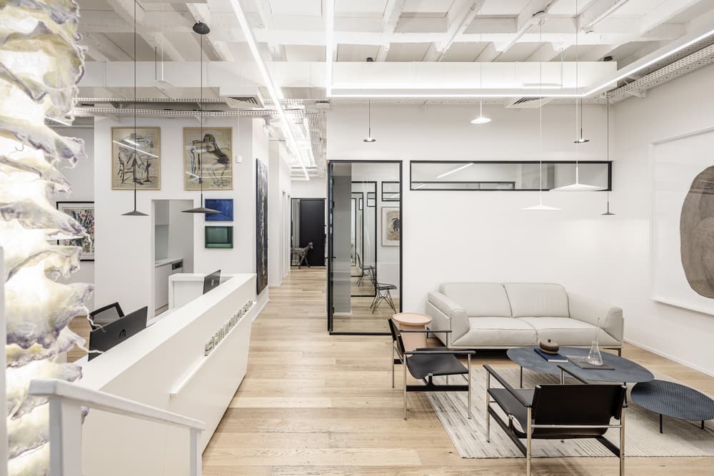
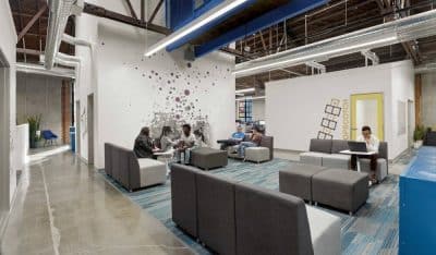
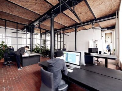
The ceiling is exposed, and the systems are visible – the air conditioning, lighting, plumbing, electricity and gas – exactly according to the Bauhaus concept, which holds that beauty is the function – form follows function.
Between the constructive ribs, an acoustic material was applied to the echo engine, and parquet covered the office floor for a feeling of warmth.
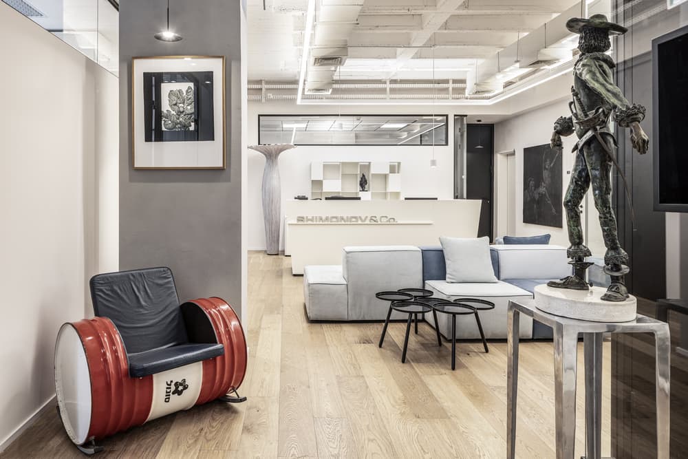
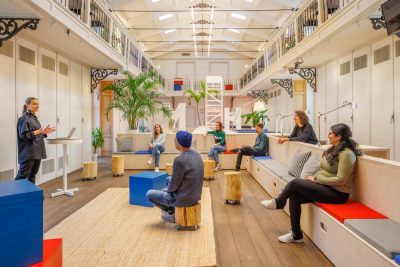
The furniture is informal and pairs with warm, home-lie rugs in waiting areas that create a sense of hospitality upon entrance, and above them are descending lighting that defines the furniture, creating an intimate feeling.
Melamed’s architectural concept holds a love for the clean and engineered line, and the introduction of color through plants and art.
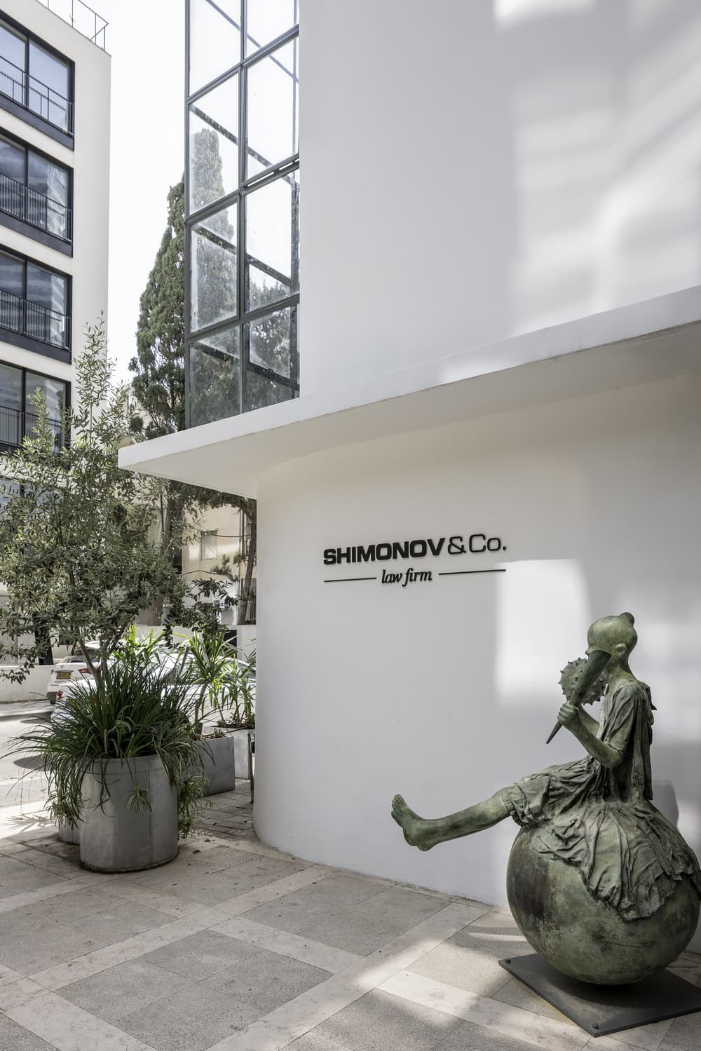
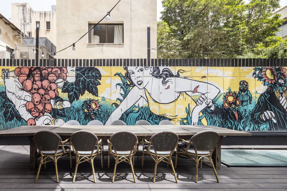
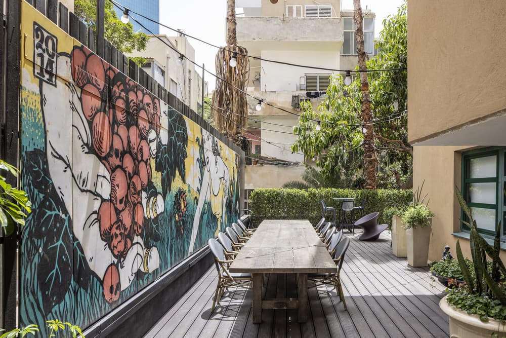
In this project the client’s art collection brought this vibrancy to life all over the office and helped Melamed incorporate the colorful element that he so loves. In addition, graffiti in the outdoor seating area by well-known artists “brokenfingaz” throws paint and mischief into the seriousness inside. This work was specially commissioned, prepared in the studio and applied on boards that create as a fence with the neighbor. This final touch serves as a reference to the Bauhaus style of art and functionality, in the spirit of this long-standing building.
Credits
1. Chairs – Vitra
2. Armchairs -Knoll
3. Sofa- Knoll
4. Tables (salon) – Living Divani
5. Coffee Tables – Moroso
6. Rugs -Nanimarquina

