Project: Fundamental House
Architecture: Sandbox Studio
Stylist: Megan Morton STYLIST
Location: Annangrove, New South Wales, Australia
Project size: 60 m2
Year 2019
Photo Credits: Katherine Lu
The latest project by Sandbox Studio is a compact ‘forever house’ designed for a couple of retirees. Its environmental design and space-efficient planning make excellent use of the site, allowing them to live near their children and give them room to roam.
Around one in five Australians is now in a multi-generational living arrangement, where mum and dad move back in with their adult kids. With Fundamental House, Sandbox Studio has reinvented the ‘granny flat’ as a super cool, small separate dwelling, no bigger than a modest apartment. – ABC News
What was the brief?
The clients are an active couple of retirees and keen gardeners, downsizing from a large family home. Their project is a secondary dwelling on their son and daughter-in-law’s property – five bush acres, 40km north west of Sydney CBD. They wanted to be close to family, but maintain privacy, so the siting/location of the little house was important: near enough to the access road, but out of sight of the main house and neighbours.
Key products used:
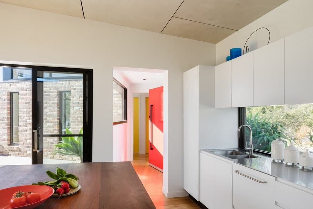
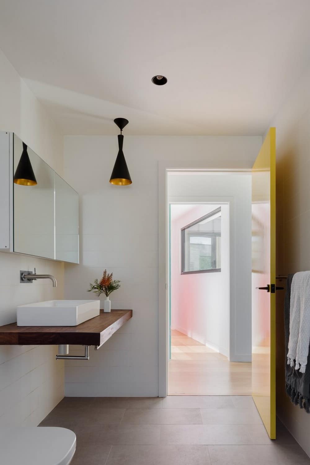
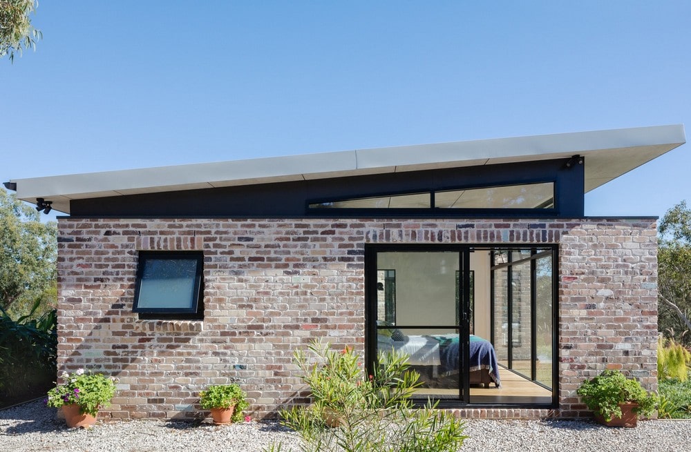
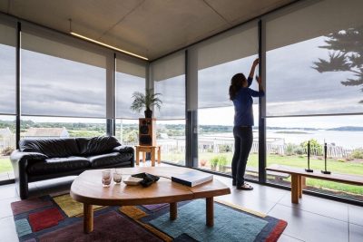
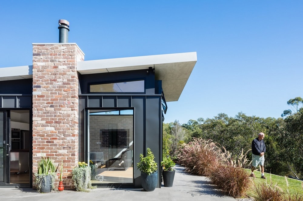
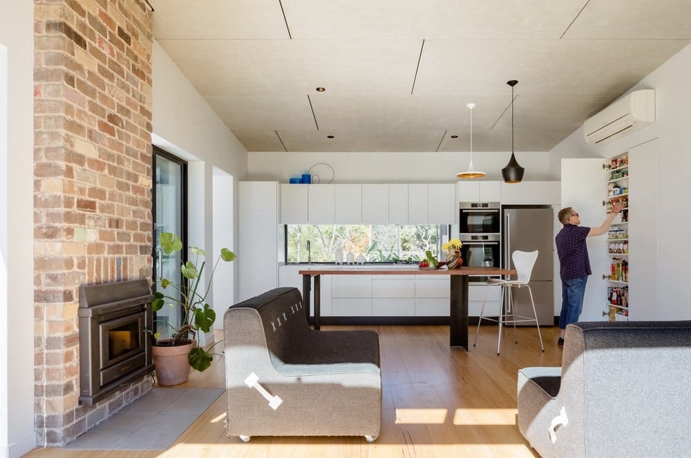
Recycled bricks and steel cladding address the bushfire code and lend character. The interior is also robust, using recycled bricks for the chimney, Tasmanian oak floorboards and ceilings and wall linings of unpainted fibre cement sheeting. Recycled spotted gum was used for the custom-made kitchen island bench and bathroom vanity. The only painted surfaces are two doors, injecting colour into the corridor.
What were the solutions?
SMALL HOME, SMART DESIGN
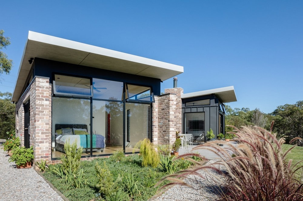
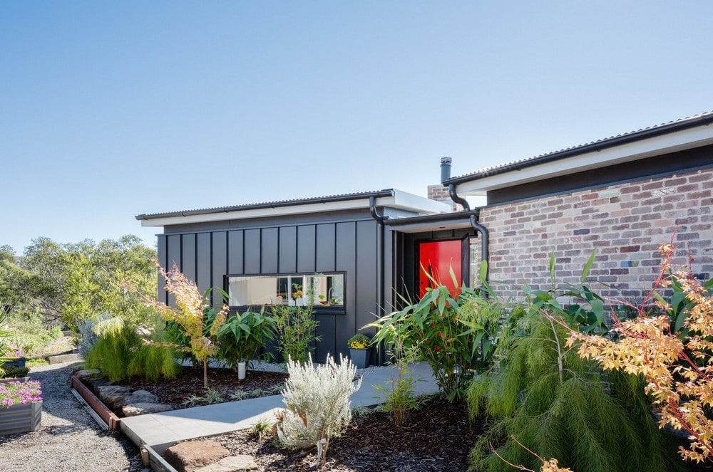
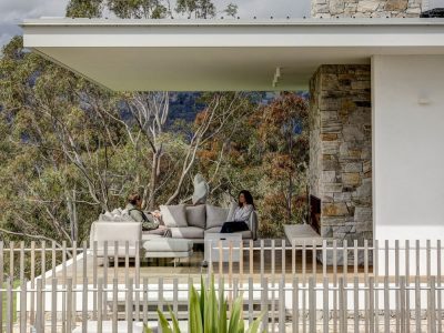
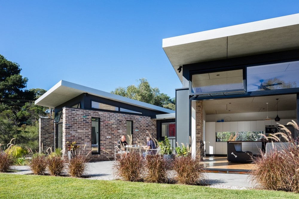
Sandbox Studio designed a building of two pavilions, separating the house into two zones – a public and a private – with a corridor linking them. Outside, the space between the two pavilions becomes a courtyard / outdoor room that effectively doubles the living area.
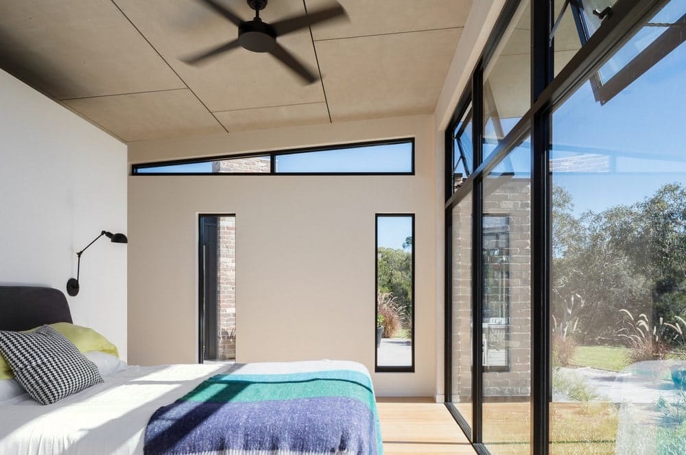
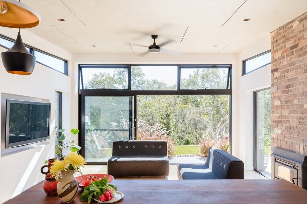
They chose the building site for minimal impact and clearing of trees, and used passive design principles throughout. A skillion roof on each pavilion rises to the north, above a glass wall of fixed and operable windows. The living room opens directly out to the paved terrace and courtyard, while the kitchen looks out to a cottage garden and the south entry to the property.
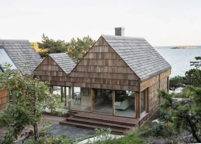
To underscore the separate functions, each pavilion has a different cladding: to feel solid and secure, the bedroom pavilion (with bathroom and walk-in robe) uses recycled bricks. The more open and light living / dining / kitchen pavilion is clad in a contrasting metal sheet, with clerestory windows to the east and west for more light, and glass doors to the courtyard.
“To make the small-footprint home feel generous, we gave it high ceilings and lots of windows so every part of the house projects towards a view. The separation of the pavilions, fanning out by 30 degrees, helps the courtyard feel expansive but part of the house.” — Luke Carter, Sandbox Studio.
What are the sustainability features?
Sandbox Studio used passive design principles (north orientation, high thermal mass, and cross-ventilation) to make the house liveable, sustainable and cost-effective to run. It includes:
• Solar roof panels providing power,
• Rainwater tanks for irrigation & firefighting (37,500 litres total),
• Double-glazed windows and high-performance insulation, and
• Envirocycle composting septic tank.
What were the key challenges?
As a secondary dwelling, the building footprint was restricted to 60 square metres internally. Bushfire zoning limited the external material choices to brick, steel, stone and glass.
