Project: Gitane Restaurant
Design: Studio Modijefsky
Team: Esther Stam, Agnese Pellino, Mariana Amado Trancoso, Ivana Stella & Gina Di Domenico
Location: Amsterdam, The Netherlands
Program: Cafe, bar, restaurant
Assignment: Interior design & Identity design & Branding
Completed: June 2023
Size: 103m2 Interior & 35m2 Exterior
Client: Angelo Kremmydas
Photography: Maanen Willemstein (Interior)
Studio Modijefsky creates a home from home for Amsterdam’s hottest young chef’s debut restaurant. Angelo Kremmydas is a chef whose name has been on the lips of the food in-crowd in Amsterdam for the last couple of years. After establishing his reputation across the city, he’s finally opening his first restaurant in West Amsterdam: Gitane. Angelo wanted it to embody his culinary signature: refined food that reflects a mix of cultures and flavours, served without fuss.
Studio Modijefsky translated this vision into a casual but elegant spatial design that radiates a welcoming atmosphere from inside to out. At Gitane Restaurant you become a guest at Angelo’s table, where you’ll enjoy food and wine carefully selected from local producers and small companies. Studio Modijefsky applied the same ethos by working with specialists who can produce the truly extraordinary, like a terrazzo that had never been made before by the company, or anyone else in the world.
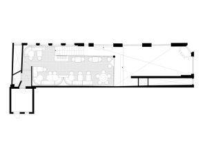
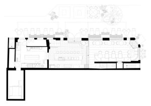
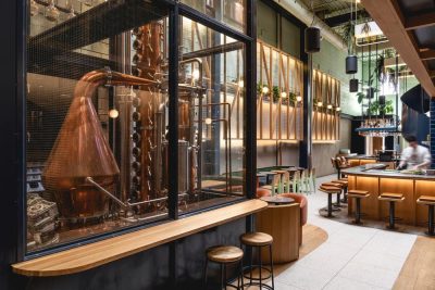
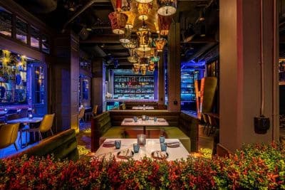
The interior of Gitane is divided into three areas: ground floor; mezzanine; bar. The restaurant is hosted on the ground floor and mezzanine, with the bar two steps down from the ground floor. After the kitchen closes, the ground floor gradually turns into a wine and cocktail bar. Each area has a uniaue atmosphere to suit a different mood, activity and time of day. Together they compose a drinking and dining destination where everyone from food connoisseurs to local residents will feel at home.
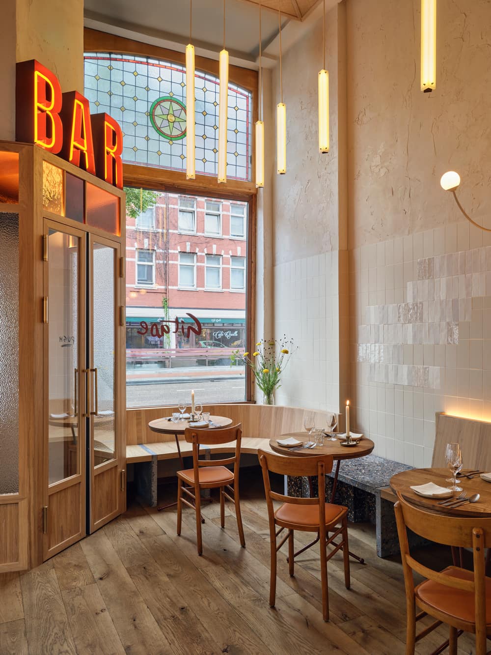
Ground Floor
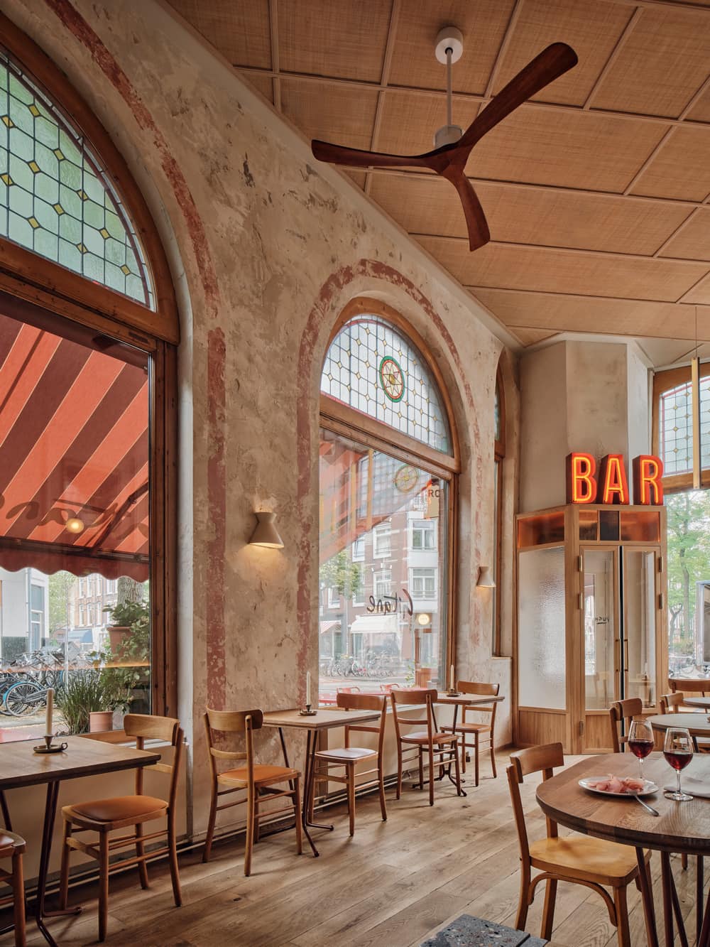
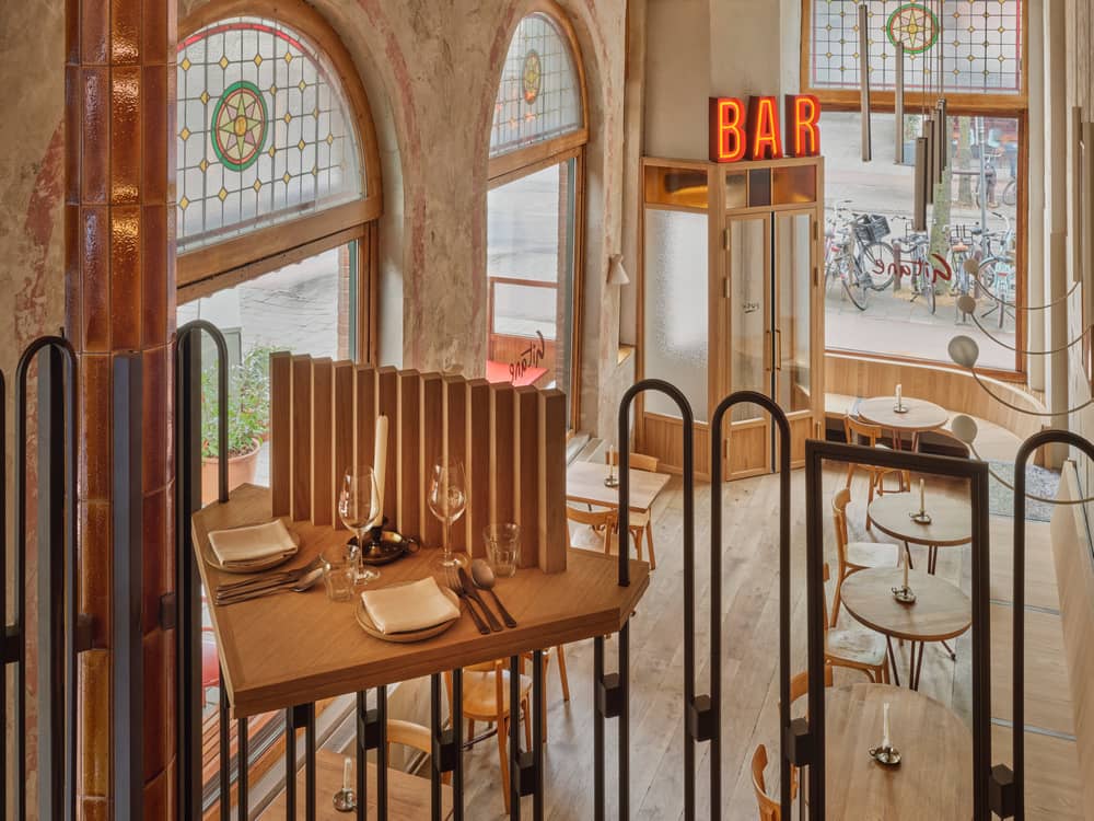
The main entrance is through a wooden vestibule with coloured glass. It brings you into the double-height restaurant space, over which large dark orange neon letters spelling ‘BAR’ spread a warm glow from the top of the vestibule.
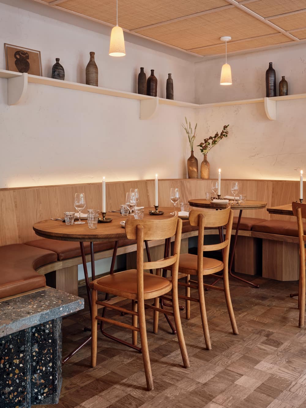
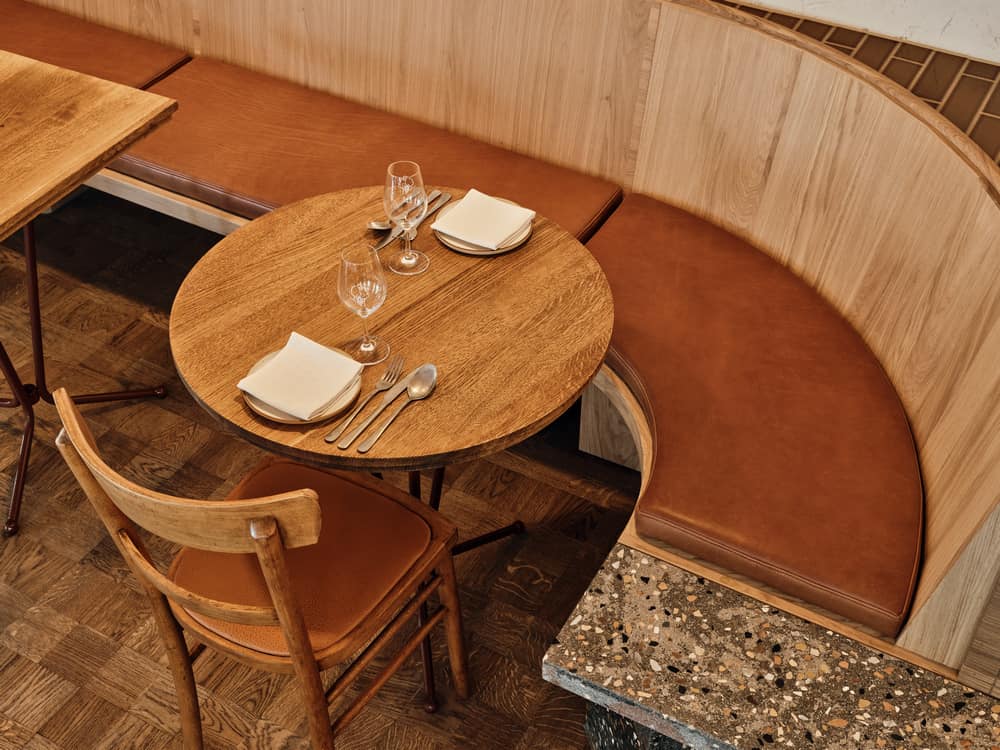
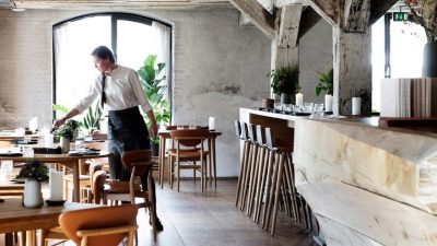
The warmth of the light and the wood of the vestibule set the tone for the ground floor. You’re surrounded by classic and custom wooden furniture: vintage café chairs, some with dark orange leather seating; custom barstools with a leather finish; tabletops with refined details; flooring made of repurposed wooden planks; and long custom benches that constitute the main spatial element on the ground floor and mezzanine. These benches have a unique character thanks to integrated terrazzo surfaces and a combination of clear lines and subtle details.
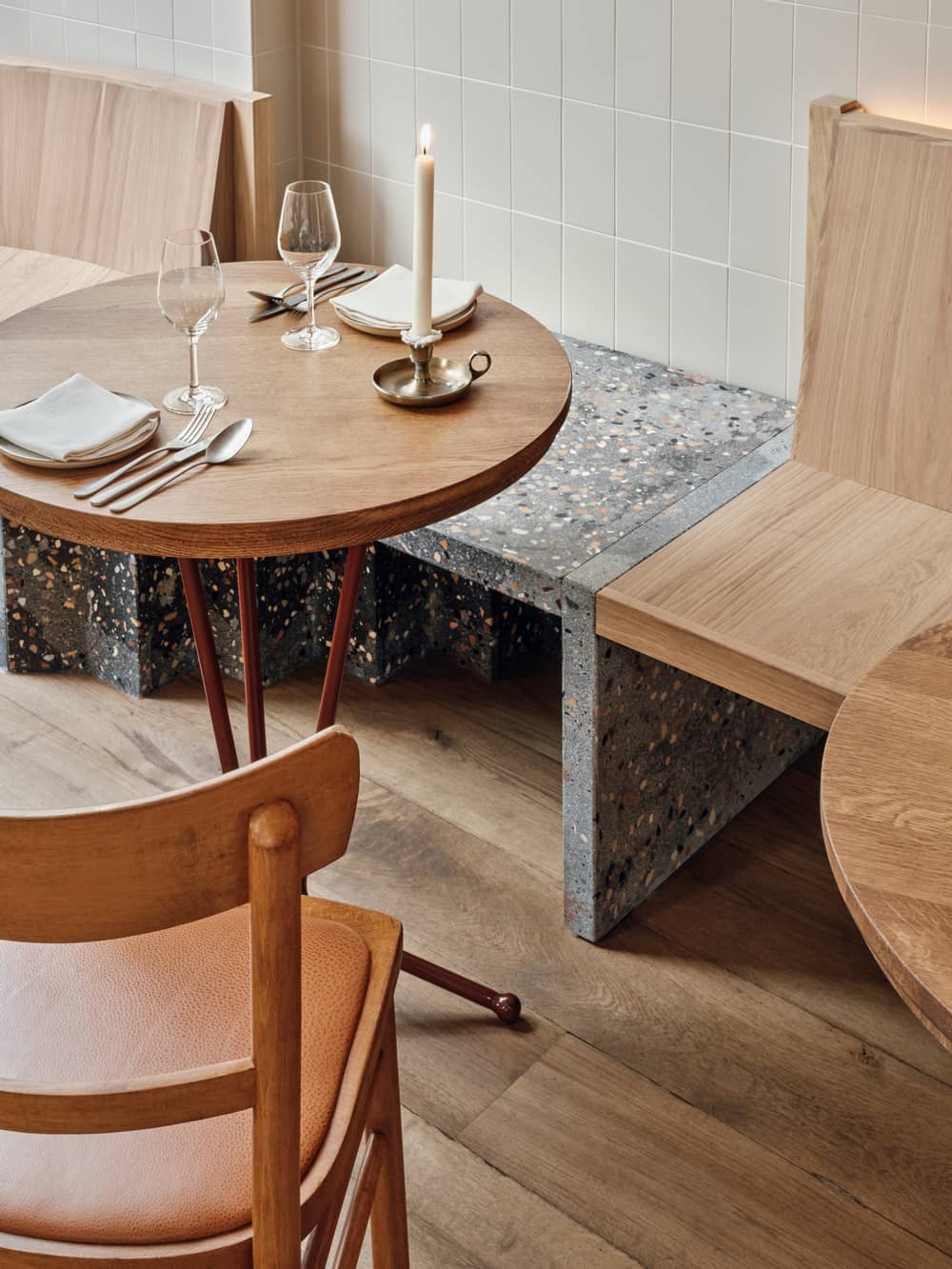
On the opposite side of the ground floor small tables offer a more intimate setting next to tall arched windows. The windows are defined by faded soft red outlines and enhanced by conic ceramic wall lamps. The background has been given a weathered appearance, and clouds of different beiges mix and match across the length of the wall.
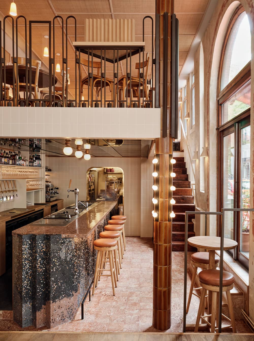
The Bar
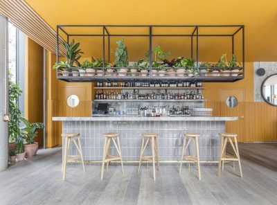
Two steps down from the ground floor you’ll find the bar. II’s a sculptural showstopper in an eye-catching zigzag shape, made with a uniaue terrazzo mix of greys with pink accents. The zigzag shape echoes the geometry of the exterior brick façade, and returns in the seating elements inside. A marbled tiled floor contrasts with the neutral colours of the delicate back bar, which stands on a wooden base. The back bar follows the ceiling geometry and develops symmetrically on the back wall. At one end a large fridge invites guests to peruse the carefully curated assortment of natural wines, while at the other they can get a glimpse of what’s cooking in the kitchen.
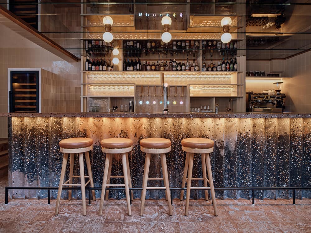
This intimate space is elevated by a dark brown, aged mirrored ceiling. It reflects the light spheres on the ceiling and the patterns of the sculptural bar beneath, capturing the play between robust, weathered materials and the fresh tiles and terrazzo.
The bar ceiling is supported by a column. By finishing it in rich textured lava tiles and giving it small lights as accents, Studio Modijefsky turned a humble structural piece into a venical design feature. As the column rises from the souterrain all the way up to the railing of the mezzanine staircase, it visually connects all three areas of Gitane.
Mezzanine
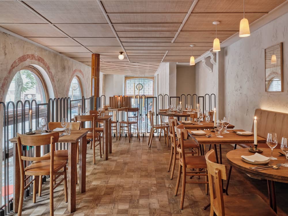
A rattan ceiling with a spectacular geometric pattern of slats unites the ground floor and mezzanine, which you climb up to via an original wooden staircase. Large windows next to the steps define the position of the glass panitions of the mezzanine railing, subtly bringing the facade indoors while extending the visual lines from the street to the interior. A railing of metallic brown vertical elements runs along the mezzanine edge. Once upstairs you’ll find a service area, tables, benches and a banauette, all with zigzag details. The length and shape of the banquette naturally establish smaller seating areas which are complemented by simple shelves exhibiting vases and plates found in obscure French bazaars. A table next to the railing offers the chance to enjoy a view over the whole dining and drinking area.
Terrace
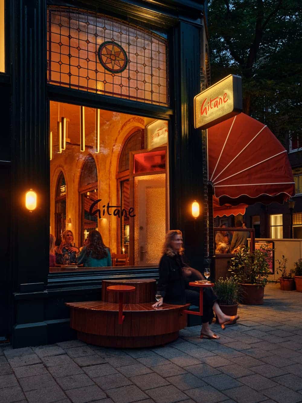
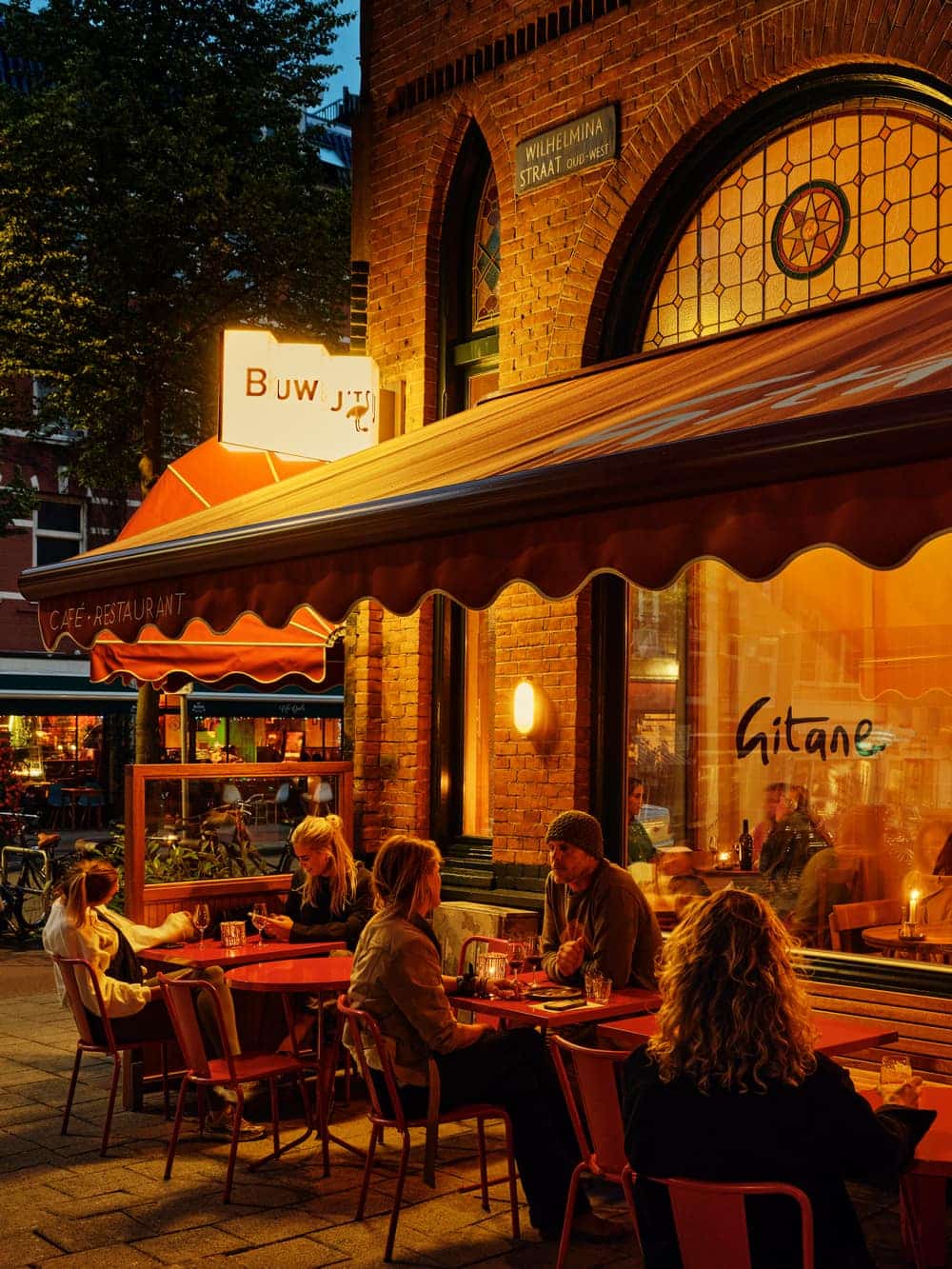
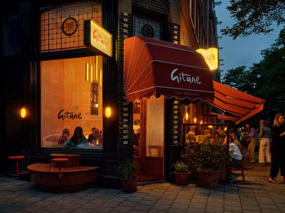
A terrace runs along the façade of Gitane, with custom wooden love seats in a warm red colour sitting underneath striped orange and red awnings. On the other side of the building you can take a seat at a hall-round bench to enjoy an aperitivo and watch the world go by, before enjoying a special meal inside.
