Project: Grade II Listed Townhouse
Interior Design: Slightly Quirky
Project Team: Deborah Moor, Caroline Iredale
Location: Chiswick, London, United Kingdom
Project Year: 2017
Photography: Anna Stathaki
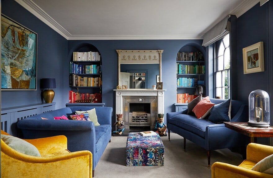
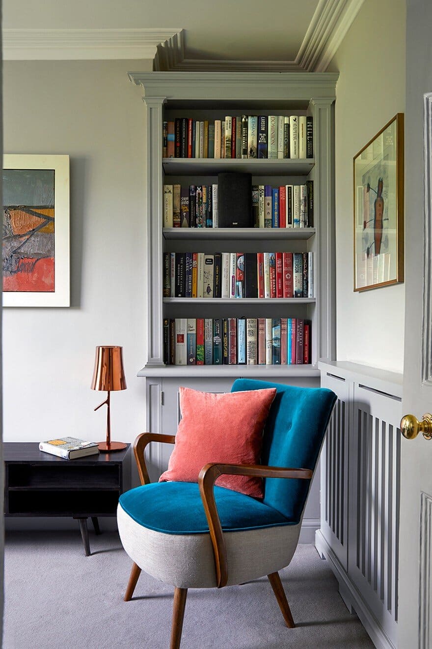
The Brief: This stunning Grade II listed four storey home was brimming with period features such as marble fireplaces, detailed coving and tall sash windows. There were a lot of beautiful, vintage pieces of furniture which the client had inherited from family members, this was important to them, yet, it didn’t represent their taste or style; they didn’t want to feel like they were living in their parents’ house. Some rooms felt dark, despite the large windows, and they wanted to bring more life into the reception spaces especially; their front sitting room, they rarely even used. They also had an extensive art collection which they wanted to display and enjoy in spaces which complemented and enhanced the work.
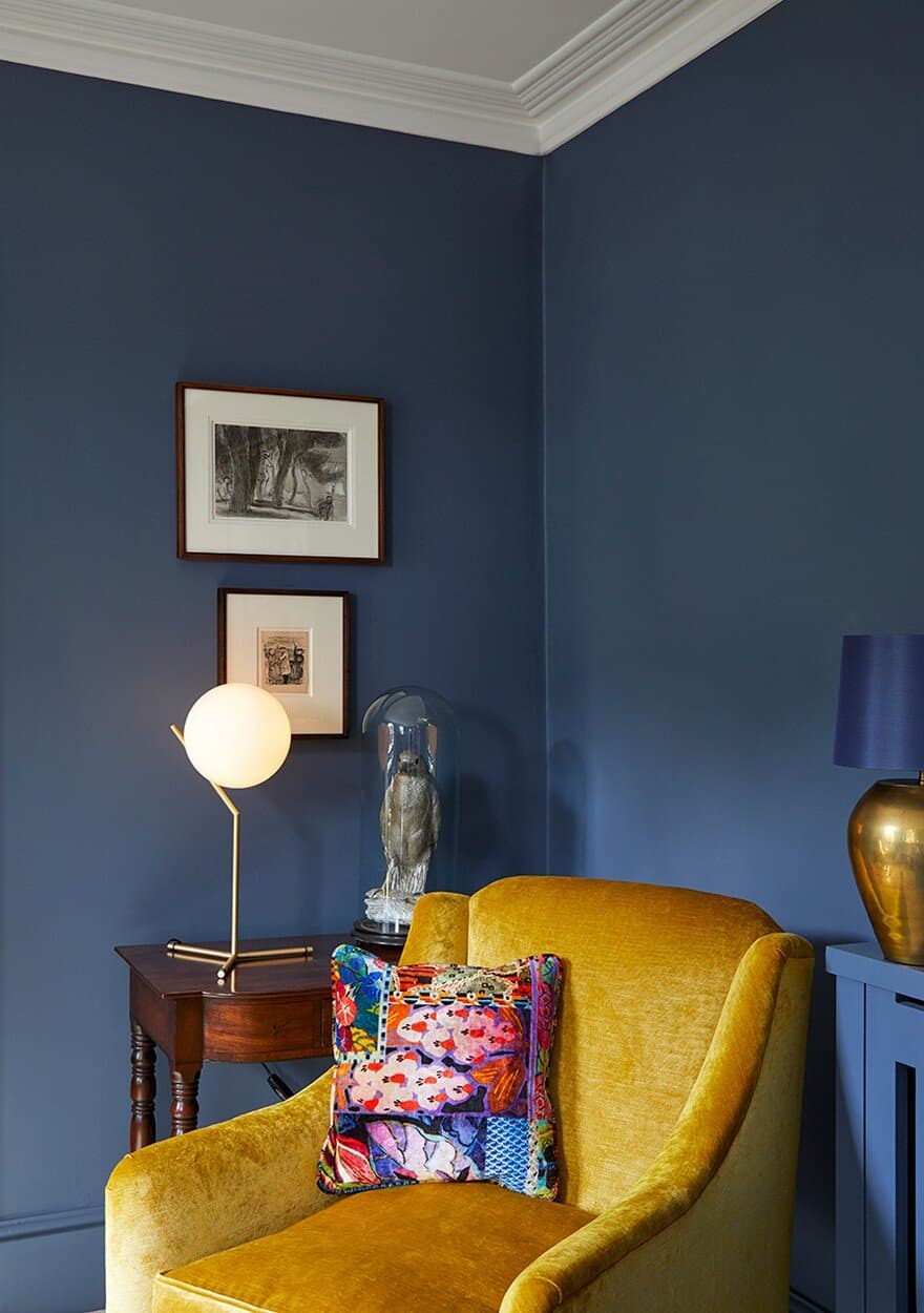
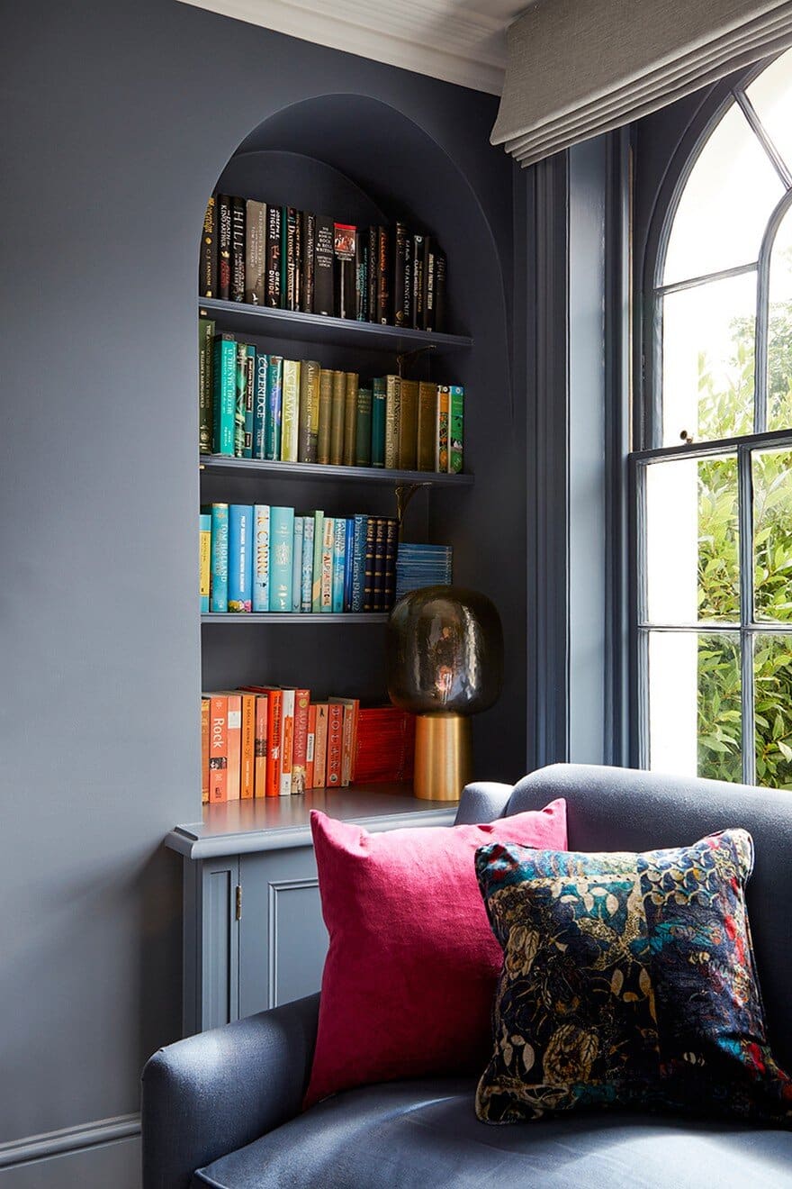
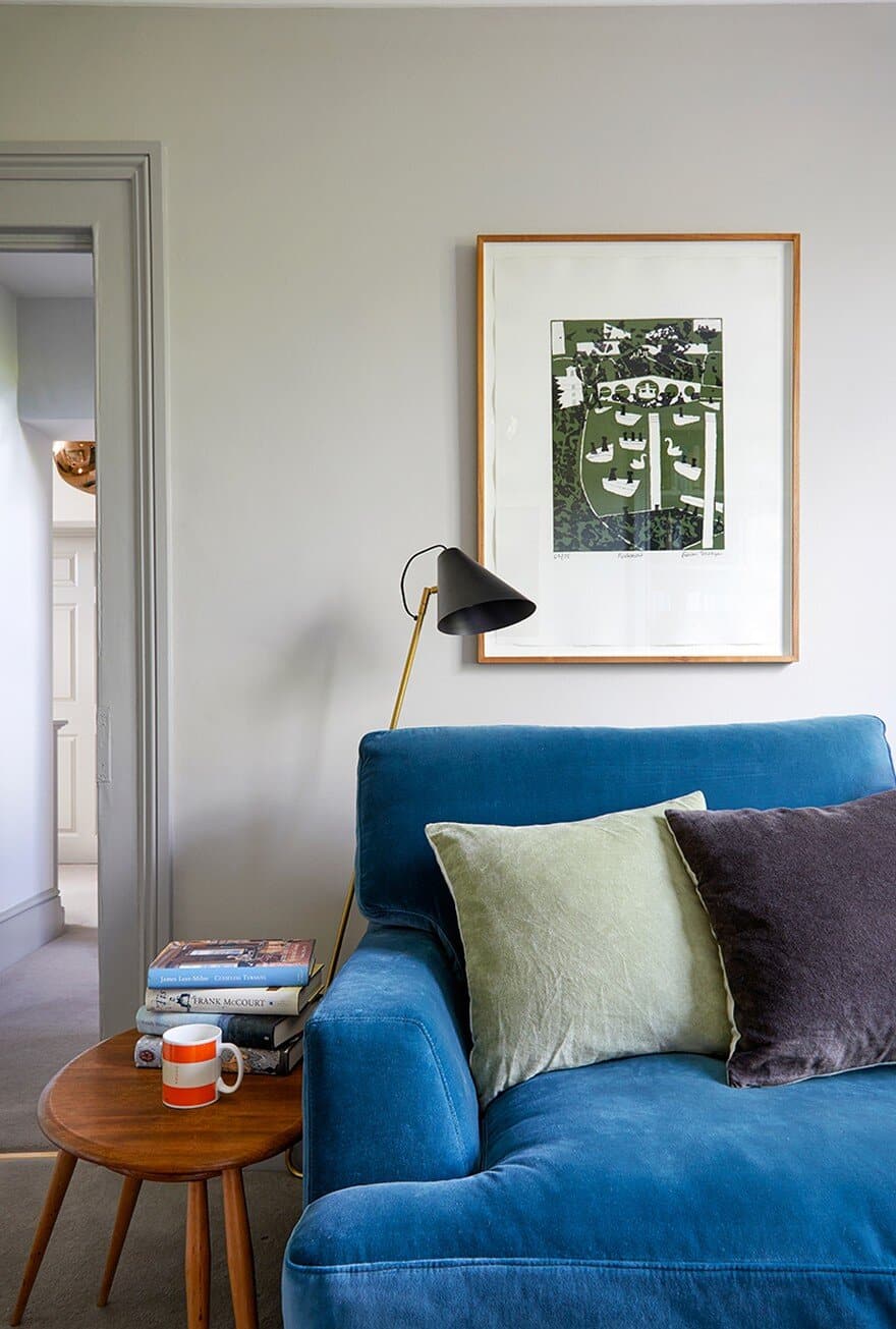
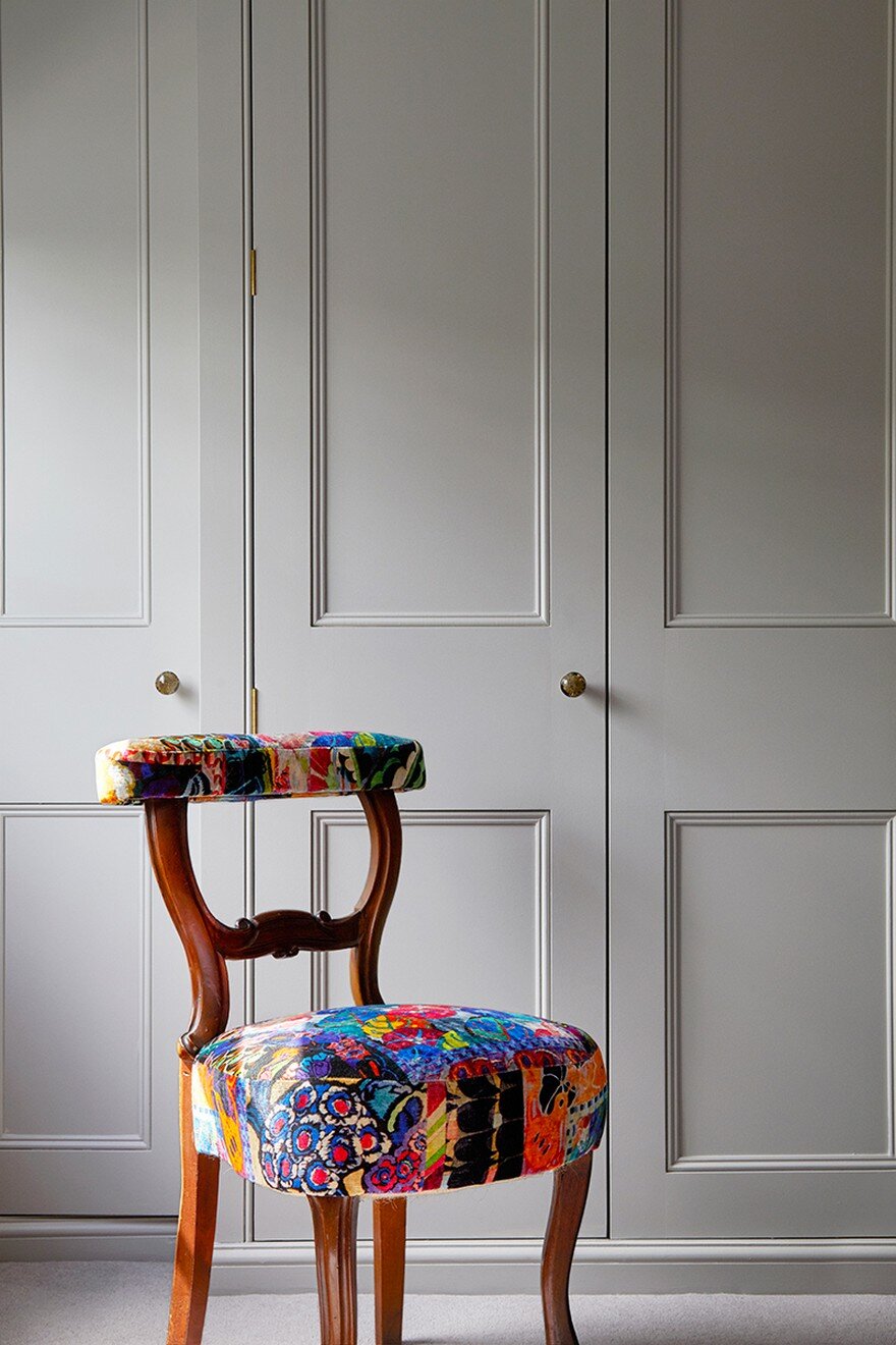
The Style: We decided to inject light and colour to the property to create a vibrant, sophisticated family house; the scheme is sympathetic to the style of the house, yet modern and fresh. The use of strong, bold colours brought the dark sitting room to life, this was accented with bold contrasting bright colours and patterned velvet cushions. We love blending the old with the new and this worked particularly well in this property: we re-covered the old furniture, which was good quality and beautifully designed, they were given a new lease of life in vibrant, modern fabrics.
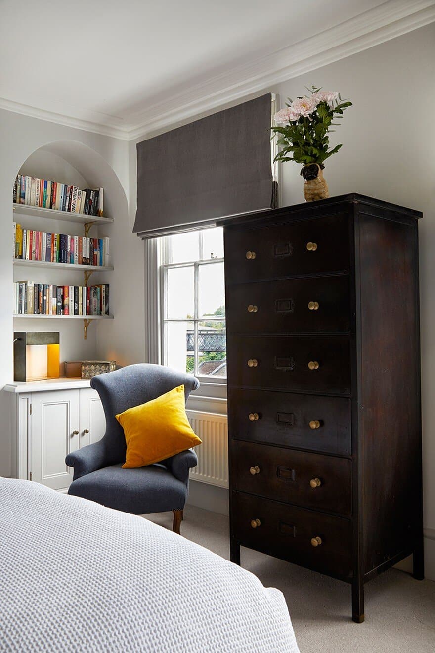
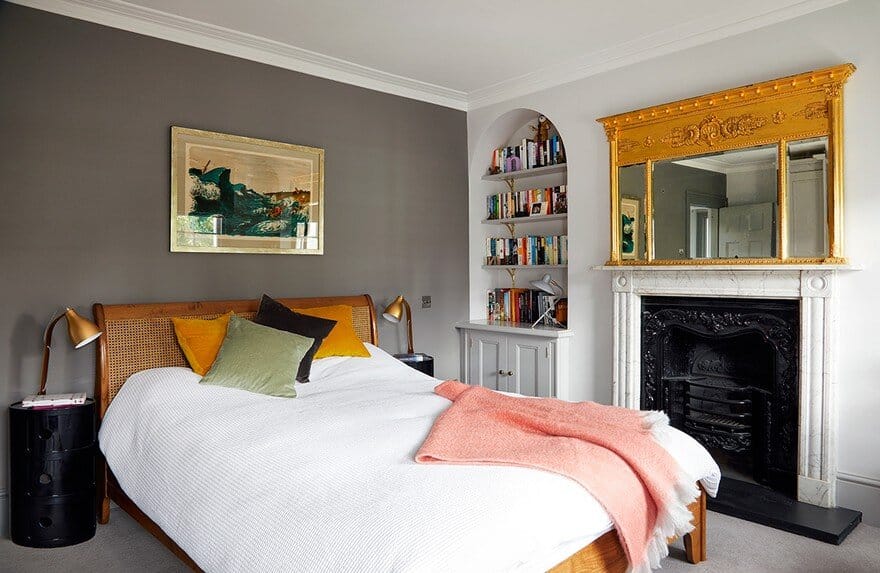
We mixed the period features with more contemporary materials including glass and plastics. The bedside tables in the master bedroom in black plastic are an unexpected choice , yet work so well in the room and offer a practical solution. We also sourced a selection of interesting table lamps throughout the house and not to mention some quirky accessories too.
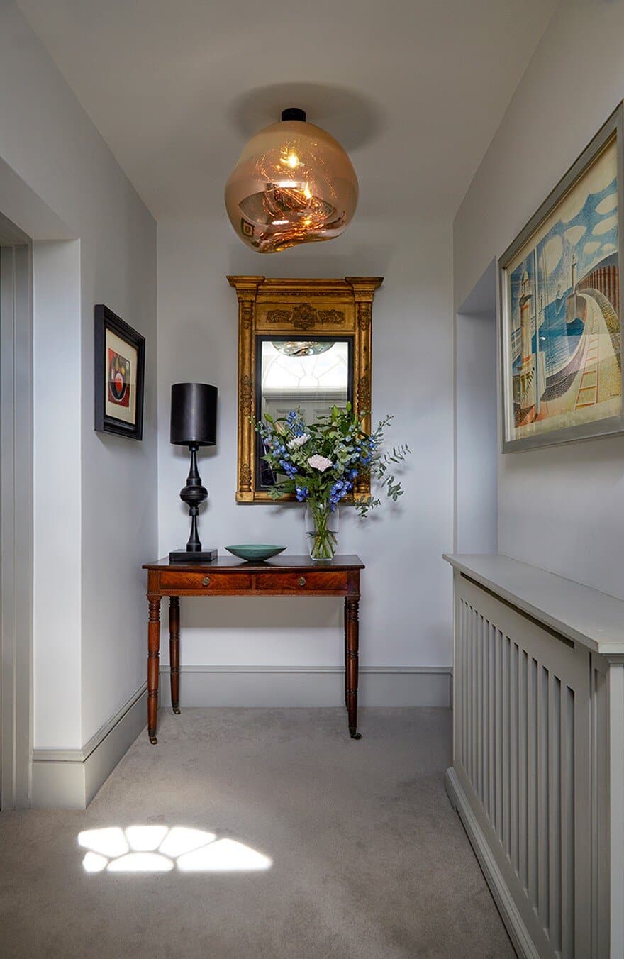
The work therefore consists mostly in finding a great colour scheme and to maximise the existing layout. The owners agreed on a strong colour palette, with some darker heritage colours. We brought the scheme into the 21st century by adding resolutely modern features (e.g. the Tom Dixon Melt pendant in the hall) and using vibrant textiles as highlights (in chair covers, for instance).

