Project name: HEYTEA LAB at The MixC Xiamen
Design company: MOC Design Office
Chief designers: Liang Ningsen, Wu Xiuwei
Design phase: September – October 2018
Completion: December 2018
Location: 1F, The MixC, Hubin East Road, Xiamen, China
Area: 460 m2
Main materials: precast cement board, gold stainless steel, KD unpainted wooden panel
Photography: ArchiTranslator
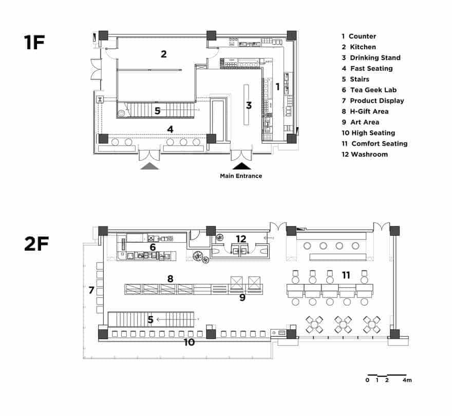
Located in the commercial hub of Xiamen Island, the project is a flagship store of HEYTEA LAB, China’s leading tea drink brand. Based on characteristics of the open two-storey architectural space, MOC DESIGN OFFICE created bottom-up oblique order within it, which accommodates various possibilities for urban life and socializing.
Dynamic surfaces
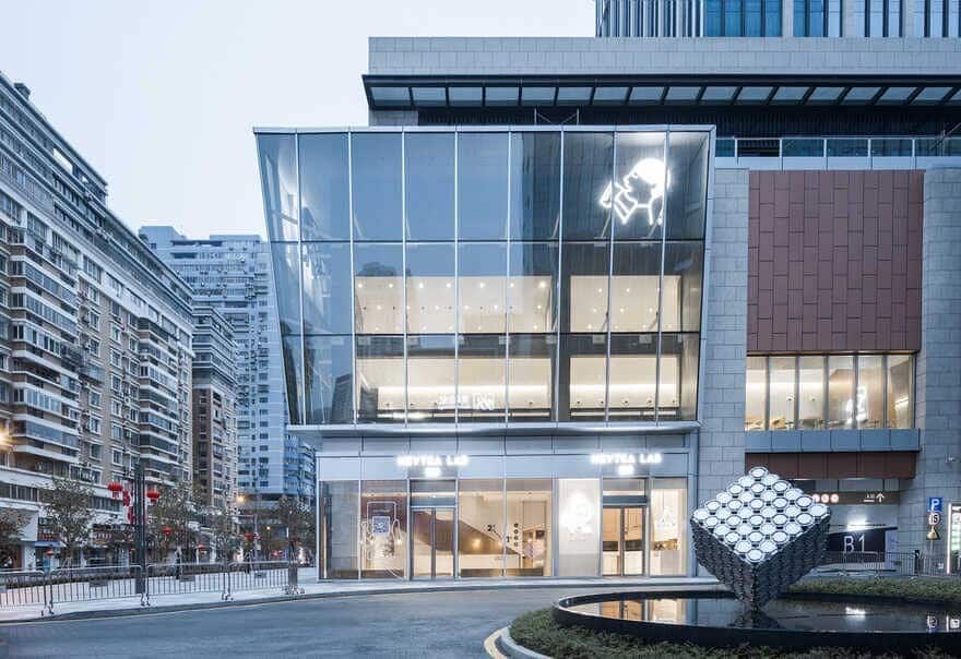
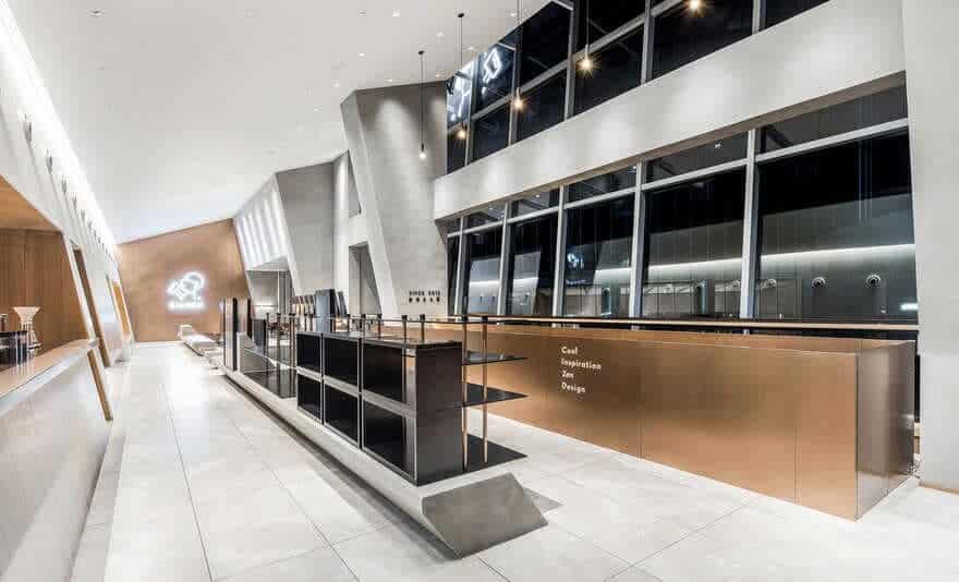
The store is situated at the street corner, and is enclosed by two glass curtain walls which form a right angle. The transparent glass opens the interior to the outside and enhances its interaction with outdoor pedestrians.
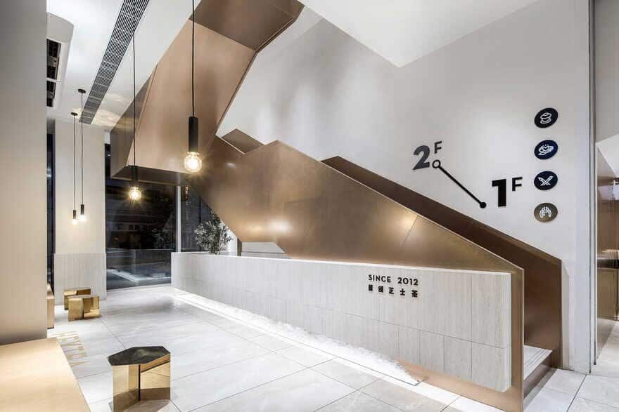
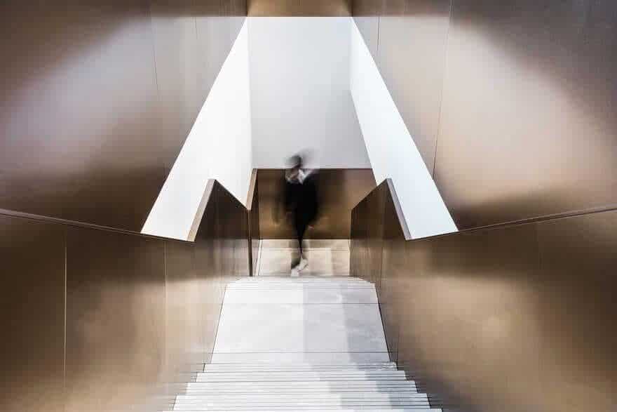
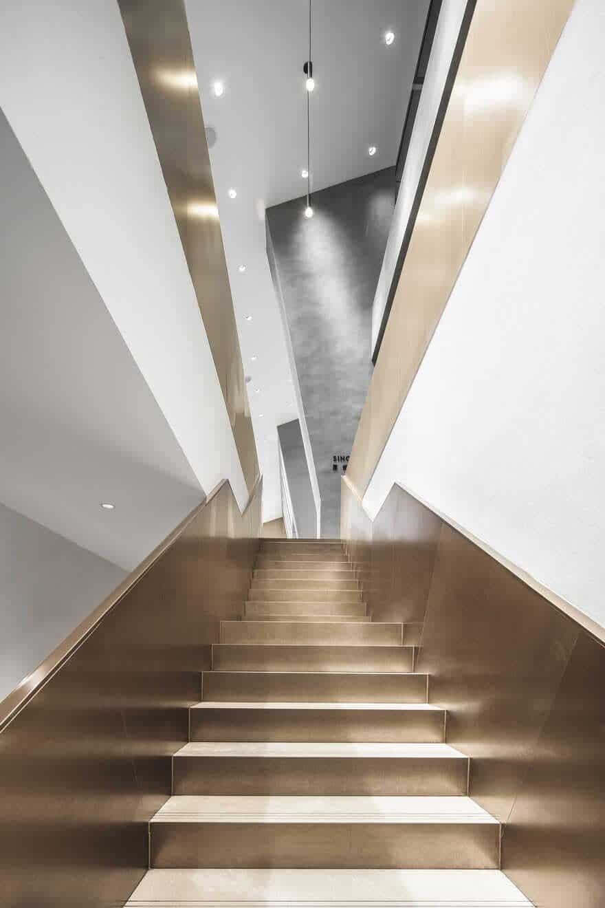
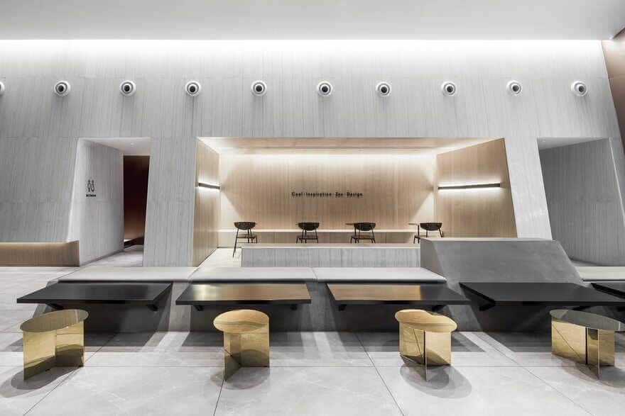
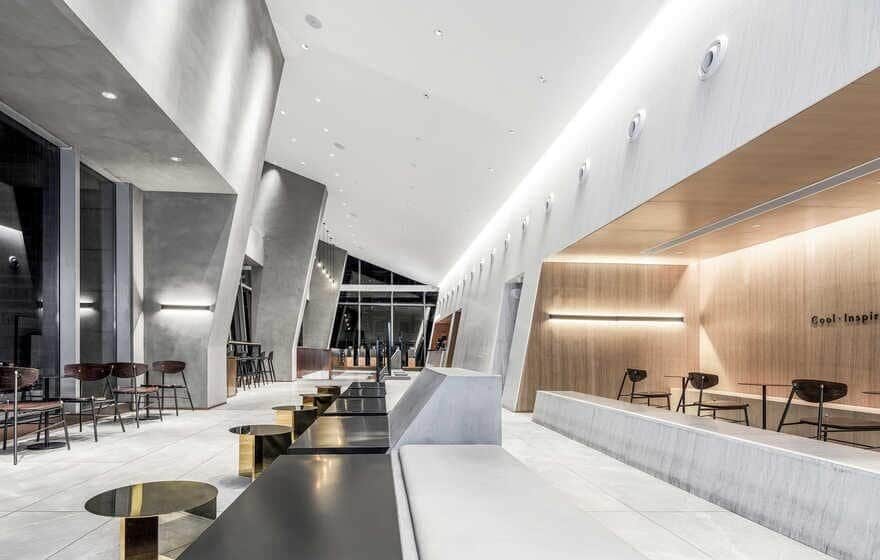
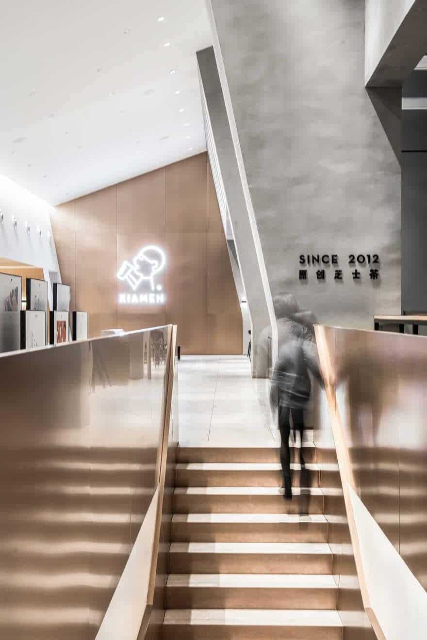
The overall space features modern geometric forms, simple, austere materials and hues, as well as an ambience that combines spirit and artistic style. Large areas of interior surfaces are covered with concrete and gold stainless steel, which present strong contrast of textures. Black baked finish is applied to details, helping to strike a balance and add a modern touch to the space. Besides, gold stainless steel is extended to the staircase installation, which appears more flexible and dynamic under the soft light and becomes a visual highlight in the space.
Dialogue with the site
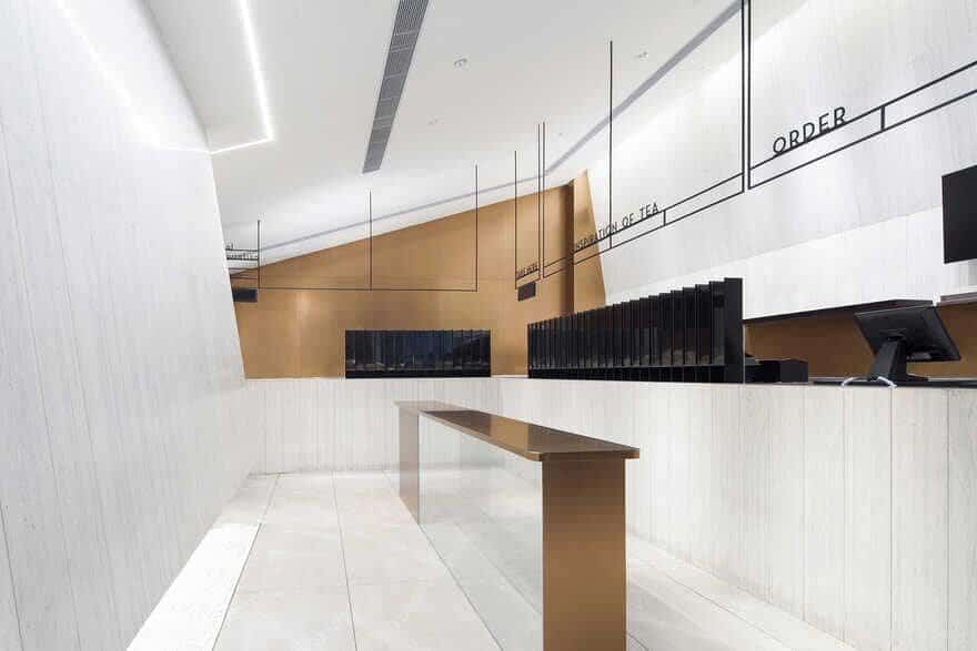
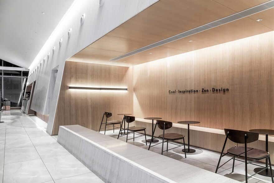
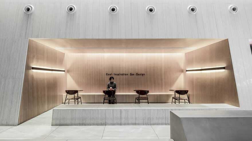
In the original architectural space, all pipes were set on one side. And the space has height differences. In order to respond to site conditions and open the interior to the outside to the greatest extent, the designers made the ceiling and walls slightly slanting. Such a creative solution effectively solved site constraints and realized the value of design in an artistic way. Oblique blocks blend into the site in a low profile, showcase strength and a structural aesthetic, and form an identifying characteristic of the store.
Breaking with conventional symmetry
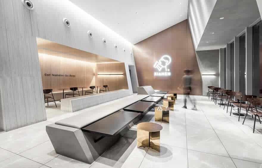
With a series of oblique surfaces, the interior space has a dynamic appearance. It breaks with conventional symmetry, and shows a sense of tension. Spatial blocks are combined horizontally or interpenetrated in a slanting manner, which creates visual variations and marks off several distinctive seating areas.
The geometric segmentation and combination of blocks create rich experiences, meet diverse spatial demands, and also fit into HEYTEA’s creative spirit. Structures, materials, the building and environment are harmonized into an organic whole — an urban destination that serves for the public.

