Project: Hidden Oaks Residence
Interior Design: Ashby Collective
Architect: Cornerstone Architects
Stylist: Stephanie Bohn Philpott LLC
Build: Shapiro Homes LLC & Allegiant Contractors
Landscape: Raiz Design Group
Location: Austin, Texas, United States
Completed: 2022
Photography: Chase Daniel
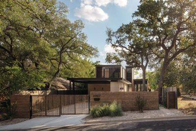
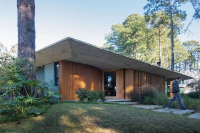
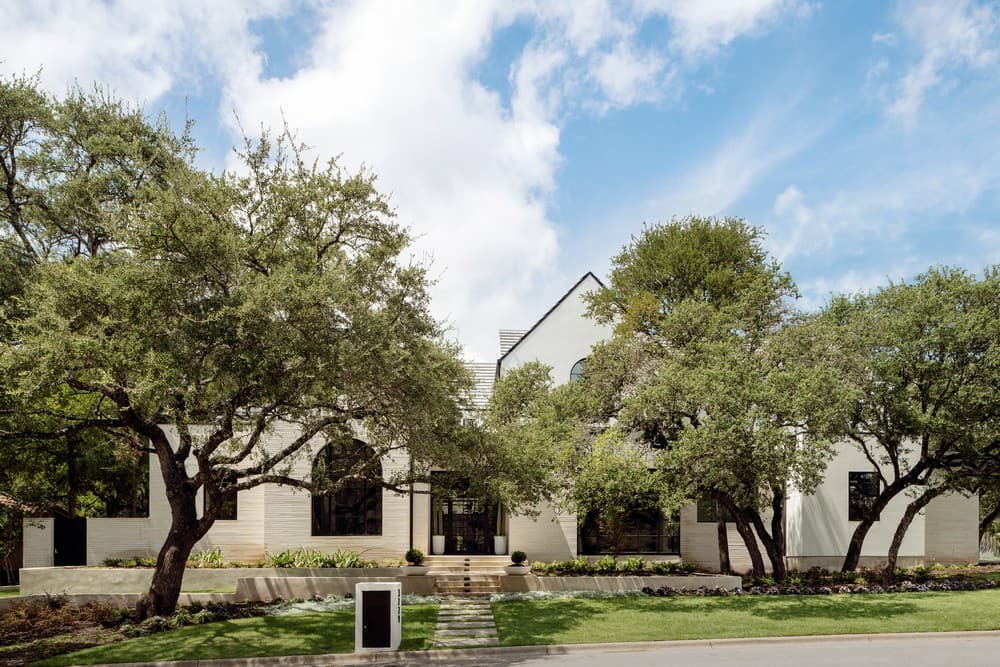
An Austin home hidden amongst majestic live oak and elm trees uniquely balances traditional forms with contemporary lines.
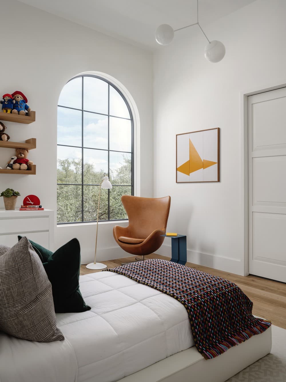
A family of four recently moved to Austin from Silicon Valley, CA to lay down roots. They purchased this home halfway through construction and worked together with Cornerstone Architects and Ashby Collective to create an environment that is truly in line with their preferences and lifestyle. The couple are each from different multicultural backgrounds as well as avid travelers. They sought to incorporate elements from their combined cultural heritage and diverse life experiences in the interior design and artwork selections. They also sought to create spaces for both more formal and more casual entertaining, as well as a teen-friendly home where their children and their friends would feel entirely comfortable.
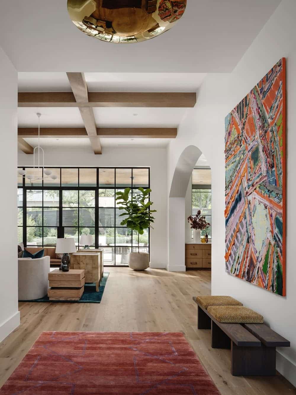
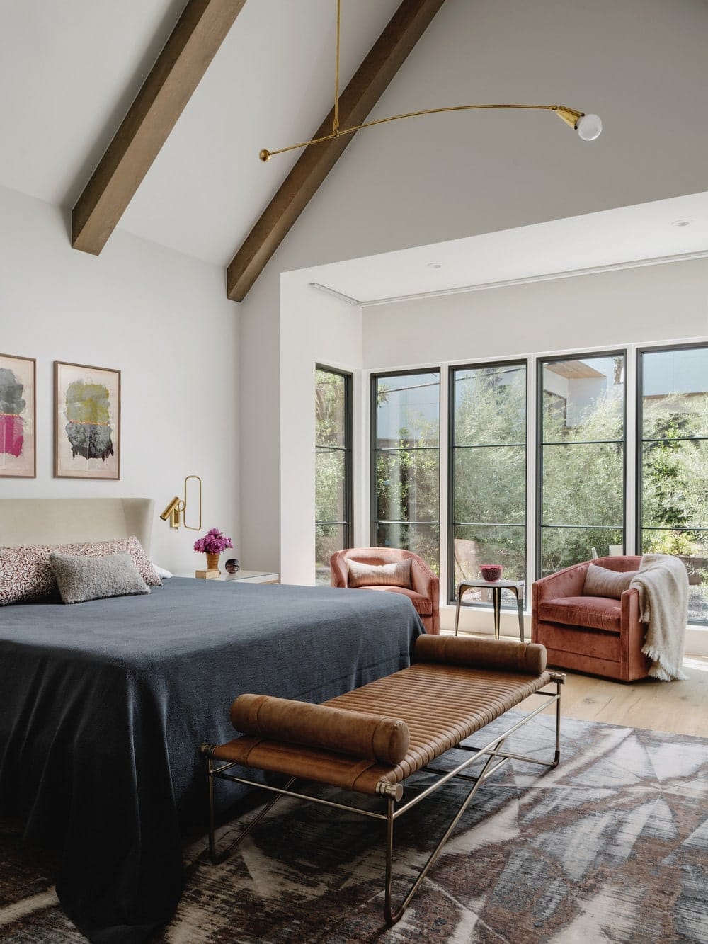
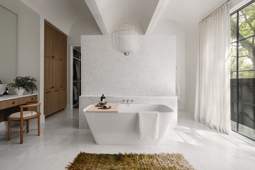
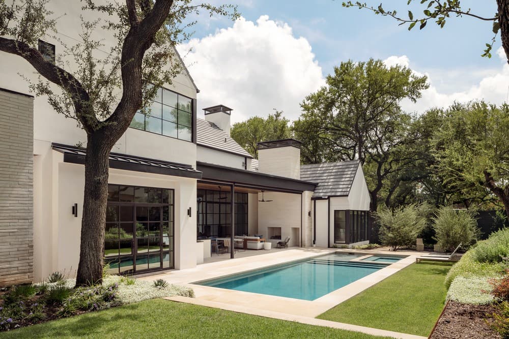
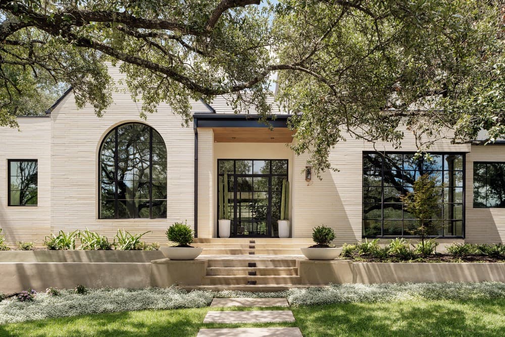
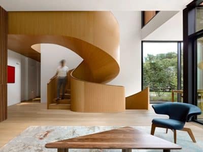
This Austin home is a beautiful example of transitional architectural design with the use of traditional elements such as dominant gables and pitched roof forms suffused with modern parapet walls and low flat sheds. The interior architecture follows the same cues as the exterior: smooth clean lines with subtle gestures of curves and arches. The material selection creates a similar balance with smooth plaster finish complementing warmer wood textures.
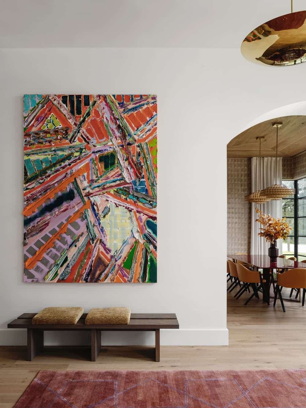
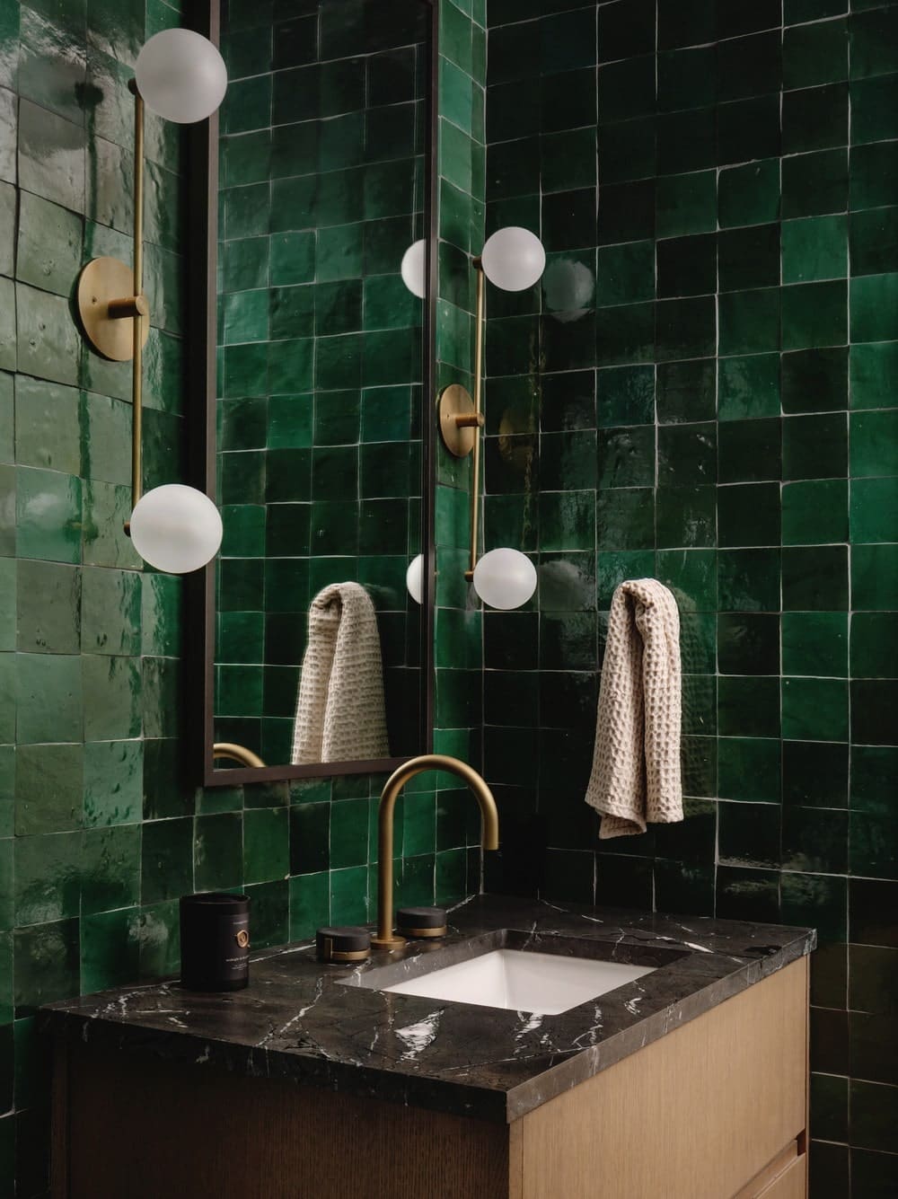
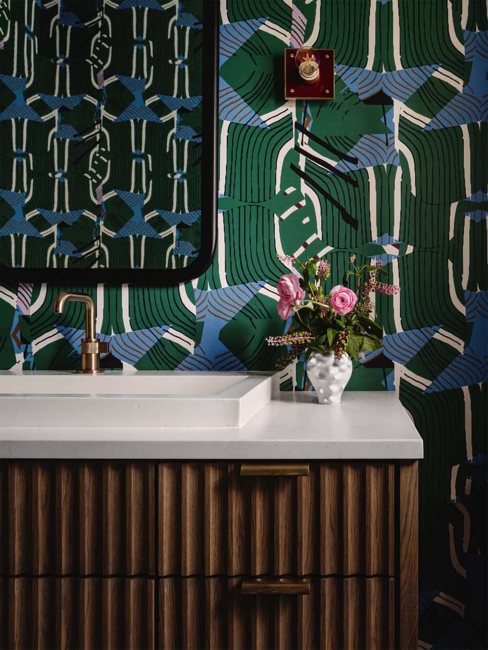
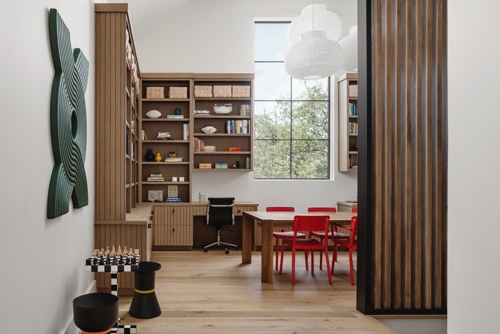
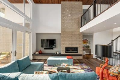
The Hidden Oaks Residence is cloaked in trees, giving fragmented views of the façade as the trees gently veil the home’s architecture. Clean geometric forms appear on approach to the entrance. The exterior and interior architecture work together to follow the same pattern in creating the simple and lovely transitional balance. The interior design team worked to elevate the architectural highlights balancing the large light-filled rooms with bold color, custom lighting, furnishings, and large impactful art pieces.
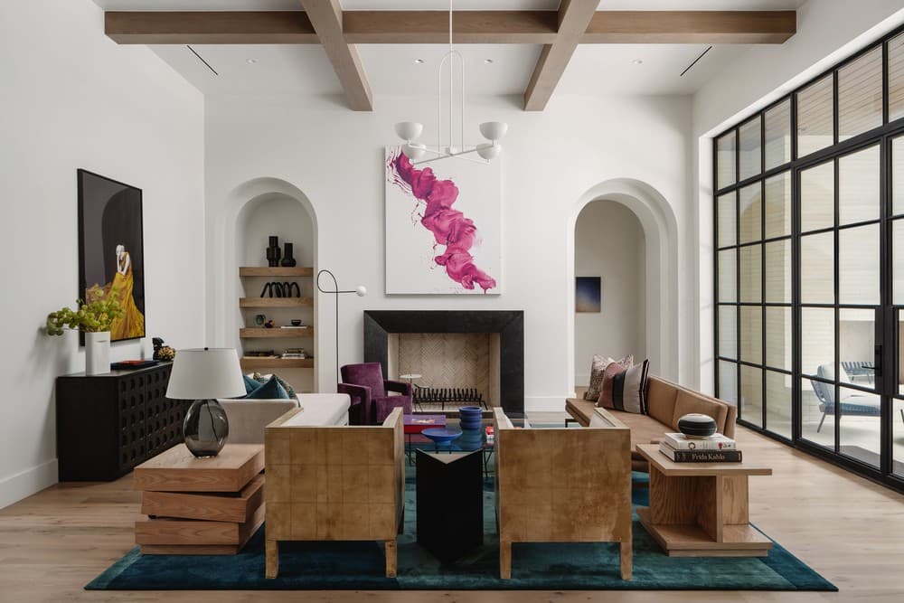
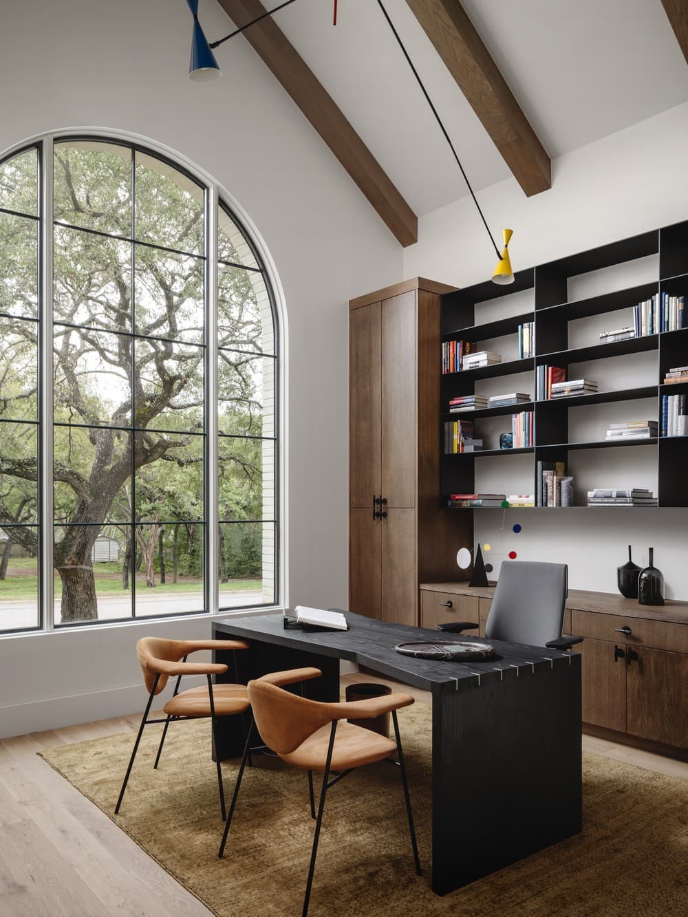
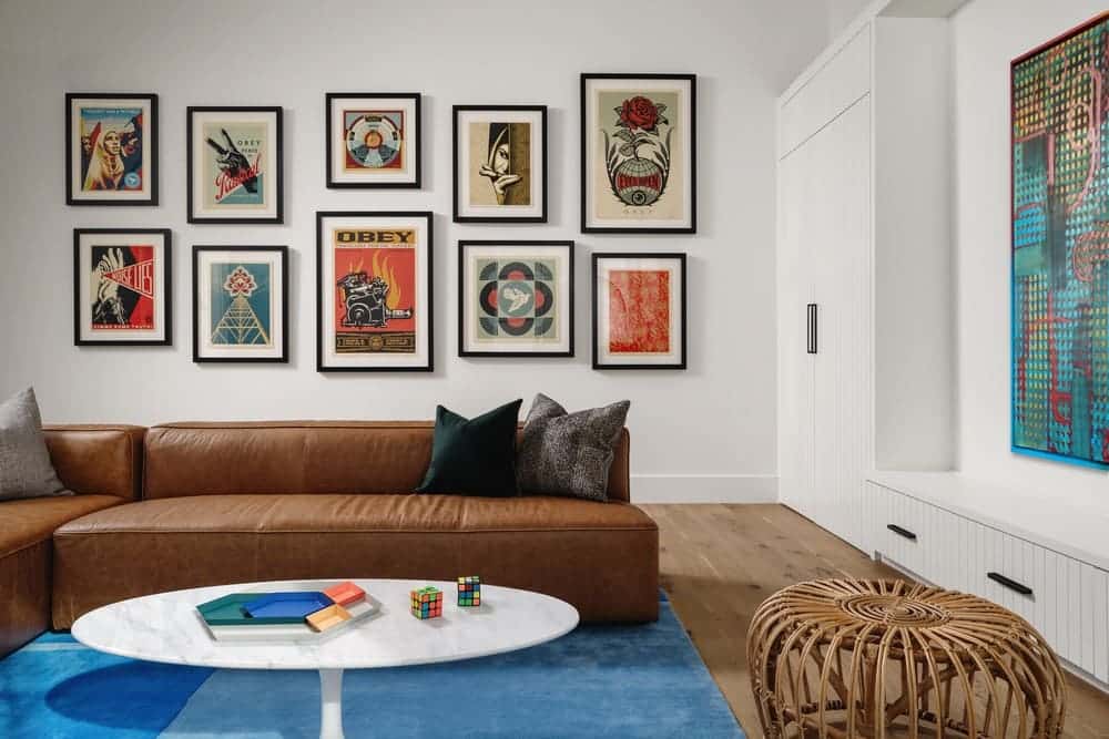
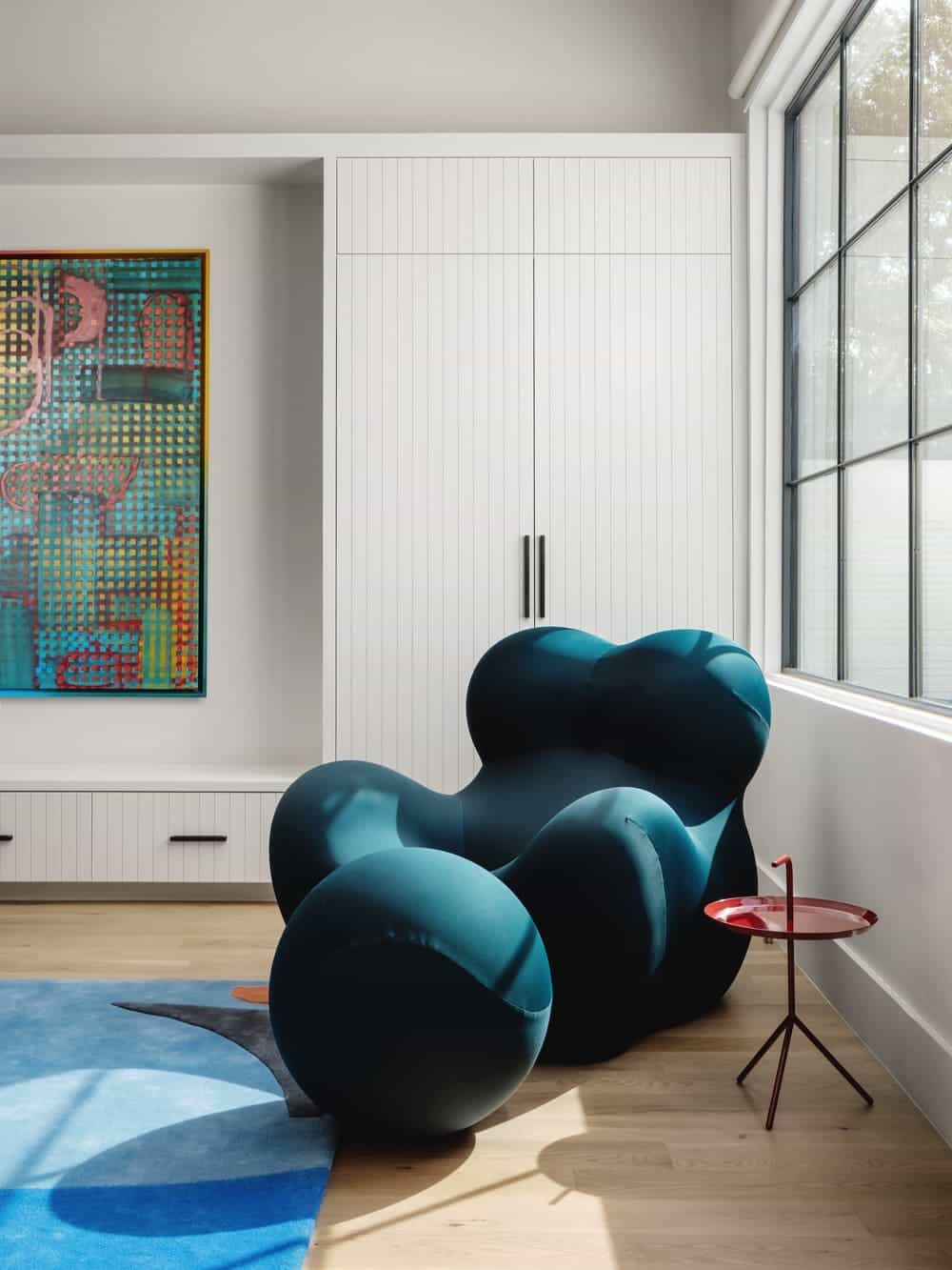
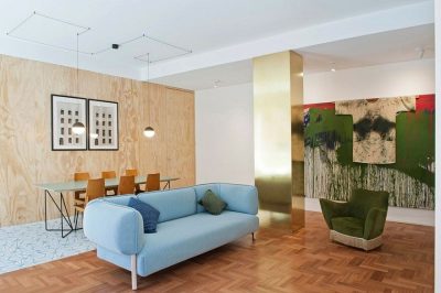
The intended large gallery-style walls throughout the house are used to highlight the client’s diverse modern art collection. The design team were inspired by the client’s art collection and love of bright, bold colors and incorporated refined hues and modern silhouettes, to compliment the vibrant works of art in the light-filled rooms.
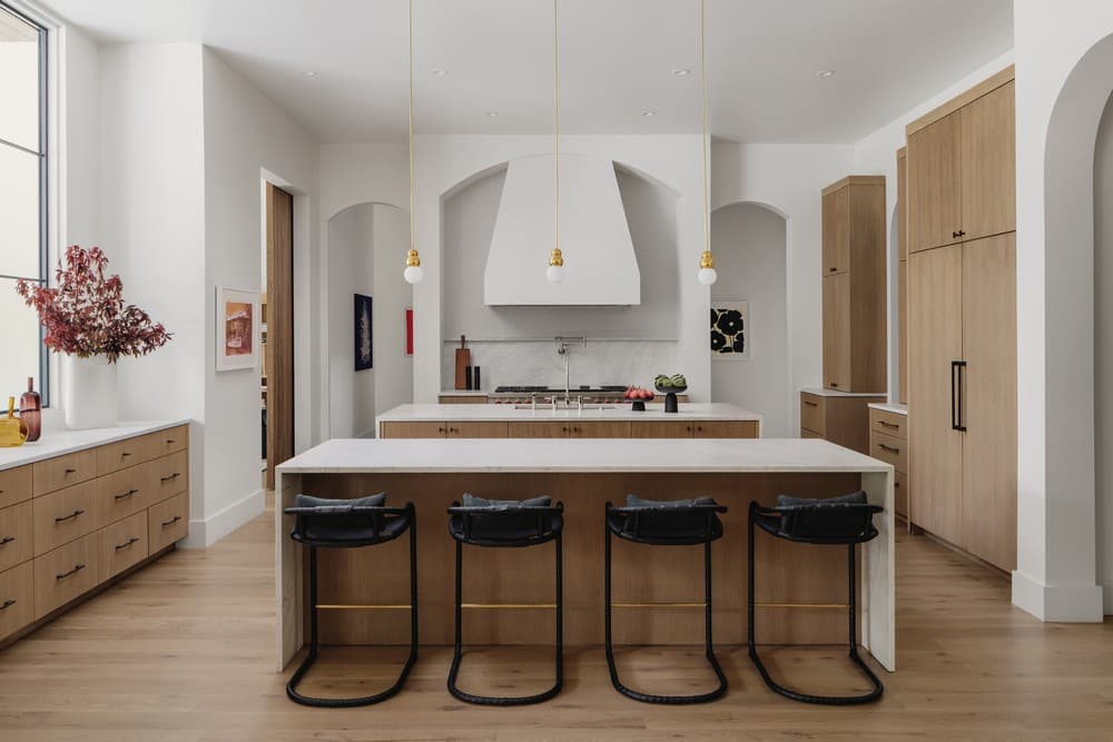
“This is a busy and active family, so the interiors needed to accommodate multiple purposes, business dinners at night, and neighborhood kids in the day. The intention with the design was to have fun while keeping it sophisticated,” says Cori Pfaff, Ashby Collective.
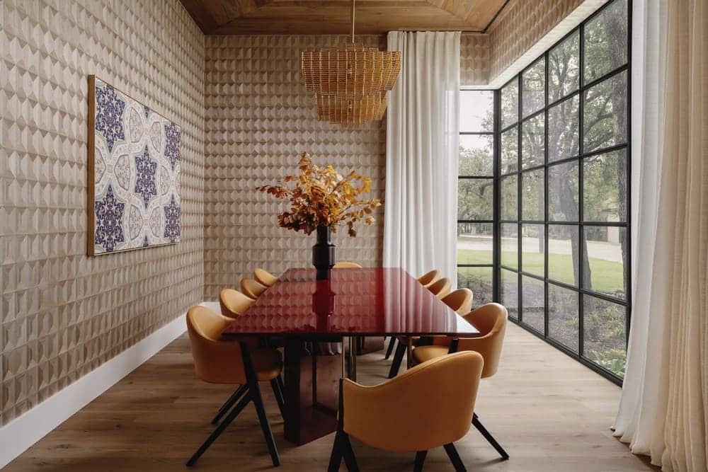
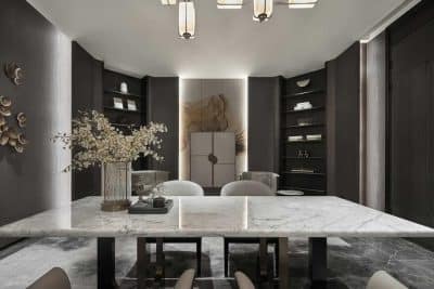
The design theme is stylized with luxury finishes while being functional and casual, sophisticated but approachable. “The homeowners prefer Italian design and classic modern pieces, they wanted to create an almost European, cosmopolitan atmosphere. They didn’t want their house to look like every other Austin-styled house; instead, they wanted it to be chic without trying too hard. The homeowners and interiors team collaborated with an art consultant to curate their collection so that it blended in with the interiors,” adds Cori.
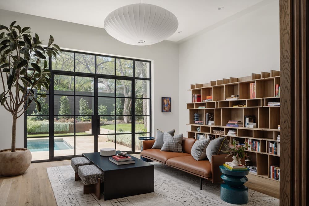
The architect and builder used limestone but opted for long cuts stacked horizontally to create an unexpected look. The lush landscape is contoured and terraced up to the front entry to soften the natural drop in the topography. “The architectural design is very transitional, balancing traditional elements with modern features'”– says Cornerstone Architects.
