Project: Little Venice Residence
Architects: Originate
Location: London, United Kingdom
Year 2017
Photo Credits: John Munro
Text by Originate
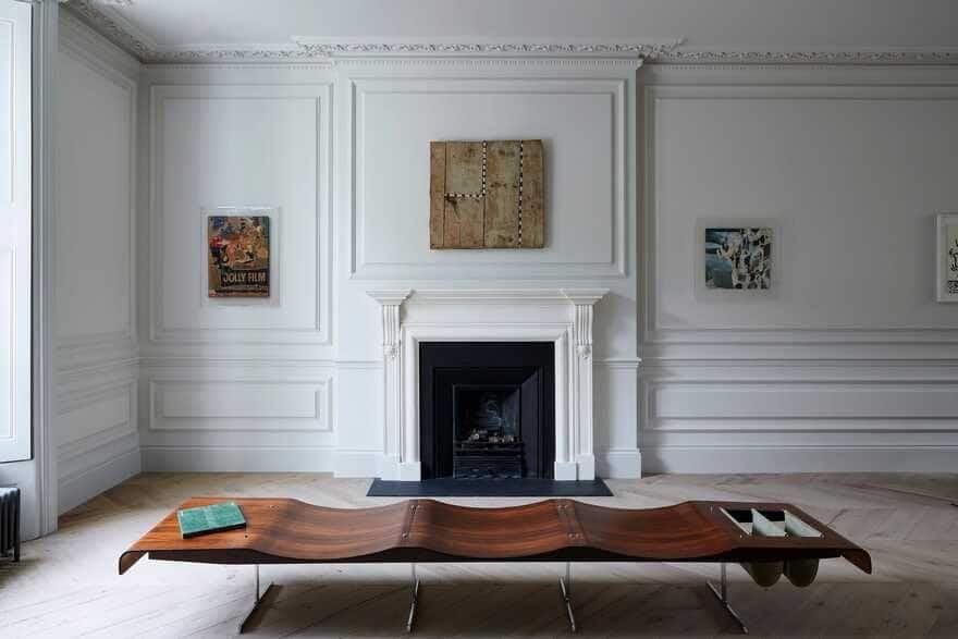
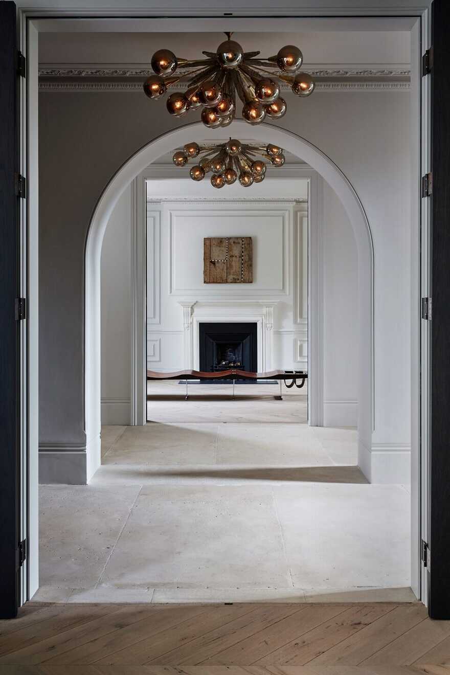
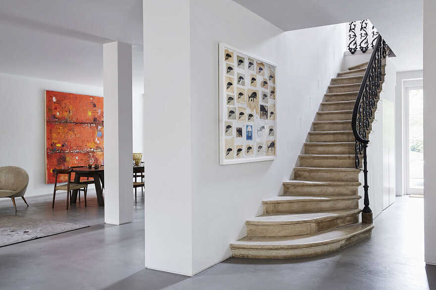
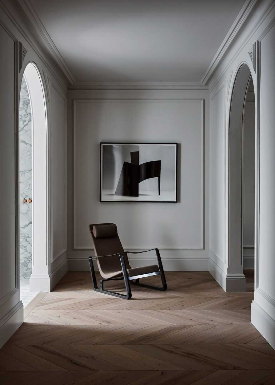
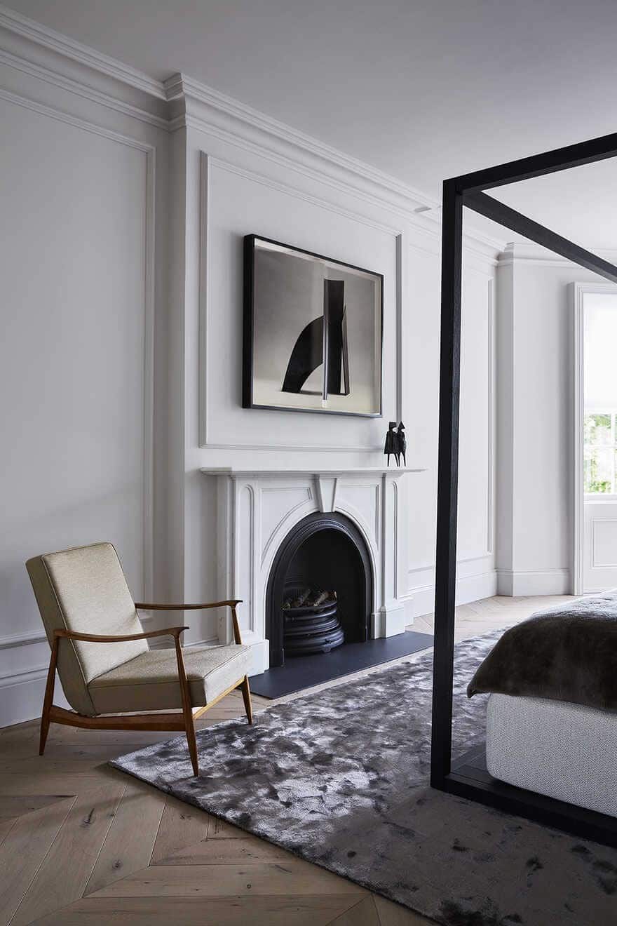
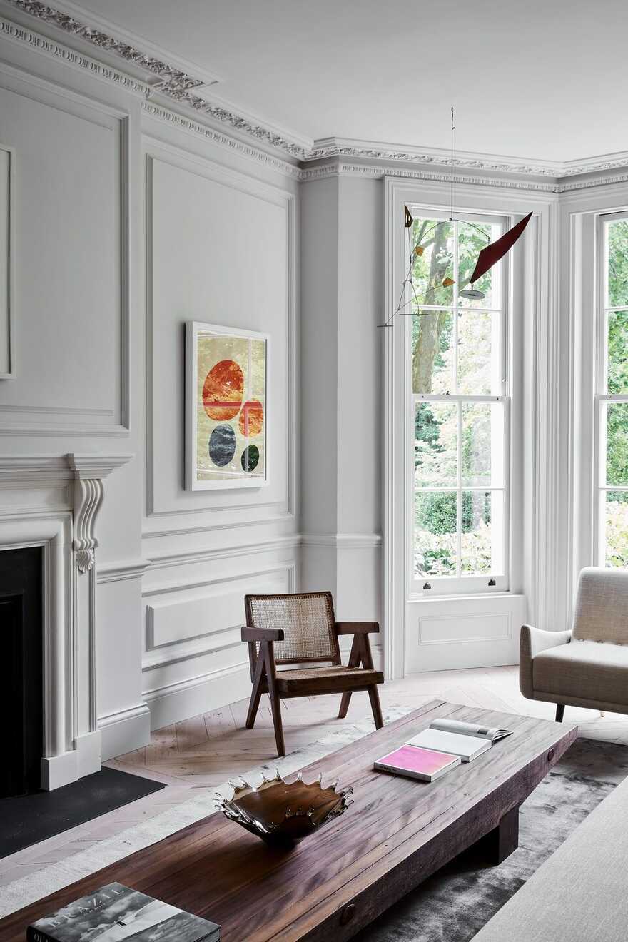
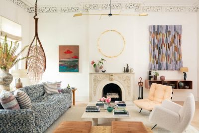
This Grade II listed 1860s residence in the Little Venice Conservation Area of London had undergone successive decades of alteration, resulting in the almost complete loss of all internal historic architectural detailing. Its restoration required the reinstatement of fibrous plaster work, internal panelled doors, fireplaces, timber floors and a cantilevered stone stair.
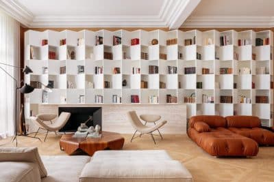
New fitted joinery of wire-brushed larch was designed within a deliberately contemporary language with its placement in the historic context deliberately ‘light-of-touch’. Bookshelves float away from walls, and a new staircase hovers above the floor. This was a strategic approach enabling a clear reading of both the building’s history and its 21st Century use.
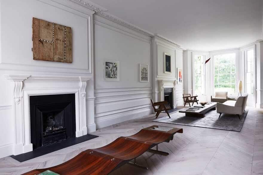
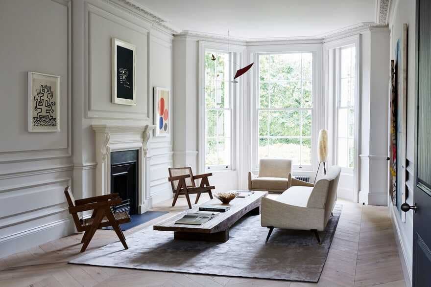
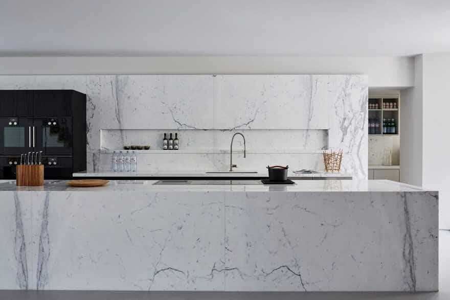
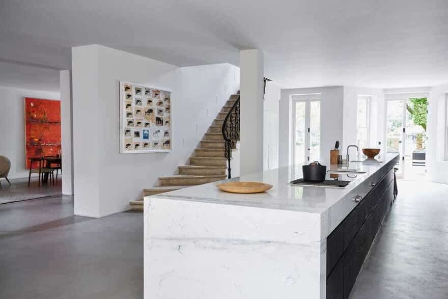
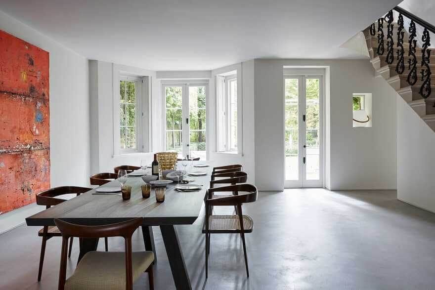
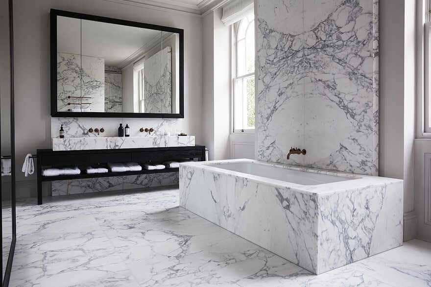
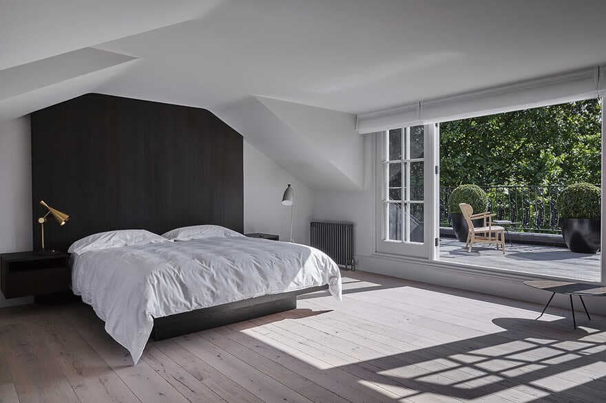
In the main reception, mid-century furniture pieces by Jorge Zalszupin and Pierre Jeanneret sit amongst art by Jean-Michel Basquiat, Keith Haring, Alexander Calder and Celso Renato. The lower ground floor Kitchen/Dining area has a more minimalist look with polished concrete floors and plain off-white walls, the centrepiece being a five-metre long marble-clad kitchen island. On the first floor is the Master Suite comprising a study, bedroom, master bathroom and dressing rooms.
The owner of the property was very specific in that he wanted an ‘open and clean’ feel to the property. As many London properties built in the 19th Century are quite narrow, he searched a long time to find two properties that had been combined. It was important to have wider rooms to properly display his art.
He wanted as few doors as possible and the rooms to ‘flow’ into one another. We had to tread a fine line between designing an ‘art gallery’ but also someone’s home and office. The client has an extensive art collection that really gave us an important insight into his taste (all modern and much of it monochromatic) and this formed the basis of our inspiration for the creation of the spaces.
As stated previously, the house had been combined into one from two existing properties, but much of the original detail had been removed. We convinced the client that it was important to re-instate this historic element to the house to honour its history. The new elements required for how we live now were inserted ‘lightly’ so that you can still easily read the difference between the ‘historic’ and ‘modern’ elements.
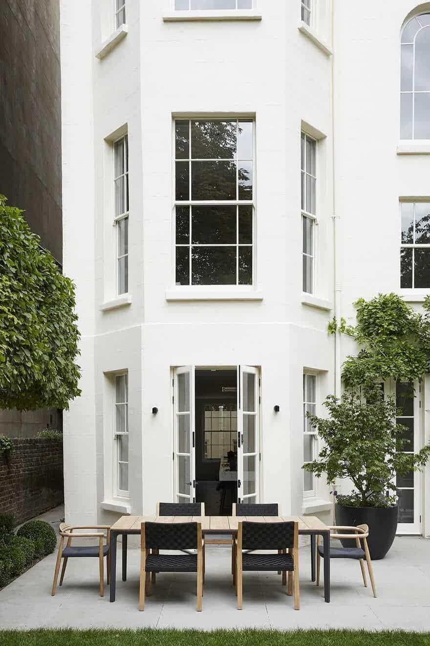
The only exception to this was the lower ground level that was extended to form the entrance to the back garden. This was done in a minimalist modern style. The artwork owned by the client is of museum quality. The Calder mobiles are probably the most eye-catching as they really work well with the height of the rooms and the simplicity of the décor, allowing them to ‘breathe’. In the lower ground floor kitchen, the central island is 8.5 metres long and clad in Statuario white marble and is quite dramatic.
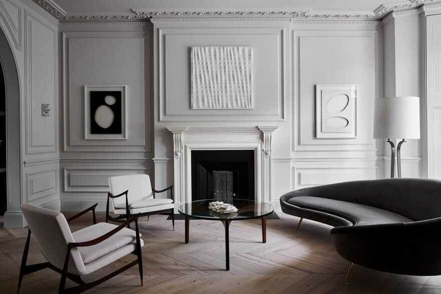
The material/colour palette for the Little Venice Residence was deliberately very limited as we did not want to compete with the art, but enhance it. All the walls were painted a grey-white (Ammonite by Farrow & Ball) and all the specialist joinery (millwork) that we designed was in Larch, which we stained black and then scoured with wire brushes to bring out the richness of the grain. By rigorously keeping to this minimal palette, we allowed the art and furniture to really ‘pop’.
As much of our work in London is in historic properties, we always seek to respect the building that we are working with. Oftentimes architects will seek to impose their will on a property by stripping out the historical features, but we believe it’s important to respect this. We very much believe in the quality of the space, and do wherever possible increase the ceiling heights, or at least the ‘perception’ of them and bring in as much light as possible.
Sometimes this is difficult with historic properties as they tend to have smaller rooms, but as with the Little Venice residence, we were able to combine rooms through the new arched openings to create that feeling of space. We tend to design to the more minimalist, restrained end of the spectrum with an emphasis on space and light and not on decoration for the sake of it.

