Project: Masná Weekend Escape
Architecture: ORA (Original Regional Architecture)
Author: Jan Hora, Jan Veisser, Barbora Hora, Klára Mačková
Custom-made furniture: CREATISA design
Project location: Masná 130, Český Krumlov, Czech Republic
Completion year: 2023
Usable floor area: 80 m²
Photo Credits: BoysPlayNice
A Word From the Owners
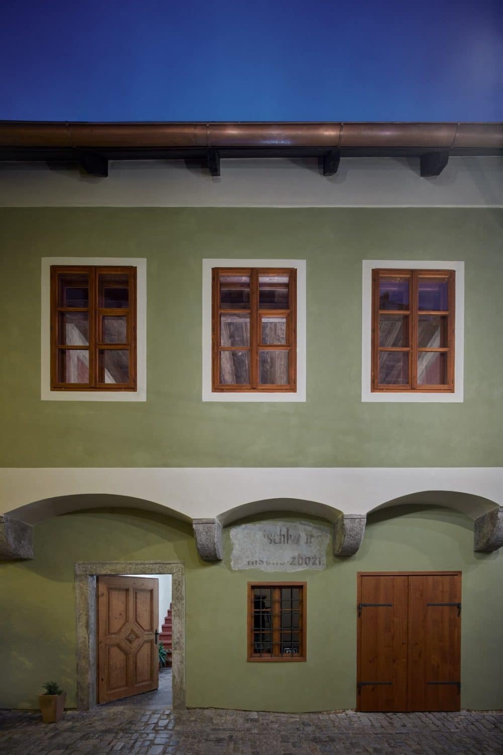
Masná 130 is a 500+-year-old house situated in the centre of Český Krumlov, a small town in Bohemia, Central Europe, and a popular UNESCO heritage site. When we bought the house in 2016, it was in a dilapidated state and had been neglected for decades. However, we saw its potential, suspecting that the neglect might also have preserved the original character of the space and its distinctive elements such as the original floors.
We only discovered gradually that taking care of even a small historical house borders on insanity. The foundations of the house were affected after flooding, it was not connected to the sewage system, the roof was in a total state of disrepair, and at the same time, the roof beams were historically much more valuable than anyone suspected. Along the way, we found out what needed to be renovated, learned to listen to the house, and acquired several old craft skills ourselves.
We wanted to preserve as many historical elements as possible, but at the same time wanted to update the house to reflect contemporary life and complement the historical interiors with something that characterizes us – a love of contemporary design and a minimalist style. We did not want to create a historical “museum” interior, nor a design showroom, we wanted to organically connect the historical and contemporary layers. The architects from ORA studio share the same philosophy in their approach to historical renovations and therefore, were the perfect choice for this project.
During the first two years, we renovated the ground floor with the aim of renting it out as a cafe. We ended up opening the cafe under the name Masná 130 by ourselves, even though we had no experience in running such a business. We then continued with renovating the next floor, knowing that for the sustainability of the project, it would also be used for business, but we did not want to divide it into several hotel rooms. We decided to keep the layout almost intact, as it was inhabited by generations before us and we would eventually like to inhabit it ourselves.
The concept of Masná Weekend Escape caters to the “slow” visitor of the city. The cafe on the ground floor has become a lively meeting place in its five years of existence. We aim to develop the local community, organizing neighbourhood street festivals with live music, and we look for opportunities to cooperate with nearby businesses and destination organizations of the city. The apartment we consider our home and only occasionally rent it to guests who want to enjoy the combination of old and new. We think a lot about sustainability and the burden that over-tourism places on the city. We seek a healthy balance.
A Word From the Architects
From the start, we were intrigued by the investors’ approach and enchanted by the atmosphere of the house. We personally know the feeling of falling in love with an old house and settling in it. This process includes struggles and revelations, as well as attuning to the whims of the place. Old houses are often moody. The assignment was to redesign the first floor of the house for housing and only occasional rental. The design therefore mirrors the lifestyle of the owners.
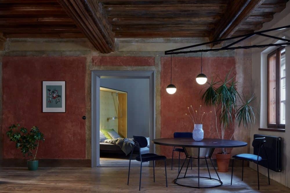
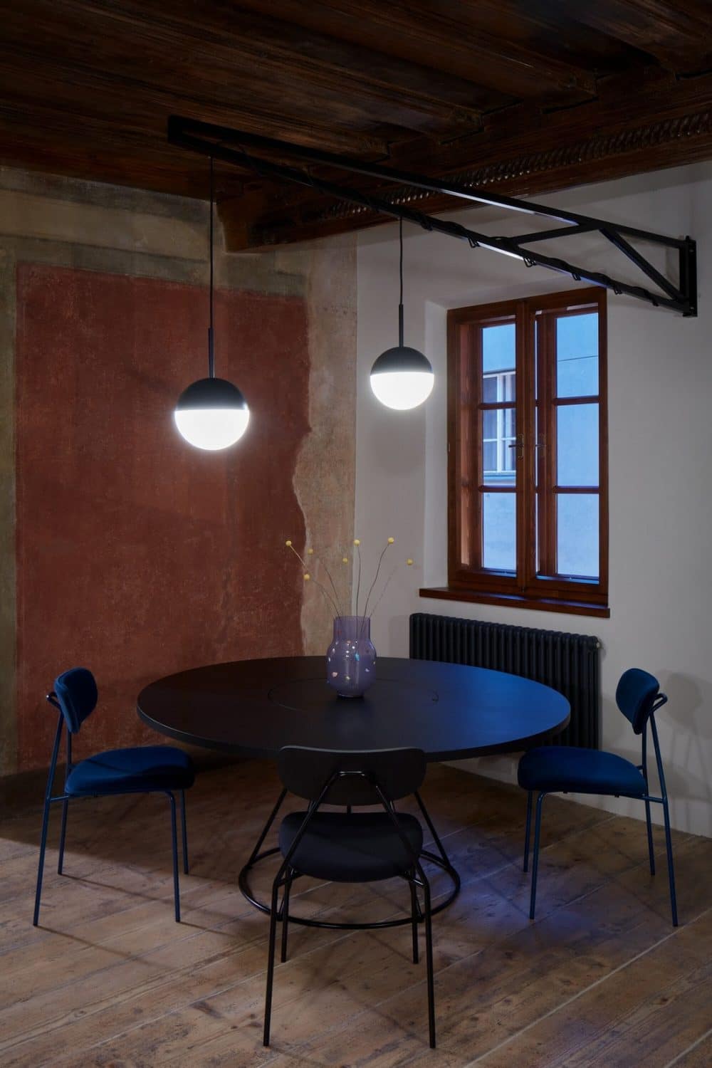
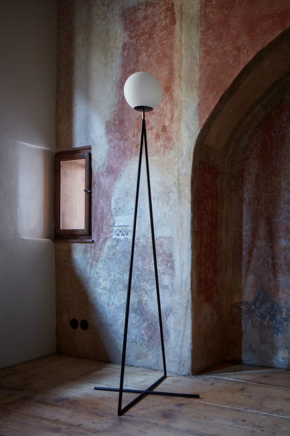
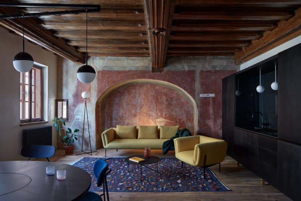
The goal was to preserve and reveal the historical origins of the house. The apartment is dominated by the main living space, a salon with a carved wooden Renaissance ceiling. The room was divided by a partition at some point in the past. This dividing wall was demolished to free the original space in its entirety. The original wall paint was uncovered and it revealed a deep crimson colour. The determining factor here is the darkness of the surfaces. The wood beam ceiling and the walls feature dark, saturated tones. A dark space embraces people, and it creates an atmosphere of closeness when compared with a light one.
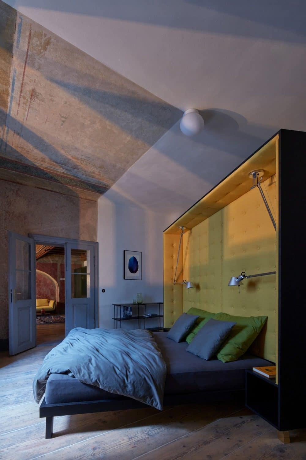
The second space is the bedroom, where only a fragment of the original complicated painting on the ceiling is revealed. The rest of the space is made calmer by using a cream colour for the walls.
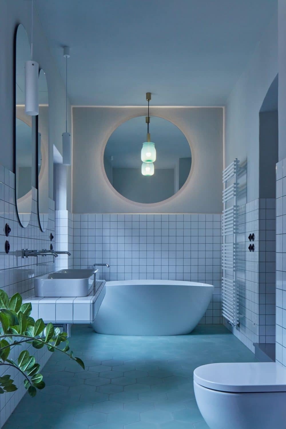
The third, but no less important room, is the bathroom. It is the lightest space in the house and because of this, cool colour tones were chosen. The atmosphere of the salon is solemn, whereas the atmosphere of the bathroom is uplifting.
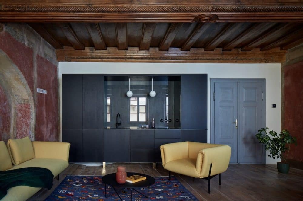
The interior design is approached as a collage of motifs. The furniture is inserted into the historical space in the form of separate objects that create distance from the historical elements. The kitchen is like a cabinet that hides everything you need. The bed, connected to the wardrobe, stands in the middle of the room and is turned towards the light and the original ceiling painting. The sleeper is directed to explore the details of the surface. The bed is not only a place for sleeping but also for reading. This is made possible by lamps installed specifically for this purpose.
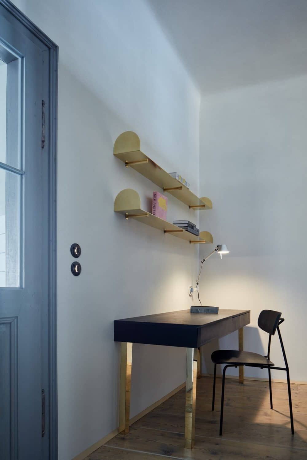
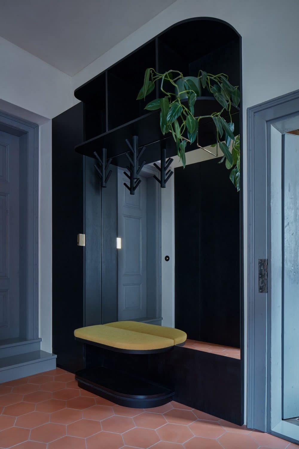
Most of the furniture is custom-made from dark stained birch plywood, the brass legs mirror the surroundings, blend in with it, and also support the spatial separation of objects. The lamp above the table is mounted on a bracket so that the historical ceiling is left untouched, a table has integrated bowls ready for a feast, and brass shelves display books.
