Project: McDonald’s Innovation Center
Architects: Studio O+A
Team: Primo Orpilla, Mindi Weichman, Alex Bautista, Elizabeth Vereker, Paulina McFarland, Kaylen Parker
Location: Chicago, Illinois
Year 2019
Size 16,410 sq ft
Photographer: Garrett Rowland
Every MBA knows the value of a detailed business plan, but a successful business profits, as well, from its detours. The discovery you wouldn’t have made if you hadn’t left the main road is of special value to companies that have been on that road for decades. Many years ago McDonald’s built a detour into its creative infrastructure. This special facility for experimentation became a source of new products, new processes, new thinking that have kept the company at the top of its industry through a period of epochal change. After Studio O+A partnered with McDonald’s on a new corporate headquarters in Chicago’s West Loop, it turned to the Innovation Center for a similarly fresh look at the spaces where fresh looking is the principal activity of the day.
Wherefore Art Thou, Romeoville?
Romeoville, Illinois is a suburb of Chicago known primarily as a shipping and warehousing hub. Since 2001 it has also been home to McDonald’s Innovation Center, a sprawling complex that serves as the company’s operational test facility. New equipment gets put through its paces here. New kitchen processes are rehearsed and fine-tuned. It’s a space dedicated to keeping McDonald’s at the forefront of innovation, but the center itself hadn’t had a refresh in almost 20 years.
Breaking Down Barriers
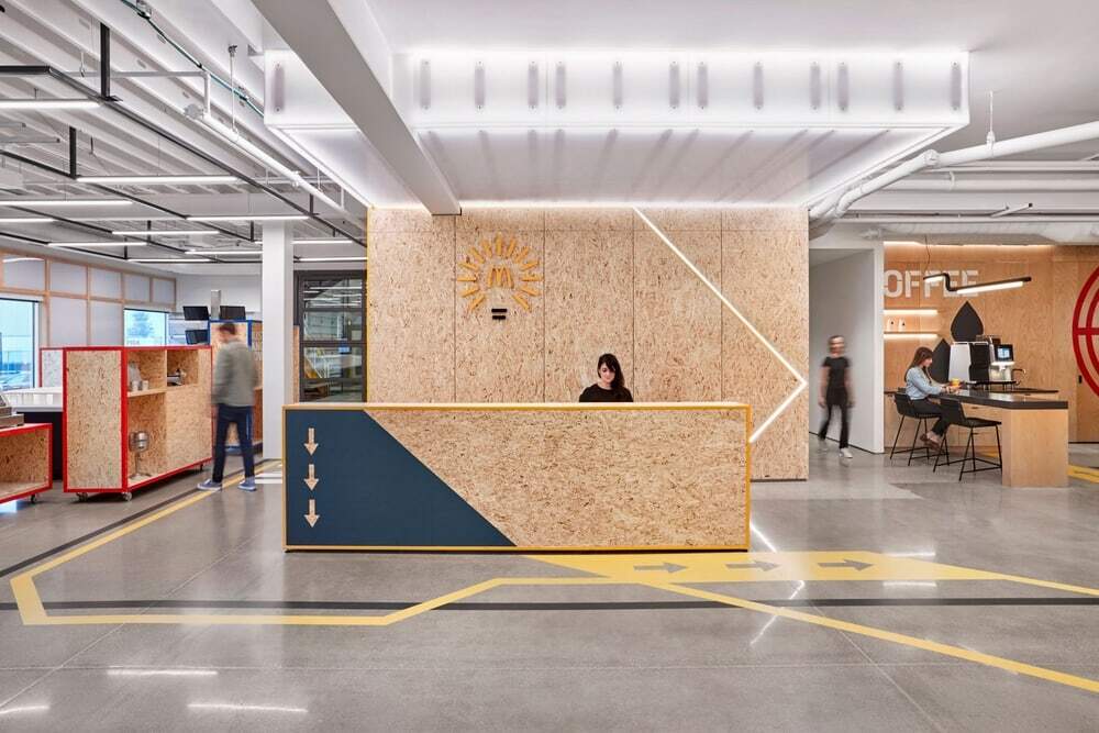
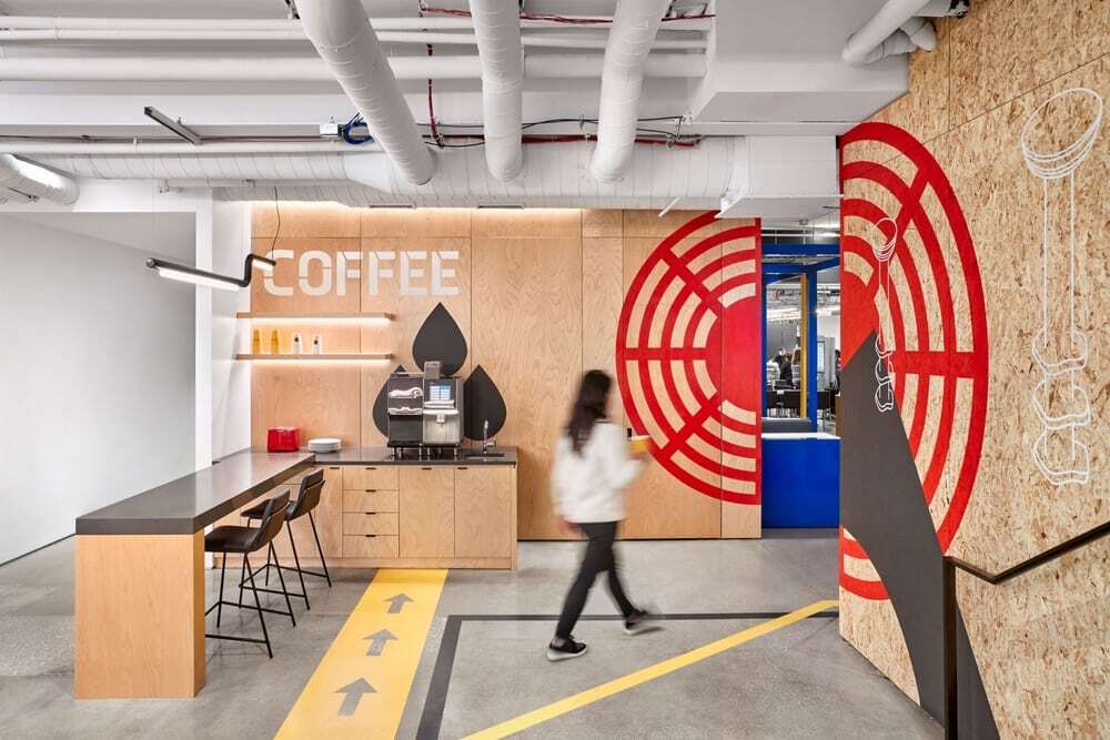
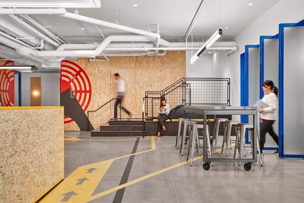
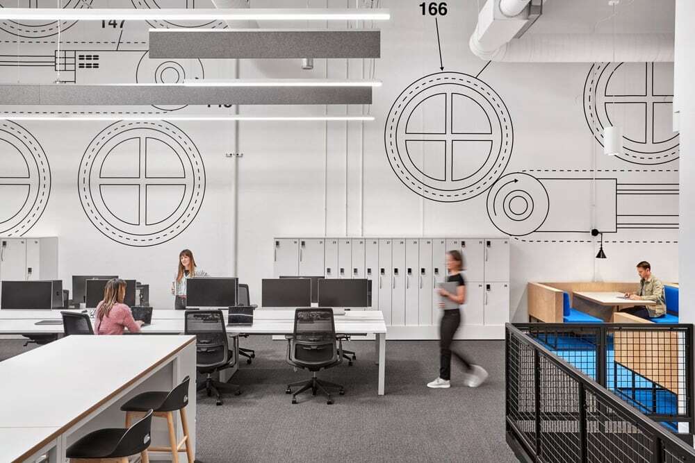
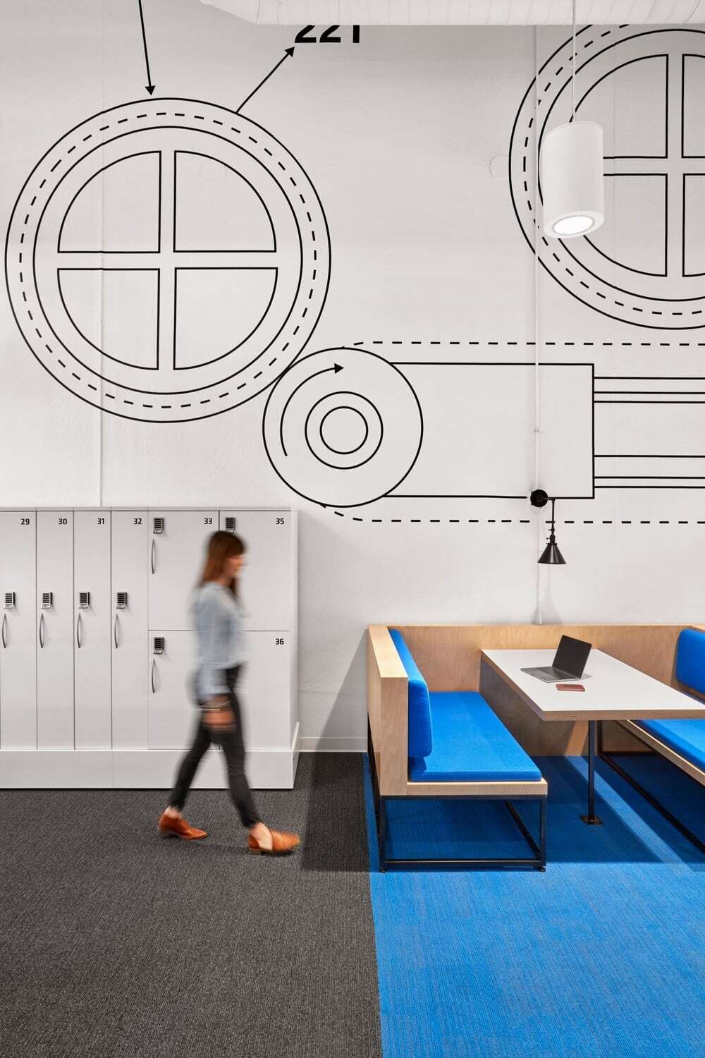
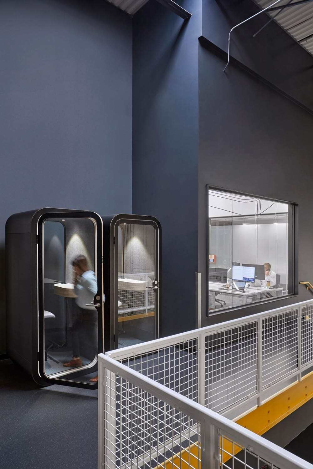
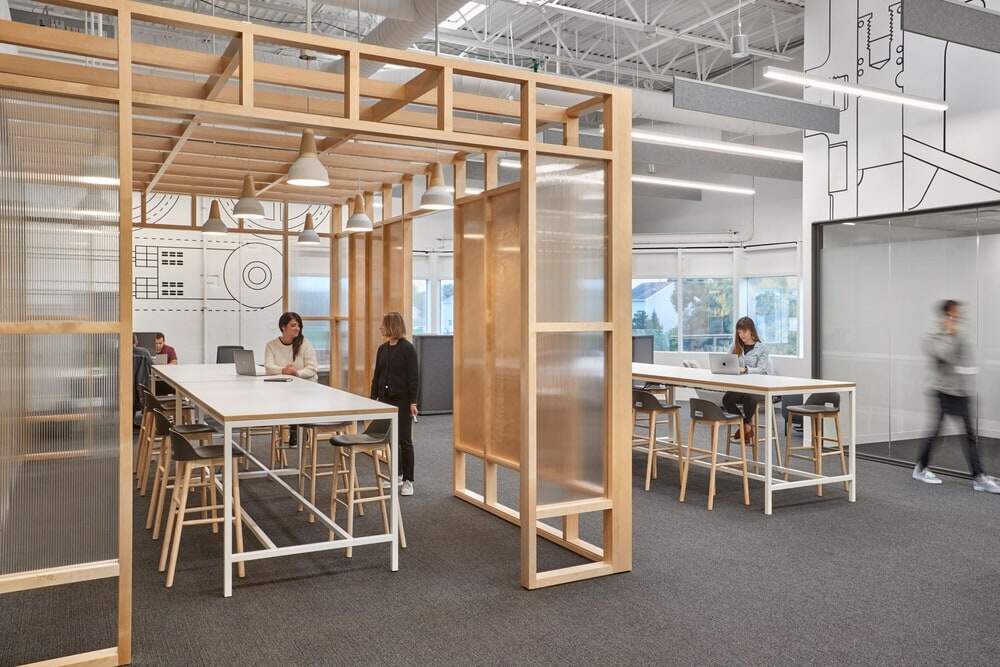
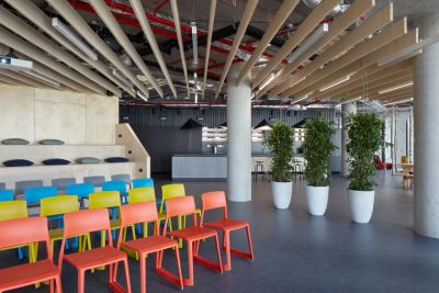
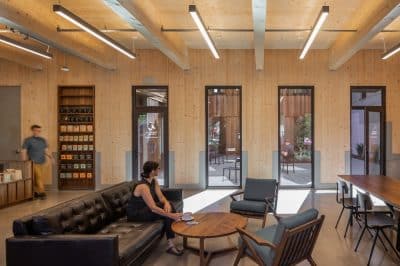
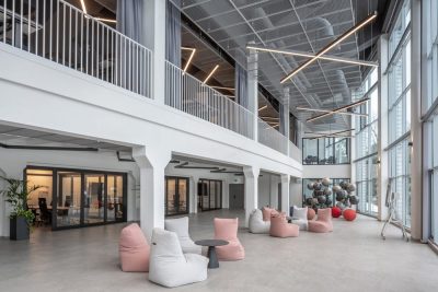
O+A’s first challenge was to pull out the improvised panels and black foam core that had turned the space into “a maze” and create the clear sightlines and uncluttered contexts that visionary work demands. But the barriers removed were not just physical. Over the years it had become the Center’s custom to keep kitchen and office operations separate and their respective staffs apart. The new Center encourages interaction in a shared café, gallery space and phone mezzanine and projects a welcoming brightness everywhere.
The Country Room
When McDonald’s teams from other countries come to the Innovation Center to test drive a new menu, logistics technology or kitchen configuration they need a temporary Central Command. In the old space that was a conference room in a corner far-removed from the kitchen. O+A’s design repositioned it to an area directly adjacent to the action and equipped it with custom pivot doors that allow visiting innovators to run back and forth. Despite the noise of a busy professional kitchen, those doors are almost always open.
Lightbulb Moments
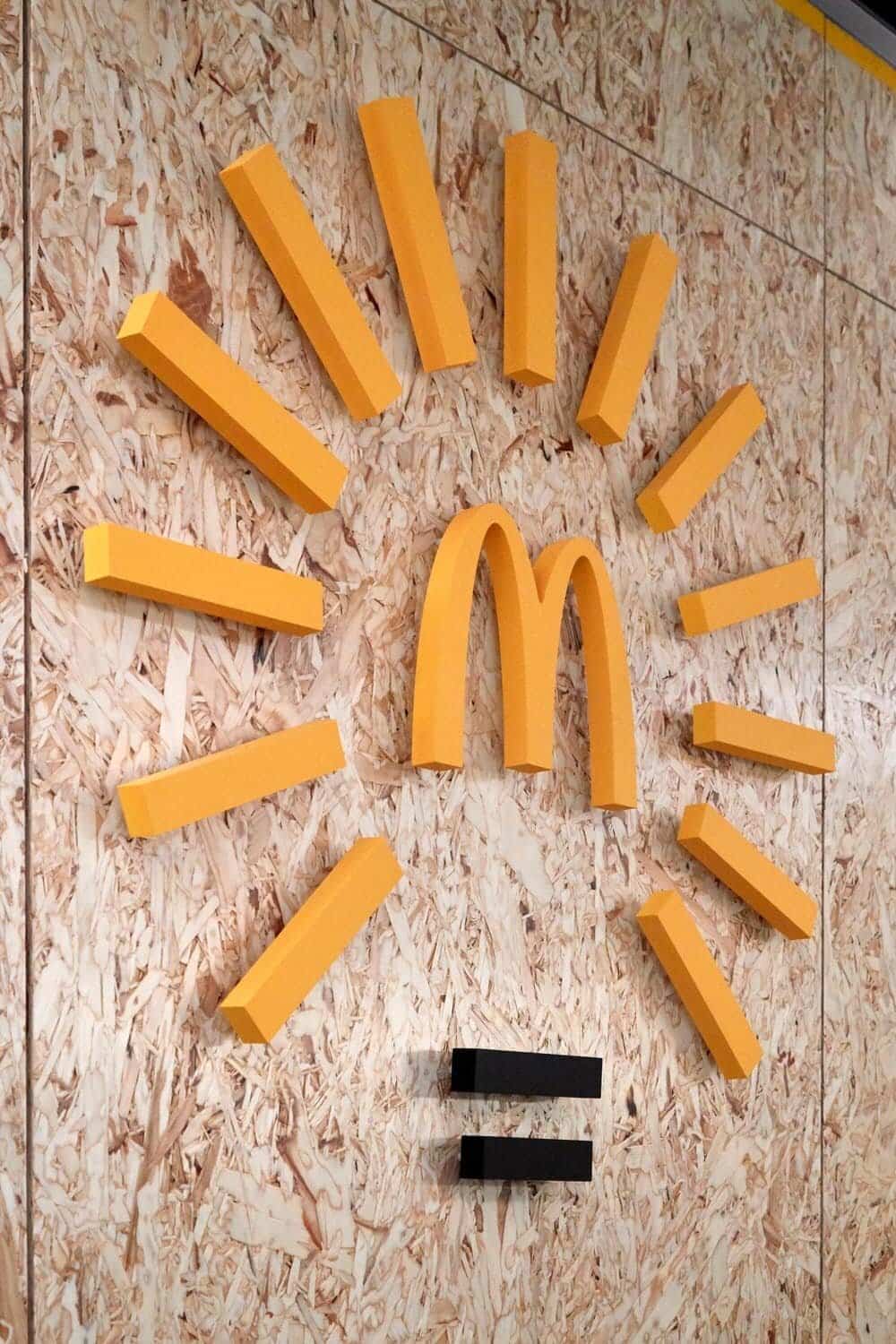
For all the ingenuity the Innovation Center has brought to McDonald’s global operation, until now it has never had its own brand logo. O+A graphic designer Paulina McFarland devised a symbol that answered the client’s preference for “a lightbulb,” while suggesting illumination specific to McDonald’s. Surely one of the most remarkable things about this Innovation Center is how successfully, over many years of practice, it has steered creative thinking through the golden arches, how it has made McDonald’s a consistent source of invention and an always relevant leader in its industry.

