Project: Microsoft office campus
Design: Design Blitz
Location: San Francisco, California, United States
Date completed: November 2016
Size: 35,000 square feet
Photography: Cortez Media Group
Located in San Francisco’s mid-market neighborhood, 1355 Market Street is a landmark office building. The project co-locates several of Microsoft’s diverse product teams within one building allowing the site to serve as a vertical campus. Various project teams are mingled together across the multiple floors in order to enhance collaboration while dedicated team zones create an opportunity to showcase the unique brand identity of each individual product group. As part of this real estate strategy, Microsoft took over a 32,800 square foot sublease space on the building’s 4th floor.
One of the key challenges for this project was balancing the constraints of the existing buildout with the Microsoft global workplace standards. With an accelerated schedule, many of the existing architectural elements were required to remain in place. Additionally, the user groups required a flexible and adaptable space that could quickly expand and contract workstations based on mobile team relocations and headcount variances.
To meet these project challenges design team developed a neighborhood concept focused on breaking the space up using flexible furniture. Construction of specialty items was limited to high impact areas social hubs like the cafe and cafe-inspired lounges located in high traffic zones.
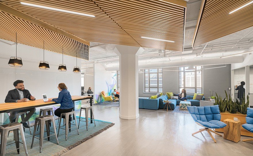
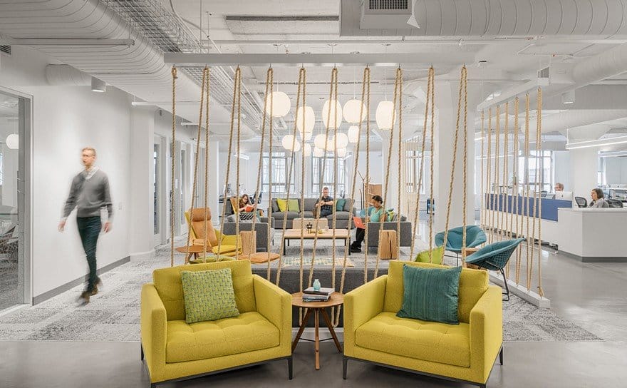
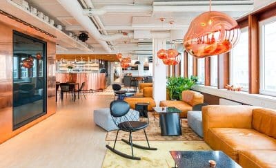
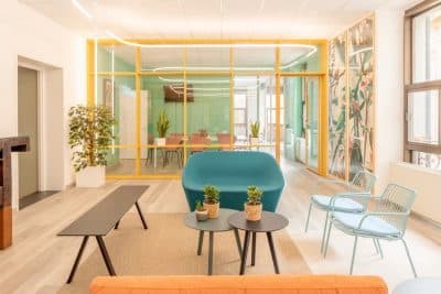
The lounge and cafe spaces act as insertions of color, texture, and pattern across the various social spaces. Users and visitors alike are enticed to explore the layered detailing of the space.
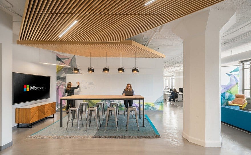
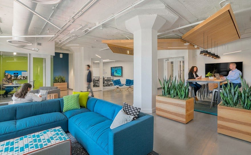
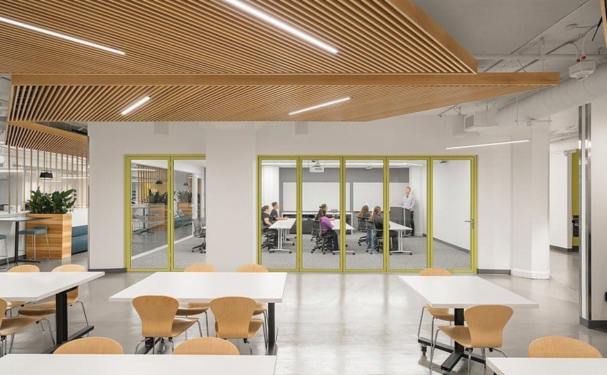
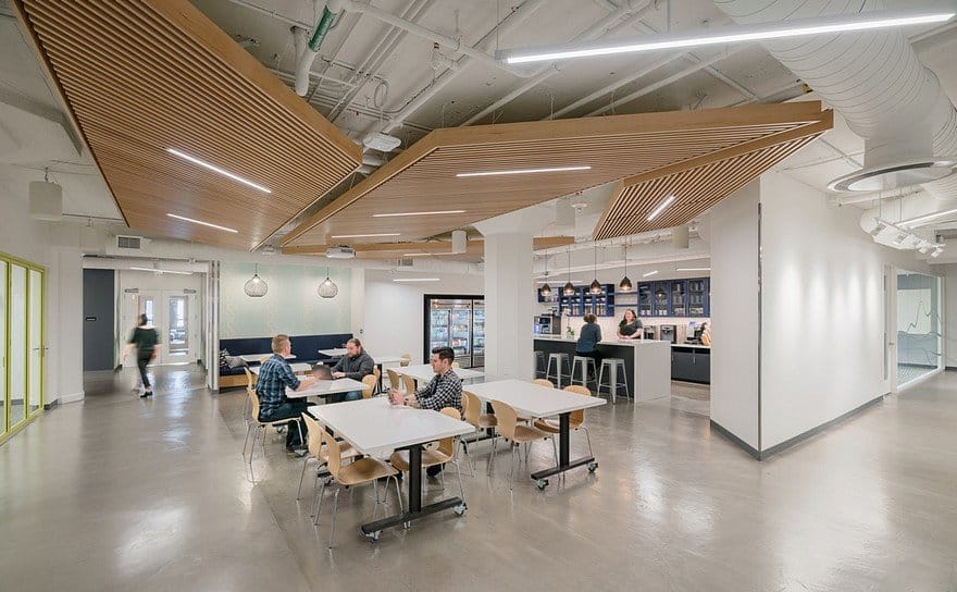
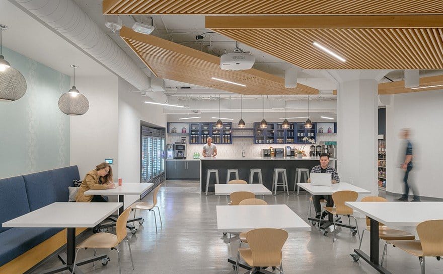
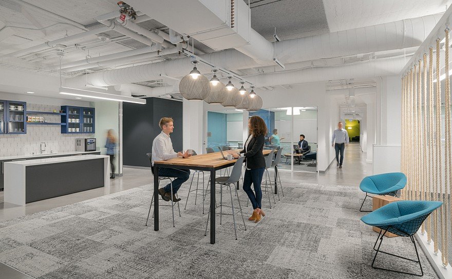
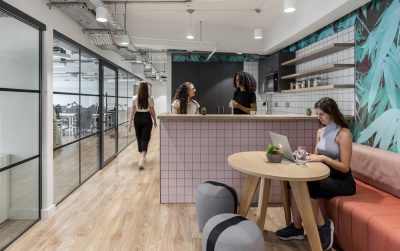
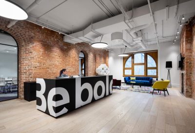
Without a formal reception, the 4th floor pantry serves as the entry point for the floor and is the central “main square” for the office. Designed to be high activity spaces, the pantry provides a welcoming first impression for employee and visitors. It also serves a dual function as an event/all-hands space for the 4th floor teams as well as a comprehensive snack and coffee resource for the entire Microsoft office campus. The pantry utilizes flexible tables on casters that allow the space to easily transition from lunchtime activities to informal office gatherings and social events. A large multi-purpose meeting room adjacent to the pantry supports ongoing staff education and product demonstrations. A folding glass wall allows the meeting room to open up to the all hands space for larger presentations.
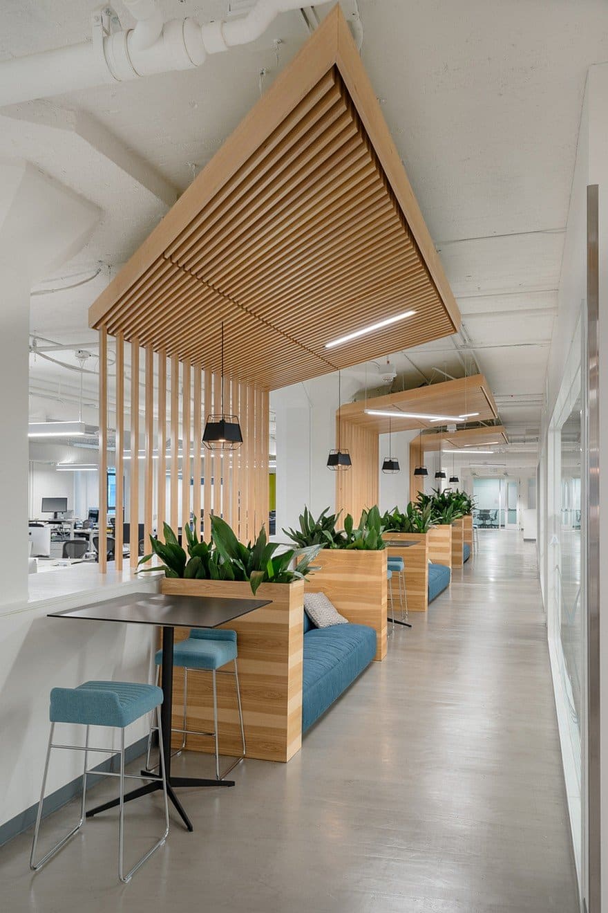
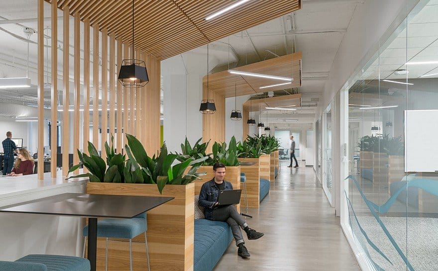
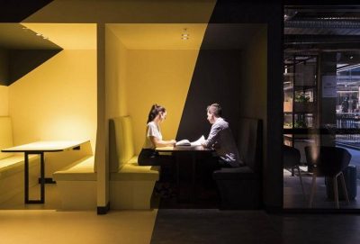
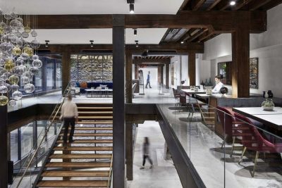
Adjacent to the main pantry space, booths with wooden slat canopies flank conference rooms to serve as impromptu casual meeting space and create a landing zone for people coming and going into meeting rooms. Also, this area provides additional seating for the adjacent cafe. The ceiling was designed as an extension of the existing ceiling elements in the cafe and to provide the sense of enclosure and intimacy. The wood slat wall extending from the ceiling elements provide visual separation from the perimeter workstations while maintaining daylight access in the central conference rooms.
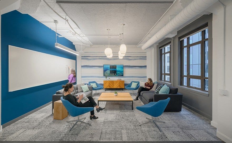
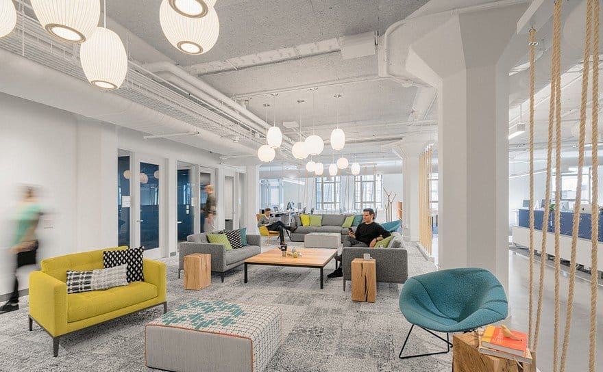
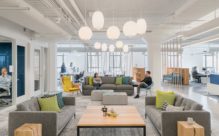
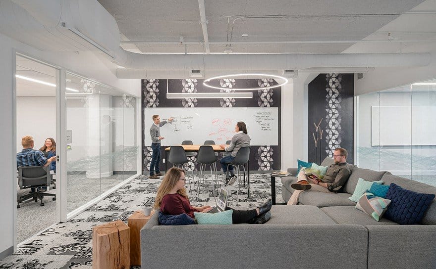
The design celebrates the Microsoft guiding design principles with a specific focus on tactile experiences; creating moments of exploration and discovery; and a focus on creating open spaces for people to perform heads down work. To physically manifest these values, the design team developed a varied design that combines vibrant colors, textural fabrics, and graphic wall coverings layered against a modern and sophisticated backdrop. Lounges, anchored and the ends of the open office, each possess a distinct graphic quality that serve as visual landmarks to orient the user within the space while also adding an added layer of human touch.
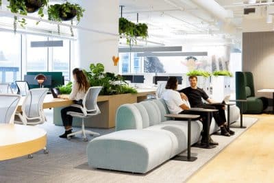
The lounge zones are identified within three separate work typologies. The primary zones, called “The Square” serve as central informal meeting areas for active collaboration. Secondary “Cafe Corners” are inset within the open office spaces to provide informal, communal focus spaces directly adjacent to workstations. The third “Library” zone is an informal touch down space for heads down, uninterrupted focus work. The Library zones are similarly located next to the workstations but are designed to provide workspaces that function as quiet, heads down focus areas within a more casual setting than an enclosed conference room. The zones serve as visual anchors within the space that instantly root and orient the user in the workplace. Selective wall and ceiling treatments, floor patterning, and lighting layouts create a clear visual distinction of spaces from the rest of the office.

