Project: New Duplex Apartment
Planning & Design: Nitzan Horowitz
Contractor: HBS – Shai Sinai and Yechiel Bitton
Area: 250 sqm
Location: Central Israel
Photography: Oded Smadar
A brand-new duplex for a small family was designed to give each family member its own space. The designer’s focus on natural elements and materials helped create tranquility and complement the mesmerizing sea view visible from the property.
The new duplex apartment, planned and designed by Nitzan Horowitz for a couple and their grown son, incorporates unusual combinations of natural materials in their raw form combined with other ultra-modern clean elements that complement each other and create a unique and unusual space.
This is a peek into an experiential living space, abundant in contrasts that co-exist in perfect harmony, a cleverly partitioned space that displays surprising materials throughout the property.
The new duplex apartment was purchased by the couple just before the construction was completed. Immediately thereafter, they embarked on an extensive renovation. The 250 sqm property that originally contained 7 bedrooms across two floors, was entirely redesigned. The result, a 4-bedroom spacious and well-lit open duplex, with the entire second level solely dedicated to the couple’s grown son.
The 160 sqm entry-level includes a large living space that is divided into a TV corner, a reading area, a well-equipped kitchen with a hidden pantry, a safe room that was converted into a gym, a guest room, a bathroom and a 60 sqm master bedroom. The top floor, circa 60 sqm, “a kingdom” designed for the couple’s 20-year-old son, is an open space that includes a sleeping area, a bathroom, an entertaining area and study corner. In addition, he enjoys a 60 sqm west facing private balcony overlooking the sea.
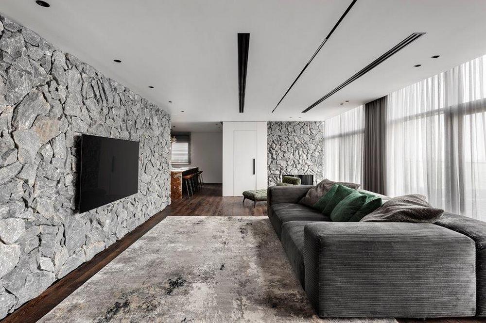
“The owners have exquisite taste”, says Horowitz. “They are goal-oriented and knew exactly what they wanted ahead of the renovation”, he explains. Horowitz, who is responsible for the planning and design of the apartment, says the family wanted to create a living area that was reminiscent of a European skiing village. “The owner is an avid nature lover, and it was important to her that we incorporate natural elements in their raw form. From the first planning stages, we discussed the incorporation of natural stone. The couple sent me some beautiful pictures that served as inspiration for the way in which we incorporated the basalt stone walls, imported from Greece, in a variety of ways throughout the property”, he explains.
“Upon completion of the project, it was evident that we were successful with the choice of material that was incorporated in just the right amount around the property. This essentially created unusual combinations and textures that blend together harmoniously. We see the stone incorporated in a variety of places across both levels, and it is the key theme of the property’s story”, says Horowitz.
He then adds: “The portfolio of materials, in general, is minimalist and based on stone and sandblasted rough-finished natural wood parquet. Both materials have an authentic and raw look which works beautifully in combination with the clean and minimalist surroundings. The idea was to create encounters between these materials throughout the property. Materials with real presence that work simply beautifully with the clean modern materials”.
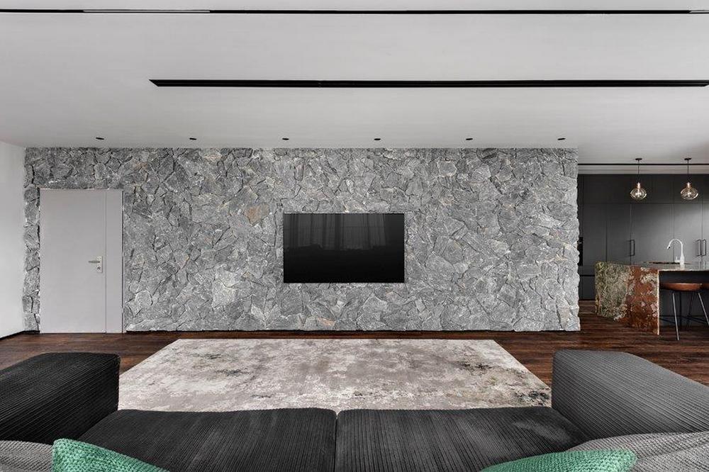
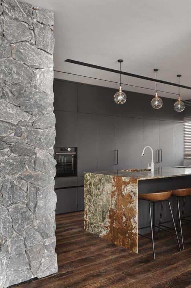
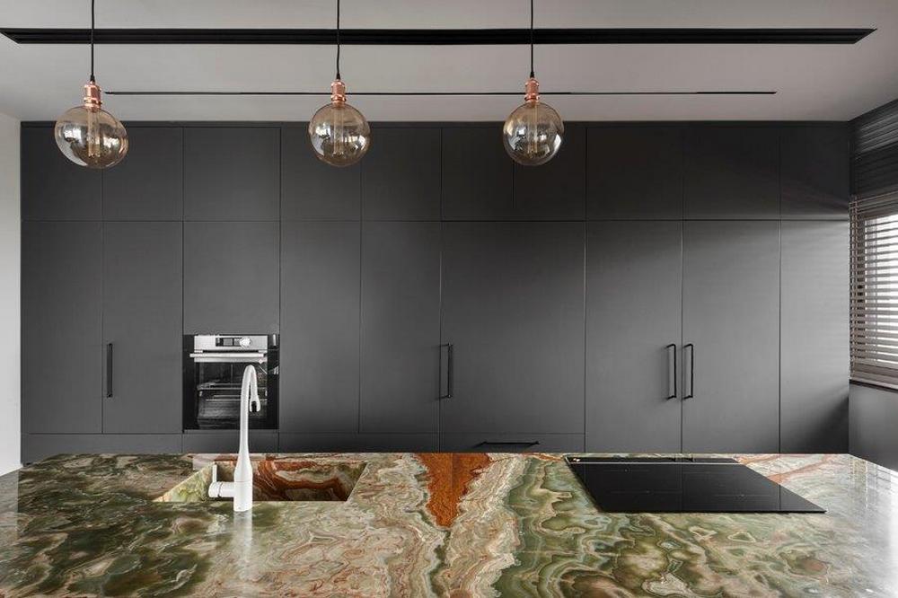
“The entrance reveals two main elements, a dominant 9-meter stone-cladding ‘power wall’ and a large north-facing window that drenches the open space in an abundance of natural light whilst keeping out direct sun rays – which is a big advantage”, explains Horowitz. “The entrance wall connects the TV corner, in which a large 4-meter cozy velvet sofa was positioned, with the kitchen that includes graphite-gray nano Formica laminated floor-to-ceiling cabinets that conceal a variety of kitchen appliances, ample storage space and the pantry door.
Wild onyx stone cladding covers the kitchen island, making it a very dominant piece that blends well with the colors and textures of the stone and wooden floors.
Continuing from the TV corner and across from the lounge is a reading area, which includes a wool Chesterfield chaise-lounge and a coffee table of the same onyx stone as the kitchen island.
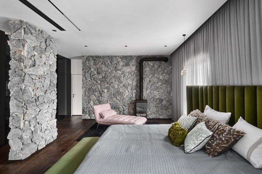
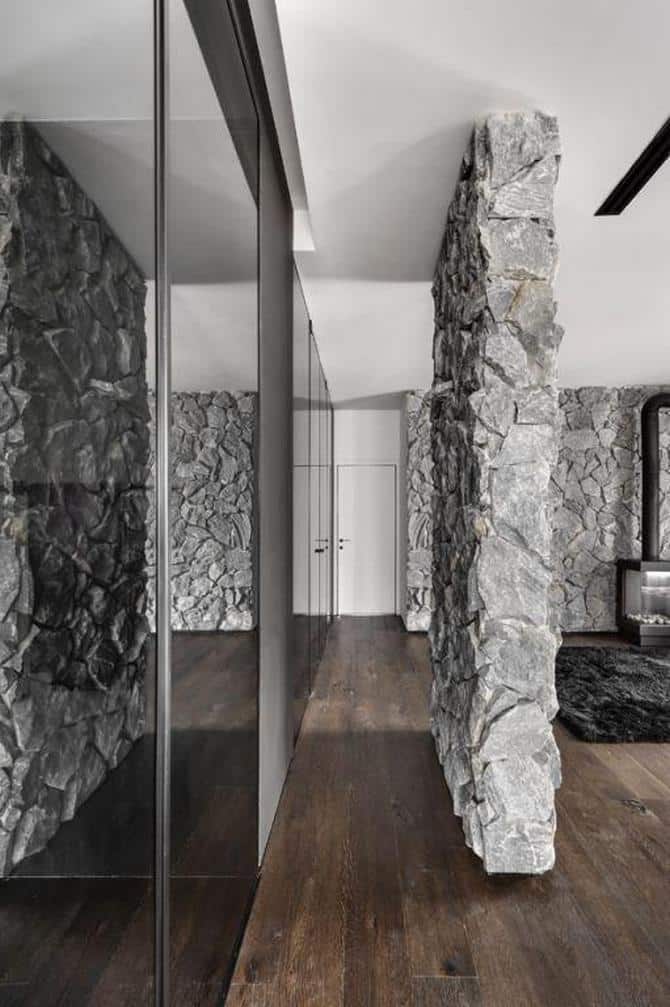
The stone wall includes a fireplace and further along a hidden door conceals the entrance to a safe room turned fully equipped gym.
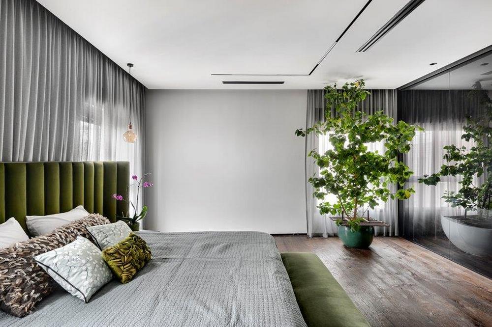
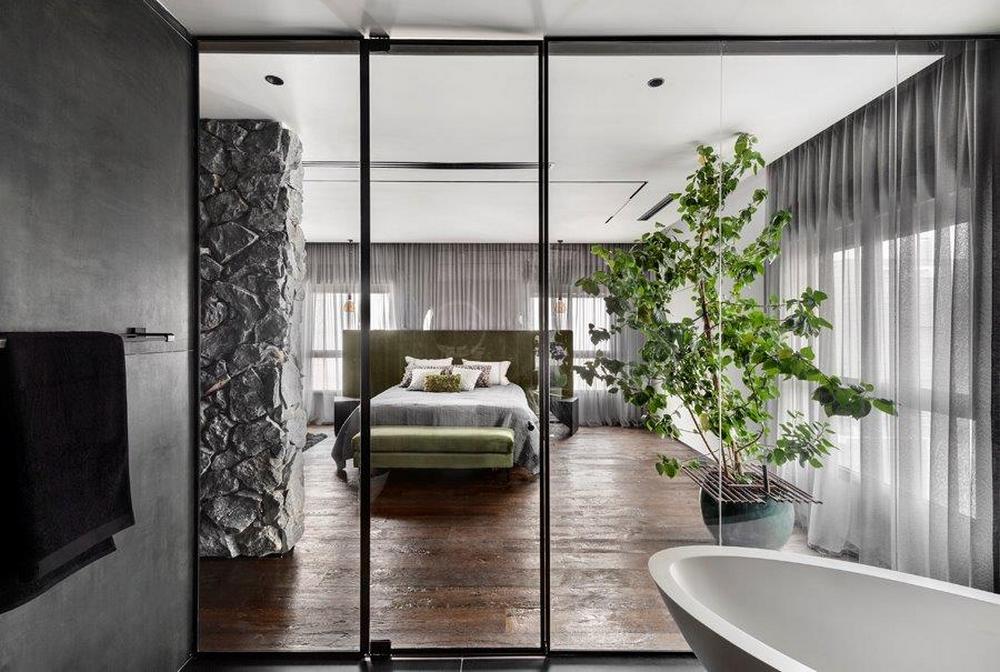
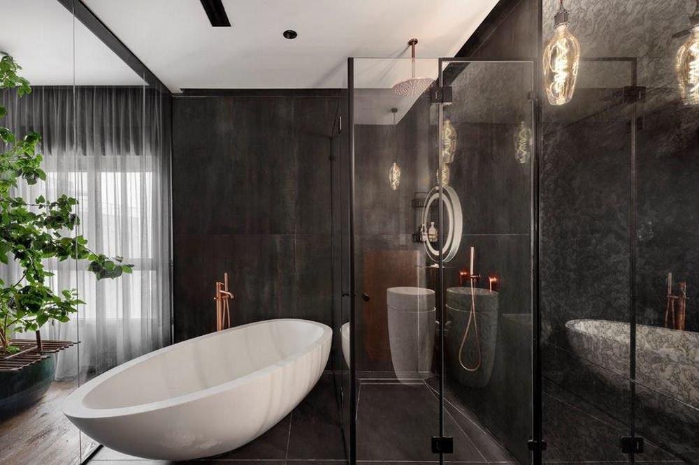
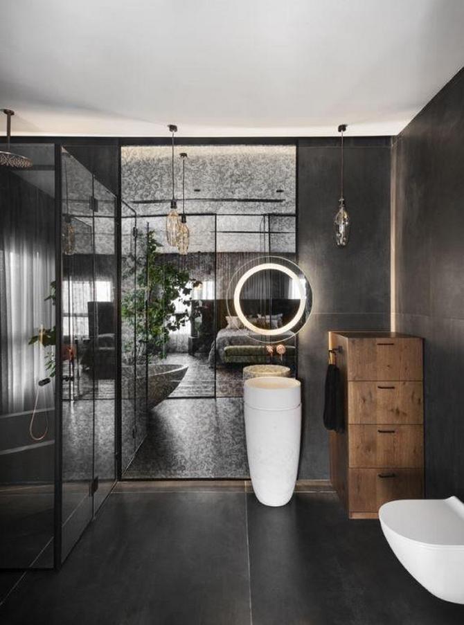
A corridor leads to a spacious 55 sqm bedroom. Prior to the renovation, this space included 2 bedrooms, a bathroom, and a family room. “We were able to create a spacious area where all features were fully addressed. The walk-in wardrobe is spacious and includes an elegant u-shaped piece of furniture. The bathroom is unusually large and includes an oval free-standing bath and sink designed to soften the straight lines dominating the space, a walk-in shower, and a smokey floor-to-ceiling mirror that adds reflection and a touch of uniqueness to the space. Concrete-style granite porcelain cladding covers the walls. The bedroom itself was divided into two areas – a sleeping area and a lounging area adjacent to the fireplace wall” adds the designer.
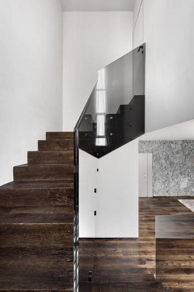
The staircase that leads to the son’s level is also unusual. Horowitz chose to remove the original stairwell and replace it with a clean geometrical glass banister in shades of grey and wooden flooring was installed on the stairs. The second level was also planned as an open space with well-defined features. “The materials used in the first level continue into the second level. These are dynamic and intense materials that blend really well across the second level and are emphasized by the color scheme, the use of grey woodwork and textures that work well with the natural materials”, Horowitz adds.
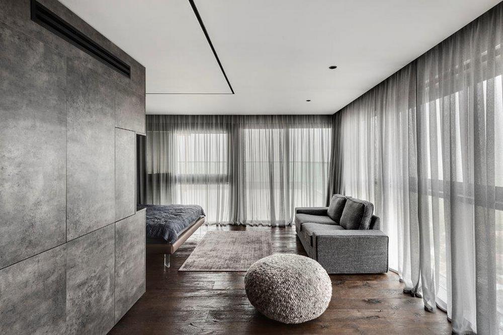
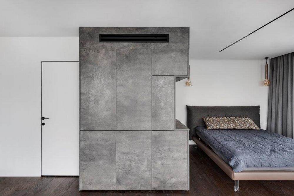
In order to create a partition between the sleeping area and the bath area, Horowitz created a multi-functional piece that incorporates multiple storage areas as well as a video/audio unit. The unit is Formica laminated in a grey shade that matches that of the stone wall and the overall natural concept.
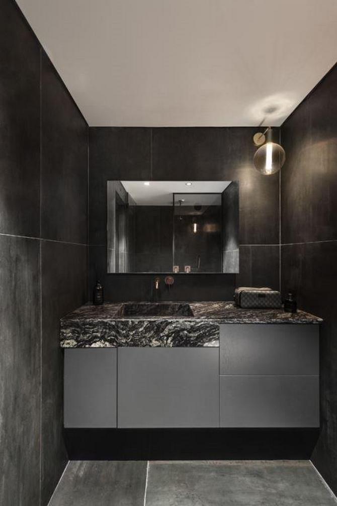
Similar to the bathroom in the first-level master bedroom, Horowitz chose basalt granite porcelain cladding in the second-level bath area too. A natural granite stone and Formica laminate were used for the bath area cupboard and fitted in a unique composition, so they look almost as though they are blending into each other.
