Project: Nutrino Workspace
Design and Planning: Sarita and Ron Peled of ECHO DESIGN Studio
Company: Nutrino, specializing in personalized health programs
Location: Tel Aviv, Israel
Area: Approximately 300 sqm
Photography: Shai Gil
Welcome to the dynamic and colorful workspace of Nutrino, an Israeli-American company specializing in tailored health programs for diabetes patients, promoting healthy living and a healthy body. Sarita and Ron Peled, owners of ECHO DESIGN Studio, were assigned the task of creating an inspirational work environment that reflects the company’s DNA and values. This is how the impressive workspace looks from within.
In recent years, workspaces around us have been meticulously designed to an unprecedented level, where both company owners and designers give importance to diverse design concepts and elements that encourage creativity. This is also the case for Nutrino, which provides nutritional recommendations for various medical conditions, including weight management and diabetes.
Sarita and Ron Peled, known for their distinctive design signature in residential and workspace design, were entrusted with designing the company’s new office space after its growth and expansion, along with new employees joining the company.
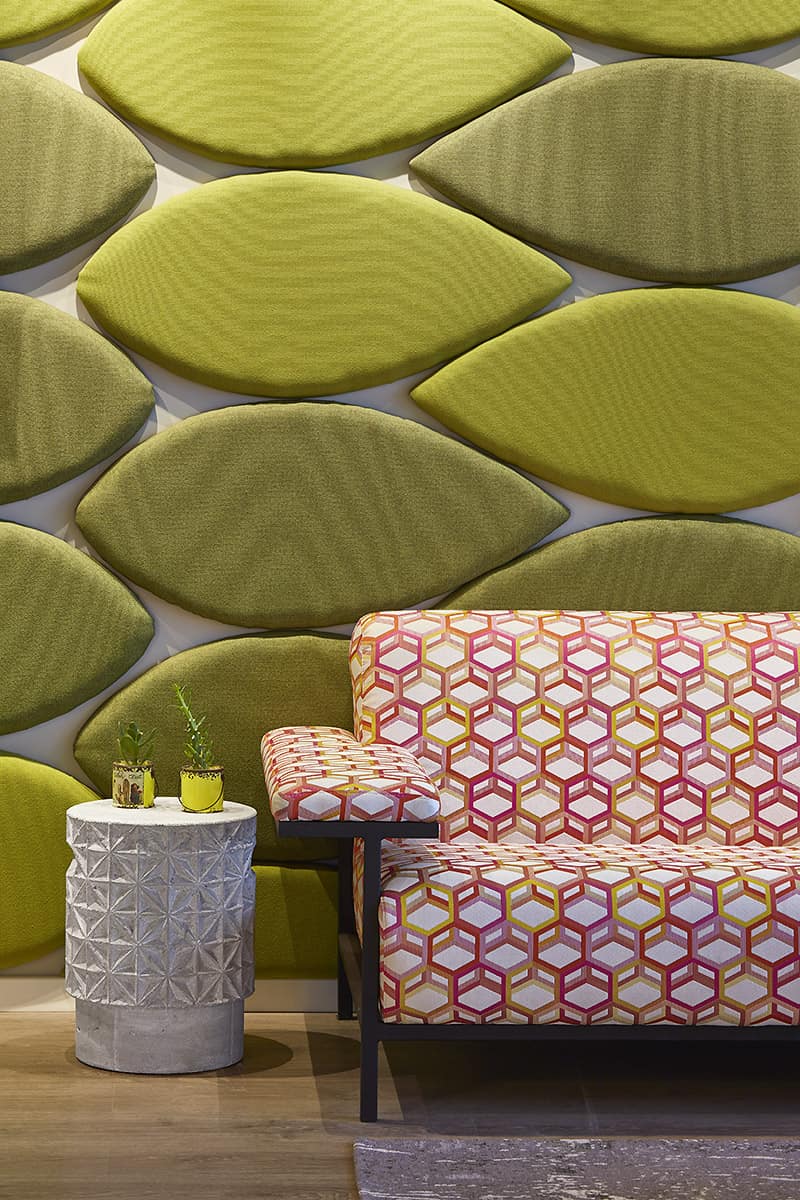
“While the company is managed by managers in their 40s, the majority of the employees are young people in their 20s. Their request was to create a workspace for 30 people – a young, dynamic, and colorful environment that would be inviting and pleasant, just like a private home,” explains Sarita Peled. “As part of the design concept, we explored symbols from organic and plant worlds. It was clear to us that the office needed to convey the freshness of ‘sowing wheat’ and the clarity of materials, so that anyone entering the office would feel lightness, airiness, and above all, comfort.”
“Despite a tight budget and tight timelines, we created a space that precisely meets their needs and aligns with the company’s DNA. We planned a separation between the dining area, workspaces, and meeting rooms. When guests arrive from abroad, the office maintains its organized and dignified atmosphere, while the remaining open space remains pleasant and vibrant for work and vitality.”
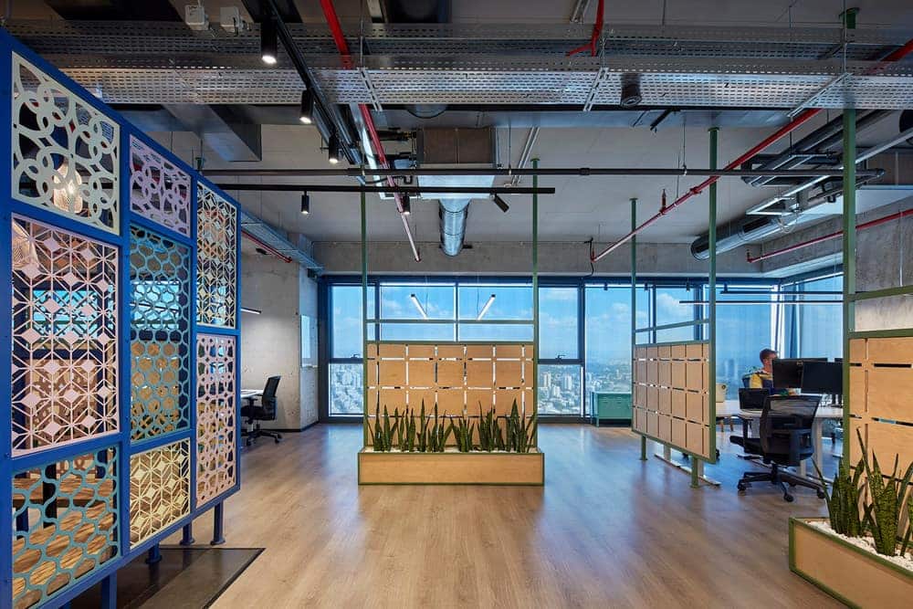
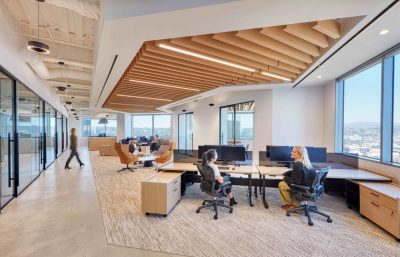
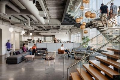
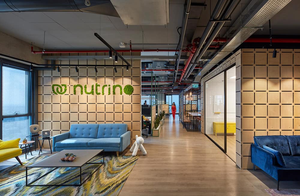
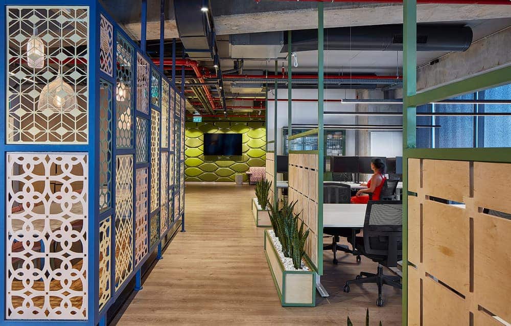
The designing duo received the office space in a bare state, with exposed ceilings, visible beams, and construction elements scattered throughout the space. “We chose to leave the ceiling exposed, as well as some of the beams and columns, which we kept in their original form as exposed concrete. They balance the colorfulness and introduce a slightly industrial look,” explains Peled. “As part of the furniture plan, we focused on creating an open and airy space, and we designed adjustable desks for sitting and standing in the team rooms. Additionally, at the company’s request, we created a shared half-open dining area that allows for communal seating, where employees can cook and eat.”
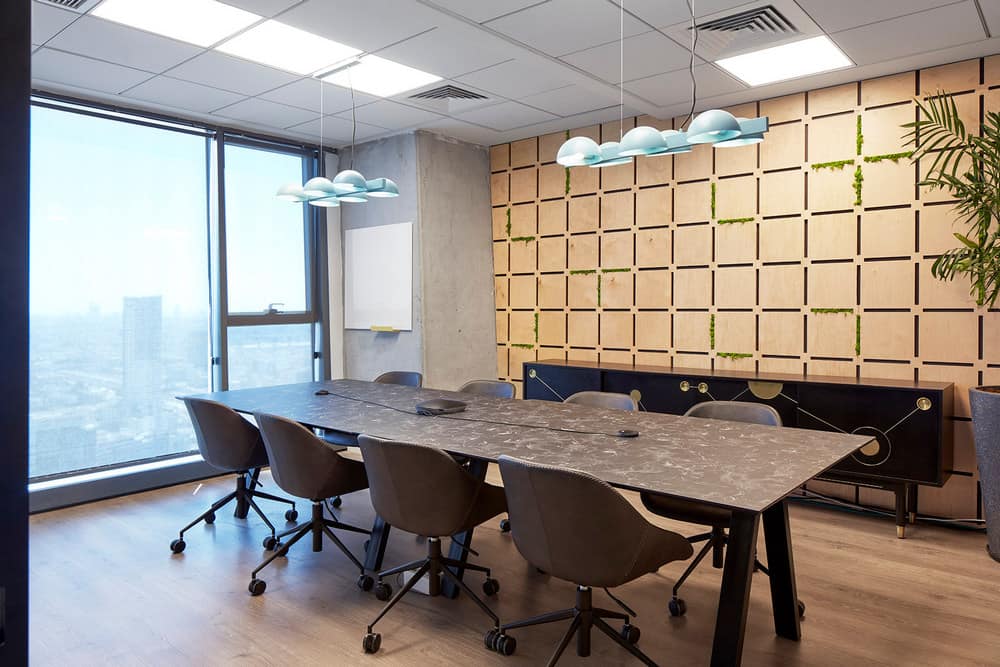
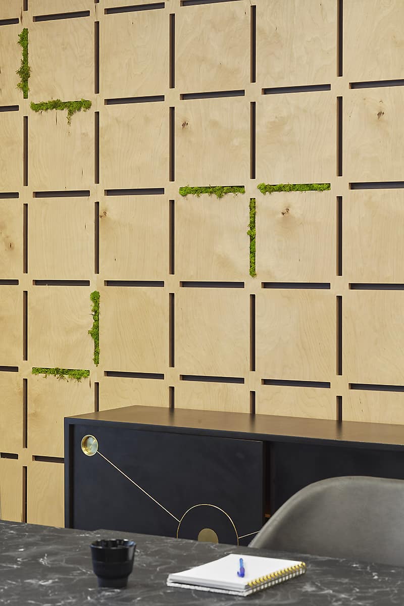
The designers carefully selected the color palette and materials after thorough research into the company’s values: “The color scheme is organic, natural, and emits a sense of lightness, contemporaneity, and optimal flow,” says Peled. “We decided to flow with the rounded lines of the company’s logo and incorporate its green tones into the space in various aspects. The repetitive gradient we chose symbolically represents the people who choose health programs. We covered most of the walls in the office area with wet-painted plaster, a natural and clean material that serves as a successful background for the wooden details. We created a cut-out of the logo and integrated it between the slats, which were cut by CNC, with green moss that requires no maintenance and grows from the letters that make up the company’s name.”
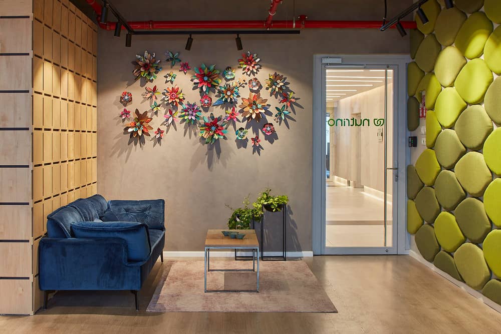
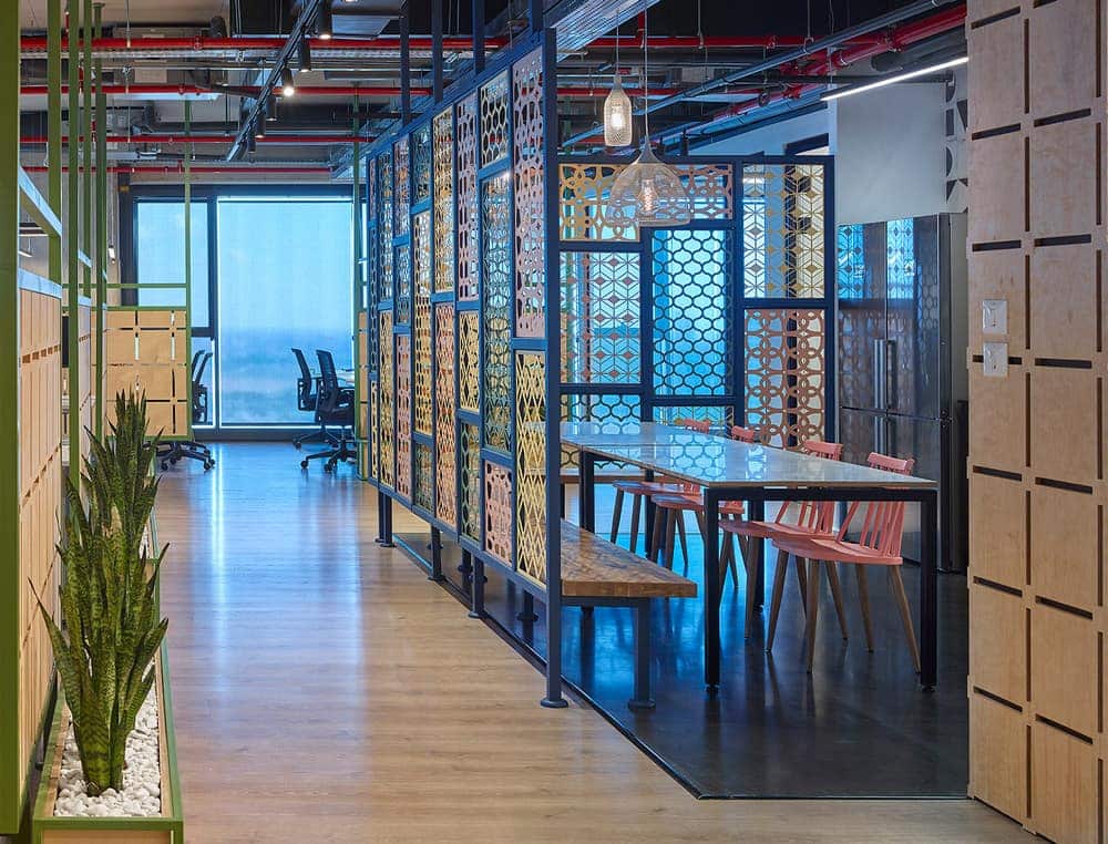
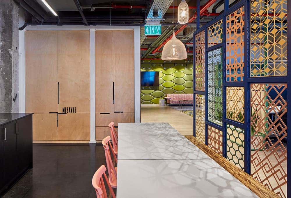
At the entrance, a strong metal partition composed of laser-cut pieces in various pastel shades of mint, blue, pink, and yellow creates a division between the kitchen and dining area and the rest of the office, allowing a glimpse of what’s happening on the other side through the openings. “We tiled the kitchen floor with dark granite tiles and adorned the wall of the partition with graphic geometric elements in black and white. The storage cabinets are birch, and the kitchen cabinets are coated with black porcelain. The dining table overlooks the open entrance, ensuring that the dynamics between the zones remain at their peak all the time.”
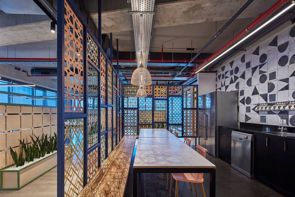
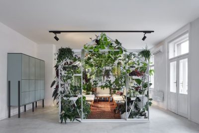
“One notable element in the office is a metal partition constructed from laser-cut pieces featuring various floral patterns in changing pastel colors of mint, blue, pink, and yellow. It creates a division between the work areas and different transitional spaces. We made them from painted metal and paired each partition with a planter containing Sansevieria plants – plants that are particularly suitable for closed spaces, cleanse the air, and require minimal care.”

The meeting room is open, large, and inviting, with the option to add additional chairs as needed. The designers chose to refurbish an old maple sideboard with the help of an Israeli artist specializing in the field, and they assembled the table palette using HPL (high-pressure laminate) and metal legs. The suspended lighting fixture above it features a clear nod to the 60s.
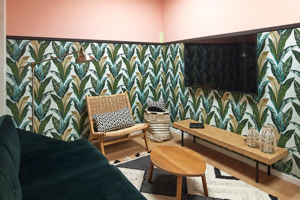
For the employees’ team, an additional intimate meeting room was designed in a wild and joyful style. The walls are adorned with botanical-printed wallpaper, accompanied by items in pink and green tones and furniture details made of rattan and straw, returning to natural materials that create an inviting and relaxed atmosphere.
